Float On: Brand Identity for FLOAT
Stepping inside the doors of FLOAT in Midtown, you’ll find an experience unlike anything else in St. Louis. It’s an experience a lot of people aren’t familiar with. And it’s deeply unique for each individual.
How do you begin to define that experience? That’s what we set out to discover for FLOAT. As we dove into our branding program, we encountered even more questions. The first, and biggest: what is floating?
What is floating?
Before the project began, a few of us had already stopped in for a float. The rest of us tried it out during the process (research!). But that didn’t mean we had all the answers. After all, talking to the owners, employees and clients of FLOAT, we learned that it’s a highly personal experience. Everyone’s float is different.
When it comes down to it, floating is just that – floating. After rinsing off, you grab a pair of earplugs and step into a pod filled with saltwater heated to body temperature. As the colorful lights dim, there you are, floating in darkness. No light. No sounds. And soon, no sense of where your fingers end and the water begins.
At the most basic level, there are a number of physical and physiological benefits to floating: muscle relaxation, chronic pain relief and glowing skin. But there are deeper, psychological benefits as well.
The FLOAT experience is typically referred to as “sensory deprivation,” but you don’t feel lost or deprived without your senses. Instead, you’re free to let your mind wander with no external distractions – a rare treat these days when distractions are just a phone notification away.
FLOAT’s original logo
Who is FLOAT?
From our very first meeting with the FLOAT team, we could sense how passionate they were about the business and the role floating plays in their clients’ lives.
They have both an understanding of the science behind floating (the founders all have backgrounds in mental and physical health), as well as the appreciation for the spiritual benefits. Their motivation for opening FLOAT in St. Louis came from experiences floating elsewhere and wanting to bring that experience back home.
What makes FLOAT different from those other float centers? Some competitors operate more on the clinical side, focusing on the medical benefits of floating. Others position themselves as a New Age option to zen out. FLOAT was somewhere in between.
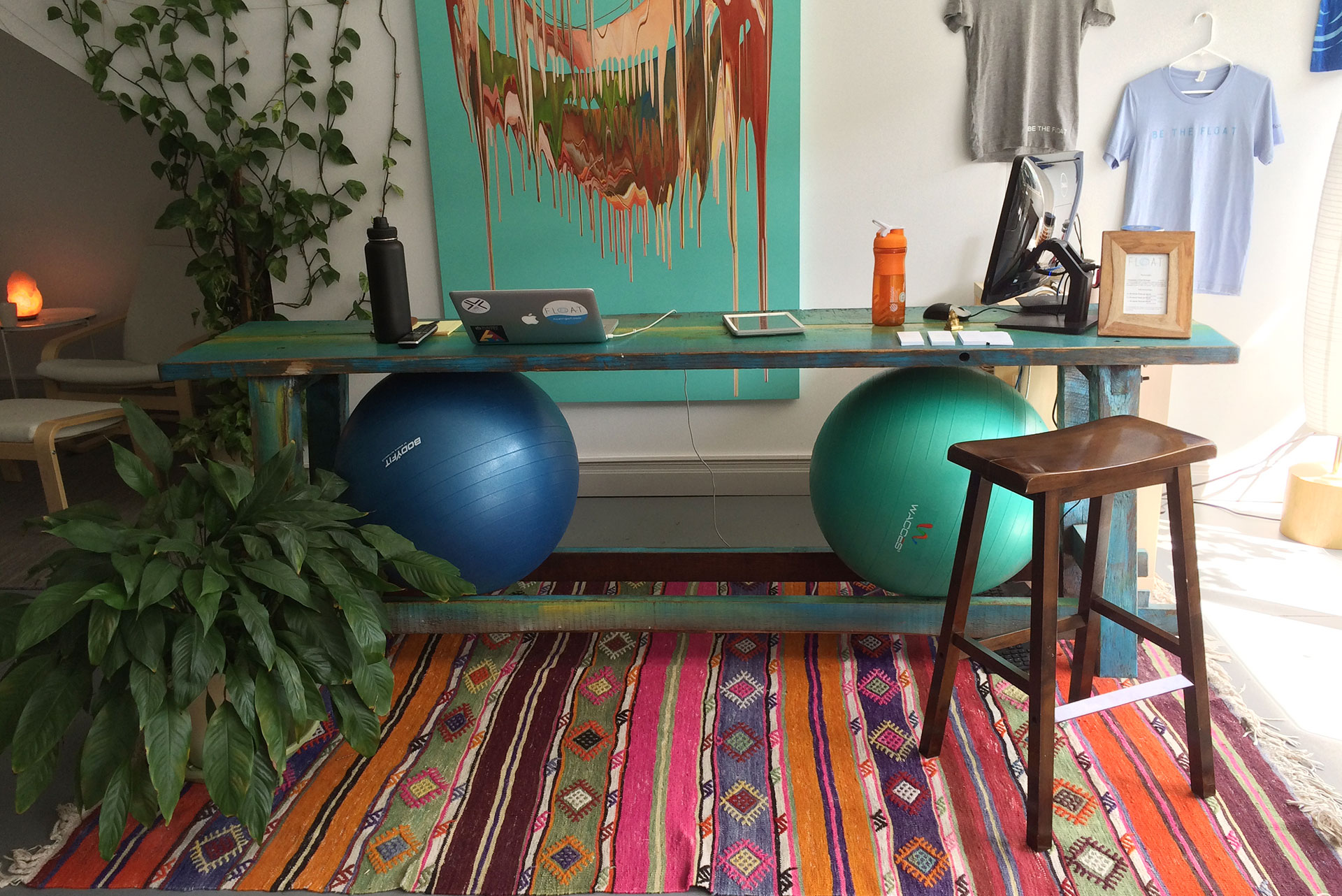
When you walk into FLOAT’s Midtown location, you instantly feel welcome and comfortable. Employees take the time to talk to you before and after their float, getting to know you personally (beyond just your name and membership level). Any fears or hesitation you have about floating are calmed. It’s also worth noting that many of the current employees actually started out as FLOAT clients, and were eager to join the team full-time.
It’s rare that we see the kind of alignment we found among FLOAT owners, employees and clients. Every person we talked to echoed the business’s welcoming, inclusive spirit. As FLOAT prepared to expand to new locations, it was key to expand on this idea this with new branding.
Rise Above
The act of floating offers the chance to unplug from the demands of daily life and take time away for yourself. But every float center offers the same product, a personal pod of saltwater and silence.
What makes FLOAT so different is that every aspect of the experience – from the moment you enter the space – helps you rise above the stress in life. That was an appropriate evolution from the idea of “welcoming and inclusive.” It was an idea we could market. In fact, it became the basis of our tagline, “Rise above.”
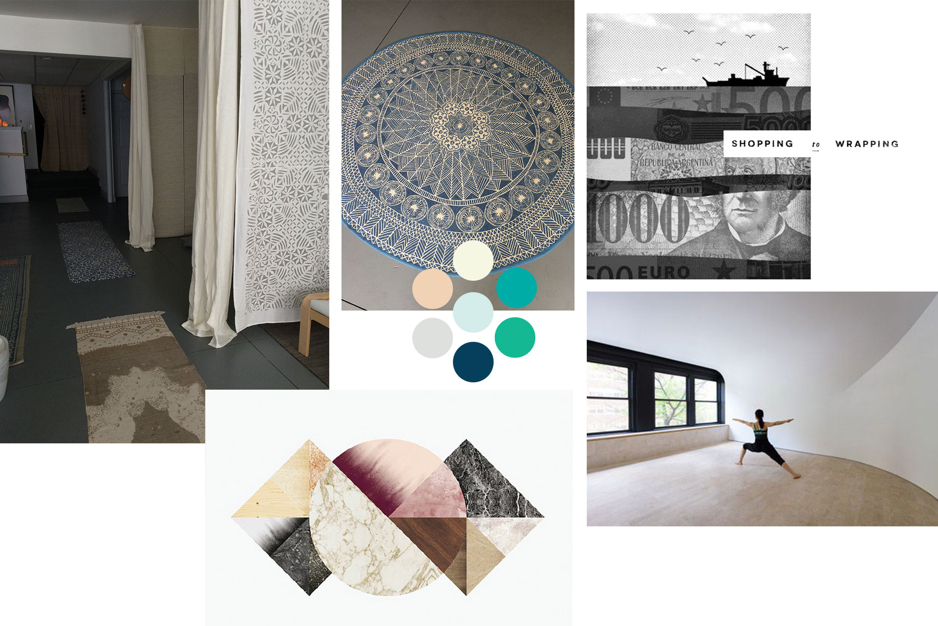
To illustrate this visually, we created a mood board to help figure out what tones and elements fit. It gave us guardrails. We built a starter color palette and found type treatments, textures and other elements to inspire the process.
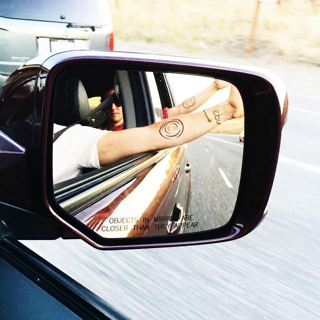
To simplify the brand for broader appeal, we wanted a cleaner, more commercial feel. But as we dug into a new design, we encountered a rather permanent roadblock – the owners of FLOAT had the wave logo icon as tattoos.
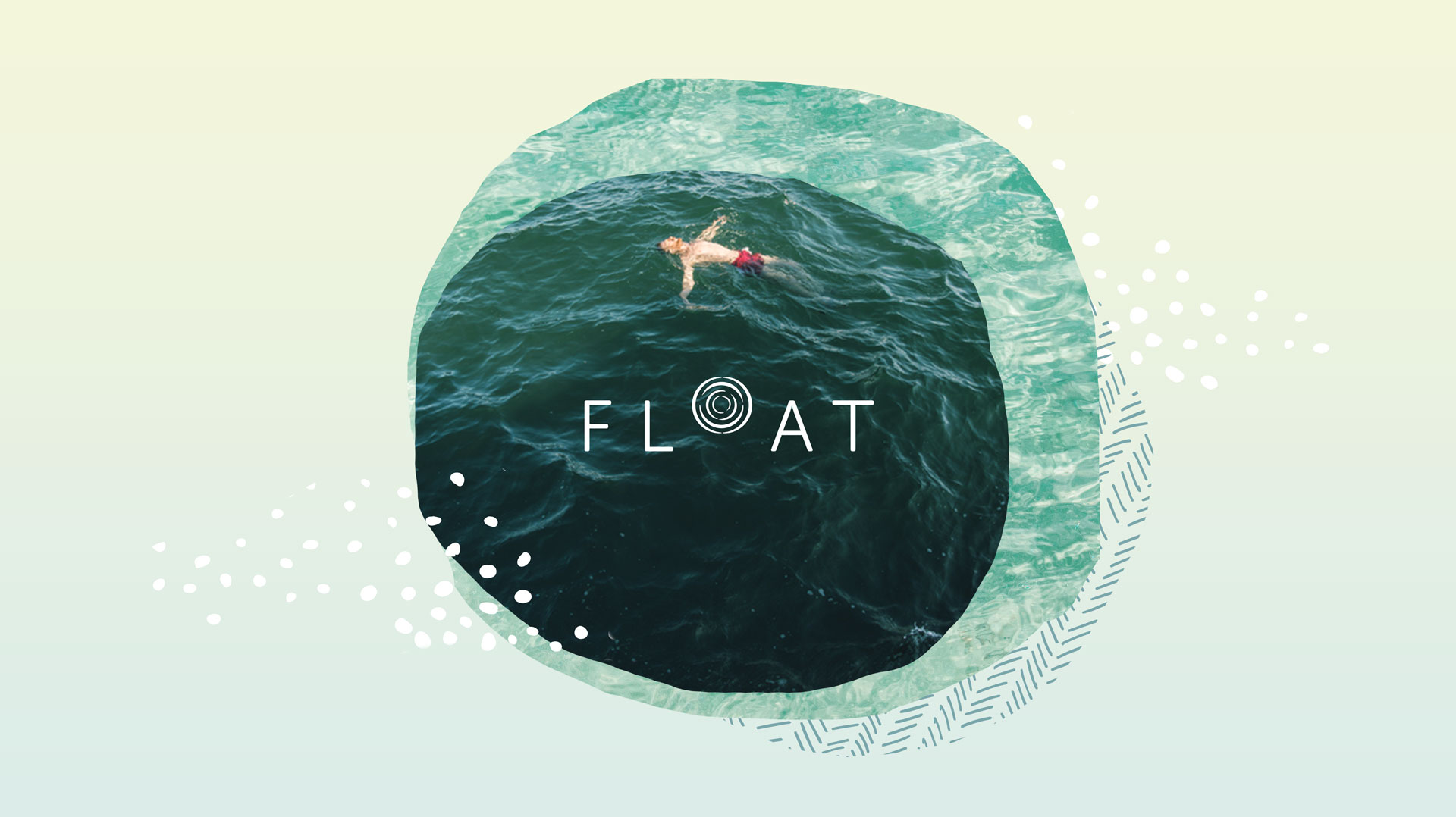
We embraced the wave and focused on creating the cleanest version of their current logo as possible. After removing the periods of the original F.LO.A.T. (which stood for “for loving antigravity timelessness”) we cleaned up the type to give it a modern, elevated look. For a final touch, we added a nod to the tagline by lifting the wave icon so that it rose above the rest of the logo.
![]()
And Moving Forward
It’s easy to see the logo as the finish line, but in reality, it’s just the first big milestone. We quickly got to work bringing other elements into the brand to create a cohesive look and feel.
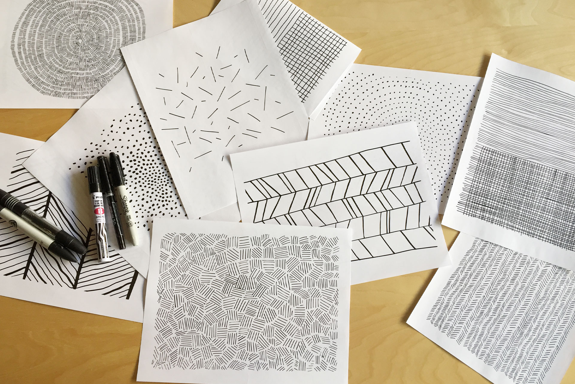
First, we stepped away from our computers and created some hand-drawn patterns. Using a pencil and paper led to subtle imperfections that felt more organic.
Then we experimented with photo styles and layering. Instead of highlighting the futuristic appearance of actual float pods, we focused on the experience itself. After a few minutes of floating, you really forget about the size of the pod and the space around you. To echo this feeling, we used ocean waves and natural water imagery to illustrate the freeing nature of every float. By layering photos to build a collage, we added depth to the otherwise light, airy tone of our designs.
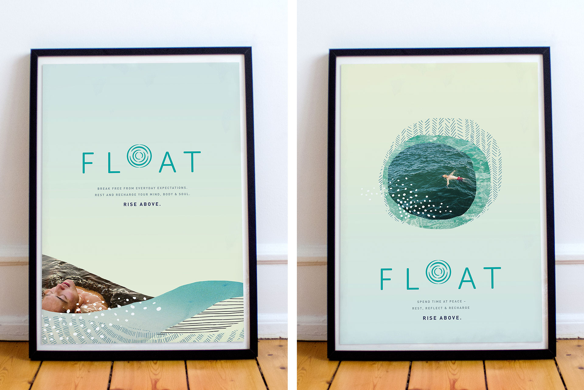
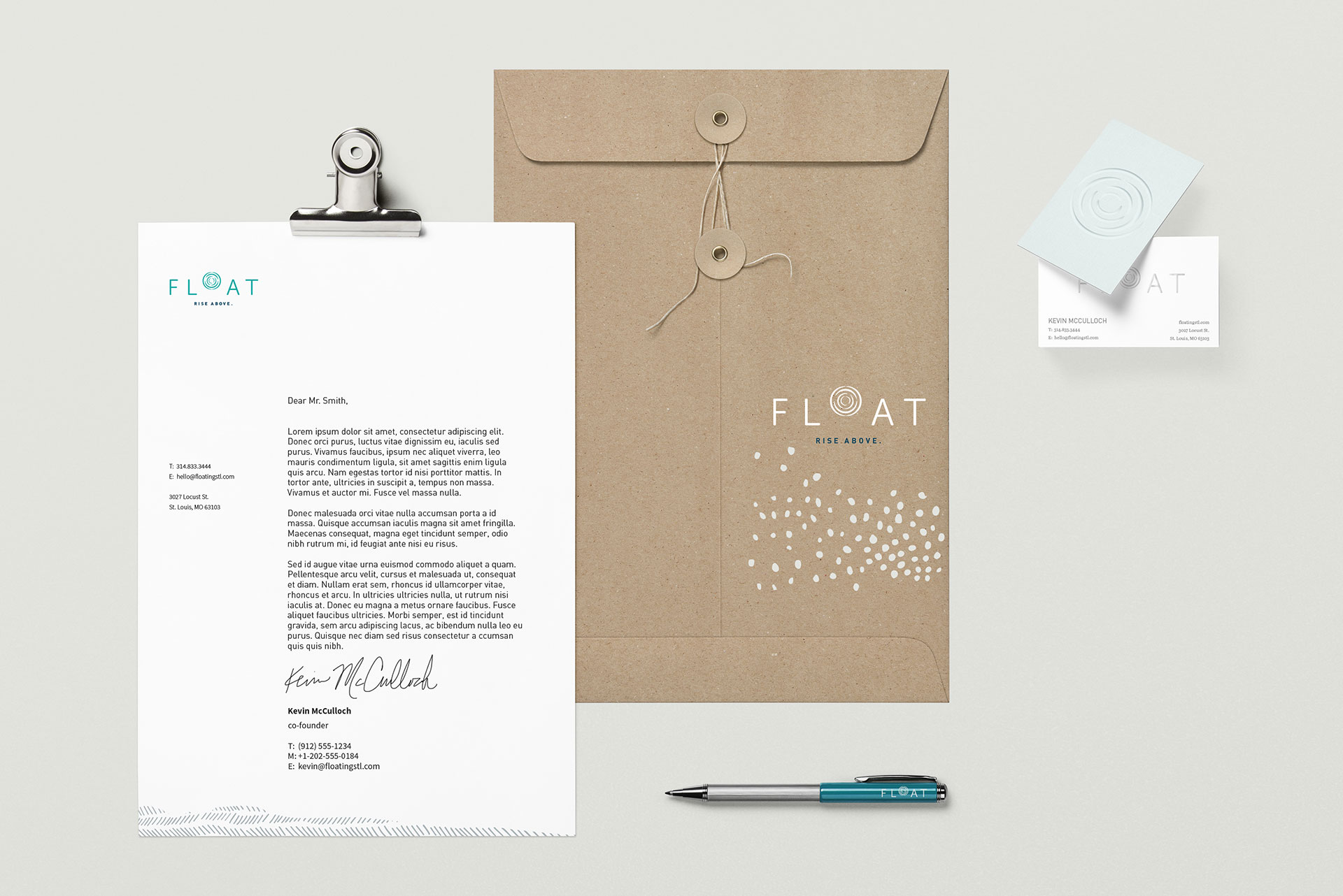
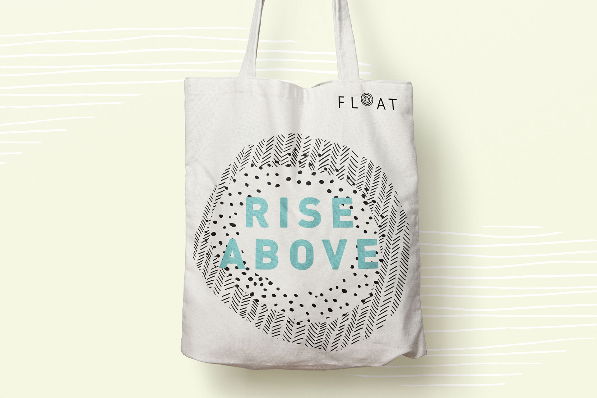
Each piece works in harmony, visually communicating the calm, relaxing and welcoming environment that FLOAT provides. We’re excited to see the new brand come to life as FLOAT expands across St. Louis.
Want to keep up with the latest work from Atomicdust?
Subscribe to our newsletter for all the latest news, events and weekly marketing tips from our team.