Seeing Things Differently: A New Website for COCA
If you live in St. Louis, you probably know COCA. It’s a cultural institution: a nationally recognized nonprofit arts organization, a leader in arts education and a huge source of pride for the region.
At Atomicdust, we know COCA. We put COCA on a pedestal. We’re an agency with an unusually large number of amateur musicians, actors and dancers parading as designers, writers and account managers. So when COCA approached us for a new website, the reaction in our office was a weird mixture of pride, excitement and crippling self-doubt.
COCA’s brand is timeless. From the simple type and colors in the logo, to the phenomenal architecture of their building on Trinity Avenue, COCA has a midcentury simplicity that works far better under constraints than most of today’s brands. Whatever we created would have to live up to the existing identity.
It would need to solve some big problems, too.
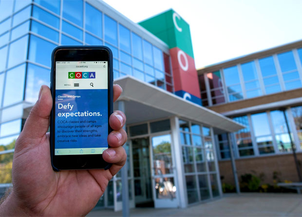
COCA has always been a bit mysterious. People tend to associate it with arts classes and camps for children, but that’s just one portion of their programming; they also offer pre-professional dance training programs, corporate coaching, free arts education for local schools and performances from internationally renowned artists. The site would have to help visitors quickly understand the impressive scope of the organization’s offerings, and then guide them to take action, whether they were inspired to buy tickets, register for a class or workshop, or make a donation.
On a more conceptual level, the site needed to showcase COCA’s commitment to the community, with diversity and inclusiveness as signature values. The arts are COCA’s vehicle for bringing people together who might not otherwise find each other. Like COCA itself, the site would need to be a community hub for the arts – a participatory, hands-on experience that encourages interaction and engagement. No one is a bystander. Everyone is welcome.
As a newer designer on the team (and a dance teacher who happens to love COCA) Katie Stegemoeller was feeling the heat. Naturally, Mike turned to Massimo and Lella Vignelli for help.
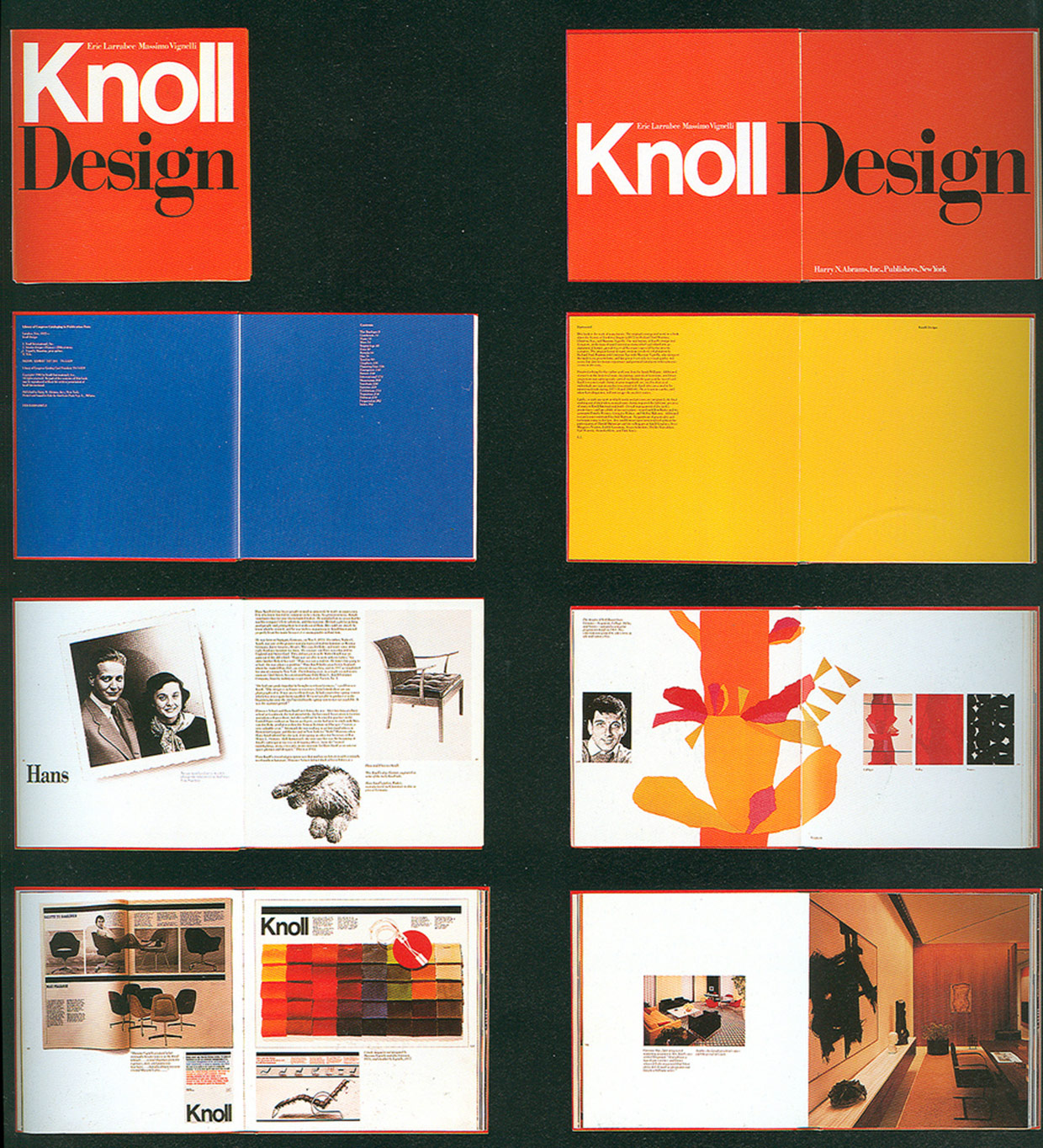
Up in our office’s “Crow’s Nest,” Mike, Katie and the rest of the team rewatched Design Is One, a documentary that explores the Vignellis’ rise to fame as well as their belief that good design solutions are timeless. Then we dove into their colorful, iconic Knoll catalogs from the late 1960s. Massimo’s graphics program for Knoll defined highly structured grids that enabled the brand to create a diverse and vivid set of ads, brochures, boxes and more for decades to come. Looking at the work, we wondered if a little bit of control might help us express all of the beautiful chaos of COCA’s programming.
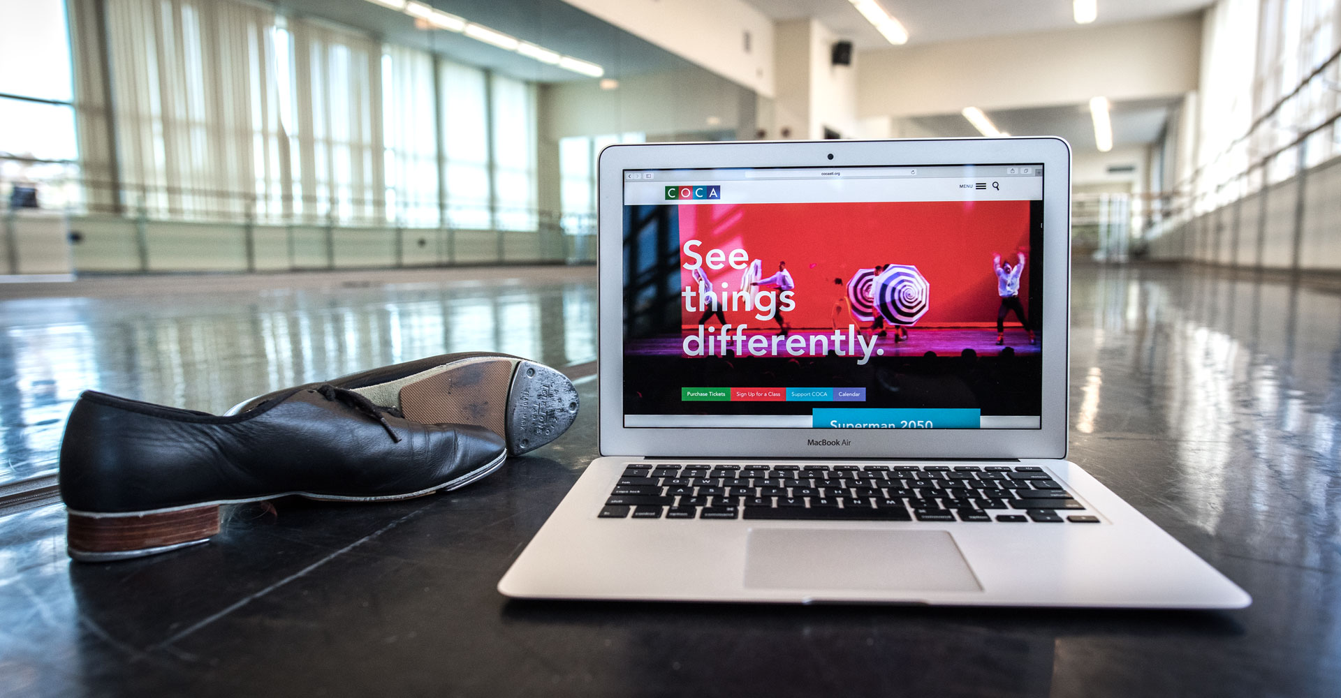
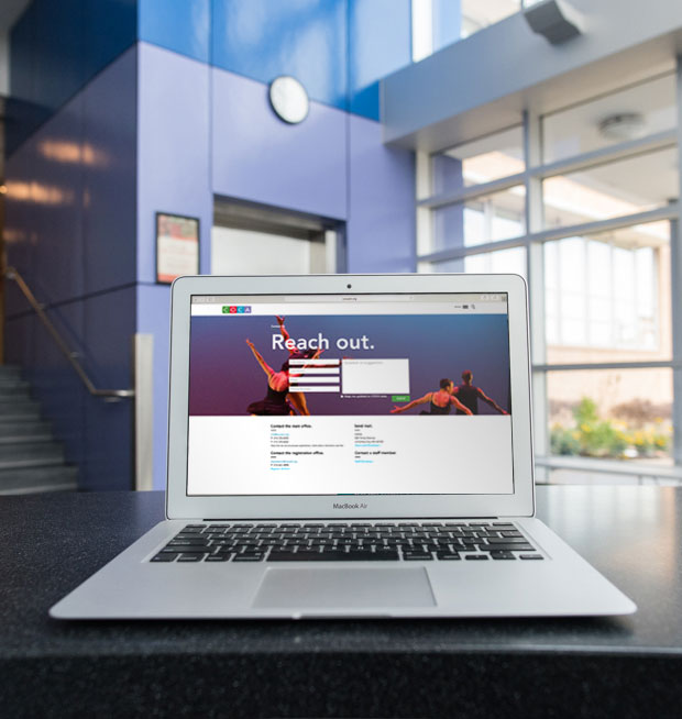
In our minds, the COCA site could combine the principles of great midcentury design – clean type, ample white space, and just the right amount of tension – with a sense of continuous movement, energy and information. We envisioned a “living calendar” for the homepage: a constantly changing, vibrant engine that reflects the dynamic programming available at COCA, from performances to workshops to lectures. The calendar would be introduced by a giant video header featuring real COCA artists practicing their craft in the classroom and beyond.
Katie made the homepage mockup, and it was stunning.
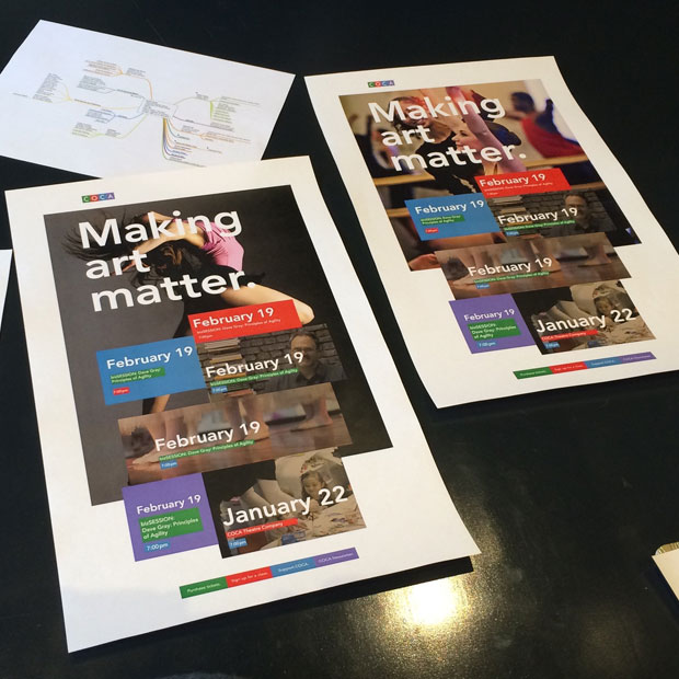
Initial homepage concepts.
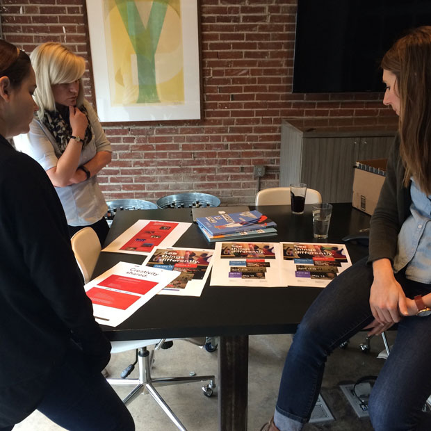
The team reviews the initial homepage designs.
This was it. We’d done it. We couldn’t wait for the client to see it. We sent it over.
And then they rejected it.
Inspire and Inform
Maybe email isn’t the best way to present a design built on the concept of movement, no matter how creative the client is. Our bad. We couldn’t really blame them for their hesitation, but we still believed in the concept, and were ready to go to bat for it. We built a new animated mockup and scheduled a call.
After we walked them through the movement and the strategy, the client was able to see what we saw, and what a flat PSD file couldn’t communicate. We had set the stage for an experience that was as alive and welcoming as the COCA space itself.
But rejection, however temporary it may have been, threw us for a loop. It was time to remind ourselves that the project was bigger than a single design. In mid-January, we took a drive over to COCA to see “Perpetual Motion,” a show that blended cutting-edge hip-hop and contemporary dance. The performances by COCAdance and the COCA Hip-Hop Crew were awesome: colorful, eclectic, ingeniously choreographed and impeccably danced by people of all ages, backgrounds and performance styles. It reminded us what we, ourselves, were capable of creating – and why it mattered.
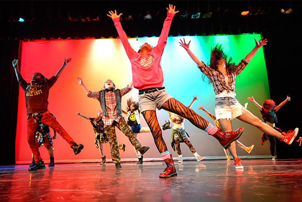
A scene from COCA’s Perpetual Motion.
But the site would have to be cohesive. It would have to be navigable. And it couldn’t sacrifice design variety. So we brought in those Vignelli-inspired grids. An underlying structure allowed us to “bend” elements across layouts without breaking the overall look and feel.
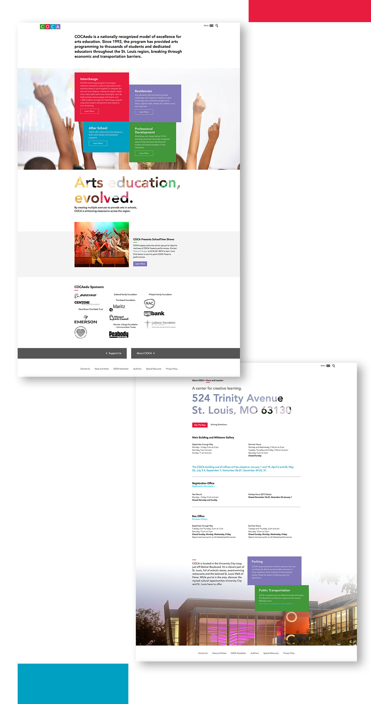
Using type, negative space and just enough tension to hold everything together, the design team began building out the rest of the site. COCA provided gorgeous photography, which we combined with inspiring language to tie everything – even functional pages – back to their larger mission.
Coding Creatively
And then – whoops. Suddenly we realized that the site was going to be huge. To manage our design team’s capacity, we color-coded the site map, indicating which pages should share the same basic structural elements. We then designed one page within each group. In theory, this should have provided a solid style guide and framework for our developers.

The entire Atomicdust team previews the test site.
But ask Annie, the project’s developer, about theory vs. practice. Annie built 20 different templates for the site, each one a “special snowflake,” each one mobile friendly. Not to mention, everything needed to be easy for the client to update. The old COCA site had been too hard to maintain on the backend – a huge problem, since COCA is always in motion, with new events and opportunities popping up daily.
“If the site isn’t usable by our client, then it’s broken. They shouldn’t have to contact a developer to make a simple text change or event update.” – Annie
Annie ensured that every part of the site was easily editable in the WordPress backend with WYSIWYG editors, but that wasn’t the last hurdle. Katie had created several designs with animations that initially show transparent words on a white background. Once the user begins to scroll, these words scroll up to reveal a full-browser image. More scrolling reveals the rest of the page’s content. For these animations, we were determined to use real type, not images.
With a tip of her blue beanie, Annie experimented with mix-blend-mode, a CSS property that blends the top layer of content into the layer below. The CSS blends are similar to Photoshop blends. This worked initially, but the property wouldn’t perform well across all browsers. That just isn’t our style. To ensure everyone could enjoy the effect, we went with transparent PNGs with words cut out. The final result may not be what we initially wanted, but it’s still striking, and it looks effortless.
After months of site maps, grids, Vignelli videos and a few victorious box steps, the site went live. We were thrilled, and so was the client:
“THANK YOU. This has been four years in the making for me, and I have so enjoyed working with your team. The site looks great and I’m having so much fun updating the blog and adding events left and right. What would have taken me hours with the old site is happening in seconds!” – Beth McClure, Director of Marketing and Communications, COCA
Intimidation be damned. We created something we’re proud of, not to mention a wonderful partnership with COCA. Keep an eye out for more work this fall, and visit the new site now.
UPDATE: Communication Arts selected COCA’s new website as their Web Pick of the Day for Thursday, November 19.