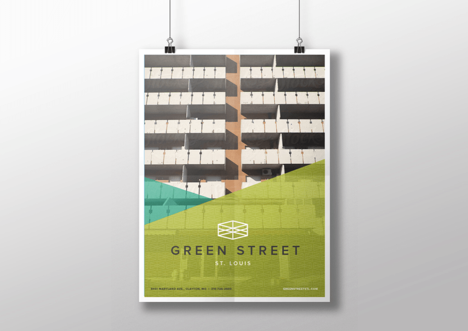
Building for the Future: New Branding and Website for Green Street St. Louis
Riding through North St. Louis’ frequently forgotten areas in a Tesla Model S may not seem like the most conventional scenario for learning about the ups and downs of local neighborhoods. But as I sat in the passenger seat listening to the Tesla’s tires whoosh away from a red light, Phil Hulse taught me about the work he and his company have been doing in our city.
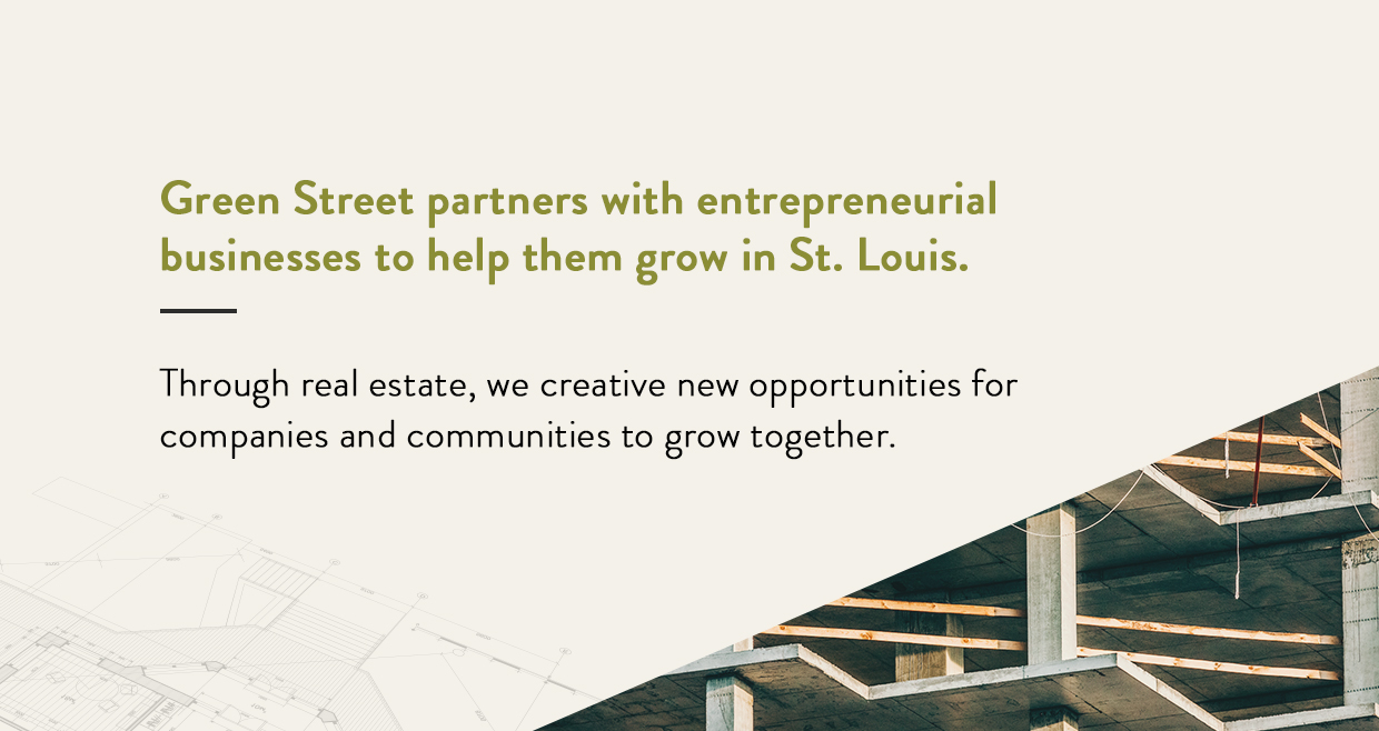
Phil is a cofounder and managing principal of Green Street St. Louis, a local real estate, development and construction firm that came to Atomicdust in search of a new website. They were looking to differentiate themselves within an industry known for fast transactions, cutting corners and forgettable buildings.
Green Street puts much more time and effort into their projects than anyone would expect. After meeting with their team and taking a look at their existing marketing efforts, we knew a website alone wouldn’t be enough to change minds about who Green Street is, what they do and why St. Louis should care. Our first task was to convince their team that they needed more than a revamp to their online presence . They needed a new brand, a new position in the market – and then a new website.
 We gathered our team to meet with Green Street and walk them through our Branding Program and case studies for other professional service clients. Within the hour, they started to see that a website wasn’t going to address their underlying wants and needs for where they were planning to take Green Street as a whole.
The more we met with Green Street, the more we realized how similar our two companies were – and that helped as we tried to explain why a nice website wasn’t going to cut it. When it comes down to it, Green Street takes a different approach to their industry, but that means spending a lot of time convincing their clients that real estate is about more than the four walls of a building. At Atomicdust, we spend time showing clients why a new website rarely solves any business problems. We have to get to the root of the issues first.
More to Do
With a consensus to do both the Branding Program and a website build, our team headed back to the office. There, we realized that we’d given ourselves an even bigger task – without much additional time — in a complex industry that we hadn’t done a lot of work in over the years. As a team, we started our research into Green Street and the real estate industry , complete with a few ride-along history lessons in Phil’s Tesla.
Green Street started out of the desire to bring more to the table for St. Louis businesses through real estate. Phil and the Green Street team lend their decades of knowledge and expertise to companies looking to grow. Instead of traditional real estate, where your agent’s purpose is get you into a new building, Green Street operates as a business partner.
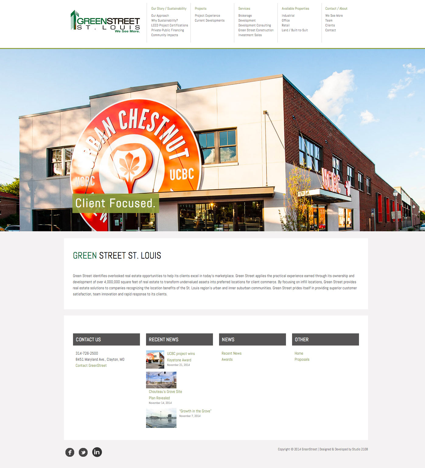
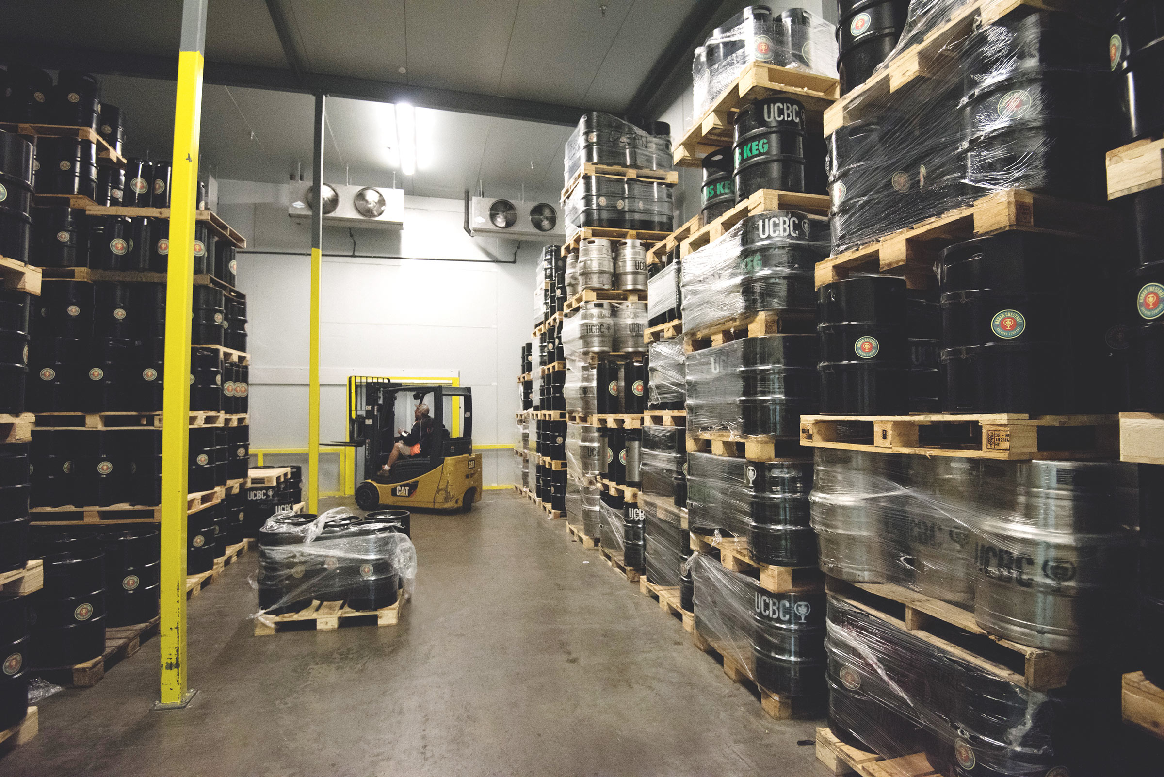
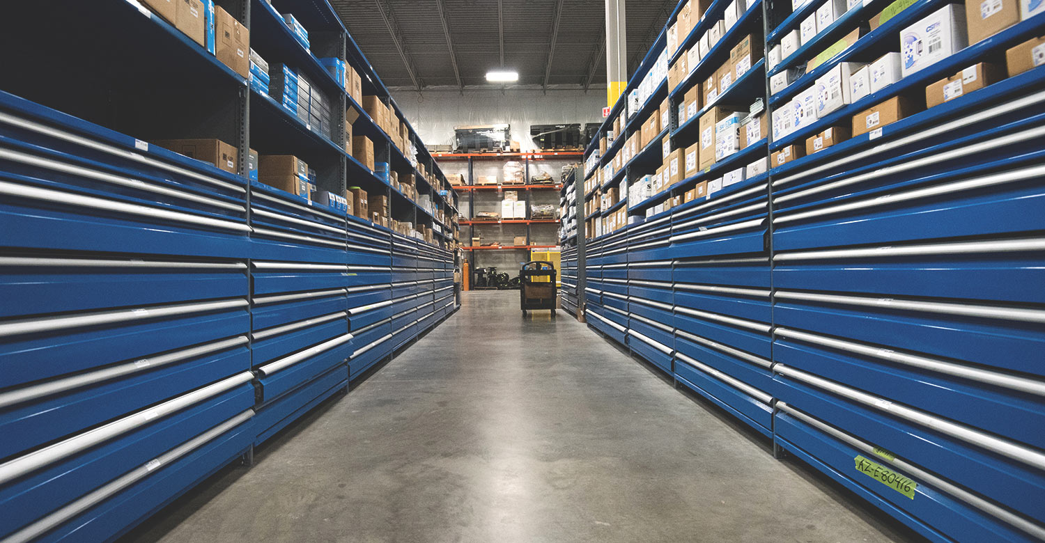
A great example of this is the new Urban Chestnut location in The Grove. When the two-year-old brewery had outgrown its space, Green Street found a way to make a $12-million brewpub possible when it shouldn’t have been. The new Urban Chestnut location has become a hub in The Grove neighborhood, offers the brewery more space to grow in the coming years, and is the first and only LEED-certified (sustainably built) brewery in Missouri.
Green Street knows more than the ins and outs of not only real estate. They know how to position companies for success. And that’s what we were trying to capture.
Once that research foundation and knowledge was in place, I began working on branding language while our design team started on logos and other top-level creative expressions. We all had plenty of great ideas, but a week before the presentation, we still hadn’t settled on an approach.
We had an idea of what we wanted to do, but the words weren’t there yet. Meanwhile, our designers had two completely different directions for the logos, website and entire brand. Toward the end of the week, we presented Mike with our thoughts on design and a proposed tagline: “Building possibilities.”
One early proposed design direction went down an organic, high-class road, using finished and distressed copper tones and a logo that created an abstract “G” from building elements.

Another proposed direction used clean, structural design with sharp angles, patterns from buildings and bursts of bright greens.
Finding Our Direction
As we talked with Mike, he gave us the not-so-great news. He sort of liked some of the designs. And he hated the tagline. We had to present our direction to Green Street in a few days. Back to the drawing board.
With the bright, angular designs slightly taking the lead in our internal poll, we went in that direction – just adjusting a couple of things, including the colors, logo, typefaces, conceptual web layouts, business cards and…okay, there was a lot of work to do. While the designers refined their concepts over the next few days, I barricaded myself in the conference room with a whiteboard to try to hammer out a tagline and supporting language.
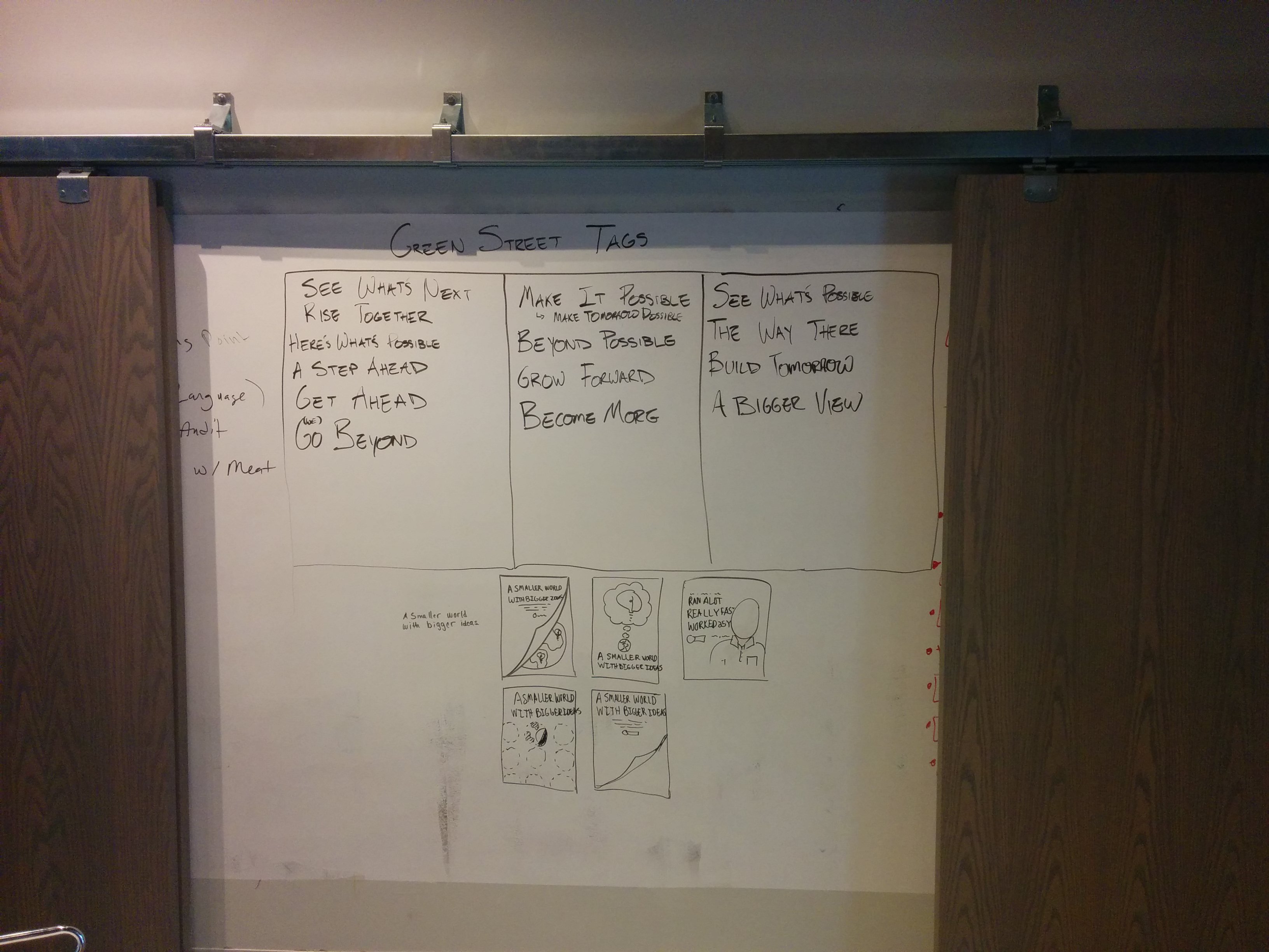 As I burned through hundreds of (mostly mediocre) taglines, it occurred to me that their existing tag wasn’t so bad: “We see more.” While it wasn’t really supported by any of the other language or designs, it began to grow on me. Where traditional real estate developers stop, Green Street sees more – always looking for the best solutions. But we saw more, too. We went to battle with the old tagline in search of something better.
Without a clear winner in sight, I mixed and matched the best of our taglines. Sure enough, it resulted in a winner: “Make more possible.” It’s short. It’s clear. It felt right. And everyone on the team liked it. (Whew.)
Meanwhile, the designers were working toward their own “a-ha” moment. For the look and feel of the brand, we knew that the original designs were going too far in an elegant, traditional direction. Through our research, it became clear that Green Street should really be more modern, energetic and approachable.
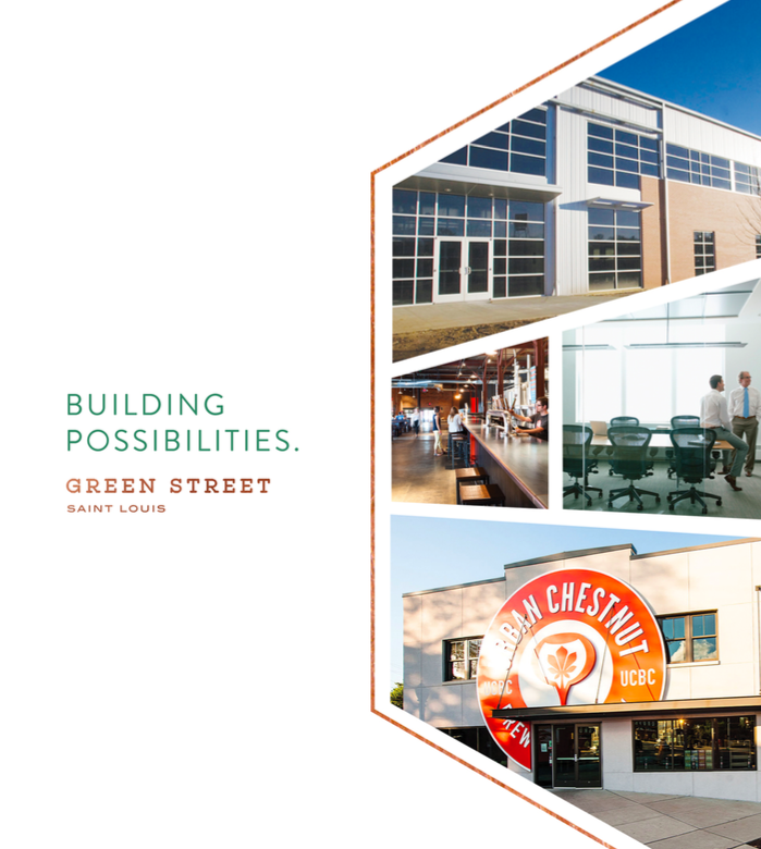
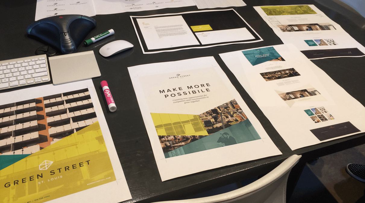
We created a look that showcased that Green Street wasn’t your everyday real estate firm. They bring more to the table, so we wanted a high-end, showstopper design that would invite people to take notice and see the differences up close. First, we pulled in sharp angles to act as the building blocks for images, patterns and the new logo. Then we embraced the company’s focus on sustainability and the greenness of their name with a family of vibrant greens, from emerald to chartreuse.
This was Green Street. A new tagline. A new look and feel. And a clever logo that pulled in an abstract representation of the interstates that run through St. Louis.

The first logo we proposed for Green Street.
The next day, we all showed up early, did a practice run, and finally presented to the Green Street team.
Green Street’s final supporting language.
Overall, everything went pretty great. We had our solution, and we had approval. We all took a sigh of relief and prepared to start the website. But our work was far from over.
Time for the Web
While Jessica is an experienced designer, this was her first web project. No pressure. There’s plenty to consider when it comes to designing for the web : grids, user experience, responsive templates and countless tiny things that don’t come naturally the first go around. So she leaned on the rest of the team – and the internet, of course – for support. While the open nature of our office was another thing for Jessica to get used to, asking questions and having spur-of-the-moment conversations is a lot easier without cubical walls.
Not So Fast
In the middle of writing copy for the main pages, Green Street emailed us their feedback after thinking through our branding presentation. They weren’t settled on the logo. They wanted something greener to better represent their commitment to sustainable design and construction.
So we scrapped the interstates and focused on the green.
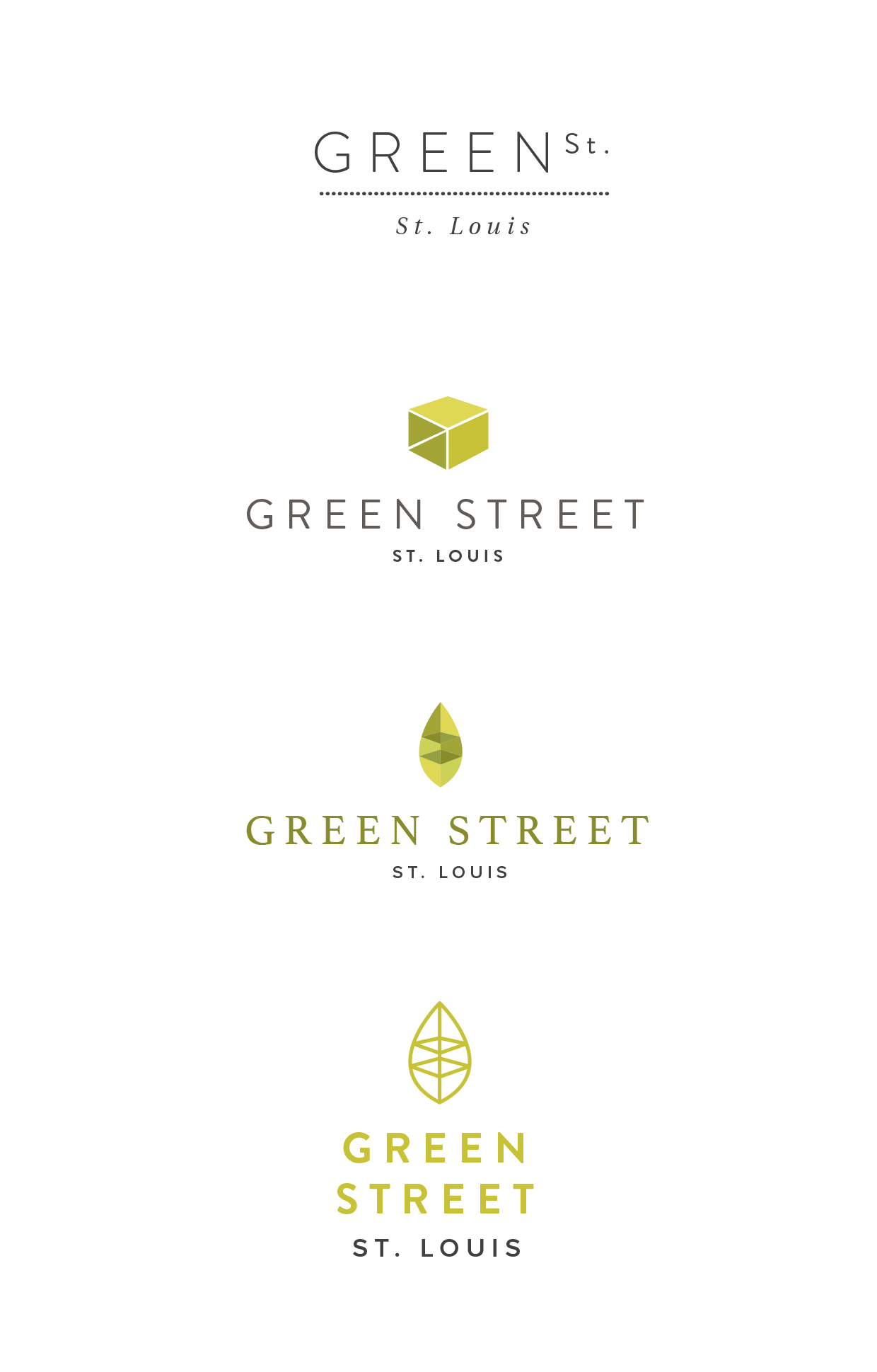
After more rounds of concepts and internal debates, we had a new direction: a leaf logomark with an exposed structure to pull in the strength behind Green Street’s sustainability.

Our new and approved logo for Green Street.
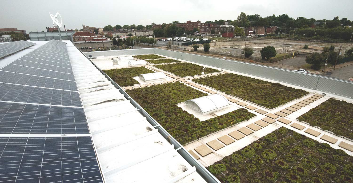
By now, the main sections of website copy and designs were going pretty smoothly through approvals. Then we hit another roadblock. A lot of what Green Street does is hard to fully explain without showing it. But we needed high-quality photography that they didn’t have.
Often in real estate and construction, photography is cold and focused on the shell of a building. We knew we had to breathe some life into the images. So we began taking still photos and drone videos of Green Street’s recent projects , showing the buildings in action, inside and out. After a week of personal tours from Phil and Liz, we had exactly what we needed.
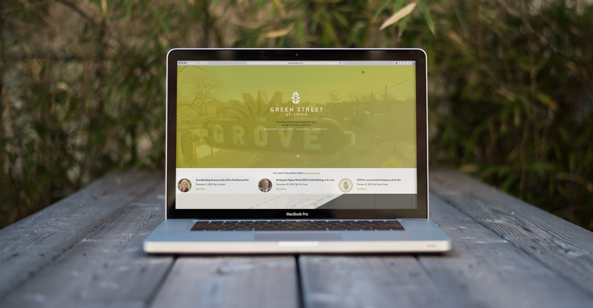
 As we kicked off the website process, we all wanted to push it to be something way out of the ordinary. But the boldness and elegance that elevated Green Street’s website in design proved to be a challenge in development – especially the angles. Our designs use sharp angles to guide your eye through every page. But, as our developer Drew puts it, “The web is a box.”
From MSN in the ’90s to Facebook today, the web is traditionally a series of boxes filled with text and images. When it came time to develop Green Street, getting all of our various angles to work in different browsers and across mobile devices wasn’t as cut and dry as creating a series of squares and rectangles.
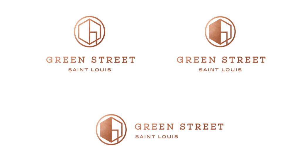
And just as we thought we were nearing the home stretch, Green Street had more thoughts on the logo. It didn’t pop as much as it needed to on a poster and t-shirt the company had created as part of their sponsorship of a local festival. This time, we built a logo system, complete with options for every situation and scenario.
Green Street’s final logo family.
Keep Moving Forward
Over the coming weeks, we held several impromptu meetings to figure out how to bring Green Street to life on the web. In addition to its unconventional angled design, the site has multiple custom Google maps, a video header, endless animations, blogs, press clippings, projects and a handful of other things going on behind the scenes that we wanted to be easily editable for the Green Street team. But for any good developer, the challenge of figuring out how to do it all is half the fun.
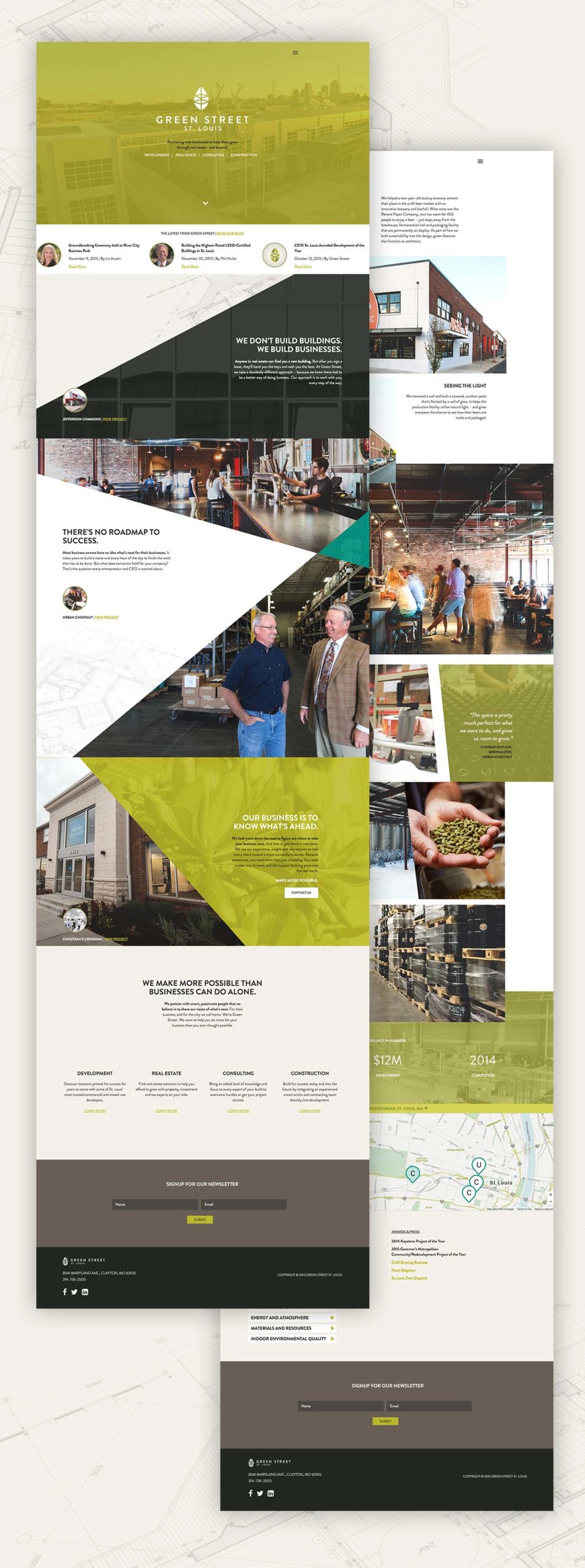
Green Street’s new homepage and a secondary page featuring a project.
Drew used this as a chance to try out some new things of his own, including a new deploy system and PostCSS, a nifty tool that takes a modular approach to simplifying and speeding up CSS development.
An Earlier Date
As development was wrapping up, we received another fateful call from Green Street. Phil was due to be featured in The St. Louis Business Journal; they wanted to know if we could bump the scheduled launch up by a few days. Thankfully, we were ahead of schedule, were able to cut some of the less vital pages, and pushed the site live the day before Phil’s feature.
Sighs of Relief and High Fives
This project came with its share of ups and downs and lessons along the way. And as everything came together, Drew summed it all up perfectly, “This is the most fun I’ve had on a project.”
As we worked through the challenges, Green Street gave us the ability to push ourselves. Sometimes it’s easy to get lost in feedback, and to see it only as a challenge to our ideas. But every time Green Street came back with something, we knew it was rooted in their deep passion for what the future of the company should look like. We used their energy and excitement to keep moving forward.
When we were asked to make a website, we showed our clients that they needed more: they needed to build a brand. Phil and Green Street showed us more, too.
Riding down streets lined with overgrown empty lots and buildings in disrepair, Phil showed us his vision. He gave us the chance to see how the work Green Street does makes an impact across the entire city, one block at a time. Former dumping grounds are now business centers. Old vacant buildings now serve the community. Businesses that have never worked in our area now have offices here. That’s the real spirit of Green Street. They don’t just work for their clients. They work for St. Louis.
At Atomicdust, we love the city where we work, live and play. Working with Green Street to solve their business problems through design also allowed us to continue to elevate St. Louis as a whole. And that’s just an added bonus to seeing a great company now represented with strong branding, positioning and a website as unique as Phil, Kevin, Pete, Sam, Brian, Chalegne and Liz. As unique as everyone at Green Street.
So, yeah, this was the most fun I’ve had on a project, too. Cheers to everyone involved in the process. And two cheers to Liz for surprising us with three cases of beer from Urban Chestnut as we had our team meeting to debrief and reflect. Head over to their website to see how it all came together.
Want to keep up with the latest work from Atomicdust?
Subscribe to our newsletter for all the latest news, events and weekly marketing tips from our team.