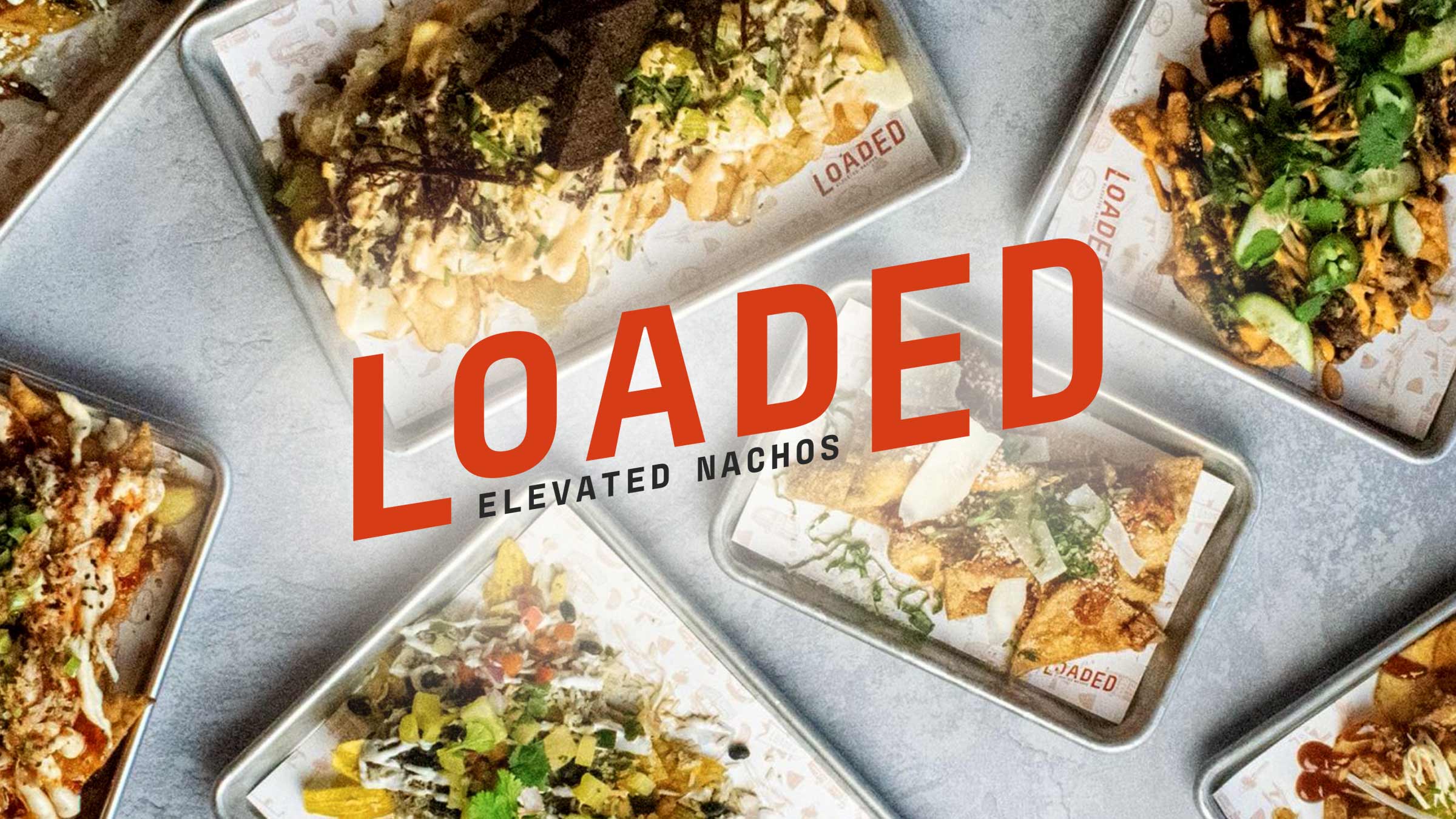
The Adventures of Loaded Nachos & Fast-Casual Branding
I was on a new business call this summer, walking up and down my driveway, listening to what I thought was an inconceivable idea for the summer of 2020: someone wanted to open a new restaurant.
Not just any restaurant, mind you, but a fast-casual nacho restaurant.
Brandon (one of the owners of the popular local frozen cocktail bar Narwhal’s Crafted) explained the concept. The nachos wouldn’t be your ordinary, traditional nachos. They’d be a gourmet spin on nachos that most people have never experienced before.
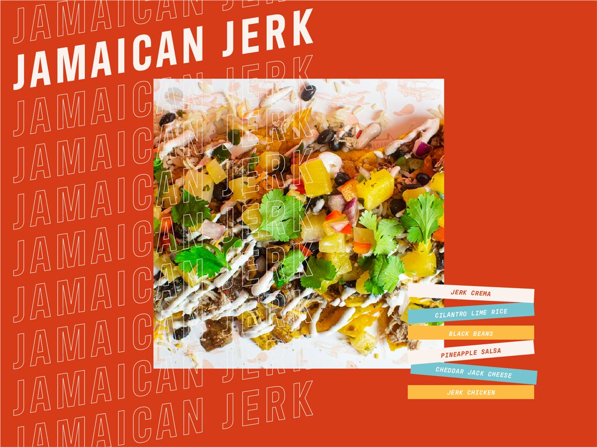
The nachos would go way beyond tortilla chips. The menu would have dishes with plantains chips, fried toasted ravioli pasta chips and even wonton chips.
All the details sounded delicious.
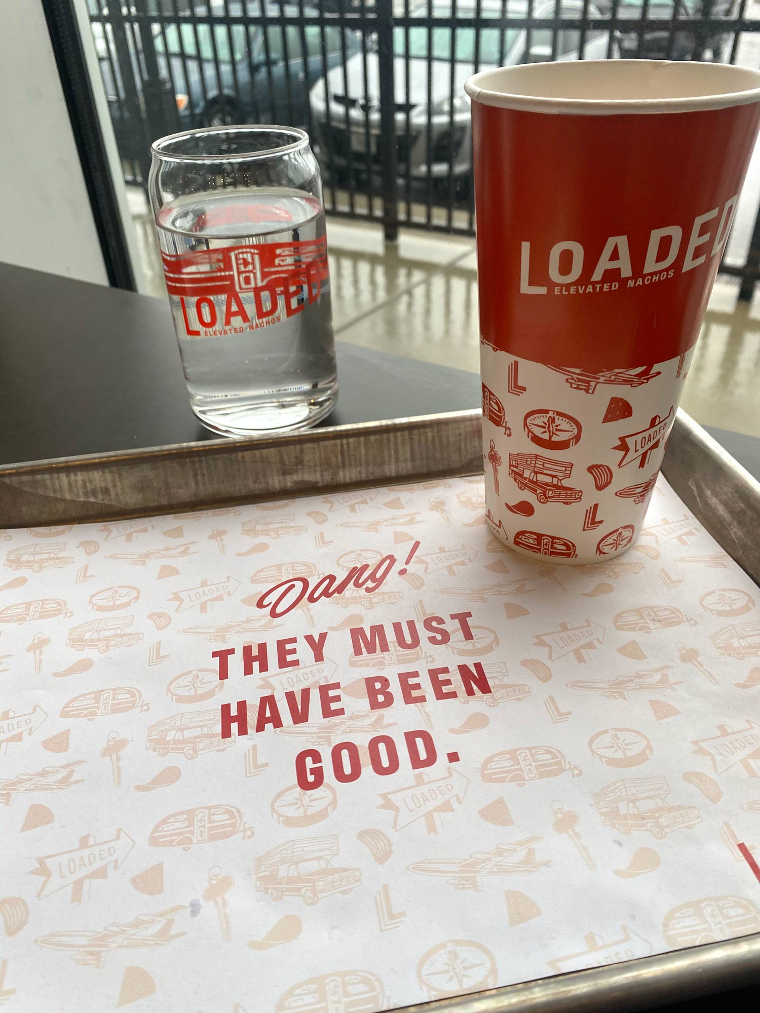
They were working with the name Loaded for the restaurant, and really wanted to build a strong brand for the new concept.
I paced the driveway back and forth, dodging my kids on their bikes, excited to hear about the new concept. It was refreshing to hear optimism about a new venture during the thick of Covid.
I proceeded to tell Brandon about Atomicdust’s Branding Program, our 8-week sprint to research, define language and create the visual identity for brands, and then sent over a few samples of previous restaurant branding we created. And we were off to the races.
Fast-Casual Branding Goes Digital
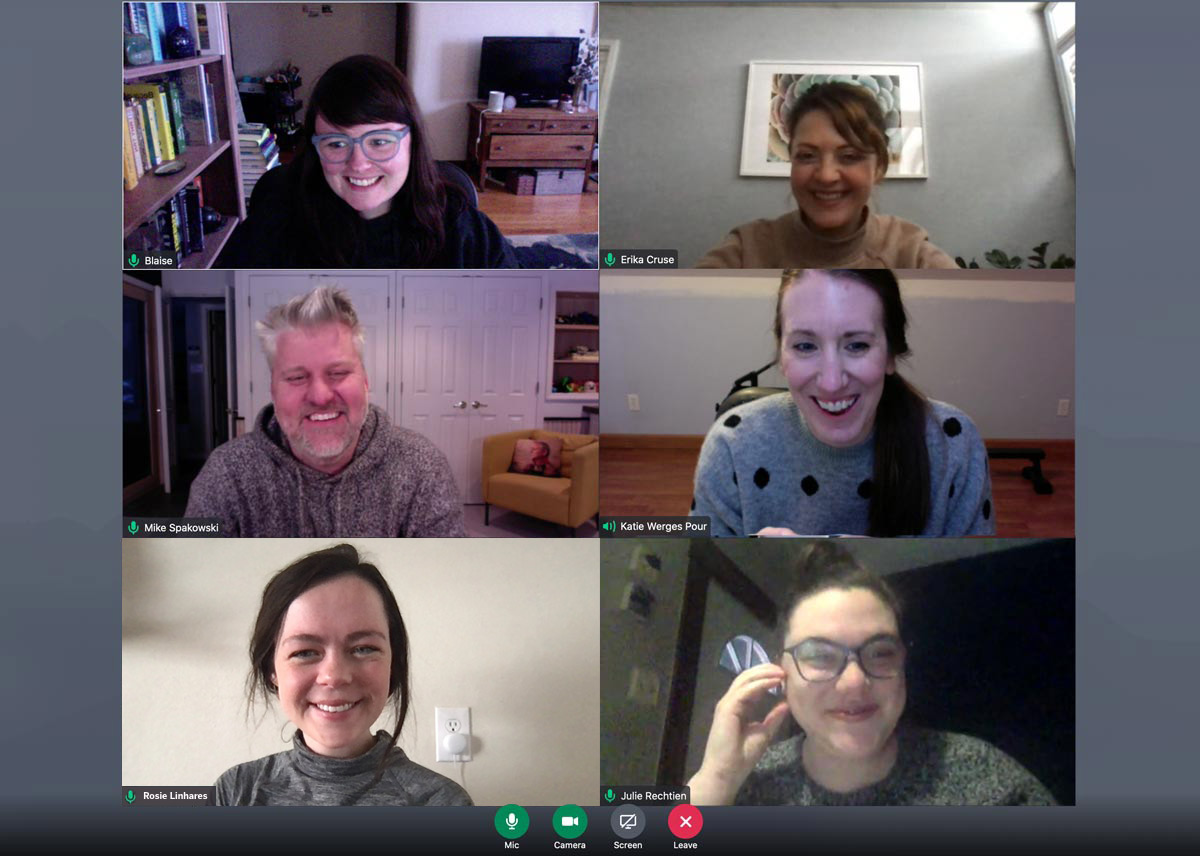
This was our first restaurant branding project we’ve ever done over Zoom. It was totally different but also kinda the same.
Pictured: A reenactment.
The Existing Architecture and Design
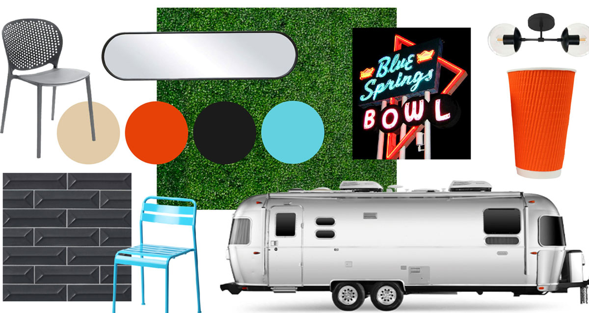
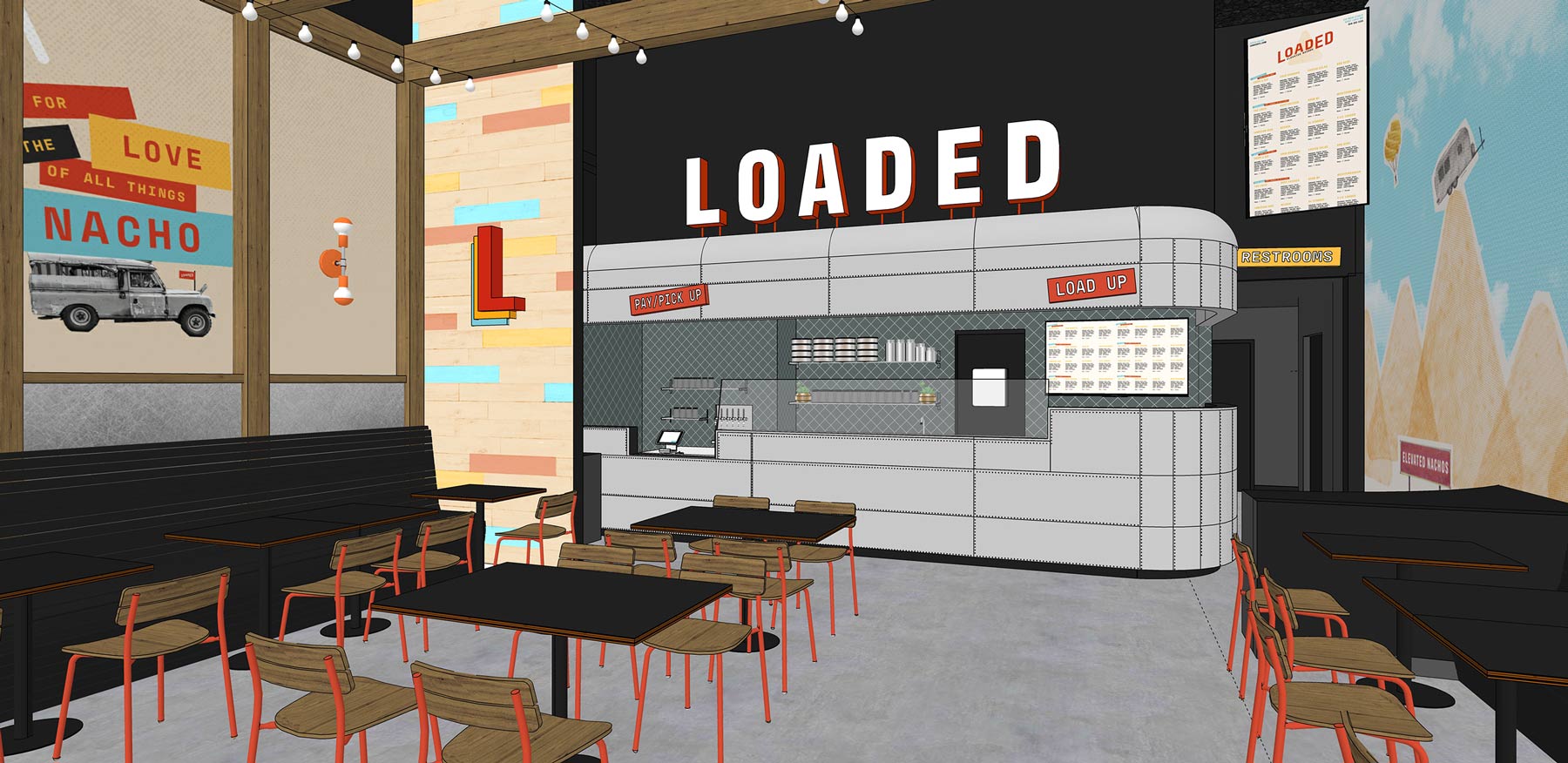
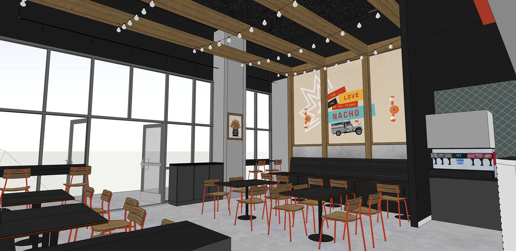
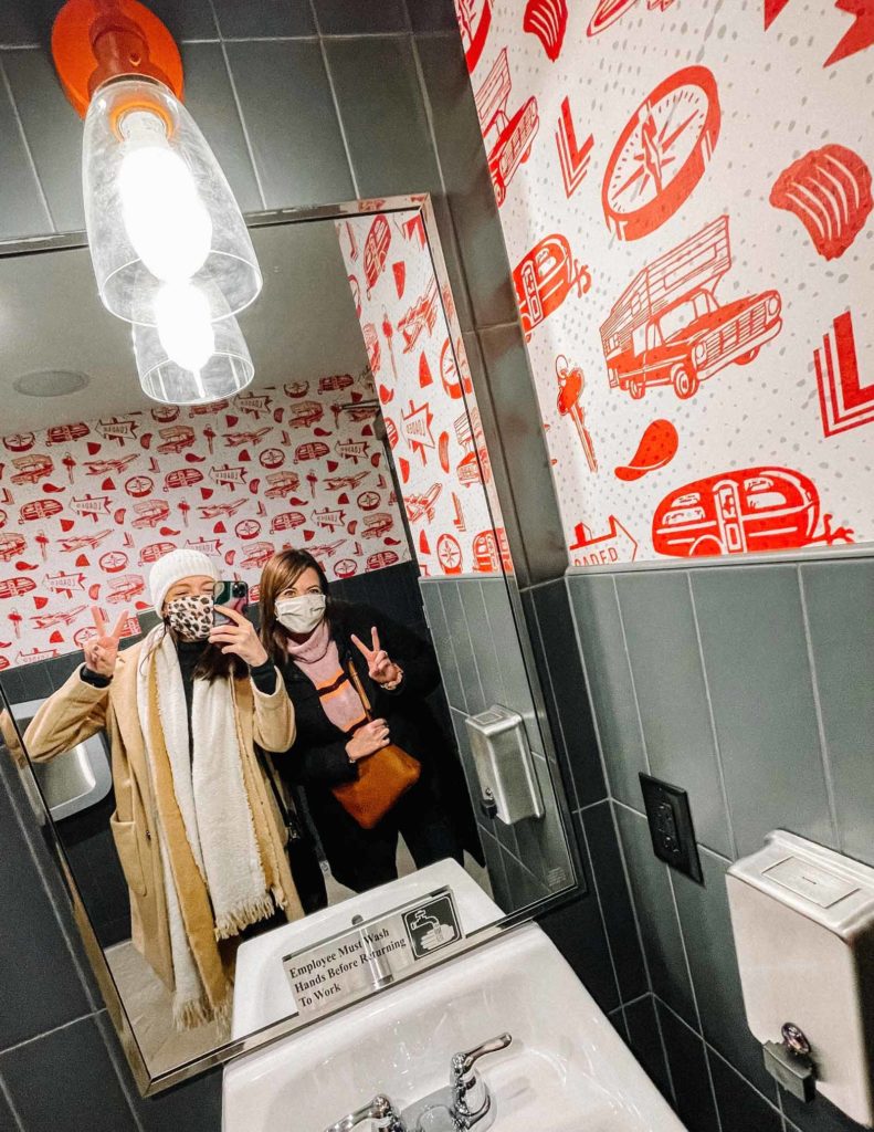
To get us up to speed with the project, our client shared the floor plans and designs for the restaurant’s physical space. The existing plan was to make the space as a sort of outdoor food truck setting, but inside. The kitchen and the counter line was designed to look like a giant, vintage Airstream trailer.
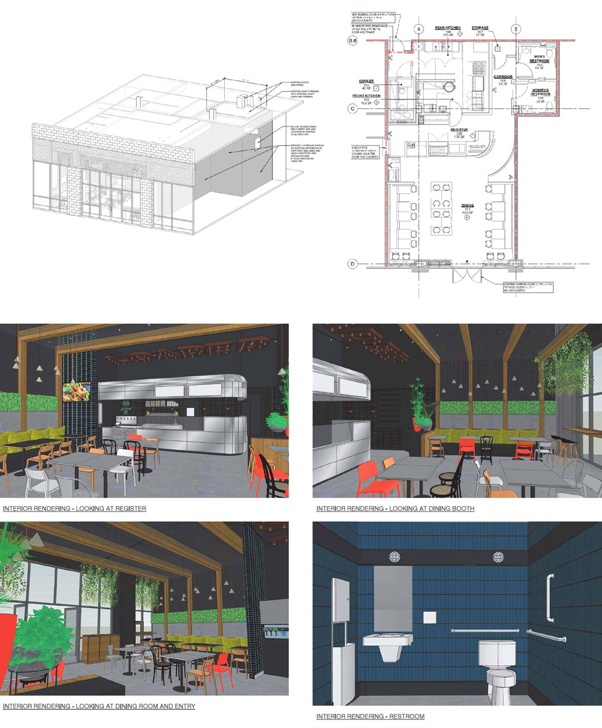
There was talk of a vintage Americana vibe—with burnt orange as the primary color.
They were open to anything, but the client imagined a retro and fun feel—and the direction and vintage Airstream trailer vibe had already been set.
A Pile of Names
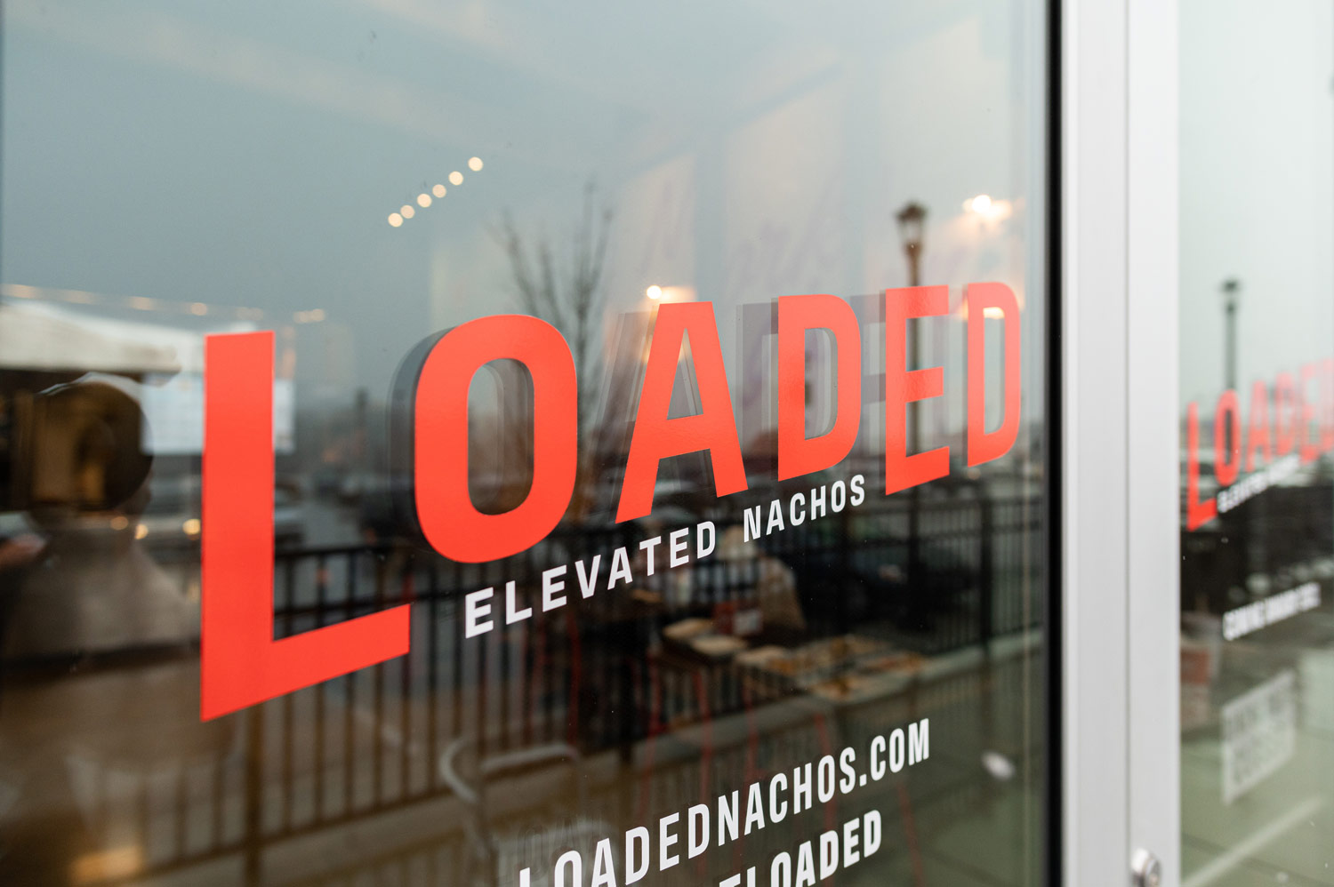
The first part of the brand identity we tackled was the name. The Narwhal’s guys had been using “Loaded” to refer to the concept for about a year, but wanted to explore other options before they sealed the deal.
Naming, like nachos, can be a messy business. The creative team at Atomicdust hopped on Zoom and the nacho puns starting flying.
With branding projects, there are always constraints, and in the process of generating name ideas for Loaded, there were a couple we had to keep in mind.
Sign up for Atomicdust’s newsletter to get insights and projects delivered to your inbox
First off, this was not going to be a Mexican restaurant. Jamaican jerk nachos, banh mi nachos, Philly cheesesteak nachos—the nachos at the new concept would be far from traditional Mexican nachos.
Secondly, we wanted to somehow tie in the concept of an Airstream, or an outdoors-y food truck setting, to the fast-casual branding and its name.
Ultimately, the client stuck with Loaded, but the process of coming up with name ideas around these constraints was a great way to start the project, and really helped shape our idea of what the brand could be.
Plus, some of our naming options ended up being used as brand elements, including Jesse’s genius idea, “The Pile High Club.”
Building Out Loaded’s Core Brand Identity
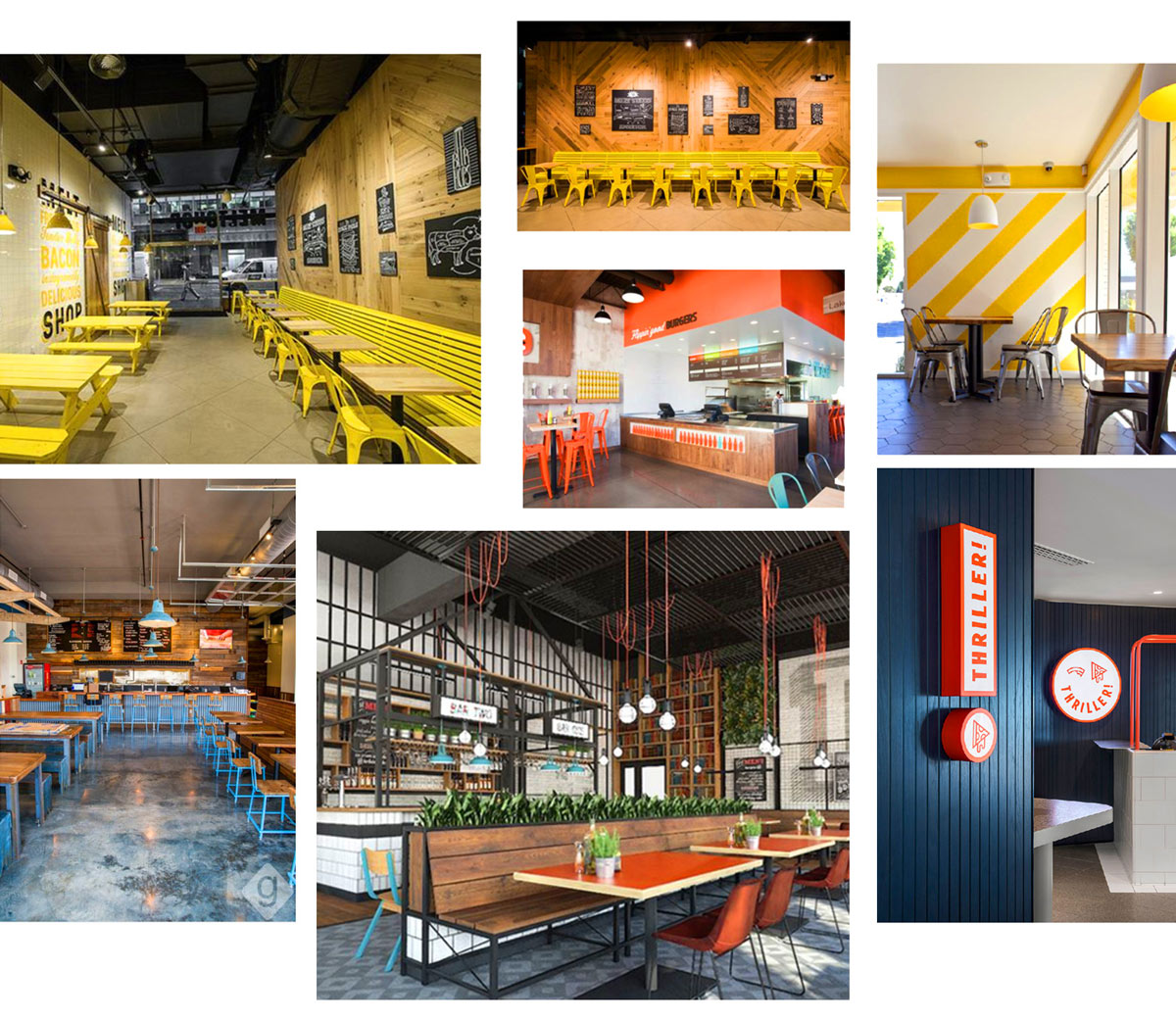
Throughout the process, we of course had lots of conversations with our client. We talked about styles, directions, and shared a lot of Pinterest boards together.
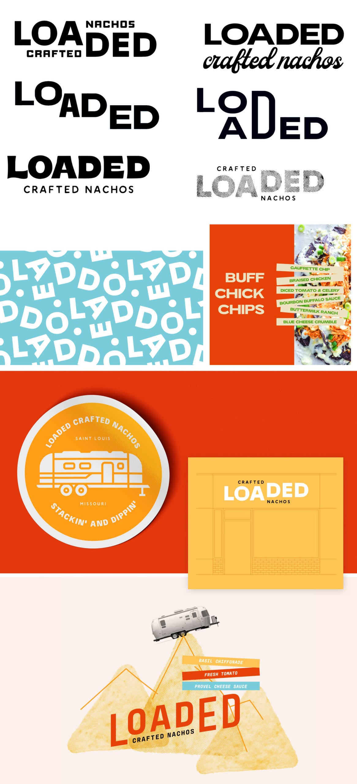
After a few weeks, we presented our brand identity for Loaded.
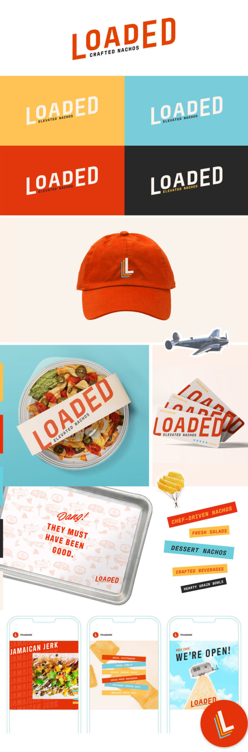
Our team was excited. The client was excited. And we were ready to bring the concept to life.
There was just one question. We had the foundation of the brand, but how would we bring it to life in the physical space—and across different platforms?
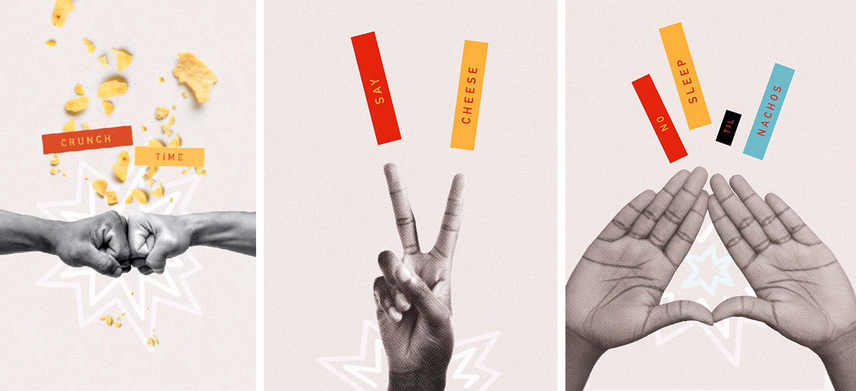
Climbing Chip Mountain
When we talk to students about design, a topic that comes up a lot is the difference between art and design.
Of course, art and design go hand in hand, but there is a difference between designing an identity system, and creating pieces that express the brand in a more abstract way.
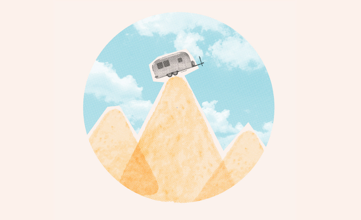
We needed to create expressions of the fast-casual branding that would tie the name, nachos, a retro feel, Airstreams and the outdoors together—all living cohesively in the branded environment.
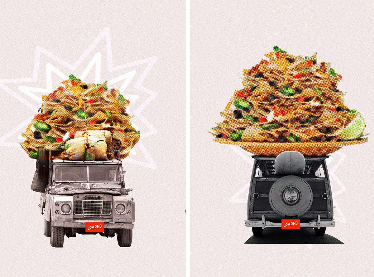
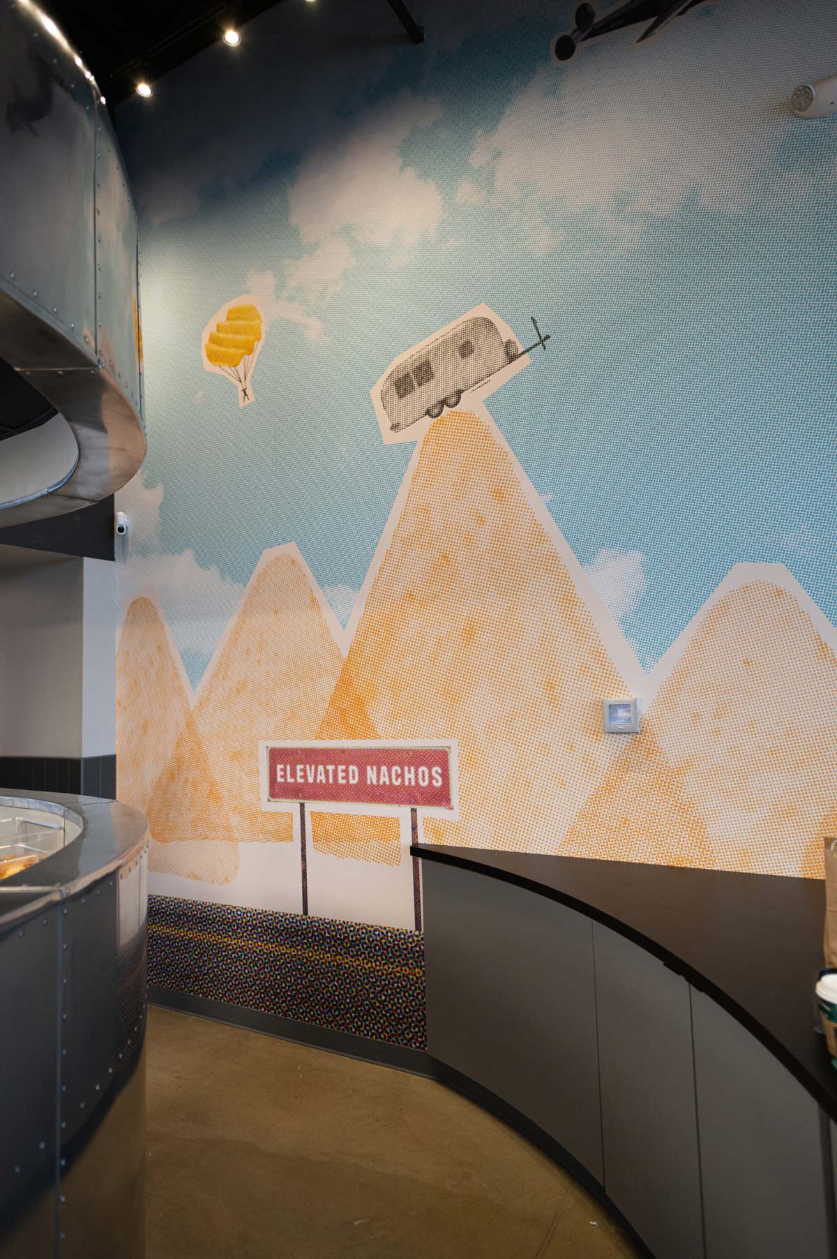
How do you express a concept like Loaded? One of our early expressions was a mountain formed by half-tone tortilla chips. Then, naturally, we teetered an image of a vintage Airstream on its peak, looking as if it was so loaded that it was off-balance and the weight of it would send it sailing down the mountain.
This idea later became know as Chip Mountain. It lives on a mural inside the new restaurant.
Building the Restaurant Interiors
I would not consider Atomicdust an interior design agency or an architecture firm. Maybe one day, but for now—the work we create for inside spaces is a term we call Environmental Branding. And with Loaded, there were tons of decisions about how we could have the most impact on the space.
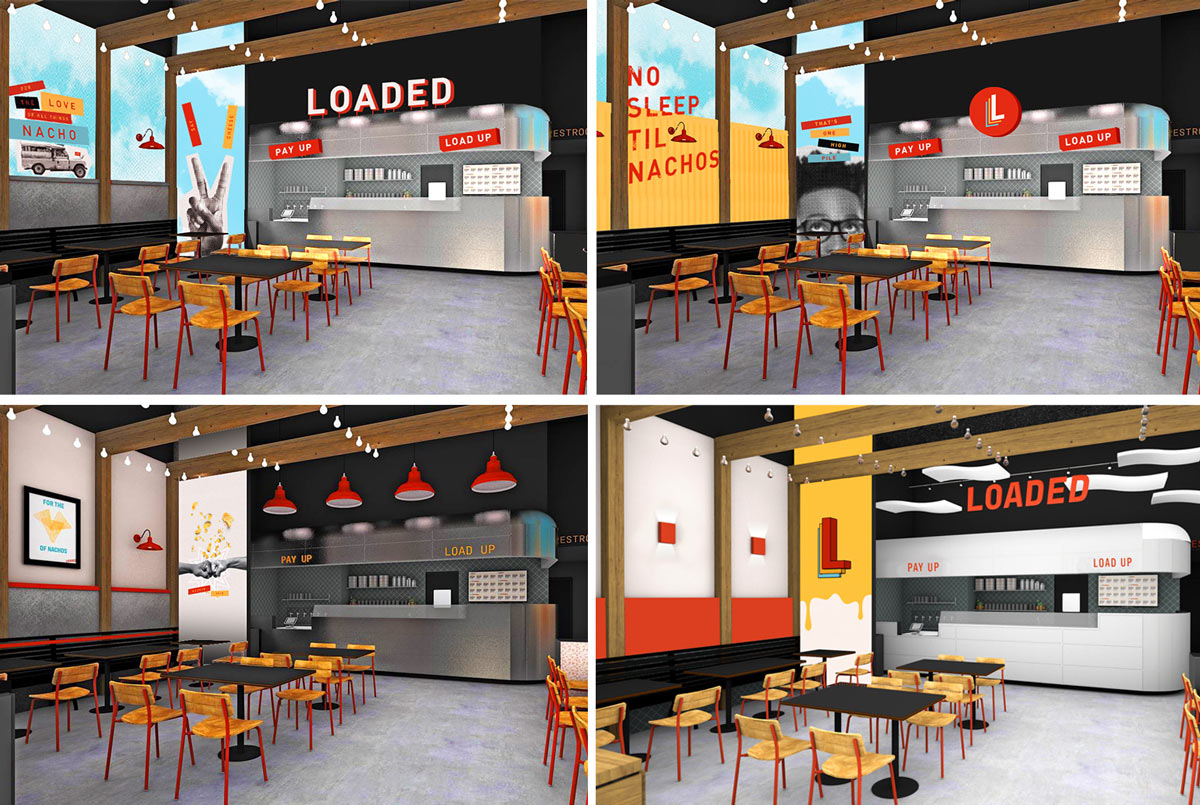
Here are some initial directions.
Playing off the vintage Airstream trailer, we started to explore the idea of weighted down and overloaded adventure vehicles. We loaded the tops of the vehicles with nachos and type with sayings around the brand.
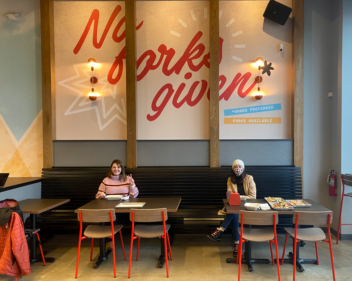
Of course, to create an interesting space, we didn’t want every wall to be of vehicles. Early in our naming brainstorming section, the amazing Blaise Hart-Schmidt had blurted out “No Forks Given,” a play the popular phrase about not caring that was also perfect for hand-held nachos.
And while we didn’t end up using it for the name, we did use the line, set in a hand-written type across the wall.
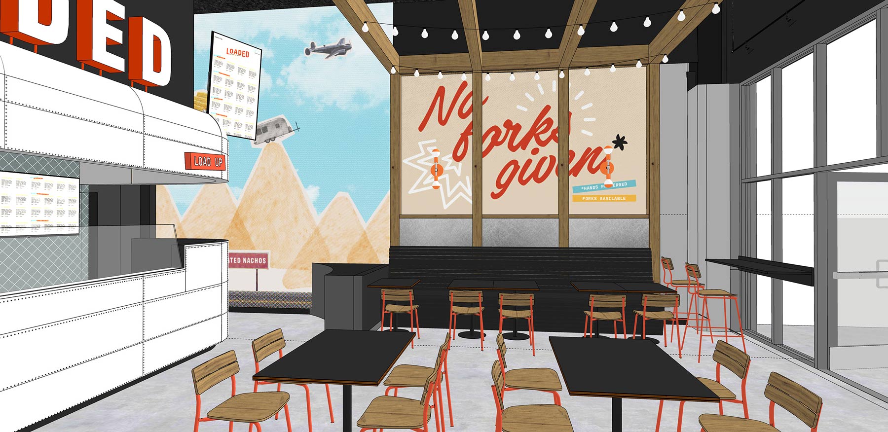
Like the brand, the space was coming together.
Explore our other recent branding projects
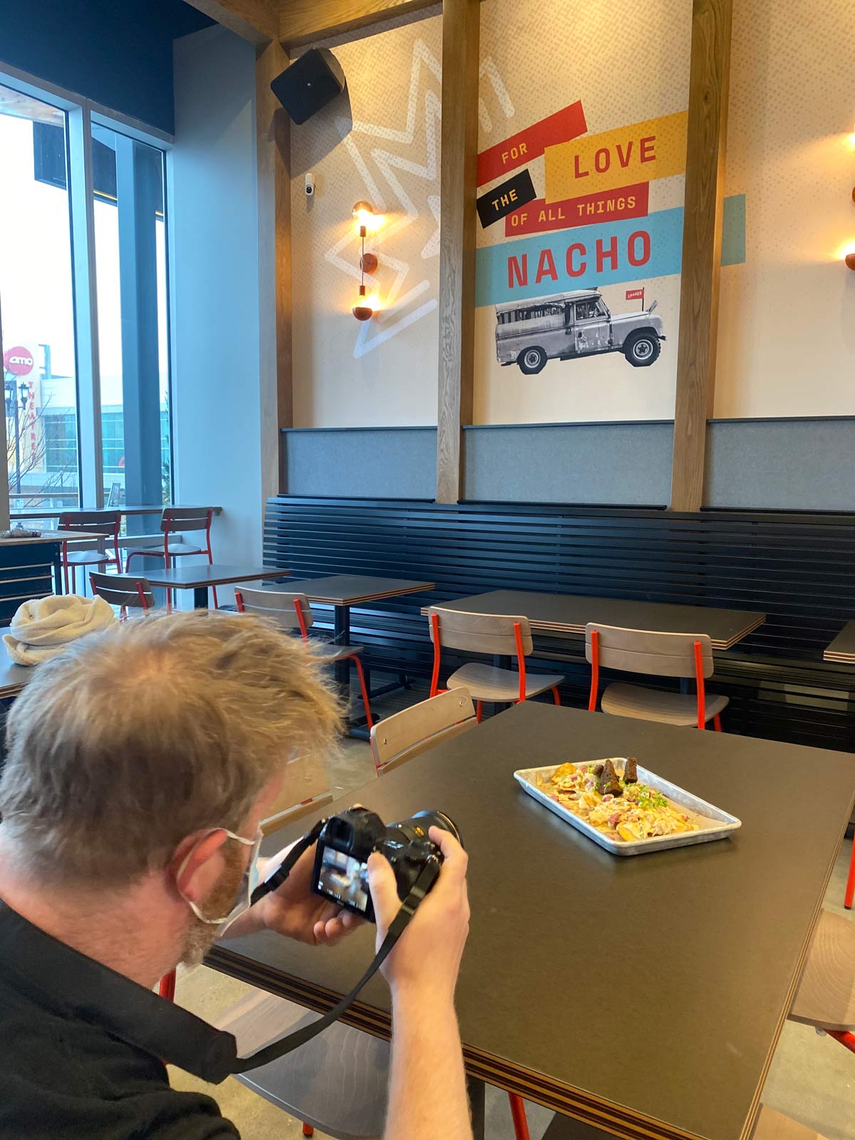
The Sweet Crunch of Success
By the time you read this, Loaded will be open. But we were lucky enough, and our client was kind enough, to give us a sneak peek, complete with trays of nachos to try during a soft opening event.

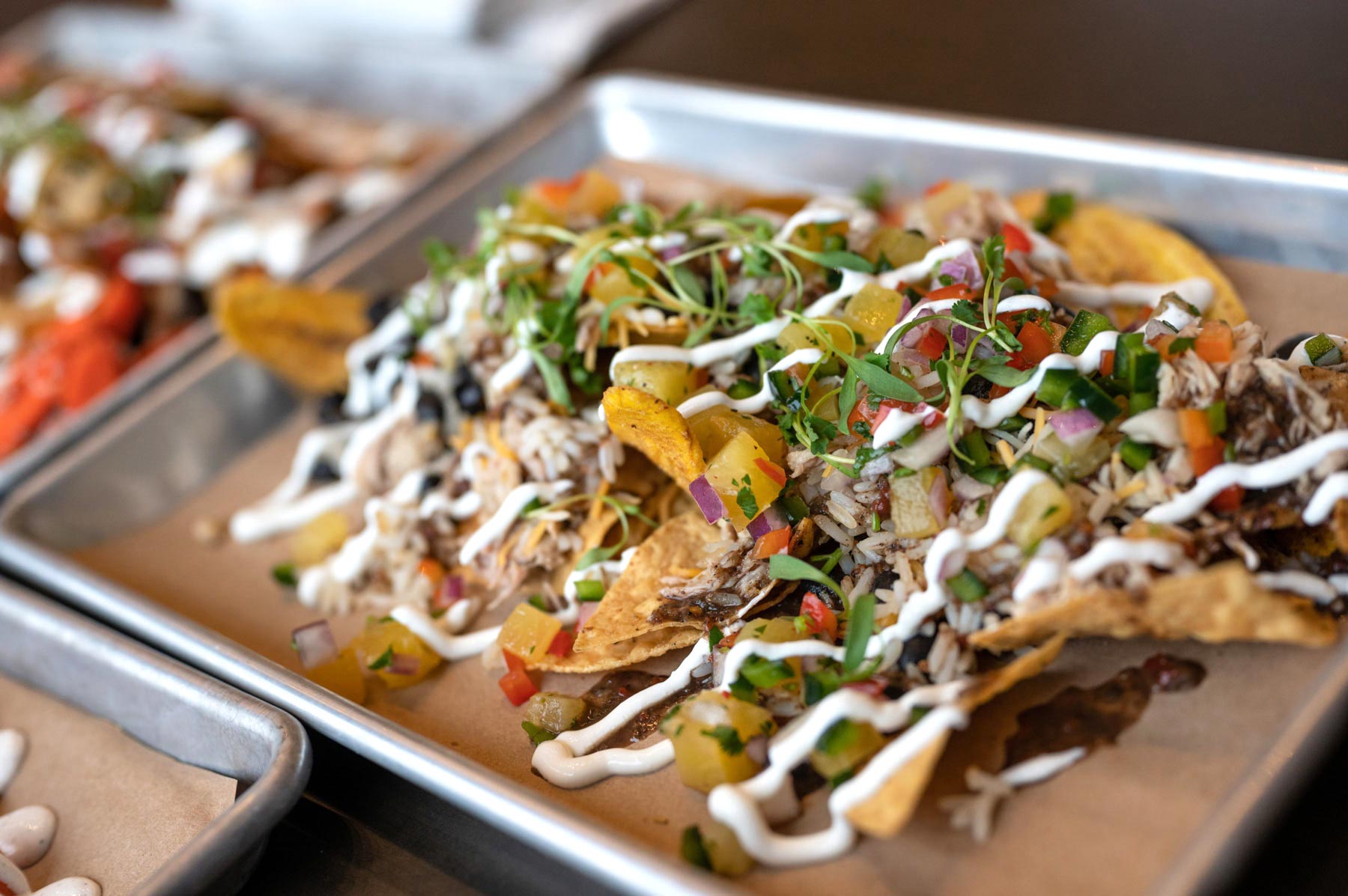
After months of looking at the menu and creating a brand inspired by it—the nachos did not disappoint.
We hope you can have a (Covid-safe) adventure of your own and try something you’ve never experienced before at Loaded.
We also want to thank our amazing clients for a really great adventure. We’re happy to tell the tale. Thanks!