Crafting a Brand Identity for Wheelhouse
The team behind Wheelhouse, a wildly successful restaurant and bar in downtown St. Louis, turned to Atomicdust to help them refine their brand identity and design new menus.
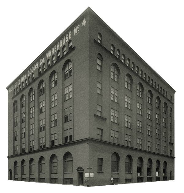
After success with the original Clayton location, the team set their sights on downtown. In 2014, Wheelhouse opened in the historic Cupples 8 Building at 1000 Spruce. (And two years later, Start Bar would open next door.) Over time, Wheelhouse’s popularity grew, and with it – through multiple events, menus and logo iterations – the visual brand become muddled. ![]()
We all wondered: what was the Wheelhouse brand, besides the logo?
Wheelhouse already had an established logo – the stacked “WH” could be seen on social media, outdoor signage, menus and more. Our challenge was never to reinvent the wheel — get it? — but instead, help Wheelhouse establish a visual identity beyond the logo. By day, Wheelhouse is a 10,000 sq. ft. restaurant, serving made-from-scratch brunch, lunch and dinner to downtown professionals, diners, and on game days, Cardinals and Blues fans. By night, Wheelhouse turns the lights down and turns the music up – attracting young crowds with DJs, VIP bottle service and the occasional champagne cannon.
So, how do we create one brand that caters to two distinct audiences?
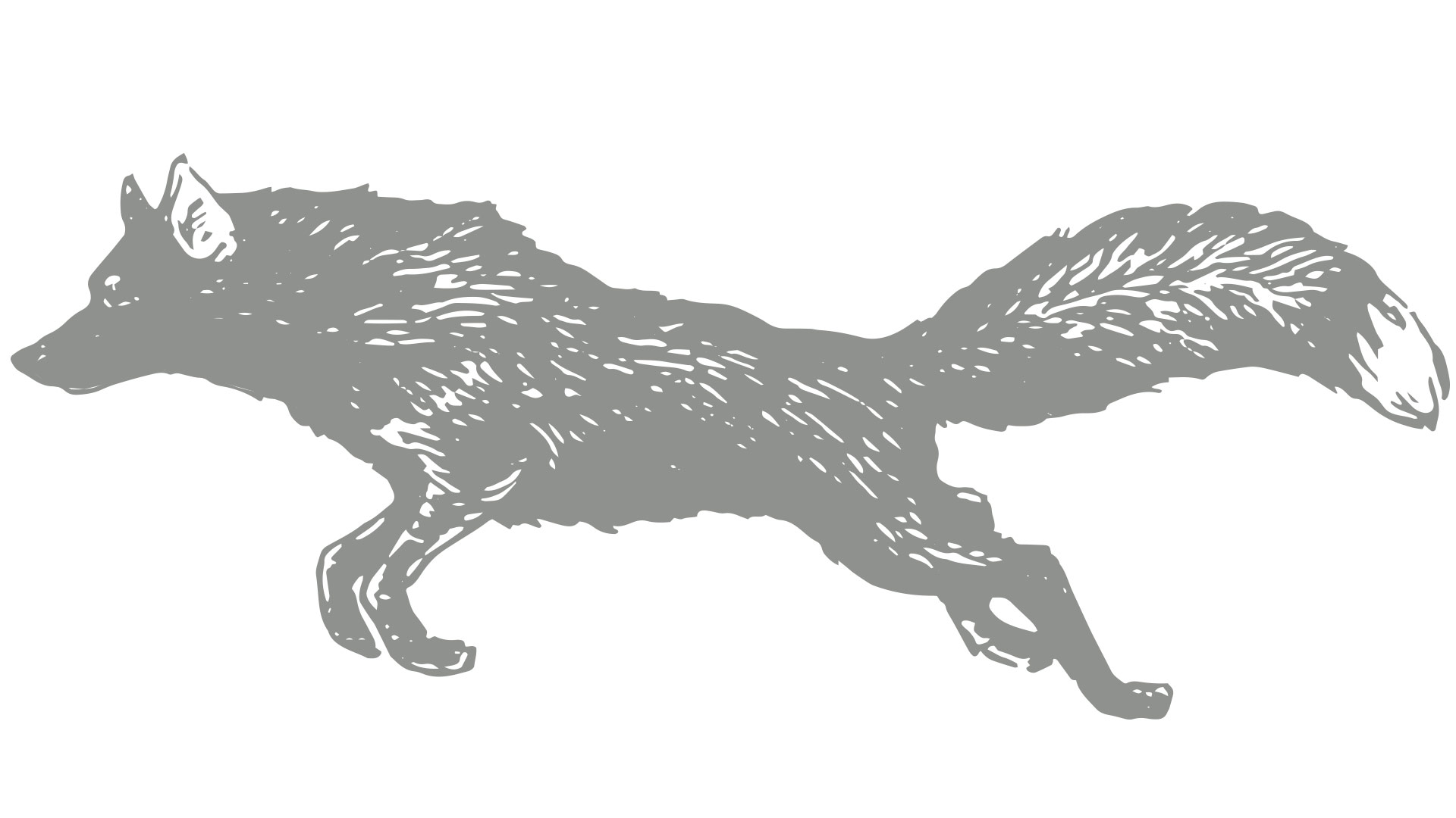
We realized that Wheelhouse has two personalities – day and night – sharing one roof. Intrigued by this dichotomy, we started to explore other dual personalities. Light and dark. Good and evil. Predator and prey. Figuring out that story was a real aha moment. We knew that the menus, the main visible touchpoint for the brand, would mostly be used during the day, so we looked for ways they could hint at the after hours. ![]() Hidden throughout the menus are illustrations of wild animals. The wolves and deer are a subtle nod to the pursuit, the chase, the wild party that goes on after the sun goes down.
Hidden throughout the menus are illustrations of wild animals. The wolves and deer are a subtle nod to the pursuit, the chase, the wild party that goes on after the sun goes down. 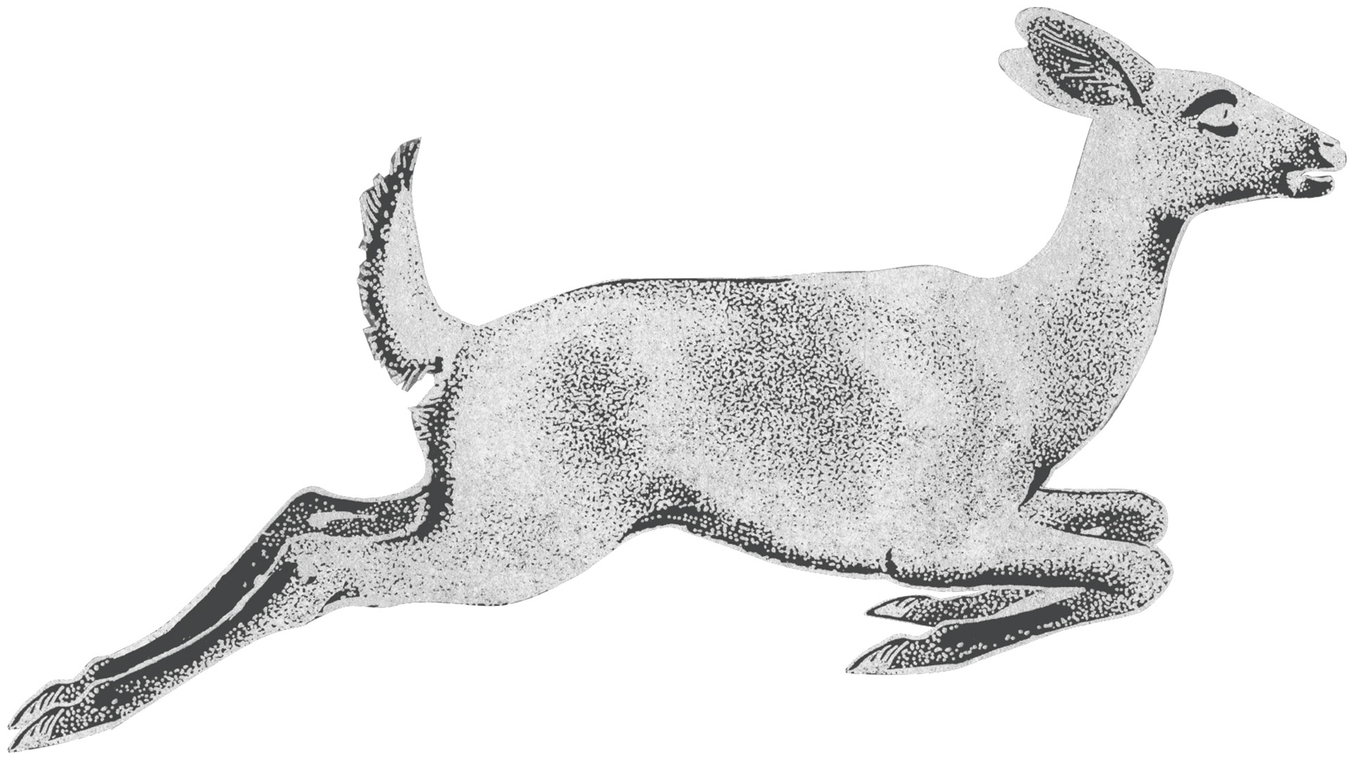
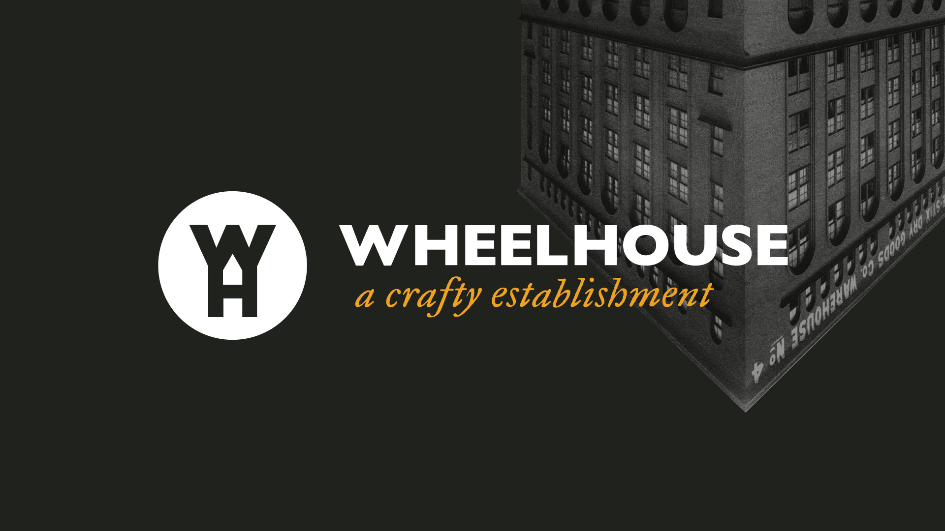
 And we took Wheelhouse’s home, the historic Cupples 8 Building, flipped it and reversed the color. An unexpected twist on a classic.
Initial athletic routes were quickly abandoned – deemed too “sports bar” for Wheelhouse. Instead, we drew inspiration from their modern, minimal interior. We used clean lines, white space and a sophisticated color palette. Unexpected handrawn elements add a little “mess” and hint at the party side of the personality. 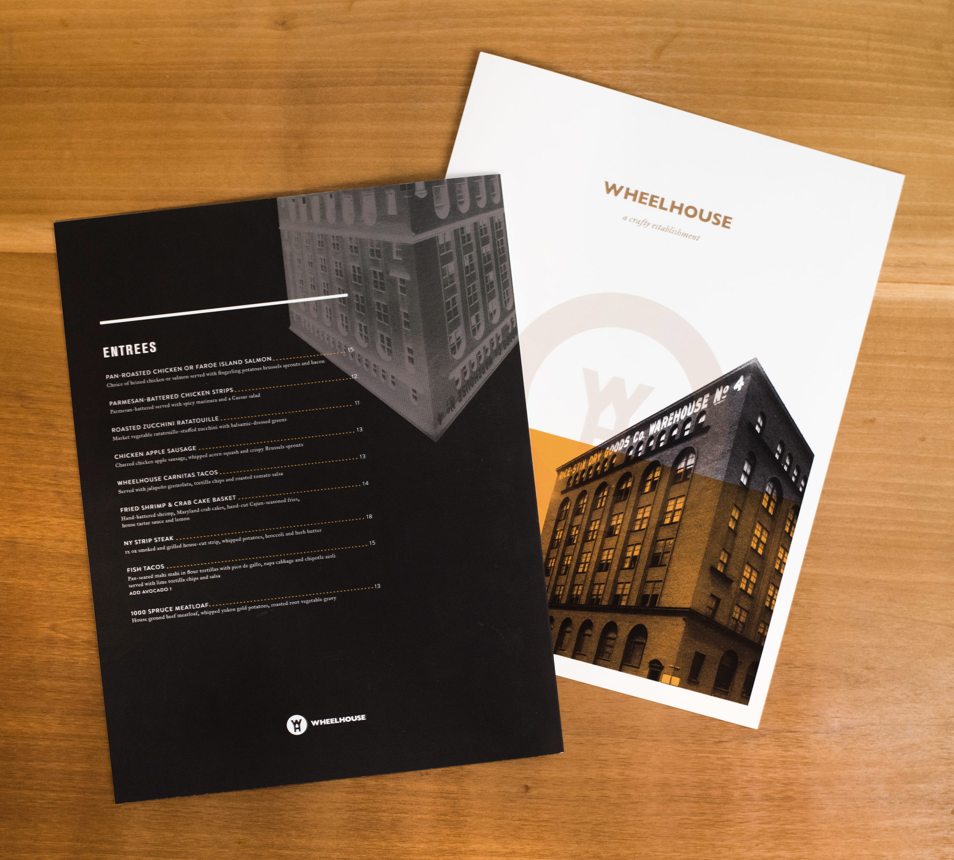
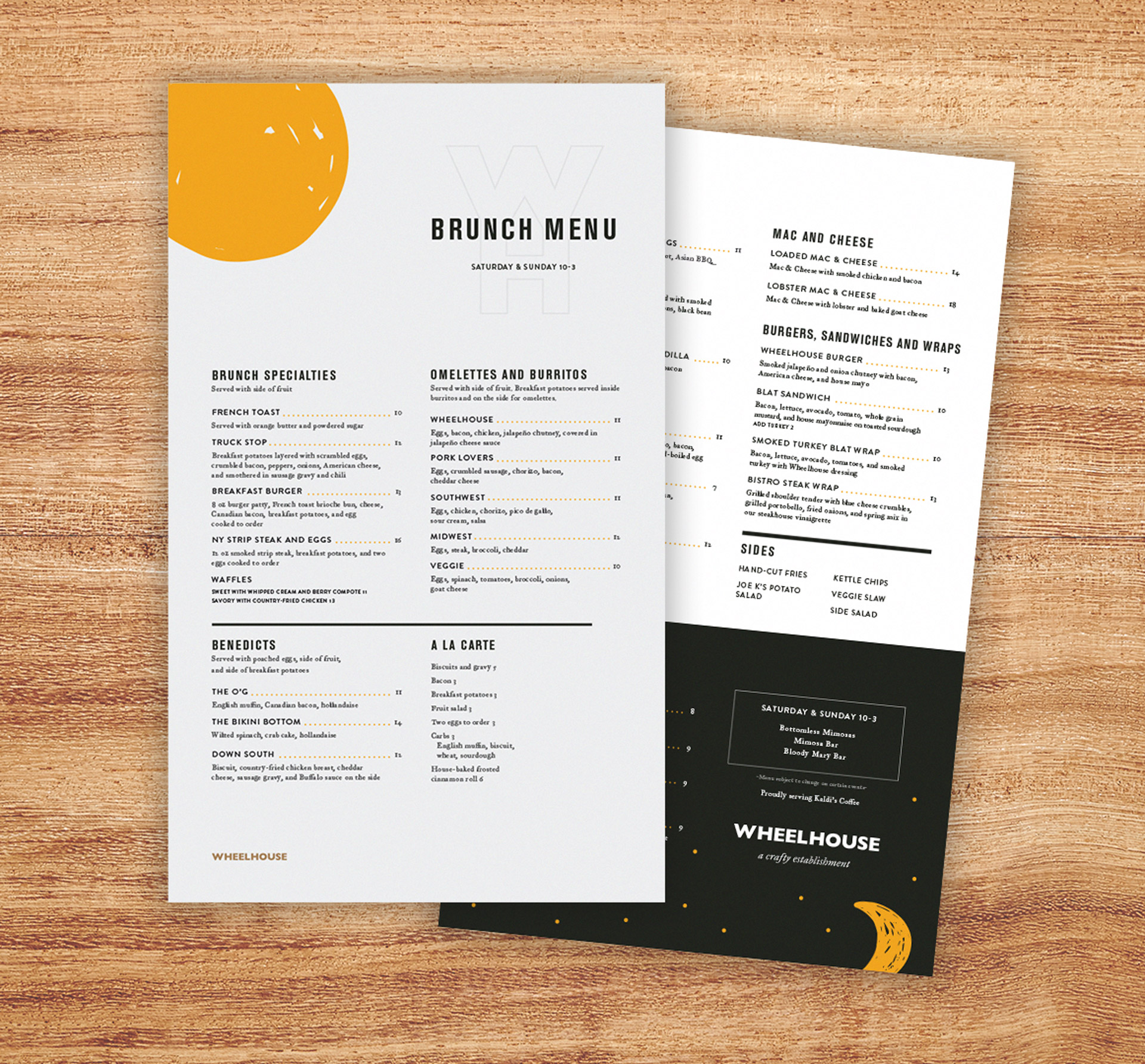 Over the last year, we’ve translated the visual identity into various menus, catering and party package brochures. We’re excited to see Wheelhouse continue to grow in St. Louis, and if you haven’t tried their mac n’ cheese yet… what are you waiting for?
Want to keep up with the latest work from Atomicdust?
Subscribe to our newsletter for all the latest news, events and weekly marketing tips from our team.