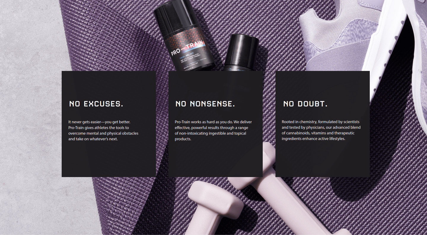
Empowering athletes
Athletes are no strangers to hard work and dedication, relying on high-quality products that fuel real results.


The winning formula
We crafted a brand narrative that speaks directly to an active individual, highlighting the results Pro-Train brings to the game—pain relief, restful sleep and laser-sharp focus.
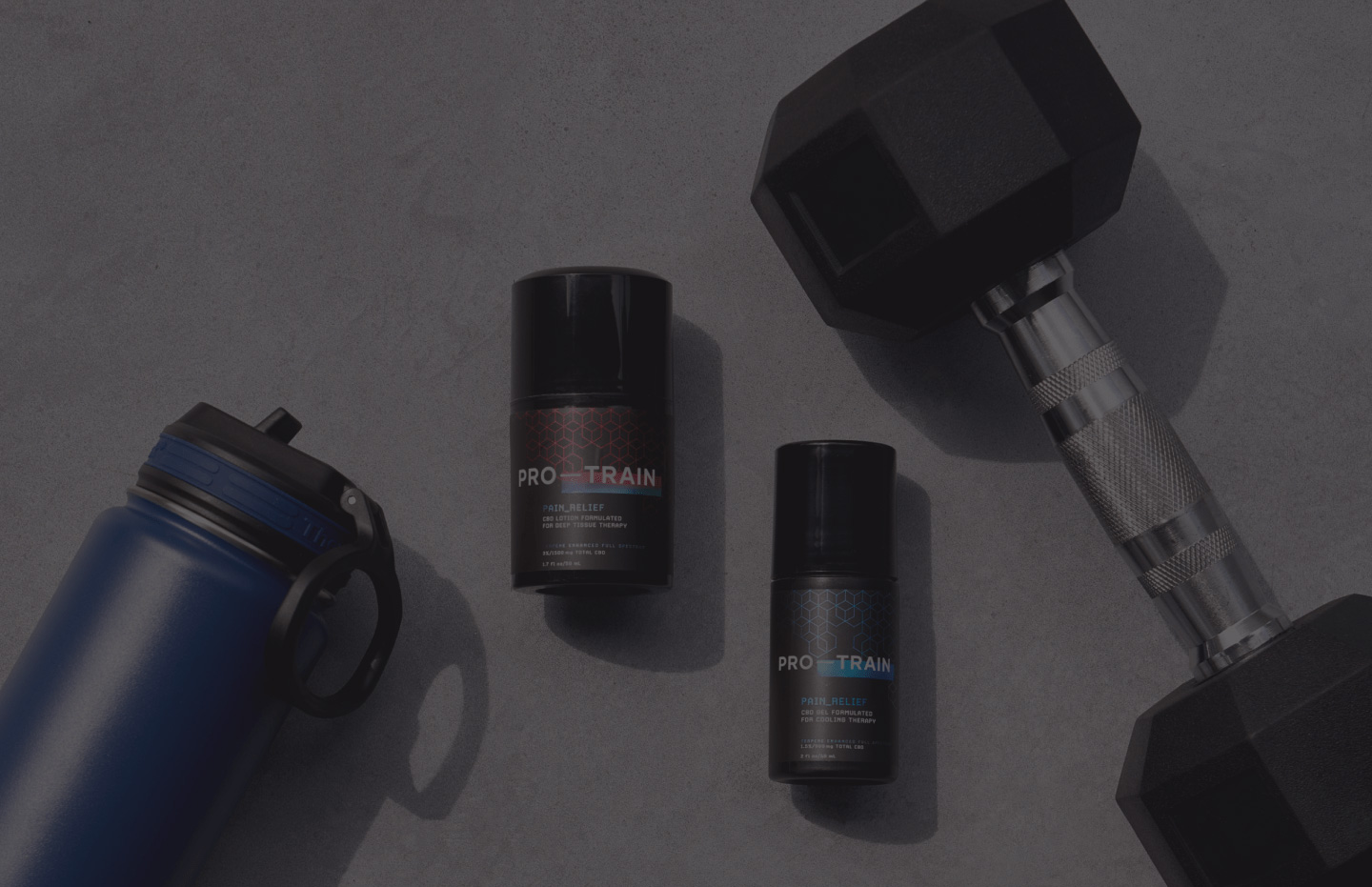
Packaging with a punch
Going beyond the typical (and expected) green packaging of the CBD market, bold typography and vibrant hues make the products demand attention.
Ready, set, launch
With a strong brand identity and sleek packaging design, Pro-Train is poised for success.
Full Story—this content appears in the side drawer on the frontend. Click the floating “Reader View” button to preview.
Empowering athletes.
Pro-Train develops scientifically formulated CBD products for athletes and achievers. The company asked Atomicdust to create branding, packaging design and a marketing strategy for its product line, which provides pain relief, deep sleep and enhanced focus to help customers maximize performance on and off the field.
Empowering athletes.
Athletes are no strangers to hard work and dedication, relying on high-quality products that fuel real results. This is precisely what Pro-Train products are designed to do, but the company faced a booming category crowded with countless other emerging brands.
The Pro-Train branding and packaging design had to showcase the products’ unique benefits and educate customers about the power of CBD while navigating various legal and marketing complexities. It wasn’t just about having eye-catching visuals—the designs needed to demonstrate how Pro-Train’s offerings are different from other options and the best choice for athletes.
The winning formula.
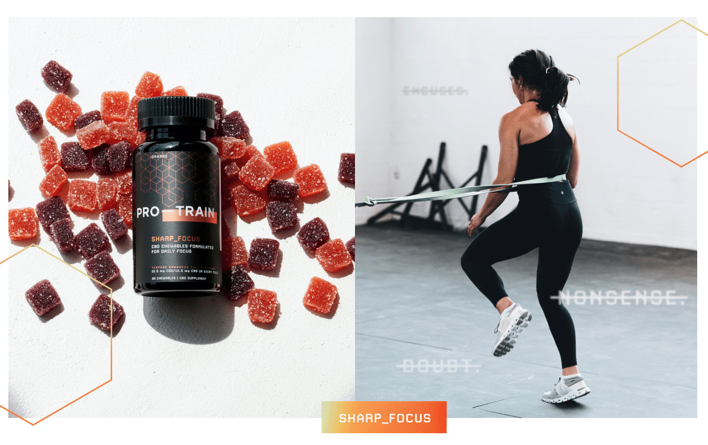
We crafted a brand narrative that speaks directly to an active individual, highlighting the results Pro-Train brings to the game—pain relief, restful sleep and laser-sharp focus. The visual identity communicates this message as well. Clear typography, meaningful illustrations and powerful images flex across each product category, capturing the essence of athletic excellence.
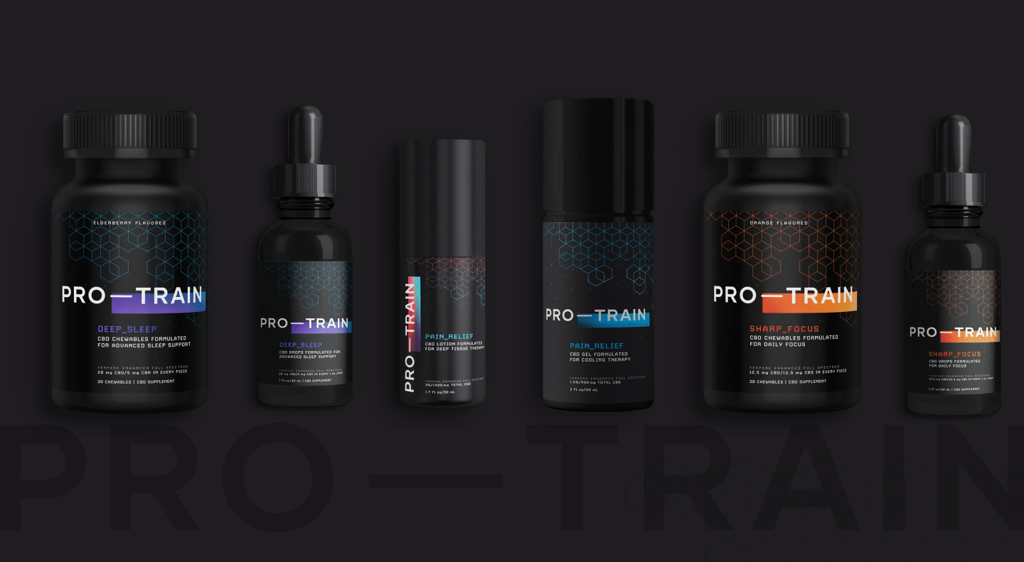
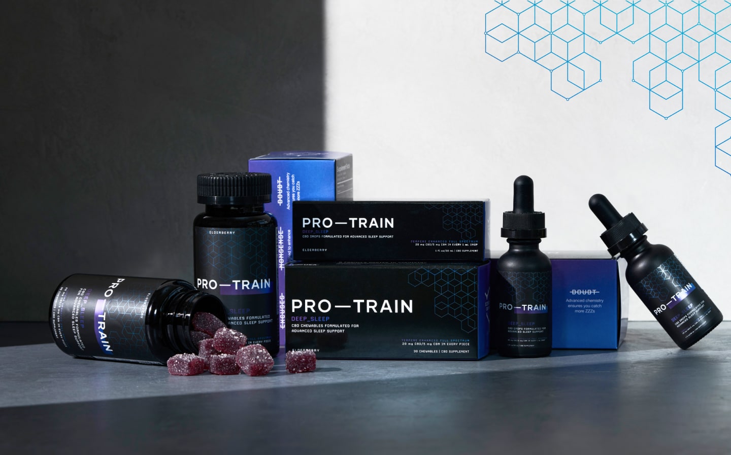
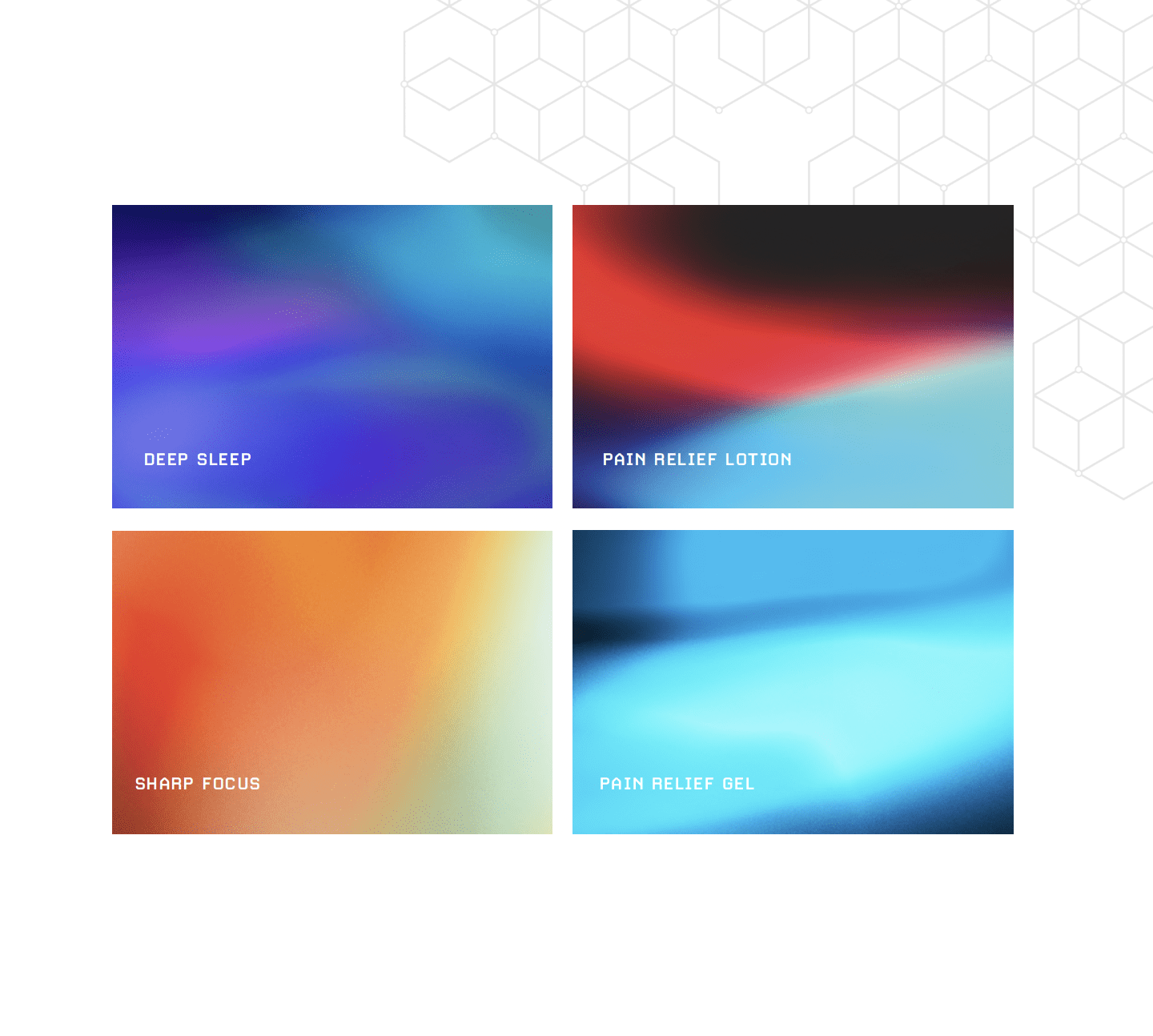
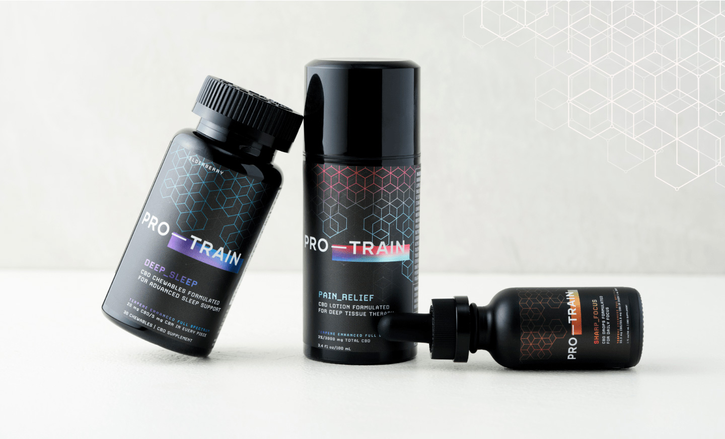
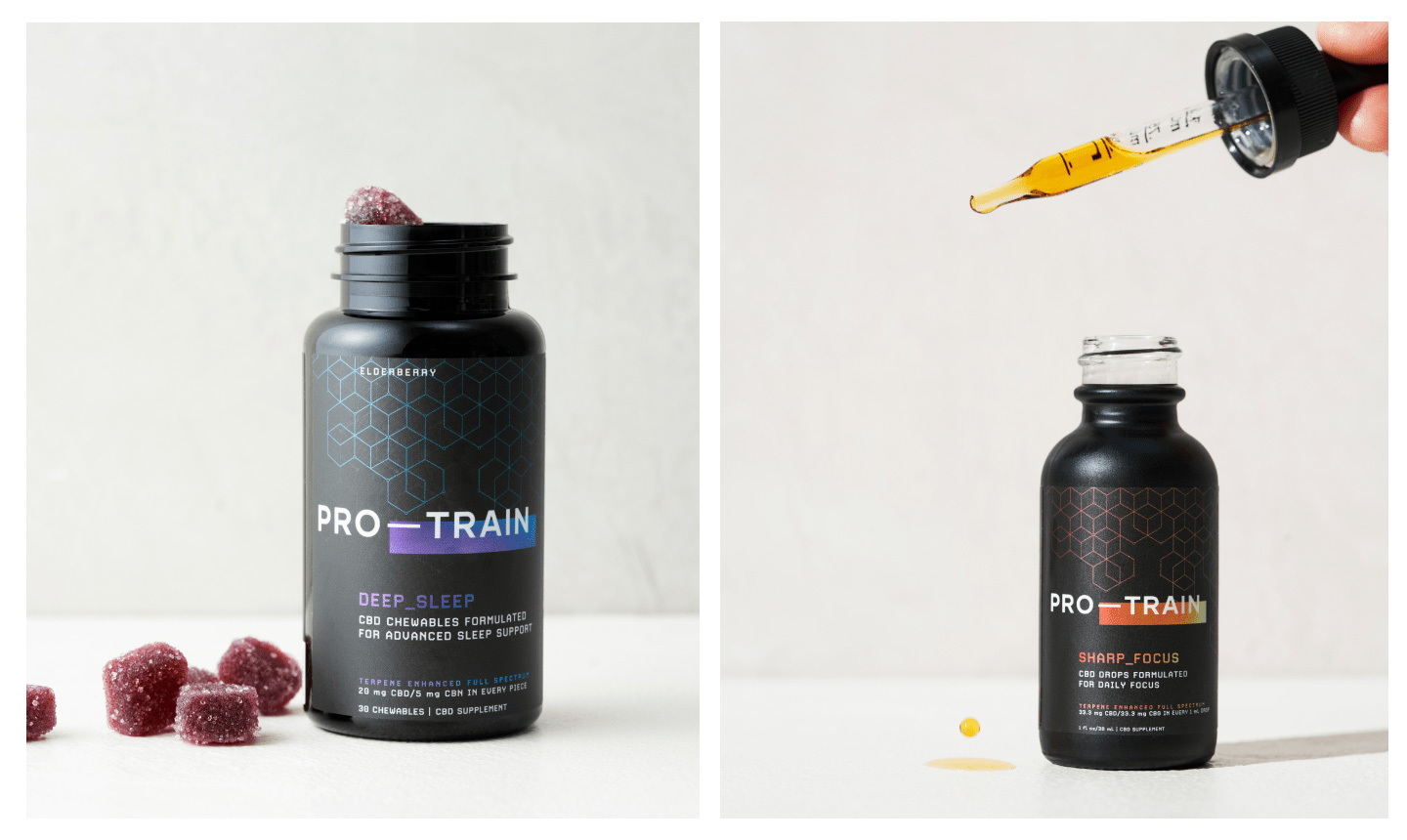
The logo reflects the brand’s athletic nature, with a strong em dash symbolizing progress and determination. Each product features its own signature gradient, while molecule patterns reinforce the scientific foundation.
Packaging with a punch.
Going beyond the typical (and expected) green packaging of the CBD market, bold typography and vibrant hues make the products demand attention. The labels cleverly illustrate the products’ effects, while the packaging’s deep black adds to its upscale appeal. Newcomers and experienced CBD consumers alike will find the packaging user friendly, with clear directions, ingredient lists and dosage information.
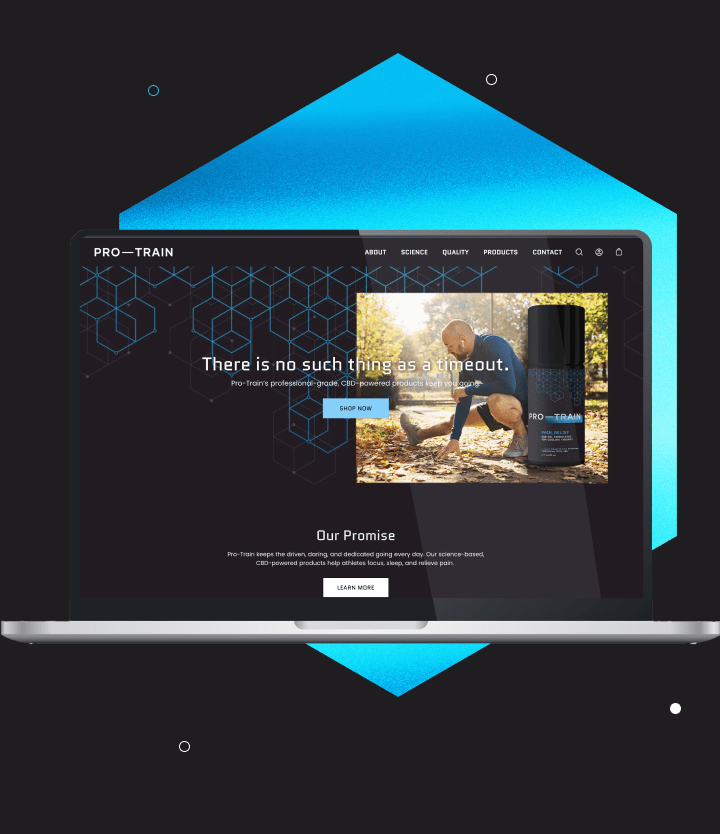
Ready, set, launch.
With a strong brand identity and sleek packaging design, Pro-Train is poised for success. But the journey has just begun. The next step? First, we partnered with Jennifer Silverberg for product photography. And now we’re helping introduce Pro-Train to the world with an e-commerce website showcasing the full product line.
Ready to empower your customers?
Let’s start a conversation.