A True Standout
Nina’s Natural drink mixers are some of the best in the market, earning gold medals from the prestigious Tastings Awards.
Naturally Good
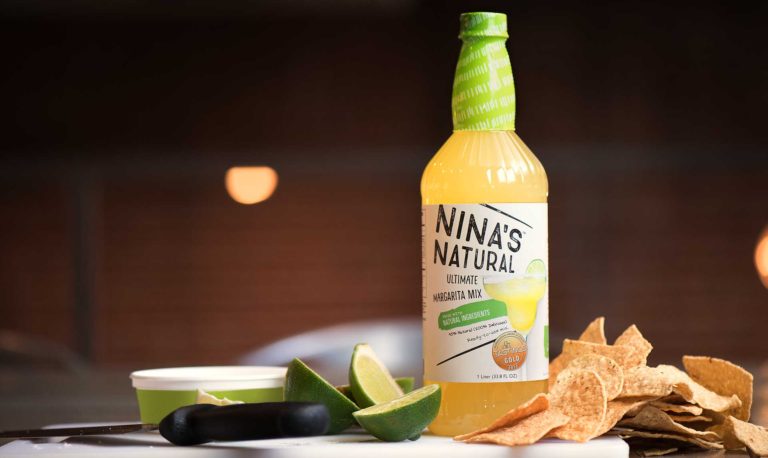
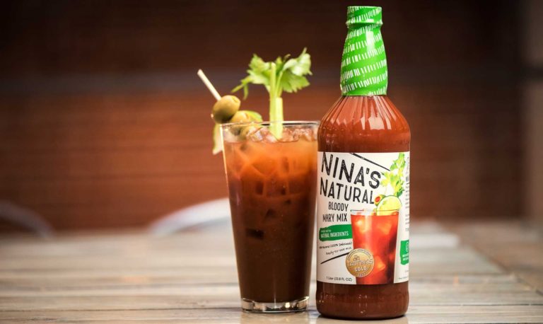
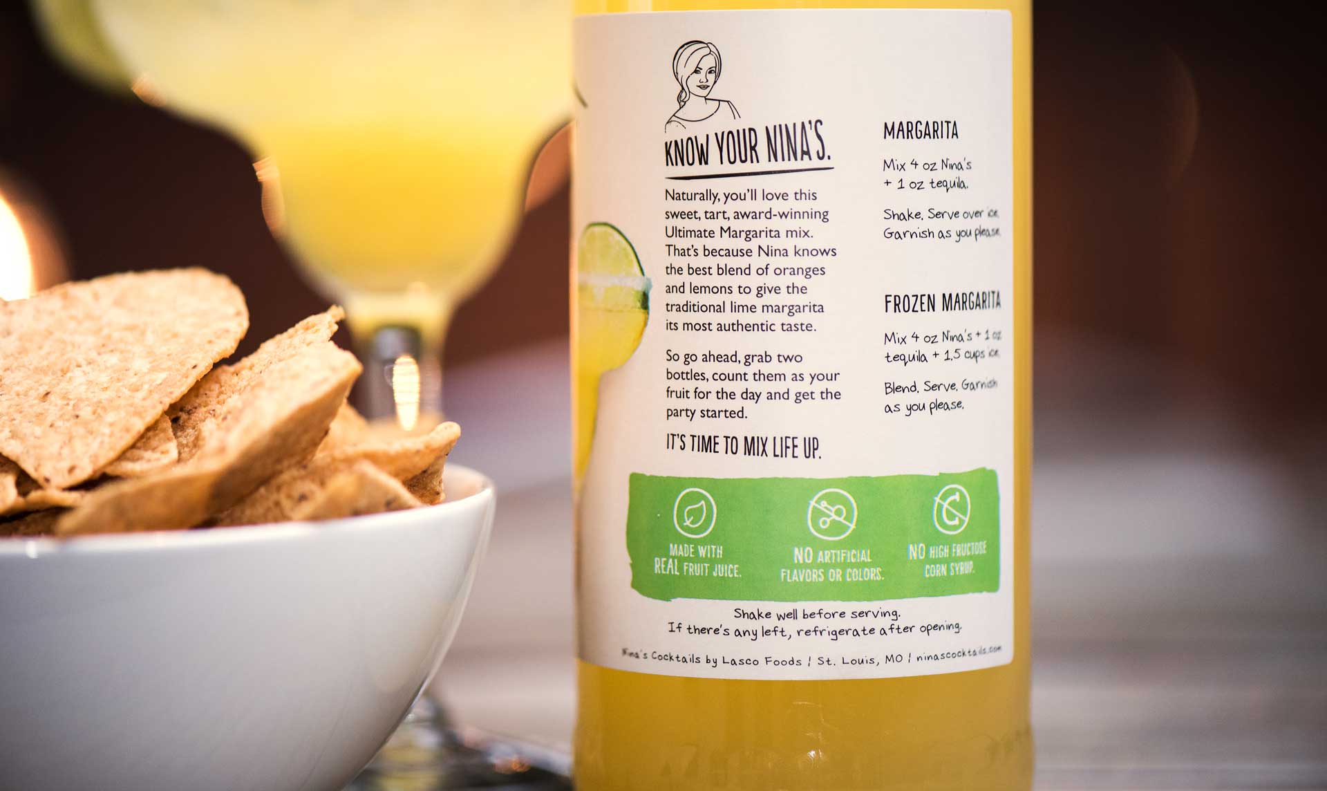
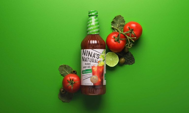
Nina’s new packaging design uses a bright, off-white label to play into the natural aspects of the brand.
Life of the Party
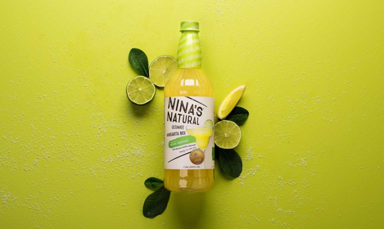
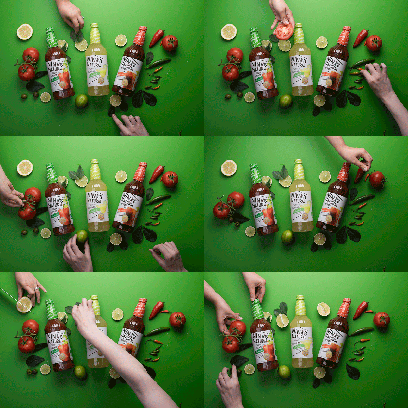
We offset the natural direction by setting all the elements at an angle, so that the labels burst with energy, motion and playfulness.
Full Story—this content appears in the side drawer on the frontend. Click the floating “Reader View” button to preview.
A True Standout
After years of success selling into restaurants and resorts, Lasco Foods was ready to bring Nina’s Natural drink mixers straight to the consumer. They turned to Atomicdust to design new packaging that would stand out on shelves nationwide.
A True Standout
Nina’s Natural drink mixers are some of the best in the market, earning gold medals from the prestigious Tastings Awards. But what further distinguishes them from the competition is that the mixers are made with natural ingredients and contain no artificial colors, flavors or high-fructose corn syrup. The challenge, of course, is standing out on an already crowded shelf.
Naturally Good
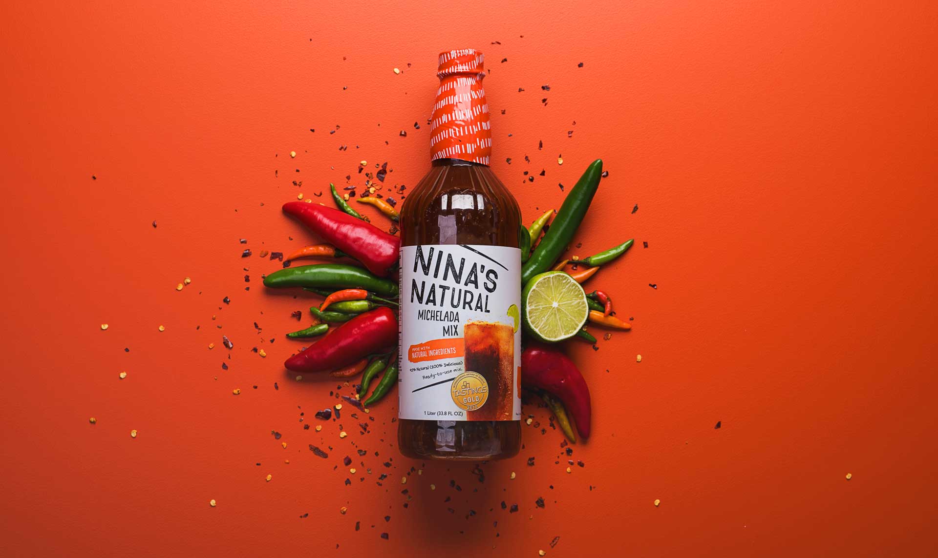
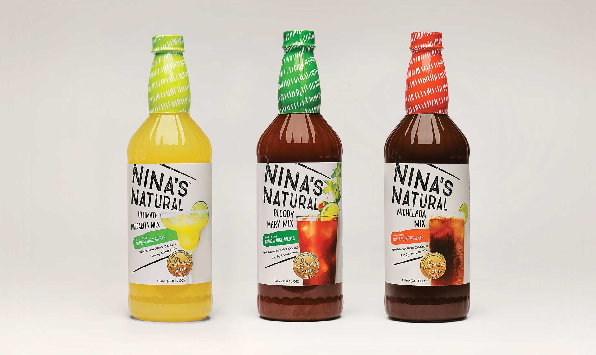
Nina’s new packaging design uses a bright, off-white label to play into the natural aspects of the brand. It’s simple, but strategic, as it makes for a welcome break of white space on the shelves. To continue the organic feel, we used a mix of hand-lettered type, a hand-drawn pattern and a hand-stamped typeface for the logo.
Life of the Party
We offset the natural direction by setting all the elements at an angle, so that the labels burst with energy, motion and playfulness. Bright pops of color bring excitement to the label from every angle, and each bottle is topped off with a color-coded neck band (one of our favorite elements). A photo of the final drink finishes off each label – a reminder of the delicious cocktails possible inside every bottle.
Time to Mix Life Up
Nina’s Natural drink mixes are starting to show up on retail store shelves nationwide, and the packaging design has been featured on the design blogs Packaging of the World and Package Inspiration.
Got a product ready for the consumer shelf?
Let's start a conversation.