Mixing Things Up with Nina’s New Branding and Packaging Design
After years of success in the business-to-business world selling cocktail mixers to restaurants and resorts across the US and Mexico, Lasco Foods wanted to make a bigger splash in the consumer market. They came to Atomicdust for help rebranding their Nina’s line of mixers and updating their packaging design.
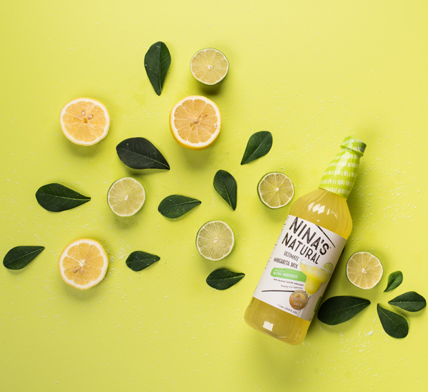
Branding is stronger when your product has a unique point of view, and in preparation for leaping on (and off) store shelves, the Nina’s team had already put in the hard work of creating new, more natural recipes for their top-selling margarita, michelada and Bloody Mary mixes. The line of drink mixers are made with natural ingredients and contain no artificial colors, flavors or high-fructose corn syrup.
Plus, Nina’s was already winning gold medals from the highly respected Tastings Awards. The new recipes were some of the best on the market, hands down.
With a sure hit inside the bottles, it was our job to add value with design. Any great product can perform better when consumers can see the quality before even making a purchase – so we knew we had to make Nina’s stand out on the shelves.
The challenge was in sharing the natural message, but also retaining the fun side of the category. After all, these are alcohol mixers soon to be the life of parties nationwide. The combination of these themes led us to the name Nina’s Natural and a tagline “It’s time to mix life up.”
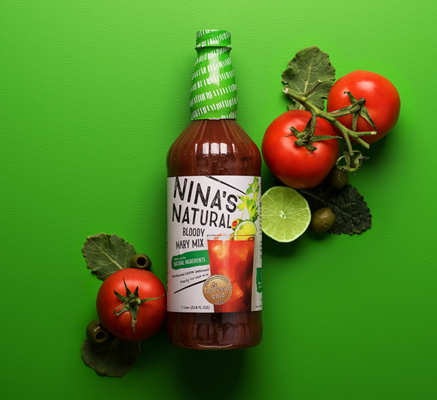
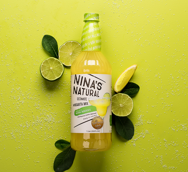
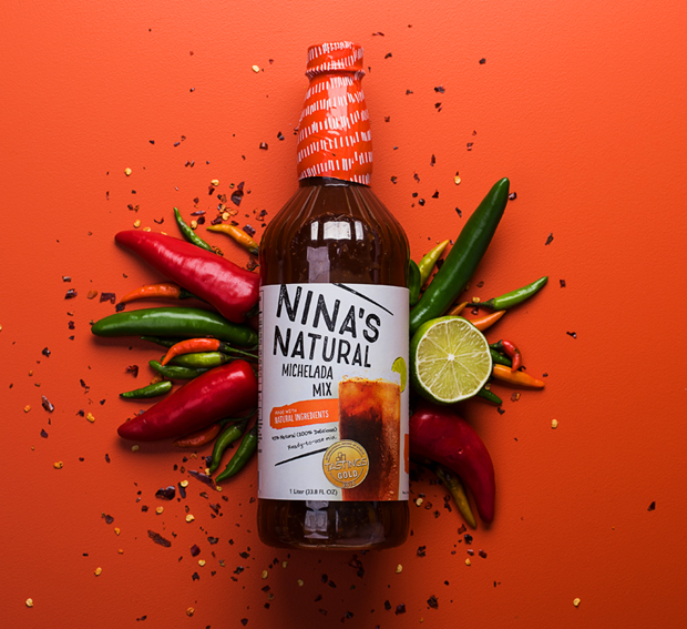
Armed with research on the market, Nina’s competitors and audience demographics, we got to work writing and designing. Normally, we only present one final direction to our clients – putting the maximum amount of time and energy into the option we see as the best fit. But internally, our process always starts by making a mountain of concepts. We explore as many directions as we can, riffing on each one to make something new. Some concepts never see the light of day – unless you read our blog.
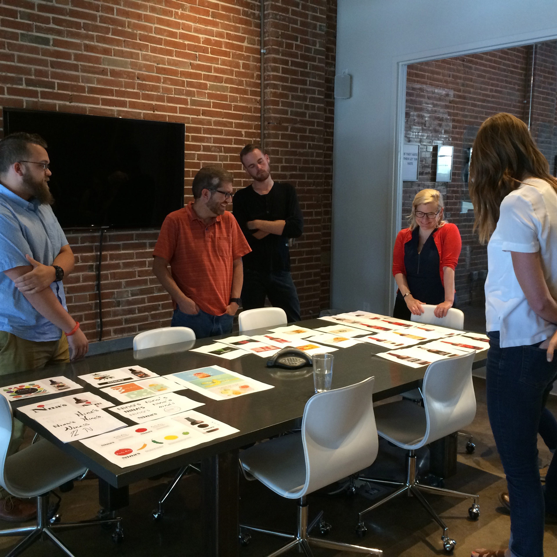
A familiar picture at Atomicdust. The agency creative review.
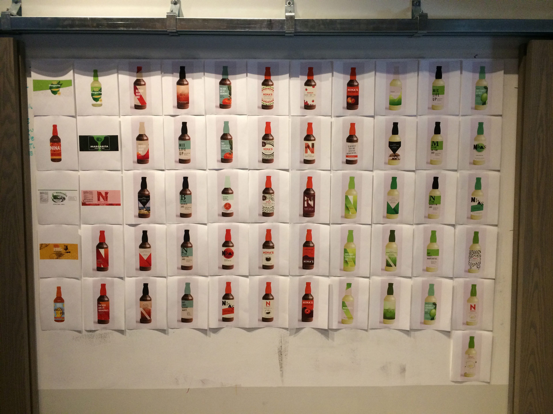
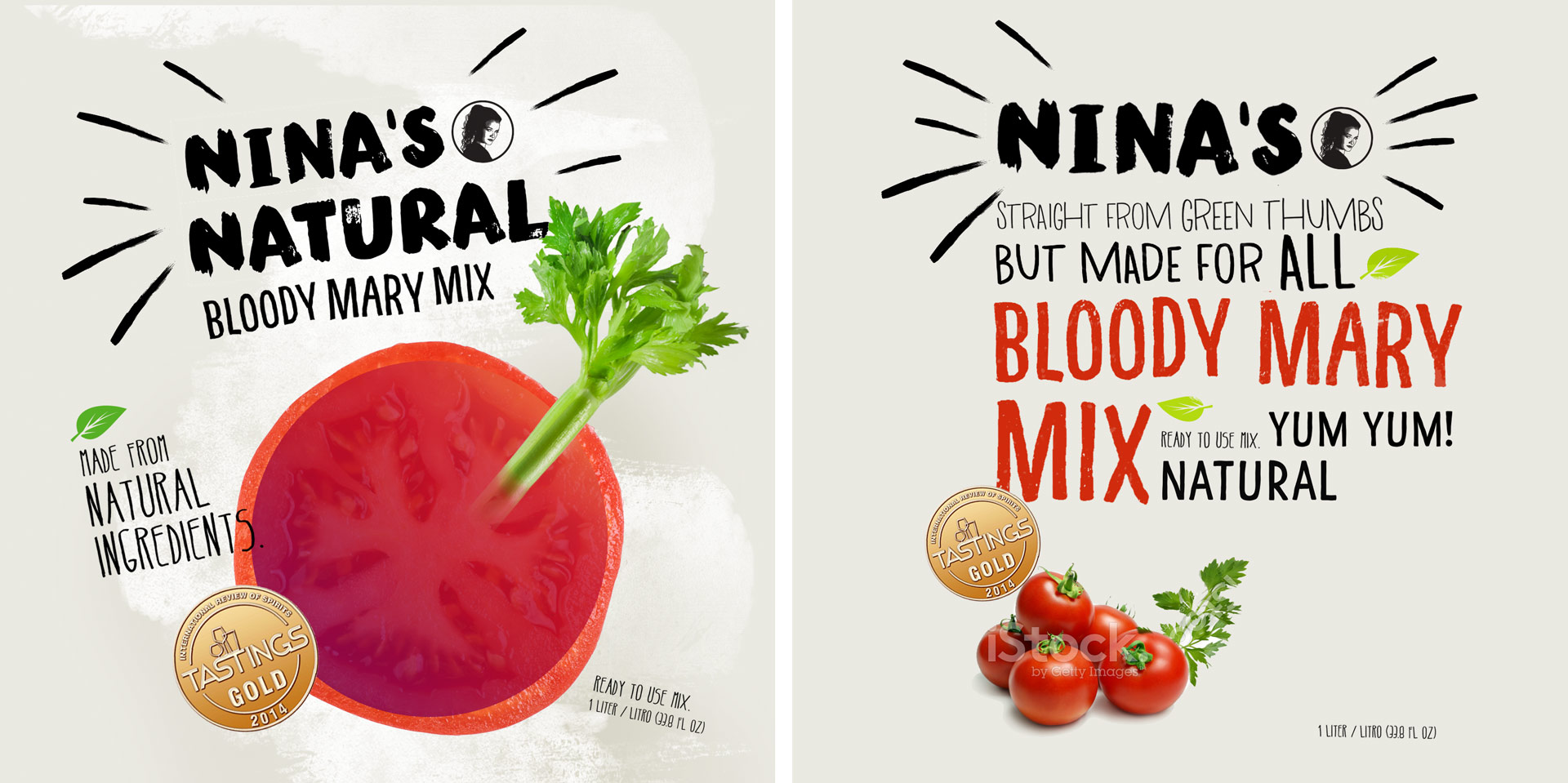
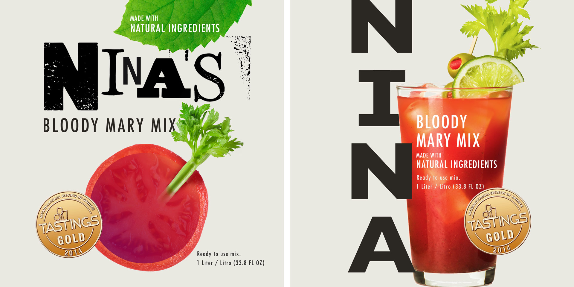
We produced over 50 package design concepts internally. (Don’t worry, we recycle.)
With every design concept, we lined up flat designs and even mocked up bottles to give us a better sense as to what would stand out on the shelf. Label after label, we closed in on something we were excited about. Something we felt would help Nina’s stand out from the competition and make a splash with consumers.
Depending on the store, you might find 10, 20 or more options for every kind of drink mix. The shelves are packed with loud, bold designs all yelling for your attention. The more we looked at concepts, the more we began to notice the design pattern most competitors were using. Nina’s needed to balance fitting into and standing out in the category.
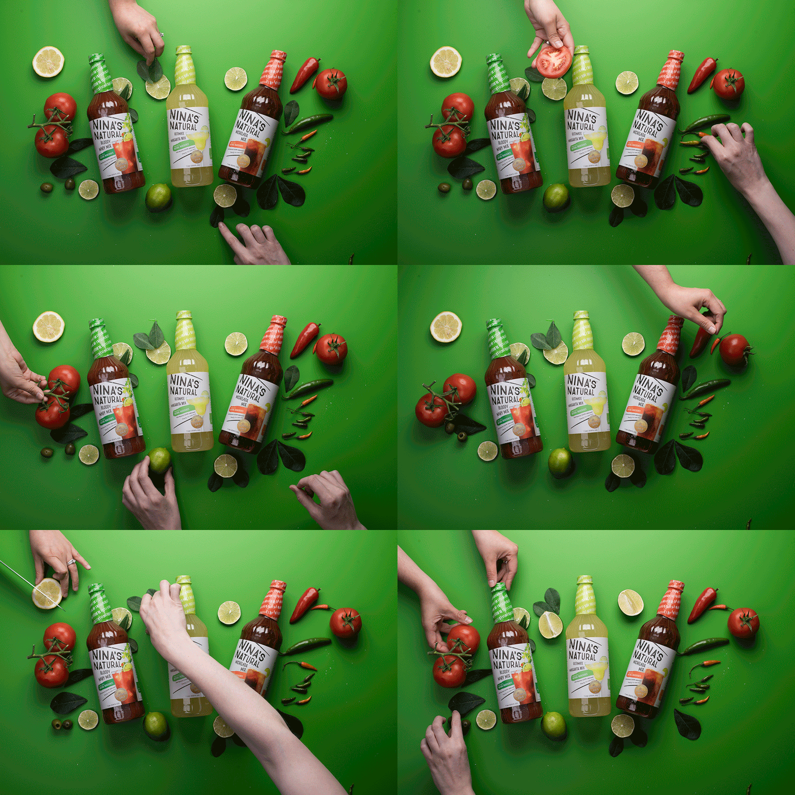
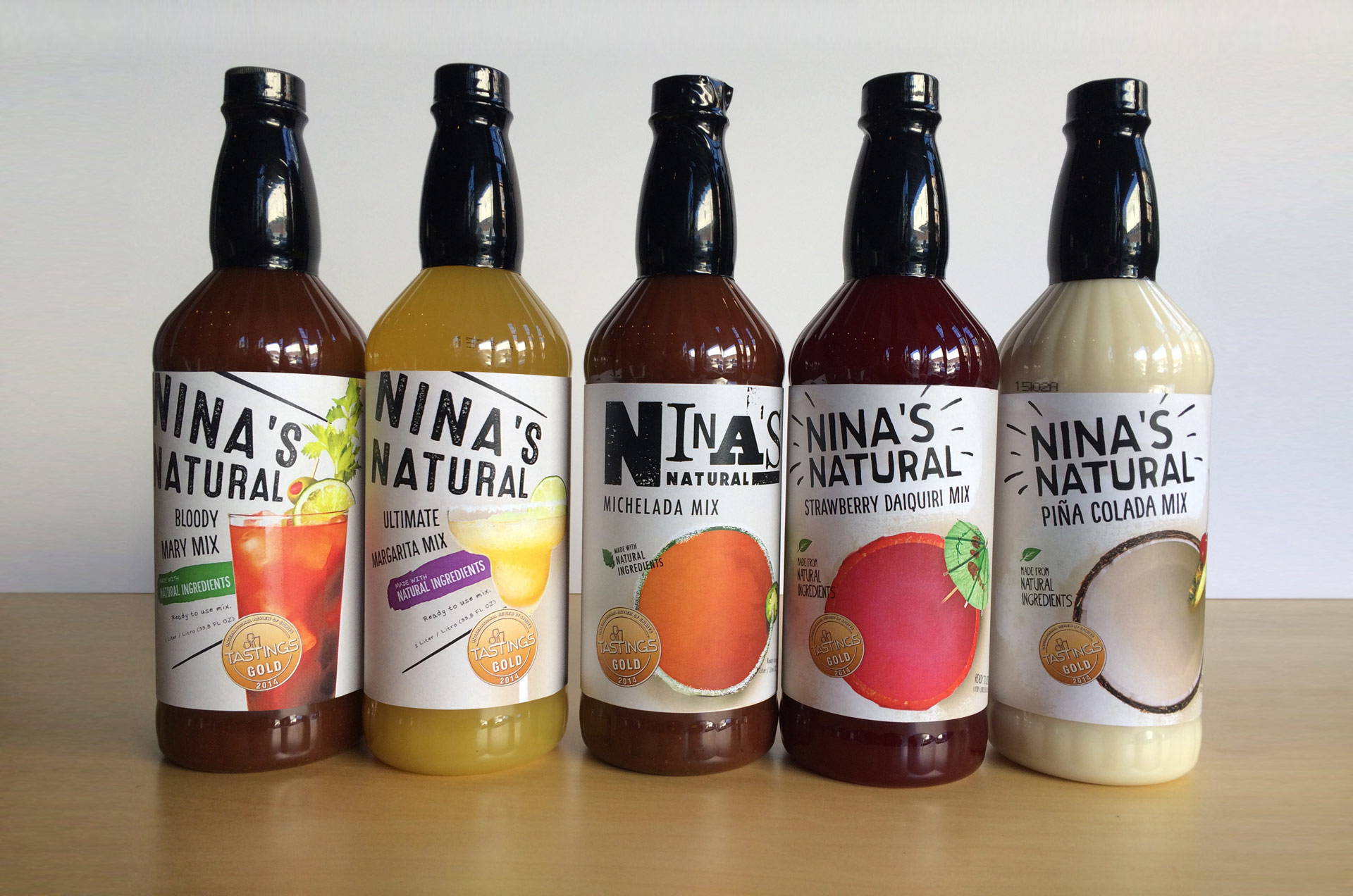
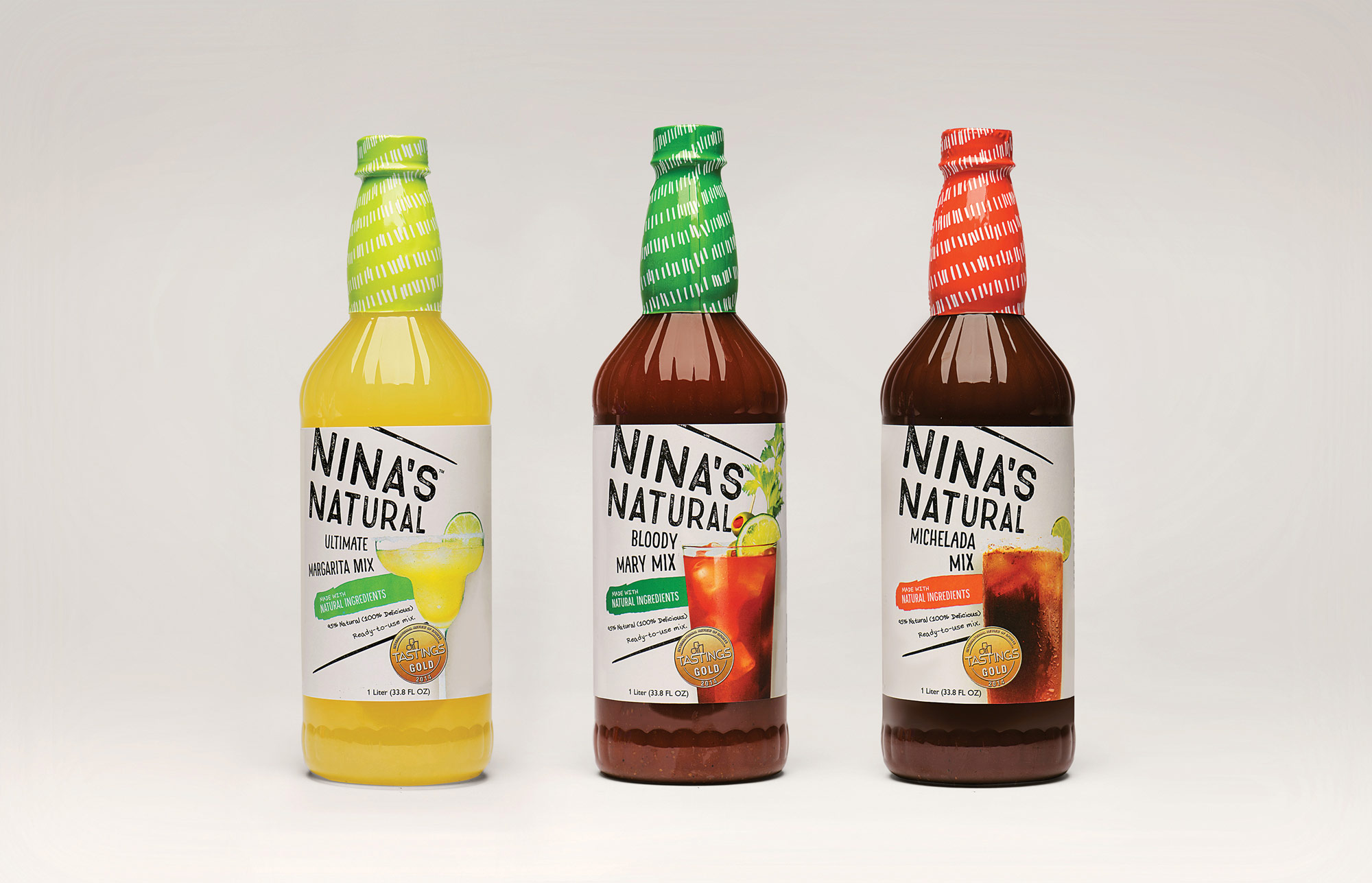
Nina’s new packaging design uses a bright, off-white label to play into the natural aspects of the brand. It’s simple, but strategic, as it makes for a welcome break of white space on the shelves.
To continue the natural feel, we used a mix of hand-lettered type, a hand-drawn pattern and a hand-stamped typeface for the logo. We offset the natural direction by setting all the elements on an angle, so that the labels burst with energy and motion, adding a bit of playfulness.
Bright pops of color bring excitement to the label from every angle, and each bottle is topped off with color-coded neck bands (one of our favorite elements). And to stay in category, a photo of the final drinks finish off each label – a reminder of the delicious cocktails inside every bottle.
The copy on the labels introduce consumers to the new brand, real ingredients and authentic recipes. Together, every aspect works in harmony, producing a tone that’s undeniably fun and natural.
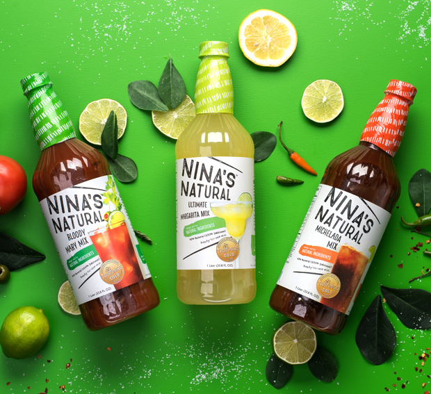
It’s always exciting to see a brand come together, and to share what we’ve been working on with the world. At the start of this project, none of us knew the Nina’s brand – or that they were serving up drink mixes to top restaurants and resorts from their office in St. Louis. Now, with branding and packaging that shares the quality of what’s inside every bottle, Nina’s Natural is ready to launch nationwide.
