
A New Direction
As Propper International expanded into the law enforcement, public safety, private security and lifestyle realm, they needed to build their reputation on the commercial side of the tactical gear industry.
Quietly Confident
For us, Propper is an authentic, deliberate, quietly confident brand with gear that speaks for itself.
Down to the Last Detail
Propper’s new voice drove all of our designs.

Full Story—this content appears in the side drawer on the frontend. Click the floating “Reader View” button to preview.
A New Direction
Atomicdust helped a tactical gear manufacturer stay true to their proud military heritage as they moved in a fresh, more commercial direction.
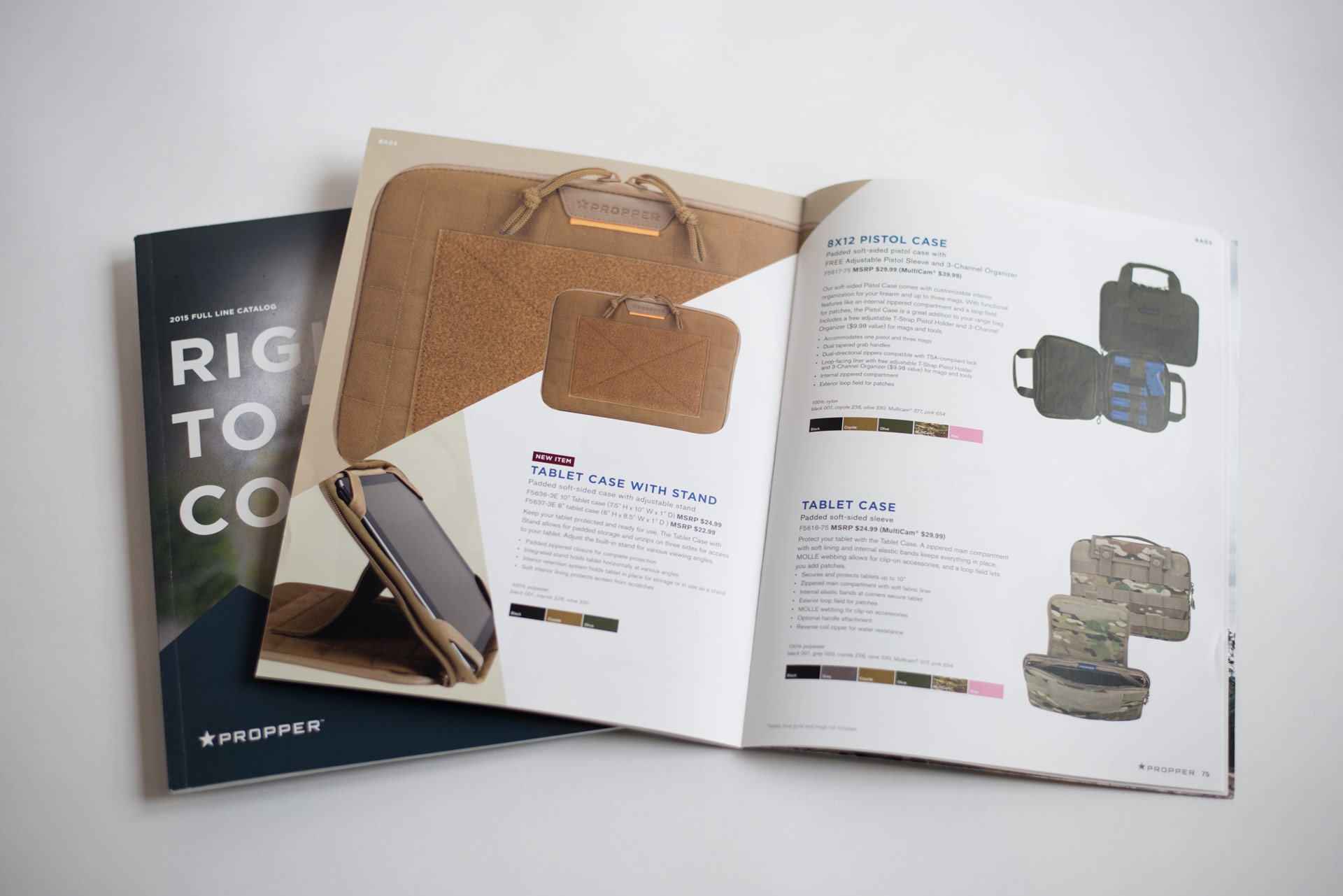
A New Direction
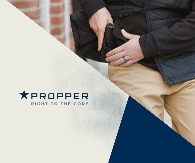
As Propper International expanded into the law enforcement, public safety, private security and lifestyle realm, they needed to build their reputation on the commercial side of the tactical gear industry. Atomicdust recommended breaking free from their industry’s marketing conventions, including the typical gritty, theatrical, over-the-top hero shots.
Quietly Confident
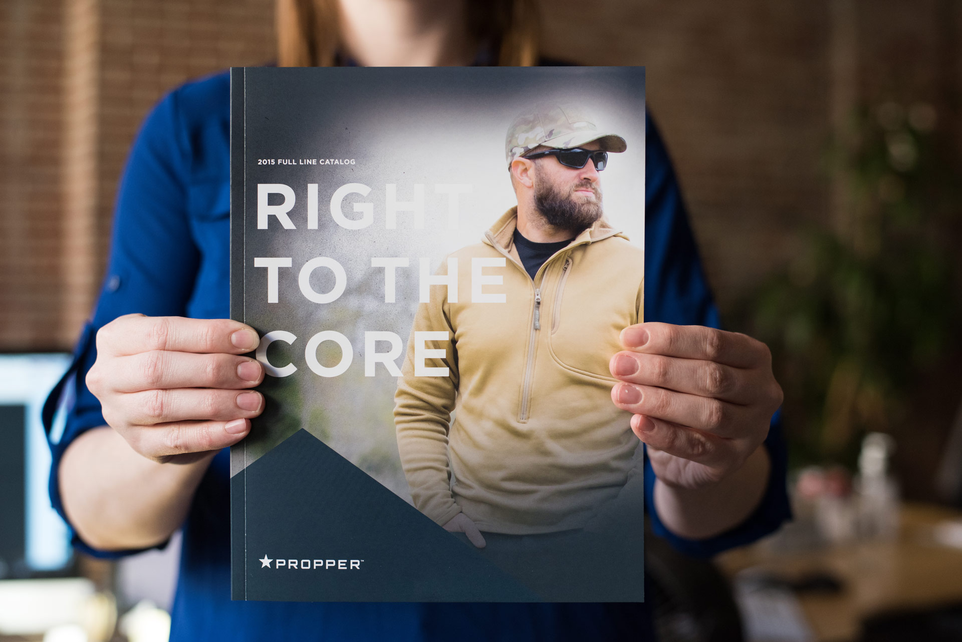
For us, Propper is an authentic, deliberate, quietly confident brand with gear that speaks for itself. Propper gear works right, right when it’s supposed to, whether you’re in the service, on the job or off for the weekend. The new tagline, Right to the Core, is all about Propper’s commitment to making essential, integral gear that stands up to any mission. For the people who wear Propper, it’s about protecting others and restoring order the right way, for the right reasons.
Down to the Last Detail
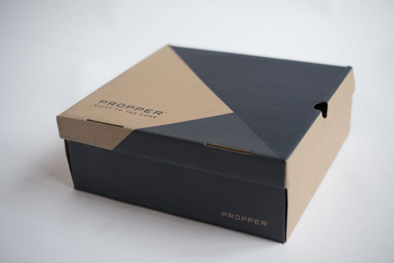
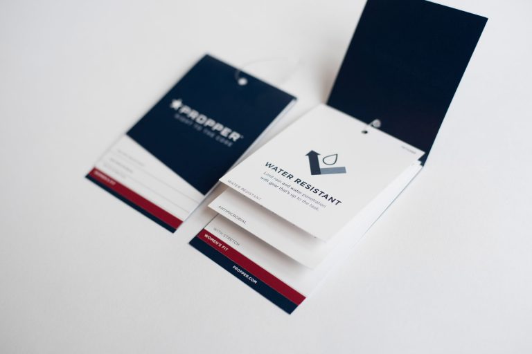
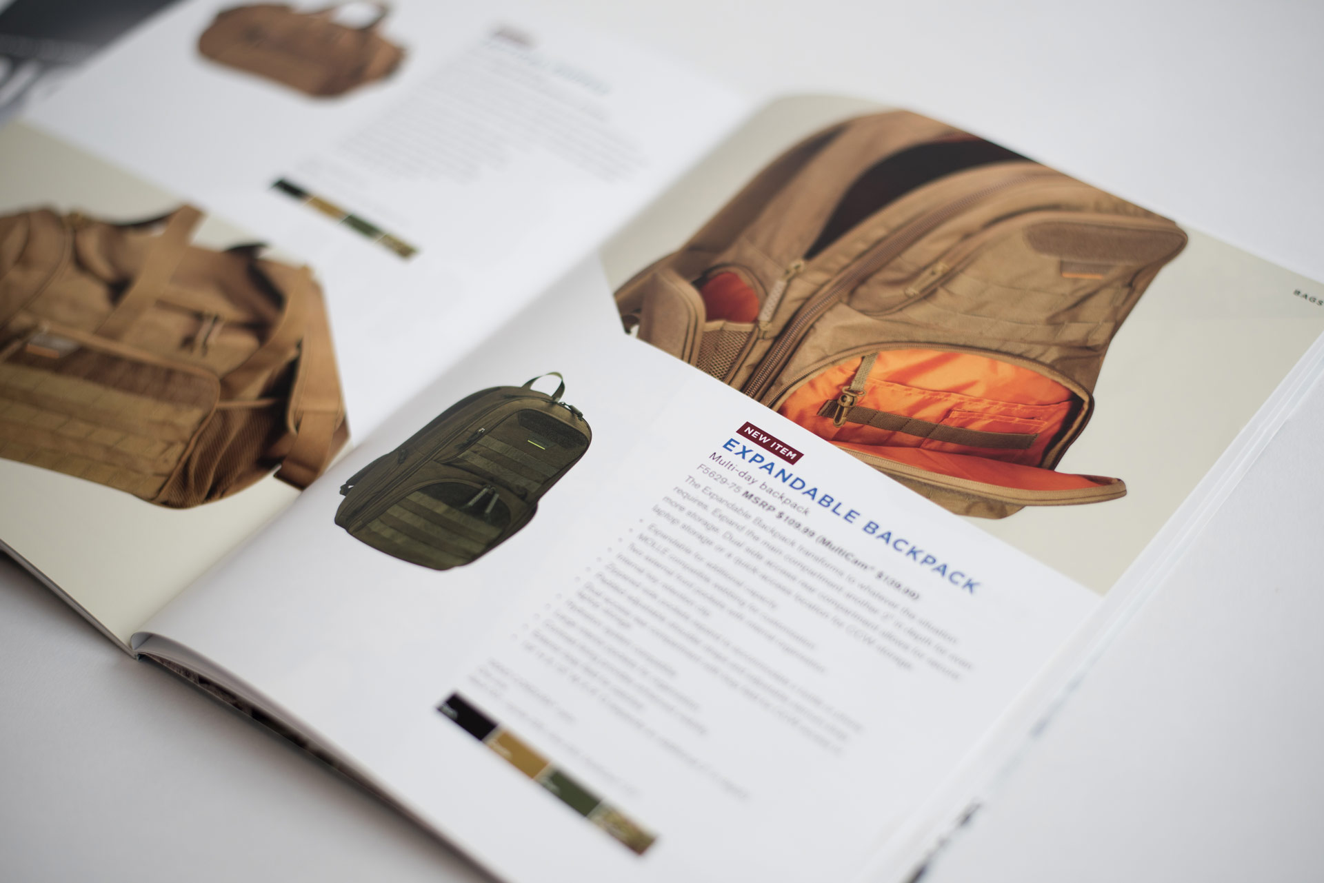
Propper’s new voice drove all of our designs. We were inspired by their iconic blue star logo, and incorporated its unmistakable color and angles into every piece of brand collateral. Sales slicks, brochures and other marketing collateral place the products front and center with generous white space and dirt textures for grit and balance, making everything feel both sophisticated and strong.
Awards
We were proud to see the entire Propper team rally around the new brand. The new branding also received Second Place at the Marketing Excellence Awards in the Identity Package category.
Ready for a new direction?
Let's start a conversation.