What’s in a Name?
NAPCRG – the North American Primary Care Research Group – is a multidisciplinary volunteer organization committed to promoting and advancing primary care through research.


Creating a Community
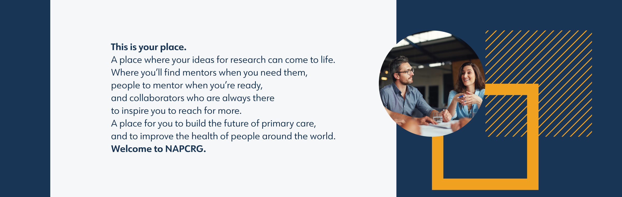
One of the key points that kept coming up in our talks with NAPCRG members was the organization’s warm, collaborative, professional approach that shone through at both its yearly conference and newer ongoing programs.

We captured this spirit in the brand narrative
And we helped clarify NAPCRG’s role in the industry:
Full Story—this content appears in the side drawer on the frontend. Click the floating “Reader View” button to preview.
What’s in a Name?
As it continued to grow and expand its influence, NAPCRG – the world’s leading organization for primary care research – turned to Atomicdust to solidify its brand and further extend its reach.
What’s in a Name?
NAPCRG – the North American Primary Care Research Group – is a multidisciplinary volunteer organization committed to promoting and advancing primary care through research. That’s a mouthful, and that’s why the organization came to us.
Creating a Community
One of the key points that kept coming up in our talks with NAPCRG members was the organization’s warm, collaborative, professional approach that shone through at both its yearly conference and newer ongoing programs.
We captured this spirit in the brand narrative.
And we helped clarify NAPCRG’s role in the industry:
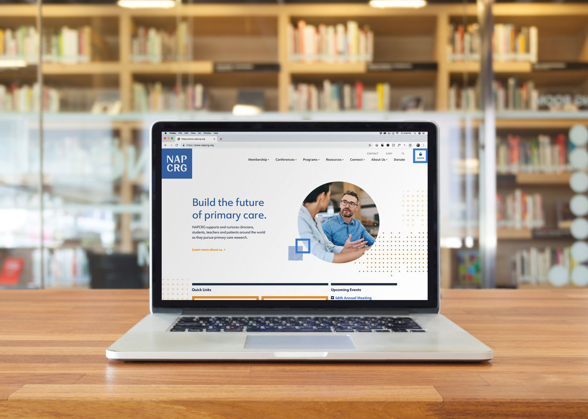
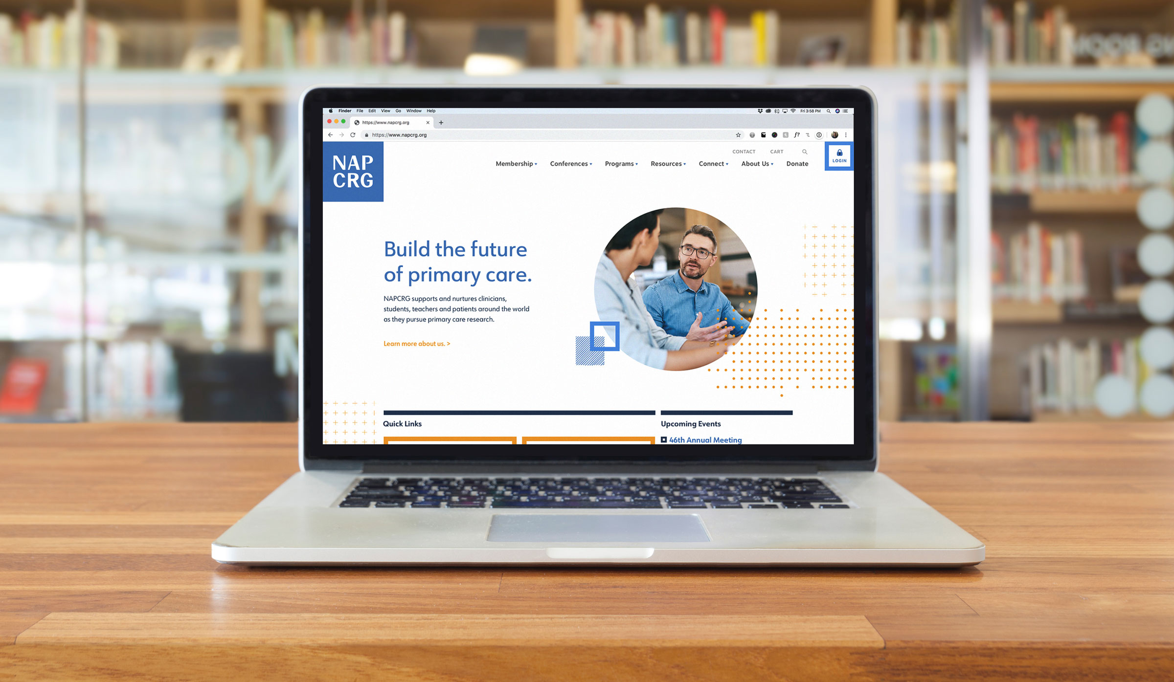
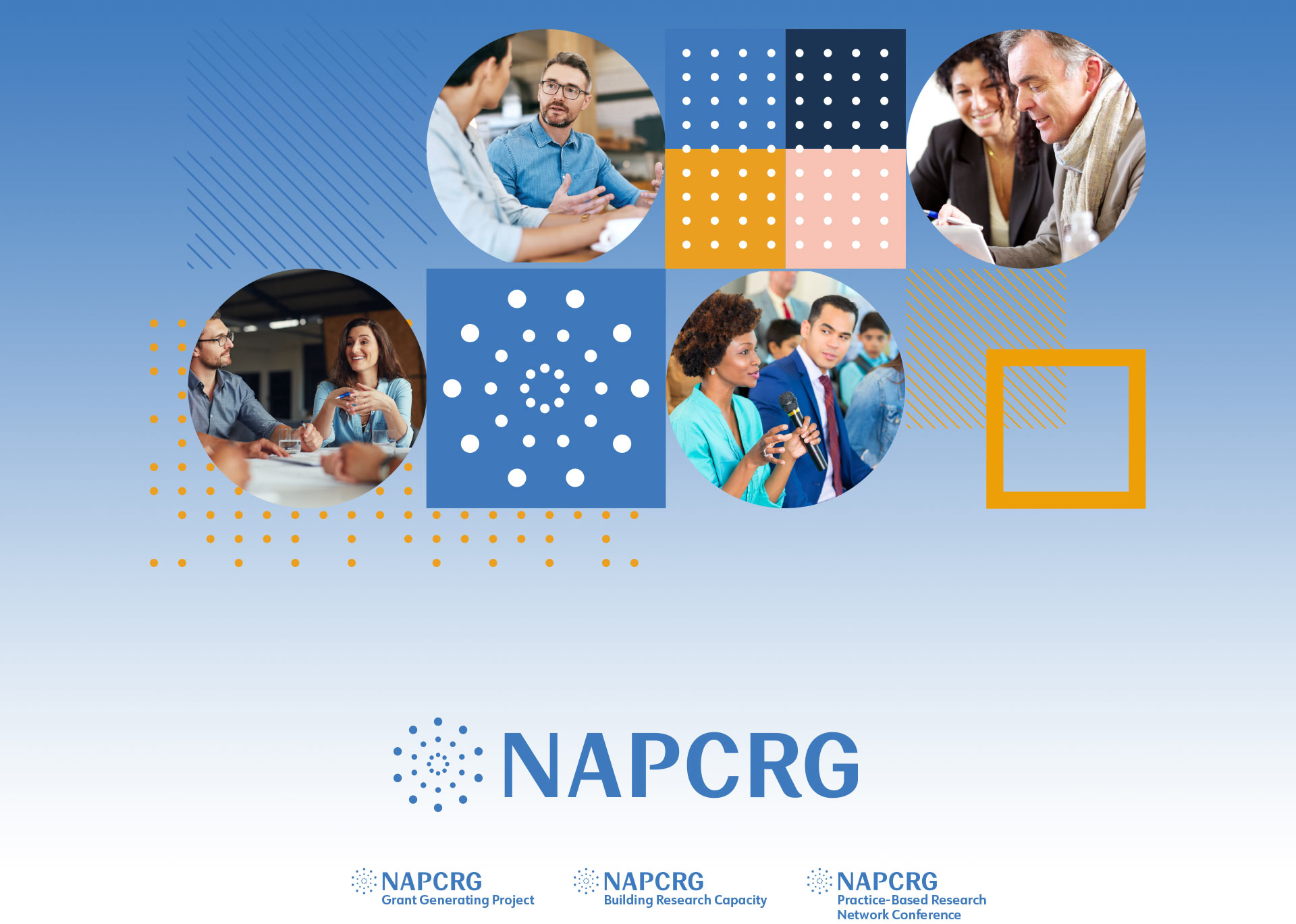
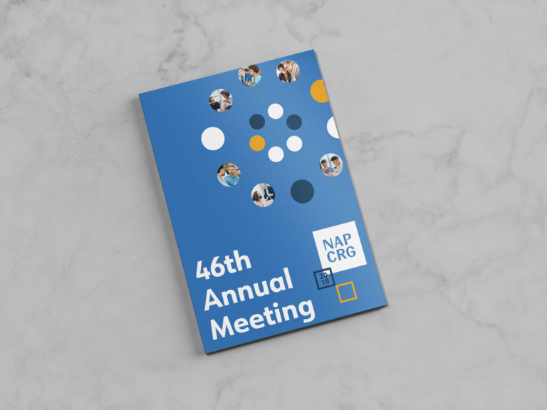
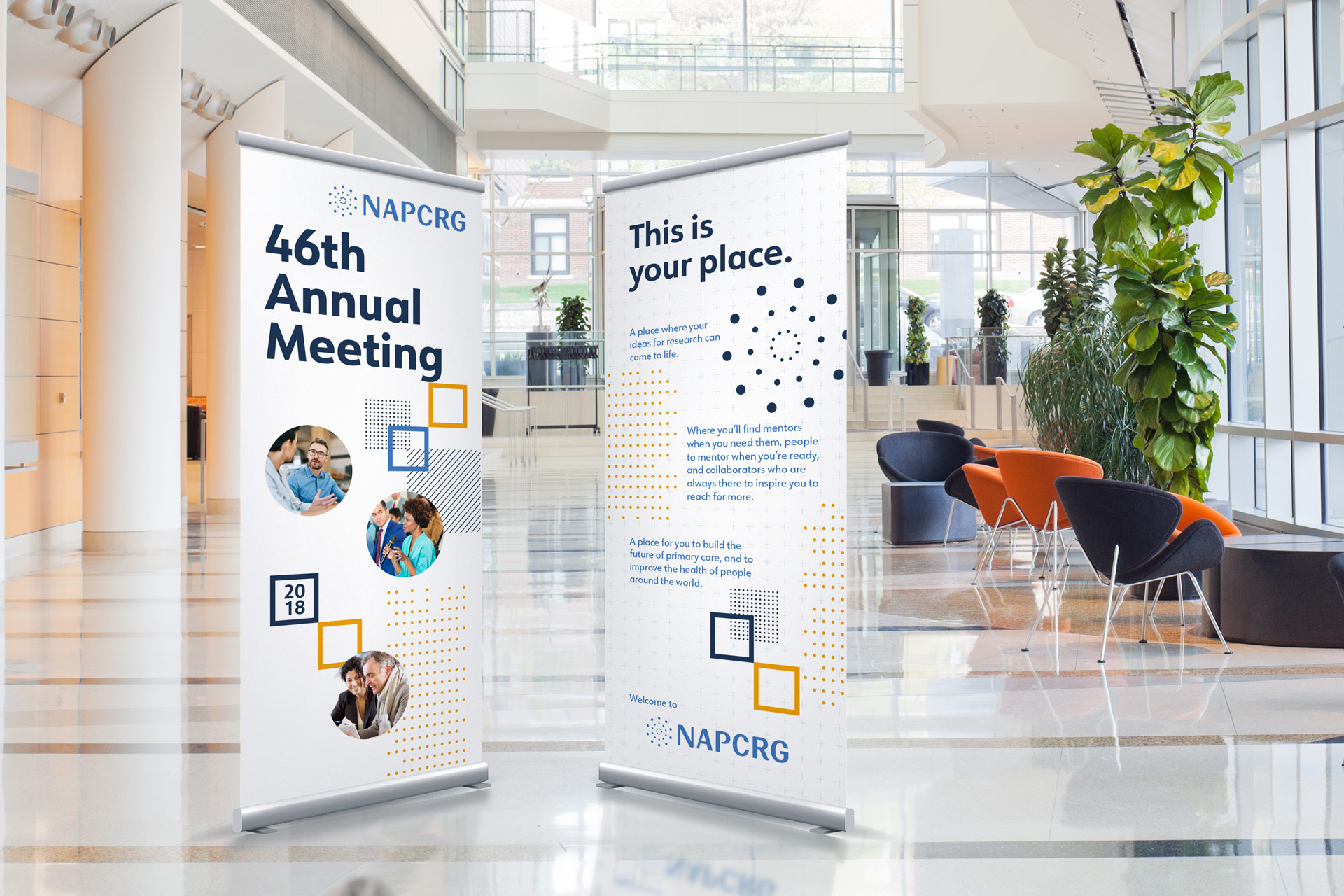
Building a Brand System
A long, cumbersome acronym like NAPCRG does present some challenges when it comes to designing a visual identity. If we made the name too bold and heavy, it could be overwhelming and unfriendly. Too light, and it might get lost in an industry dominated by complex acronyms.
We solved the challenge with a new brand typeface that reflects NAPCRG’s open, friendly culture – while still communicating its respected, professional nature.
The brand mark echoes a pebble’s drop into water, showing both the connected nature of research and the organization’s ever-increasing reach.
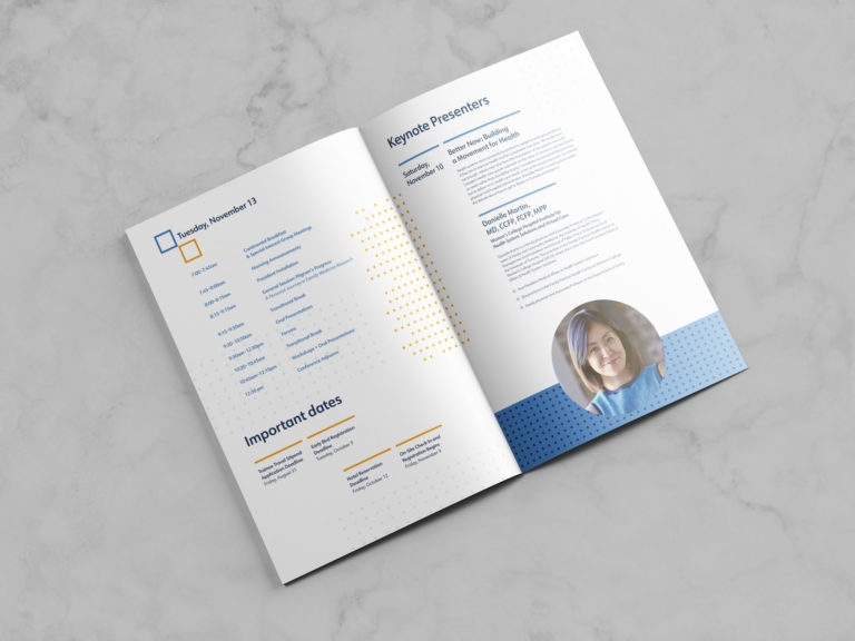
Speaking of ever-increasing reach, we built the NAPCRG identity to make it easy for their team to create sub-brands for their programs and other conferences. The entire system lets each effort have its own identity, while maintaining consistency across the brand.
Is your name telling the whole story?
Let's start a conversation.