
A sales agency that never sits still.
CORE (formerly CORE Foodservice) had grown into a leading sales agency, but its brand still looked like a broker from another era. With the business expanding beyond food into beverage, non-foods and new channels, the team asked us to rethink everything: the story, the identity and the website. We started with language, landed on a promise and built a visual system around it.

One letter breaks the pattern.
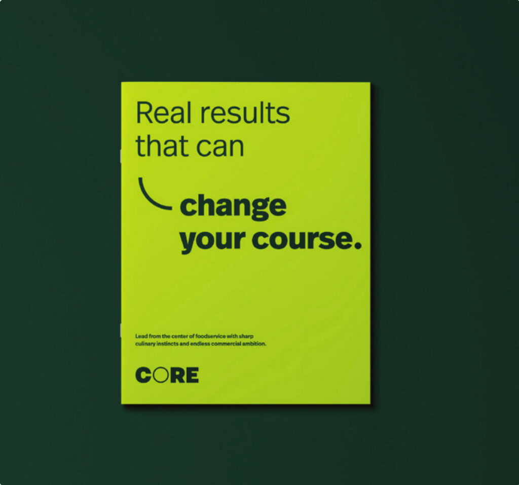
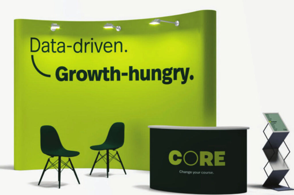
The wordmark is built to be seen from across a trade show floor. Then the O interrupts it, forming the base of the visual system. It connects thoughts, frames food and marks the moment a business changes direction when it partners with CORE.


Built to perform everywhere it shows up.
From social media and sales materials to trade shows and recruiting, the system flexes to meet the moment and still reads as CORE at a glance.
A sales-focused site.
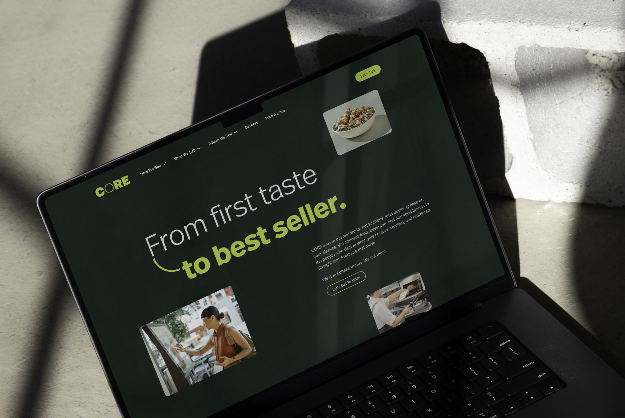
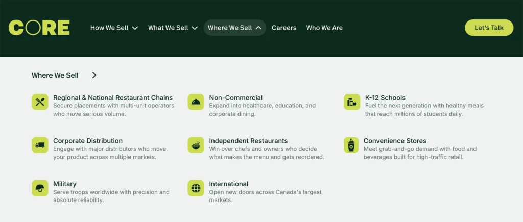
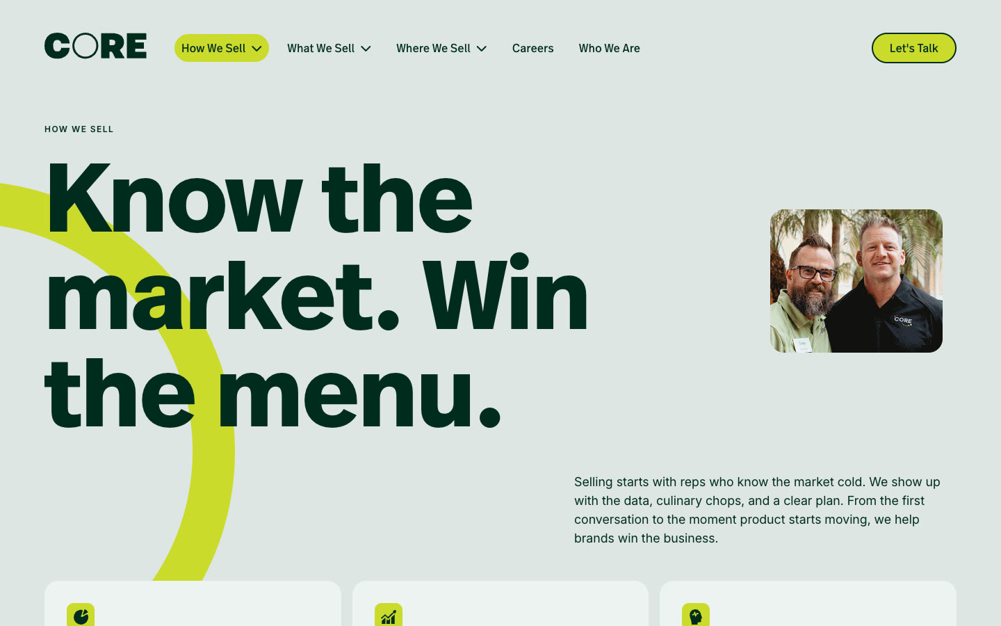
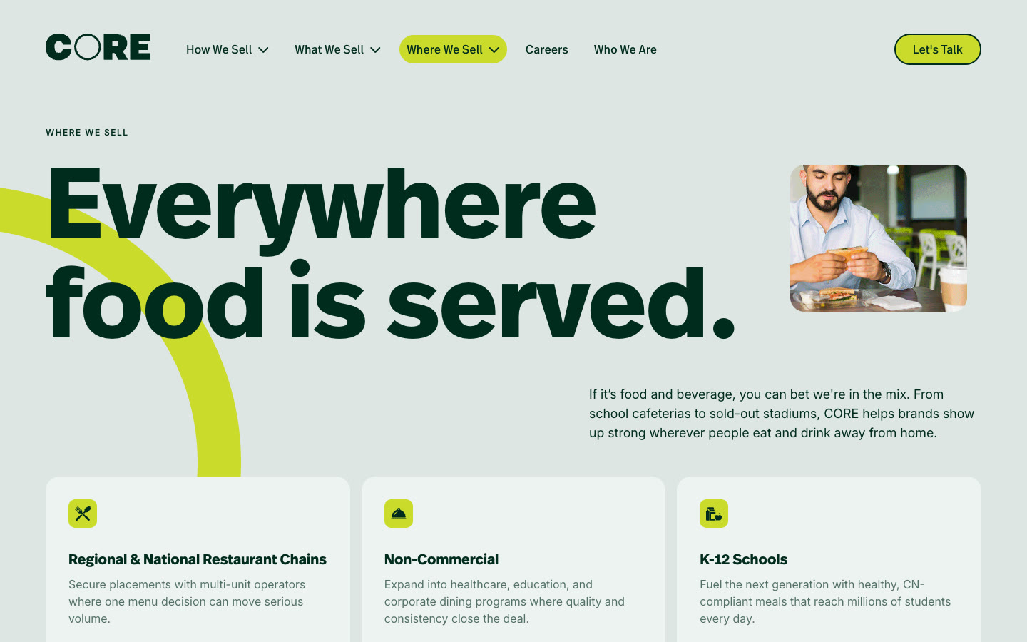
CORE wanted to be known in every channel away from home, so the old foodservice domain and brochure-style site both had to go. We rebuilt the navigation around three clear categories—How we sell. What we sell. Where we sell.—to reinforce what CORE exists to help clients do: sell.

An appetite for CORE.
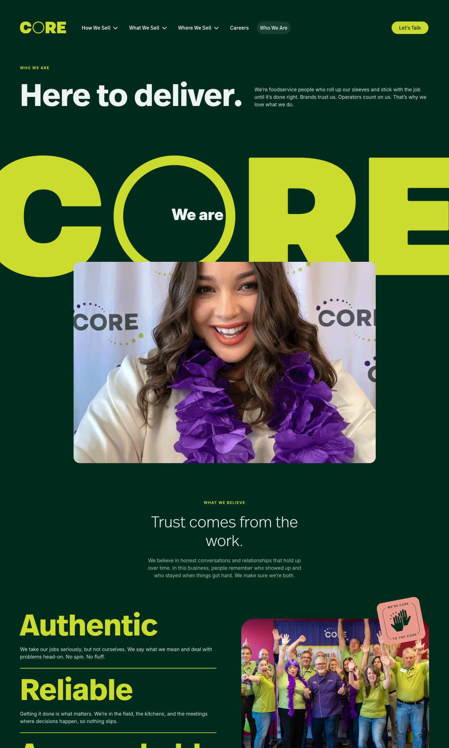
Competing in a tight labor market, CORE's new site sells the company to prospective team members too, with pages that show of culture, benefits and the real people who keep CORE running.
Now, CORE’s brand identity and website match what the company has become, standing out from the competition to accomplish more.
Outliving the label.
The "Foodservice" in CORE Foodservice once described CORE well. But the business had grown into schools, convenience stores, military and international markets, and the label kept dragging people back to a narrower view of the company. Dropping it to just CORE gave the brand room to be defined by what they do, not by an old label.
A promise, not just a pitch.
Modernizing the CORE brand meant transforming how the brand speaks to the market. This is a sales agency focused on delivering real results. We developed a narrative that speaks to those outcomes:
Every product is a promise.
We never break ours.
We show up ready for anything, and when your name’s on the line, we’ve got your back.
Nothing halfway. No smoke. No mirrors.
Just real results that can change your course.
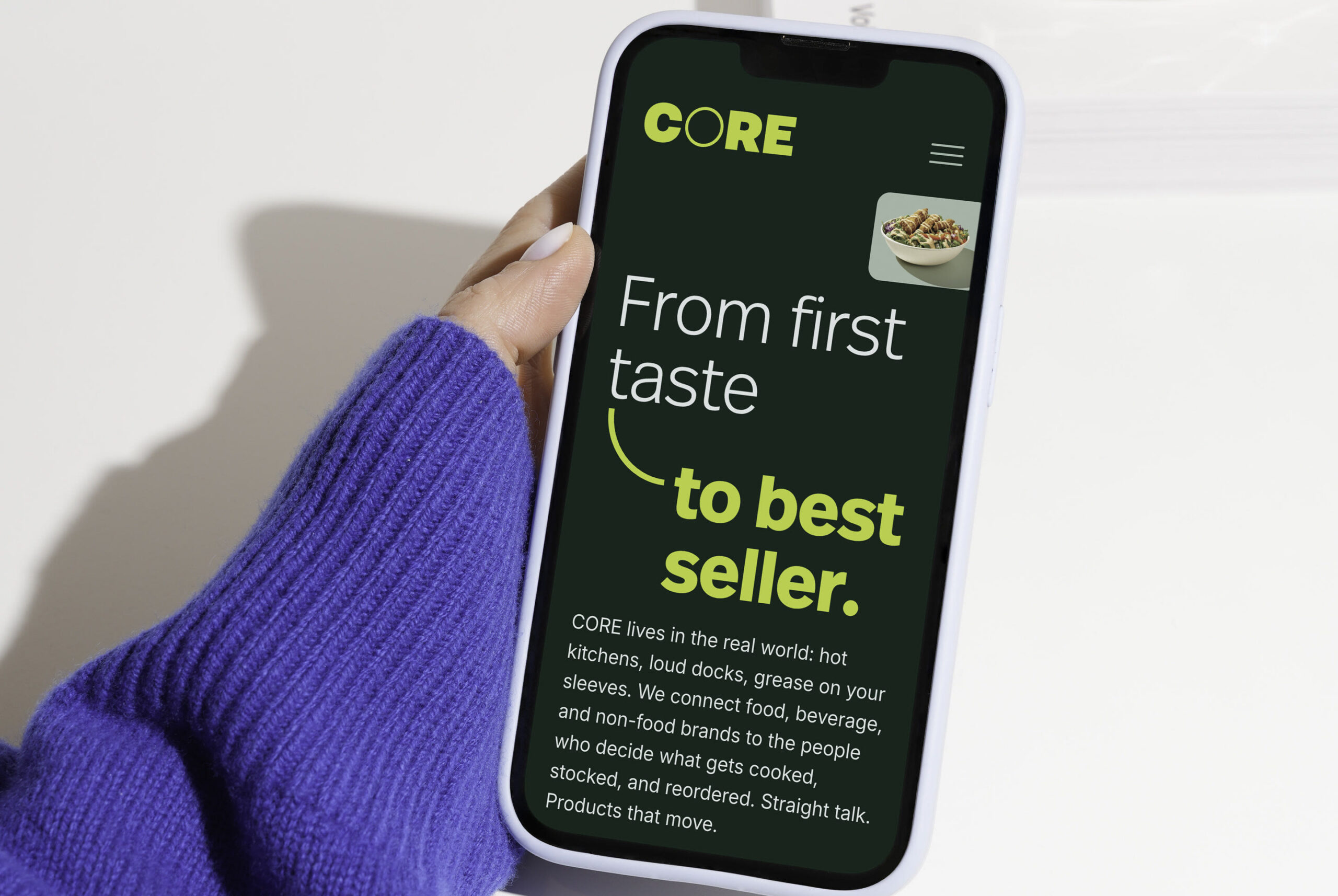
From first taste to best seller.
From bottom line to bragging rights.
We reach into every corner of your business to light a fire for growth.
That’s our passion. That’s our CORE.
And the tagline? Change your course. These three simple words are a rally cry and big call to action, with not-so-subtle industry wordplay. There’s the food context, of course, but there’s also the invitation to set your business on a new path with a better partner.
We created a new logo that brings the Change Your Course promise to life. The wordmark’s bold, solid letterforms show strength and stability. And a thinner, standout “O” brings a small visual break to mirror a brand built to do things differently.
Color outside the lines.
The new identity plays as hard as the people it represents. A bold color palette shows up in unexpected combinations instead of safe, corporate pairings, and circles and quarter-circles, borrowed from plates and place settings, recur as a signature graphic device, echoing the logo and carrying it further through the brand.
Punches of additional personality bring even more energy to the website, representing services and capabilities without resorting to the typical slate of stock icons.
A site with some swagger.
We built the new CORE website (winwithcore.com) to skip the typical foodservice sales agency playbook. It steps closer to a consumer or lifestyle brand, with bold photography, energetic motion and copy that captures the full personality of the company.
The navigation is purposefully simple, organized around how CORE clients and customers actually think about the business: How We Sell, What We Sell and Where We Sell. The result? CORE is positioned as a powerful force for sales: exactly what leading brands need to get on more menus and on more plates than ever.
Recruiting with a bite.
Foodservice is a tight labor market, and CORE was competing for talent against flashier, more modern brands. So we made sure the site is a recruiting engine, capturing the energetic culture that sets the company’s services apart from a candidate’s perspective. Like the client-facing brand tagline’s promise, “Change your course,” CORE offers the chance to change the course of a career, and this page is the starting point.
Brand ready to change its course?
We help B2B and food & beverage companies build brands with an appetite for growth.