Flower power
Curate helps florists organize the tedious parts of their business more efficiently, from accounting and invoices to client proposals and inventory.



As fresh as a daisy
Curate had a logo they liked, but little else in the way of ownable and recognizable branding.


Putting in a good word
To match the vibrant visual branding, we developed language that’s conversational, helpful and relatable, speaking directly to florists as well as wider audiences in the future.

Full Story—this content appears in the side drawer on the frontend. Click the floating “Reader View” button to preview.
Flower power.
SaaS company Curate came to Atomicdust for branding, a website and a trade show booth that would build brand recognition and sales as the company grows.
Flower power.
Curate helps florists organize the tedious parts of their business more efficiently, from accounting and invoices to client proposals and inventory. Eventually, the company plans to expand to include catering and rentals, so branding needed to be adaptable.
As fresh as a daisy.
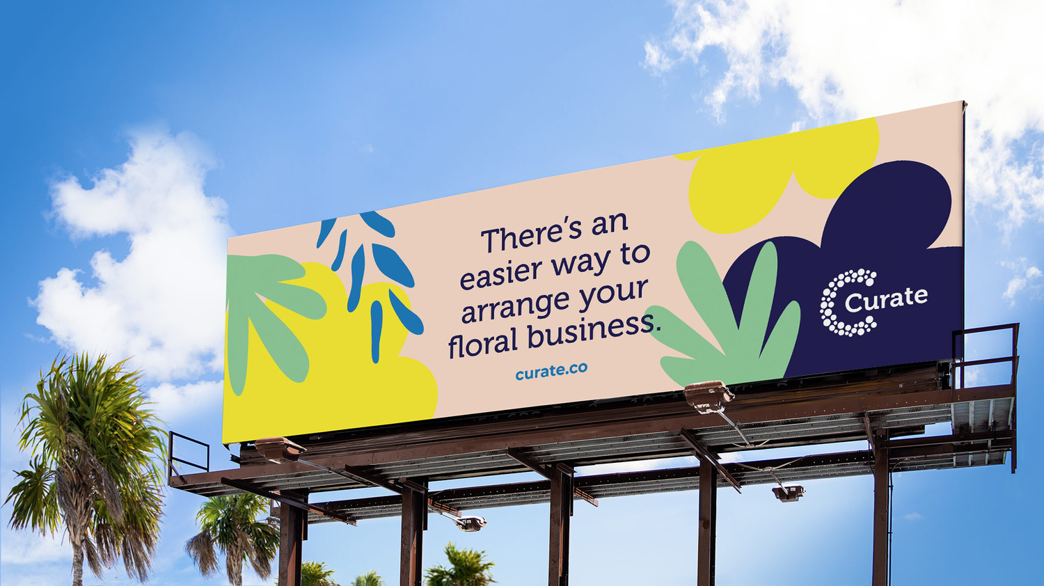
Curate had a logo they liked, but little else in the way of ownable and recognizable branding. We updated the logo with a contemporary typeface and designed organic shapes—mostly floral with a few other event-related items in preparation for the company’s expansion—in a bright, modern color palette. The shapes can be mixed and matched in different colors for unique designs in every execution.
Putting in a good word.
To match the vibrant visual branding, we developed language that’s conversational, helpful and relatable, speaking directly to florists as well as wider audiences in the future. Subtle floral-inspired language choices add pops of fun to the copy.
Tricks of the trade show.
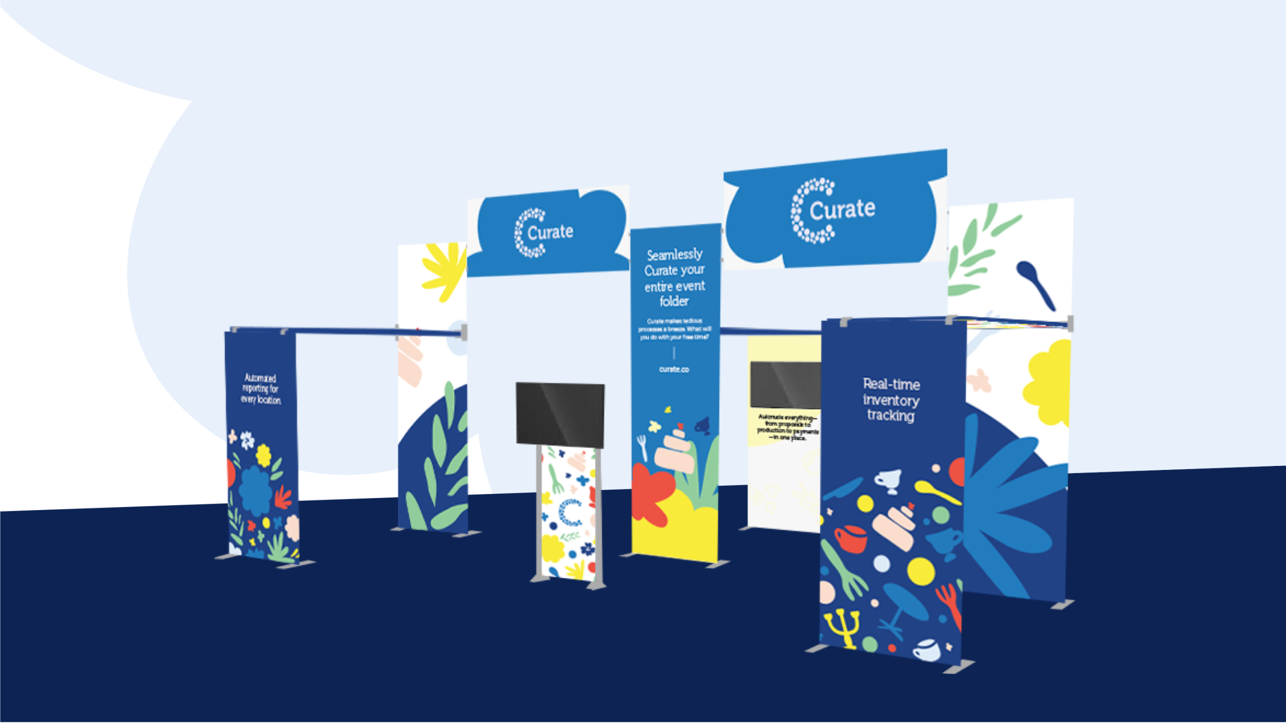
The bright branding takes centerstage in the trade show booth designs, with minimal text explaining the platform benefits—focusing on how it improves workflows and saves time rather than technical features. Unexpected elements, like the floral pattern underneath an overhead surface, represent the brand’s attention to details.
A little bit tech-y, a little bit floral.
As we started our website program, the biggest challenge became clear immediately—the site needed to walk the line between tech company and events business. Our solution: mixing the brand’s signature organic shapes representing the company’s floral roots with tech and business icons that illustrate the benefits of the platform. Just like the branding, Curate’s website proves tech companies don’t need cold colors and boring screenshots to be trustworthy and engaging.
Need a brand that makes a complex product click?
Let's start a conversation.