A simple strategy, designed to shine
In an industry where everyone claims to offer the newest tech and best security, Lightedge stands apart by helping clients see past the hype.

Breaking through the noise
A brand that promises a different experience and better results needs to stand out visually, too.
Illuminating the path
On top of showcasing the new brand identity, Lightedge’s new website needed to drive interest and leads while positioning Lightedge as thought leaders in their field.


A unified future
With their newly unified brand, Lightedge now presents a cohesive identity that honors both companies’ strengths while boldly stepping into the future.


A simple strategy, designed to shine
In an industry where everyone claims to offer the newest tech and best security, Lightedge stands apart by helping clients see past the hype.
Full Story—this content appears in the side drawer on the frontend. Click the floating "Reader View" button to preview.
A simple strategy, designed to shine.
Lightedge and Connectria were preparing to merge—blending secure cloud, data center, managed infrastructure and hybrid cloud solutions. Keeping the Lightedge name but now with broader service offerings and more audiences, the company asked Atomicdust for a brand and website that would unite the two companies and put them in the industry’s limelight.
A simple strategy, designed to shine.
In an industry where everyone claims to offer the newest tech and best security, Lightedge stands apart by helping clients see past the hype. Instead of chasing trends and buzzwords, Lightedge carefully selects the right solutions for each client’s needs.
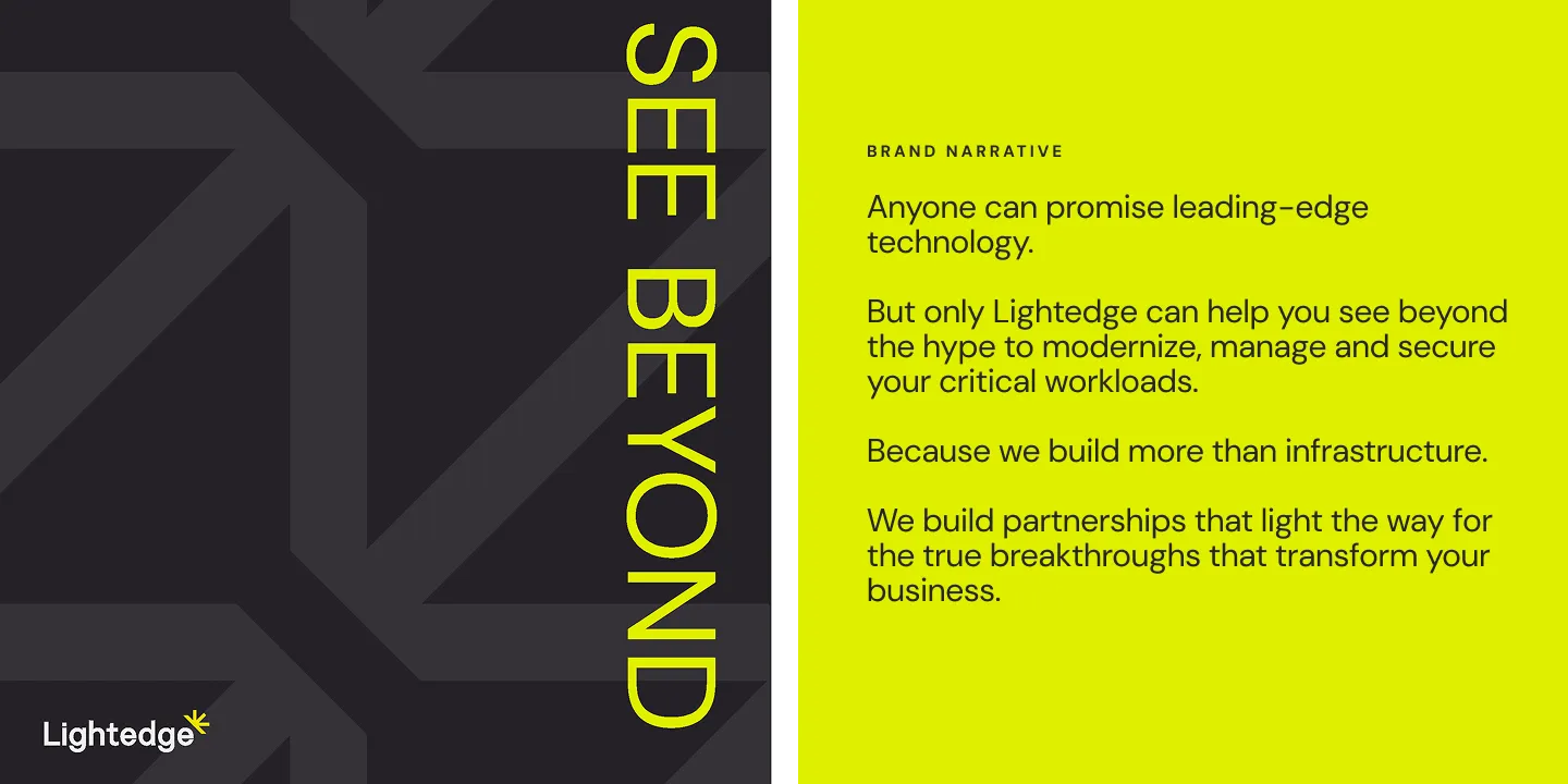
New brand language expresses the core strategy and brand promise—a concept that’s summed up in a two-word tagline: See Beyond. Lightedge helps clients cut through the noise and step confidently into the future. Each component of the brand messaging shows how Lightedge takes clients beyond complexity, beyond limitations, beyond what most providers even think to offer.
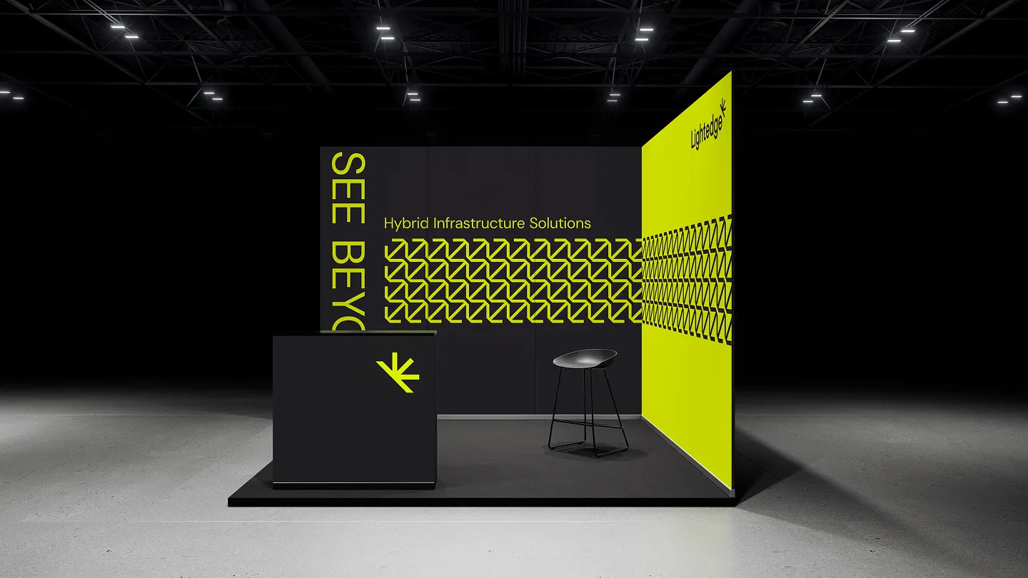
Breaking through the noise.
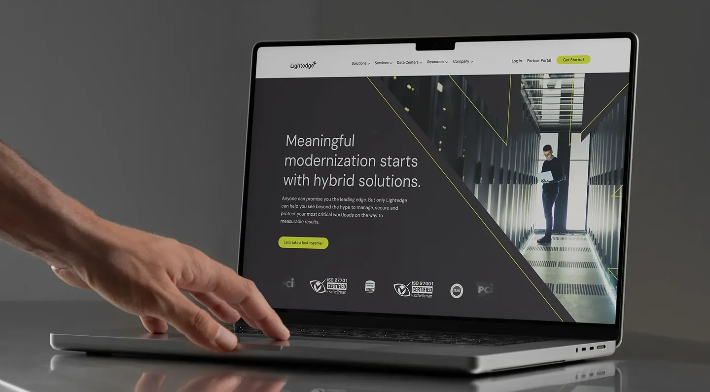
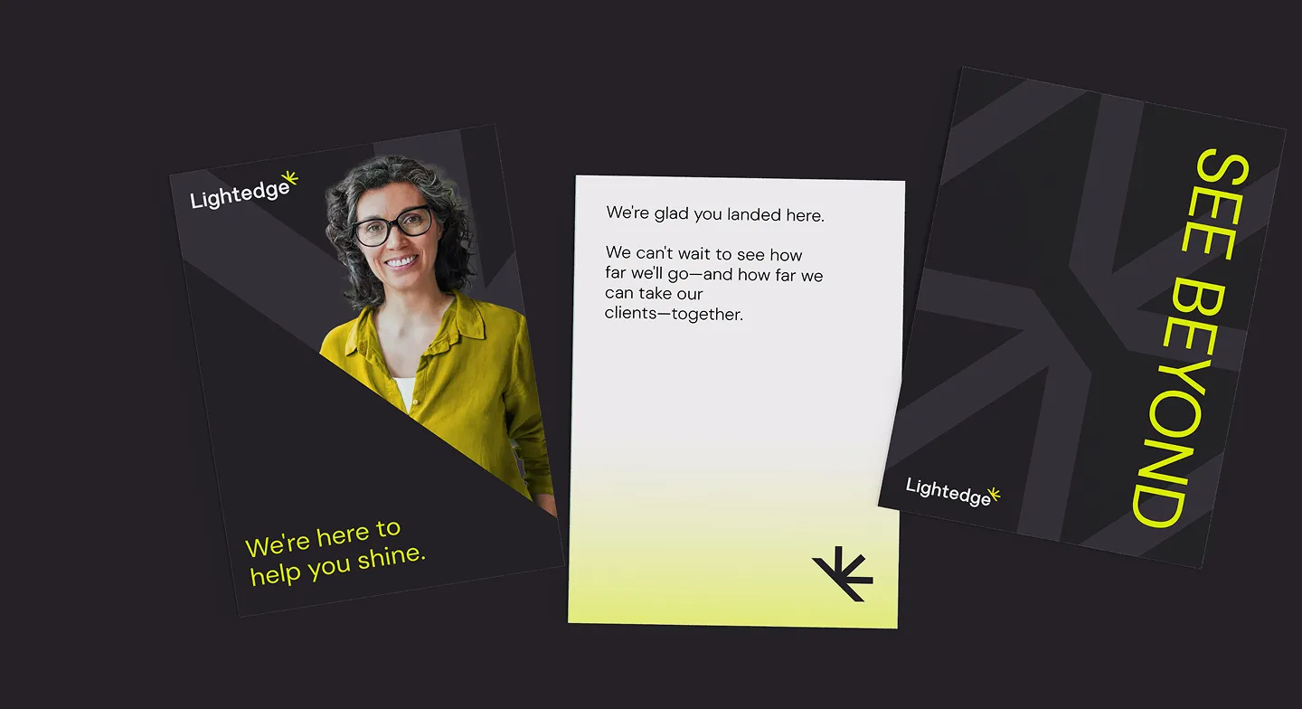
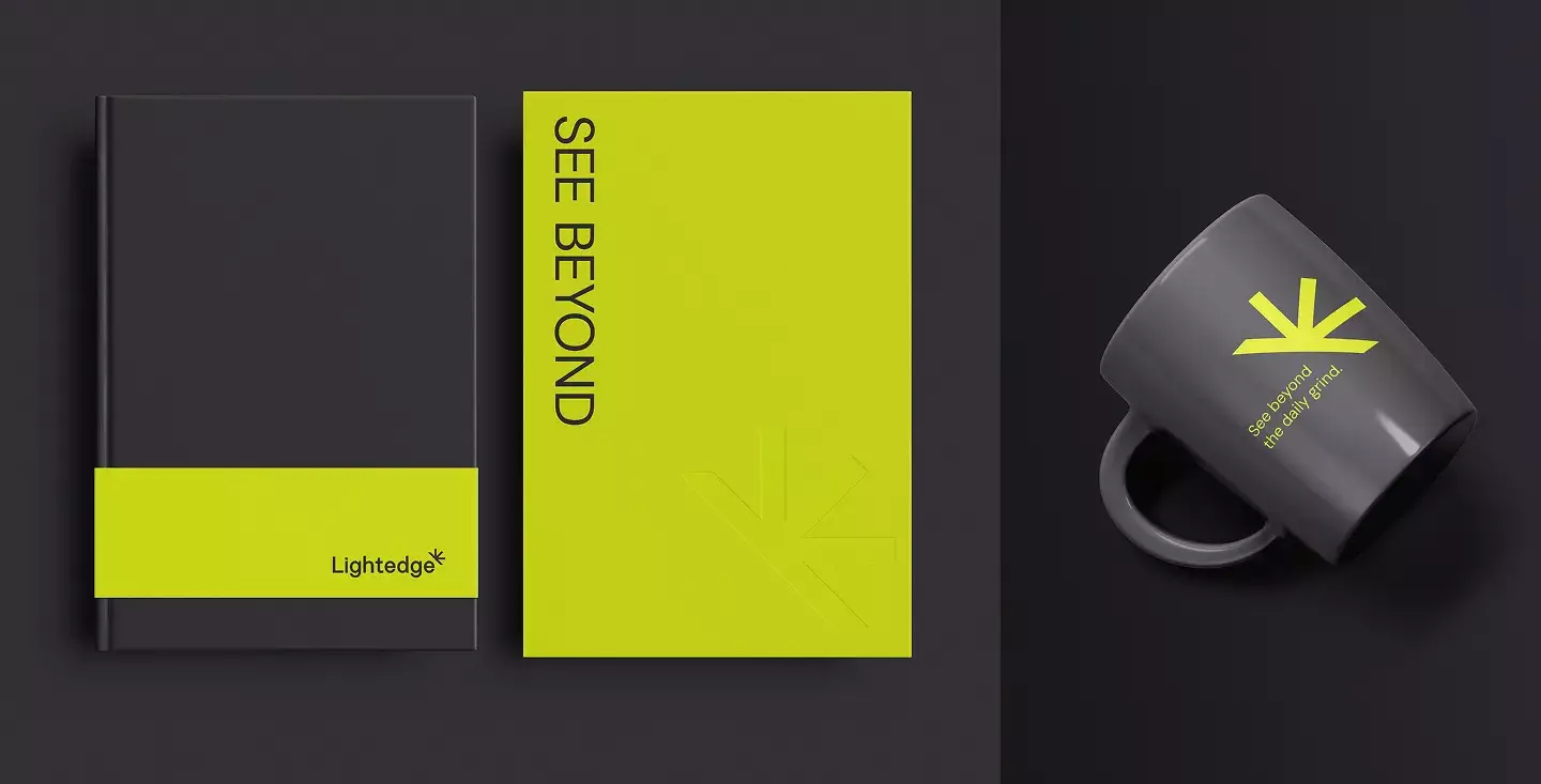
A brand that promises a different experience and better results needs to stand out visually, too. Instead of the predictable sea of blues and purples, Lightedge’s new visual identity features a high-contrast palette pairing black and highlighter yellow to draw attention to what matters most. Every detail was carefully considered—we updated the company name from “LightEdge” to “Lightedge,” creating a smoother visual flow that better represents streamlined IT infrastructure.
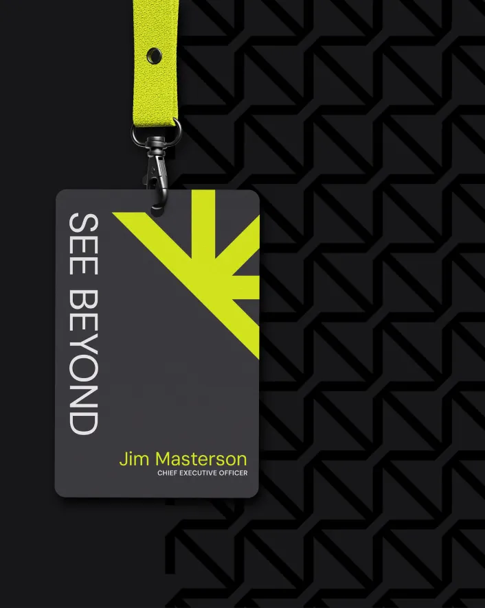
The angular, modern logo with its sunburst accent tells the story of “lighting the way” visually, while being flexible enough to work across all creative. The sunburst element can stand on its own for social media and other small-space applications, creating a versatile system that scales.
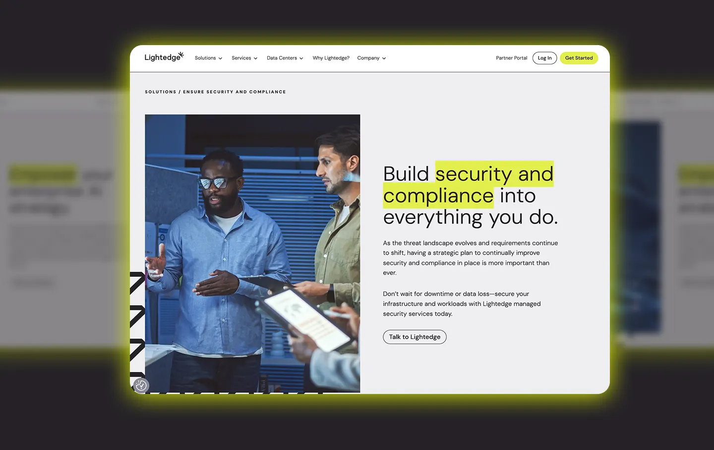
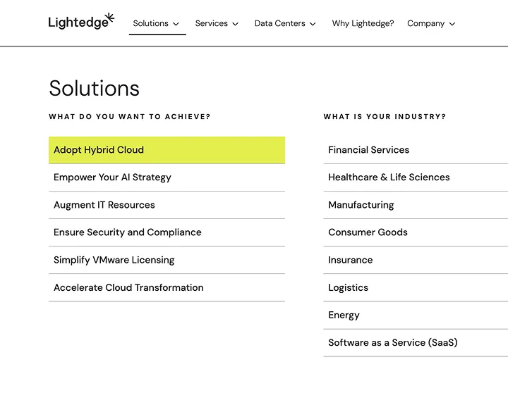
Illuminating the path.
On top of showcasing the new brand identity, Lightedge’s new website needed to drive interest and leads while positioning Lightedge as thought leaders in their field.
Animations highlight key messaging to “light up” important content as users scroll, reinforcing the brand promise. Side-stepping industry norm of just listing services, the homepage maps business challenges directly to Lightedge solutions. Content showcases data-driven case studies and measurable client results.
A comprehensive megamenu simplifies navigation, organizing options by industry, technology, service and business goal—mirroring how Lightedge makes navigating technical challenges easier. Throughout the site, the logomark-inspired pattern creates visual consistency without sacrificing interest, functioning much like Lightedge itself: bringing order to complexity.
A unified future.
With their newly unified brand, Lightedge now presents a cohesive identity that honors both companies’ strengths while boldly stepping into the future. Every element—from the strategic name adjustment to the high-contrast visuals and thoughtful animations—works together to differentiate Lightedge.
The refreshed visual identity and messaging don’t just tell clients they can “see beyond.” They show it through every interaction, helping Lightedge break through in a crowded marketplace and light the way toward true business transformation. As they continue to unite the best of both company cultures, we’re excited to see how Lightedge will continue illuminating new possibilities for their clients.
Got a simple strategy ready to shine?
Let's start a conversation.