Nailing the Message
We knew we needed messaging that would resonate with their expanding list of audiences, including business owners and their employees, prospective policyholders, and independent insurance agents.


Evolving the visual identity
The new all-caps logo makes a bold statement, clearly defining the name as “M-E-M”, and serves as the cornerstone of a brand that resonates with core audiences.

Bringing confidence to the web
How do you build confidence on a website?
Full Story—this content appears in the side drawer on the frontend. Click the floating "Reader View" button to preview.
Nailing the Message
A workers compensation carrier with a Missouri-based charter and a separate brand for out-of-state policies was gearing up for big changes. Growing and going private (and changing their name to MEM from Missouri Employers Mutual), the organization needed an updated story and fresh voice—while eliminating any reference to Missouri.
We’d worked with MEM almost a decade prior, developing the brand and website. In a great compliment to our team, they came back to Atomicdust so we could tackle the next chapter together.
Nailing the Message
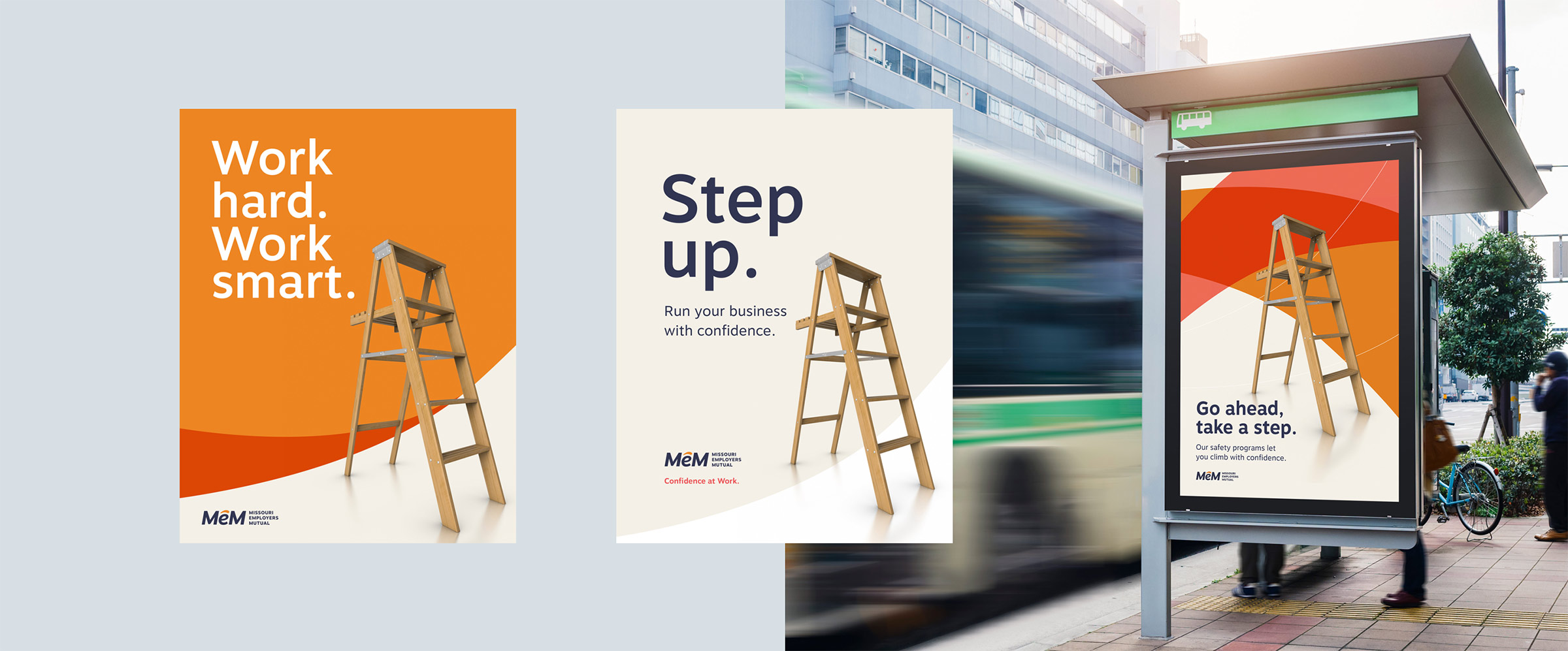
We knew we needed messaging that would resonate with their expanding list of audiences, including business owners and their employees, prospective policyholders, and independent insurance agents. Our original, nine-year-old message, “Confidence at Work,” still felt on point, but needed to evolve to match where the company is today.
We explored a range of alternate ideas with their team, including different ways to express their core differences and key promises. But we kept coming back to the idea of confidence. A small update kept the central idea while making it more active.
Evolving the visual identity.
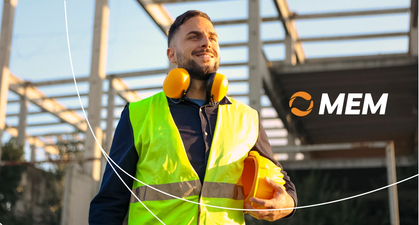
The new all-caps logo makes a bold statement, clearly defining the name as “M-E-M”, and serves as the cornerstone of a brand that resonates with core audiences. The new circular mark becomes a stronger demonstration of MEM’s commitment to bring confidence to its policyholders, agents and partners.
All of the brand elements support this idea. From the circular mark that can stand alone, to bold arcs and authentic photography, MEM pushed beyond the expected hard hats and safety cones so prevalent in workers comp insurance marketing.
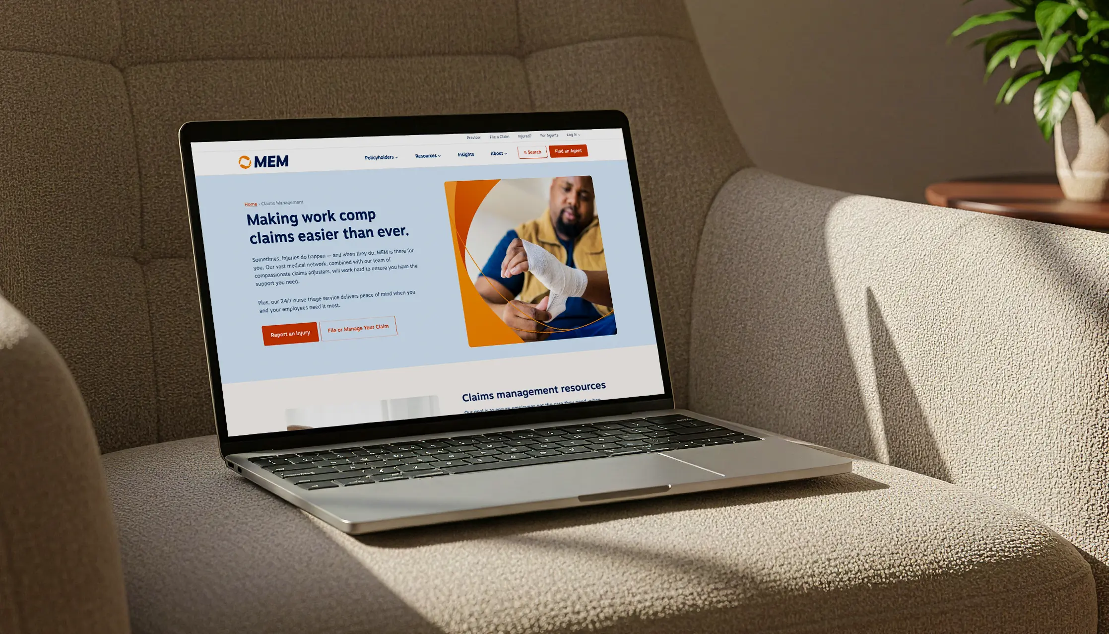
Bringing confidence to the web.
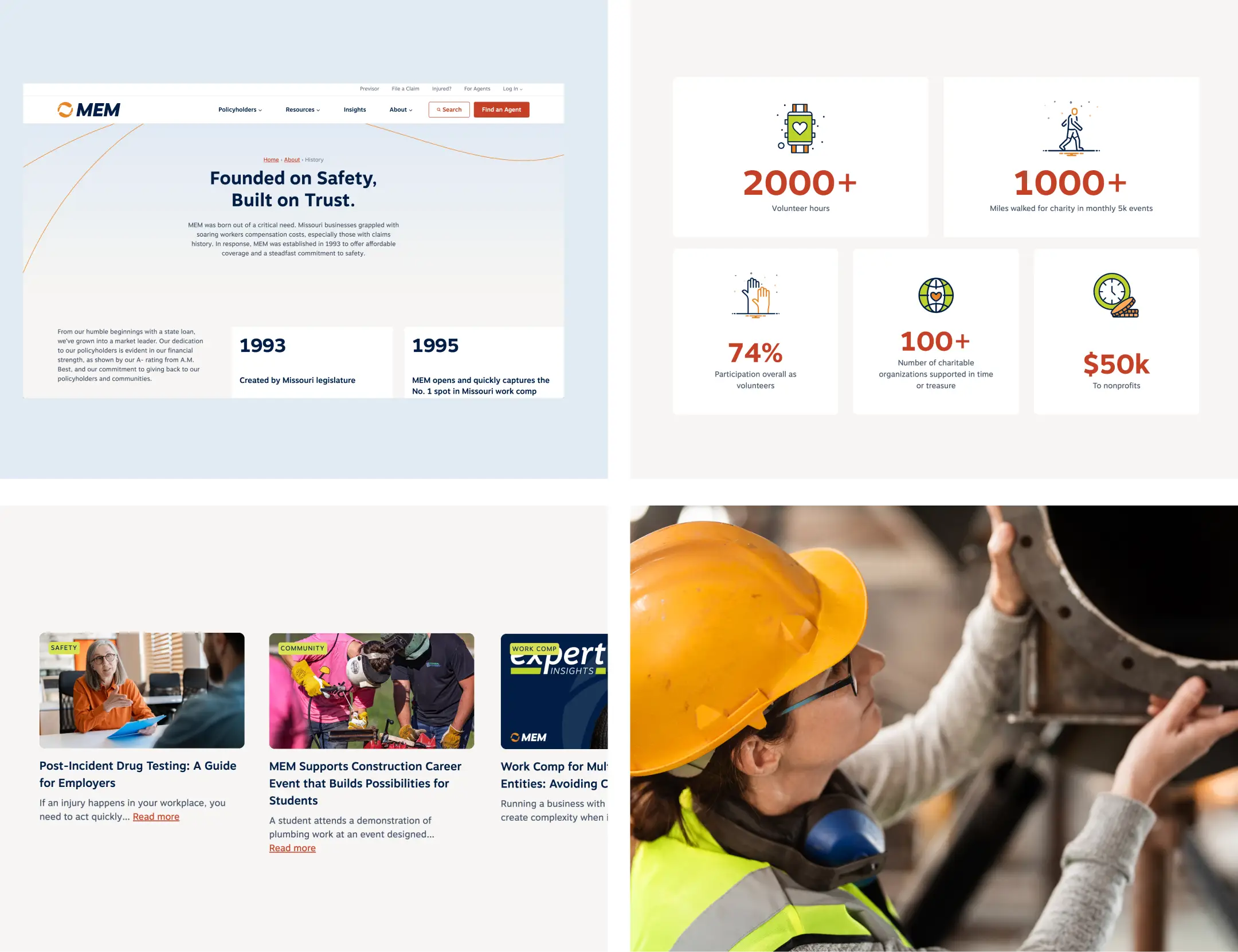
How do you build confidence on a website? It’s all about making information easy to find. It’s about plain, short copy and bright, bold graphics that get to the point—and, really, the benefit—quickly.
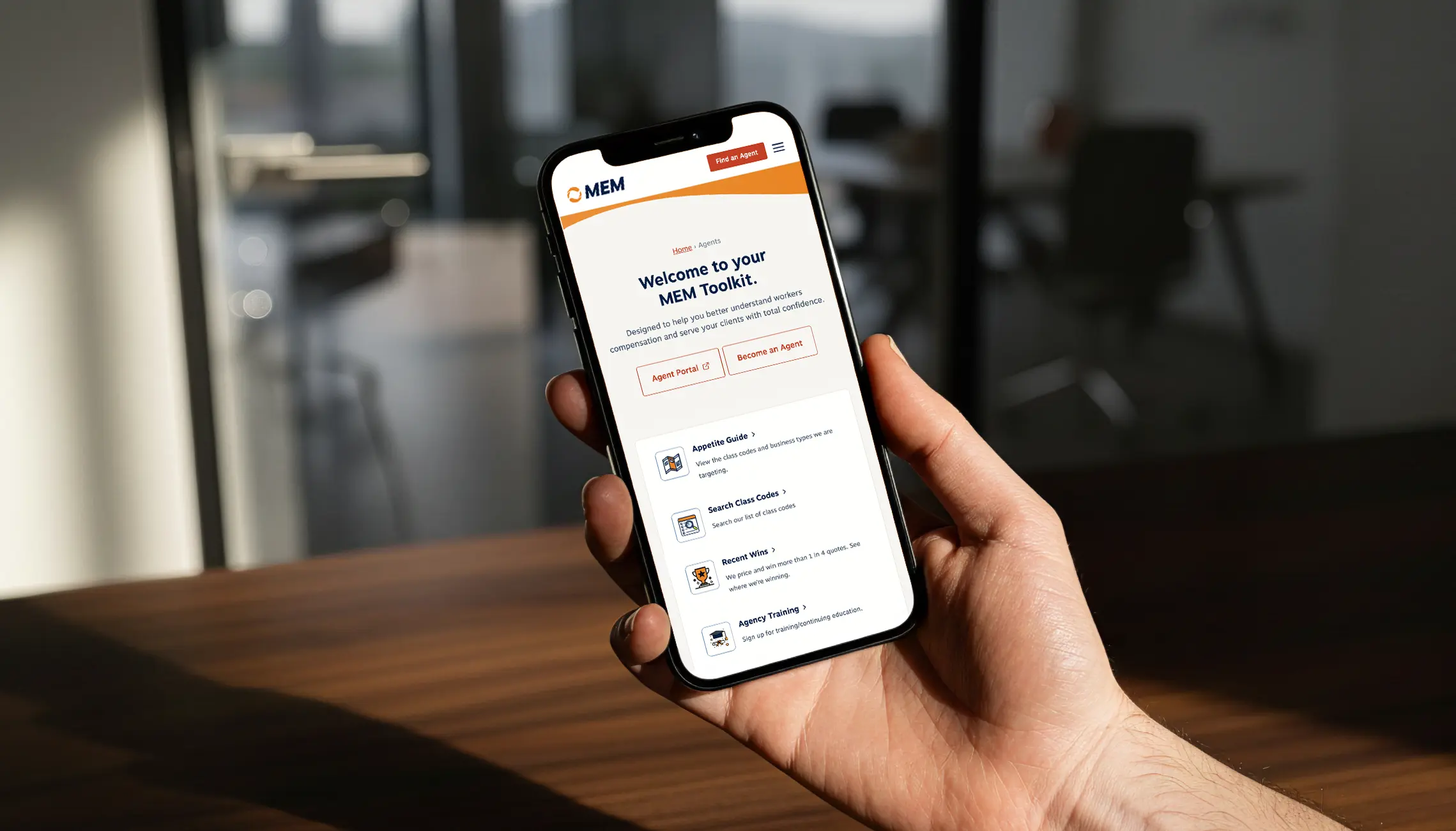
Our clients came prepared, providing traffic data and support staff pain points that helped us create a site that achieves everyone’s goals. Large callouts create clear paths to action for policyholders, employees and agents. At every step, visitors are invited to get relevant training, find an agent or log in to their accounts.
Surprising animations and subtle rollover effects draw users’ attention to the information they need, from core brand promises and social proof to key next steps.
Elevating every resource.
From podcasts to safety articles, agent guidance and more, MEM’s robust content library sets it apart from the competition. They needed to give everything room to shine, while making each piece more accessible. That translated to a simplified navigation, organizing content sections by audience—making it easy for people to find what they need in just a couple clicks.
Positioned for the future.
We’re beyond thrilled to have been a part of MEM’s growth over the years, and have tremendous respect for the work their team does day in and day out. They’ve been a great partner, and we’re excited to see how the company continues to evolve.
Brand outgrowing its old name?
Let's start a conversation.