Fresh perspective
The first Eatwell location opened in Columbia, Missouri in 2020.

Flip the script
Schnucks had explored a few logo concepts before coming to Atomicdust.
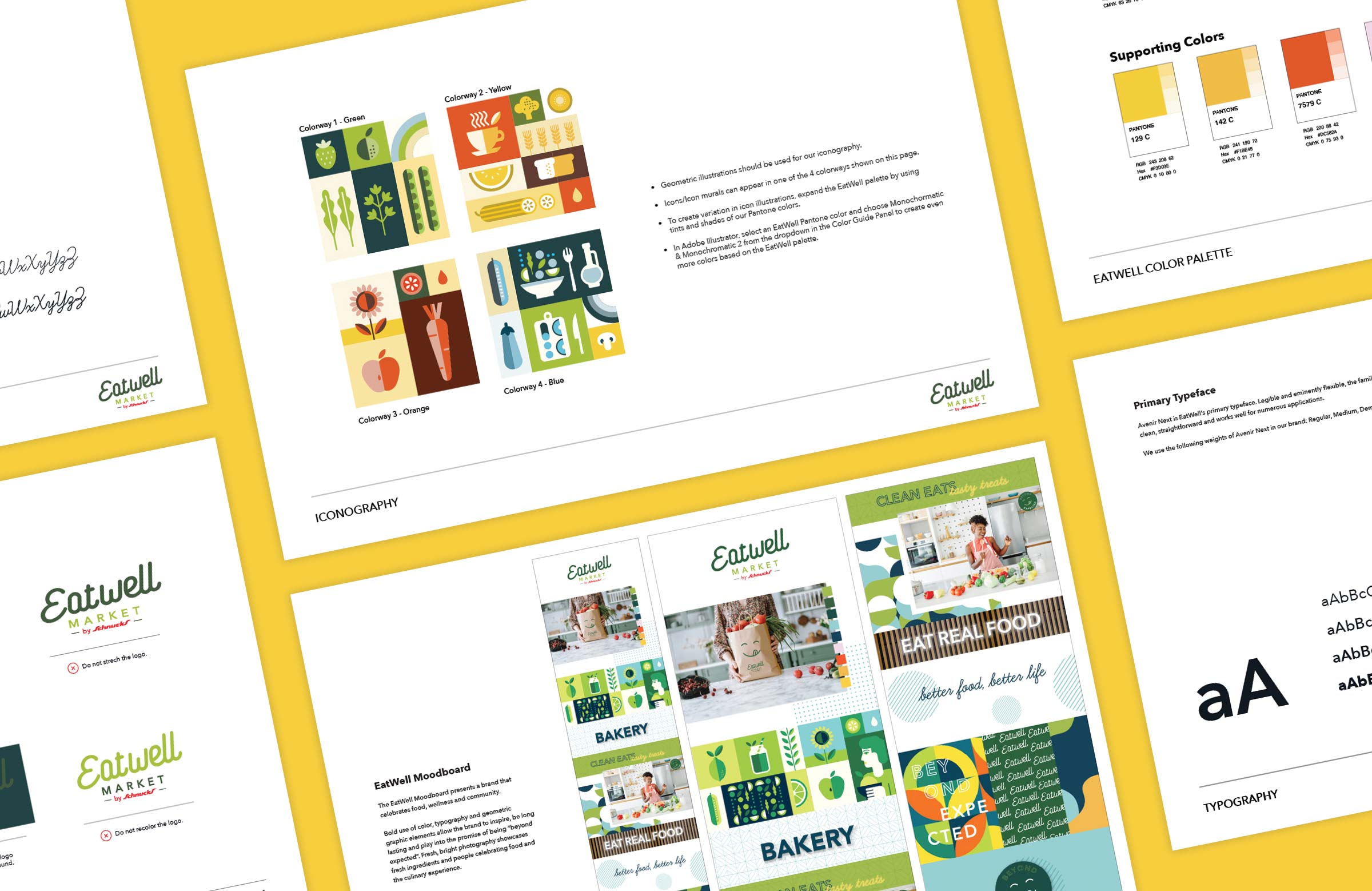
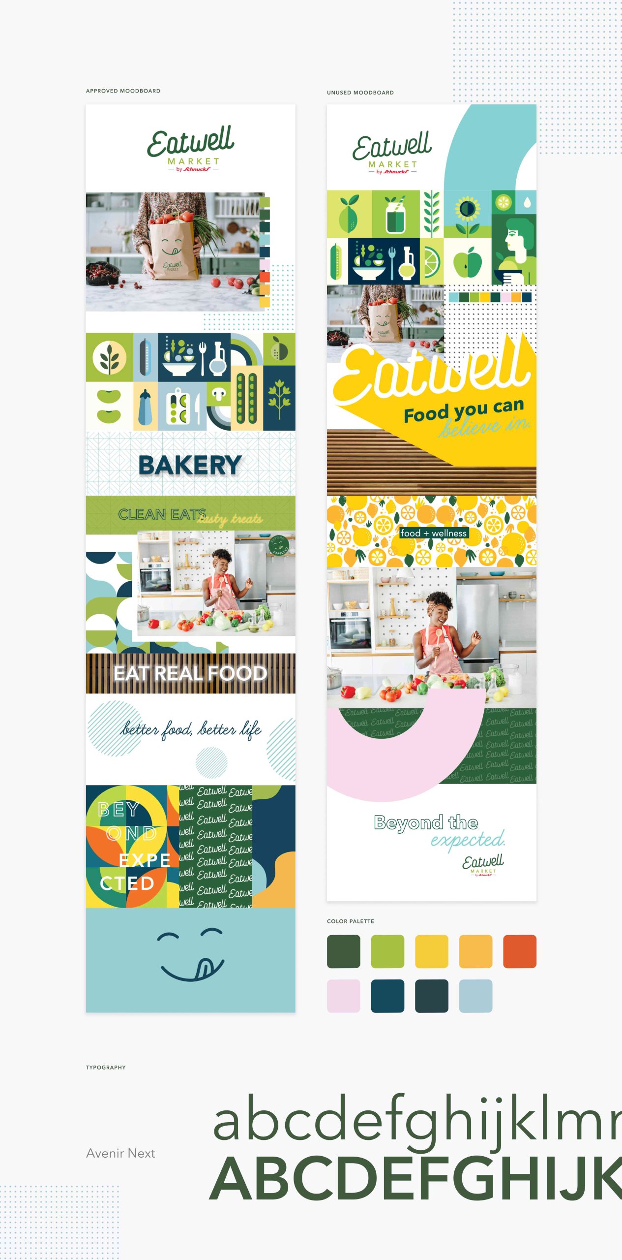
A bright idea
After making refinements to the logo, we helped Schnucks ensure the full brand identity was ready for growth.
Full Story—this content appears in the side drawer on the frontend. Click the floating “Reader View” button to preview.
Fresh perspective.
Schnucks is a St. Louis-based supermarket brand with 100+ locations and a great reputation for carrying a wide selection of groceries at affordable prices. And within that wide selection of groceries, one category has grown—and continues to grow—in popularity year after year: wellness. When Schnucks saw a desire for more natural, organic and wellness-focused products, they launched Eatwell.
Fresh perspective.
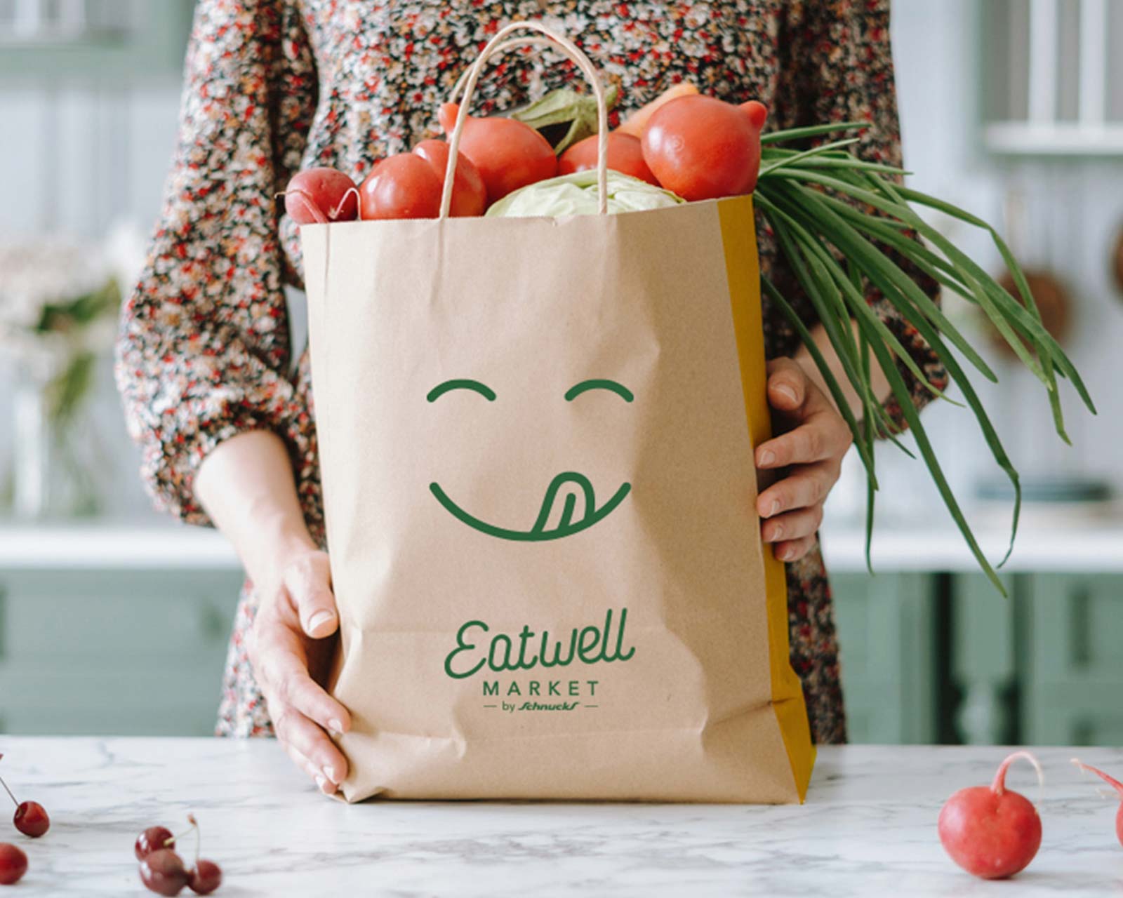
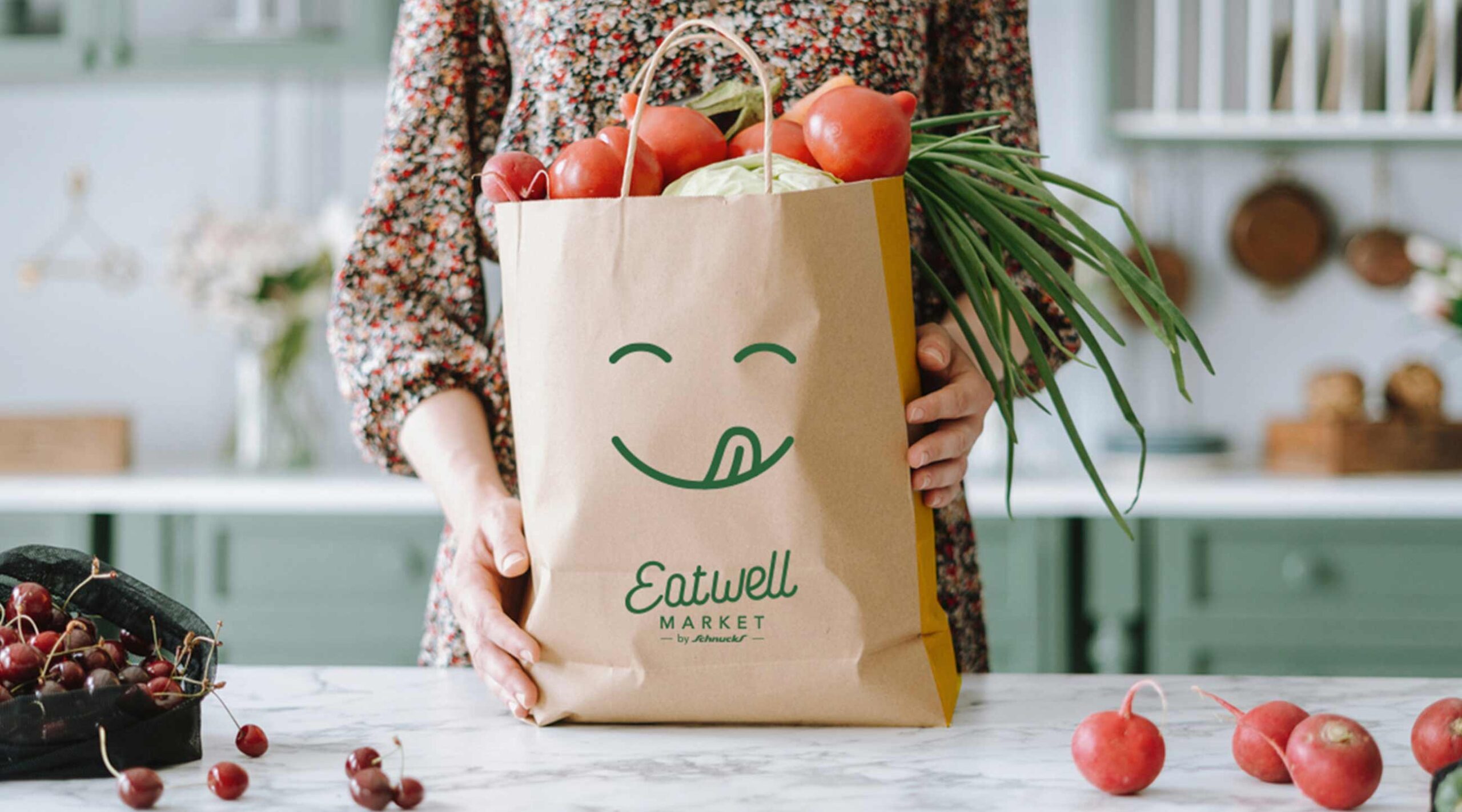
The first Eatwell location opened in Columbia, Missouri in 2020. Two years later, Schnucks was ready to open another store, this time in a suburb outside of St. Louis, and they wanted to take the opportunity to refresh and refine their brand identity before introducing it to a new market.
Flip the script.
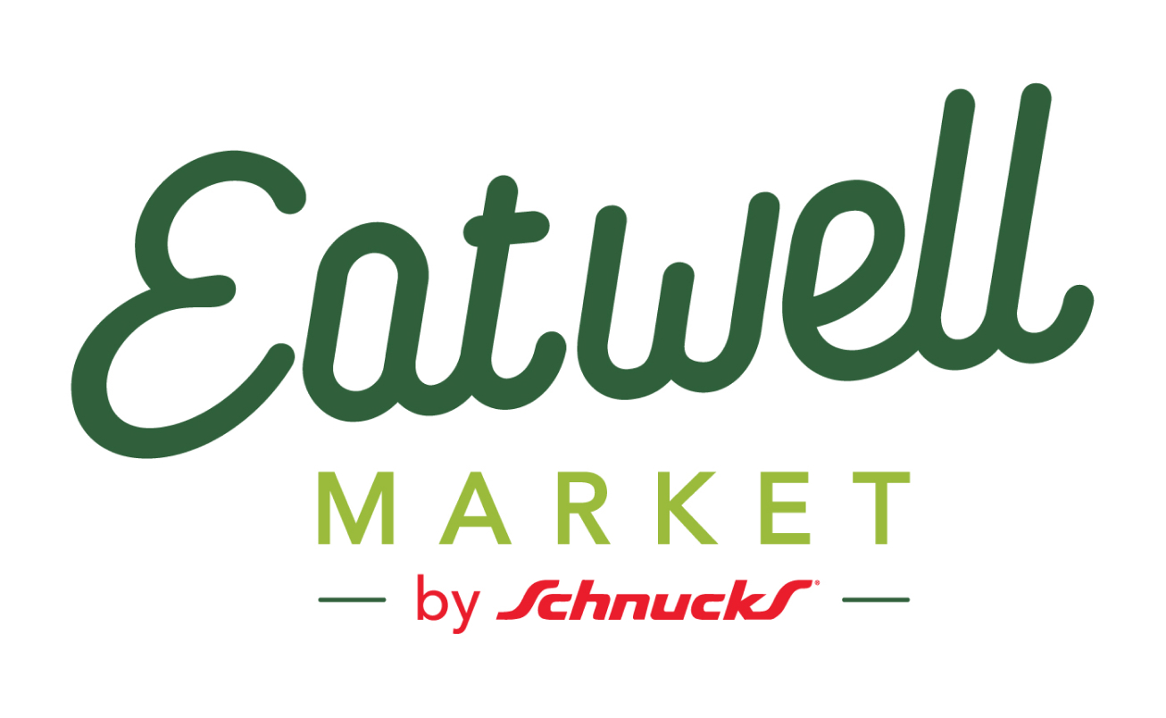
Schnucks had explored a few logo concepts before coming to Atomicdust. They’d settled on a scripted typeface that brought friendly personality to the brand, but led to readability challenges. They asked our team to evolve the concept—we provided a more refined, legible logo that preserved the welcoming energy of the original.
A bright idea.
After making refinements to the logo, we helped Schnucks ensure the full brand identity was ready for growth. We brightened the brand’s signature green and expanded the color palette to help it stand out in an environment filled with fresh and colorful ingredients. The next step was building out an inspiring “style board,” showing how the brand could live in the world, with ownable illustrations, iconography and typography designed with Eatwell’s audience—people who enjoy cooking good food with whole ingredients—top of mind.
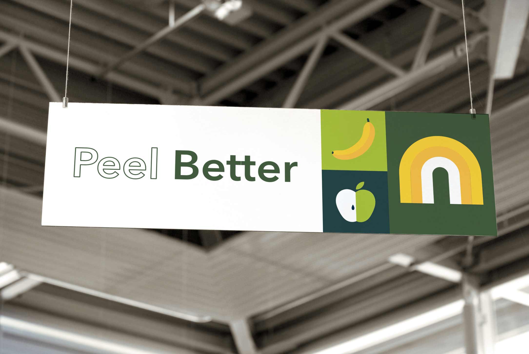
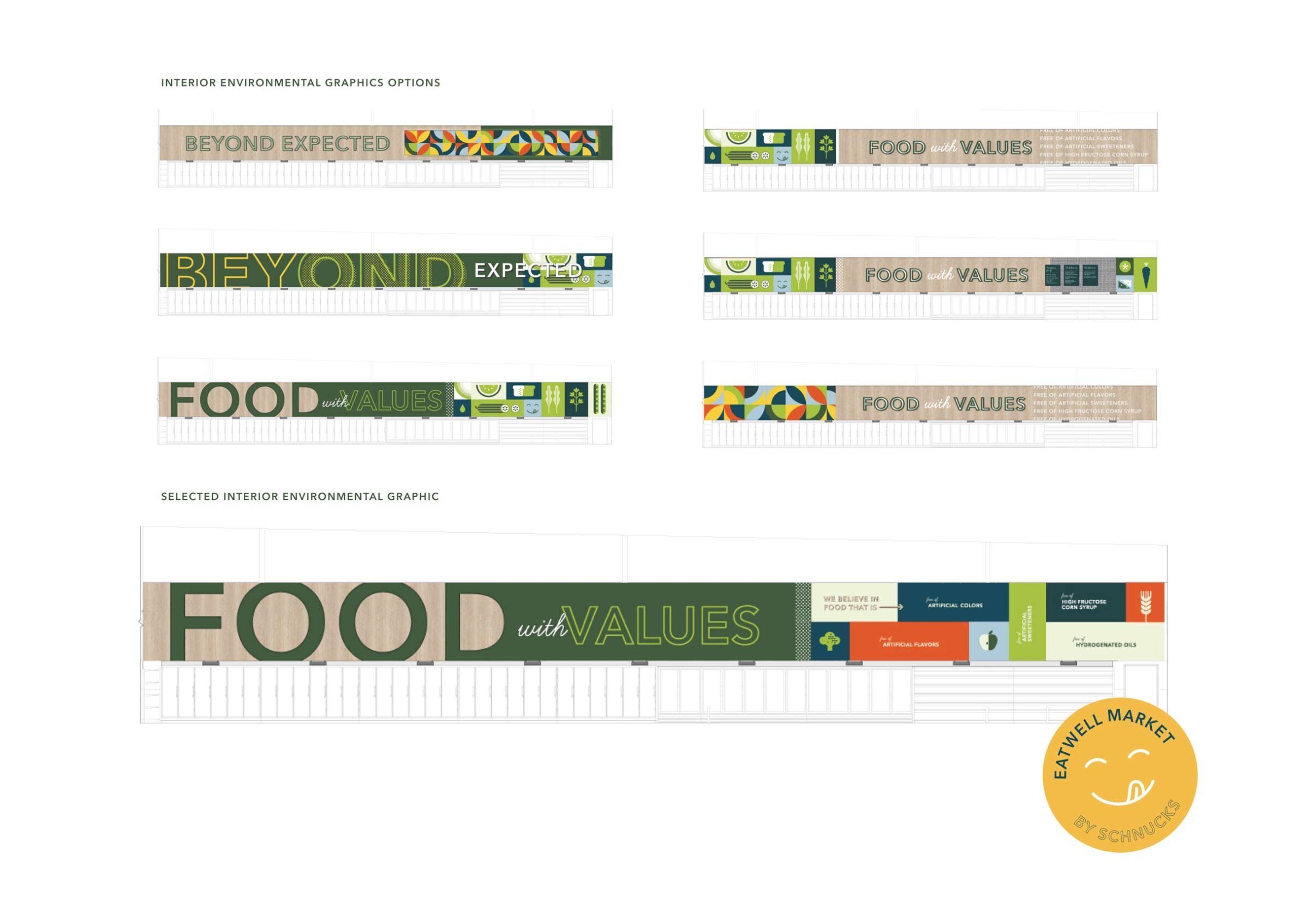
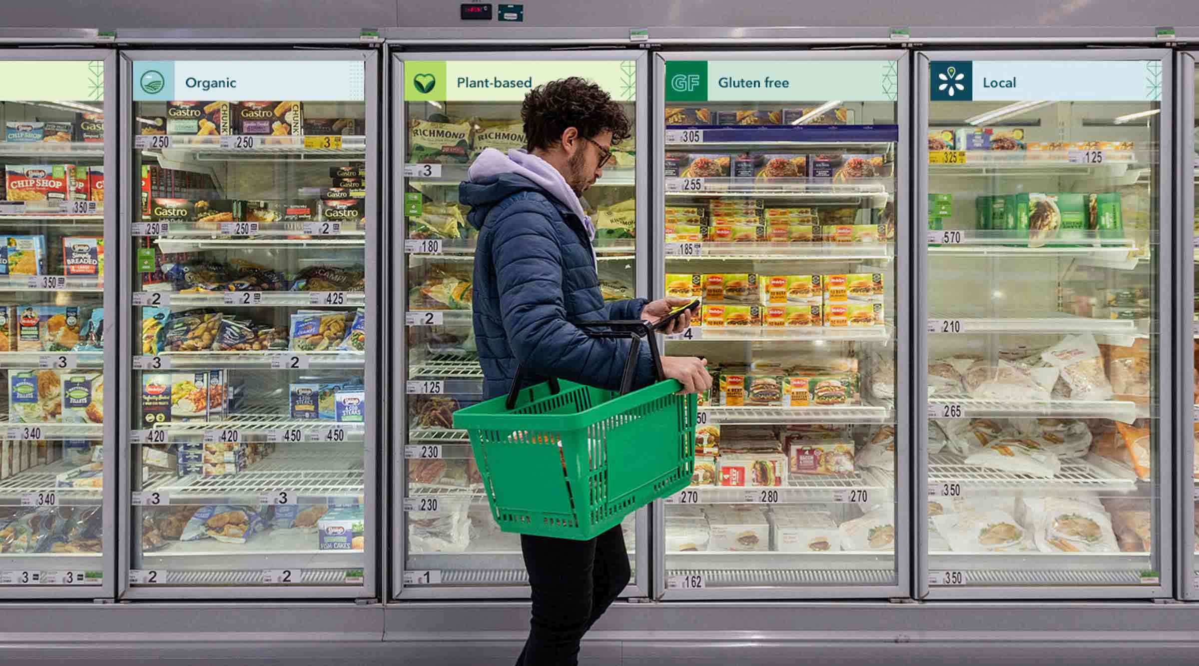
A good sign.
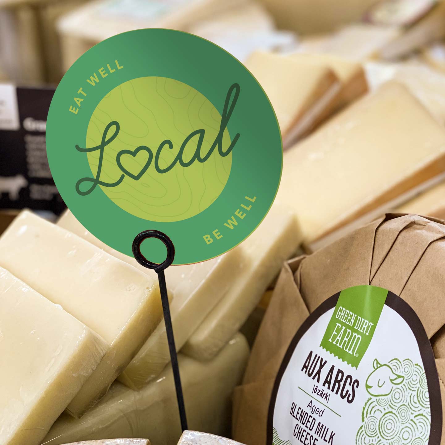
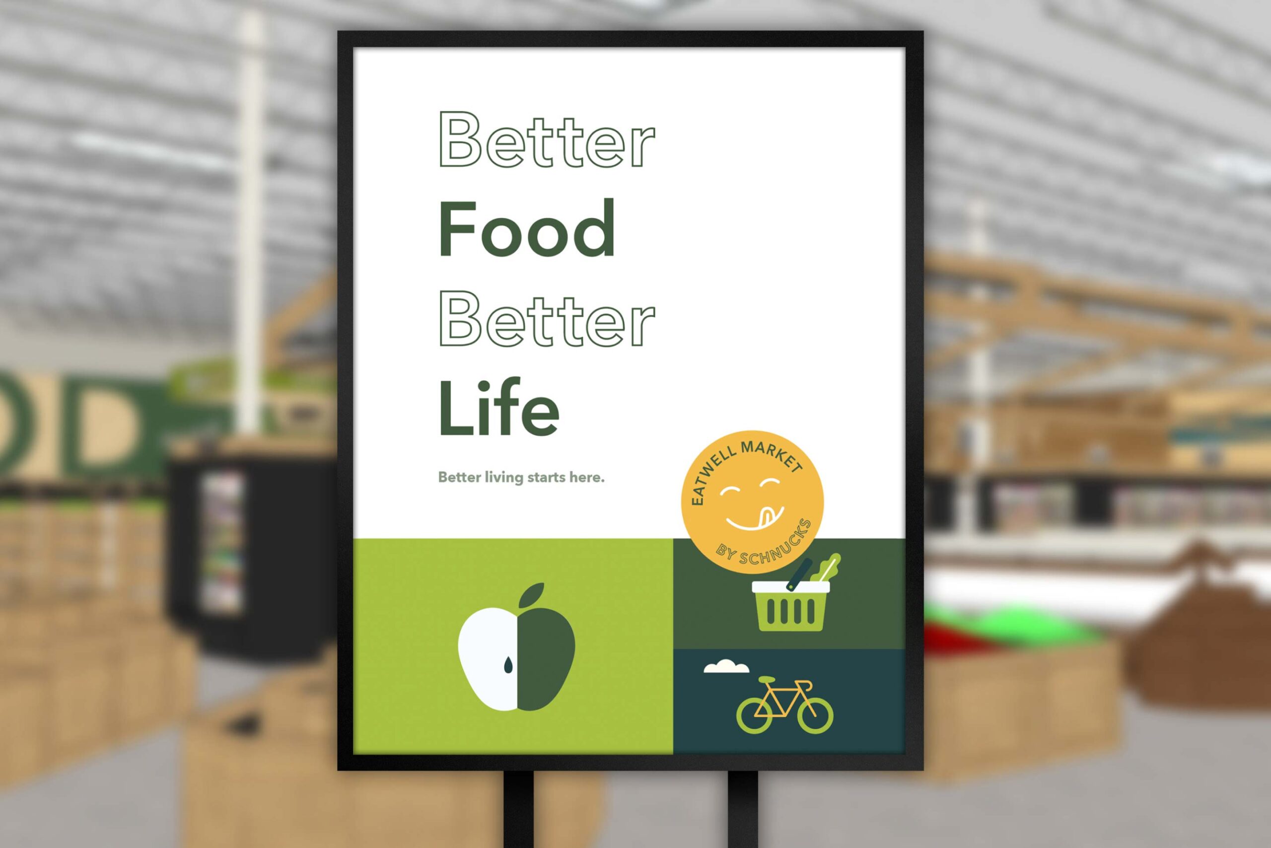
With brand elements in place, it was time to bring them to life across the store. We toured the space and worked with Schnucks’ architects to offer input on the finishes and interior design that would complement the wayfinding, promotional and environmental signage we were creating.
From huge installations to smaller shelf blades, we worked to reflect the Eatwell brand throughout the store—and spotlight the qualities that make the foods they stock so great.
Welcome to Eatwell.
Eatwell is all about bringing together good food and great people. With a brand system in place, they can do just that in an environment designed to reflect their values. The brand’s emphasis on fresh, organic and natural products is reinforced in the bright, happy designs.
Eatwell makes it easy to prioritize wellness—we’re excited to have played a part in helping the newly opened store look as great as the products on its shelves.
Launching a new concept under a trusted name?
Let's start a conversation.