Flintco

For over a century, Flintco has built some of the country’s most complex projects, but their brand didn’t reflect it. We partnered with them to create a brand identity, website, and business development toolkit worthy of a builder’s reputation.

Flintco's previous website before the rebrand

The challenge:

Spend five minutes browsing commercial construction websites and the pattern is clear: everyone talks about safety, quality and trust. Flintco had the reputation and the track record—the brand and digital presence just weren't telling that story with enough conviction.

Beyond the plans

Flintco's real differentiator isn't the complexity of the work. It's the experience of going through that complexity with them—the ownership, the accountability, the transparency. They're the team you want beside you when things get complicated.
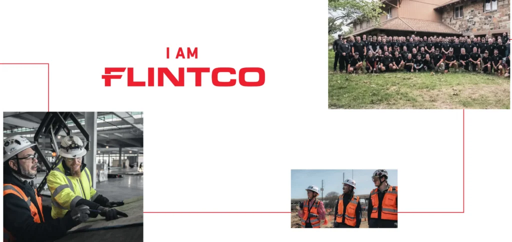
The Flintco team on the jobsite
Flintco brand narrative

Putting words to work

Once we uncovered what made Flintco different, the language came naturally. We didn't invent a voice—we captured the one that was already there. Their Creative Director's response: “I love the voice you created.”

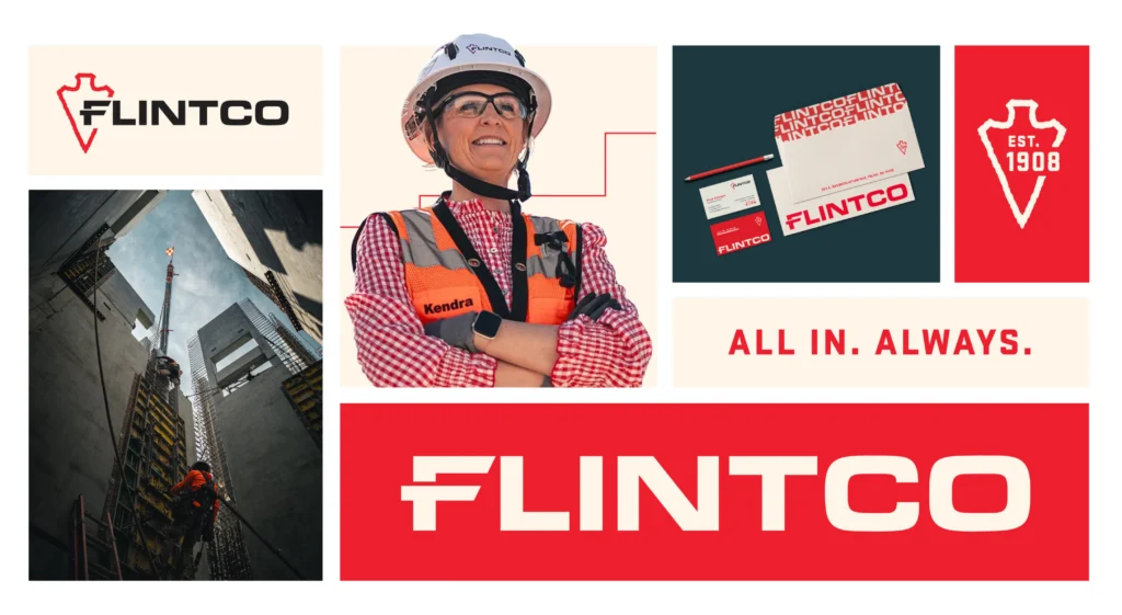
“All In. Always.” — the Flintco brand tagline

A fresh coat, and then some

Flintco already had what most brands chase: recognition. The opportunity was to honor that equity—and the Native American roots the company was founded on—while building a system to carry the brand into its next chapter.

Flintco's previous logo and color palette
The refreshed Flintco color palette

More stopping power

Clients kept calling the signature red ‘dated,’ while deep blue made the brand feel darker and more corporate than the team really is. We brightened the red to a shade with real presence—and the brand felt more confident almost immediately.

Room to work

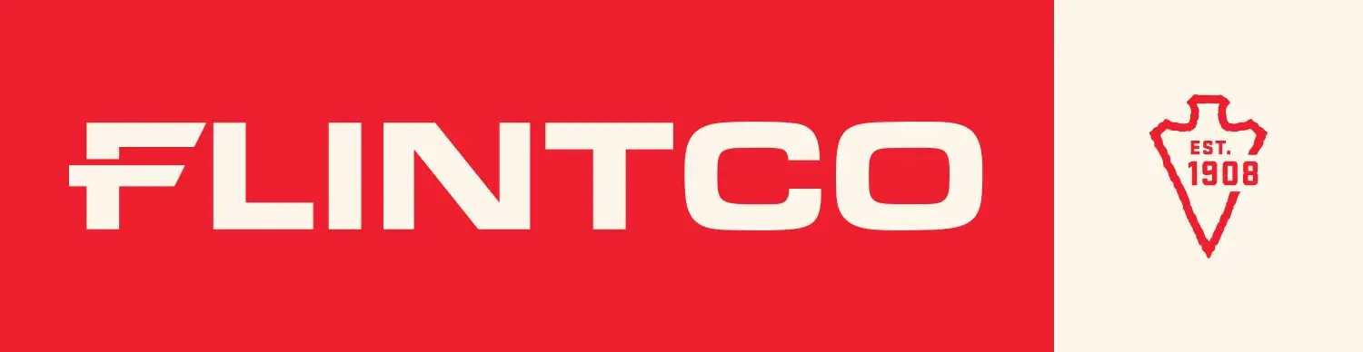
By separating the arrowhead from the wordmark, we gave Flintco a standalone icon for more touchpoints. Adding “Est. 1908” was a subtle nod to their heritage. The wordmark was built to be bold, legible and impossible to miss.

The evolved Flintco logo with separated arrowhead and Est. 1908
The Flintco logo system
The Flintco brand pattern
Flintco brand elements

A system, not a skin

Color, type, pattern and graphic elements come together into a flexible identity—grounded in where Flintco came from and clear about where they're going.
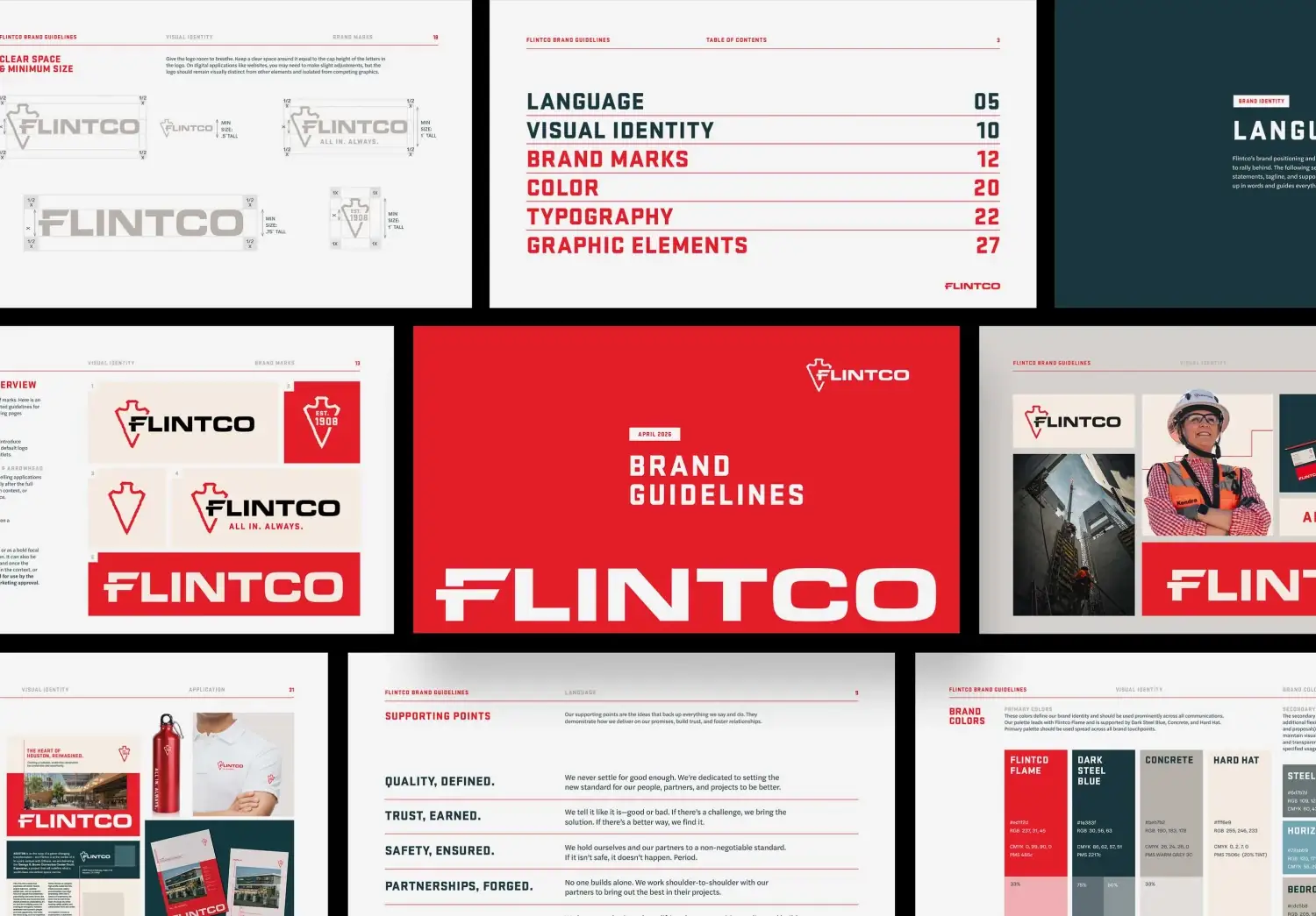
Flintco brand board
Flintco brand board detail
Flintco brand identity guidelines

Less digging, more finding

The site needed to communicate deep experience and broad capabilities while helping owners, partners and future employees each find what's relevant to them. We reworked the structure and sharpened the hierarchy so visitors move from learning, to proof, to the next step.
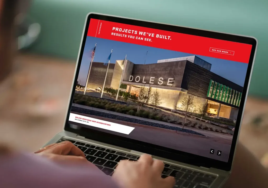
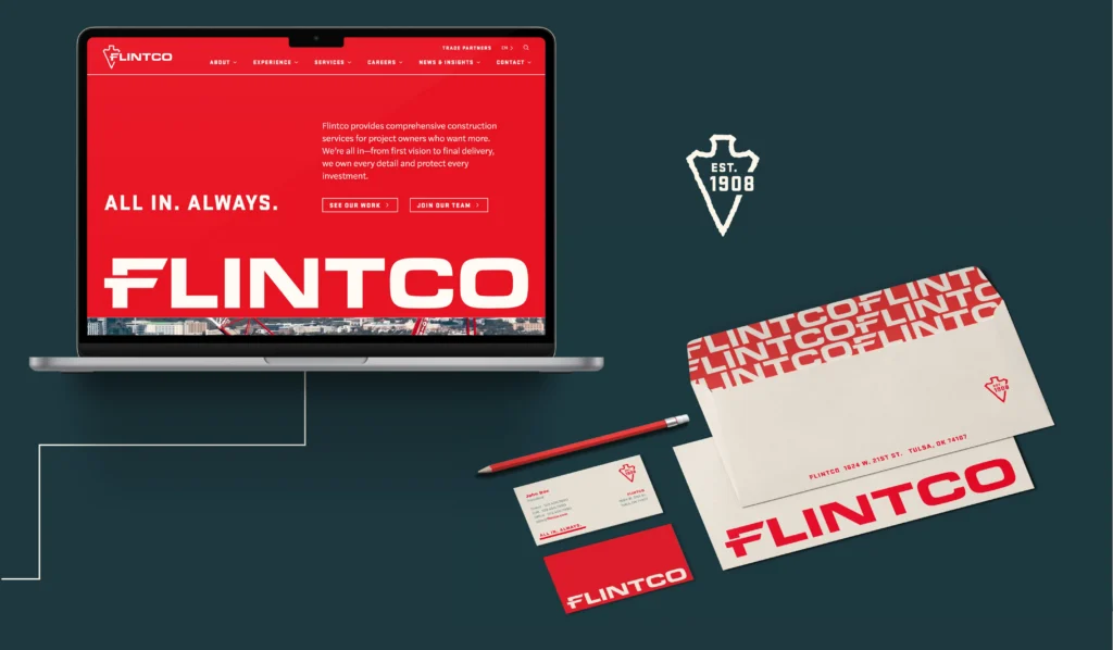
The redesigned Flintco website
Flintco homepage design
Flintco website interior pages
Real Flintco jobsite photography

Authentic by design

Real jobsite photography and video bring scale, movement and credibility—connecting the digital presence to the actual work.

Tools of the trade

We built a custom digital brochure builder and a flexible proposal template system, so business development can assemble tailored materials fast—without losing consistency in language or design.

Flintco proposal template system
Flintco proposal design
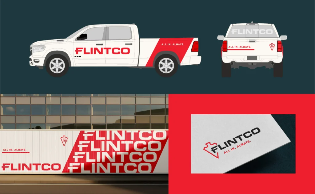
The Flintco identity on fleet vehicles

On every surface

From fleet to field, the identity shows up with confidence across the high-visibility environments where Flintco works.

Flintco print materials
Flintco jobsite hoarding board
Flintco brand postcard

All in. Always.

Sounding like everyone else.

What’s the fastest way to be forgotten? Say the same thing as everyone else. Spend five minutes browsing commercial construction websites and you’ll start to see the pattern—every firm talks about safety, quality, integrity and trust. All good things. All necessary things. But when everyone says the same thing, no one truly stands out.

Flintco provides comprehensive construction services and serious expertise to complex projects around the country. They have the track record, the credibility and the trust of the people who work with them. Internally, their team knew exactly what they stood for. But in the market, the brand and digital presence weren’t telling that story with enough clarity or conviction—and the identity wasn’t fully reflecting the strong, positive experience clients and partners already had with the company. So Flintco came to Atomicdust to close that gap.

Beyond the plans.

Within the Flintco team, people were down-to-earth, confident and humble. They cared about their work, their clients and each other. From the outside, people saw them as honest, dependable and genuinely collaborative. Their role requires technical depth, of course—but technical expertise was only part of what people valued about Flintco.

What people remembered was the way Flintco worked. The ownership. The accountability. The transparency. Again and again, we heard the same idea in different forms: Flintco’s difference is how they show up. They were the team people wanted beside them when things got complicated, and the kind of partner that made hard projects feel handled. The real differentiator isn’t the complexity of the work alone—it’s the experience of going through that complexity with them. And that was the story we needed to tell.

Putting words to work.

Once we uncovered what made Flintco and its approach different, the language came naturally. The new narrative gives the brand a way to express not just what the company delivers, but the character behind the work. Just as importantly, it helps Flintco stand apart without relying on the obvious, overused language that makes so much of the category sound the same.

Clients want to know the people they meet in the pitch are the same people they’ll get on the job. When the language reflects that consistency, the brand becomes more believable. When we presented the brand language, their Creative Director told us, “I love the voice you created.” But the truth is, we didn’t create the company’s voice—we uncovered what was already there and captured it in a way that felt right to them and would resonate with their audience.

A fresh coat, and then some.

Flintco already had something most brands spend years trying to build: recognition. People knew the name and the Native American roots it was founded on. The opportunity was to honor that equity while creating a visual system that could carry the brand into its next chapter—and the color palette was the first place we started.

In conversations with Flintco’s clients, one thing kept coming up. The Flintco Red, often described as maroon, felt dated. At the same time, their materials leaned heavily on deep blue, which made the brand feel darker and more corporate than they really are. It felt off—because when you spend time with the Flintco team, you feel energy, momentum and pride. So we brightened their signature red to a shade with more stopping power, and the brand felt more confident almost immediately.

Then we looked at the logo. The existing mark had the necessary components; it just needed room to work. By separating the arrowhead from the wordmark, we gave the brand a standalone icon that could appear across more touchpoints without always requiring the full logo. Adding “Est. 1908” was a subtle but meaningful nod to their heritage. And because Flintco operates in high-visibility environments where a brand has seconds to make an impression, we made sure the wordmark could do that job on its own: bold, legible and impossible to miss.

Less digging, more finding.

When you’re working on major construction projects, there’s a lot to communicate. Flintco’s website needed to do more than list services or showcase projects. It needed to communicate deep experience, broad capabilities and a strong point of view—all while helping different audiences find the information most relevant to them. Owners, partners and prospective employees don’t come to the site with the same questions, so the experience couldn’t treat them the same way.

The redesign focused on making that complexity easier to navigate. We reworked the structure, sharpened the content hierarchy and created clearer pathways, so visitors could move from learning about Flintco, to seeing the proof points, to taking the next step more naturally. The homepage now introduces “All in. Always.” right away, leading with a stronger brand promise from the start. And real jobsite photography and video bring scale, movement and credibility—helping the digital presence feel connected to the actual work.

Tools of the trade.

Our work didn’t stop at the website. To help Flintco’s business development team leverage the new brand to bring in new projects, we developed a custom, digital brochure builder that makes it easier to assemble materials for specific prospects and projects. Instead of starting from scratch each time, the team now has a flexible way to customize the story and content without losing consistency in language or design.

We also developed a sophisticated, flexible proposal template system, so the sales teams could customize how they need each proposal to work. The new proposals look better—but more importantly, the brand is more usable in the real, fast-moving moments where it needs to perform. Because a brand like this has to do more than show up in a presentation. It has to support the trust Flintco has spent years earning.

The finishing touches.

For Flintco, this project wasn’t about a new look. It was about creating a brand experience that better reflects the company’s deep heritage, high standards and commitment to the people and projects behind the work. A century in, they had already built a solid reputation. This branding and website work helped create an experience that matched it. It was a pleasure to partner with Flintco’s team throughout the process, and we’re excited to see where they go next.

Have a reputation your brand isn’t living up to?

We help established companies build brands as strong as the work behind them.

Let’s talk about your project.

You’ve seen what we can do. Now let’s do it for you.

How does your brand score?

Run the free scan and see how you read to buyers — in about 20 seconds.

More brands that never settle.

  • InfoPlus

    InfoPlus

  • Kadean Construction

    Kadean Construction

  • Didion

    Didion

  • Vantage Credit Union

    Vantage Credit Union

  • Harbour Group

    Harbour Group

  • Cottle Village

    Cottle Village

  • WashU Law

  • Gateway Health Partners

    Gateway Health Partners

  • MEM

    MEM

  • Chicken Meets Rice

    Chicken Meets Rice

  • Lightedge

    Lightedge

  • Acosta

    Acosta

  • InfoPlus

    InfoPlus

  • Kadean Construction

    Kadean Construction

  • Didion

    Didion

  • Vantage Credit Union

    Vantage Credit Union

  • Harbour Group

    Harbour Group

  • Cottle Village

    Cottle Village