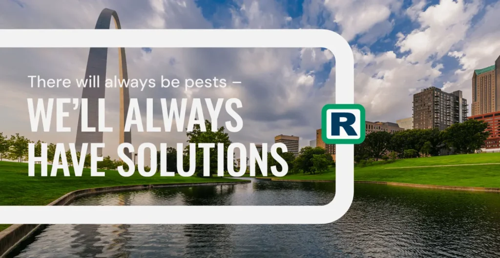
Setting sights beyond the city.
Rottler is a household name in St. Louis, but as the family-owned company looked to reach new markets, it needed an identity that could grow with it without losing the familiarity and trust it had already built.
Zeroing in on the advantage.
Research into Rottler’s customers, competitors and existing marketing revealed what set the company apart in a crowded category. It offered the personal service of a local team with the resources and expertise of a much larger company.
Making it more personal.
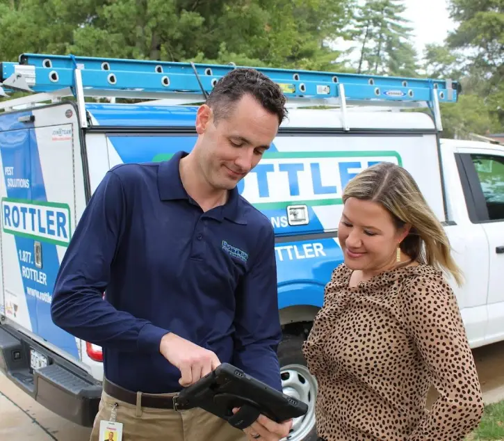
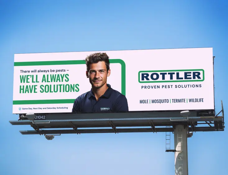
Updated messaging and collateral moved the focus beyond promotions and pest control services to the care behind them. Simpler layouts, bolder copy and technician photography give Rottler a more human presence that can connect with customers in St. Louis and beyond.

Building on the familiar.
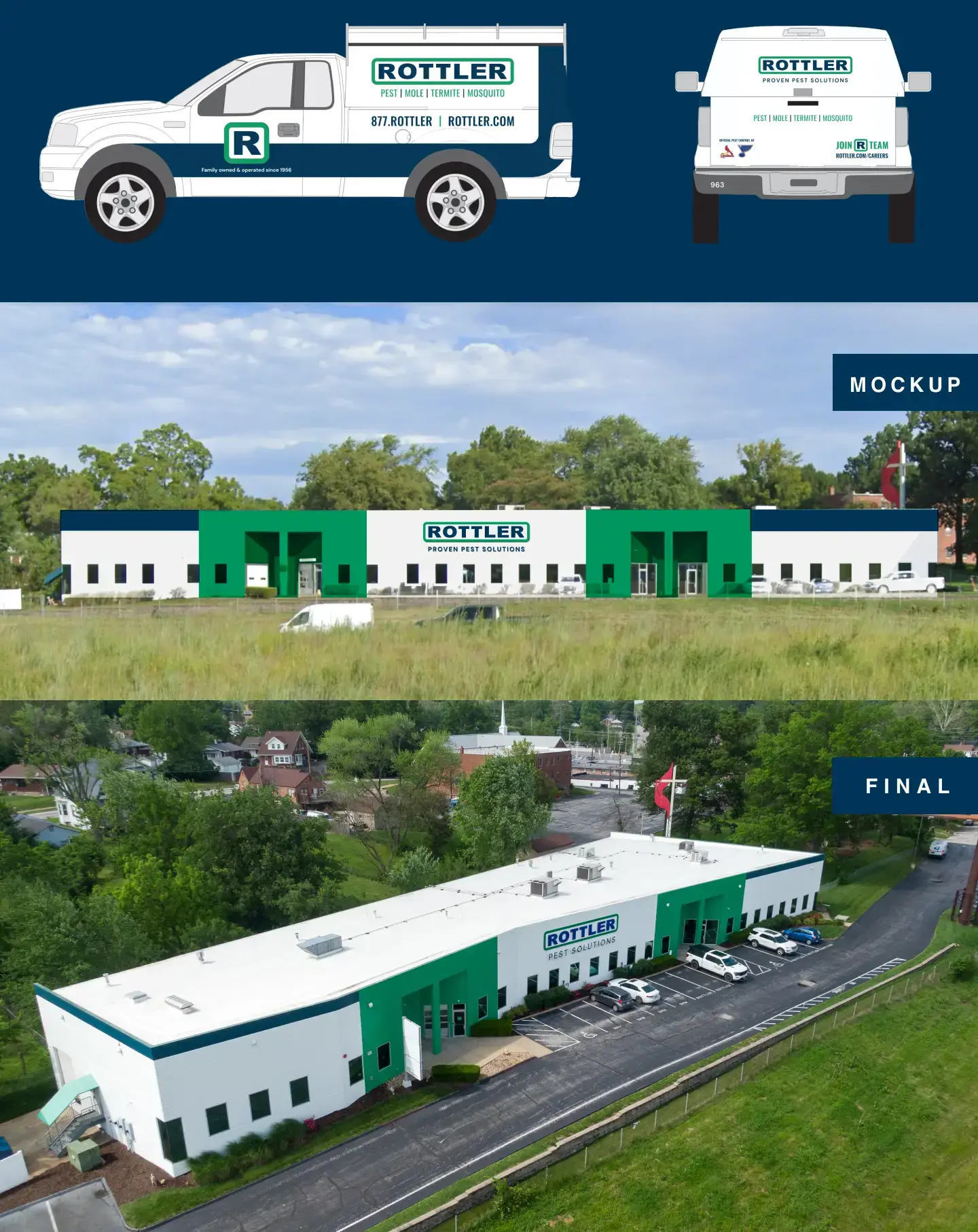
Instead of starting over, we sharpened what people already recognized with updated colors, messaging and a more flexible visual system. Graphic elements pulled from the logo turned Rottler’s promise of protection into a recognizable visual device.

Full Story—this content appears in the side drawer on the frontend. Click the floating "Reader View" button to preview.
A pesky challenge.
A family-owned company with a strong reputation, Rottler Pest Solutions was ready to strengthen their already recognizable brand to help them do more. They asked Atomicdust for a strategic approach in creating a more consistent—yet flexible—brand identity.
A pesky challenge.
Rottler’s branding hadn’t evolved as quickly as the company had grown, and it didn’t reflect its core values and capabilities. And while the respected pest control company is a household name in the St. Louis region, the company had its sights on increased brand awareness in markets farther afield.
Inspection and detection.
An effective brand strategy starts with understanding the company’s market and audience. We immersed ourselves in the world of pest control, conducting stakeholder interviews, analyzing competitors, scouring through customer reviews, and evaluating Rottler’s existing positioning and marketing materials.
What we found set the stage for a refreshed brand: In the saturated pest control industry, Rottler has the best of both worlds—the friendly teams and personal touch you expect in a local company with the resources and expertise of a national name. The brand just needed to communicate that difference.
A branded barrier.
Rottler’s brand identity needed to mature, while still staying familiar enough to maintain brand recognition. The solution is nuanced—a subtle yet impactful evolution conveying the company’s established position at the forefront of the market. A refreshed color palette and revamped tagline ensure the logo remained a symbol of reliability and professionalism. Echoing the border in the logo, a system of graphic devices represent Rottler’s ability to surround customers with protection.
Long-term solutions.
Whereas much of Rottler’s previous marketing focused on the transaction—with special offers and service information—the new brand positioning emphasizes the proactive, personal care its customers receive. Updated collateral, with simpler designs, bold copy and photos of Rottler technicians drive home the brand’s human touch.
Rottler’s refreshed brand stays true to the company’s roots while giving the brand a strong enough voice to resonate in new markets. It all adds up to a framework for growth—many protected, satisfied customers and communities at a time.
Ready to evolve your brand with nuance?
Let's start a conversation.