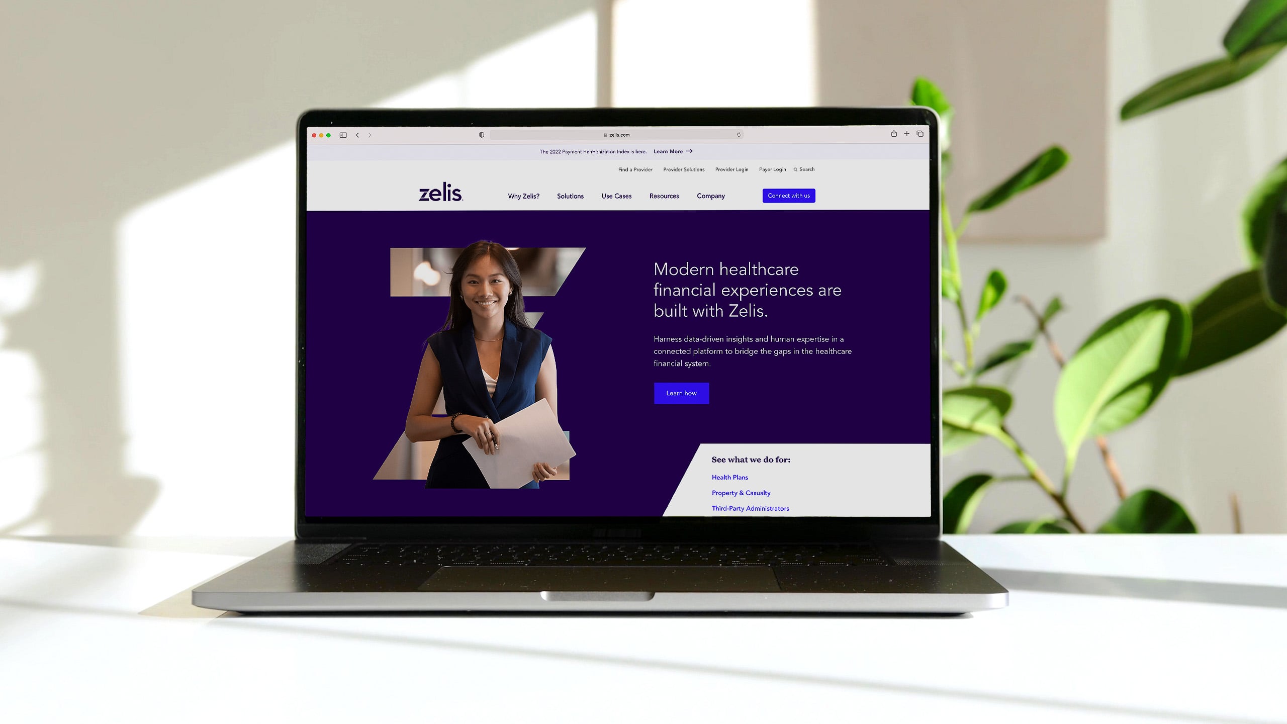
Eliminating friction
The healthcare payments process is a maze of regulation, red tape and communication with numerous parties.
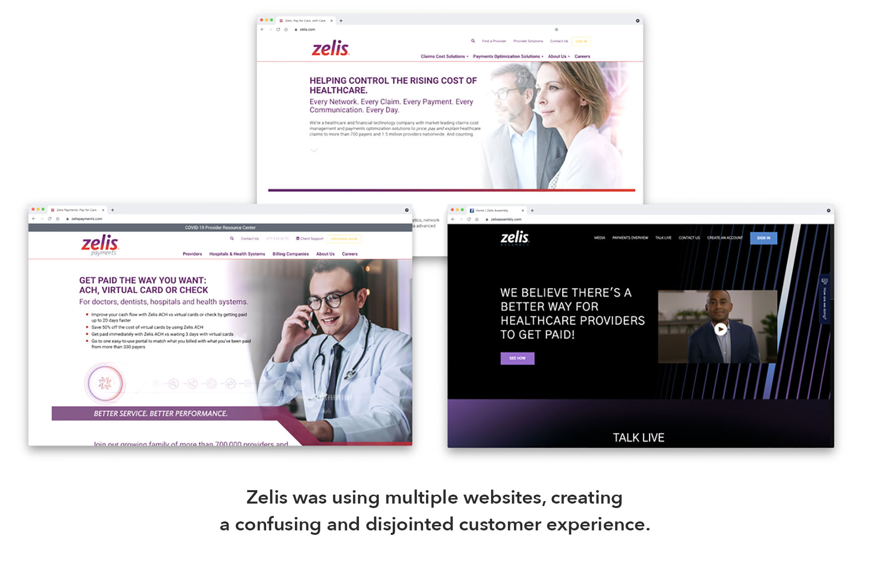
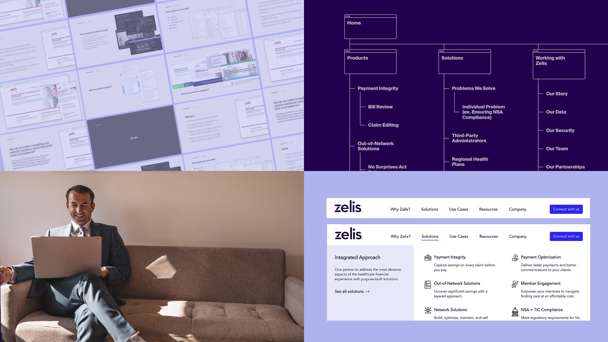

Simplicity is key
Serving hundreds of payers and 1 million providers, Zelis’ website needed to speak to multiple audiences and simplify a complex library of information.

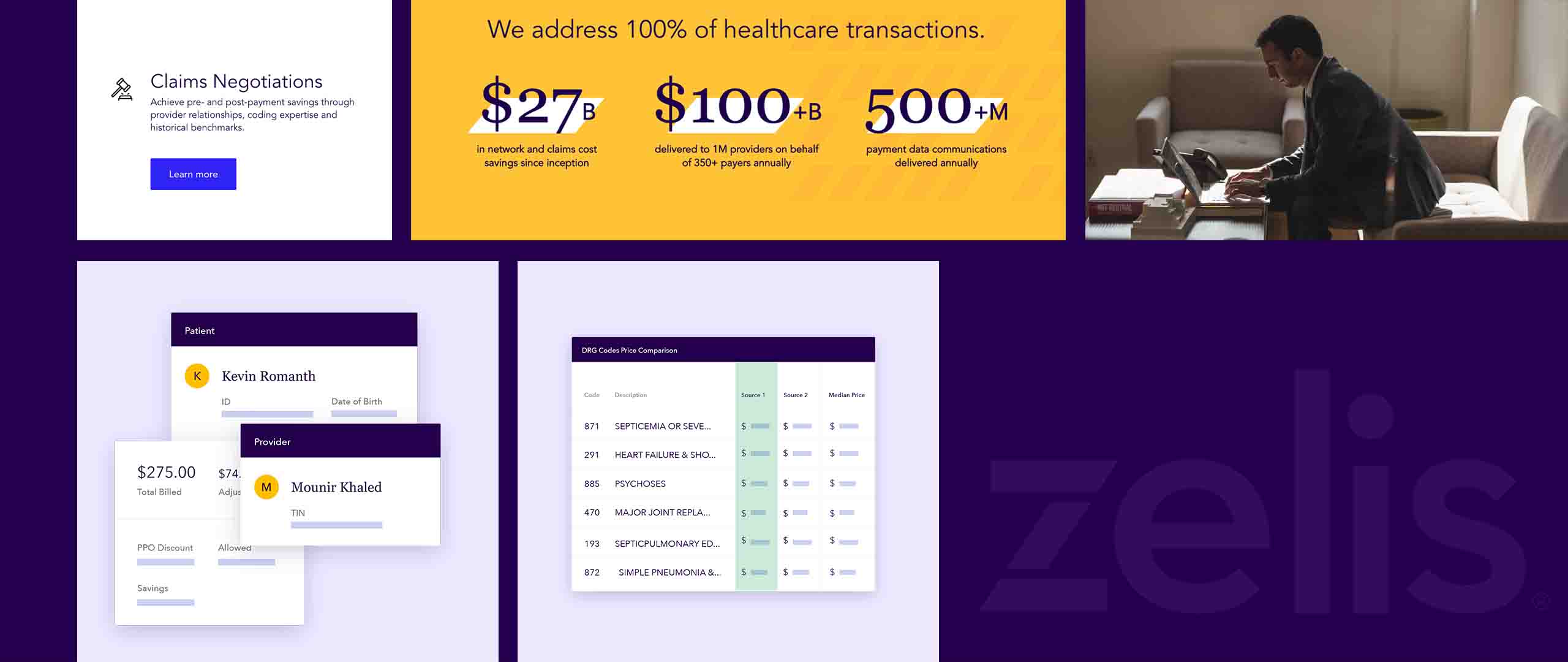
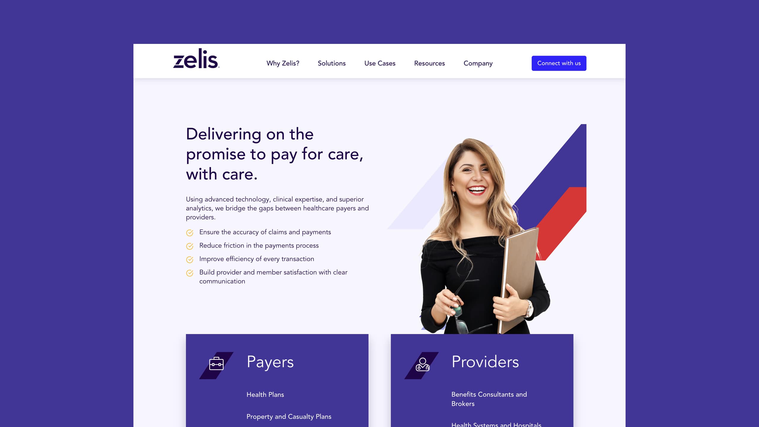
All in a letter
The diagonal stroke of the Z in Zelis instantly created an ownable graphic device that could be used in numerous applications, from photos to animations.
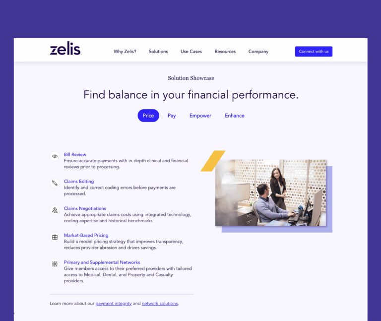
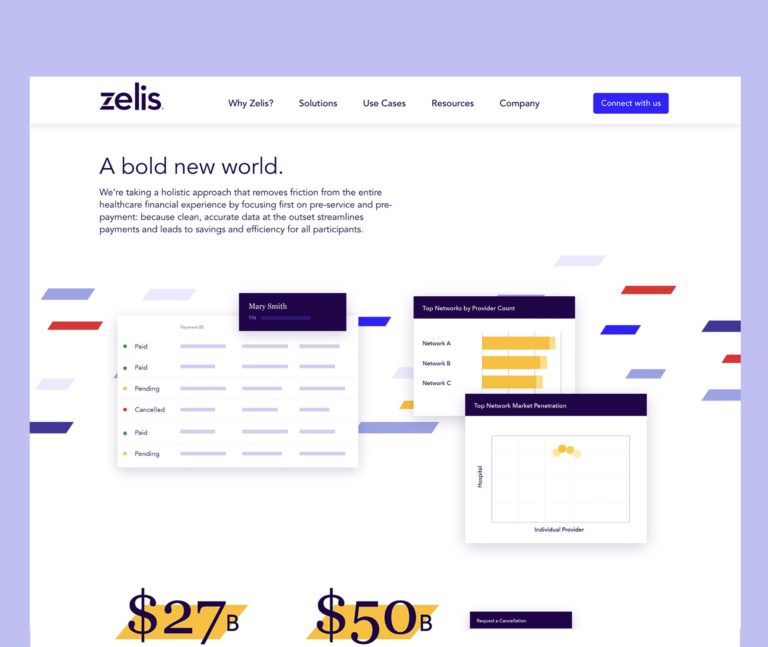
Bridging the gap
A prominent “Connect with us” button appears on all pages, emulating the simple, seamless experience Zelis provides its clients—and emphasizing how all their solutions bridge the gaps in the healthcare financial system.
Full Story—this content appears in the side drawer on the frontend. Click the floating “Reader View” button to preview.
Eliminating friction.
Zelis leads the way in streamlining and clarifying healthcare payments for everyone involved. The company brings payers, providers and consumers together to improve healthcare claims and remove friction—making the process more efficient and cost-effective.
Eliminating friction.
The healthcare payments process is a maze of regulation, red tape and communication with numerous parties. Zelis offers an agile payment solution that modernizes the financial experience and ensures compliance with changing market conditions.
As the company grew, it turned to Atomicdust to create a website that would tell its story and keep up with industry changes for years to come.
Simplicity is key.
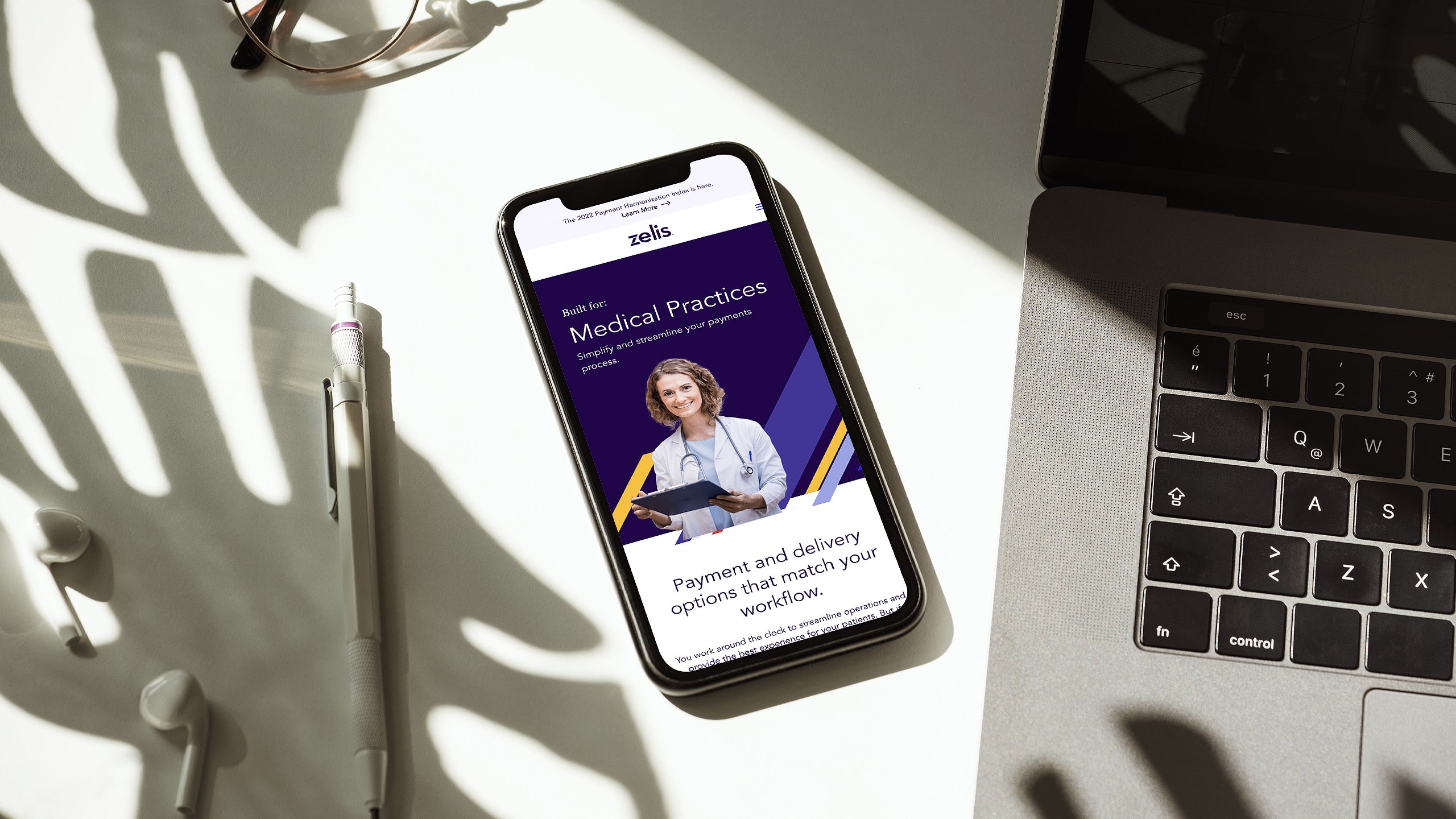
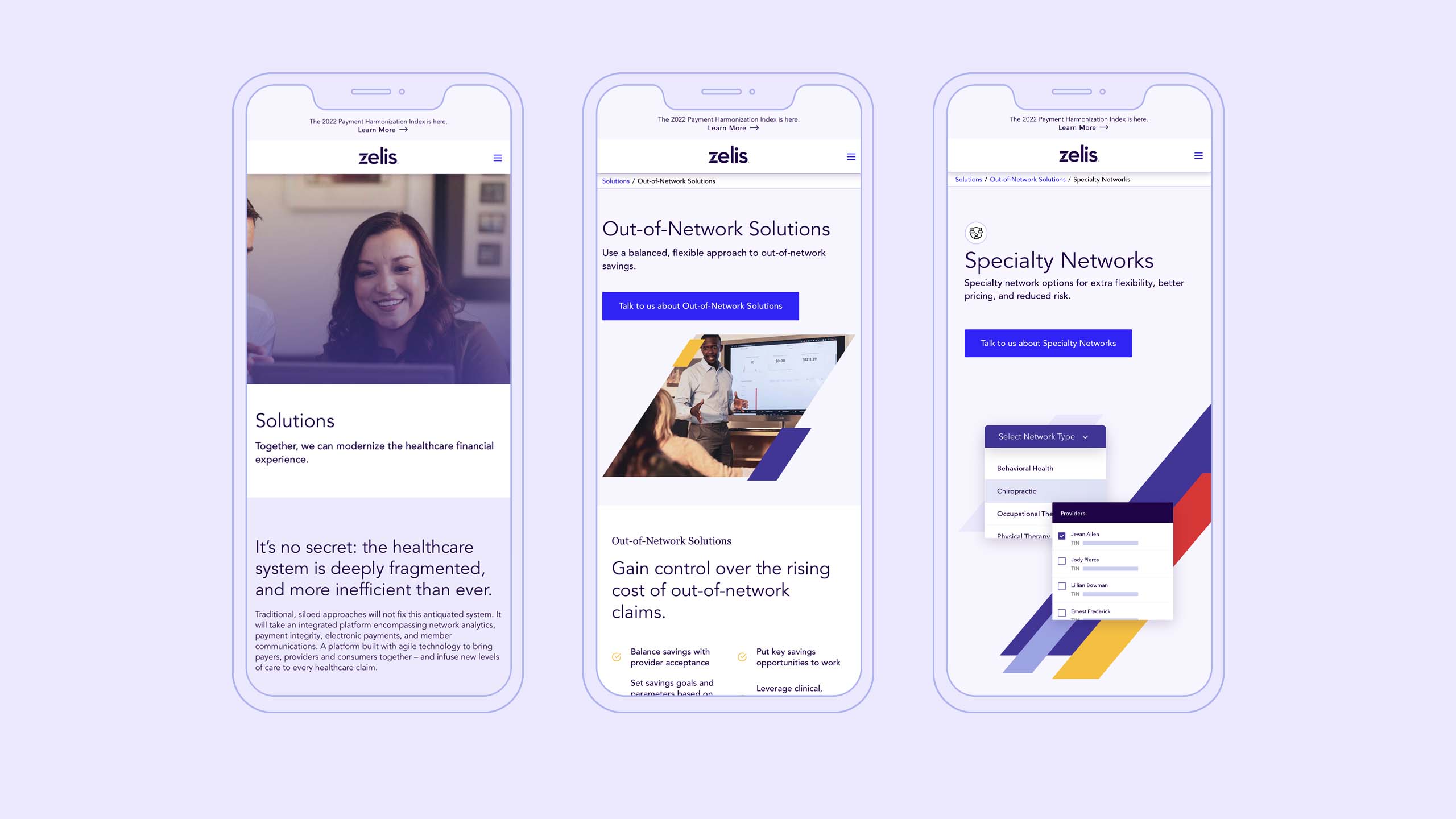
Serving hundreds of payers and 1 million providers, Zelis’ website needed to speak to multiple audiences and simplify a complex library of information. For the site’s structure and pages, a systematic approach was crucial.
By framing the navigation options around solutions and benefits instead of features and functions, we were able to make exploring the website easy and seamless for all visitors, regardless of their background.
All in a letter.
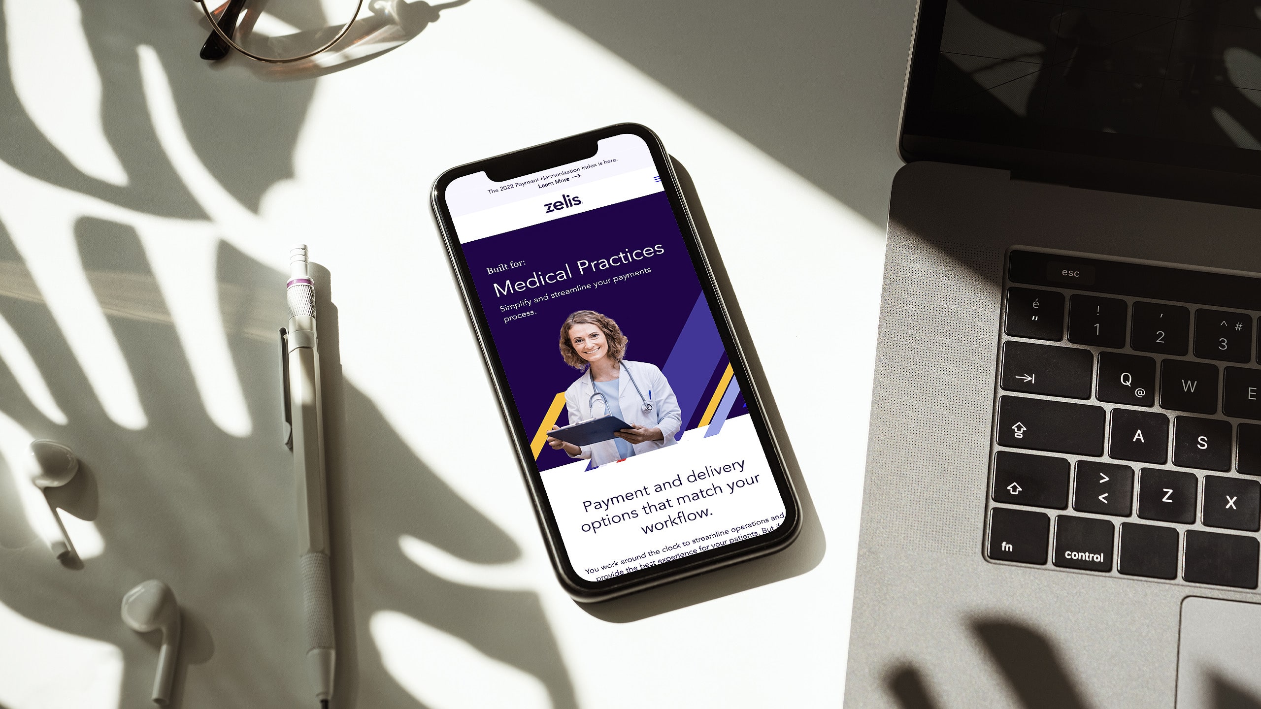
The diagonal stroke of the Z in Zelis instantly created an ownable graphic device that could be used in numerous applications, from photos to animations. A color palette with red, purple and yellow helps Zelis stand out against other healthcare fintech companies.
Throughout the pages, we added vibrant spots of color, or “confetti,” along with video masks and block textures to create a cohesive experience from page to page.
Bridging the gap.
A prominent “Connect with us” button appears on all pages, emulating the simple, seamless experience Zelis provides its clients—and emphasizing how all their solutions bridge the gaps in the healthcare financial system.
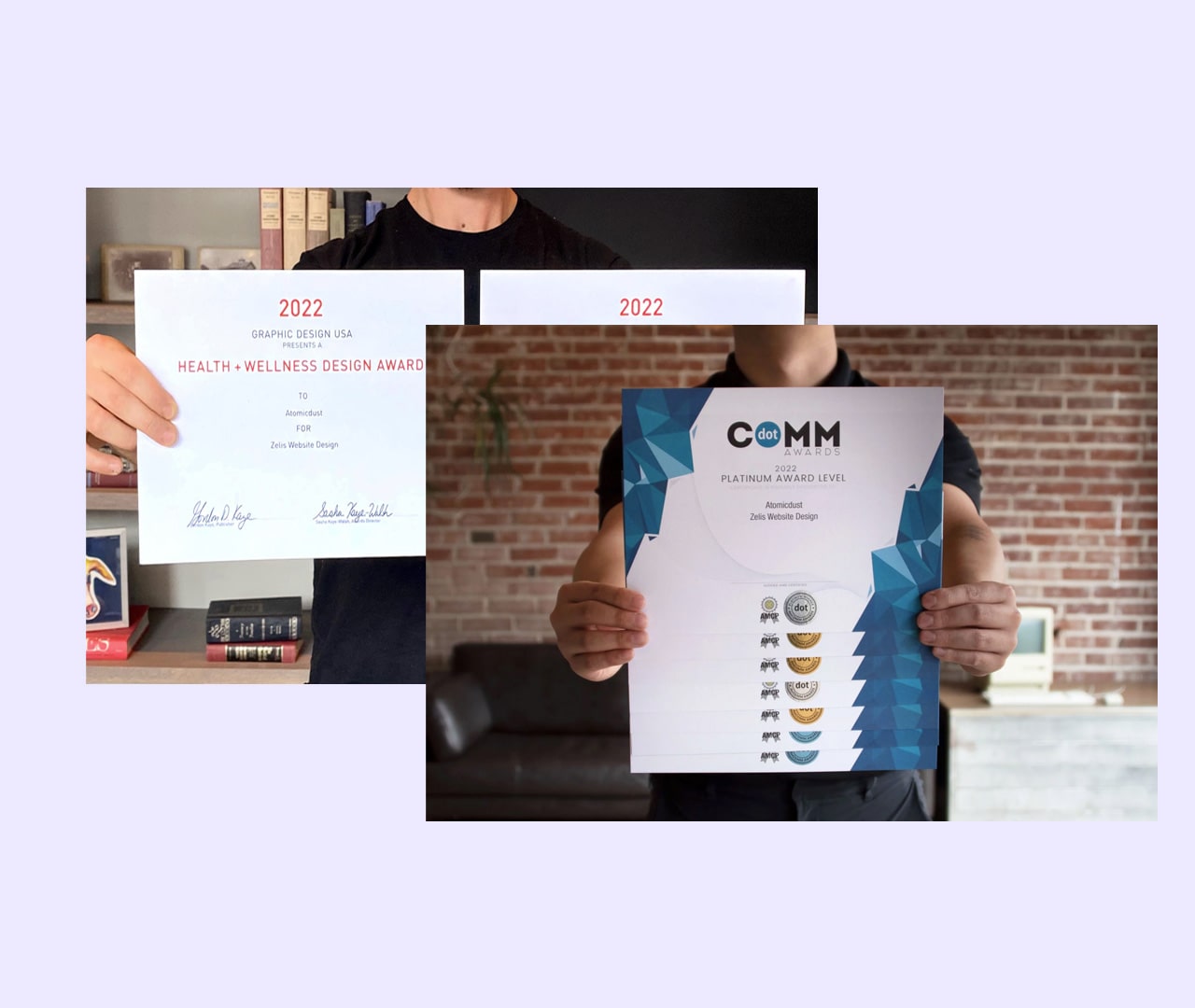
We’re proud to have helped Zelis find the right balance for their clients, and others agree. Zelis’ redesigned website earned a 2022 dotCOMM Award and 2022 Graphic Design USA Health + Wellness Award.
Ready to eliminate friction for your customers?
Let's start a conversation.