Bringing Balance to Healthcare With the Zelis Web Design
There are few things as regulated, process-heavy and complicated as the healthcare industry.
Just think of all the people involved—the patient, the providers, insurance companies and more—and how many rules and steps there are for just an annual physical, let alone a complicated procedure or long hospital stay.
Zelis, a leading healthcare payments company, uses data as well as both human expertise and artificial intelligence to make the process more affordable and transparent for all. It’s a big challenge, but one the company is achieving for more than 700 payers, millions of providers and over one hundred million members.
They asked us to make a website that would tell their story.
A complex process and fast deadline
When we started working on the new Zelis website design, the company’s new brand messaging was still in flux. So was their product naming and hierarchy. Their team was growing, with new decision-makers coming on board. Thought leadership content and product details were spread across multiple websites.
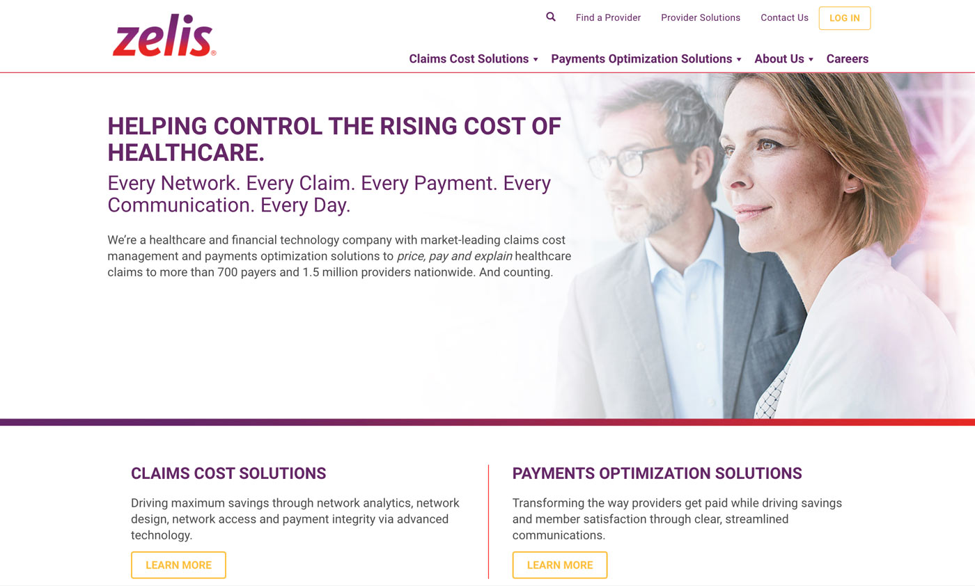
A screenshot of Zelis’ old website
This isn’t an unusual set of challenges when it comes to healthcare websites. The industry moves and changes all the time. Companies evolve. Larger companies gobble smaller ones. New regulations turn everything upside down in an instant.
So while Zelis’ new website needed to speak to multiple audiences and convey complex information, it also needed to mirror the efficiency and transparency that Zelis provides to clients. It was our job to find the right balance between expected and unexpected—creating a site unique enough to be memorable, but not so unusual that visitors feel lost or skeptical.
And we only had a few months.
A team and a plan
We knew from the get-go that the project timeframe would be tight. We didn’t know, though, how we would make it all happen.
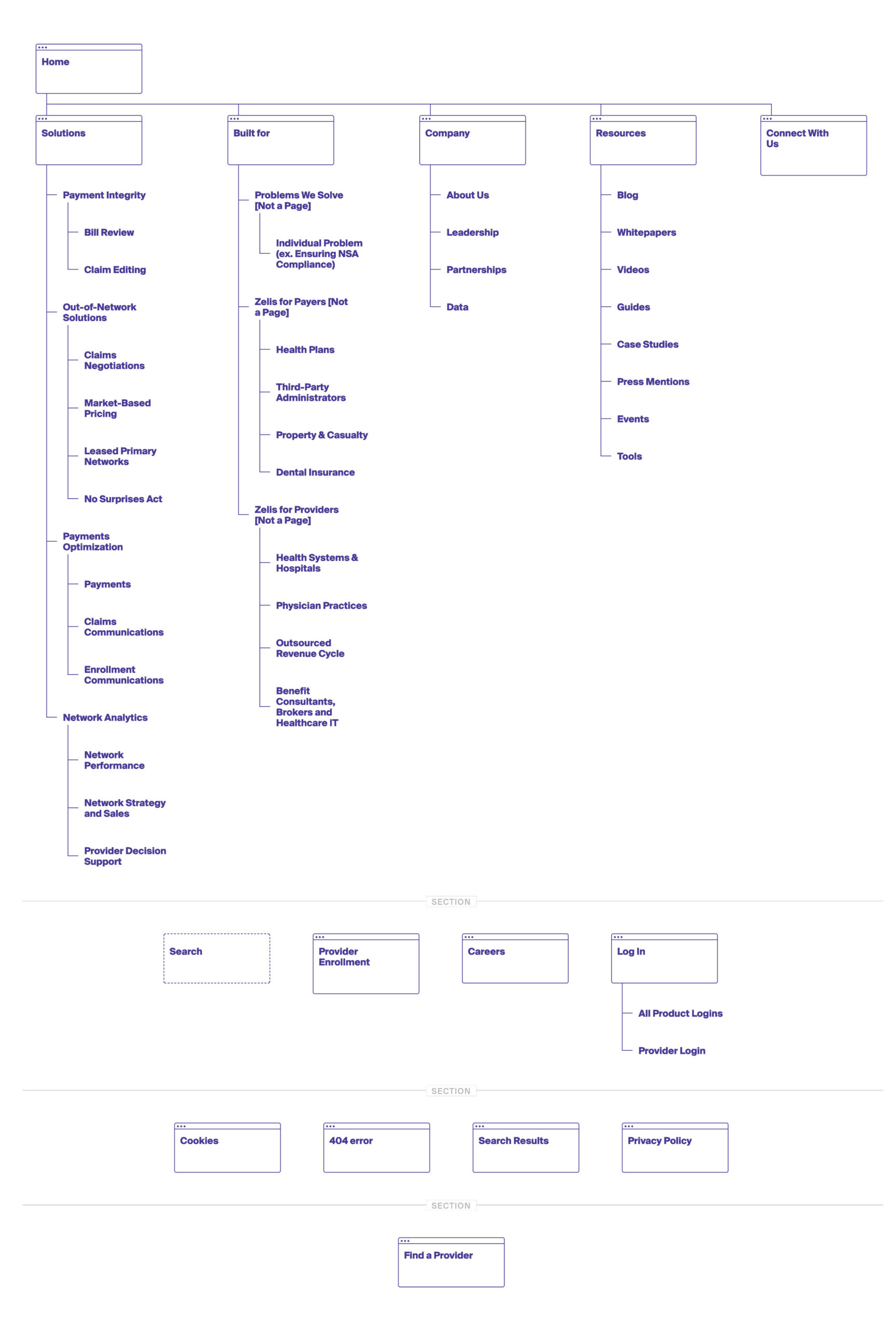
Eventually, we realized we couldn’t. Couldn’t launch the entire site, at least, by the deadline. But we could launch most of it and continue adding to it after the initial launch. We worked with the client to identify the most critical pages to prioritize first. It was most of the site, to be sure—but leaving out some development-intensive elements like thought leadership content and other pages let us focus on the core products and kept us on target.
We forged ahead with the plan.
The details of healthcare—and web design
The healthcare fintech industry is full of blues and greens. Zelis’ new brand colors of red, purple and yellow immediately set it apart.

Inspired by the diagonal stroke in the Z of Zelis, we created video masks, block textures and what the client eventually started calling “confetti”—spots of color that give pages dimension and cohesiveness.
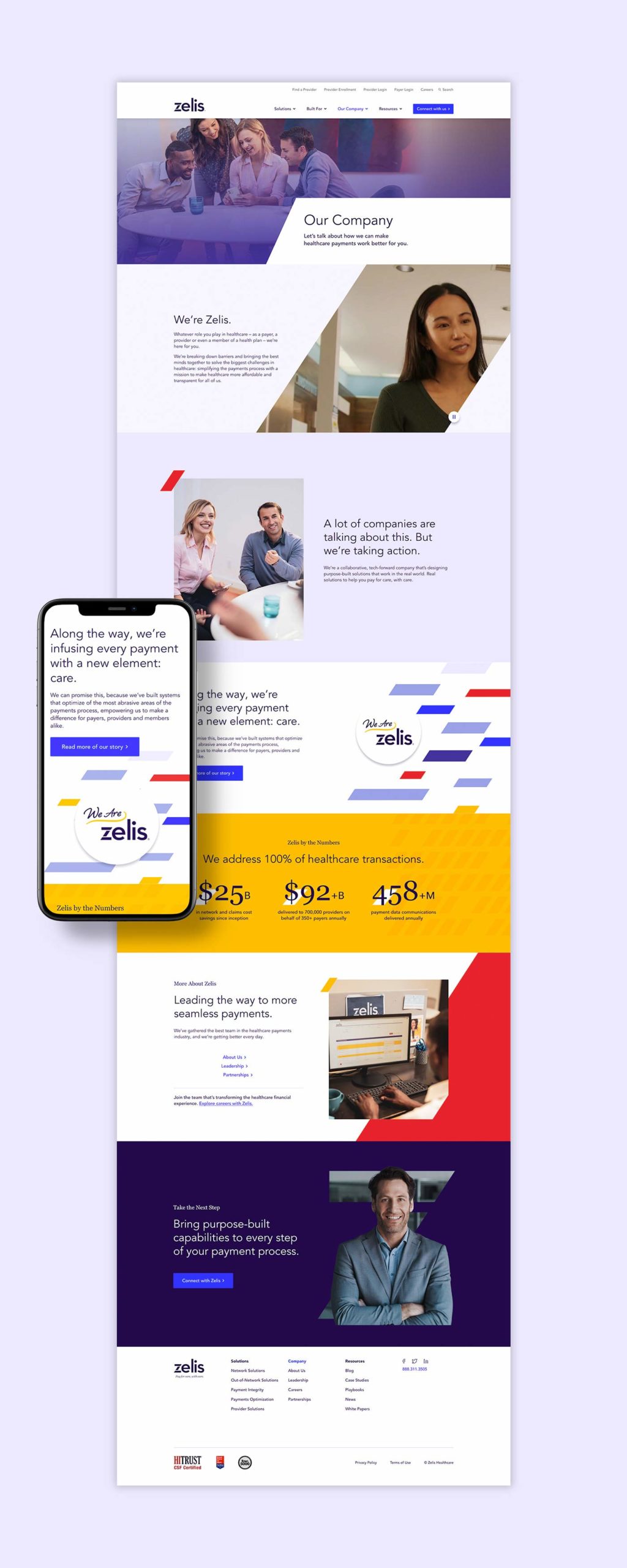
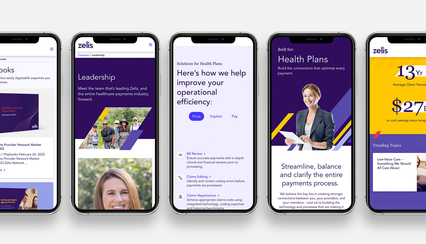
But our considerations went far beyond just aesthetics. That’s why we were also intentional with the site’s structure, creating both audience- and solution-specific pages. A prominent “Connect with us,” button is both inviting and reflects how all of Zelis’ solutions are connected.
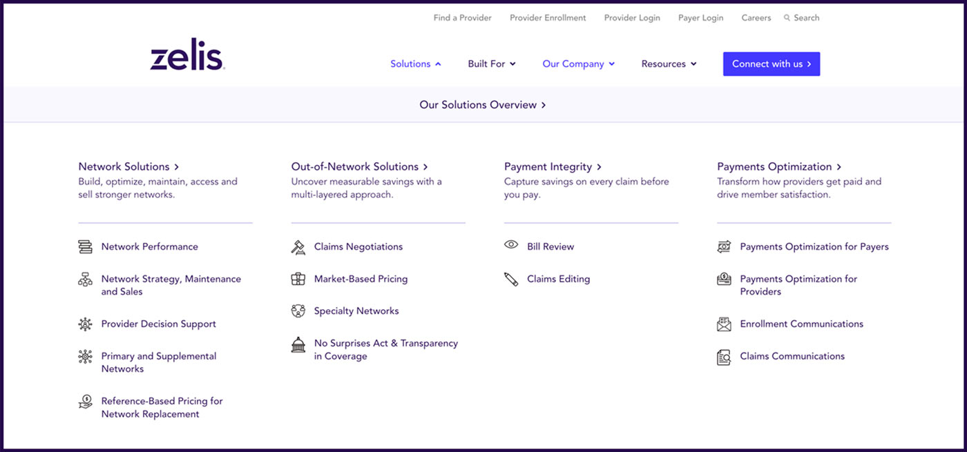
There was no avoiding a mega menu—healthcare marketing is just too complex—but by framing the navigation options around solutions and benefits instead of features and functions, we were able to make it more appealing (and navigable) to visitors of all backgrounds.
After the deadline
A few months after the site launched, we worked with them to launch more content-intense pages, rounding out the site experience both for visitors and Zelis’ marketing team.
From a realistic perspective, however, no site is ever finished. No page is truly “static,” and no content is final. So instead of page templates, we provided the Zelis team with a library of customizable components, so they can easily create whatever they might need in the future.

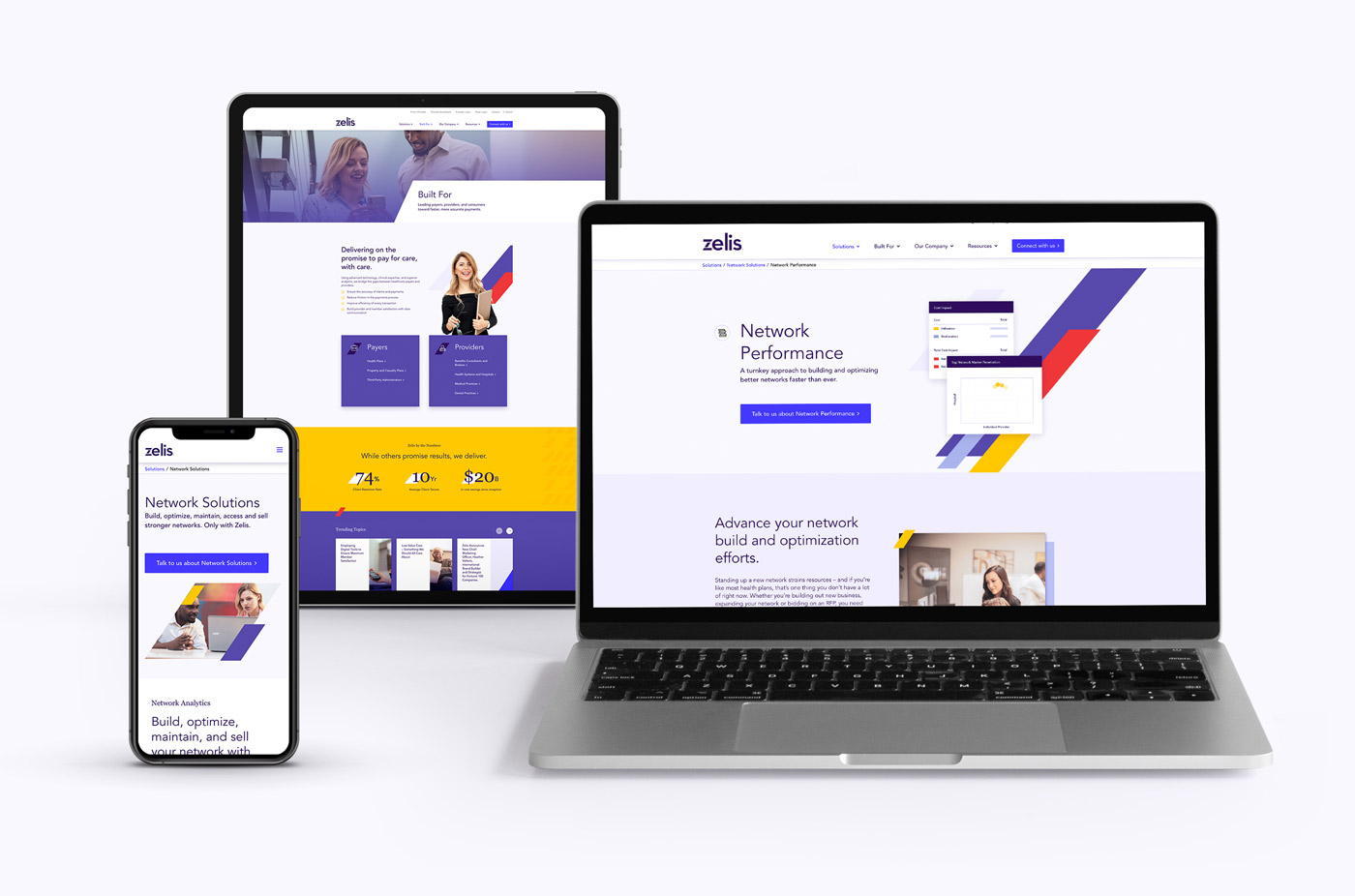
While the project had its share of challenges (most websites do), we’re proud to have helped Zelis find the right balance for their team—and for their clients.

