Legal brief meets creative brief
One of the best law schools in the country, WashU Law (formally Washington University in St. Louis) needed a site that would reflect the school’s prestige and resonate with a wide range of audiences, from prospective students and faculty to alumni, judges and legal recruiters.


Seeking counsel on the strategy
We rebuilt the navigation from the ground up, giving every visitor, whatever they came for, a clear path to it.


A brand in order
The site follows WashU’s new brand while carving out its own identity through bold accent colors, reimagined shield graphics and real photography and video.


Motion granted
Scroll animations and hover effects make the site dynamic and keep users’ attention, and a modular block system makes it easy for the WashU Law team to evolve the site over time.
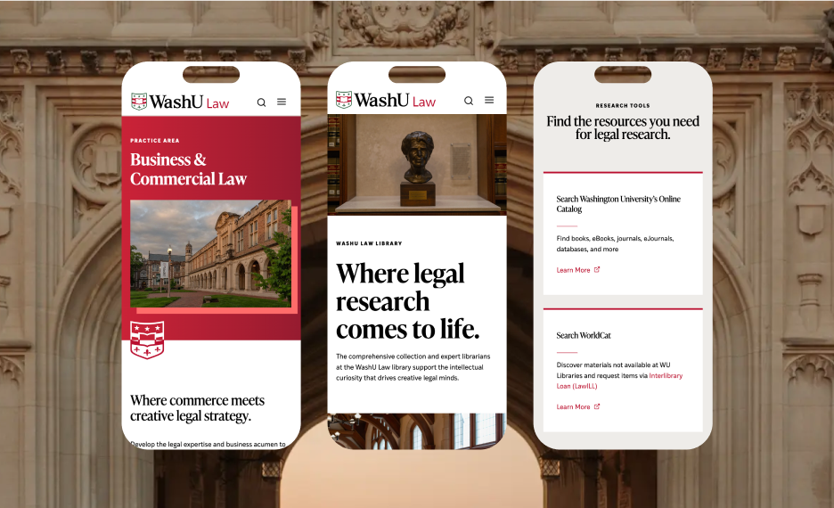

Now, WashU Law has a site worthy of its ambitious legal minds and notable accomplishments‚ guiding visitors confidently and leaving a lasting impression.

Full Story—this content appears in the side drawer on the frontend. Click the floating “Reader View” button to preview.
The case for a stronger presence.
WashU Law (formally Washington University in St. Louis School of Law) trains future litigators, judges and legal minds through a mix of rigorous coursework and real-world practice. It’s a school in motion, not a static institution content to rest on its reputation. But its website hadn’t kept pace. With an outdated technical build, the site didn’t reflect where the school was headed, especially with WashU’s overarching brand recently refreshed. WashU Law needed a digital presence with plenty of room to grow.
A packed brief.
This wasn’t a simple redesign. Prospective students comparing top law programs would judge the school by its site. So would faculty, alumni, donors and recruiters, each looking for something different. And underneath it all sat thousands of existing pages. WashU Law brought us in to sort through the noise and build something built to last.
Building an airtight structure.
Before any visual work began, we dug into the content: degree programs, clinics, faculty research, admissions details and more. Working closely with the WashU Law team, we built a navigation structure that organizes all of it without overwhelming visitors. Every path, whether someone’s applying, researching or donating, now leads somewhere useful.
Distinct, but not out of order.
WashU Law had to follow the University’s newly established brand, but it couldn’t blend in with every other school on campus. We treated that tension as an asset. Select brand colors highlight key moments, while the WashU shield gets reimagined throughout the site: oversized for texture, subtle in tone-on-tone, split for contrast. Bold, confident copy backs it up, along with real photography and video that capture the school’s energy and its community members.
Setting the site in motion.
A school that teaches students to think ahead deserves a site that feels forward-moving, too. Headlines and key stats animate into view as users scroll. Images and hover states add subtle depth throughout. Behind the scenes, we built the site with modular, reusable blocks, giving the WashU Law team a flexible system that can grow alongside new programs and initiatives without ever requiring a big development lift or rebuild.
Closing arguments.
A great legal argument balances structure with room to make its point. That’s exactly what we aimed for here: a site organized enough to guide visitors with confidence, and distinct enough to leave an impression. We’re proud of what launched, and are continuing to partner with the WashU Law team to grow the site and promote the school.
Need a website that lives up to your reputation?
Let’s start a conversation.