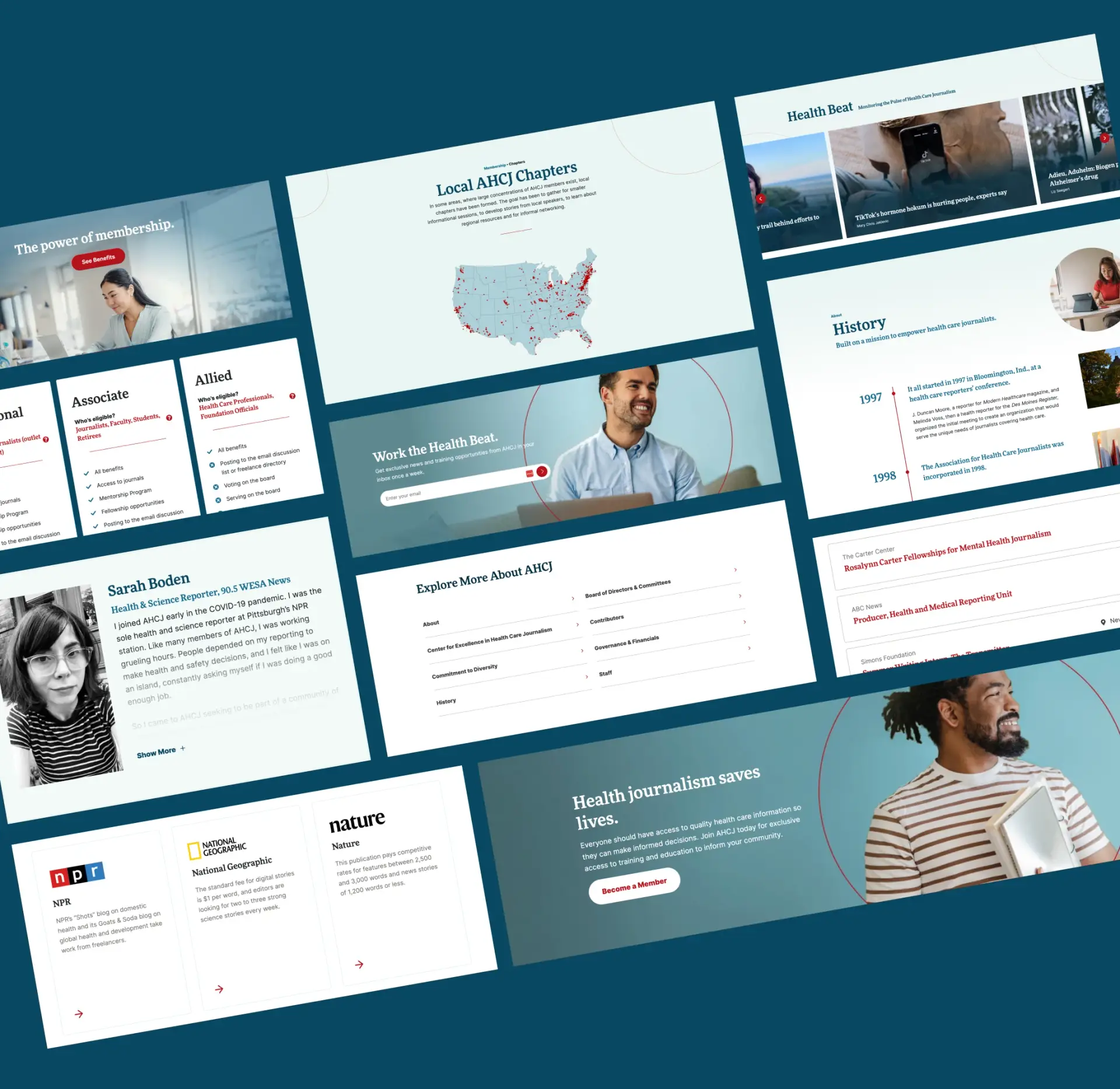
A prescription for clarity
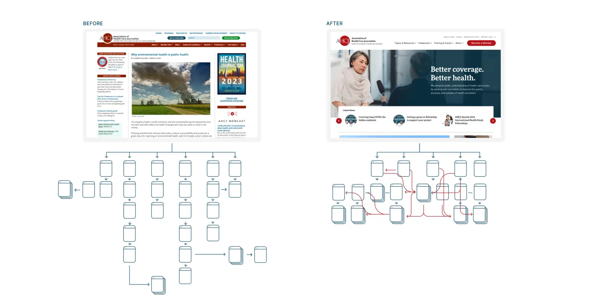
Built on multiple content platforms, the existing AHCJ website was crowded, disorganized and disjointed—even their internal team wasn’t aware of some of the content it housed.
Shorter paths, easier journeys
Within each health beat, users can filter by content type or author.

The front page and beyond
The website’s visual design also needed to be revamped—starting at the top.
Full Story—this content appears in the side drawer on the frontend. Click the floating "Reader View" button to preview.
A prescription for clarity.
The Association of Health Care Journalists is out to save lives. By empowering journalists with the resources, information and skills to maximize their impact, the organization elevates healthcare journalism to better serve the public. But the organization faced a big challenge: its outdated website.
A prescription for clarity.
Built on multiple content platforms, the existing AHCJ website was crowded, disorganized and disjointed—even their internal team wasn’t aware of some of the content it housed. Many of the articles were only accessible through one specific path, requiring up to six or seven clicks to find. As a result, much of the content was going unused.
Our job was to push the organization’s valuable content centerstage and show the impact AHCJ has on the world through fair and accurate healthcare reporting.
Shorter paths, easier journeys.
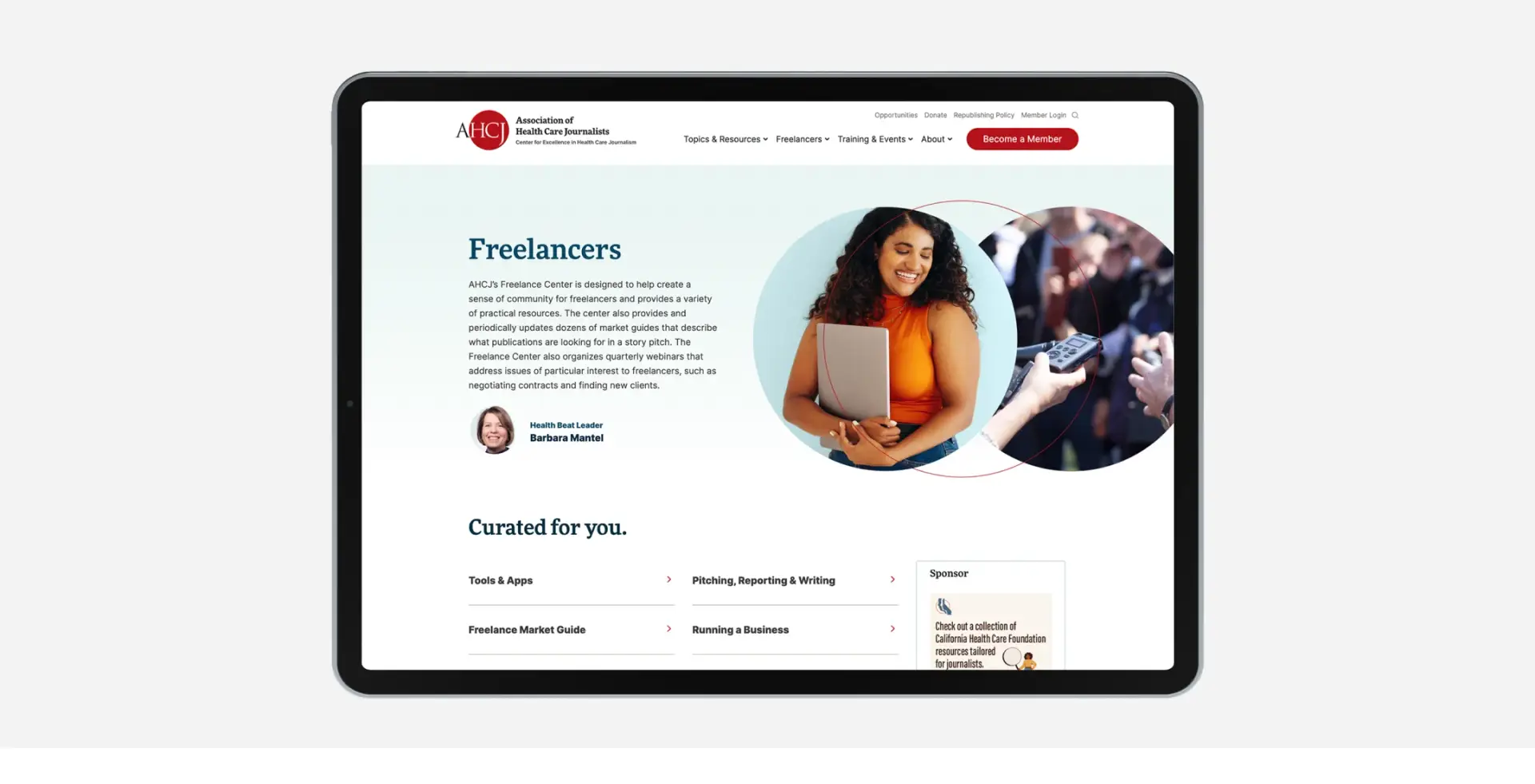
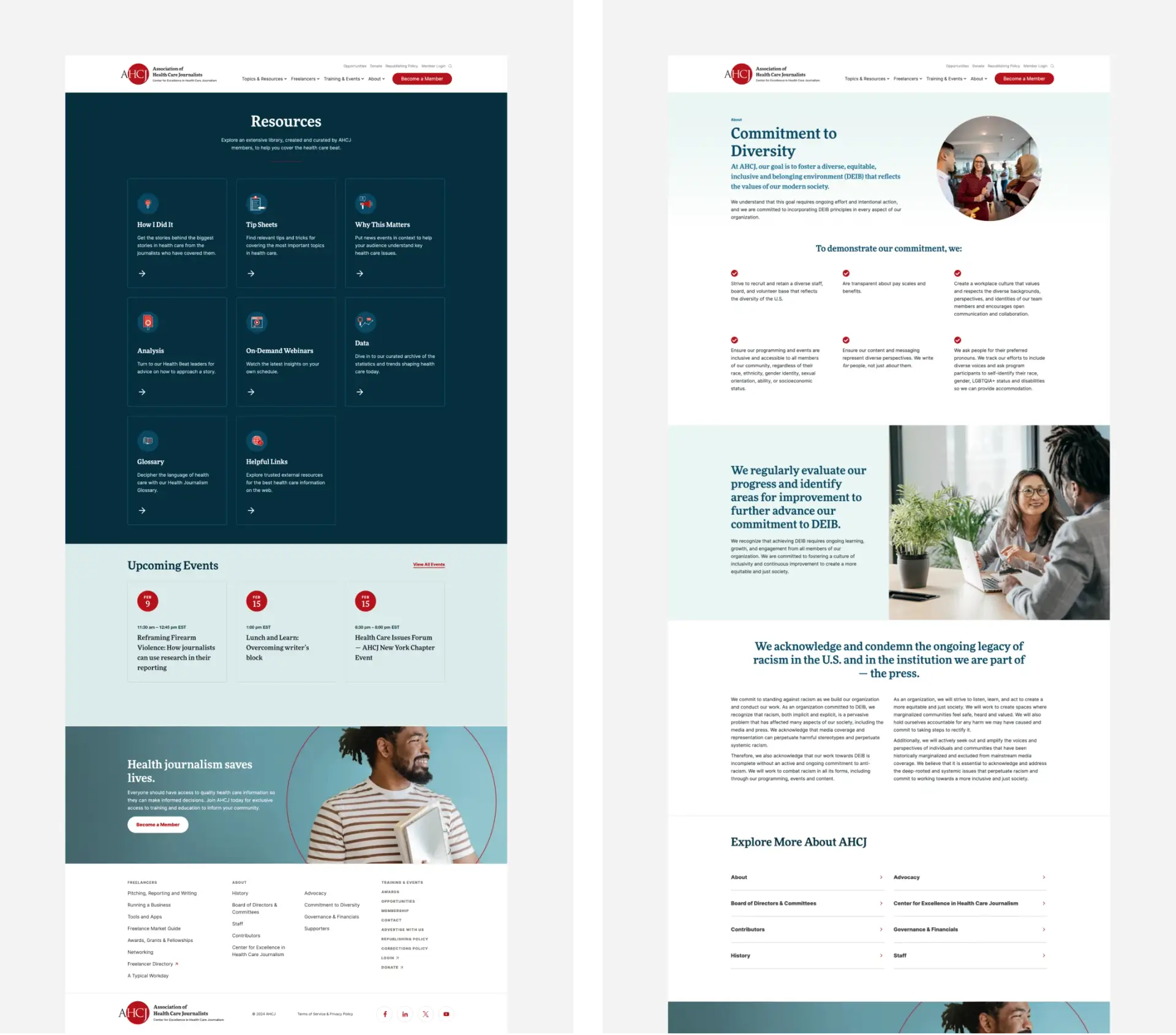
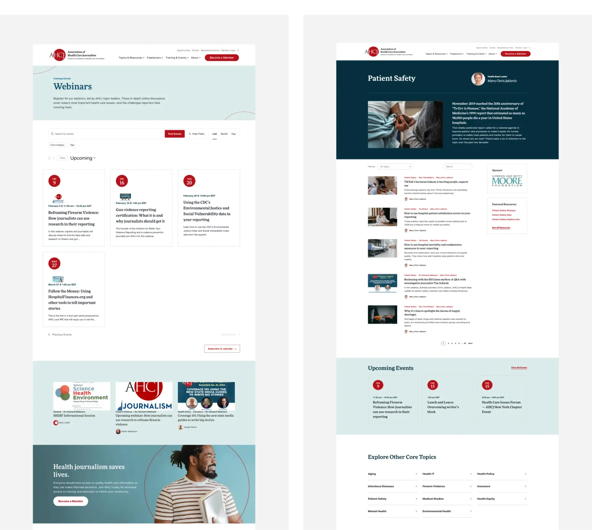
Within each health beat, users can filter by content type or author. A massive glossary is organized by categories, and a plugin we included automatically adds relevant links from articles to the appropriate glossary pages.
Now, journalists working against tight deadlines can find articles through numerous paths, with just a few clicks. As a result, more content is being discovered and utilized.
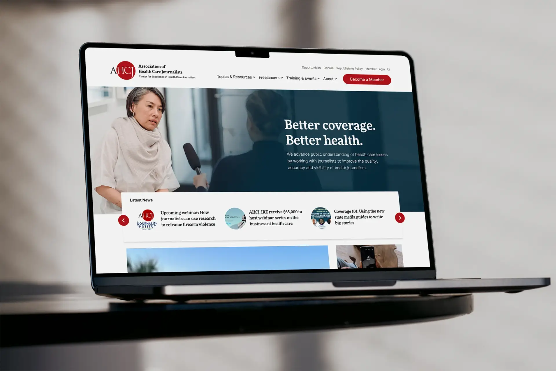
The front page and beyond.
The website’s visual design also needed to be revamped—starting at the top. We modernized the logo and made it easier to read when scaled down. On each page, visual hierarchy guides visitors to the most important elements and strengthens the user experience. Information, images and calls to action no longer compete to be seen. And echoing the logo, a circle applied as a graphic element in photos highlights the journalists the organization serves and underscores the brand values.
The tools to grow.
At first glance, the new site seems simple. That’s by design. Down to the smallest details, each element serves a strategic purpose—guiding the user, promoting specific content and emphasizing the brand. It’s all furthering AHCJ’s vital mission, providing resources, education and support to healthcare journalists around the globe.
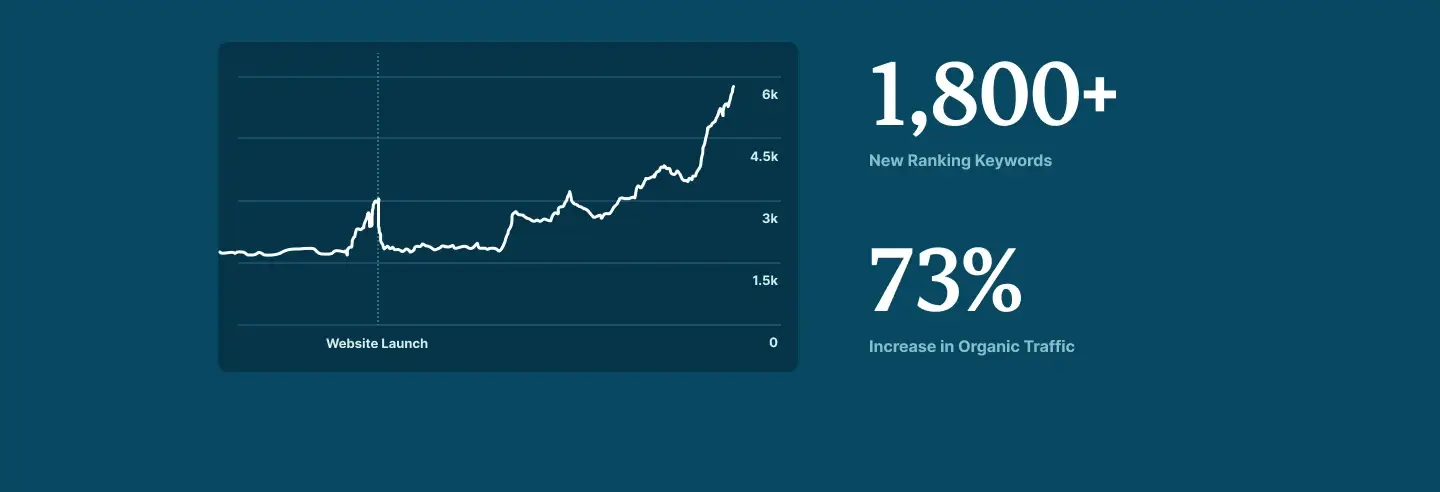
Positive momentum.
Within a few months of launching AHCJ’s new website, the organization saw sizeable jumps in organic search performance. The website began ranking for an additional 1,800 relevant keywords and drew a 73% increase in organic traffic.
As AHCJ continues to publish invaluable content, the new site will help journalists keep the public informed through reliable, insightful and balanced healthcare reporting.
Is your content buried under its own weight?
Let's start a conversation.