Thinking outside the box.
The old InfoPlus logo—a minimalist representation of a box—didn’t capture the company’s comprehensive abilities and approach. The redesigned version tells a more complete story, with arrows, a plus sign, and yes, even a box, symbolizing the players and processes involved in warehousing.
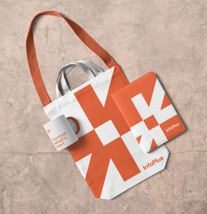
With elements converging in the center to represent InfoPlus at the heart of successful warehouse operations, the logo illustrates how InfoPlus helps clients and visually reinforces the new positioning language. Playing off the platform’s easy customization, different combinations of the logo’s elements form a system of graphic devices that uphold the brand without getting monotonous.