Pandemic-era shortages showed us all how fragile supply chains can be, from production and warehousing to shipping and last-mile delivery.
InfoPlus sits at the center of the mayhem. As a connector and organizer of sorts, the SaaS company’s technology works to bring it all together with the power of data. They came to us last year to help tell this story to warehouse owners and third-party logistics companies.
But telling this story would take more than branding, web design or marketing alone. Instead, we used a holistic brand marketing strategy to help the company grow.
Centering on the InfoPlus difference.
Solving any challenge starts with understanding it—inside and out.
Through interviews with InfoPlus team members, we learned one of their biggest differentiators is their approach to data. While some competitors restrict data access, the InfoPlus API is completely open—making it fully customizable. Clients can mold the system to include their own workflows and unique mix of partners and components. This open architecture makes InfoPlus more flexible and powerful than competitor systems.
That makes it so much more than just a Warehouse Management System, which is the industry-standard lingo. We built on this idea, but created a brand-new category InfoPlus can own: Warehouse Management Ecosystem.
InfoPlus puts its clients at the center of this ever-evolving ecosystem. This idea became the central messaging point for the brand narrative and, ultimately, the tagline.
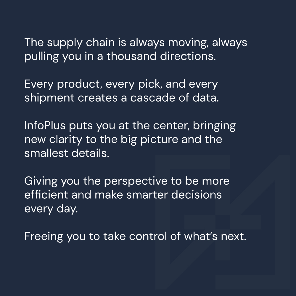
Putting clients at the center is, well, central to the InfoPlus ethos. This thread ties everything together. And the end benefit of this attitude and approach? Peace of mind, in the chaotic warehouse world? Visibility, clarity and freedom to grow?
Yes, yes of course.
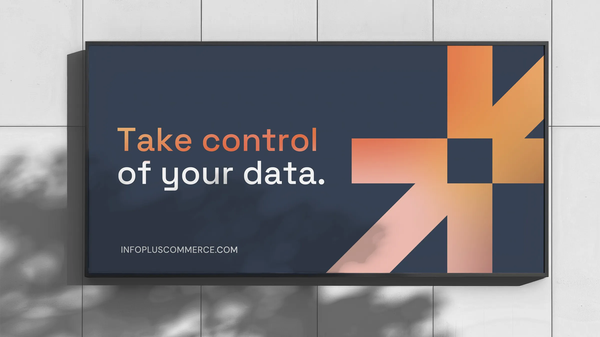
It all comes down to a single, two-word invitation. A client-centric promise that changes everything: Take Control.

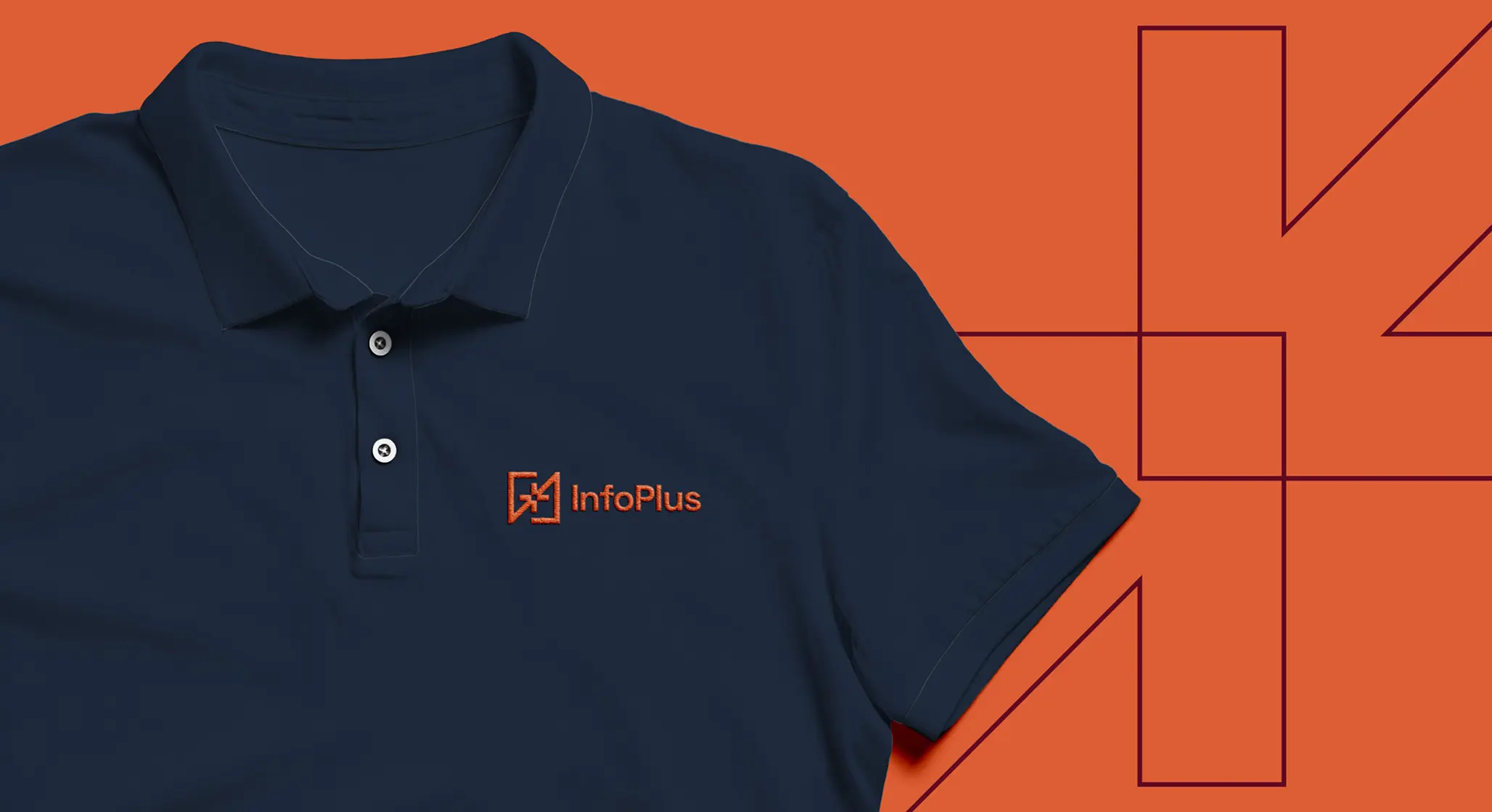
Telling the InfoPlus story with a logo.
It’s a lot to ask for a mark to tell a story as complex as the one InfoPlus wanted to share. Their old logo was very literal, a box shape to suggest the industry and the types of items InfoPlus can impact. But there’s more to the story—and we pushed our client to go for something new.
Changing the logo would, of course, mean changes for things like signage, marketing materials and sales collateral, but also for their product itself. The old logo was hard-coded into some of their software.
But we knew we needed to try, and if the InfoPlus team’s reaction is any indication, we feel like we succeeded.
![]()
The new logo brilliantly captures the real story behind InfoPlus, echoing the constant motion of the warehouse and how it centers everything, delivering a unique ability to control it all.
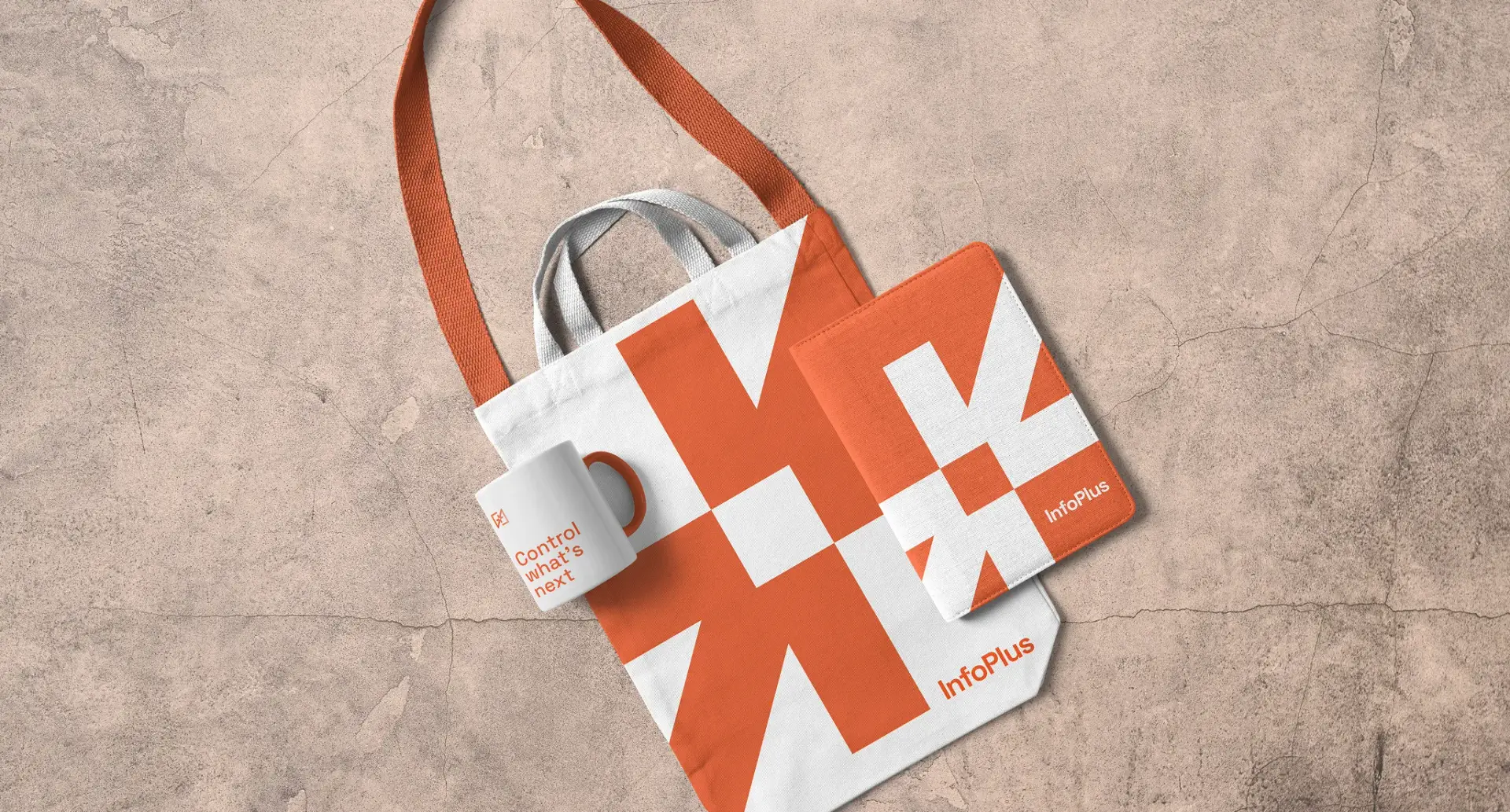
It feels familiar and fresh, with arrows converging—you guessed it, at the center—to form a “plus” and a box. It all comes together quite nicely, and sets the stage for a wide range of graphic elements that round out the evolved brand.
An unexpected pop in the brand presentation.
As we wrapped our presentation of the new brand identity, we could see that the brand language and graphics were resonating with the InfoPlus team. It was a thrill to hear them start to use phrases like “Take Control” so naturally to describe their company and their brand.
The biggest thrill came, though, as they popped bottles of champagne to toast our team and celebrate the work we had done together so far.
We took that enthusiasm and spirit into the next phase of the project: the website.
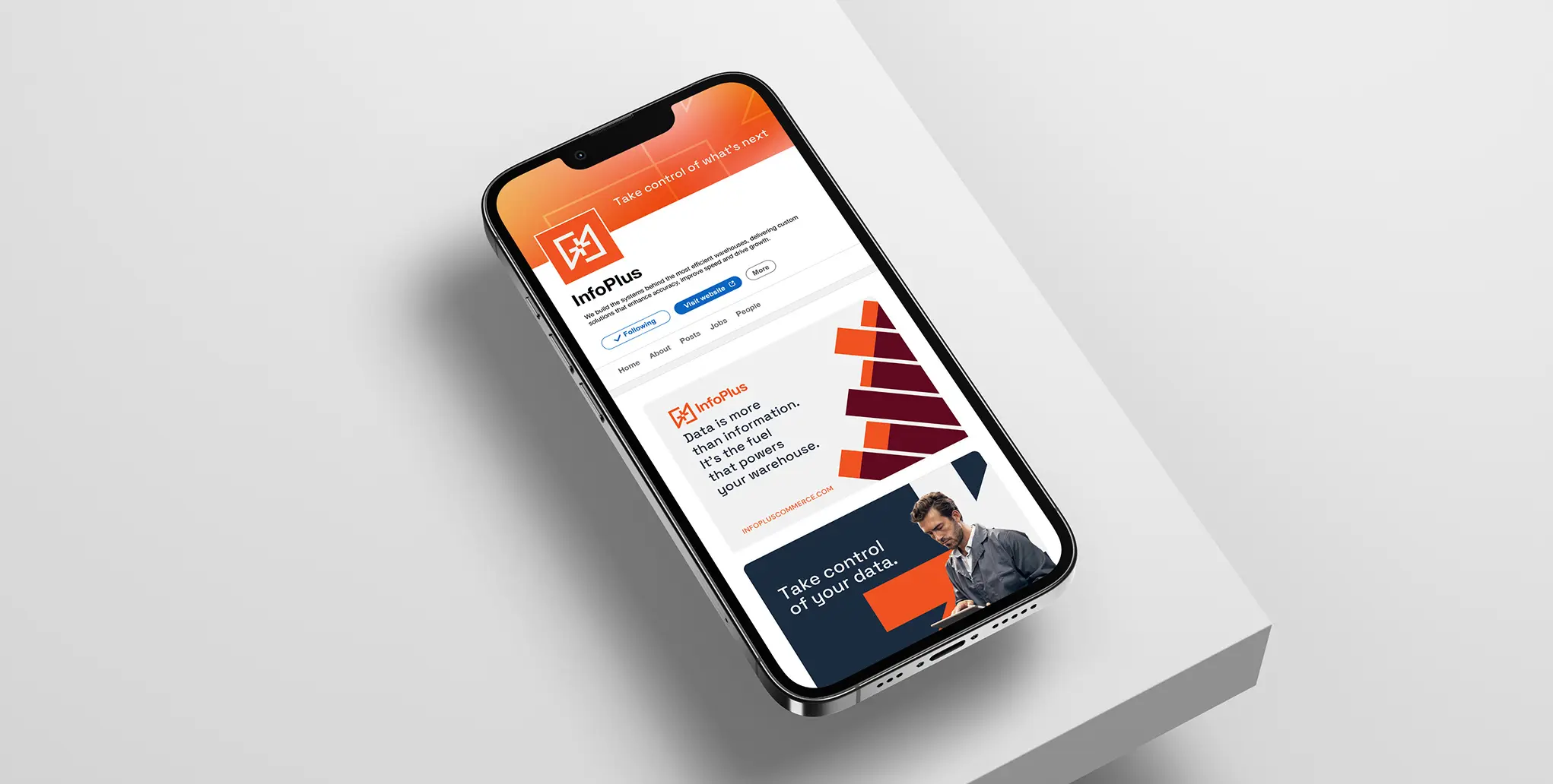
Bringing the InfoPlus ecosystem to the web.
Right from the start, we wanted to put InfoPlus prospects and clients at the center of the experience. That sounds obvious, of course, but it’s a philosophy that influenced everything we did.

Sure, we included a B2B standard “services” section, but it’s not the headline-maker on the site. The navigation leads with “Your Challenges,” and Services has been renamed “Our Solutions.” It’s a subtle but effective change.
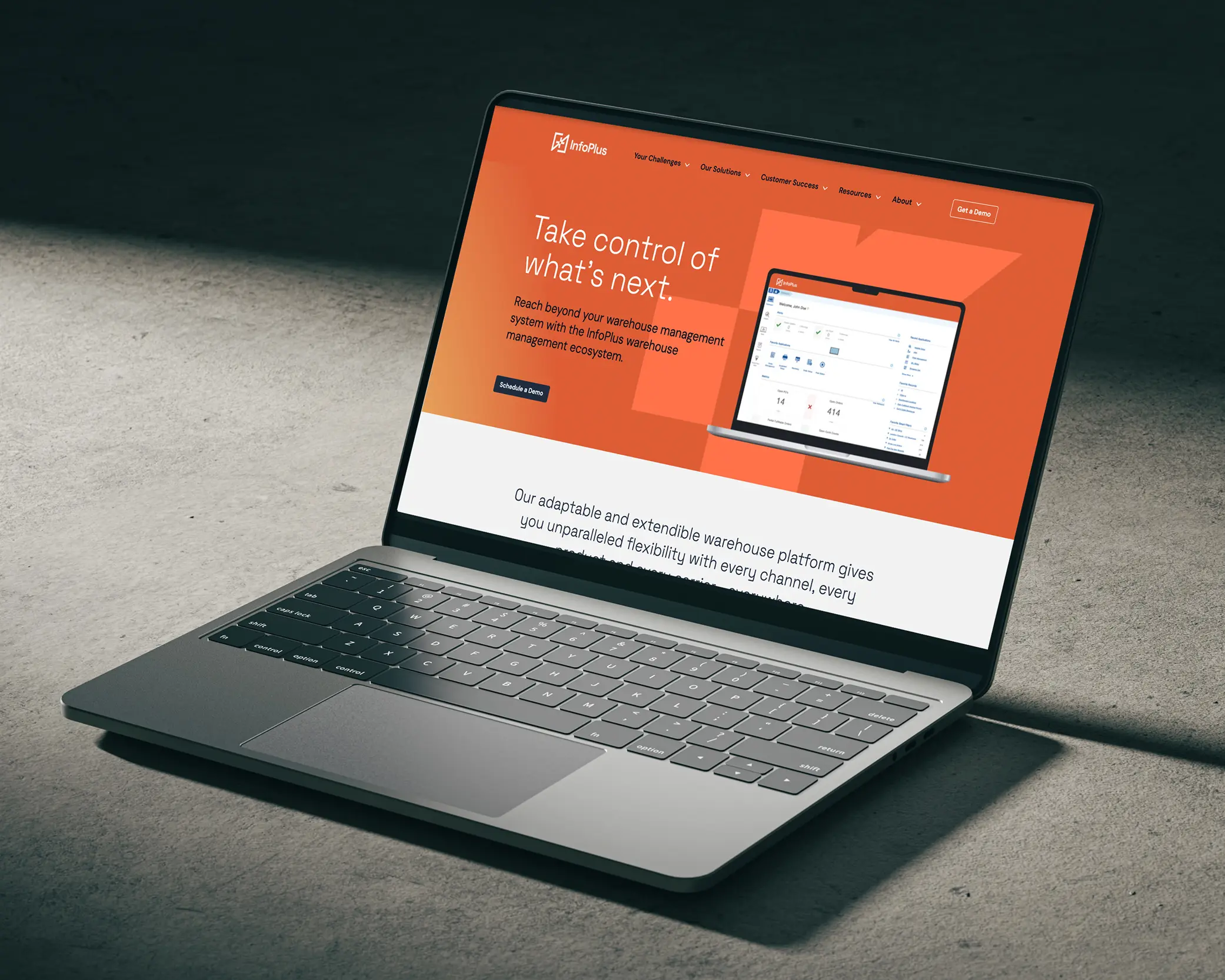
The result? We’ve made the entire InfoPlus website a demonstration of how deeply InfoPlus understands not just what warehouse operators are facing, but how to make their jobs easier and their lives better. You’ll see it in every element, from putting challenges front-and-center on the homepage to bringing helpful content to every single page.
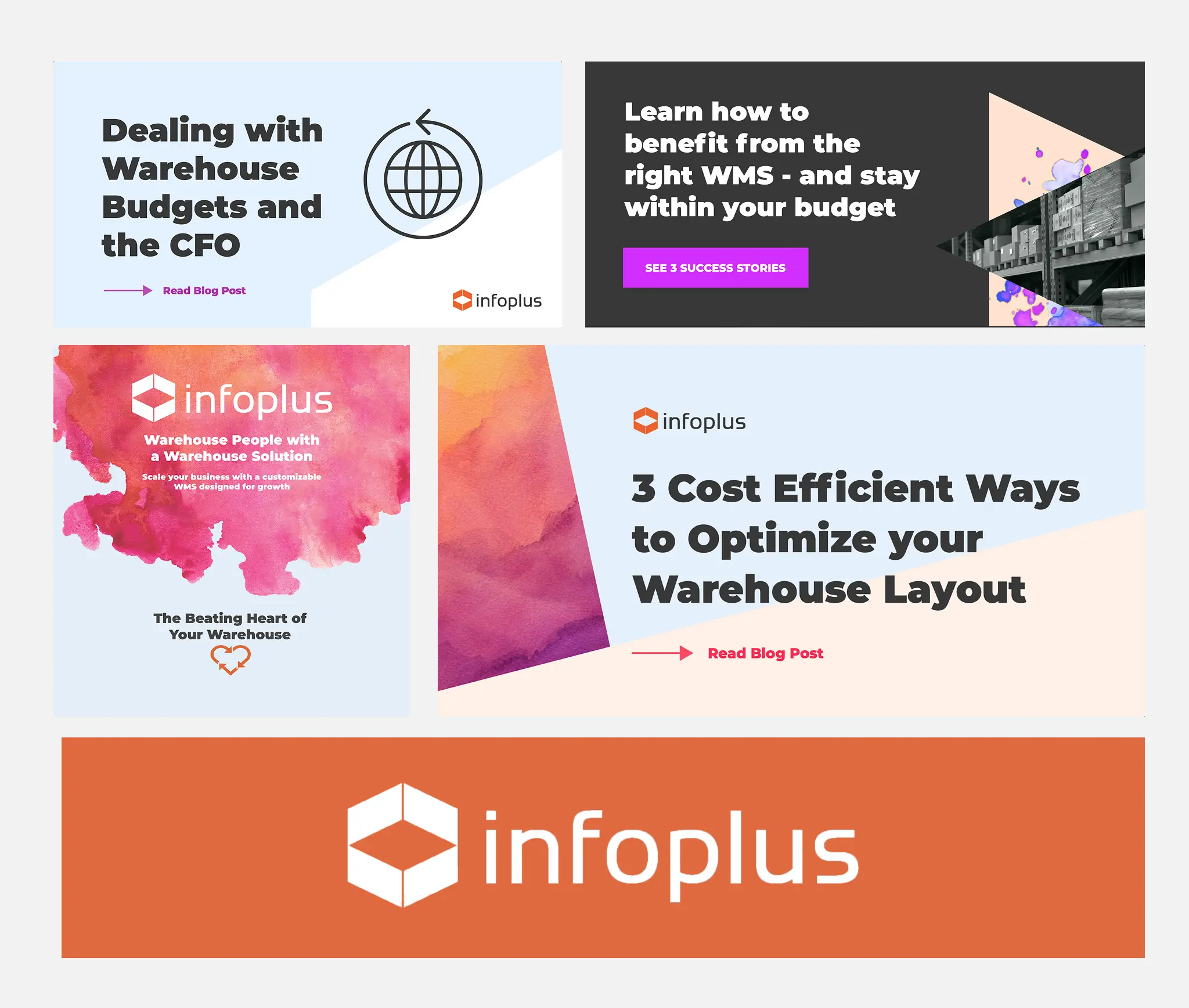
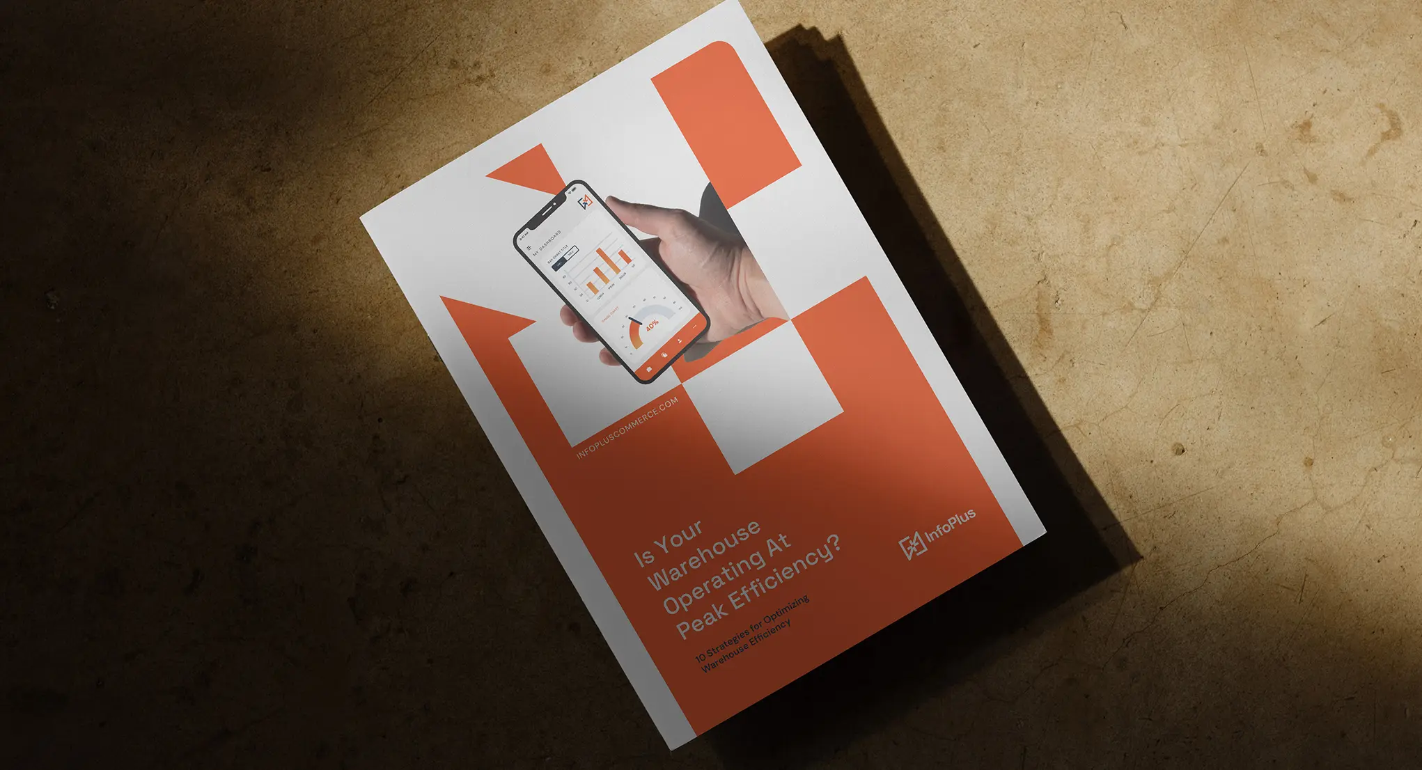
Making helpful content the star of the show.
One of the biggest challenges we faced as we organized the site was bringing hierarchy to their extensive resource library. One big, positive change the InfoPlus team wanted to make was to ensure everything was accessible to all.
This became a great way for InfoPlus to prove their expertise and give a boost to SEO. While their previous site had a slew of categories and content types listed in the navigation, we made things simple, diverting traffic between Customer Success (for current customers) and Resources (for prospects).
Even in the Customer Success section, documentation is open to the public—so technically inclined visitors can get a sense of what it’s like to both use the software and solve common problems with it.
Making the new InfoPlus brand more meaningful.
A brand is never static, and a company’s website and marketing shouldn’t be, either. Every day, we’re working with InfoPlus to find new ways to help them connect with their prospects and their current clients. It’s not just about pitch decks, content and social media marketing, although those things are certainly important.
With a combination of branding, web design/development and digital marketing, the idea behind the Atomicdust Brand Marketing Program works similarly to the InfoPlus Warehouse Management Ecosystem. We’re essentially creating an ecosystem of marketing, a common thread that runs through all communications that brings everything and everyone together.
As InfoPlus continues to evolve, we’ll be right there to make sure their brand, messaging and content keep pace.