A game changer
Once renovated, the building will boast a rooftop pool deck, bar, pickleball courts and dog run.
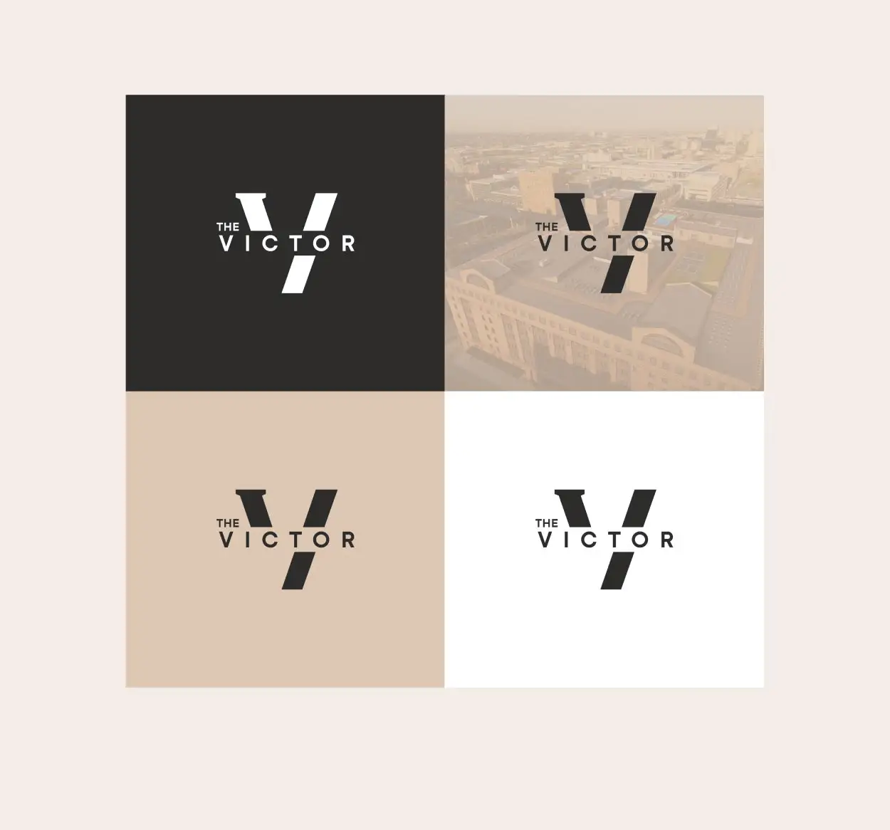
Introducing The Victor
Before a logo or tagline, the new development needed a name.

Where triumph lives
The word “Victor” served as a creative foundation for the brand identity, inspiring both the language and visuals.
Branded for each touchpoint
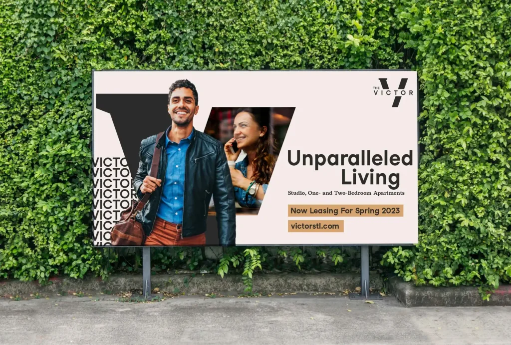
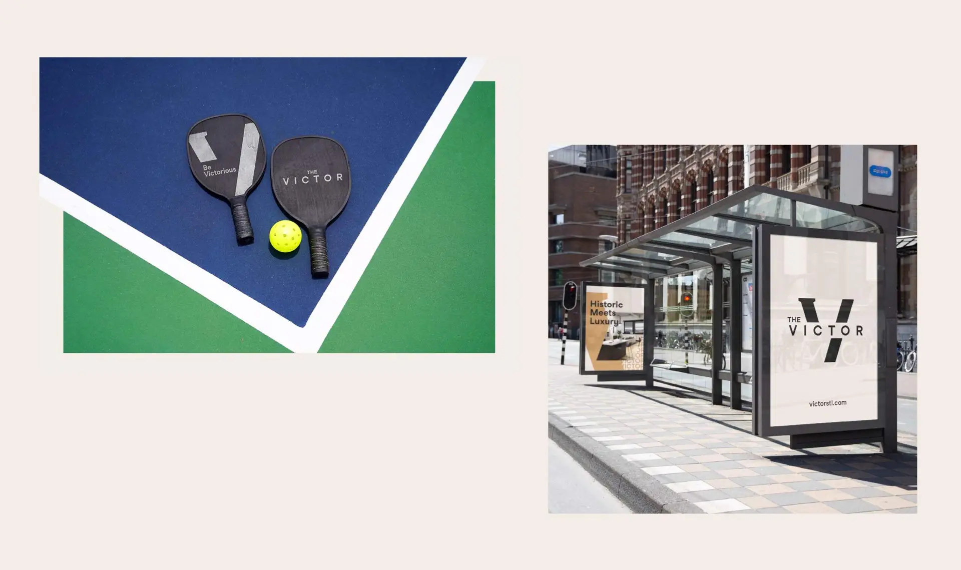
Signage, ads, business cards, social media posts and even branded pickleball paddles elevate and express the brand throughout the resident experience.

Full Story—this content appears in the side drawer on the frontend. Click the floating “Reader View” button to preview.
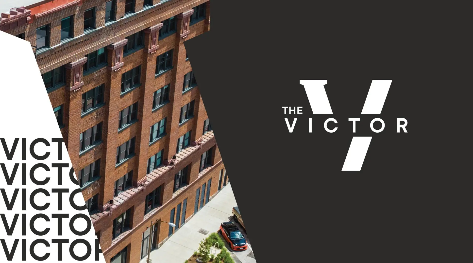
After sitting mostly vacant, a century-old building in Downtown West St. Louis was being redeveloped. Formerly used as warehouse space, and with a footprint taking up an entire city block, the building is massive. Its developers tasked Atomicdust with creating a name and brand identity that would live up to the behemoth’s history, size and reimagined future.
A game changer.
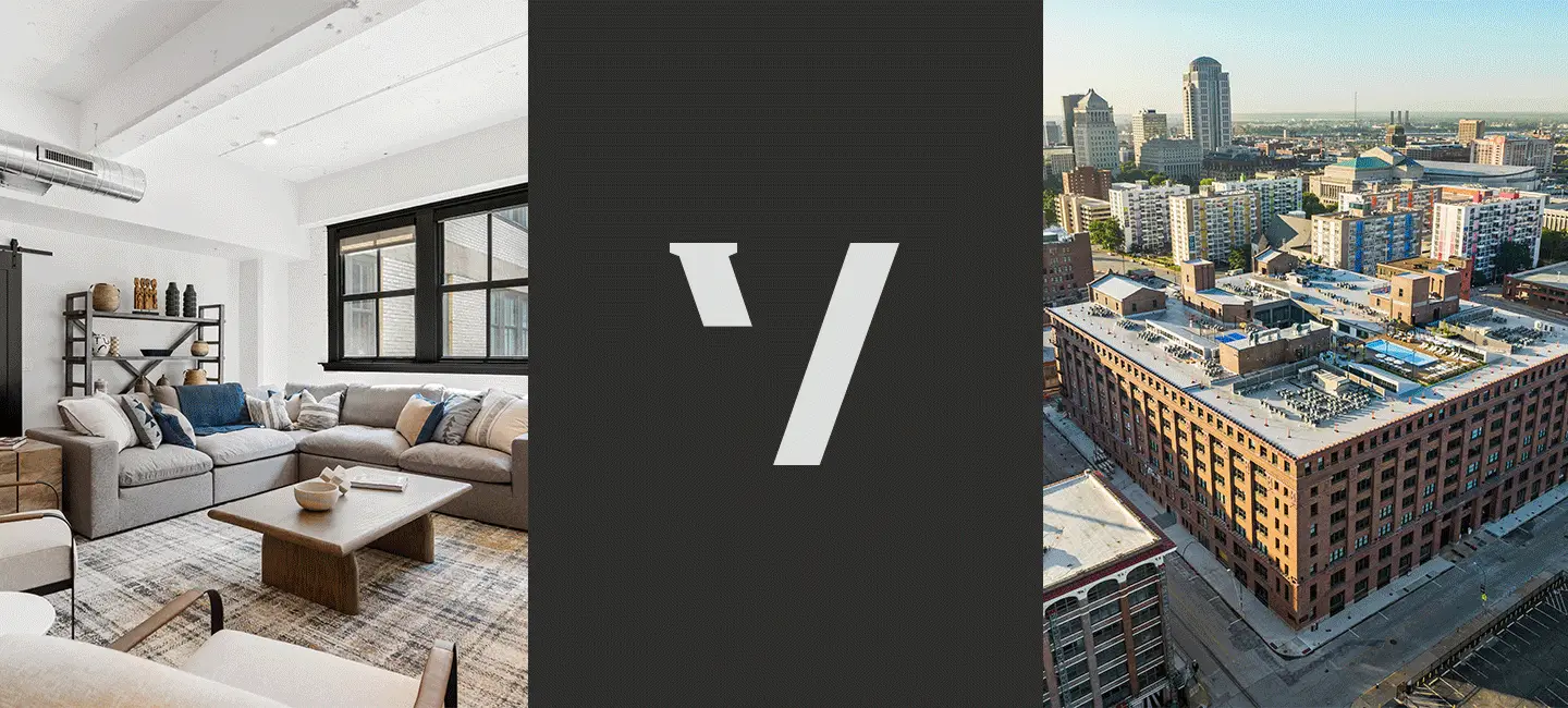
Once renovated, the building will boast a rooftop pool deck, bar, pickleball courts and dog run. Residents will also have access to a fitness center, electric car charging station, central courtyard, co-working spaces—even a golf simulator. The luxurious amenities are set to make the building one of the most sought-after places to live in St. Louis. The brand identity we created needed to match.
Introducing The Victor.
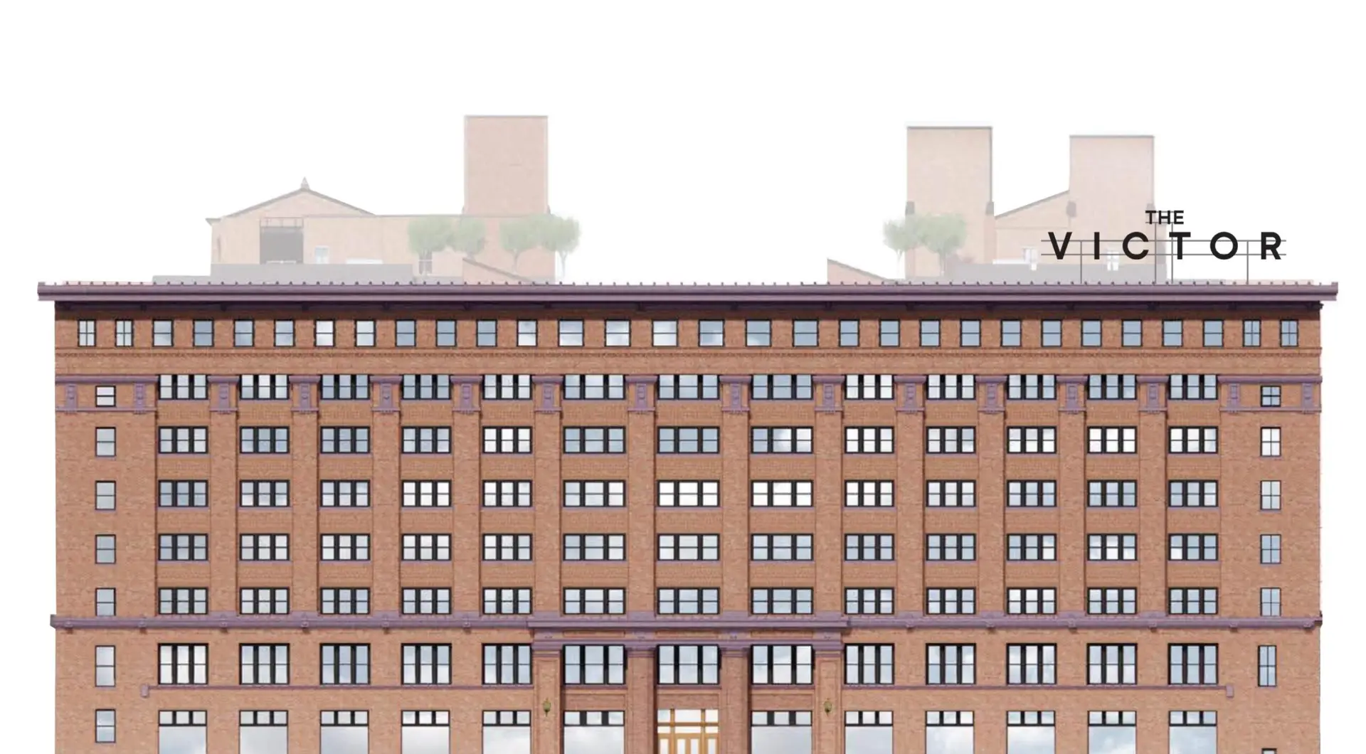
Before a logo or tagline, the new development needed a name. We landed on The Victor, a name that nods to several of the building’s unique features: its size and history, the masculine and sophisticated interior designs, and proximity to a new soccer stadium being built just blocks away.
Where triumph lives.
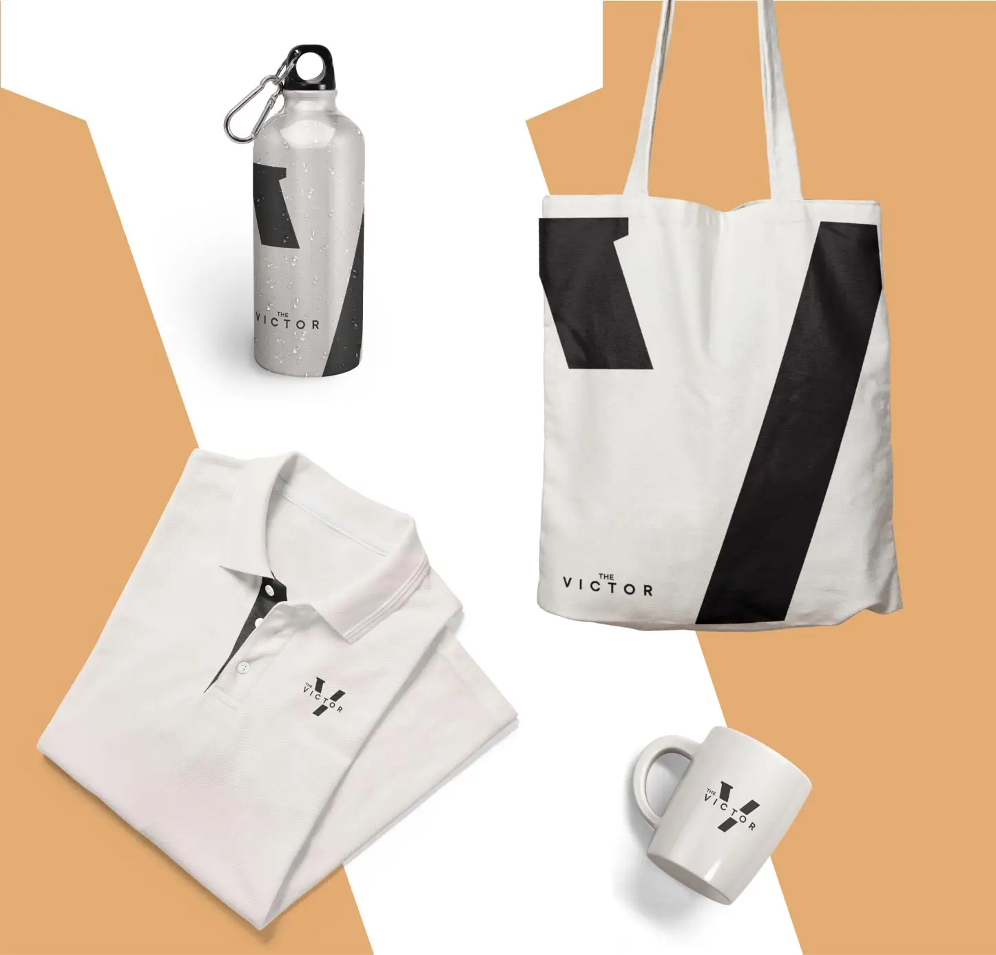
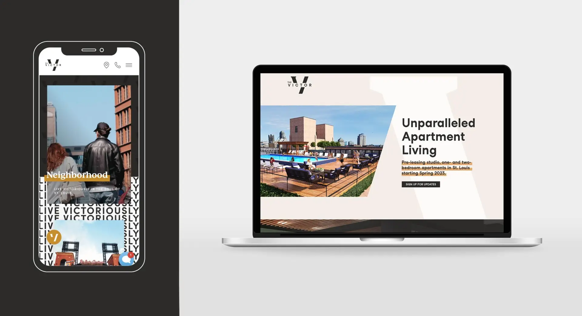
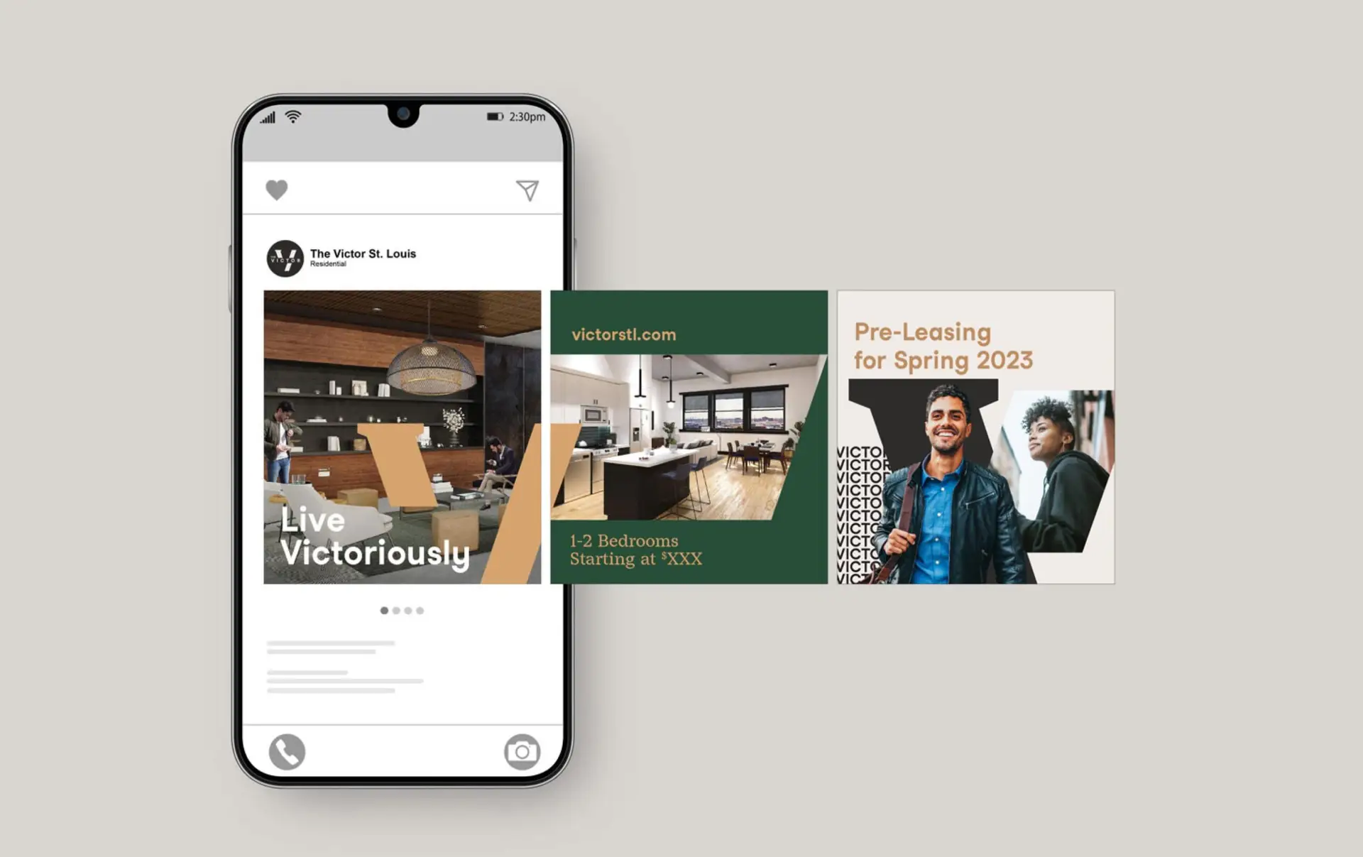
The word “Victor” served as a creative foundation for the brand identity, inspiring both the language and visuals. We developed an eye-catching pattern with “VICTORIOUS” repeated in bold, all-caps type. Symbolizing the building’s history and future, the logo mixes serif and sans serif type, and photo masks reflect the upward slant of the letter V. Brand language invites audiences to take advantage of The Victor’s unrivaled energy, unmatched location and undefeated amenities.
Branded for each touchpoint.
Signage, ads, business cards, social media posts and even branded pickleball paddles elevate and express the brand throughout the resident experience. A simple landing page that captures the building’s spirit in place helped drum up excitement for pre-leasing.
Ready for a game changer?
Let’s start a conversation.