Finding the voice
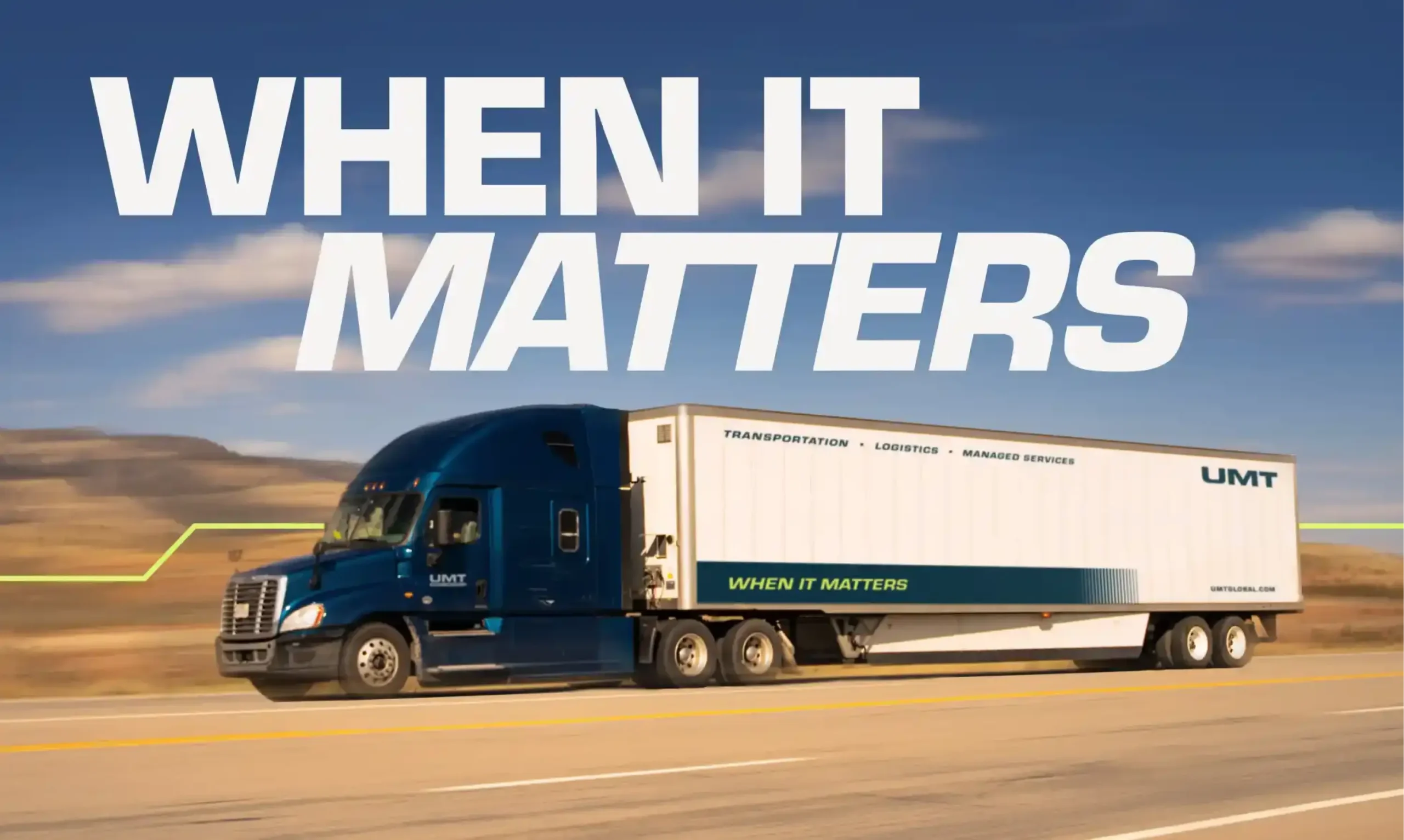
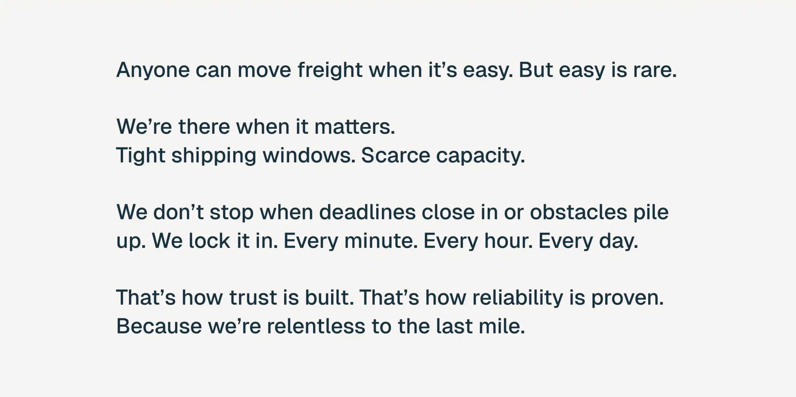
We dug into what actually sets UMT apart—not the trucks, but the team’s refusal to let anything slip. That mindset became the throughline for the new brand narrative and brand voice.
A mark built to hold weight
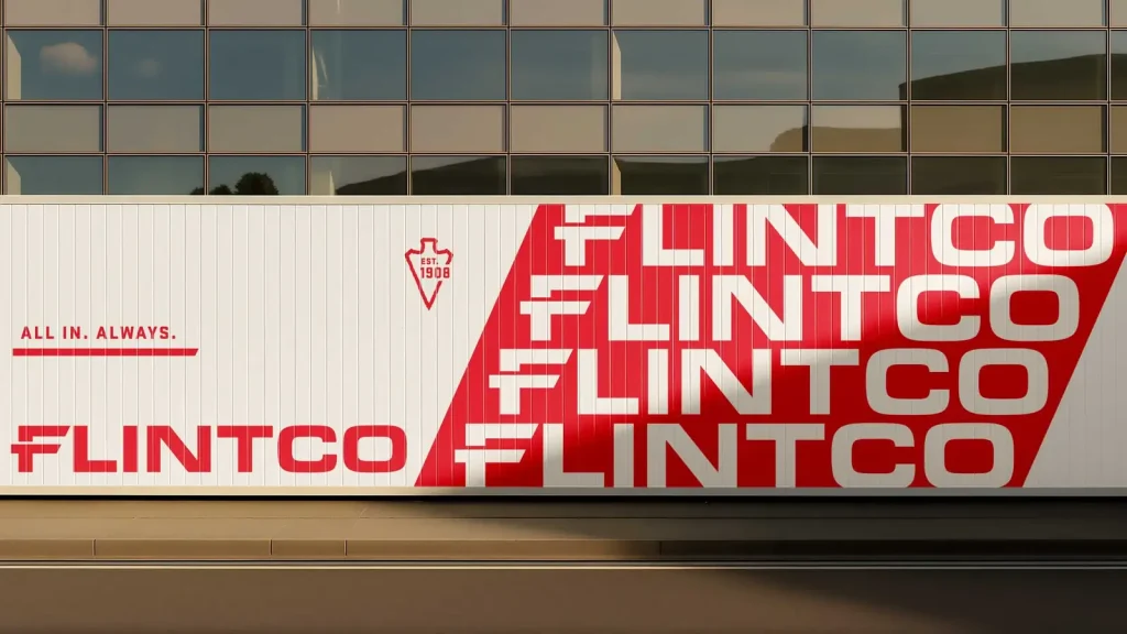
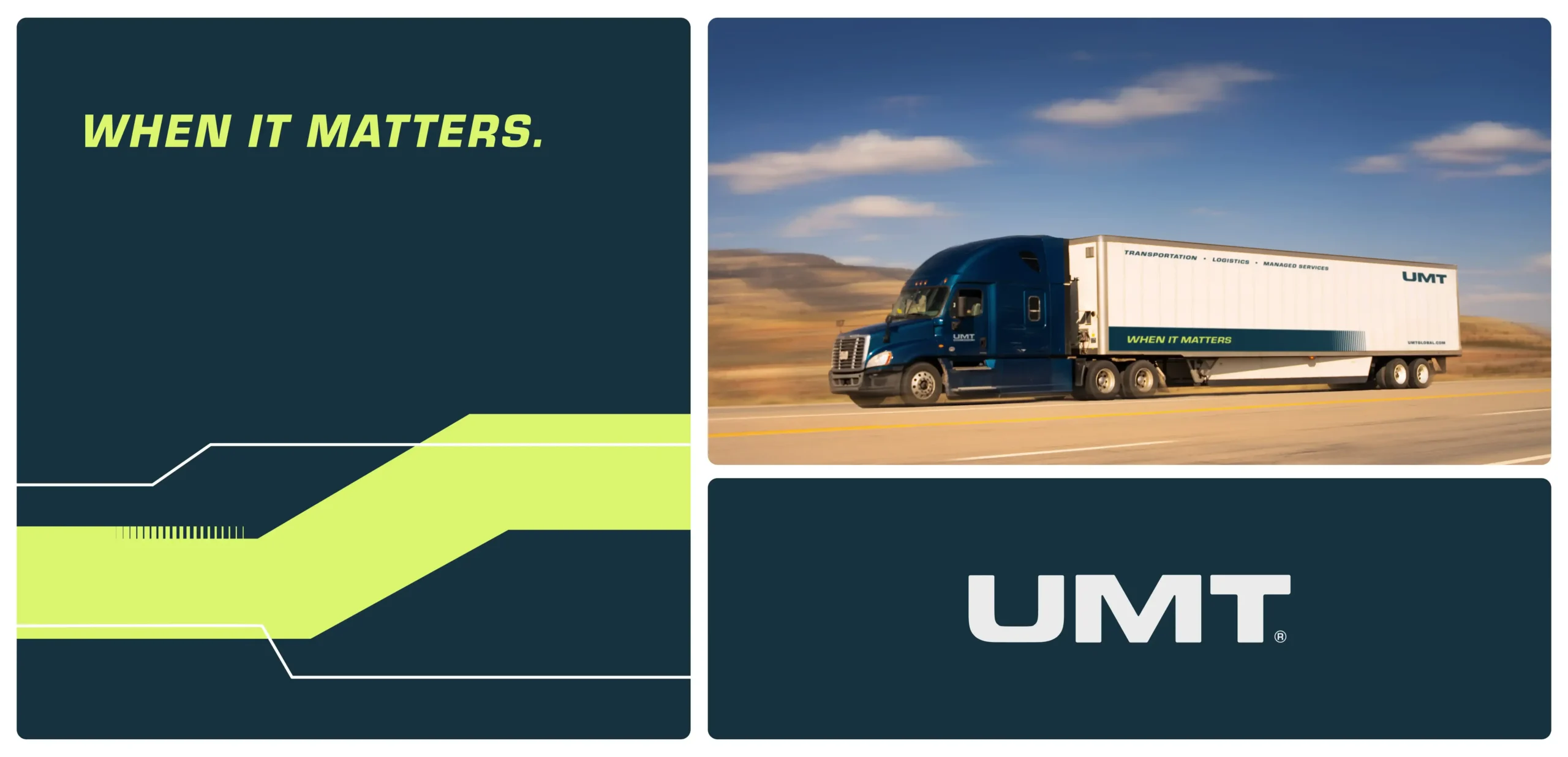
Solid, sturdy letterforms replace the old logos with something that reads as dependable at a glance, whether it’s on a business card or the side of a trailer.
A system with range
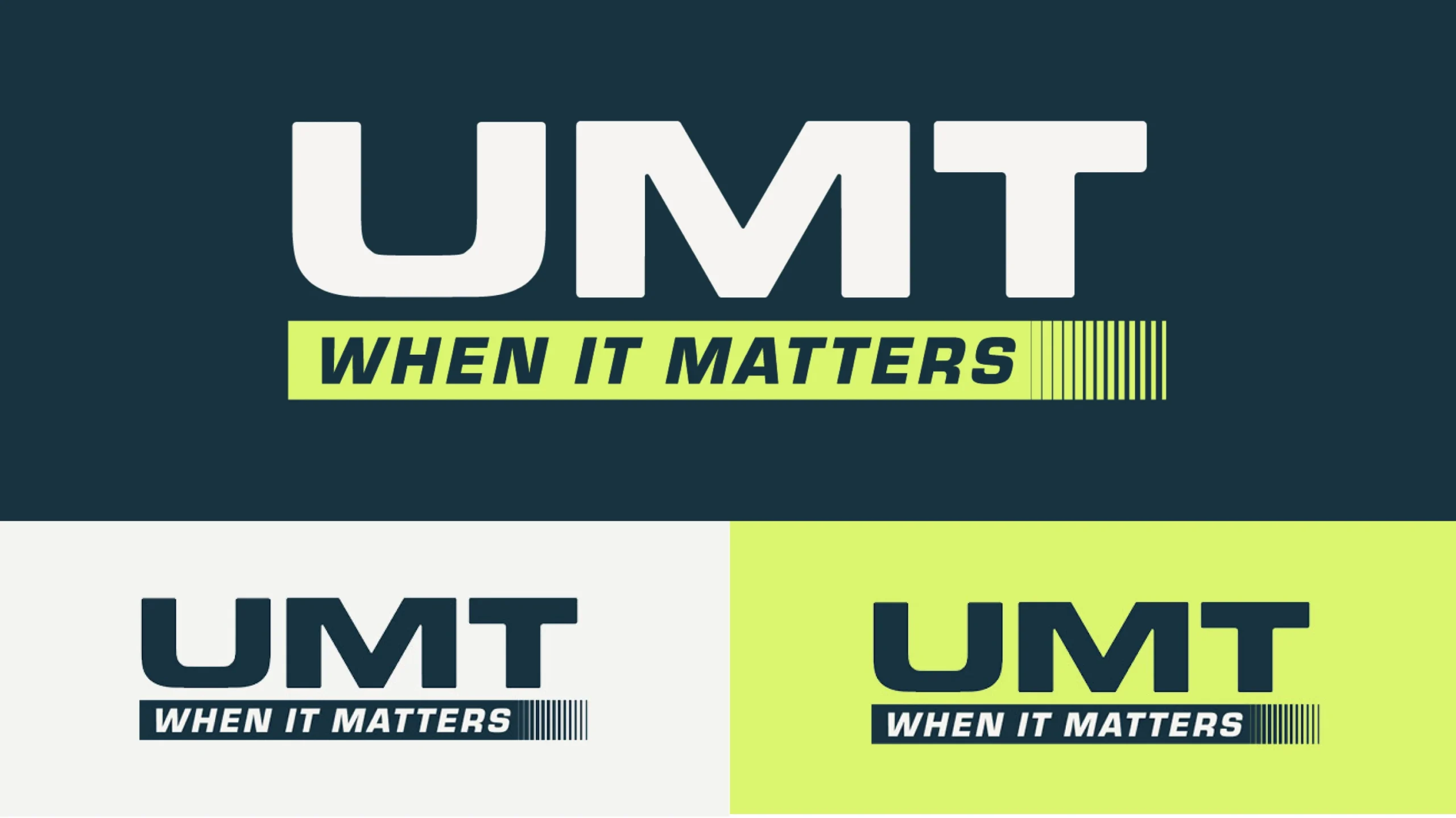
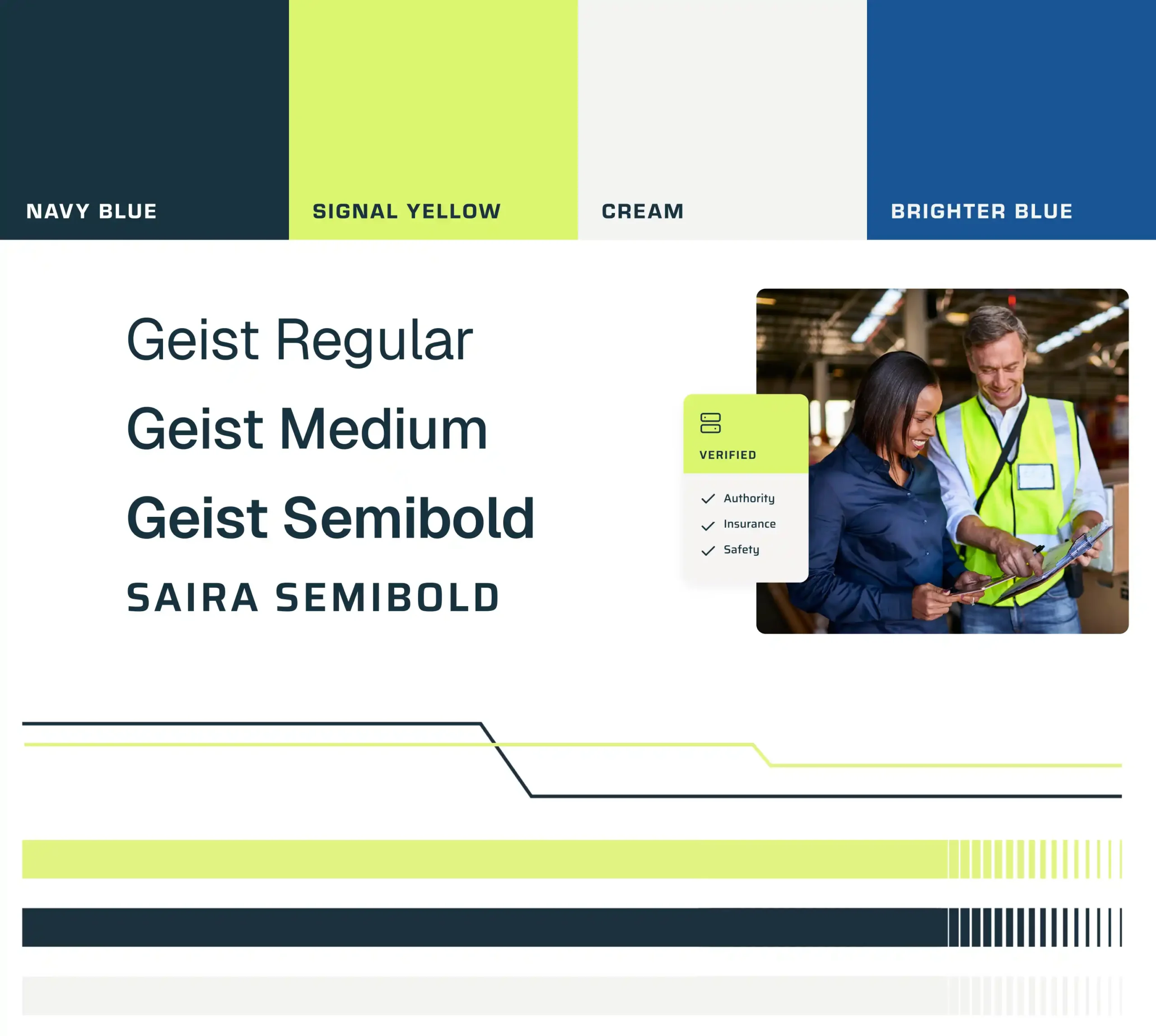
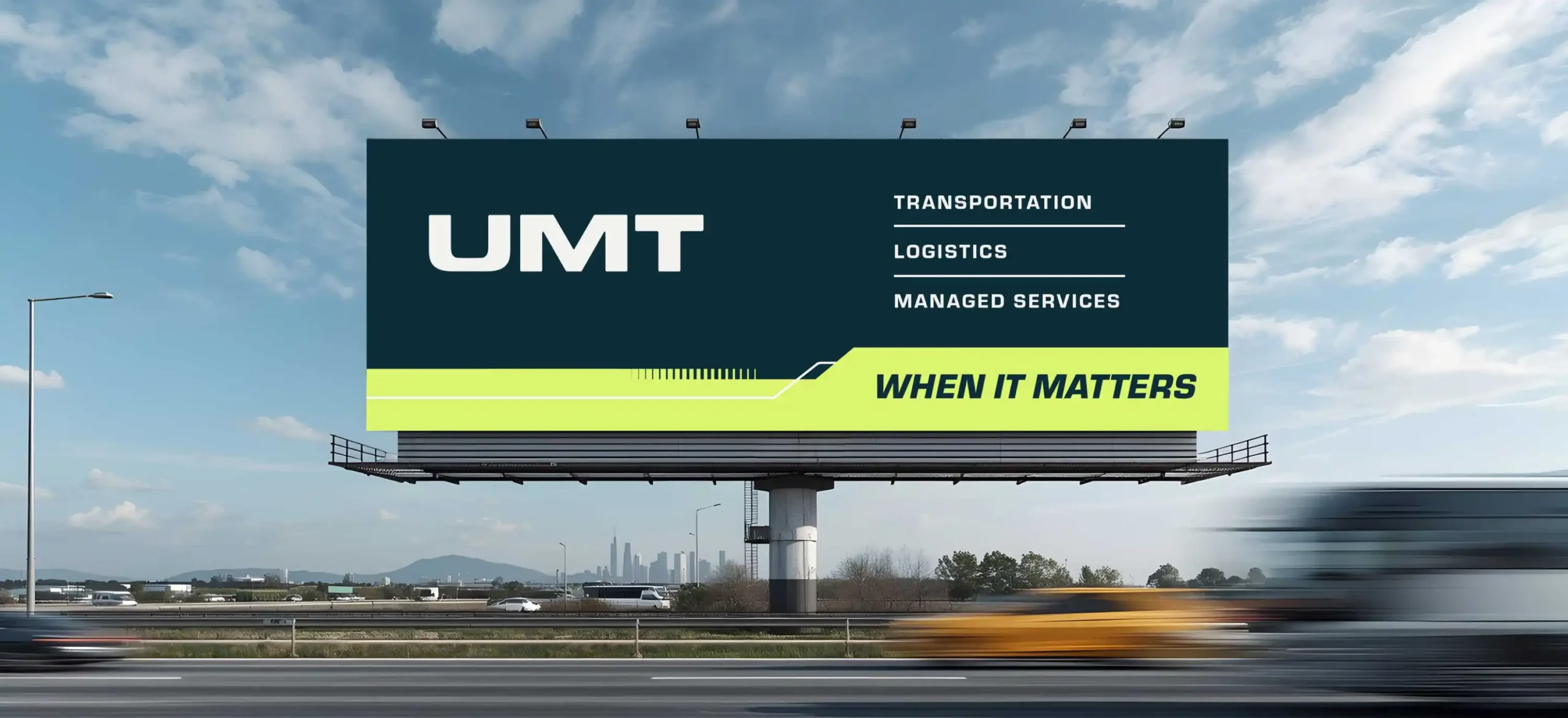
A confident color palette and clean, no-nonsense type give UMT a look that holds up, from the web to billboards to team apparel.
One site, two divisions
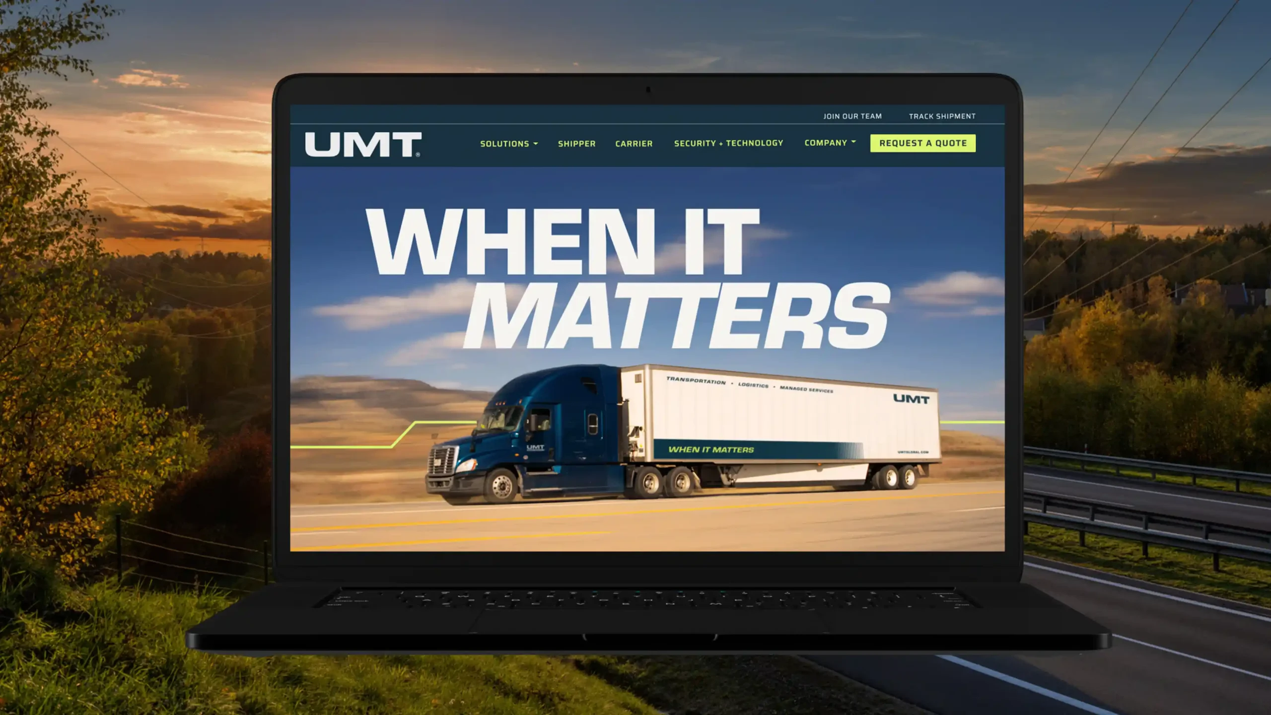
The new site unifies UMT’s transportation and logistics businesses into a single, confident experience, with clear paths for shippers and carriers alike.
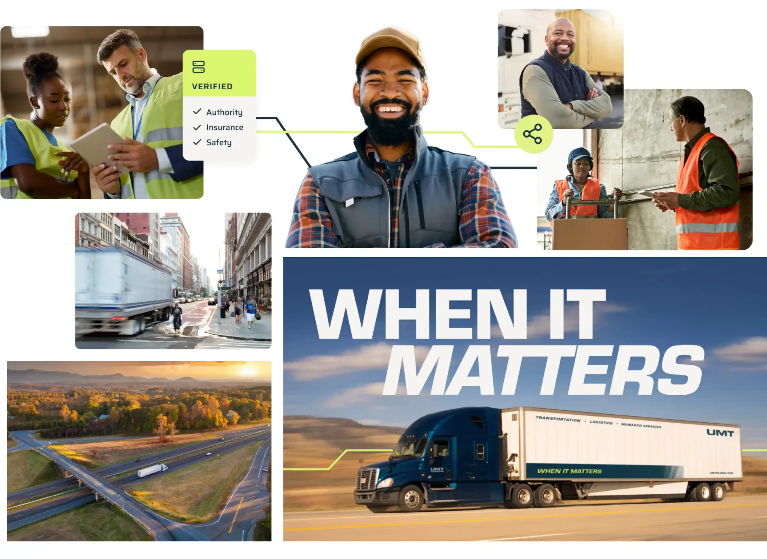
Built on proof
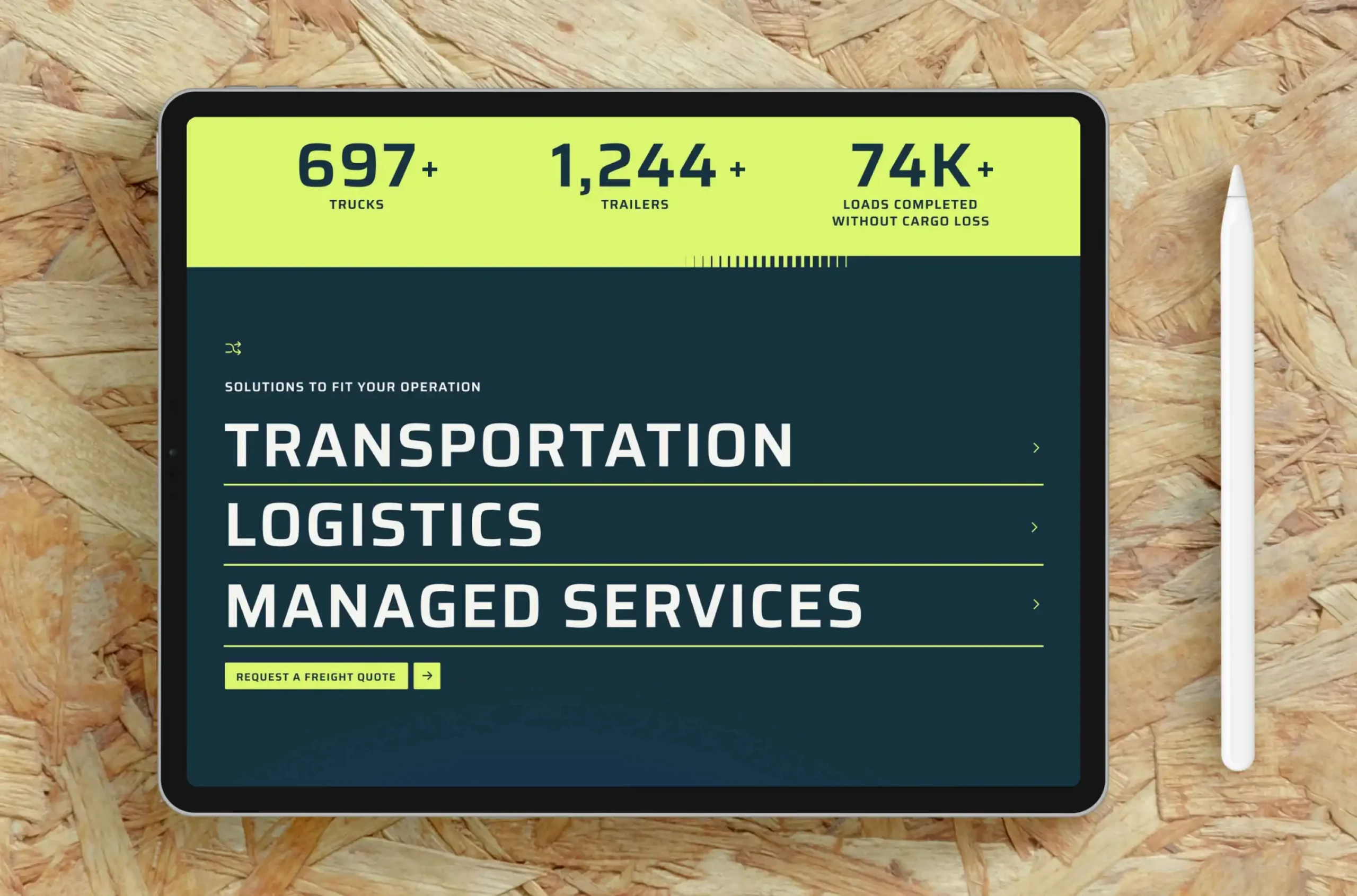
Impressive statistics, people-focused photography and real routes back up every claim, so visitors don’t have to take UMT’s word for it.
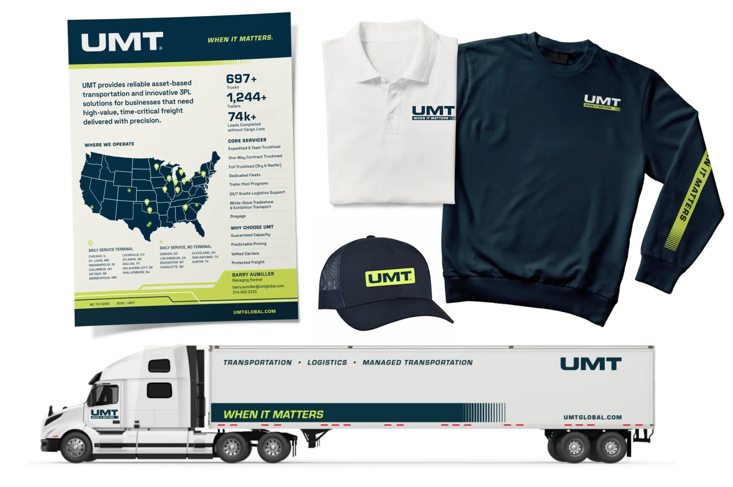
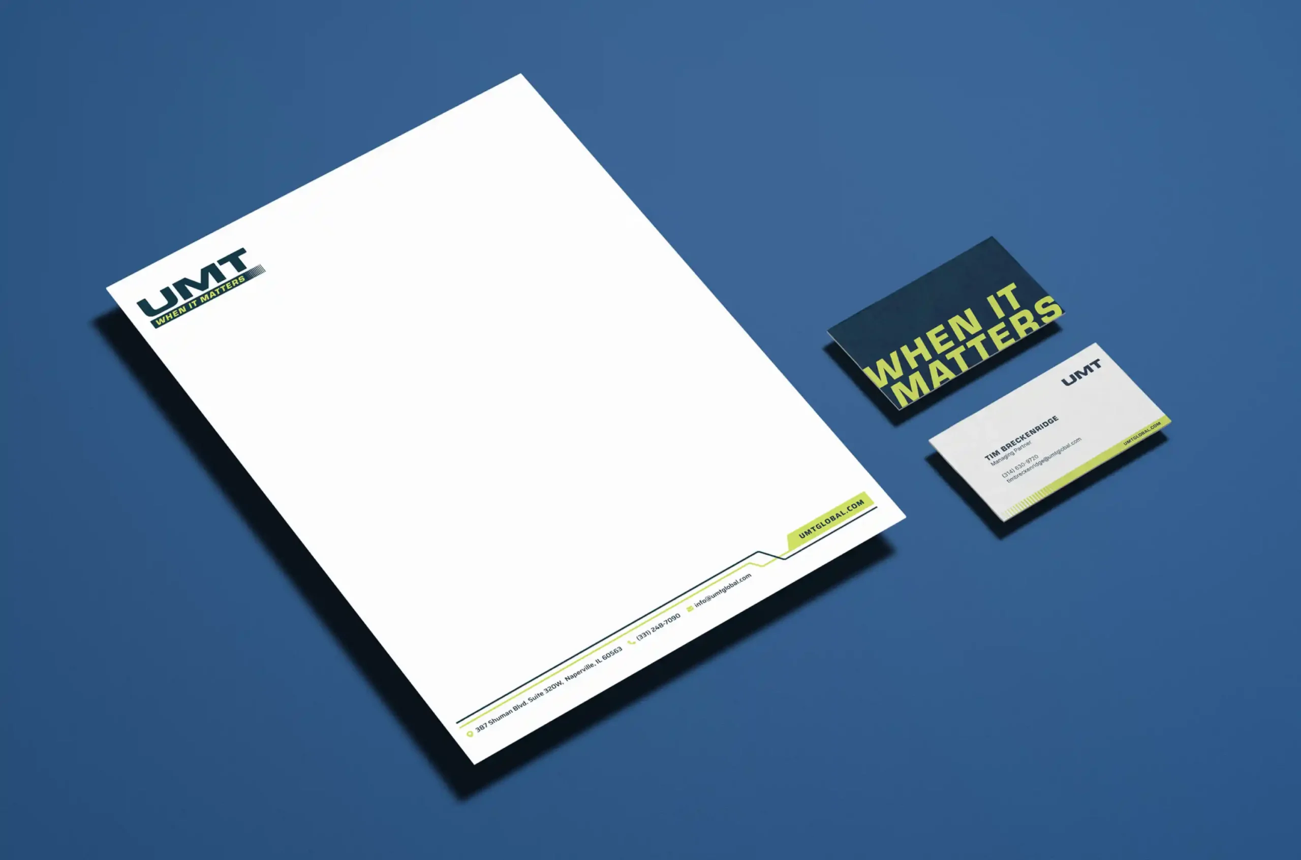
Consistent, down to the letterhead
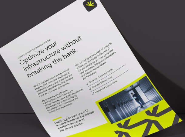
Every touchpoint, from sales slicks to trade show materials, now carries the same confident voice and look.
Putting reliability in the driver’s seat.
The real value of a logistics and transportation partner shows up when needs get complicated and the margin for error narrows. The more we learned about UMT, the clearer the story became. The company’s value isn’t just trucks, routes or logistics capabilities. It’s the team’s ability to stay locked in when the work gets complicated.
That idea led to a more direct, confident brand voice. New messaging positions UMT as the kind of partner clients want in a high-pressure situation—confident and reliable. The tagline, “When It Matters” points to those moments. The company’s standards are woven throughout the brand language, serving as evidence that UMT is paying attention to the right things.
A visual identity with more hauling power.
UMT needed an identity with distinction; professional enough for high-stakes conversations, but energetic enough to reflect the company’s responsive, hands-on approach.
Solid, sturdy letterforms give the new logo a stronger, more recognizable foundation. The mark projects confidence and reliability, visually reflecting the strength behind every UMT solution. The new color palette adds energy while keeping the brand grounded, and notched line elements suggest routes and forward motion without being too literal. Together, the elements create a visual thread that carries across the site and sales materials.
Together, the brand identity feels active but controlled—a visual reflection of how clients want a transportation partner to operate.
A clear route to confidence.
The new UMT website brings the company’s asset-based transportation and logistics capabilities into one experience, giving visitors a full scope of the business.
Content is organized based on what visitors need to know first: what UMT does, what it can move, where it operates and how it protects freight throughout the process. Because shippers and carriers come to the site with different priorities, we created a clear path for each audience. Prospective clients can explore services, coverage, security and technology, while carriers can quickly find qualifications, benefits and next steps.
The focused structure moves visitors from capabilities to proof to action without unnecessary detours.
Taking the message on the road.
UMT’s sales team regularly attends trade shows and meets with prospects, often with only a few moments to introduce the company. We created a one-sheeter that covers the essentials, including UMT’s fleet, services and lanes. A more detailed presentation gives the team room to talk through capabilities, technology and security. Branded apparel helps the team present a consistent, unified presence. Together, the materials give the team a consistent story and a more polished way to tell it.
Carrying the momentum forward.
The new brand brings UMT’s two divisions together, with language and visuals that reflect how its team operates: focused, responsive and prepared. Prospects understand the business faster. The sales team has better tools. And the company can show the standards behind its service before a shipment ever leaves the dock.
We’re excited for the road ahead as we continue partnering with UMT to bring the brand to life across new collateral, marketing materials and customer touchpoints.
Need a brand that delivers when it matters?
We help transportation and logistics companies build brands as reliable as their operations.