When complexity becomes clarity
Acosta’s messaging and visuals needed a refresh to help Acosta differentiate from competitors and uphold their reputation as an innovator.
Same foundation, fresh application
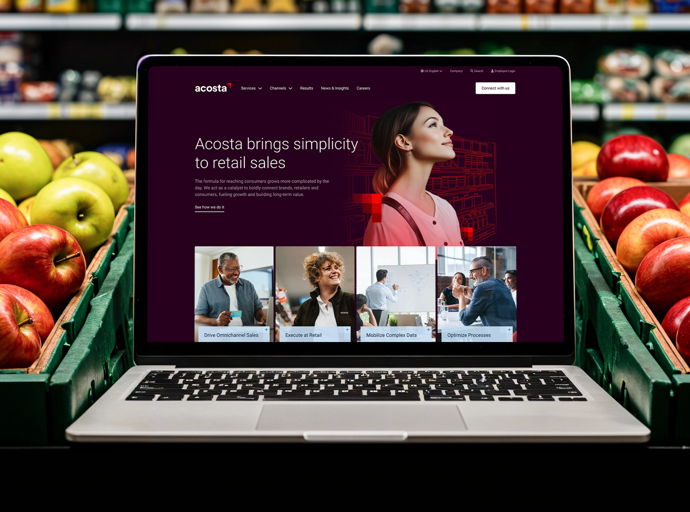
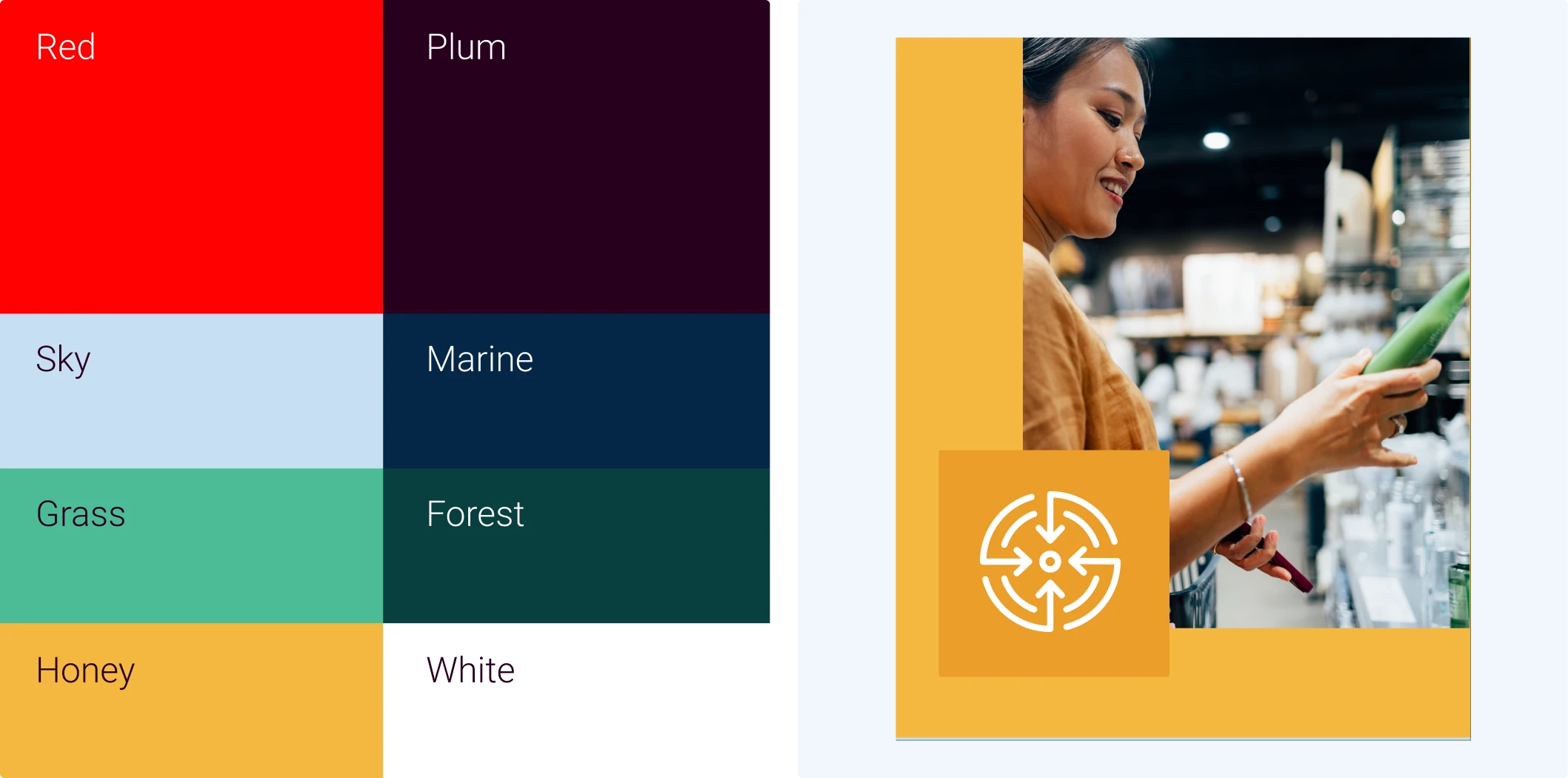
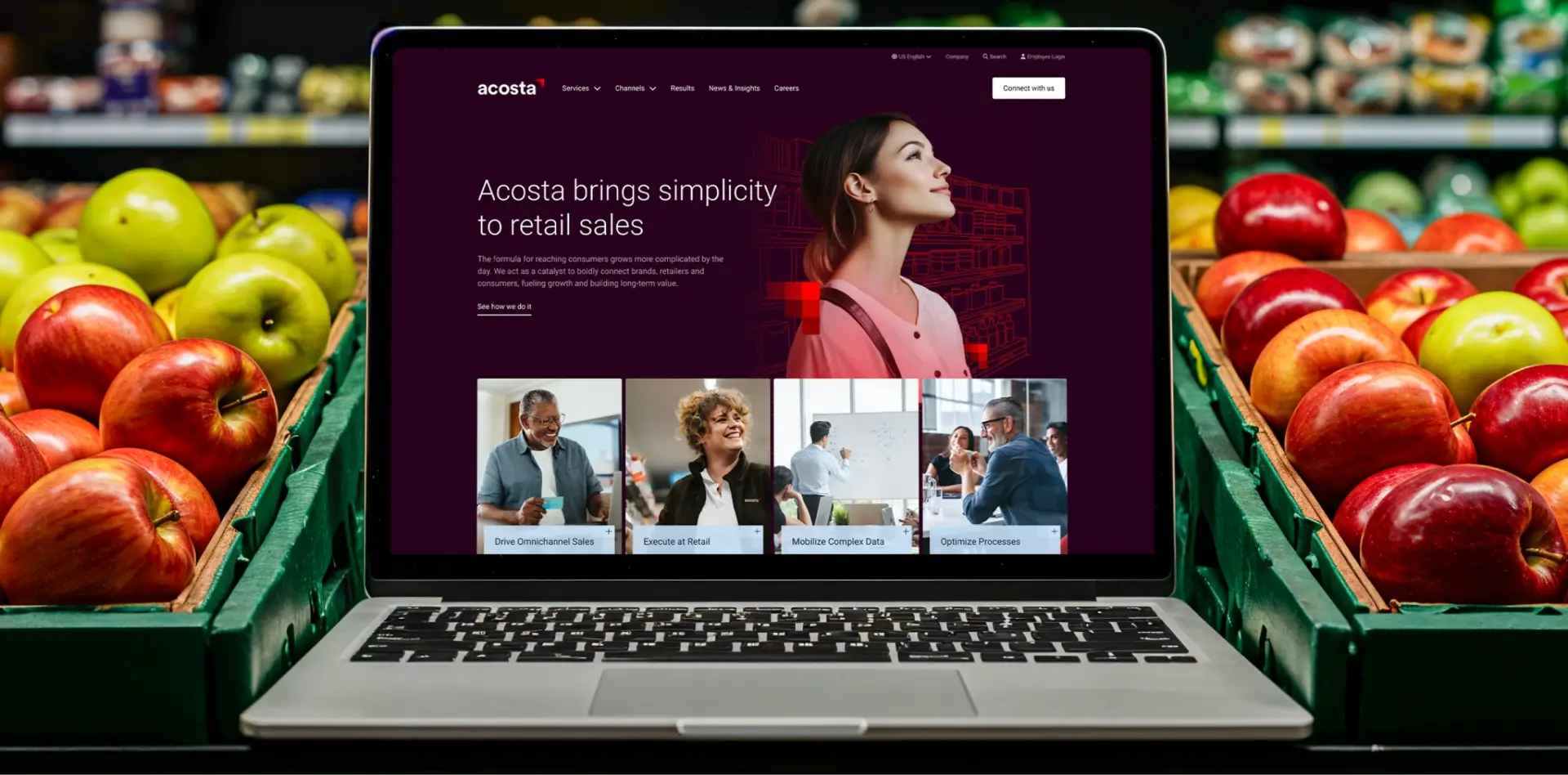
Working with Acosta’s existing color palette, we reimagined how to apply it—shifting the emphasis from the traditional red (commonly used in grocery and retail) to a sophisticated plum.
Full Story—this content appears in the side drawer on the frontend. Click the floating "Reader View" button to preview.
When complexity becomes clarity.
An established leader in the grocery and retail industry for nearly a century, Acosta partners with brands from Coca Cola to Kikkoman, and retailers like Costco and Whole Foods. But the company’s capabilities had expanded and the industry had evolved. They asked Atomicdust to transform their website into a platform that explains their wide-ranging services while showcasing their forward-thinking approach.
When complexity becomes clarity.
Acosta’s messaging and visuals needed a refresh to help Acosta differentiate from competitors and uphold their reputation as an innovator. Through an intensive brand workshop, we began to uncover Acosta’s core strength: simplifying sales in an incredibly complex retail ecosystem. The insight became the foundation for the entire website strategy.
Same foundation, fresh application.
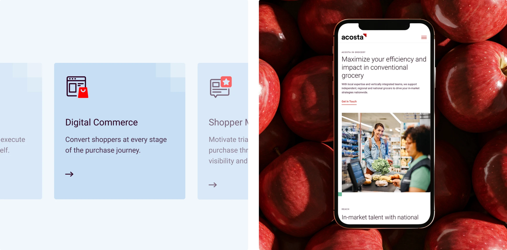
Working with Acosta’s existing color palette, we reimagined how to apply it—shifting the emphasis from the traditional red (commonly used in grocery and retail) to a sophisticated plum. Now, red and other secondary colors are used to drive attention to important details and bring pops of color to each page. And to drive home the message of how Acosta guides clients onward and upward, we began using an existing brand element (the pixel logo mark) as a visual device. These subtle but effective changes position Acosta as a visionary partner, rather than just a legacy player.
From the inside out.
Acosta faced another challenge, too. With a multitude of business units, channels and international teams, explaining Acosta’s capabilities—especially in a way that didn’t sound like all the other brands in their space—was a hurdle. Our team facilitated conversations with Acosta’s leadership to clearly define service offerings that crossed traditional boundaries. Based on client goals, options like “Drive Omnichannel Sales” speak clients’ language and help clarify the impact each service can have. Housed in the website’s main navigation, the structure is yet another demonstration of Acosta’s core promise of simplifying sales—simplifying the process of getting clients to where they want to go.
All about the audiences.
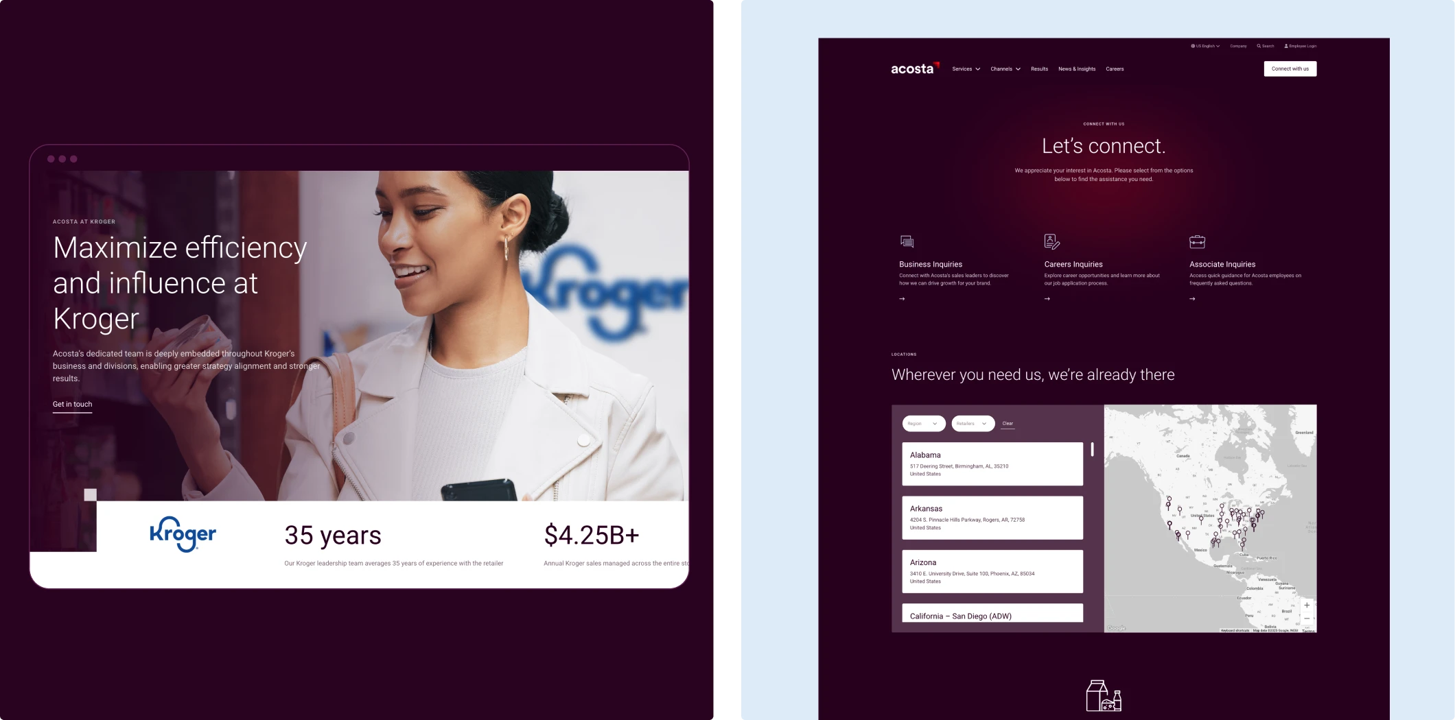
The best websites and content strategies aren’t just based on org structure—they’re built around client goals. We created intuitive pathways for visitors based on their needs, whether they’re approaching by industry, service type or business challenge.
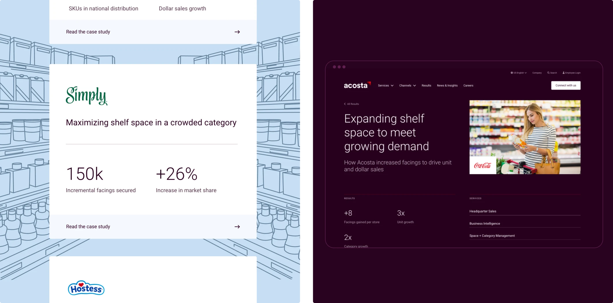
Case studies, labeled “Results” and filterable by objective and channel, highlight sales success metrics Acosta has helped clients achieve. Employee quotes throughout the site are paired with headshots to make them even more personal, and thoughtfully sourced photography helps visitors visualize themselves as Acosta clients. We worked closely with Acosta to ensure calls to action speak directly to what prospective clients need (“Transform your brand today,”) and what tangible impact they can expect (“Drive traffic and boost conversions.”)
Built to scale.
Beyond delivering a standalone website, we designed with scalability in mind. The site serves as a design system, with reusable components that can fuel future digital projects.
There’s one thing we haven’t mentioned: we weren’t going at it alone. To make the high-profile project happen, Acosta brought two specialists together: Atomicdust for our design and creative prowess, and Integrity for technical expertise and coordination with Acosta’s internal IT teams. Collaborating closely throughout, our teams complemented each others’ strengths and ensured the site checked every box.
A next-gen website for next-gen growth.
The retail landscape will always keep changing. But now, Acosta’s website reflects their position at the forefront of the industry—not just keeping pace with change, but helping to define it.
Got a complex story that needs to feel simple?
Let's start a conversation.