Cooking up a dream
Founded by friends and former tech professionals, Chicken Meets Rice started with a simple mission: introducing more people to a dish they loved.
Branding from the bowl up
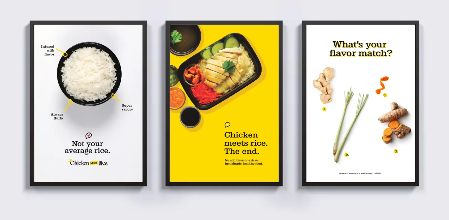
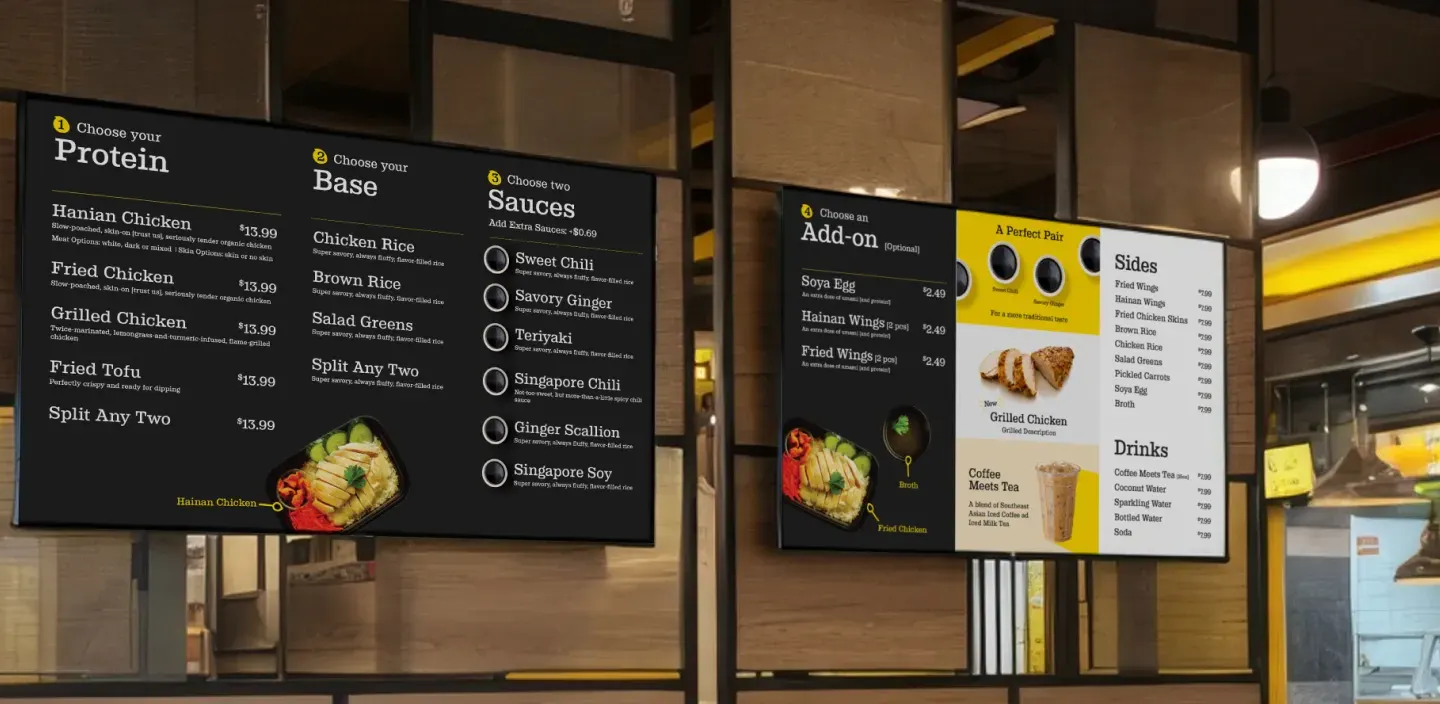
When we met the team, they clearly had all the right ingredients—authentic recipes, a choose-your-own-adventure menu and loyal customers.
Adding a dash of design
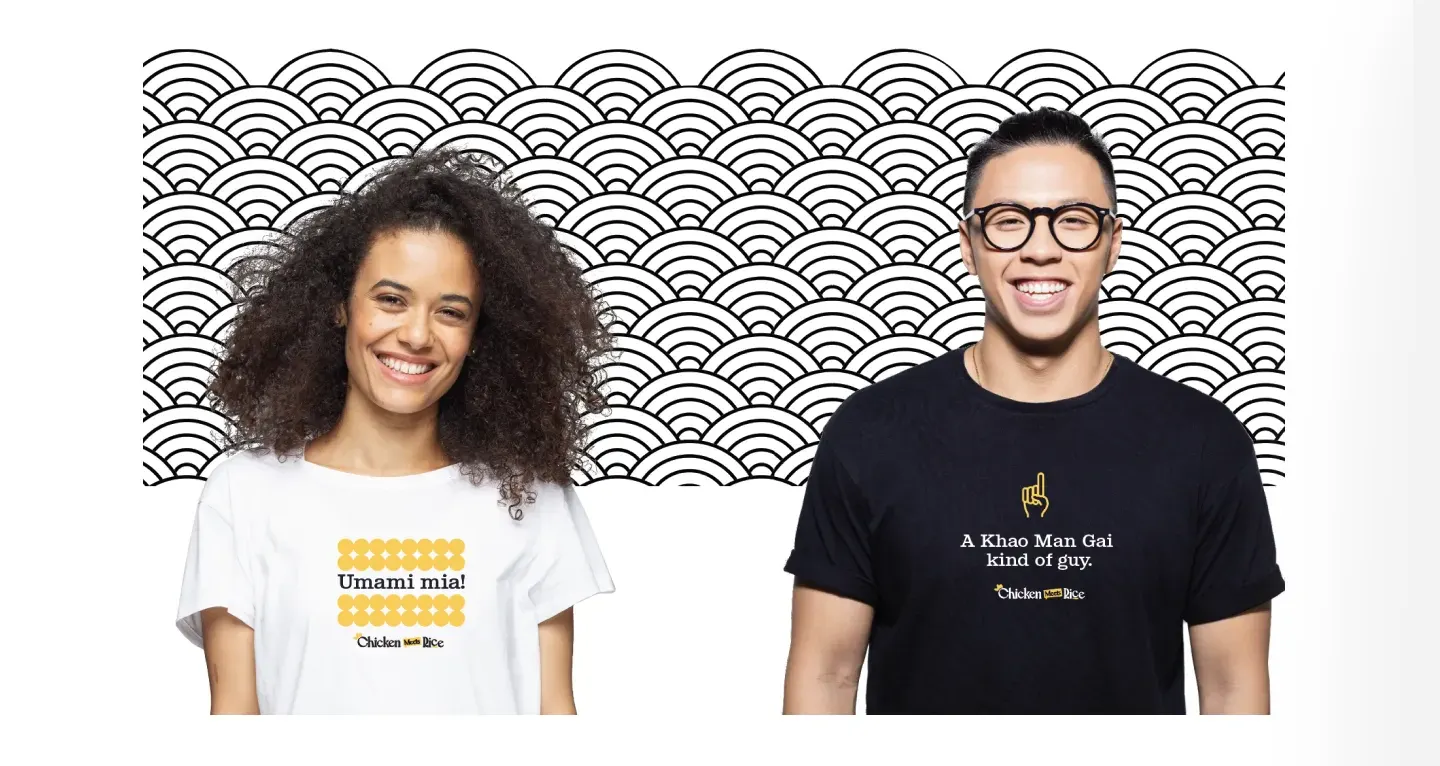
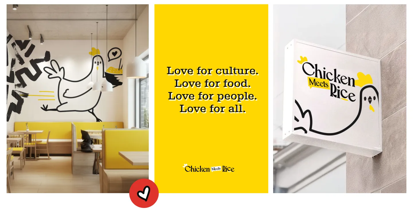
The design direction focused on warmth and approachability by using thick, rounded typography, a bright yellow color palette balanced by high-contrast black and illustrations that mixed culinary craft with a wink of whimsy.
Introducing the chicken
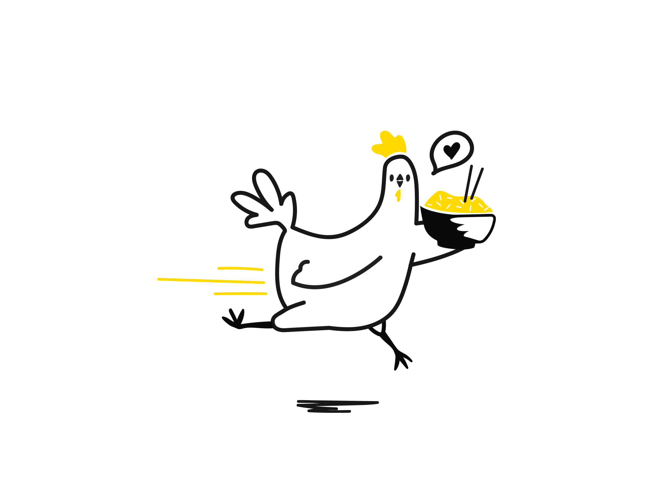
At the heart of it all is a chicken, literally.
Full Story—this content appears in the side drawer on the frontend. Click the floating “Reader View” button to preview.
Cooking up a dream.
Born in California, Chicken Meets Rice introduces Hainan chicken rice—a beloved Southeast Asian dish—to American fast-casual dining. As they prepared to open their largest location, they realized they needed more than great food. They contacted Atomicdust to help design a visual identity that could grow with them.
Cooking up a dream.
Founded by friends and former tech professionals, Chicken Meets Rice started with a simple mission: introducing more people to a dish they loved. Early success proved the concept had legs (or wings), expanding to multiple locations. But while the food resonated, the brand wasn’t quite sticking in customers’ minds. They wanted to celebrate the authenticity of Hainan chicken rice while making it accessible to people who may have never heard of it before.
Branding from the bowl up.
When we met the team, they clearly had all the right ingredients—authentic recipes, a choose-your-own-adventure menu and loyal customers. What they needed was a clear and memorable story. One that would help new customers understand what makes the dish—and their version of it—so good. We set out to make the unfamiliar feel familiar, honoring the dish while keeping the tone fun, friendly and undeniably delicious.
Adding a dash of design.
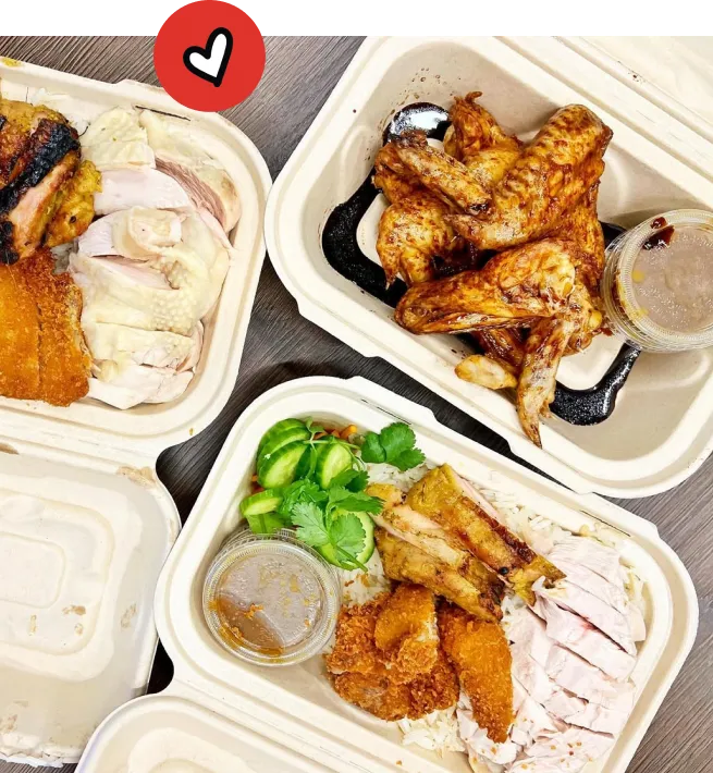
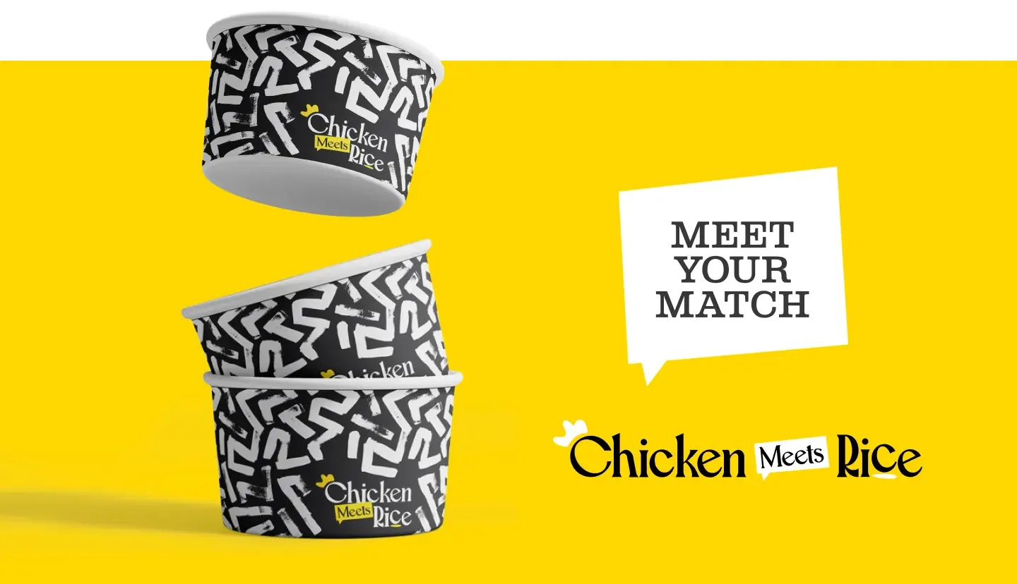
The design direction focused on warmth and approachability by using thick, rounded typography, a bright yellow color palette balanced by high-contrast black and illustrations that mixed culinary craft with a wink of whimsy. We built custom icons and badges to highlight preparation methods and regional origins, helping customers understand what makes each dish unique without overwhelming them with information.
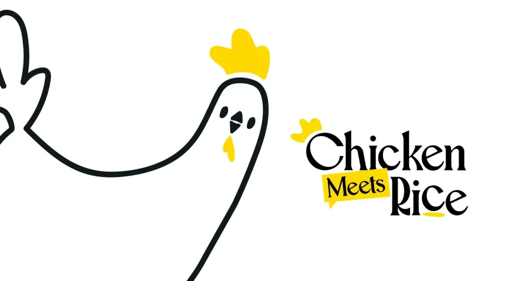
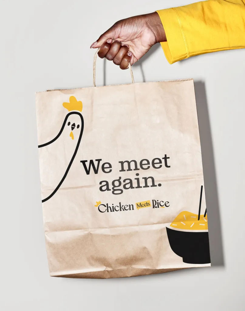
Introducing the chicken.
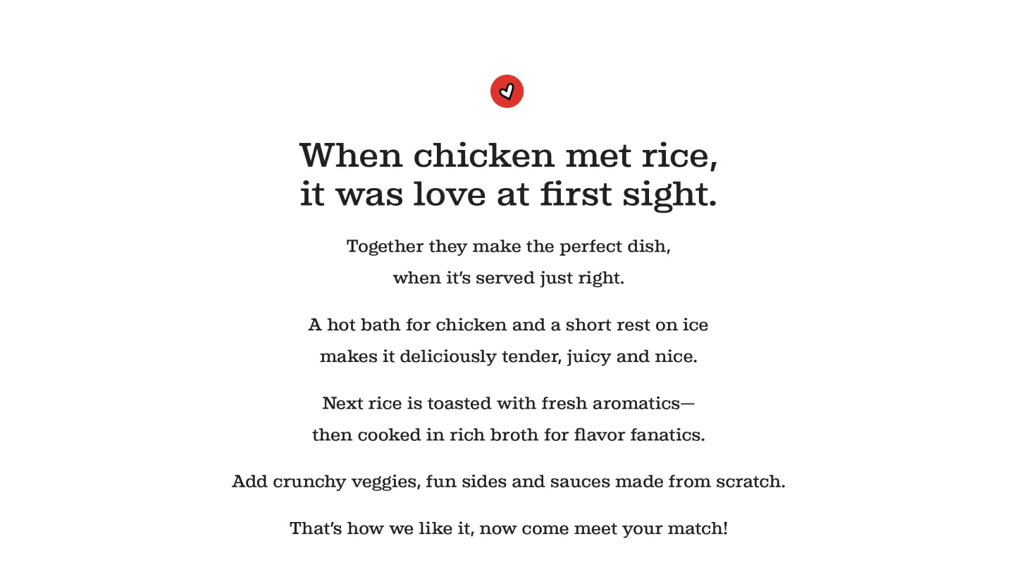
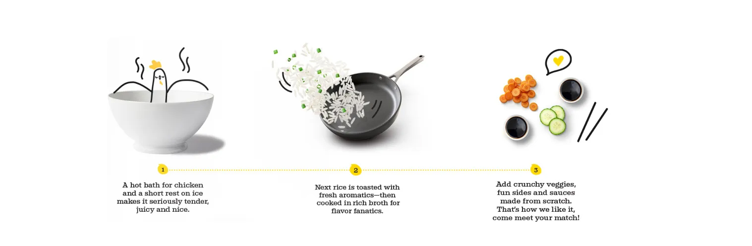
At the heart of it all is a chicken, literally. We created a happy, bowl-holding mascot that personifies the brand. To back it up, we wrote a brand narrative with the same charm, a love story of sorts between chicken and rice. The rhyming, storybook-style narrative explained the slow-poaching, broth-simmering, flavor-layering process in a way that added personality while educating first-time diners.
Sharing more than a meal.
Chicken Meets Rice isn’t just serving food. They’re sharing a dish rooted in culture, comfort and connection. By helping them build a brand that balances tradition with modern appeal, we helped them set the table for continued growth without losing sight of what made it special in the first place.
Cooking up something worth scaling?
Let’s start a conversation.