Engineered to move forward.
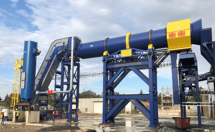
DIDION builds enormous machines that help foundries and recycling operations work more efficiently while cutting waste. We updated the brand and website to better reflect the ingenuity and power behind the company and its equipment.
Built around motion.
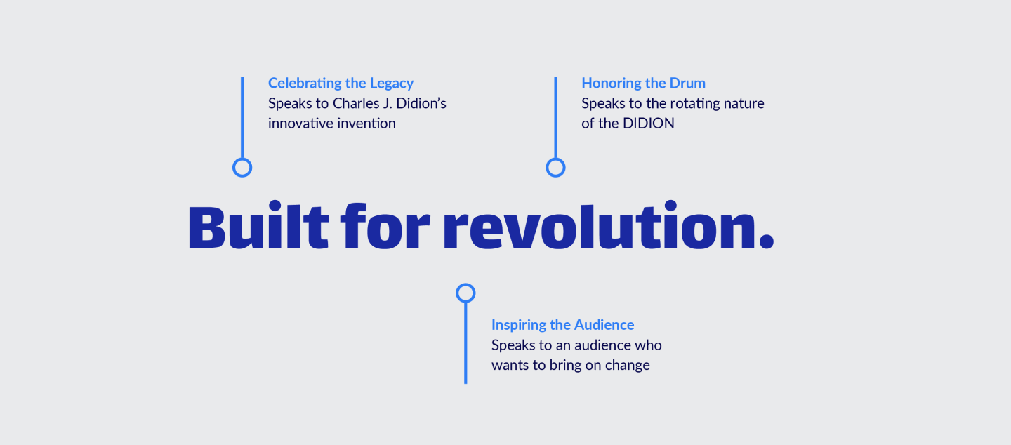
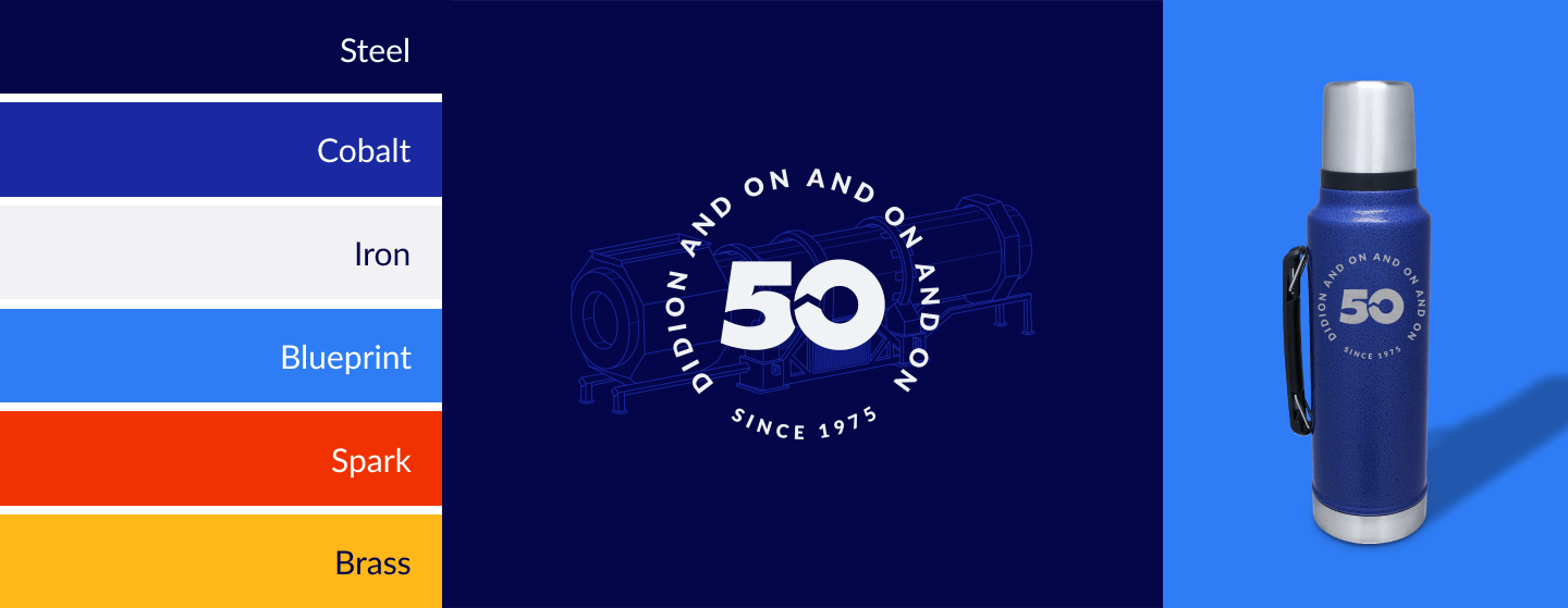
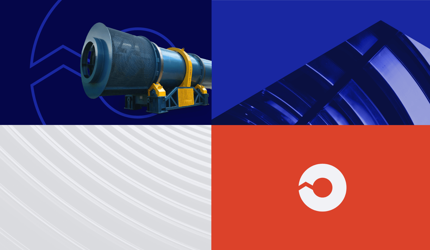
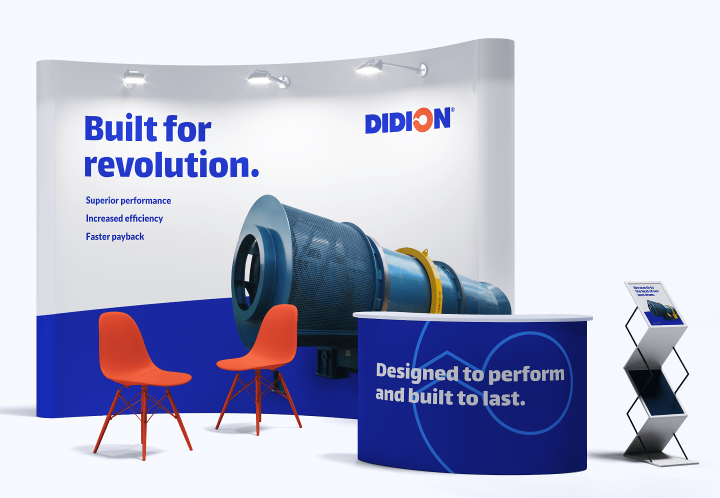
The machinery itself inspired the brand system, with its signature rotation influencing everything from the language to the visual identity. A streamlined color palette, new graphic elements and refined logo details gave DIDION a stronger, more modern presence without losing what people already recognized.
Showing what the machines can do.
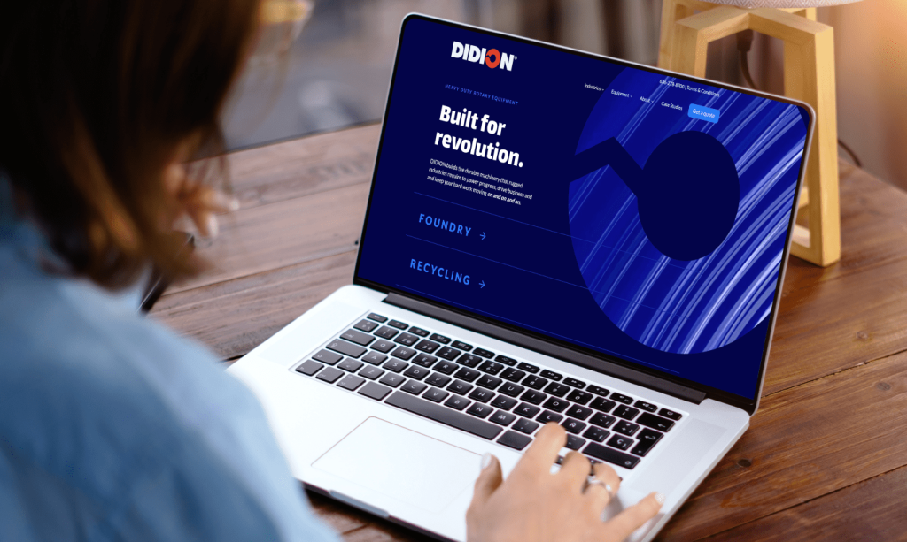
The new website puts more focus on the results DIDION equipment delivers and makes those benefits easier to understand at a glance. Case studies, interactive comparisons, clearer messaging and motion help show the difference the machines can make across an operation.
Ready for revolution.
After 50 years of advancing metal processing, DIDION needed a brand that felt as progressive as the company itself. The refreshed identity and website give DIDION a stronger way to reach the next generation of customers and continue pushing the industry forward.

Full Story—this content appears in the side drawer on the frontend. Click the floating "Reader View" button to preview.
Made for revolution.
DIDION’s rugged (and massive) machinery makes foundries and recycling plants more efficient, safer and less wasteful. It’s a revolutionary concept—literally. DIDION machines use rotational force to process metals. But the brand and website weren’t conveying the company’s forward-thinking nature and powerful products. Our job was to reimagine the brand identity and website to stay ahead of its evolving industry.
On and on and on.
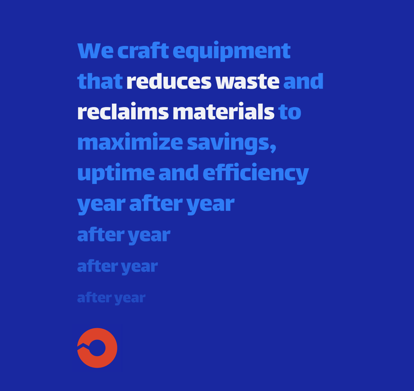
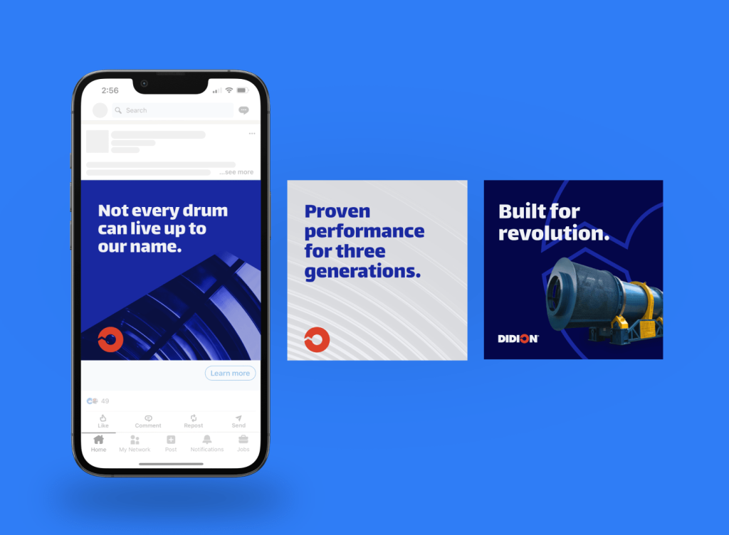
Inspired by the machinery’s rotary elements, we developed brand language that underscores the equipment’s durability and strength, with phrases like “power progress,” “spin waste into wealth” and “year after year after year.”
DIDION’s logo already hinted at mechanical revolution and only needed subtle updates, but other visual elements needed a bigger lift to modernize. A streamlined color palette instantly elevates the brand’s perceived quality, and new graphic devices introduce texture and ownable, repeatable elements. And since the company was about to roll into its 50th anniversary, we surprised the client with a 50th-edition version of the logo they could use to celebrate all year long.
Next-generation insights.
The website needed to speak to younger professionals ascending to leadership positions within DIDION’s target market. Messaging and visual elements directly address audience pain points—showcasing how the equipment reduces costs and delivers cleaner outputs.
Case studies put client results centerstage while interactive before-and-after sliders show users the tangible impact of DIDION’s equipment. And across every page, animated elements highlight the company’s signature rotation while providing a modern user experience.
Making the world turn.
DIDION has always been at the forefront of its field, and now, again, it looks the part. We’re looking forward to seeing the company redefine what’s possible in metal processing—again and again and again.
Got a revolutionary product hiding in plain sight?
Let's start a conversation.
More on how we build brands for business audiences: B2B branding.