Digging into the brands
Our first step with MEM was to study their current brand experience, and compare it to their increasingly aggressive competitors.
Setting the stage
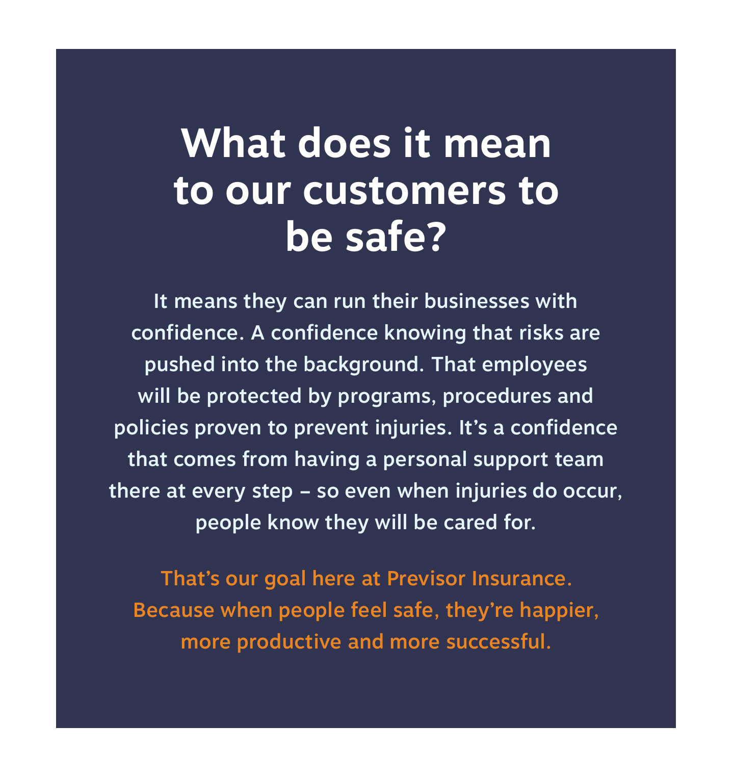
Within the workers compensation industry, there was a lot of messaging parity: Everyone’s talking about safety – but no one’s talking about what it means for employees to be safe, and, in turn, what that means for the companies they work for.
Confidence in logos
We wanted the new MEM and Previsor logos to further emphasize the company’s new, confident brand promise.
Full Story—this content appears in the side drawer on the frontend. Click the floating “Reader View” button to preview.
Digging into the brands
(This page shows our original branding and website work for MEM. Almost a decade later, as the organization underwent a significant evolution, they hired Atomicdust again to refresh the brand and build a new site. We were beyond flattered. Check out that work here.)
Missouri Employers Mutual (known internally and to the market as MEM) was in an enviable position: they were leading the workers compensation insurance market in Missouri, and had achieved tremendous levels of brand recognition, not to mention an unbeatable reputation for service.
As they planned for the expansion of a new brand, Previsor, into other states (and, long-term, for Previsor to become the lead brand), they looked to Atomicdust for a research-based strategy to make it happen.
Digging into the brands
Our first step with MEM was to study their current brand experience, and compare it to their increasingly aggressive competitors. On the MEM side, we found a confusing maze of five websites and multiple branded campaigns and content programs.
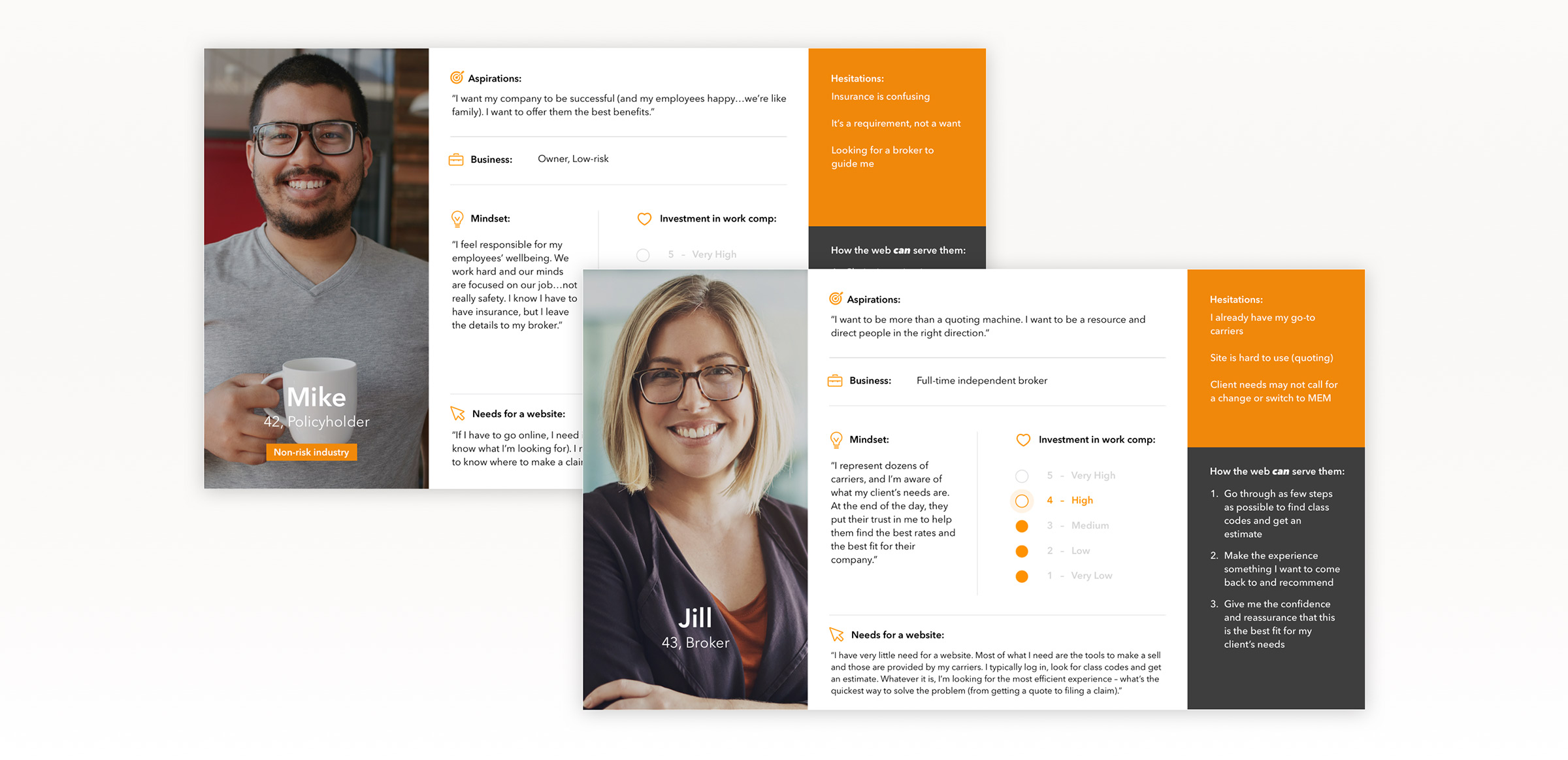
Armed with user personas based on our research, we created a brand strategy that would simplify the experience for customers, allow the brands to benefit from their rich content library, and help Previsor quickly gain brand authority.
Setting the stage
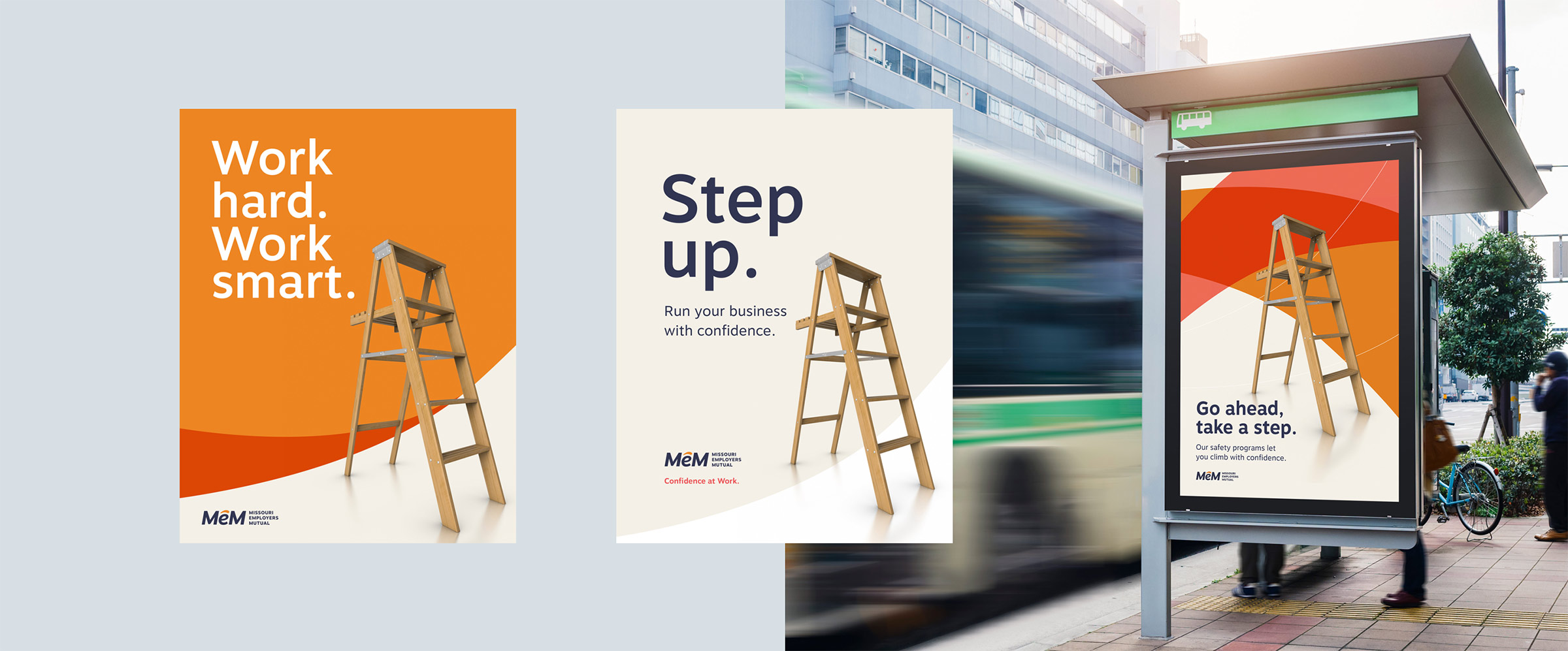
Within the workers compensation industry, there was a lot of messaging parity: Everyone’s talking about safety – but no one’s talking about what it means for employees to be safe, and, in turn, what that means for the companies they work for.
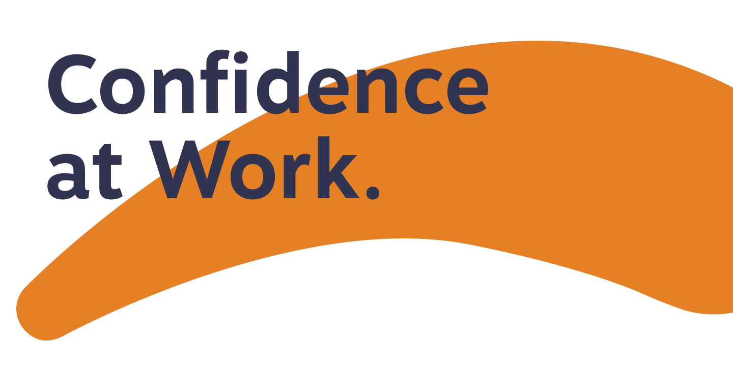
It’s best expressed in our tagline for both MEM and Previsor: Confidence at Work.
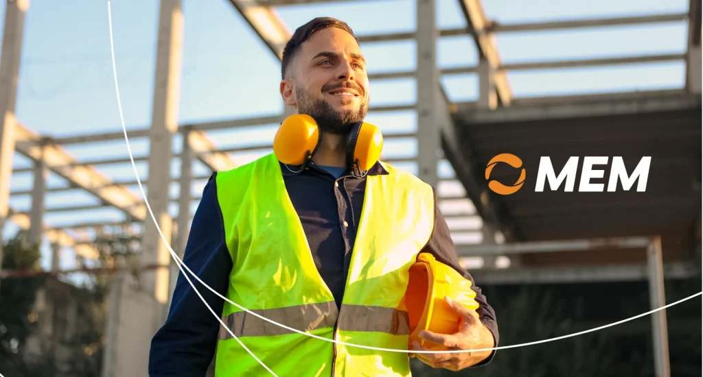
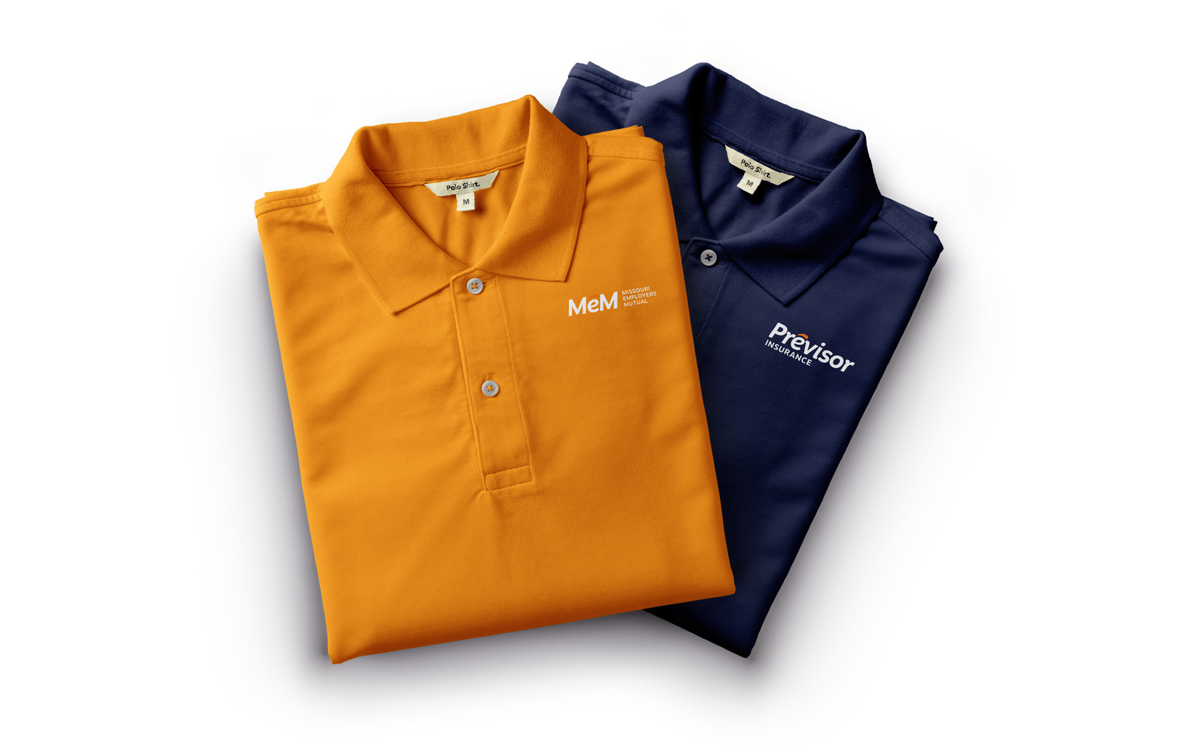
Confidence in logos
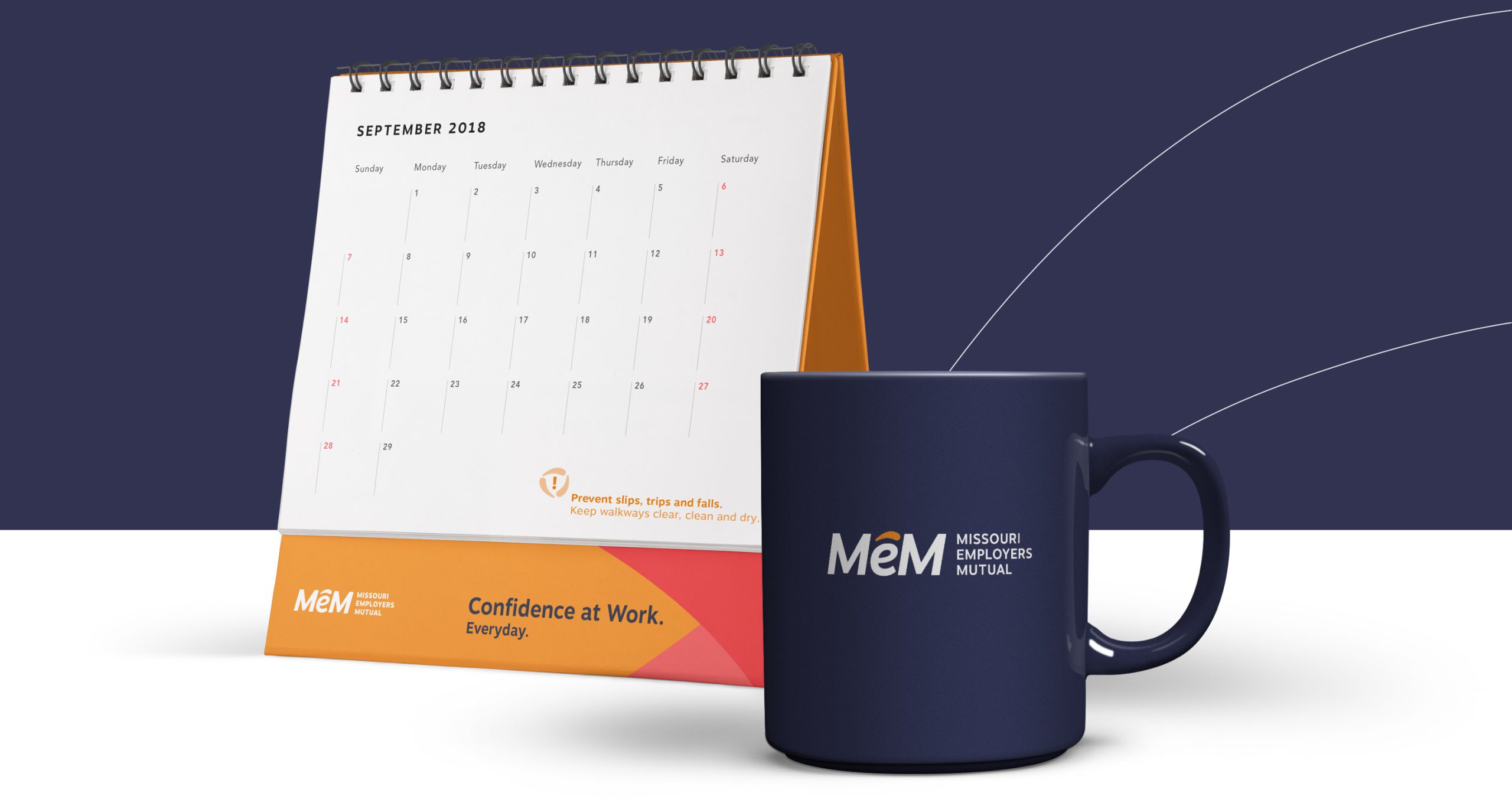
We wanted the new MEM and Previsor logos to further emphasize the company’s new, confident brand promise. It started with the bold type and subtle forward motion, but the feeling truly comes through with the distinctive arc mark that sits over the “e” in each brand name. It’s an unusual treatment with a message: Previsor and MEM have your employees covered.
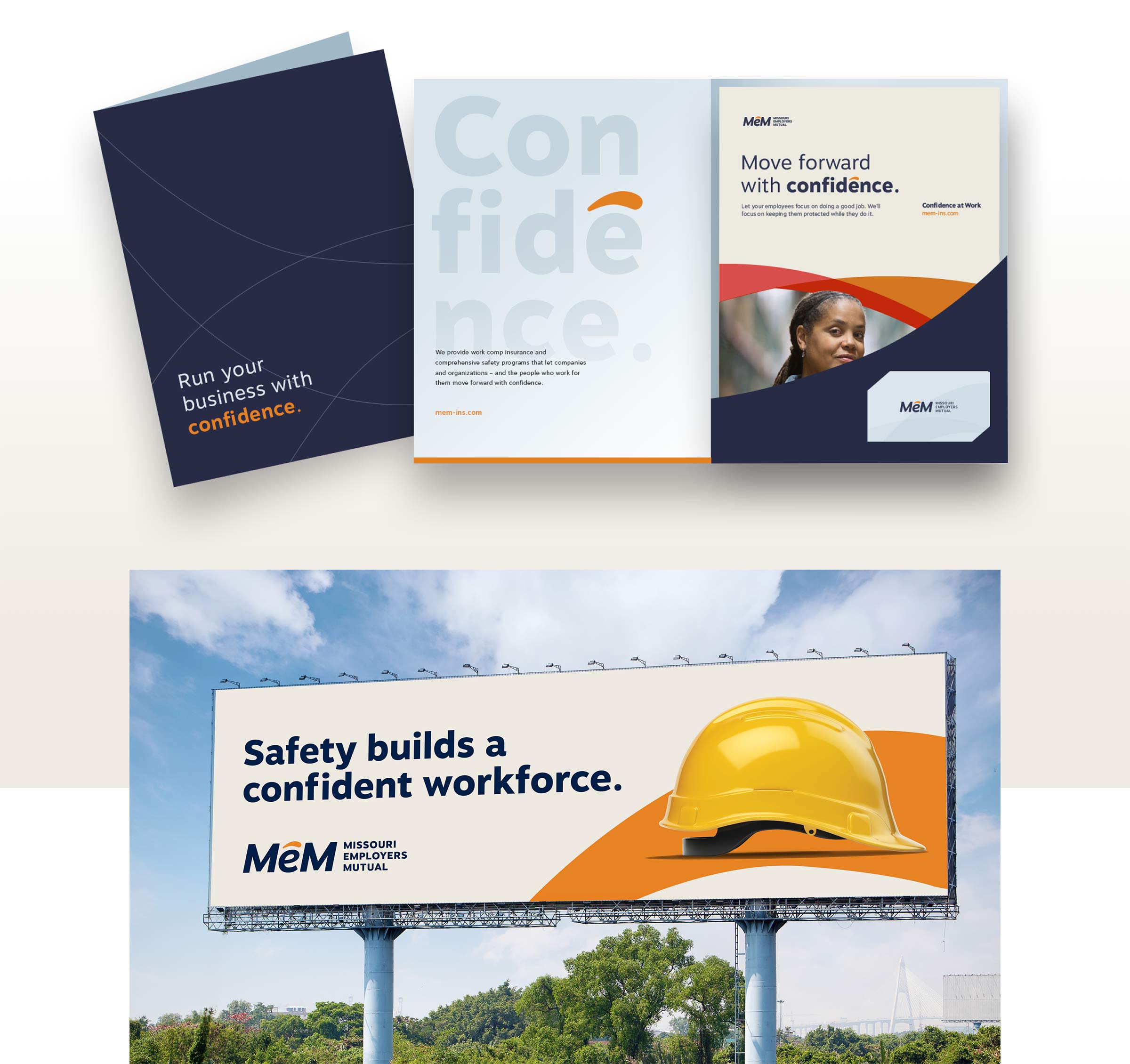
Sharing the brand with the world
Of course, MEM and Previsor have multiple touch points with their customers and the employees they serve. We provided their team with a comprehensive set of tools and expressions they could use to reach the right audiences at the right times.
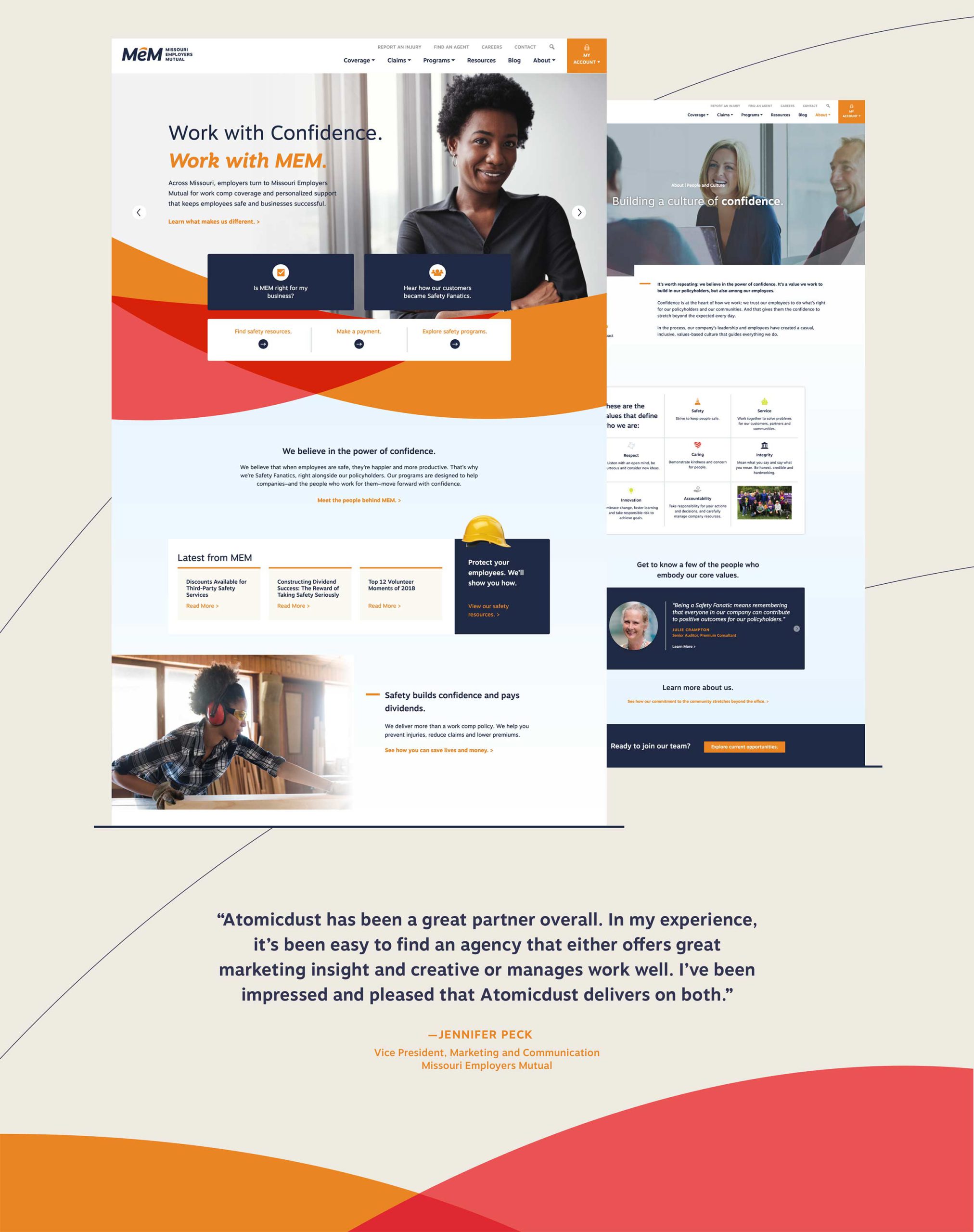
Untangling the web
We approached the websites for MEM and Previsor with one goal: clarity of action. No matter why people are coming to the site – to pay their bills, to access safety resources, or to learn about workers compensation coverage – we wanted to make it easy for them to get there.
From a technical standpoint, we wanted to use the two sites to build content and brand authority for Previsor. So while the two sites have nearly identical content, they don’t compete for search results. This is a critical component in MEM’s long-term strategy for Previsor to become the lead brand.
Got multiple brands that need a clear strategy?
Let's start a conversation.