When a client came to us with an idea for a lotion that would soothe muscle pains, gummies that would sharpen focus and a tincture that would deliver the best sleep of your life… well, it sounded too good to be true.
But when we heard that the chemist behind these products would be our former client and founder of Better Life—a line of naturally formulated cleaners that really work (we’ve been using them to clean coffee spills and dusty screens around the office for years)—we thought, maybe he’s onto something.
That something is CBD.
What’s the big deal with CBD?
Harvard Health Publishing explains CBD this way: “CBD, or cannabidiol, is the second most prevalent active ingredient in cannabis (marijuana).”
While the marijuana plant has a long-standing and polarizing reputation, when CBD emerged on the market it was relatively unknown. It’s often described as sharing the same therapeutic benefits as marijuana, with none of the high. That feature has made it attractive to many—from wellness enthusiasts to anxious pets.
CBD was something our team had heard of and read about. Some of us had tried it. But marketing it? That was a whole new frontier.
With so many CBD products on the market—how were these going to be different?
An opportune target audience
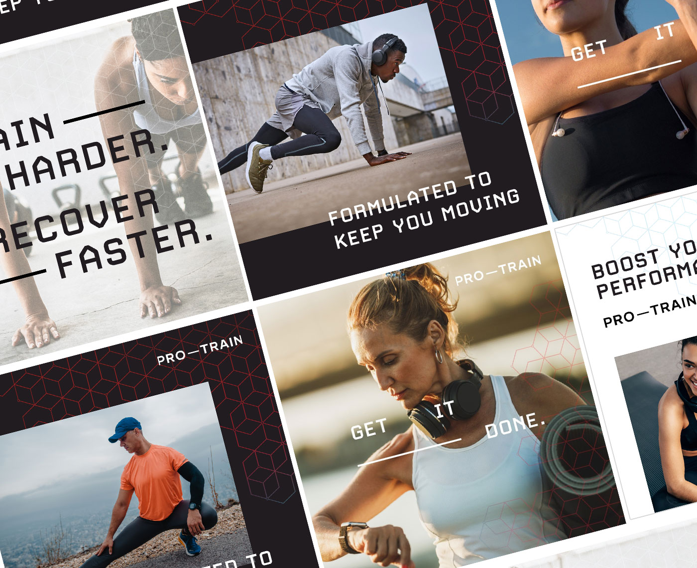
Our clients came to us with a name, product line and target market in mind. Pro-Train would offer pain-relieving lotions and gels, along with gummies and drops specially formulated for enhancing focus or sleep—all designed with athletes in mind.
![]()
Athletes are driven, motivated and daring—but distractions, lack of sleep and injuries can get in the way of game-time performance or making progress towards goals. CBD products offer athletes powerful relief from obstacles and can help them maintain focus and motivation.
Seems like a perfect fit, right?
As long as the brand values, benefits and claims you make reflect real results.
Athletes are a very discerning audience. In the same way they look for the best quality gear and apparel, they’re interested in products that enhance their workout or game. Good branding isn’t enough to make a sale—packaging design and product descriptions need to have realistic claims and benefits.
We needed to introduce and educate customers on the benefits that CBD can add to their game and create a brand message that appealed to athletes at every level, from professional players to gym enthusiasts to weekend golfers.
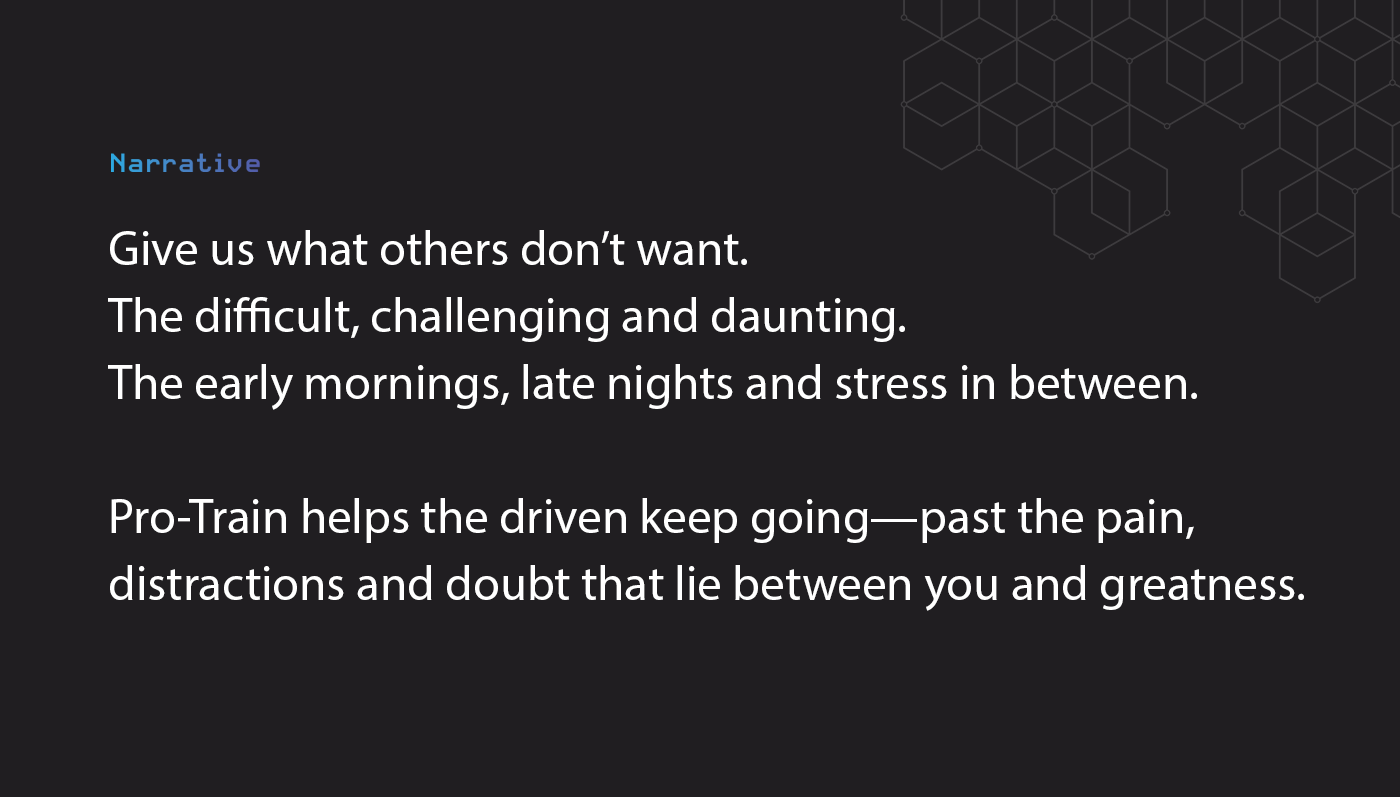
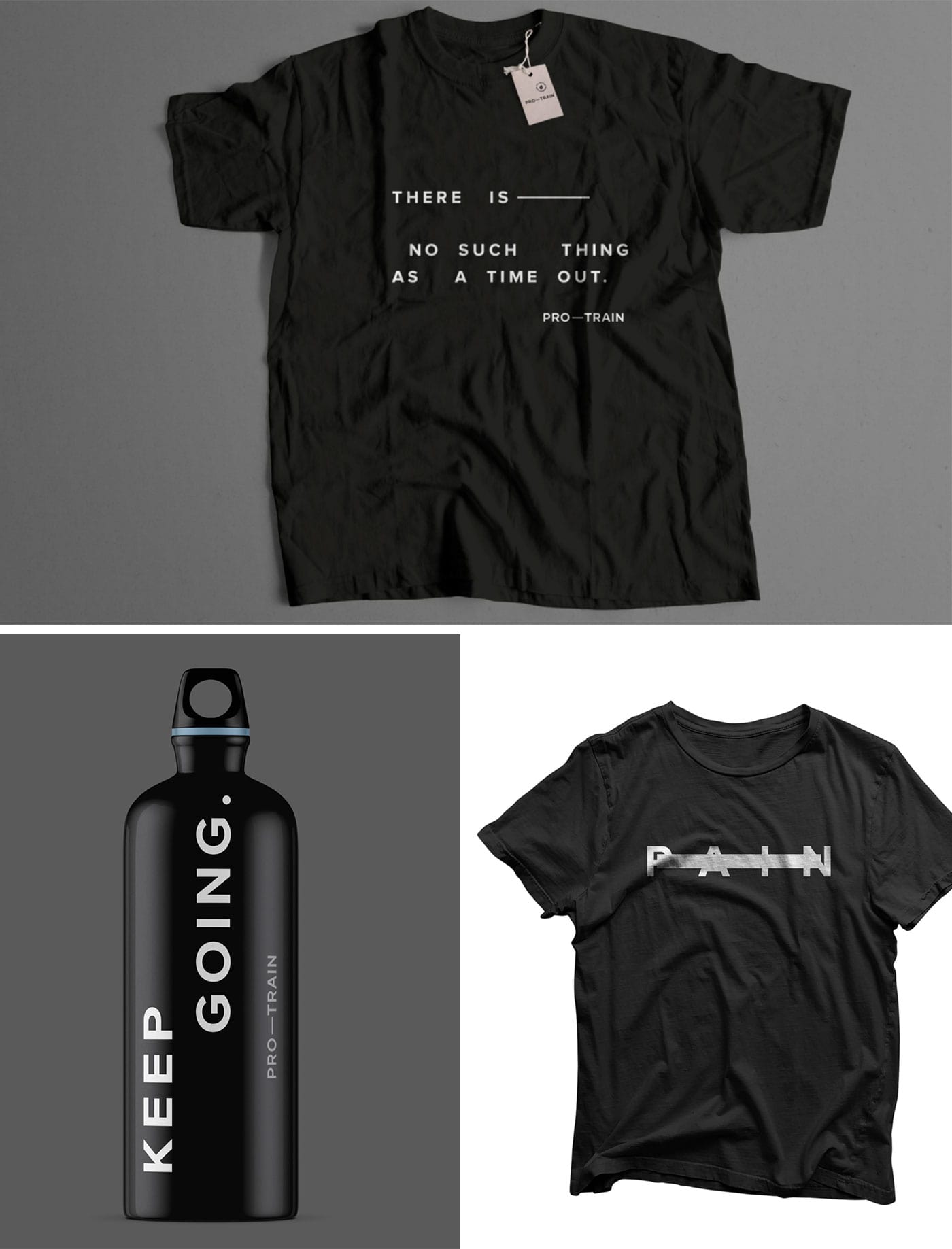
We crafted a powerful narrative, appealing to the spirit that active individuals bring to every challenge and establishing a strong brand personality that would reach across the brand’s social media channels, e-commerce website and our next challenge: packaging design.
CBD packaging design: Things to consider
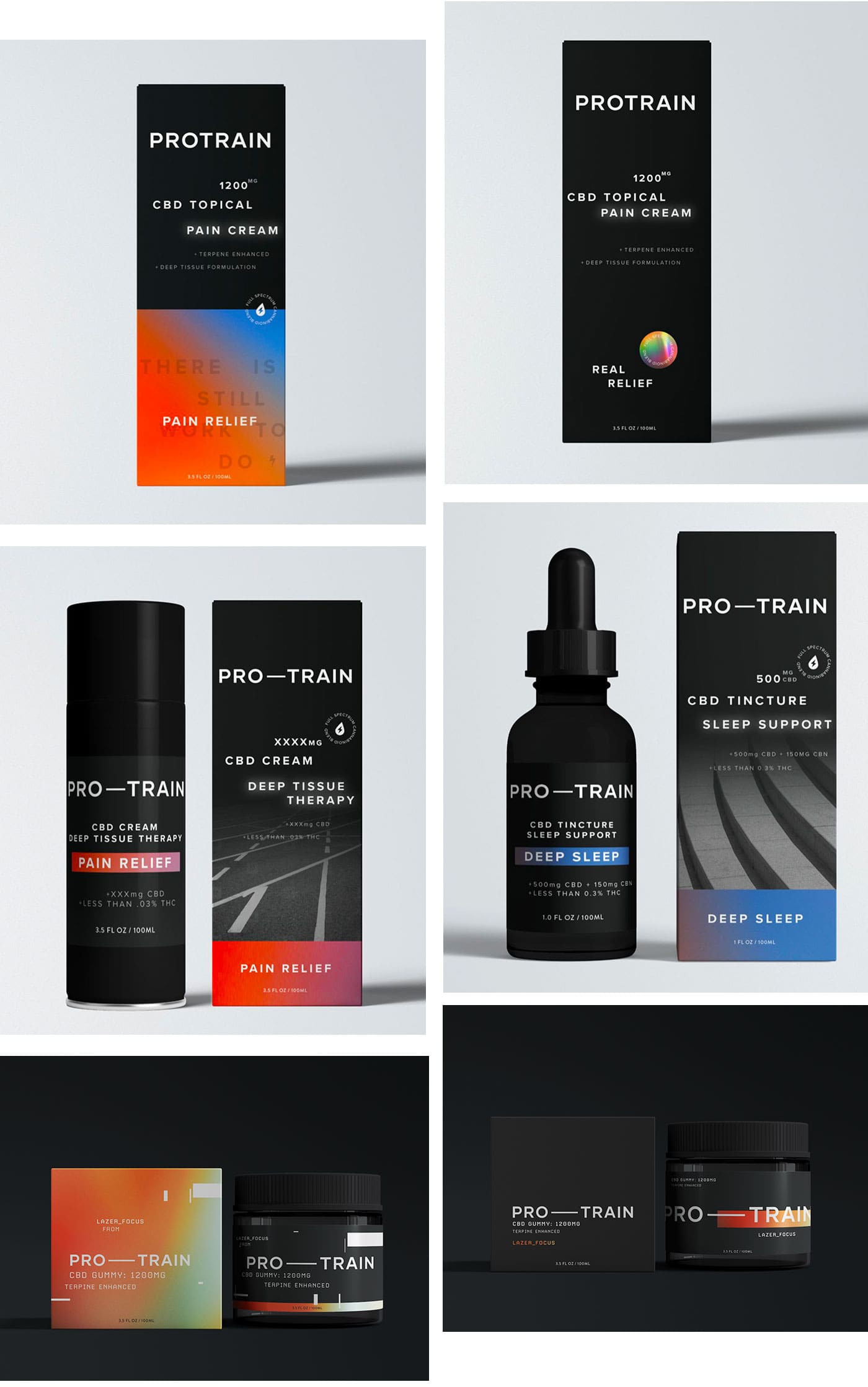
When creating Pro-Train’s visual identity, we focused on clear, functional typography, meaningful illustrations and powerful images that could flex across the three product categories—Pain Relief, Sharp Focus and Deep Sleep. The packaging designs needed to look alike from a branding perspective, but we’d need to differentiate them from each other so that customers could tell the products apart—whether they’re on a retail shelf or webpage.
But those weren’t the only obstacles we had to overcome.
Forbes outlined the industry’s unique position: “As a substance that was federally illegal before the passage of the 2018 Farm Bill, hemp-derived cannabinoids with no more than 0.3% THC still face a regulatory grey area. This ambiguity creates a host of novel challenges in financing, marketing and producing products. But simultaneously, the industry and market are growing incredibly fast.“

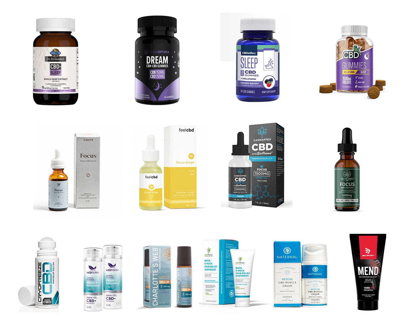
Not only are regulations and legal guidelines important to keep in mind, but there is a massive amount of competition. And these CBD brands are all making the same claims, touting benefits and aiming to fill the same wellness niche in customers’ lives.
We needed to get creative to help the Pro-Train brand stand out, attract athletes and sell products.
![]()
Turning strong branding into stand-out packaging design
Logo design and packaging design are two very different things. But they need to be consistent to maximize brand impact and awareness.
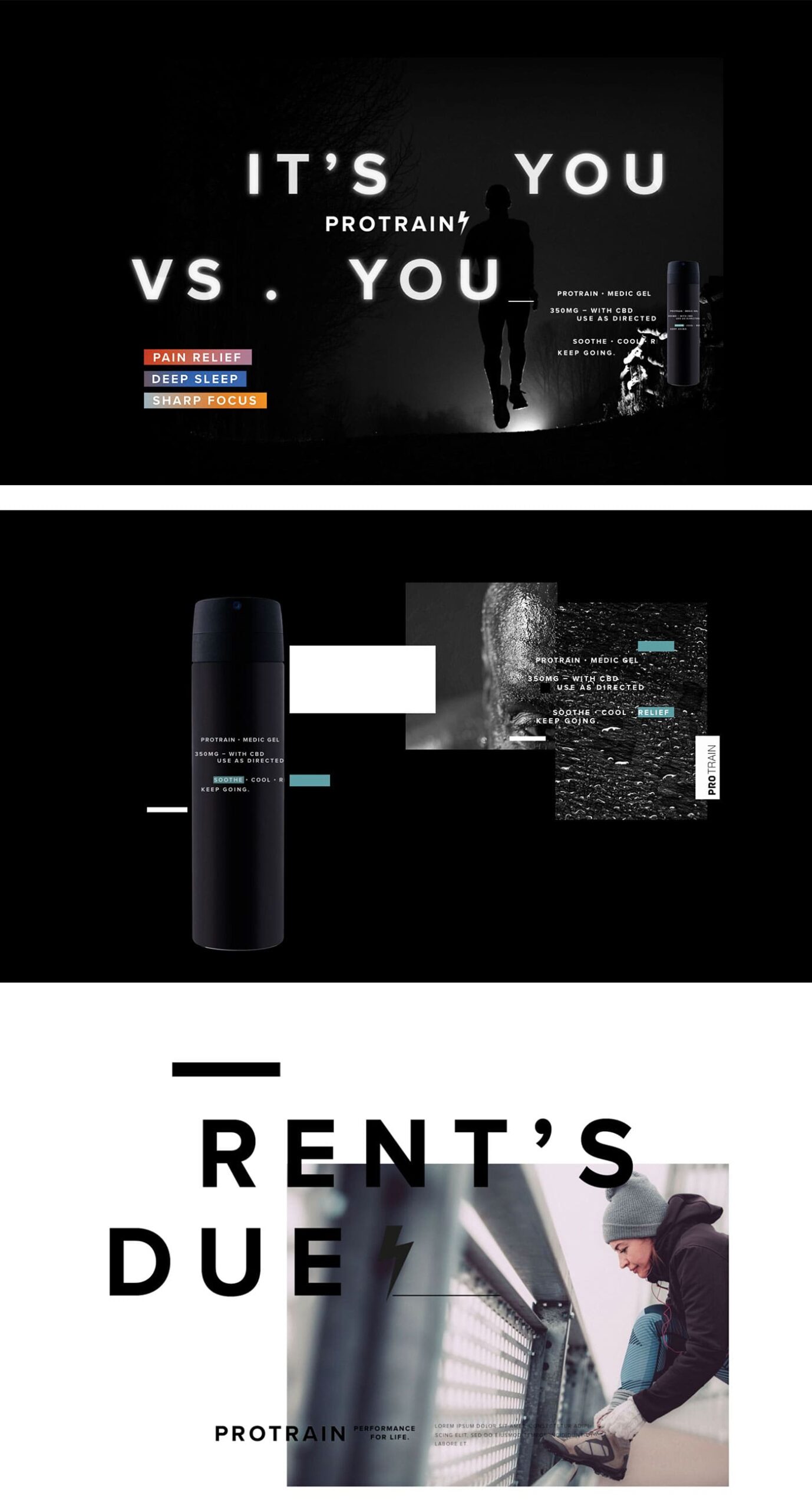
The Pro-Train logo is clear and sporty—with a strong em dash that not only connects the two words, but also bridges the gap between where you are today and where you want to be. Its client-pleasing size (aka BIG) and central placement on each label makes a strong and memorable impression.
Just as there’s meaning hidden between (or should I say, in) the lines, the gradients depicted on each label show the effects of each product, with brighter colors fading to more neutral tones. Each category gets its own signature shade—Pain Relief, an alarming red; Deep Sleep, a lively purple; and Sharp Focus, an electric orange—all fading into a soothing blue shade.
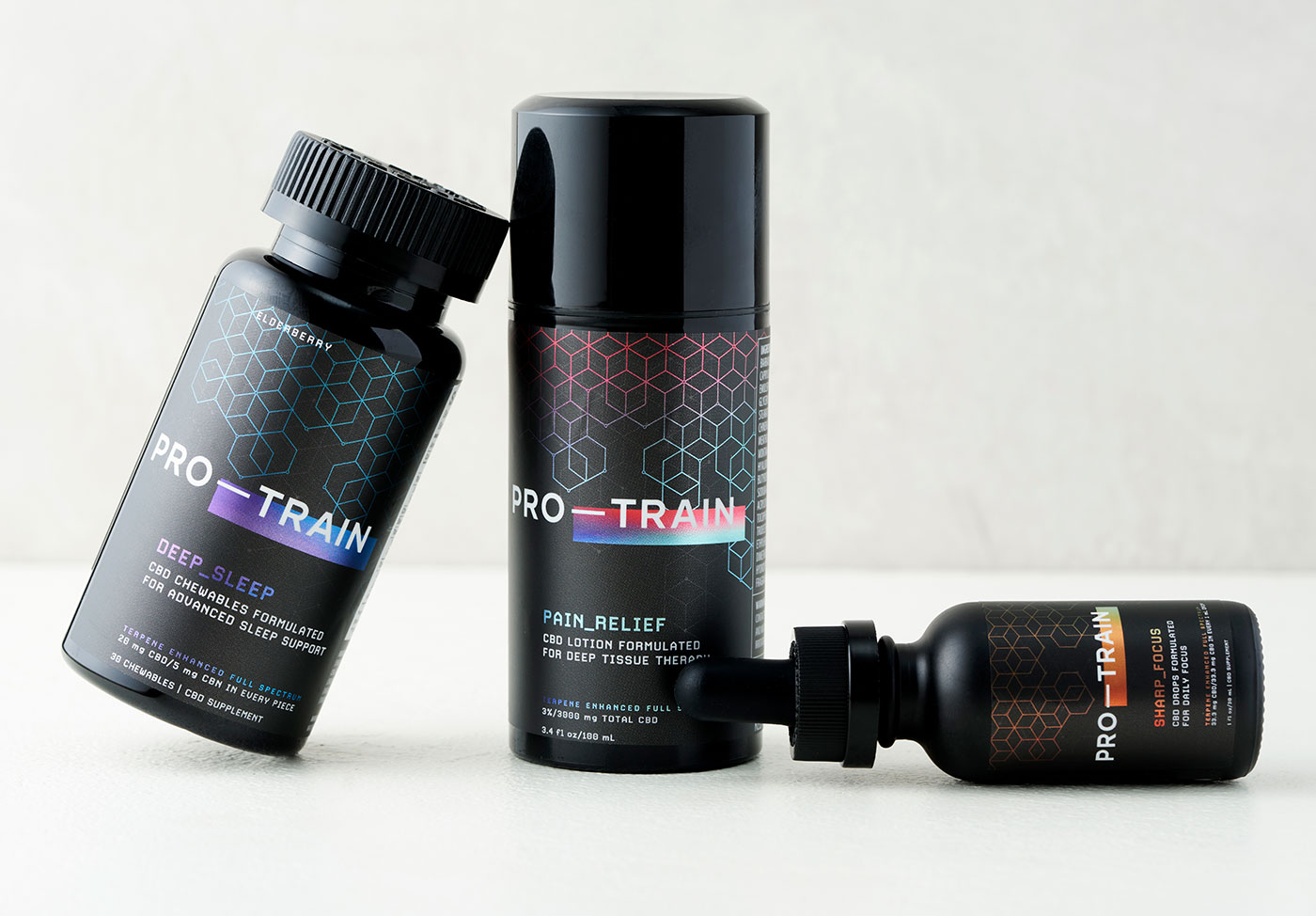
These gradients also appear in the abstract molecular patterns that reinforce the science behind each product. Instead of rounded lines, we opted for clean edges that highlight accuracy and stability.

With a dark background to finish the color scheme and give the CBD brand an upscale feel, the packaging design also contrasts with the very green competitive landscape.
Clear instructions, ingredient lists and dosage information help everyone from first-timers to experienced CBD consumers understand how to use the products and maximize their benefits.
Across the full product line, we worked to make sure the powerful CBD products inside each container were being represented effectively outside of it.

With the packaging in production, our friend and talented product photographer Jennifer Silverberg helped us capture shots of the full product line.
The future of CBD
With formulas designed to provide maximum impact, Pro-Train is the real deal. And they’re only getting started.
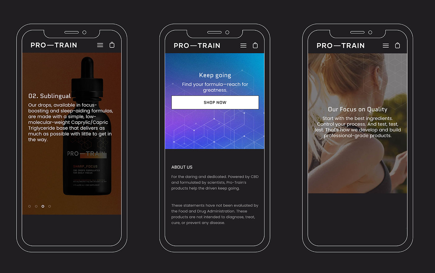
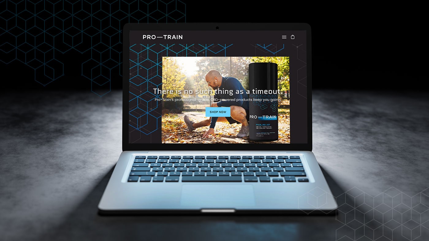
With a solid brand and a sleek product lineup complete, we developed an e-commerce website and digital marketing campaign to introduce the brand—and its wide range of benefits—to the world.