Lost in translation
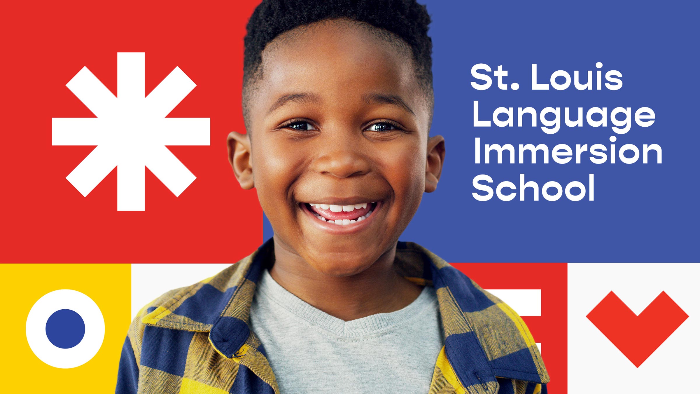
Despite offering a unique and transformative learning experience, SLLIS struggled with brand awareness.
Unlocking cultural connections
Learning a foreign language can have powerful reverberations throughout a student’s life: multicultural awareness, global perspectives and a commitment to diversity.
A visual symphony
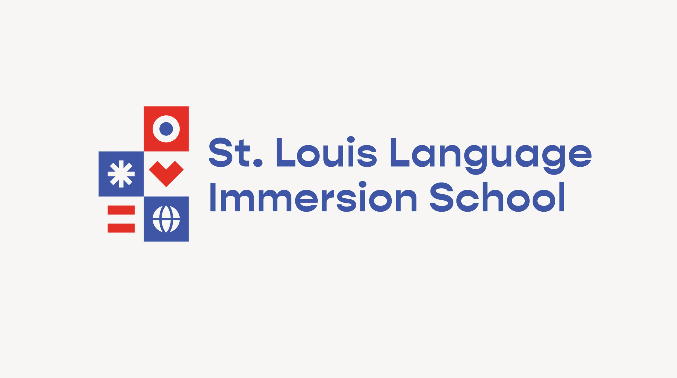
For the logo, we drew inspiration from diacritical marks found in various languages, such as umlauts and accents, and developed geometric icons.
Full Story—this content appears in the side drawer on the frontend. Click the floating "Reader View" button to preview.
Lost in translation.
Public charter school St. Louis Language Immersion School (SLLIS) offers an innovative learning experience, teaching students not only English, but also one of three target languages: French, Spanish or Chinese. The school aims to develop cultural understanding, global awareness and academic excellence by integrating a second language into their academic curriculum.
Lost in translation.
Despite offering a unique and transformative learning experience, SLLIS struggled with brand awareness. This is where we stepped in: to help align the brand with their vision.
Unlocking cultural connections.
Learning a foreign language can have powerful reverberations throughout a student’s life: multicultural awareness, global perspectives and a commitment to diversity. We heard about those effects in interviews with members of the SLLIS community, and it served as inspiration for the entire brand. The brand language reflects how the school is building a better world, one student at a time.
A visual symphony.
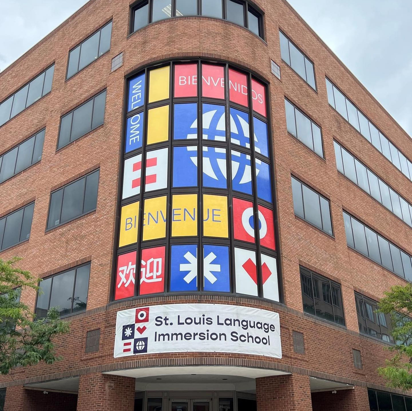
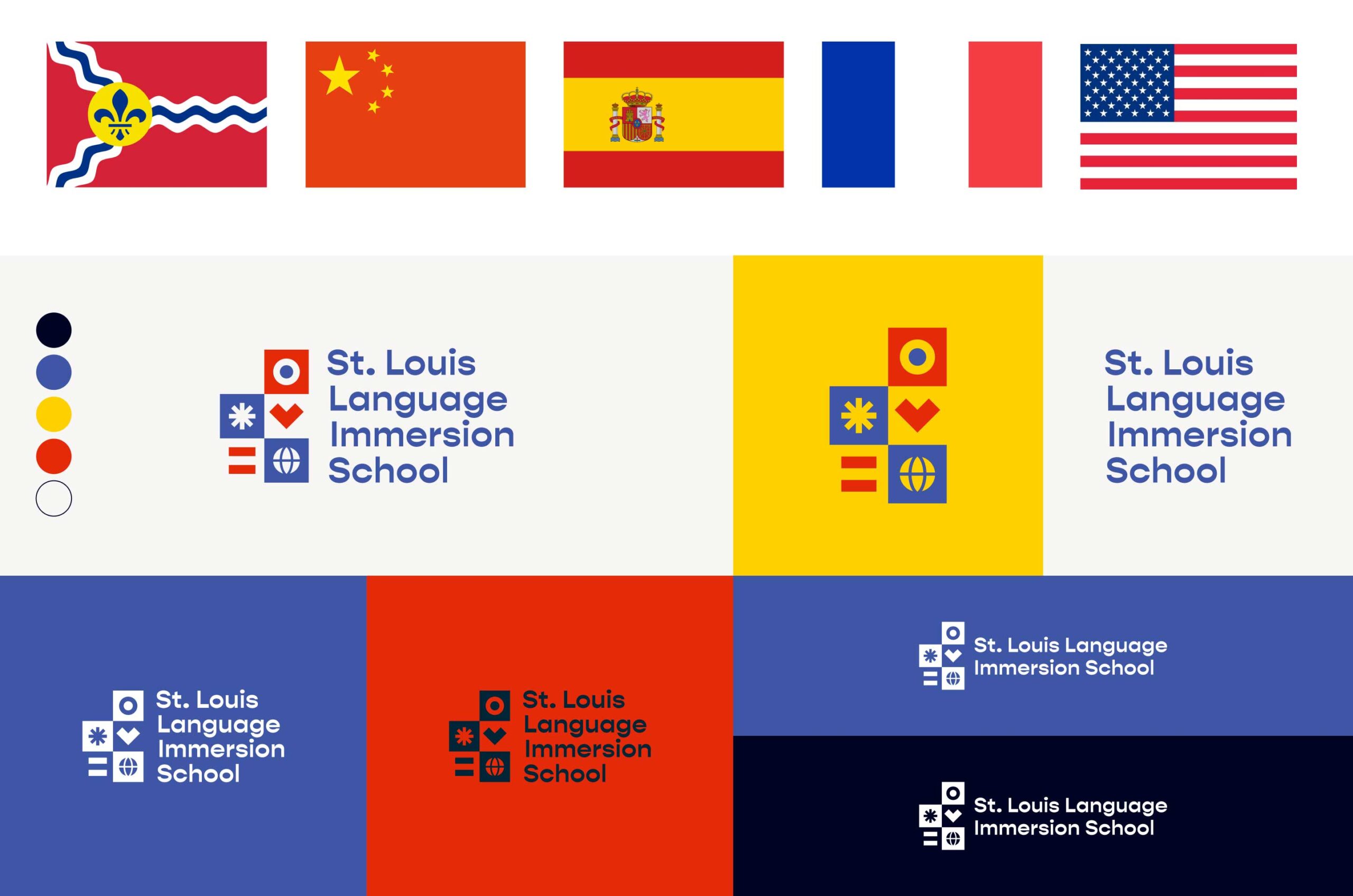
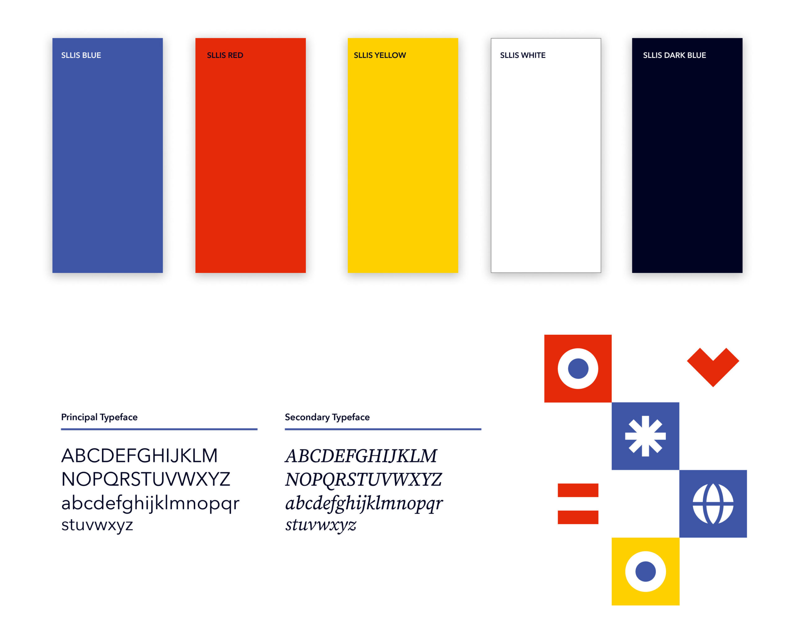
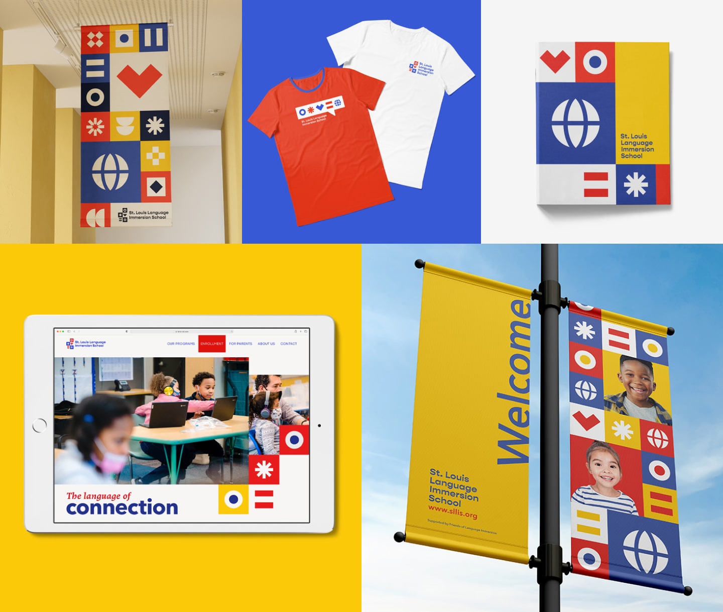
For the logo, we drew inspiration from diacritical marks found in various languages, such as umlauts and accents, and developed geometric icons. Using colors found in the Spanish, French, Chinese and St. Louis City flags, the brand palette highlights the similarities among the cultures.
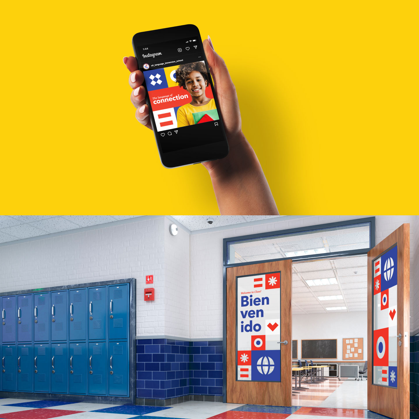
Brand graphics reflect the school’s cultural diversity—with a building block-like icon corresponding to each supporting point. But we knew the brand’s success relied on adoption, so we designed the icons to be easily understood, recited (in each language) and drawn by students.
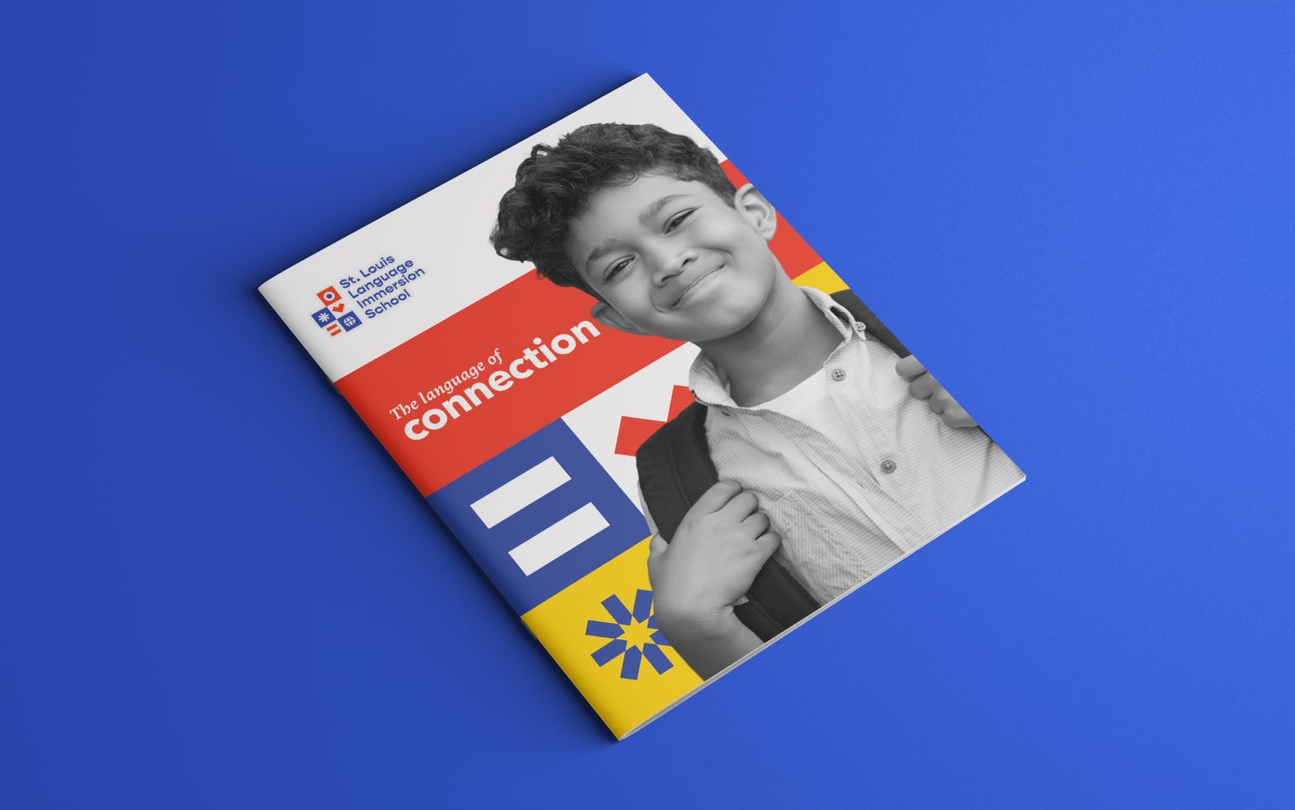
Through this cohesive visual language, the school’s mission and its profound benefits are encapsulated in the tagline, “The Language of Connection.”
From logos to life.
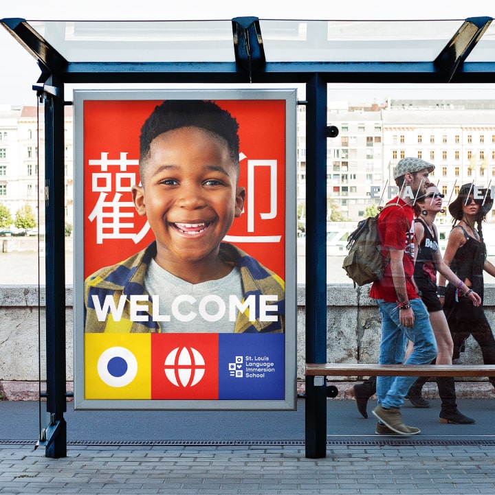
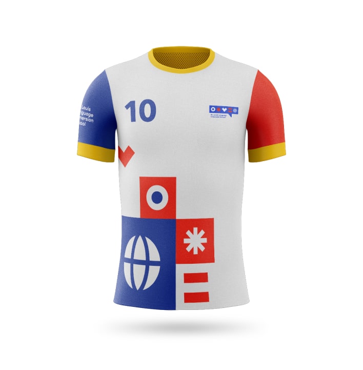
Branding isn’t confined to just logos and language. Updated communications materials and swag, like pamphlets, signage, bus shelter ads and team jerseys connect parents, students, staff and the broader community to the brand.
St. Louis Language Immersion School has significantly impacted the lives of children and families in St. Louis City; we were honored to have played a part in amplifying their mission.
Is your story getting lost in translation?
Let's start a conversation.