Most schools teach kids in their native language.
Depending on the school district or the students’ ages, kids might spend a few hours a week learning a second language.
At St. Louis Language Immersion School, though, students learn in two different languages.
It’s an awesome experience that gives City kids diverse world views and a desirable, practical skill. But most locals didn’t know the school existed.
A Mission Worth Celebrating
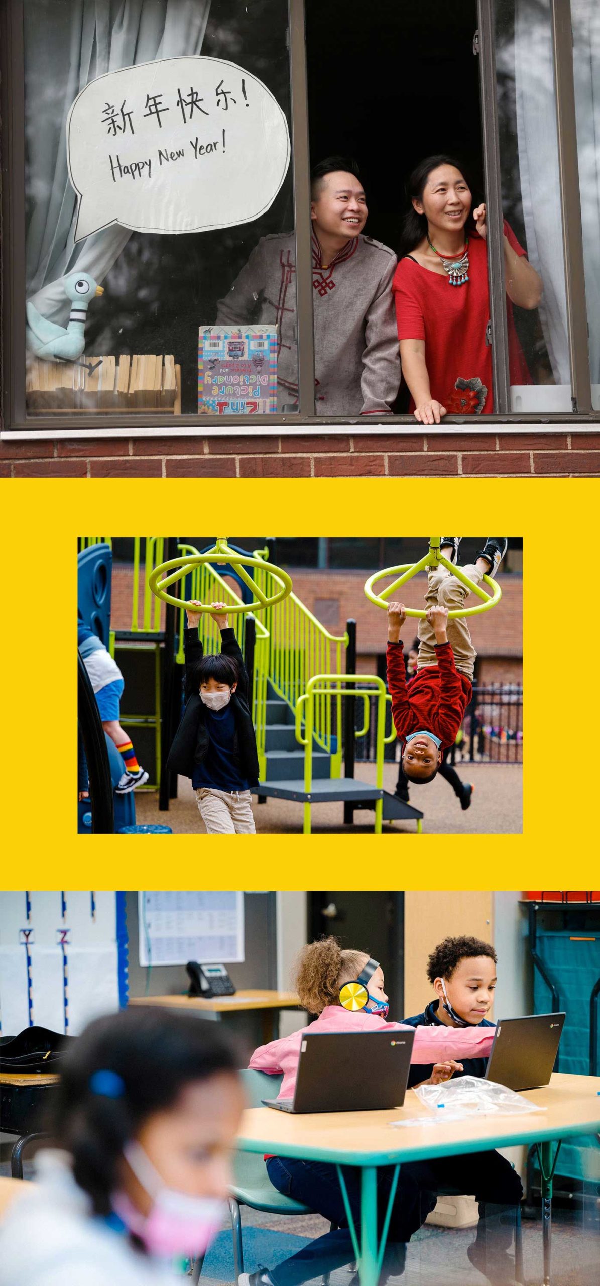
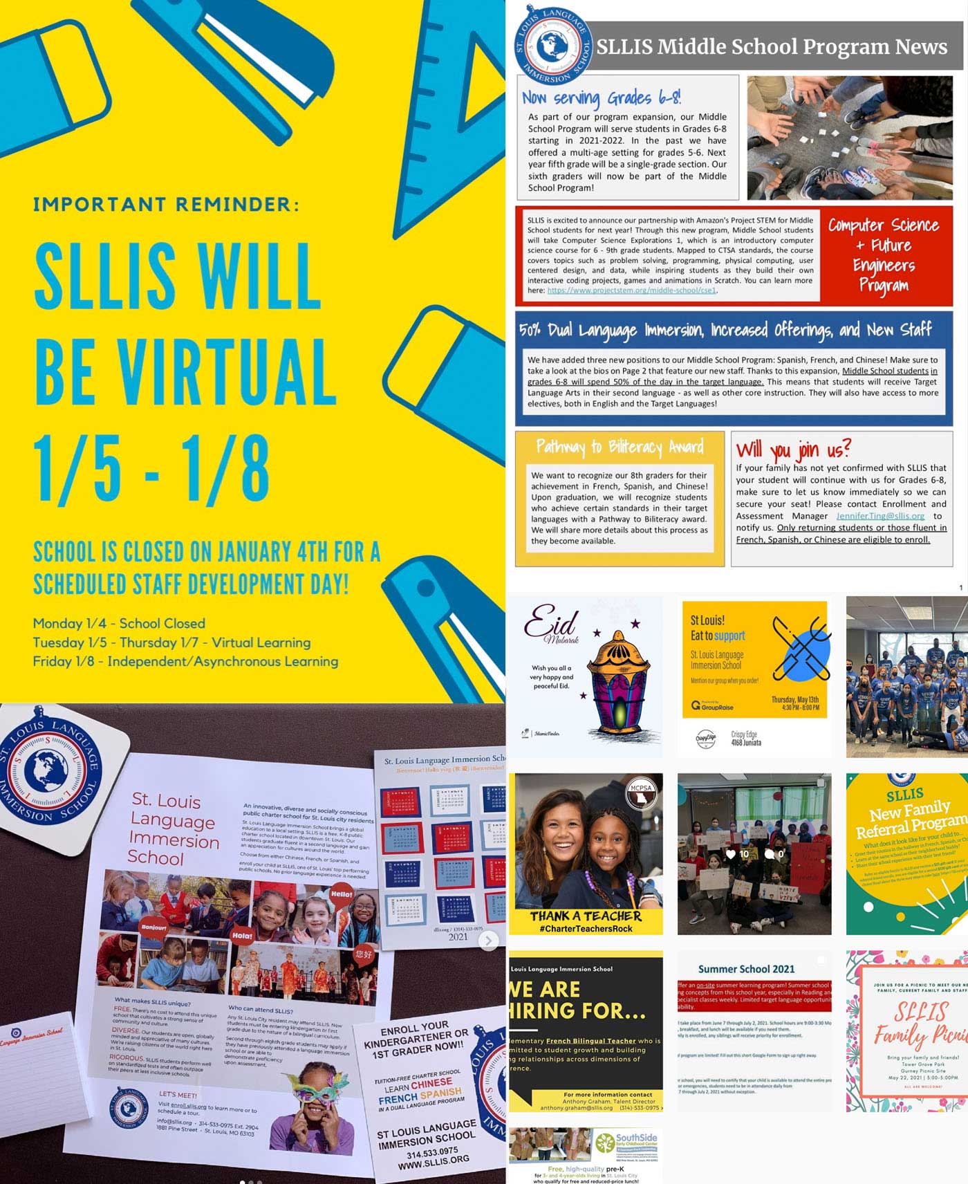
Lessons at St. Louis Language Immersion School are taught in both English and one of three target languages: French, Spanish or Chinese. Kids who start in kindergarten can graduate St. Louis Language Immersion School fully bilingual. And it’s a public charter school, meaning it accepts all St. Louis City students, providing a culturally responsive, transformational education that can enrich their lives.
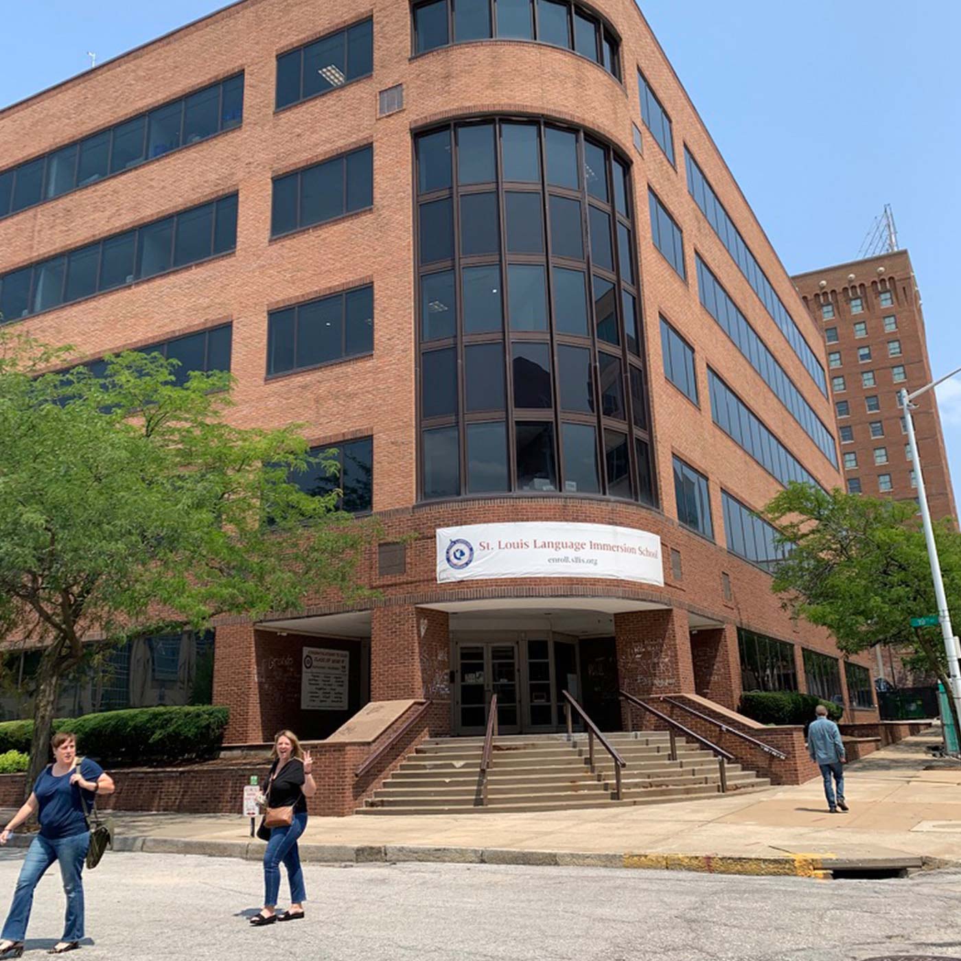
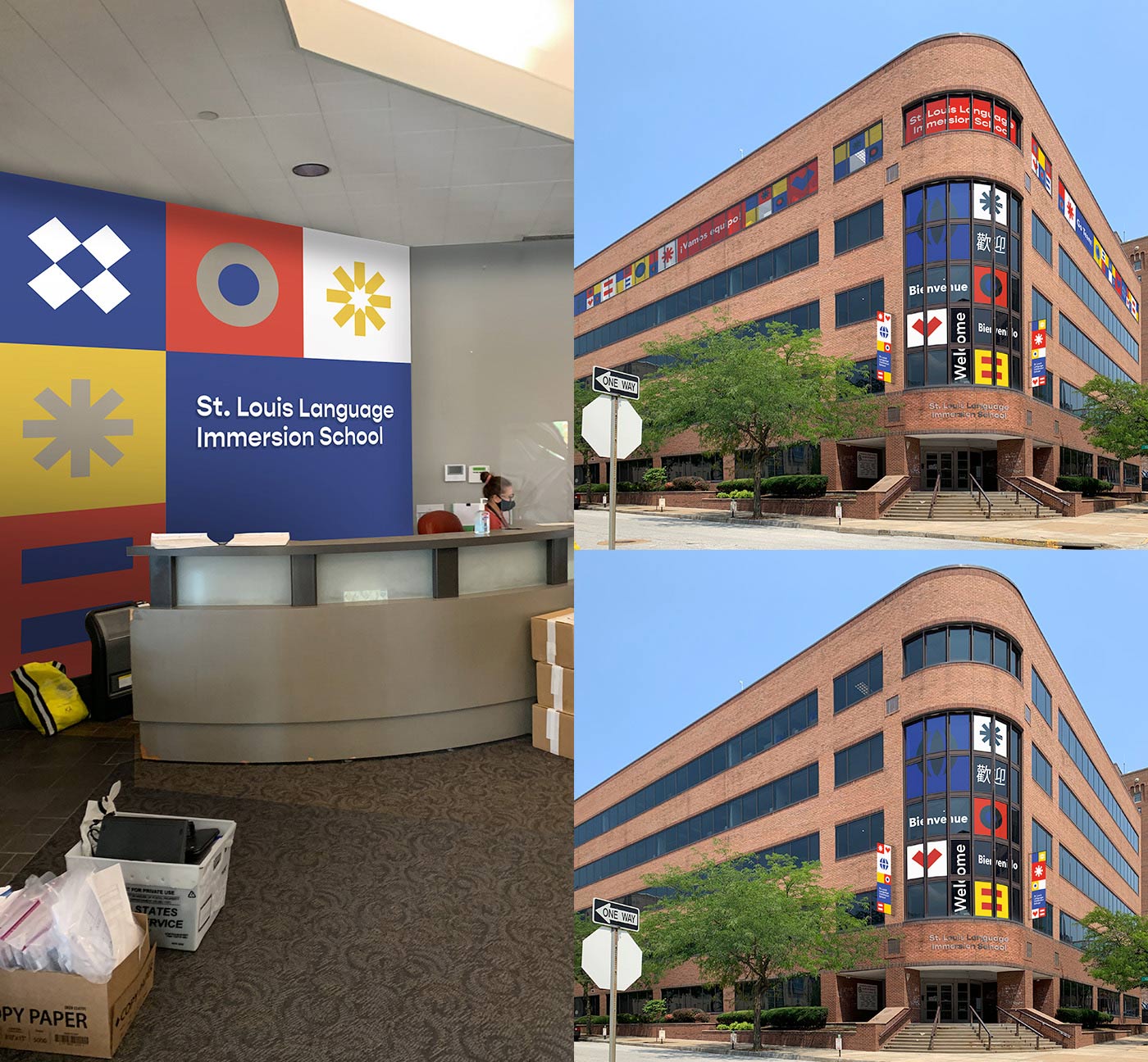
The school came to us with a big challenge. Over the past few years, they’d taken an honest look at their strengths and weaknesses, and they’d undergone a strategic planning process. In 2018, they moved into a new school building, giving all three language programs a shared space and a shared vision.
It was time to make their branding reflect that vision.
St. Louis charter schools face unique challenges, and public perception is one of them. It was important that the new branding reflect how welcoming and vibrant the school is—and how excited the school community is about its future. The previous branding, while professional and informative, didn’t do that.
The power of language
In every branding project, we consider the story we want to tell and the emotions we want the brand to evoke. With St. Louis Language Immersion School, we knew we wanted to amplify the school’s mission and let more parents know why the school is a life-changing option for their kids.
We started by thinking about how education and the power of language had changed our own lives.
Before becoming a copywriter, I taught in public schools. I know firsthand how innovative charter schools can be (and often must be) in the face of daunting challenges. My experiences in education left me with a deep respect for teachers and administrators. And, as a person who was lucky enough to study abroad, I understand how valuable international experiences are as well.
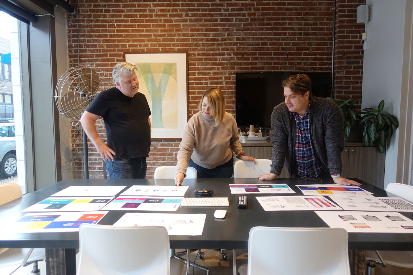
As we interviewed staff and members of the St. Louis Language Immersion School community, we reflected on how magical it feels to experience a new culture and acquire a second language—while remaining conscious of what it takes to provide an equitable education to students from different backgrounds. Parents were enthusiastic about what the school had done for their kids. Staff shared their concerns about wanting every student to feel welcome.
A school that provides international experiences along with a heavy dose of love and support to kids? I can’t think of anything better for the St. Louis community.
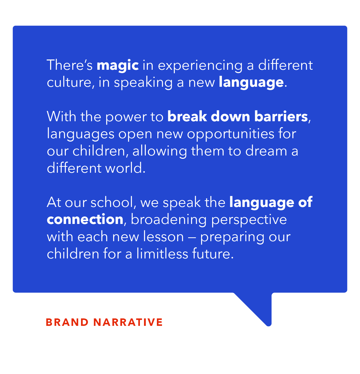
The brand narrative needed to reflect, both in the meaning and rhythm of the words, the spirit of St. Louis Language Immersion School. We even drew inspiration from poets like Langston Hughes and Amanda Gorman as we wrote draft after draft until we got it right.
Branding the School Community Can Make Its Own
To be successful, a brand needs to resonate with its intended audience.
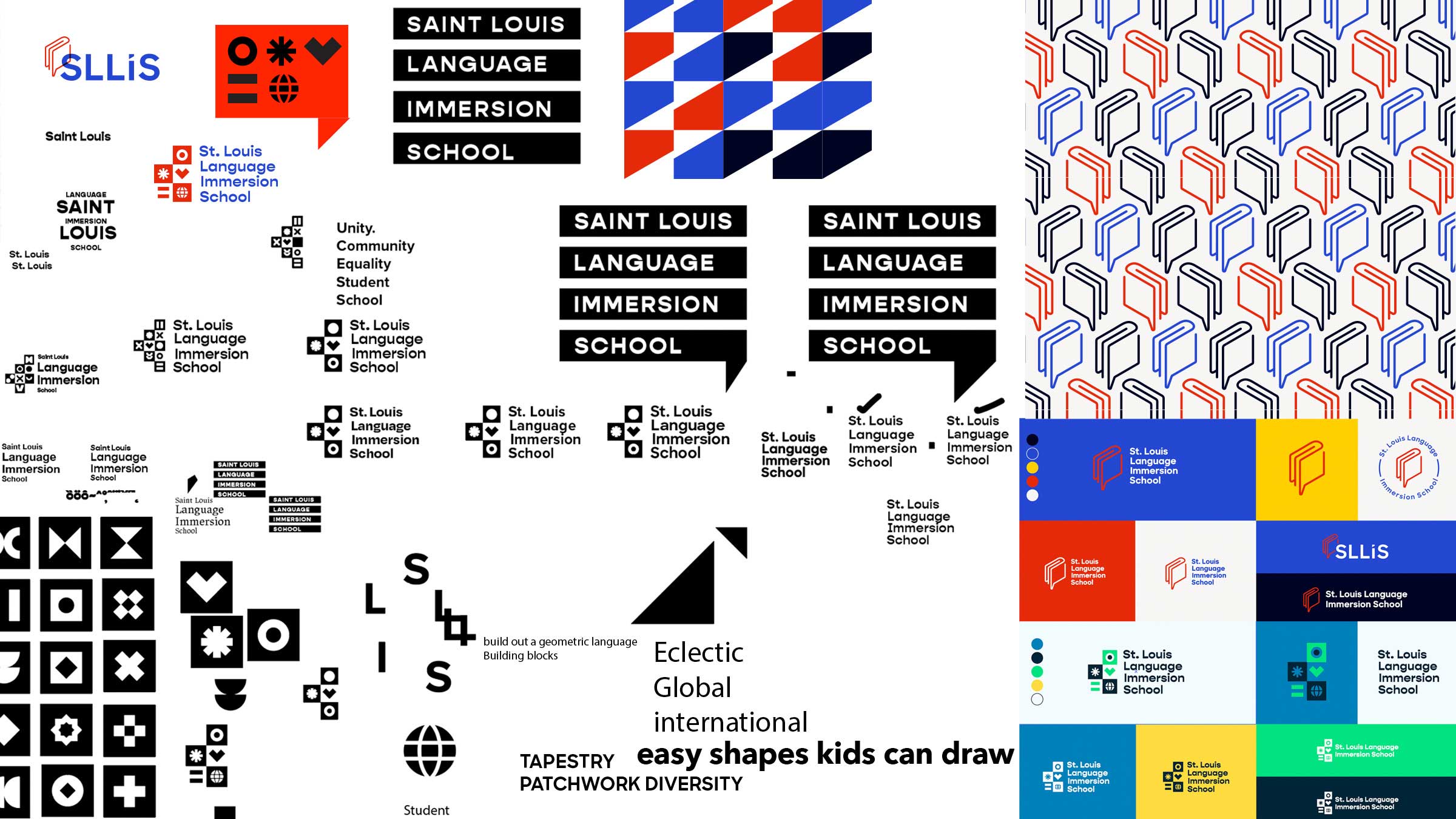
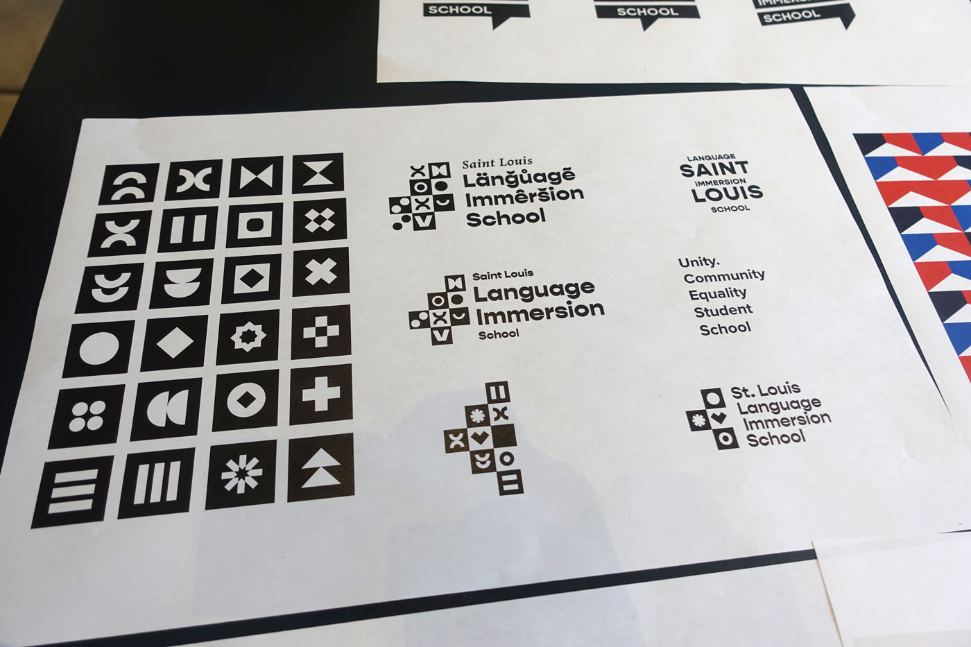
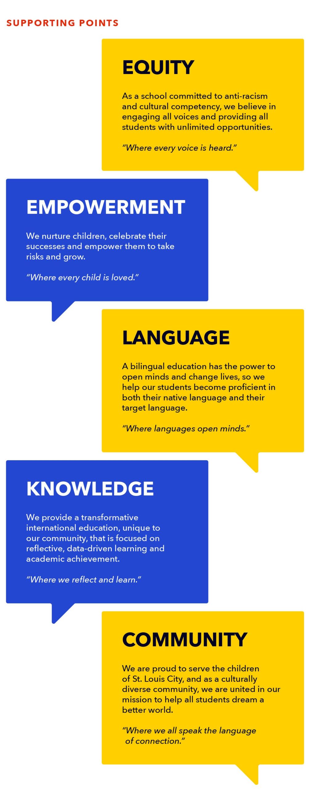
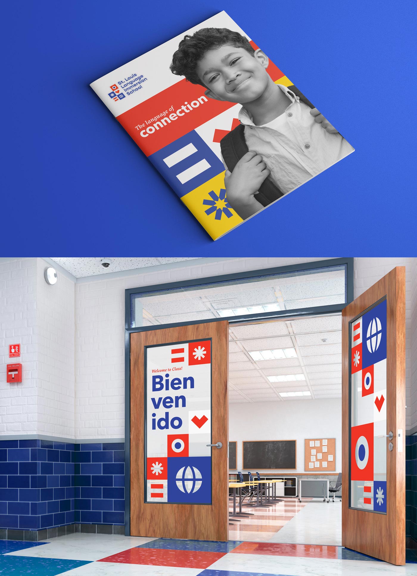
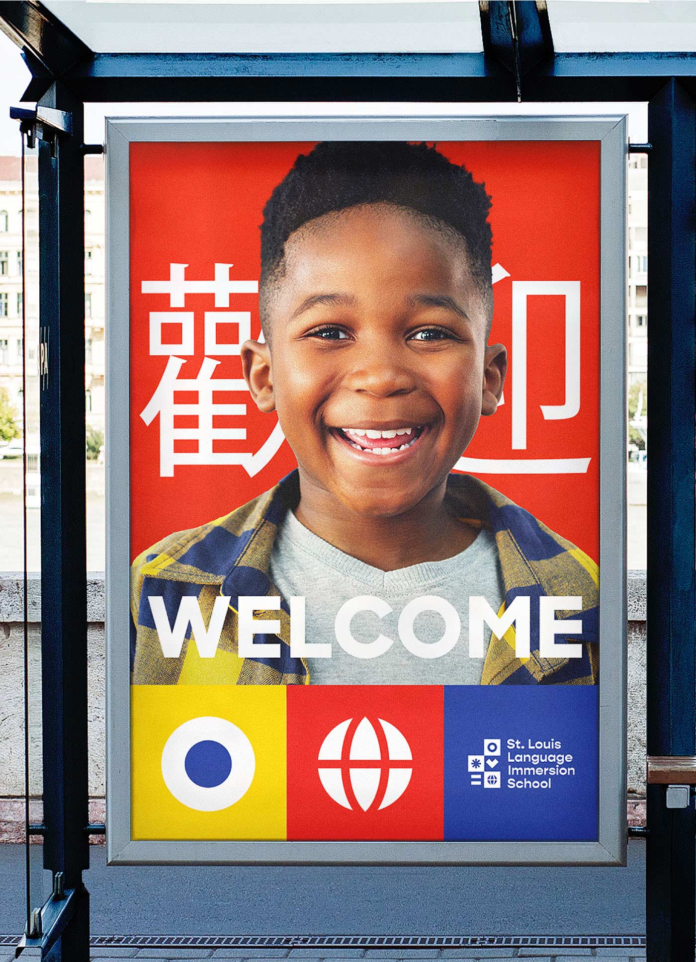
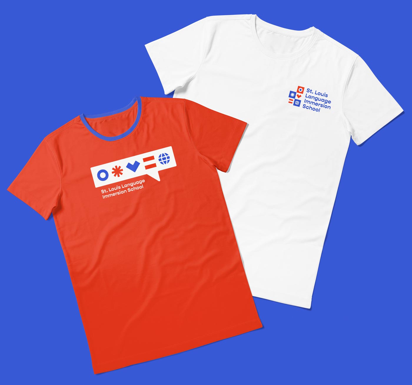
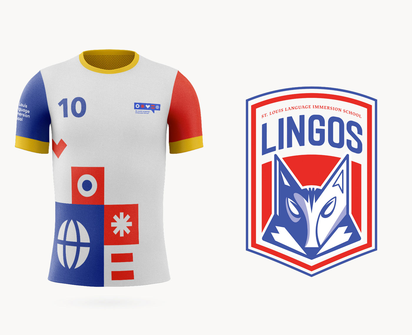
The school’s new brand language and visual identity needed to be accessible—and include elements the school community could interact with. So, we designed the supporting points to be words and phrases students could recite and understand in all the school’s languages. The corresponding design elements included symbols kids could easily draw.
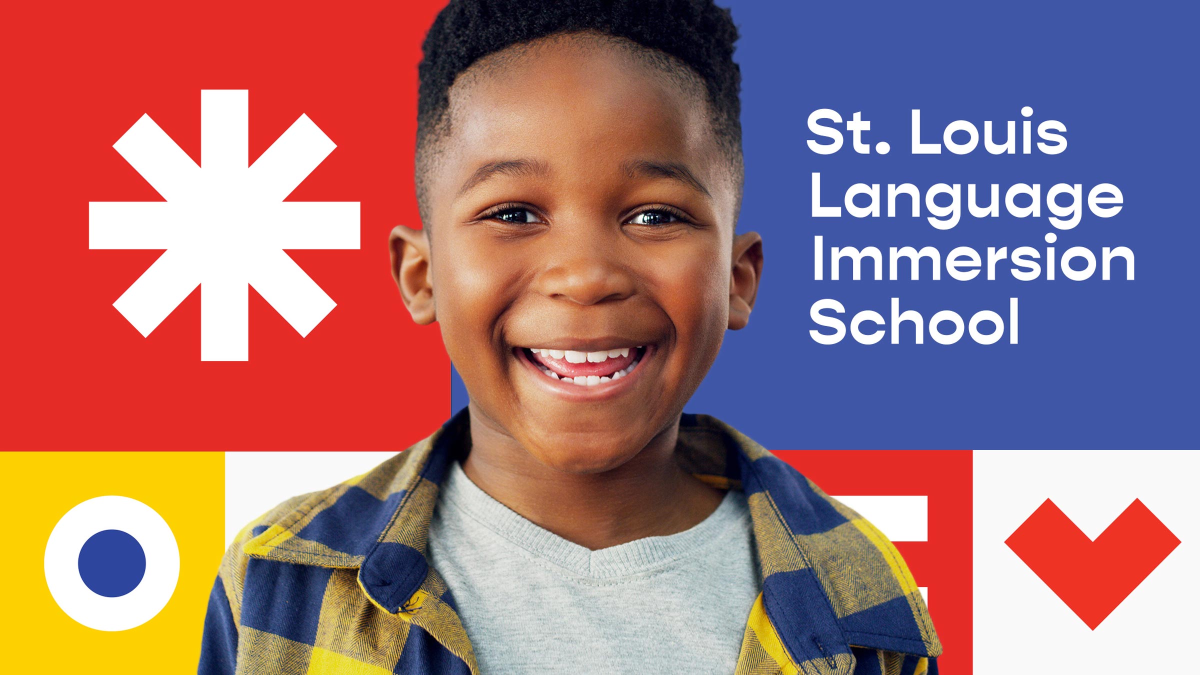
Language can be incredibly visual—just ask any type designer. We were excited to develop brand visuals that expressed that. In addition to considering the school’s new typefaces and imagery, our team invented an entirely new visual language representing words from the school’s mission statement. The geometric forms of diacritical marks that tell readers how to pronounce words (umlauts, accents, and other dots and squiggles) inspired the symbols in the logo. We pulled color inspiration from the Spanish, French, Chinese and St. Louis City flags—a nod to the languages taught at the school.

![]()
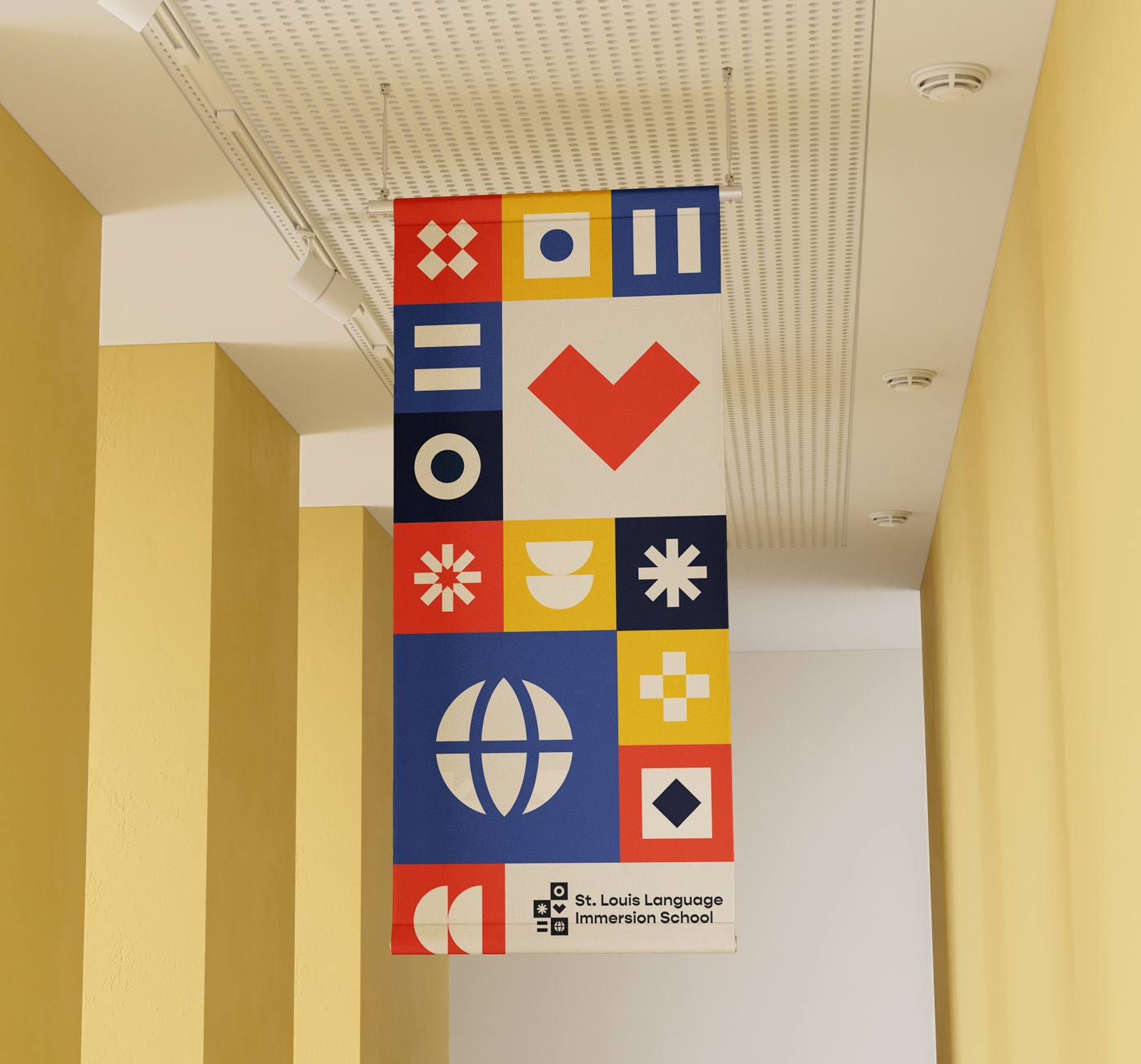
As a collection of symbols came together, we saw them as building blocks—like the alphabet blocks we play with as children—or a mosaic made up of the different cultures that come together in one school.
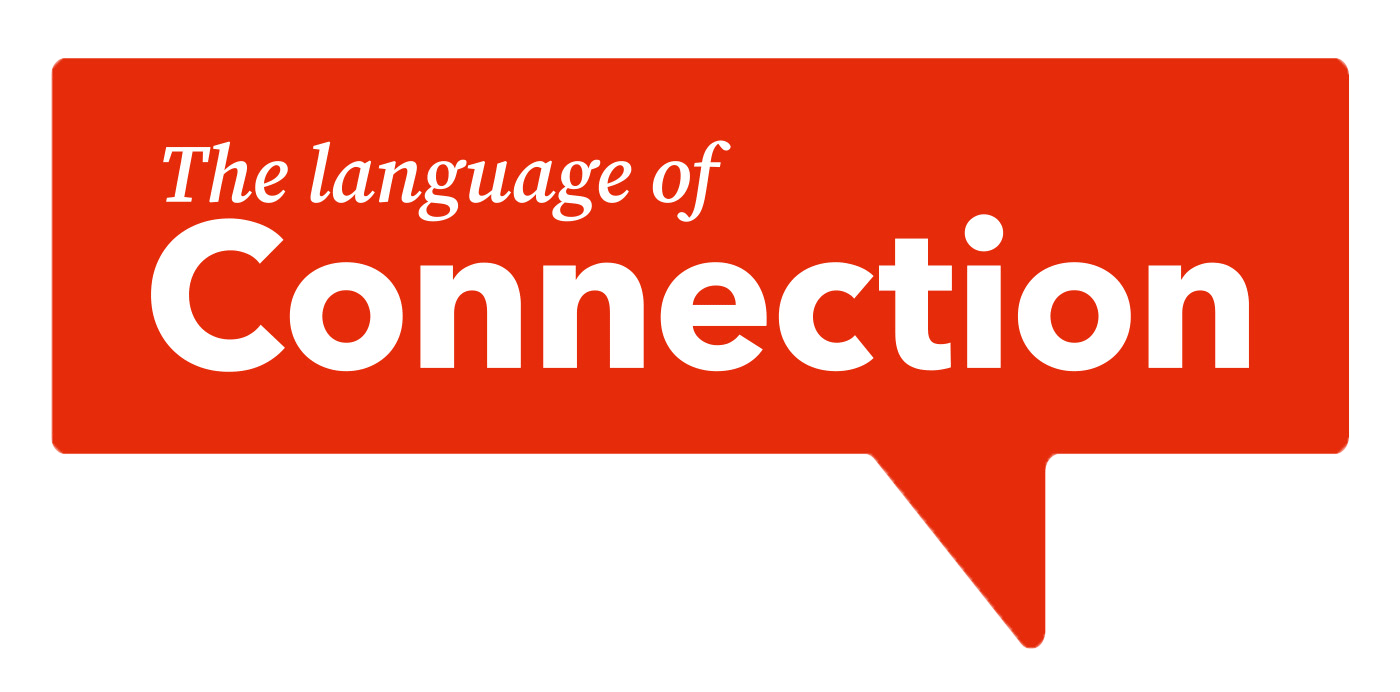
Together, the brand elements reflect the warmth, vibrancy and possibility St. Louis Language Immersion School represents. They also led us to the tagline, The Language of Connection.
Now, the school has a rallying cry that expresses both its mission and its benefits.


While every new project brings its own challenges, it isn’t every project that gives us a chance to work for the benefit of St. Louis kids. We were thrilled to help St. Louis Language Immersion School refresh their branding and show off how valuable they are to our city.