In a world with more Zoom calls and fewer long sales lunches, your sales deck has never been more important—because it may be the only thing your prospects remember.
According to John Medina, author and biologist focused on brain development:
“Vision trumps all other senses. We are incredible at remembering pictures. Hear a piece of information, and three days later you’ll remember 10% of it. Add a picture and you’ll remember 65%.”
Presenting your sales pitch, product specs or brand promise in a visual way helps your prospects actually remember what they’ve heard. As digital decks have replaced leave behinds, brochures and even business cards, presentations are a powerful tool for B2B marketers.
With the right words and graphics, a thoughtful series of rectangles can inspire audiences, close sales and unify employees—but when done poorly, a presentation can turn a board room into a bored room.
Perfecting the sales presentation starts with a solid strategy and simple sales deck
A great sales deck includes applicable information, makes the audience think and is visually engaging. It doesn’t need bells and whistles (in fact, it should not have bells and whistles—unless you are a bells and whistles sales rep, of course) to engage prospects and showcase the benefits of your product or service.
At Atomicdust, we build, design and refine presentation decks all the time, for both ourselves and our clients. And though every industry, sales process and business presentation is unique, we follow the same seven principles no matter the content.
But before we get into the principles we use to make B2B sales presentations a success, here are some tools we recommend.
Tools for creating winning sales decks
- PowerPoint or Keynote
Both programs offer a range of tools to make your slide presentation visually appealing. - Unsplash and Openverse
These websites offer free stock photography you can use to create more compelling decks. - Grammarly and Hemingway Editor
Both of these sites offer free tools to help ensure your messaging is clear, concise and spelled correctly.
With these resources in your sales deck toolbox, you’re almost ready to start selling.
1. Know your brand.
Before you start building your deck, think about your company’s visual identity. This sales deck is a projection of your brand; it should be consistent with your LinkedIn ads, your direct mailers, your website, even the company polo you wear while presenting.
If your prospective customers have seen your company out in the world—or see it after they’ve heard your pitch—they can easily connect the visuals they’re familiar with. It creates an instant familiarity and increases your brand awareness. A blank background or generic template loses the chance at making that connection with the rest of your marketing.
That doesn’t mean your logo, tagline and brand color palette need to be splashed across every slide; instead, your brand’s visual identity can be subtly incorporated. Maybe the pie charts and bar graphs use your brand colors. Or just make your logo smaller and set it in the corner of each slide to give a sense of branding without distracting from your message.
2. Know your audience.
The second step to creating a better sales deck is to think about who you’re talking to. Not just the company or industry you’re addressing, but who’s actually going to be in the room or on the call.
Are you speaking to a group of executives? Contractors? New hires? You wouldn’t present the same content to all three—because they all interact with your company in different ways. Think about the products or services you’re sharing, and then put yourself in the shoes of your audience.
What are they worried about? What keeps them up at night? Knowing the specific challenges or pain points of your target audience gives you the tools to position your offerings as the perfect solution. It will help you craft a clearer and more engaging presentation from the start.
3. Capture attention.
Speaking of the start, your first few slides are a chance to set the tone for the entire presentation. If you don’t capture your audience’s attention then, you’re unlikely to grab it at all.
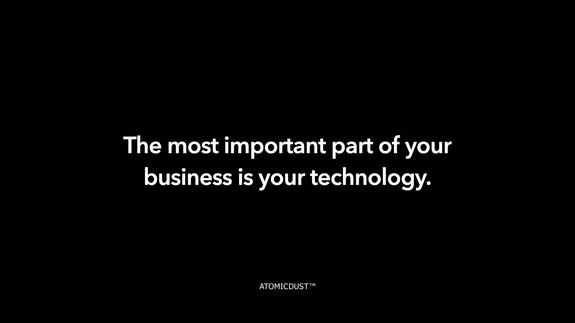
What’s the secret? Be bold. Whether you’re a branding firm or an IT consultant, starting with a bold message really wakes up a room. One of our favorite opening slides to use simply reads:
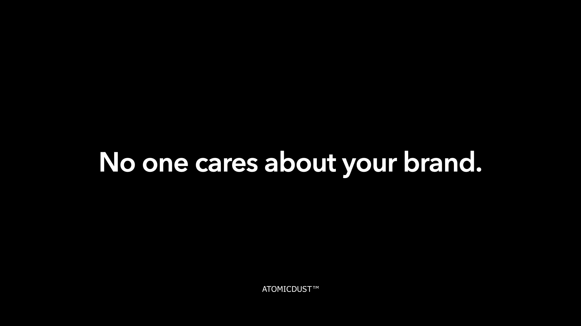
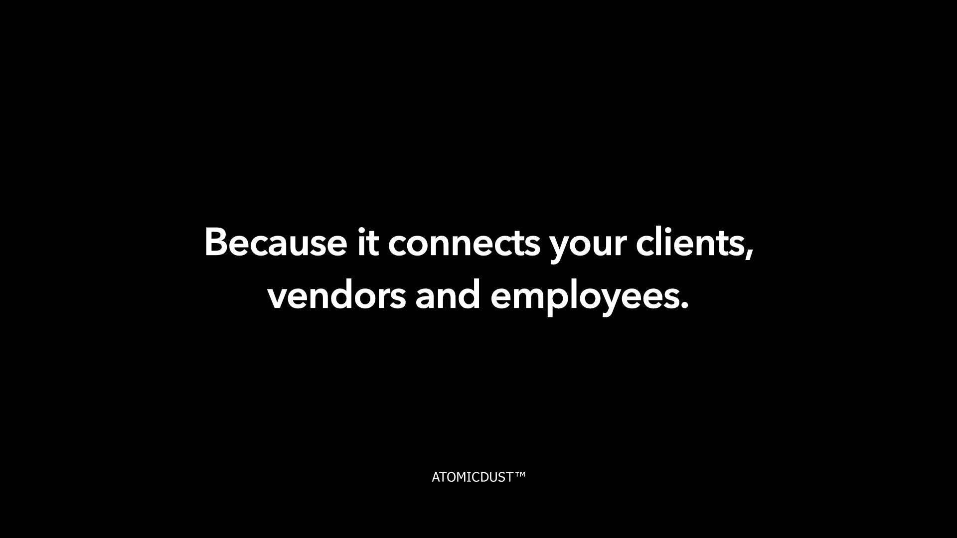
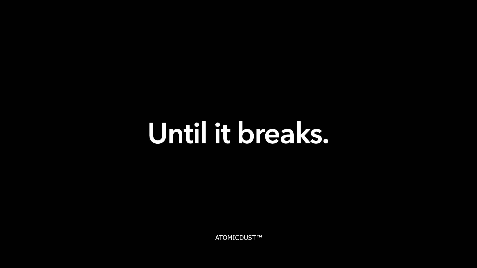
It’s a little startling. And confusing. Aren’t we a branding company? In the next few slides, we start connecting the dots:
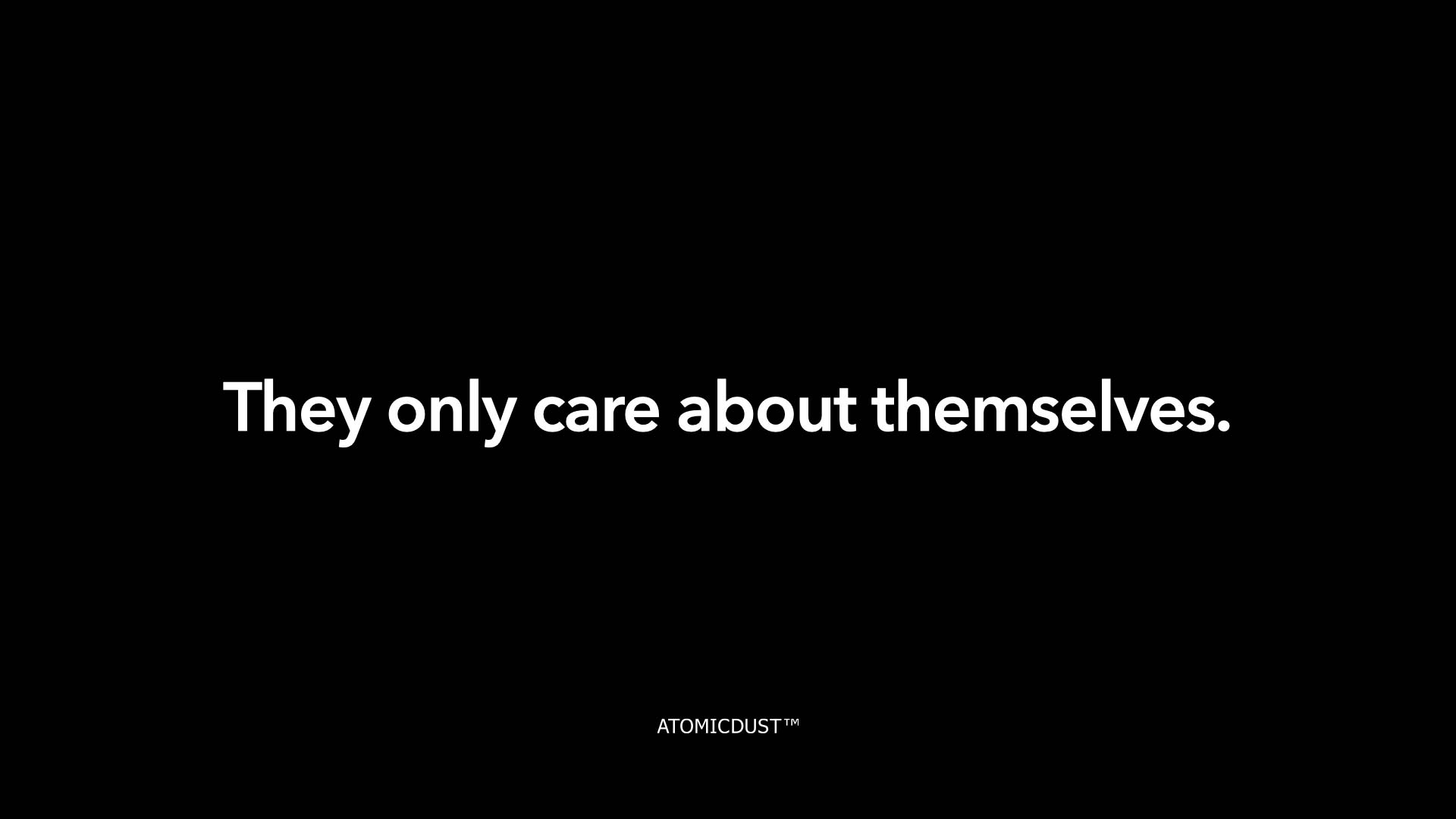
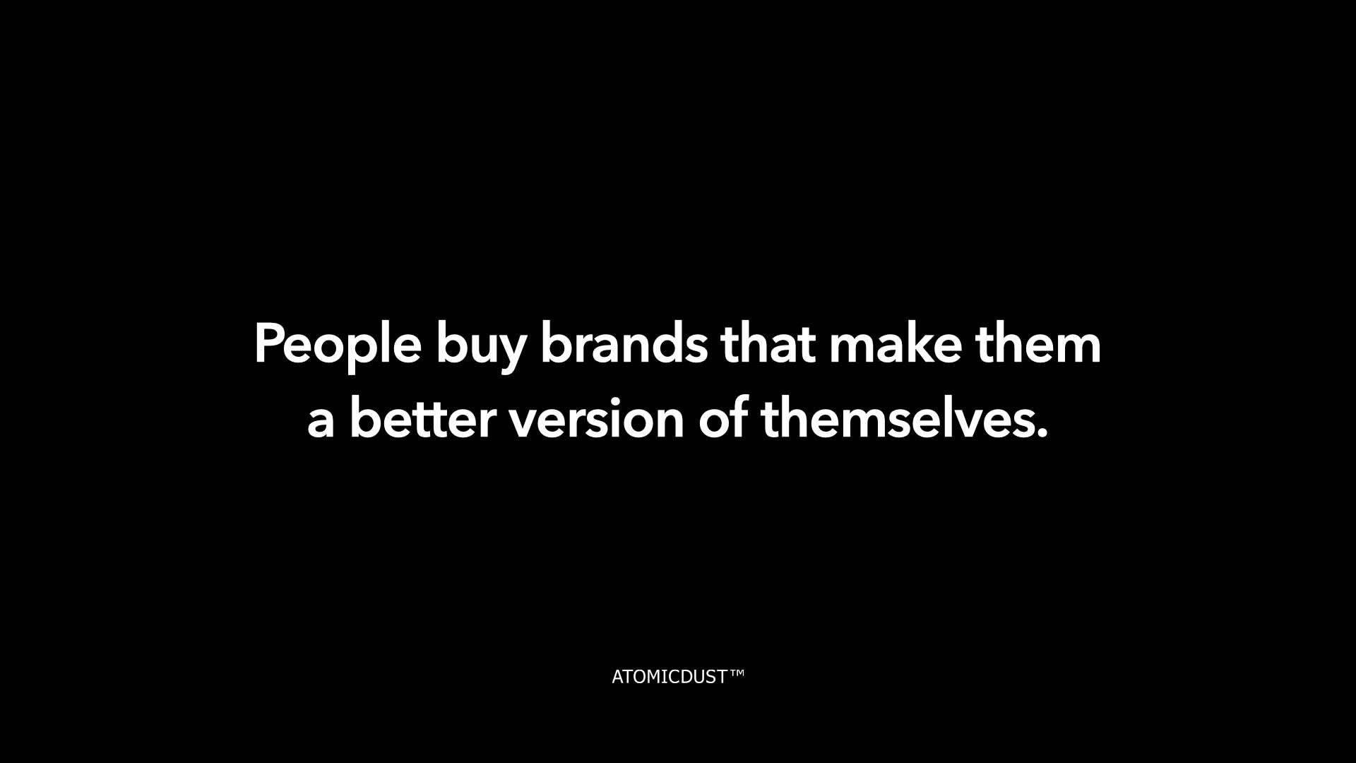
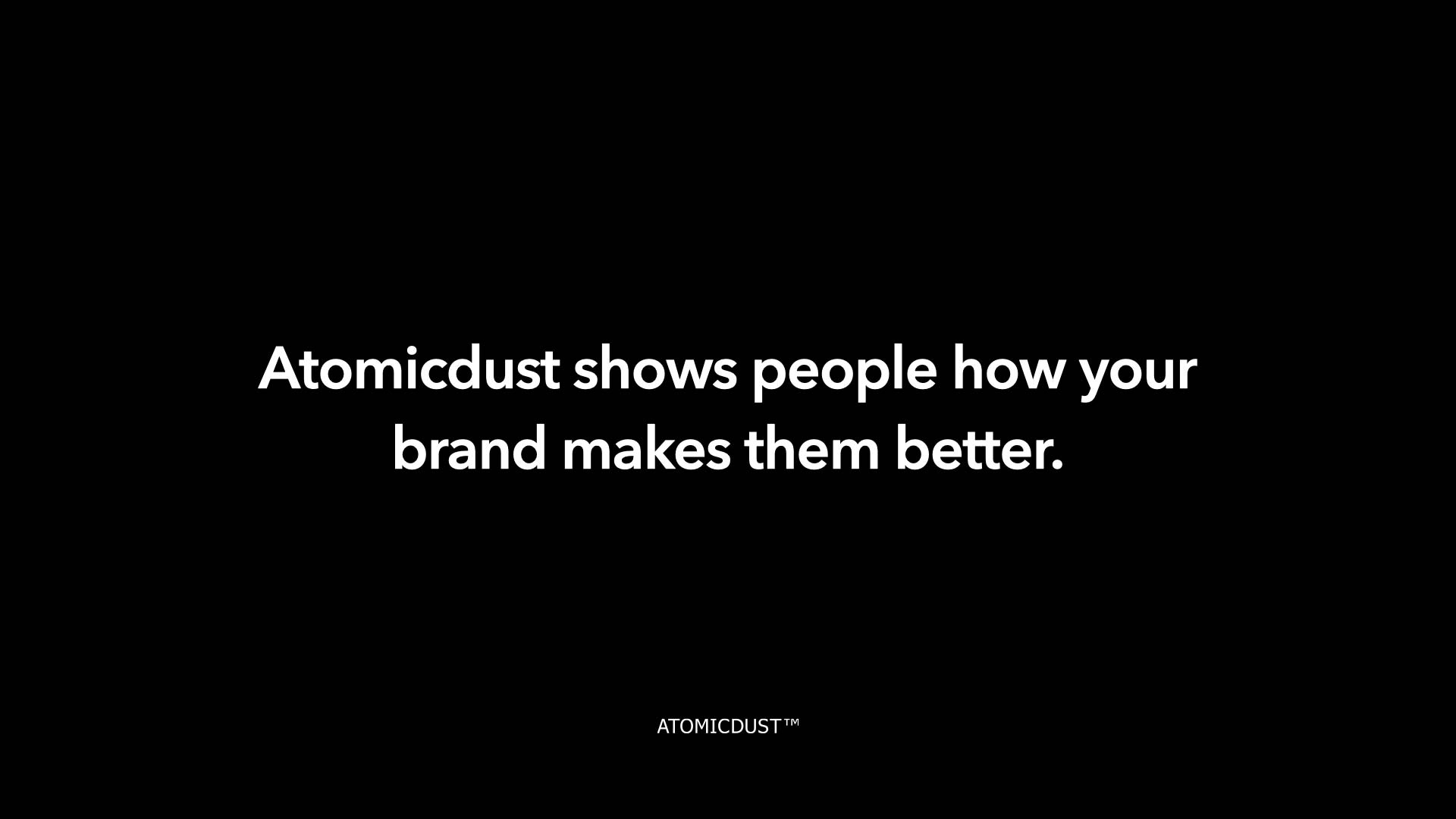
In just a few slides, we’re showing clients—or potential clients—that we understand their challenges and already know the solution. Plus, it’s more memorable than, “Hi, we’re a branding and digital marketing agency.”
But it doesn’t just work for creative agencies. Any industry can make a bold introduction that captures attention. Let’s think about an IT consultancy pitching their services to other businesses.
Sometimes to capture attention, you have to tell your audience what’s at stake if they don’t hire you.
Then, show them how you can eliminate the risk and make their lives—and their customers’ lives—better.
4. Simplify your message.
Once you’ve thought about who your audience is and how you can engage them, you can begin to craft the rest of your presentation. Though you may be tempted to fill your sales presentation with facts and figures that seem incredibly important, the more you add, the less people will remember.
“A wealth of information creates a poverty of attention.”
This quote from Herbert A. Simon, a political scientist whose work influenced the fields of computer science and cognitive psychology, is one our team repeats often. Because in marketing, no matter what the medium is, the goal is always the same—deliver a message that inspires viewers to act.
If your slide deck is chock full of lists, product features, stats and too much text, you’re not going to inspire your audience—you’re going to lose them.
Shorten copy, especially in lists, and try use as few words as possible to get your value proposition across. Bullet points are fine to use but should be short and sweet. Focus on identifying the key point(s) for each slide. If you have too many bullets, add more slides—you likely won’t increase the length of time your presentation takes, because with simpler content, you’ll flip through your deck at a faster rate.
Sometimes people forget the point of a Keynote or PowerPoint presentation is to support your actual pitch. To reinforce what you’re saying with visual cues that let your audience know the most critical information that you want to share. Remember that’ll you’ll be presenting alongside your deck—it’s there to make you look good and make your message stick.
Your audience doesn’t need all the information—just a few key points that intrigue them enough to take action and continue engaging with your brand.
And if you’re worried that your presentation is starting to look empty… don’t be.
5. Embrace white space.
As you cut down your content, remember white space is a good thing. Don’t think of empty space as a missed opportunity to add more information. That blank area doesn’t look empty to your audience. Instead, it’s helping draw their eyes to the statements, charts or numbers that matter.
When we talk about white space in design, we’re talking about any negative space between graphics or text. It doesn’t have to be white; it can be whatever color you’ve chosen for your background.
White space makes your words more readable, your visuals more powerful and your overall message more impactful. Some fear that eliminating content leads to a less valuable presentation, but in reality, white space puts more emphasis on what matters so your audience knows exactly what you’re saying—it eliminates confusion and distractions.
Need proof? Head to Google.com.
While Google has fun changing its logo depending on the day, the look of Google.com has remained mostly unchanged over the years. According to one article, “Google’s iconic look is beautifully simple and has a calming effect. Because there’s no clutter, there’s less work for your eyes and mind. You can focus on what you came for—searching for something.”
Even if it means adding more slides to your presentation, embracing space in your deck will make your key takeaways more memorable to your audience.
6. Clean up charts and graphs.
Fewer words can increase your white space, but it’s important to look at your graphics, too. Charts and graphs can be amazing tools for illustrating concepts and highlighting statistics, but just like text, it’s important to streamline visuals for the greatest impact.
If a graphic is the best way to convey your message, it needs to be as clear as possible, or it will lose its value. Eliminate any unnecessary or irrelevant labels and information to draw attention directly to the points you want reinforced.
It’s important to give your graphics the space to work their magic in your pitch deck. Even if that means giving them multiple slides to highlight different information. Use colors or type treatments to break down different points and fully explain your graphics:
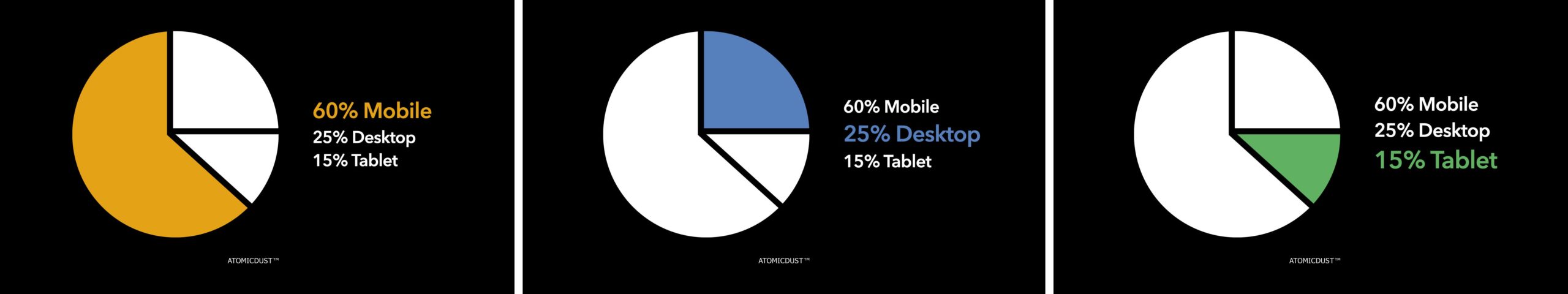
Charts and infographics only help your presentation if your audience can interpret them. Simplify them to draw out the most meaningful elements and minimize or eliminate the information that doesn’t matter to your viewer.
But that doesn’t mean every deck should be bare. Once you’ve hammered down the most important messages and information, warm up your presentation with imagery.
7. Consider lifestyle imagery.
You don’t need a gallery full of professional photography of your company and employees to add imagery of your deck. And if you do have that—great! But there are tons of stock images out there that can enhance your presentation and add visual impact. Using a variety of them can help emphasize your messaging.
Look for images that complement your service or message—they don’t have to be literal. If you’re talking about how eco-friendly your product is, show a green landscape. If you’re talking about your clients’ connections with their end customers, show them. Avoid clip art and overly posed images and show moments or environments that illustrate how your solutions benefit your ideal customer.
These seven principles can take your next sales deck to the next level—making your messaging more impactful and clearer to any audience. They’ll help you reframe the way you present information and share it with your potential customers, so you can continue to grow your business and generate more sales.