Here at Atomicdust, we’re doing more and more icon work: icons for apps, touch-icons for mobile websites and social media profiles for brands all require varying degrees of iconography. Just like any design specialty, icon design has rules and best practices, and following them can lead to a better designed, stronger brand.
Rule One: Keep It Simple
Icons share more than a few design goals with logos. They have to be instantly recognizable, different from competitors, but versatile enough to fit into layouts that aren’t designed specifically with your brand’s graphic standards in mind.
That’s not to say a logo will be the best direction to take for an icon or avatar. It can work well with simple logos, but complicated logos will often lose legibility when placed into an icon’s size constraints. In cases like this, try to use the simplest essence of a logo as the basis for an icon. Many logos are comprised of a wordmark and a glyph, so it may be possible to only use the glyph. (It’s very likely that the icon will be accompanied by some other system text on a mobile device or social network, so including a brand name is redundant information that distracts from the icon’s focus.)
An uncomplicated glyph that is both conceptually relevant and easily recognizable goes a long way to communicating what your app/site/social account is all about.
Start designing icons in black and white. That’s not to say that color and texture shouldn’t be used to reinforce a brand — more on that in the next section — but icons, in their barest form, should work without them.
Rule Two: Own It
Confidence is key for an attractive and effective icon. Too many brands request a logo on their icon designs, and the end product comes off as ineffective and timid. Instead, use other design elements to connect icons to a specific brand. Color, texture, tone and more can go a long way towards a great branded icon.
This is a little easier to talk about with an example. Yahoo recently released a great mobile weather app, titled — you guessed it — Yahoo! Weather. Despite some interesting and beautiful interaction design, the app’s icon (and therefore, first impression) could use some improvement. (I don’t mean to pick on Yahoo. They’re doing great work right now, and their weather app was simply top-of-mind while putting this post together.)
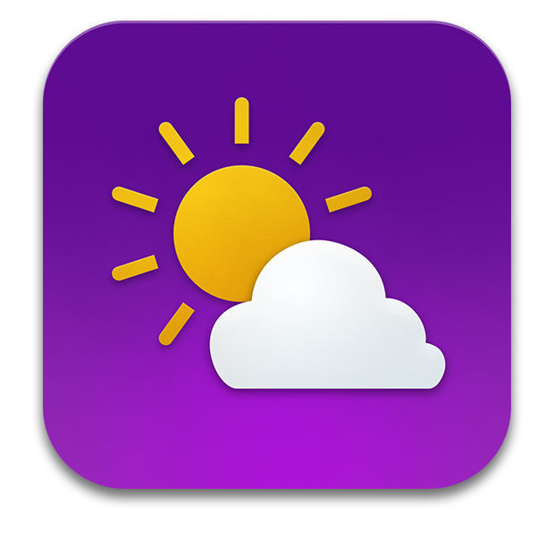
Here’s Yahoo! Weather’s current icon on iOS:
The glyph is good. It’s different enough from other weather app glyphs, and it’s both friendly and simple. It looks a little like something out of a stock icon pack, though, so there’s room for improvement. The smooth purple gradient screams “Yahoo!” and the overall flat style of the design is consistent with Yahoo’s other properties.
Still, that logo at the bottom throws the whole thing for a loop. It makes the piece feel cheapened, and it makes Yahoo look insecure.
What would happen if we removed it, and focused more on finding a more distinct Yahoo style?
With a few small revisions, the icon really starts to come into its own. The strongest parts of Yahoo’s brand are emphasized (color, friendly shapes) while stylistic tweaks — shapes that cast shadows, a touch of subtle texture — make it feel both more considered and distinctly “Yahoo!”.
Rule Three: Family Planning
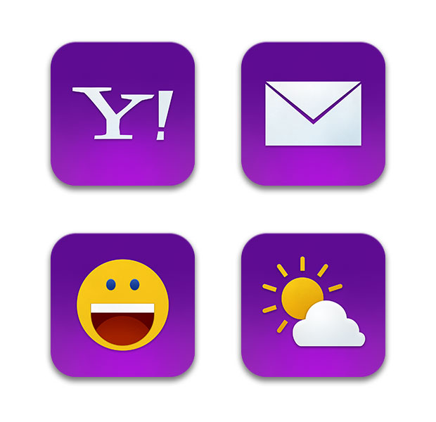
When designing icons, it’s important to consider if a brand is going to need multiple extensions of one design language. To continue our example, Yahoo has more than one app on iOS — and while some follow loosely similar icon design principals, the “Chat” app icon is fairly different form the “Mail” icon.
Let’s take the style from our earlier example and apply it to a few other Yahoo properties.
Nice. The revised icons share elements — purple, friendly shapes, subtle texture — and fit together well as a brand. They’re still easily recognizable, and easy to find on a device screen.
This type of execution builds a brand naturally. Instead of forcing a logo in front of a user’s face every time they look for your app, it’s possible to create a positive association between your icon style and a good experience (or helpful information). In this case, a good experience with Yahoo! Weather may lead more people to try Yahoo! Mail or Chat, as they’re clearly cut from the same cloth.
In Conclusion
Rules are rules, until they get in the way. Many great icon designers break these rules, and that’s fine if they help the end product. Still, something I learned in art school applies here: it’s best to know the rules before you start breaking them. If you’re just getting started creating icons for your brand, or you’re trying to tie your products closer together, this is a great place to start.

