I didn’t always work at Atomicdust.
Before we started the company 19 years ago, a couple of the founding partners and I worked at Lawrence Group, an architecture and design firm. I loved my time there, I learned a lot, and much of their culture and approach to projects shaped what Atomicdust is today.
I continued watching Lawrence Group over the years, always impressed by their work and the culture behind it. So when we got a phone call from Lawrence Group asking about a website design project, we jumped at the chance to get to work with their brilliant team—one that I knew would be open to big ideas and new approaches.
Duck, duck, duck, goose.
Ok, let’s talk about the goals of a professional services website and ultimately, its brand.
The goal of marketing professional services firms should always be to articulate difference. You want to eliminate, as much as possible, the brand’s comparability with competitors.
It’s a balancing act. You don’t want to be so far different that the brand is totally removed from the category, but you don’t want to blend in.
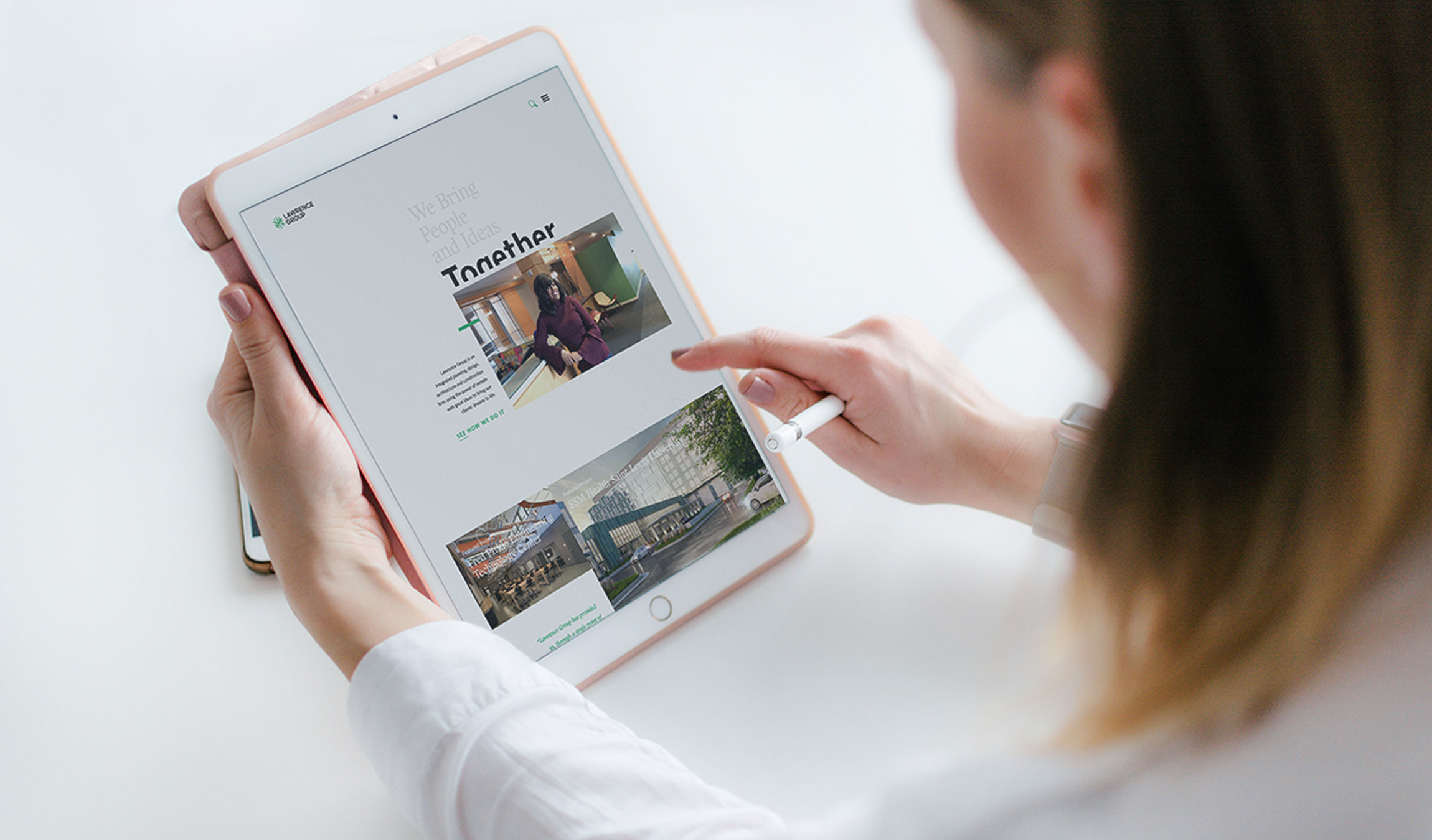
Lawrence Group’s existing website was good but getting a little dated, and associates weren’t directing prospects to it anymore.
The new site needed to help the firm stand out in the market and create a strong experience that would inform, inspire and reassure clients and prospects.
That goal, to help the Lawrence Group differentiate itself in its industry, drove every decision we made.
It’s the amazing Jessica Davis!Insert firm name here.
Through a competitive audit, we found an almost universal formula that architecture firms use for their websites: a huge photo of a building they designed at the top of the homepage (usually shot at sunset—or photoshopped to look like it was shot at sunset) followed by grids of photos of other projects and buildings.
This of course looks nice, but it has become the design pattern for architecture firms.
Also, the messaging most firms use tends to be formulaic. Most rely on one of two messages as differentiators: “Our projects are great and come in on budget!” or “Our people make the difference!”
The thing is, Lawrence Group could truthfully use these claims—they have amazing work, and remarkable people—but we needed a way to articulate that was different or interesting.
Eureka moment.
How do you showcase really talented people in an authentic way that is believable?
While we were working on concepts to help differentiate Lawrence Group, I remembered a series done by Hillman Curtis, one of my design heroes.
Over a decade ago, Curtis created “Artist Series,” short documentaries about different design legends. I watched the videos so many times when they first came out, they were engrained on my being. His documentary about Pentagram, an international design agency, ended with brief video portraits of Pentagram partners and designers working.
Inspired by those final moments of the documentary, we shot short video portraits of the Lawrence Group team in their natural environments: sitting at a desk doing paperwork, standing in the hallway, leaning against the front desk.
(Above, we shot videos of Atomicdust team members to test out the concept on a staging site. Below, a handful of the final videos and the guide we gave Lawrence Group to keep future videos and photos consistent. Look, there’s Jazzy!)
The shots look natural and candid, like what you’d see if you showed up unannounced at a Lawrence Group office. It gives a sense of honesty and transparency that people want in a professional services firm. The style is immediately different from what someone shopping for an architecture firm sees on other sites. And because the entire site was designed so that Lawrence Group could easily update it in the future, we shot the videos using no professional equipment—just an iPhone and tripod.
Making it meaningful.
Messaging also played a big role in demonstrating Lawrence Group’s industry positioning. The team brings meaning and intention to every project; when designing a hospital, they don’t just design a beautiful space, but one that can better serve the physicians, staff and patients who will use it day in and day out. We sought to create copy that showcases the amount of thought and soul that they put into their approach.
Even the microcopy is reflective of Lawrence Group’s focus on people and relationships. Calls to action on the site include “Tell us your idea. We’ll create it together” and “Read the values at the heart of our firm.”
A few bells and whistles.
A white background and little extra decoration throughout the site steer the visitor’s focus to the images and copy. One twist: we designed the page titles so the text is cut off at the bottom, giving the type a bit of personality.
When it came time to design the portfolio page, we knew what we didn’t want: a static grid of endless building photos. Instead, a smattering of overlapping photos in different sizes makes the eye travel down the page from each image, instead of glossing over the entire section. Hover animations bring in the client name and images link to individual project case studies. We made sure that adding new projects is easy, so the firm can share their work and keep the site current.
The gang’s back together.
One of the best parts of this project was getting to work with some of my colleagues from Lawrence Group who are still there, 19 years later—a testament to the strong culture of the firm.
We’ve since collaborated with their team on the City Foundry STL website, and are looking forward to the opportunity of more projects in the future.
Thanks to great clients and old friends. We really enjoyed this one.