When Niche moved from Benton Park to a larger space in Clayton’s Centene Plaza, owner Gerard Craft knew the interior wasn’t the only thing that would need to change. After working with Atomicdust on branding for Pastaria, Gerard approached us again to help him redefine his flagship restaurant, an award-winning St. Louis staple where the food is elegant and the atmosphere is never pretentious.
During an early meeting, Gerard told us that his approach to Niche grew out of a simple maxim from his childhood: “Be plumb and square.” It’s a guide for good behavior (and good construction) inspired by a carpenter’s tools.
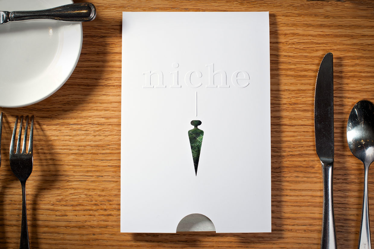
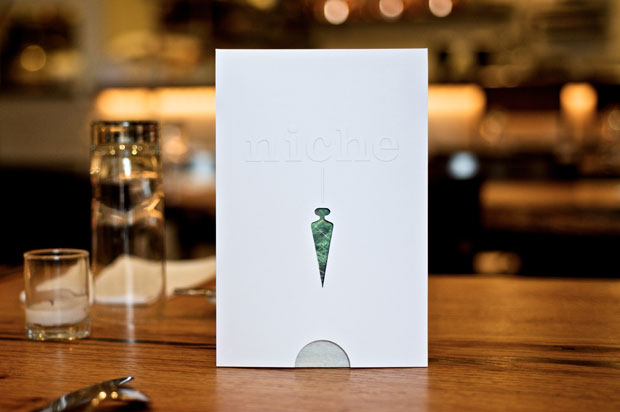
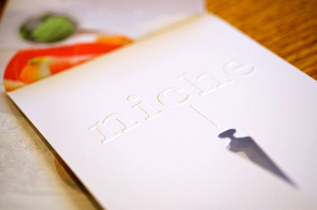
Niche’s brand identity was influenced by the plumb bob, a weight that swings on the end of a string until gravity holds it still, forming a perfectly vertical line.
For centuries, this humble tool was the starting point for the construction of great buildings and monuments. It even helped marine navigators measure the position of the stars.
For us, the connection to Niche was immediately clear. Amazing things start simply.
Niche takes an uncomplicated approach to the complexities of modern cuisine, starting with a precise balance of ingredients and flavors to create something that transcends its origins.
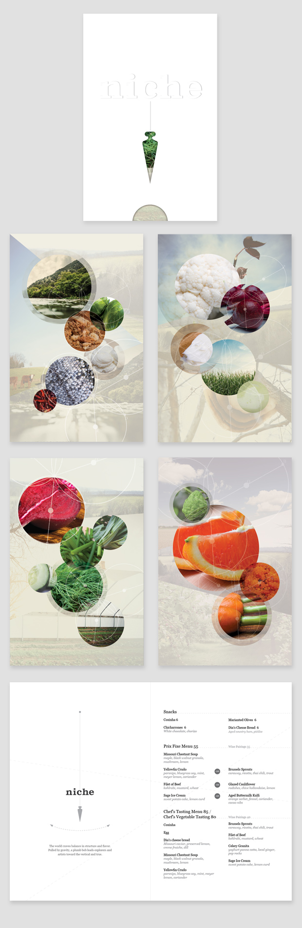
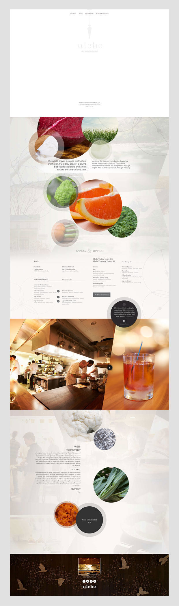
All recipes are a process. Raw ingredients are refined and combined, and become something great. We decided to represent that concept visually by bringing together individual ingredient photographs to create works of art. Circles of various sizes encompass ingredient images that represent the building blocks of good cuisine: colors, textures and shapes. These circles achieve balance without rigidly adhering to any formula or pattern.
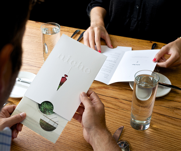
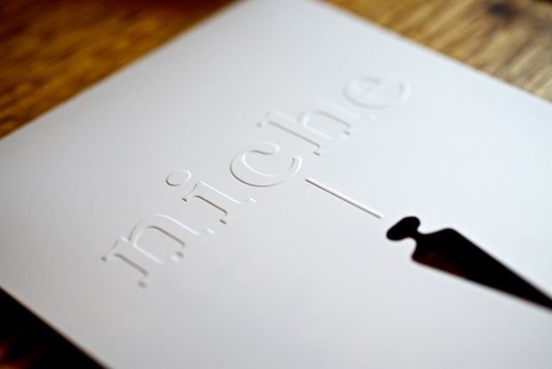
People tend to visit Niche on anniversaries, birthdays and other special occasions. We wanted the menu to feel like a gift: something that would surprise people and make them smile when they opened it. To achieve this, we designed it to slide in and out of an envelope with a plumb-bob-shaped cutout on its cover. The cutout reveals only a small portion of the menu’s textures and saturated colors. When the menu is removed from its envelope, guests feel the full impact of the images: bright herbs, chili peppers, orange slices, radishes and more. A variety of interior menu covers makes it likely that the image will be different for each person at a given table. To add a bit of intrigue, and to acknowledge that Niche can’t easily be defined, the front of the menu has no printed ink—just embossed logo type.
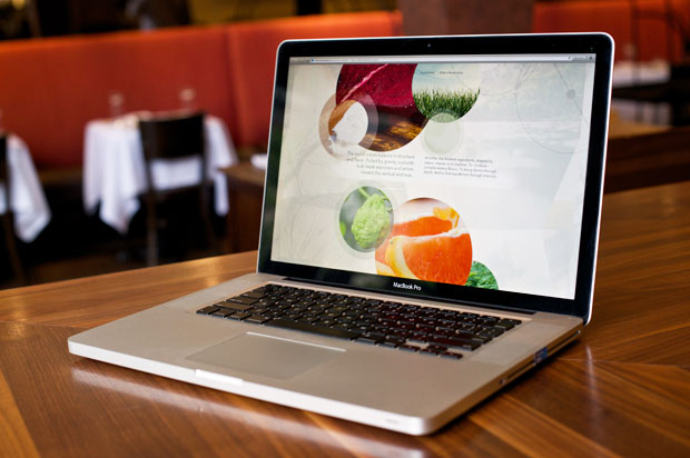
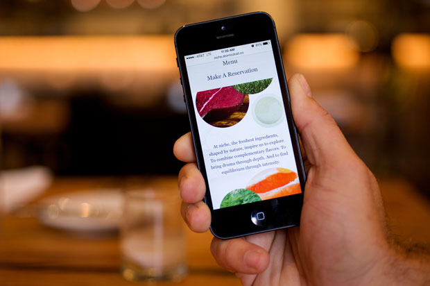
In the spirit of simplicity, the new Niche website is contained on a single vertical page, allowing the restaurant’s story to unfold in a clean and streamlined way.
A semi-transparent swinging plumb-bob follows the visitor throughout the visit, guiding the eye with a straight, dividing line that dives underneath certain sections before reappearing above others. The restaurant can share news, new additions to the menu and images via the embedded Twitter feed, and a reservation button makes it easy for visitors to take action when the site makes them hungry for more.
Throughout the process, we were inspired by the experience of Niche itself, where part of the delight is the act of discovery. Like Niche’s cuisine, the new materials are designed to surprise through details—in perfect balance.
