It’s hard to find a good breakfast spot in Chesterfield, Missouri.
At least, that’s my opinion, as a kind-of foodie and Chesterfield native.
Not that it’s low on options—it’s home of the “World’s Longest Strip Mall”—where just about every chain restaurant with a Midwest presence is represented. But, again, in my opinion, there’s a shortage of locally owned, thoughtfully created restaurants serving anything new in town.
So, when a local (and well-loved) restaurant group enlisted Atomicdust to bring their new finer diner concept to life in my hometown, I was pretty excited.
Well, excited, but also a little confused.
![]()
![]()
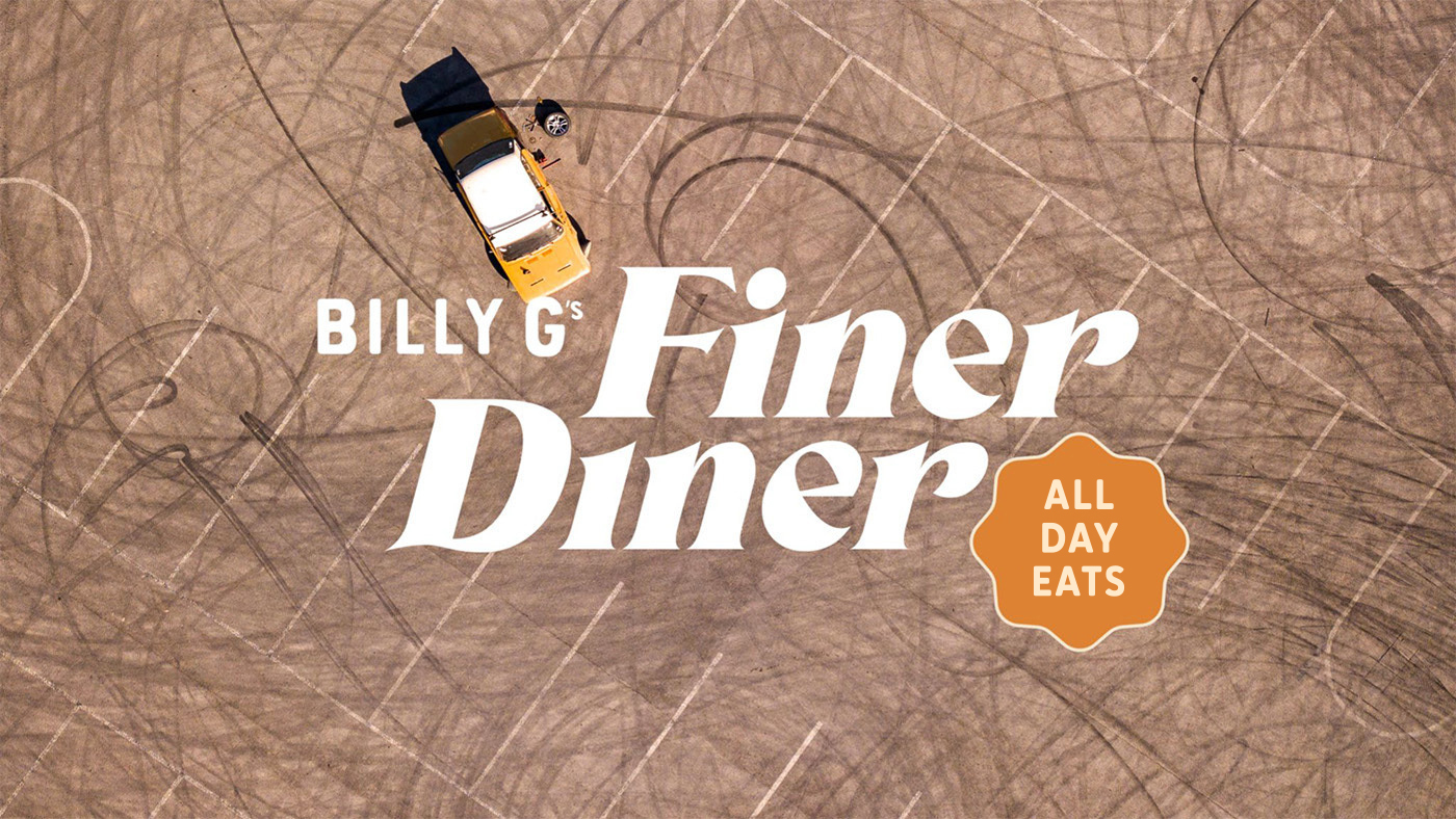
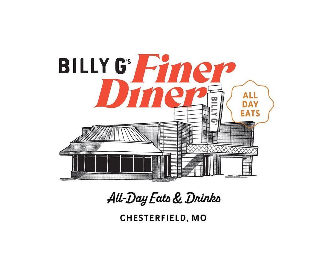
What’s a Finer Diner?
What comes to mind when you think of a diner? I think of a brightly lit, neon-clad, leather-booth-filled hole in the wall with kitschy décor and an expansive, laminated menu (that probably sticks to the table a little bit).
Though wonderful in its own right, a greasy spoon is not what Bill Gianino set out to create in Chesterfield.
A member of the Gianino family, which has owned successful restaurants in St. Louis for almost 40 years, Bill wanted to create a diner, but make it finer. He wanted to keep the comfort foods—but serve them in a more comfortable (and clean) space.
Billy G’s Finer Diner would be a spot where you could enjoy breakfast, lunch and (eventually) dinner, but also bring your boss or in-laws along. A place with great food, a little nostalgia and a lot of modern touches.
Our first task—explain the concept to potential diners. The narrative we composed set the tone for all of the restaurant’s brand language:
What makes a diner finer?
It’s familiar flavors with a fresh spin.
It’s a cup of coffee—or a crafted cocktail.
It’s breakfast, lunch, dinner and then some.
Billy G’s Finer Diner is a place to catch up or wind down with finer food, drink and company.
![]()
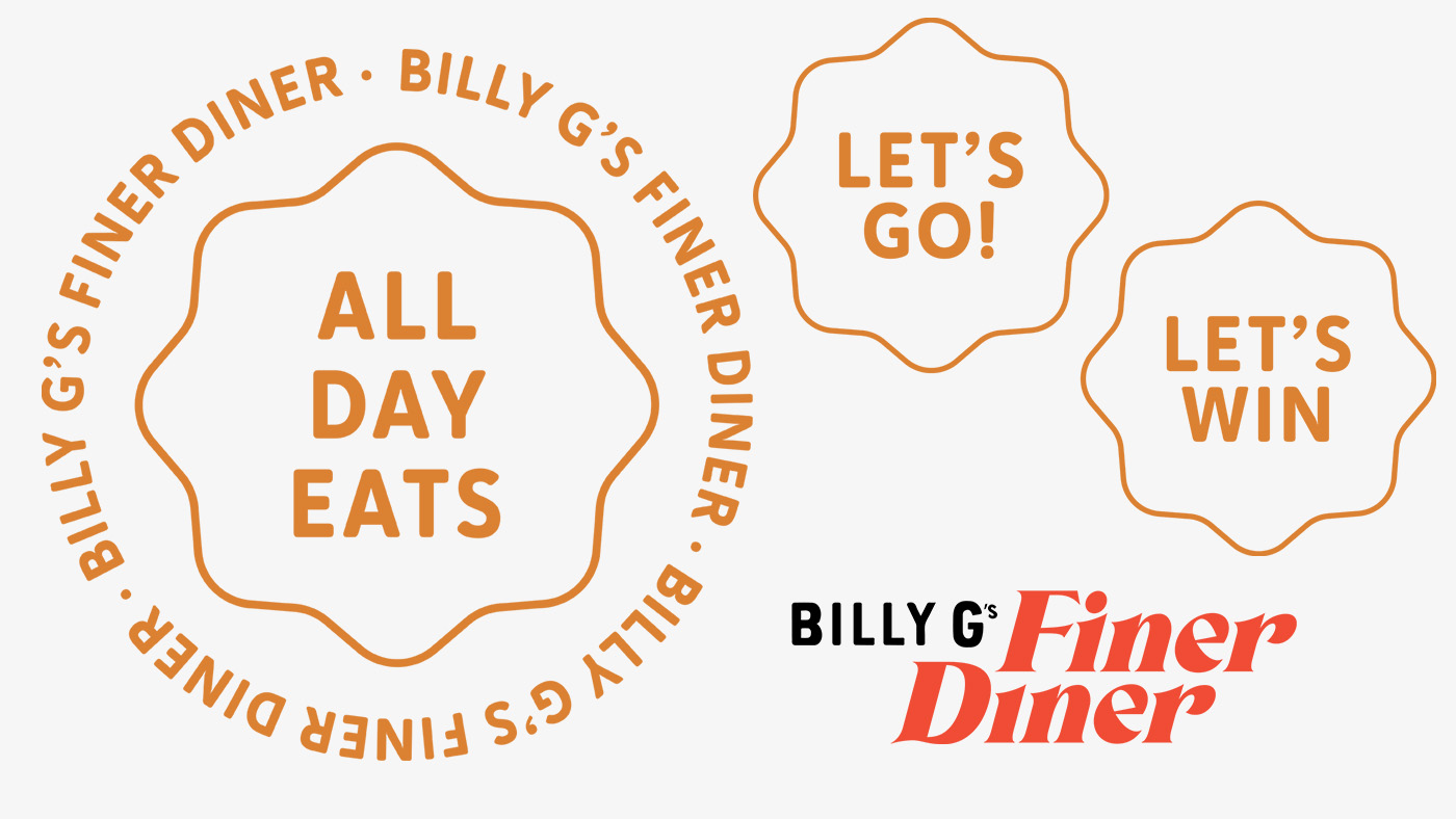
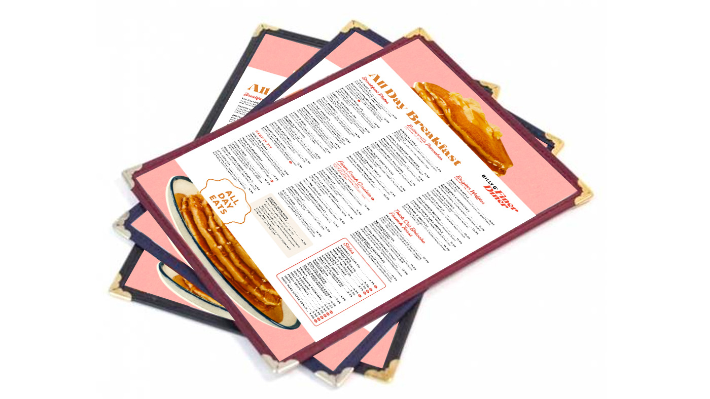
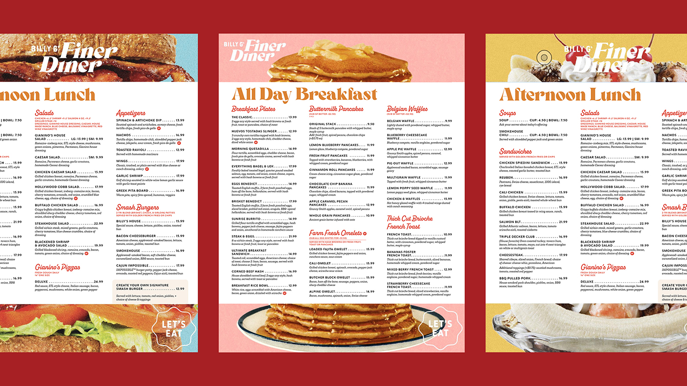
With a story—and a tagline that sums up the expansive menu and beyond-breakfast hours: All-Day Eats & Drinks—we started to dream of what the Finer Diner brand could look like.
Diner, Meet Designer
Restaurant branding is fun… but not as easy as you might think.
Yes, the industry is more playful, colorful and relaxed than, let’s say, the insurance field. But much like our more buttoned-up clients, restaurants face endless competition for customer attention.
And once they have that attention, they need to provide a memorable, meaningful dining experience. It doesn’t hurt to look good on Instagram, too.
We needed to design more than a diner brand—Billy G’s needed to be a destination.
Luckily, their team had already enlisted interior designer Lori Olsen, who planned to convey “a ‘70s-era, Quentin Tarantino-Palm Springs kind of vibe” through the restaurant’s furnishings and finishes.
We also had recognizable brand elements from Billy G’s other location—a bustling spot known for its packed patio—to incorporate into the brand identity.
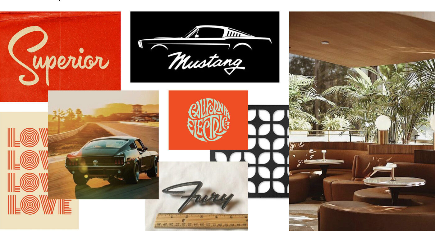
With visions of muscle cars, desert landscapes and mid-century design in our heads, we were ready to start cooking up logos, graphics and more.
Palm Springs and Pancakes
With a ‘70s diner concept, it’s incredibly easy to go overboard.
Checkered floors, pastel colors, bright red booths, a jukebox. The standard elements are a little more Johnny Rockets than Billy G’s.
Rather than over-saturate the brand, we explored calmer color palettes in desert-inspired hues.
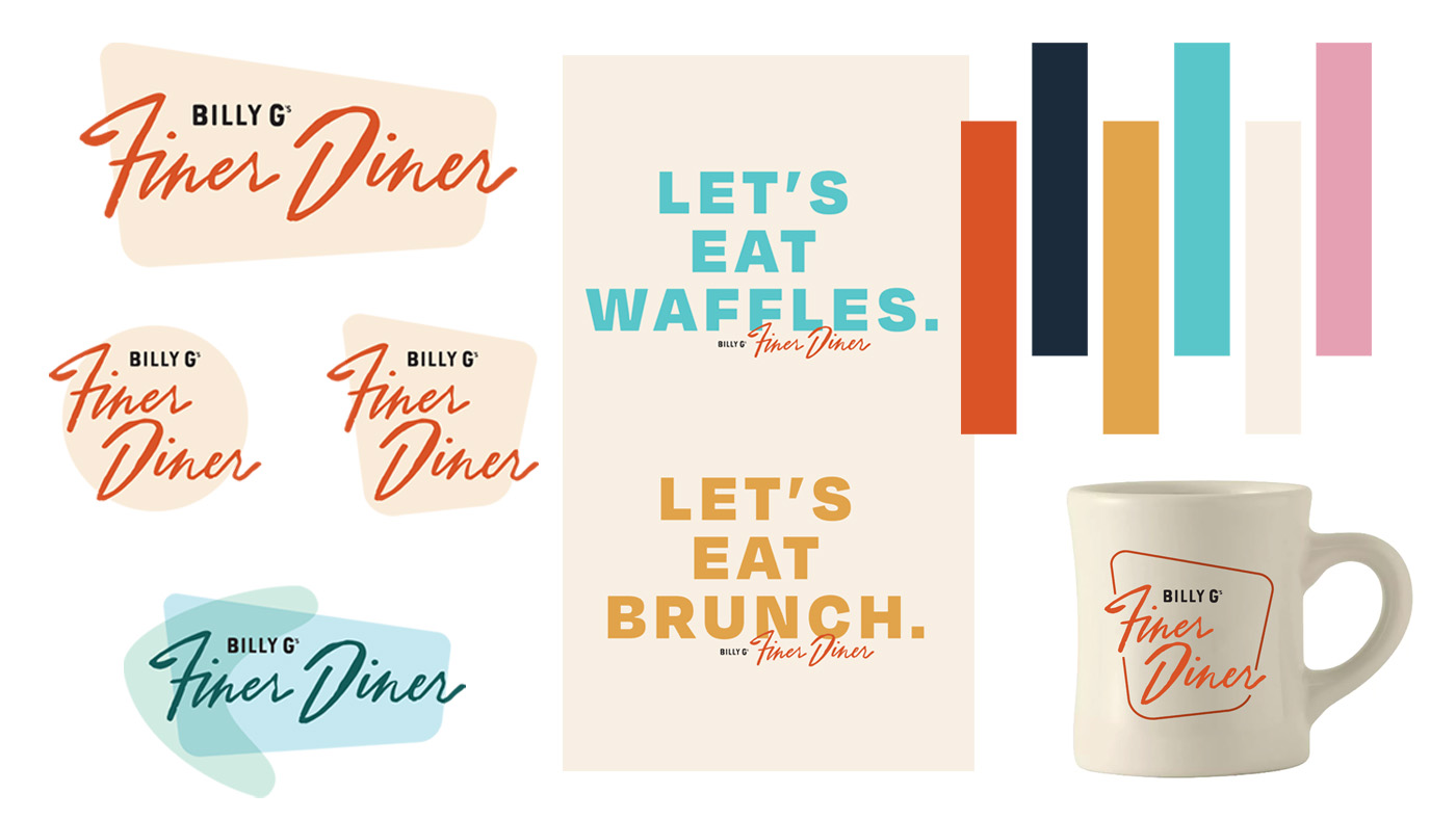
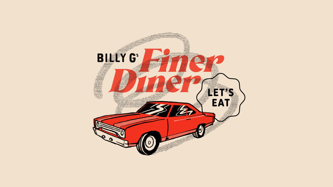
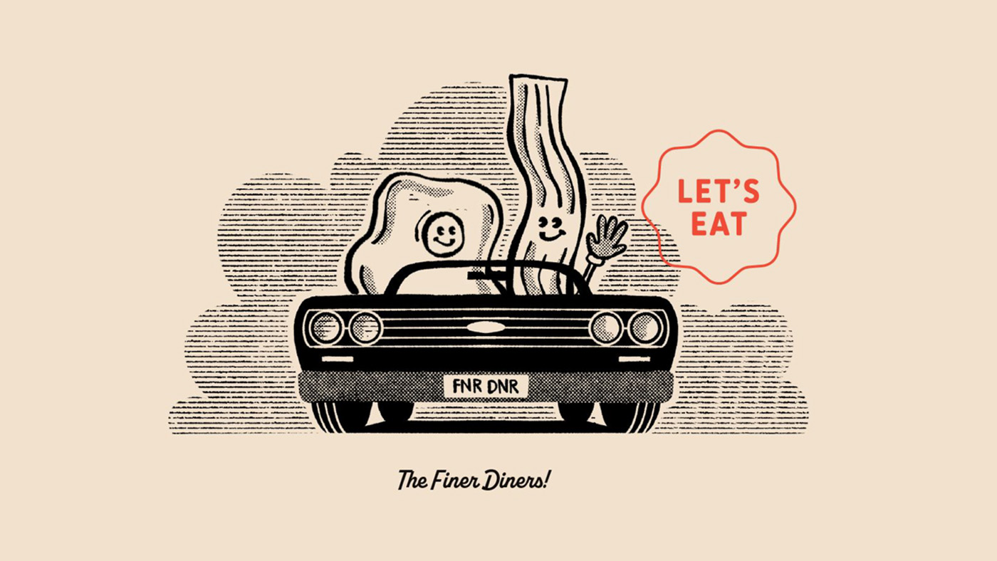
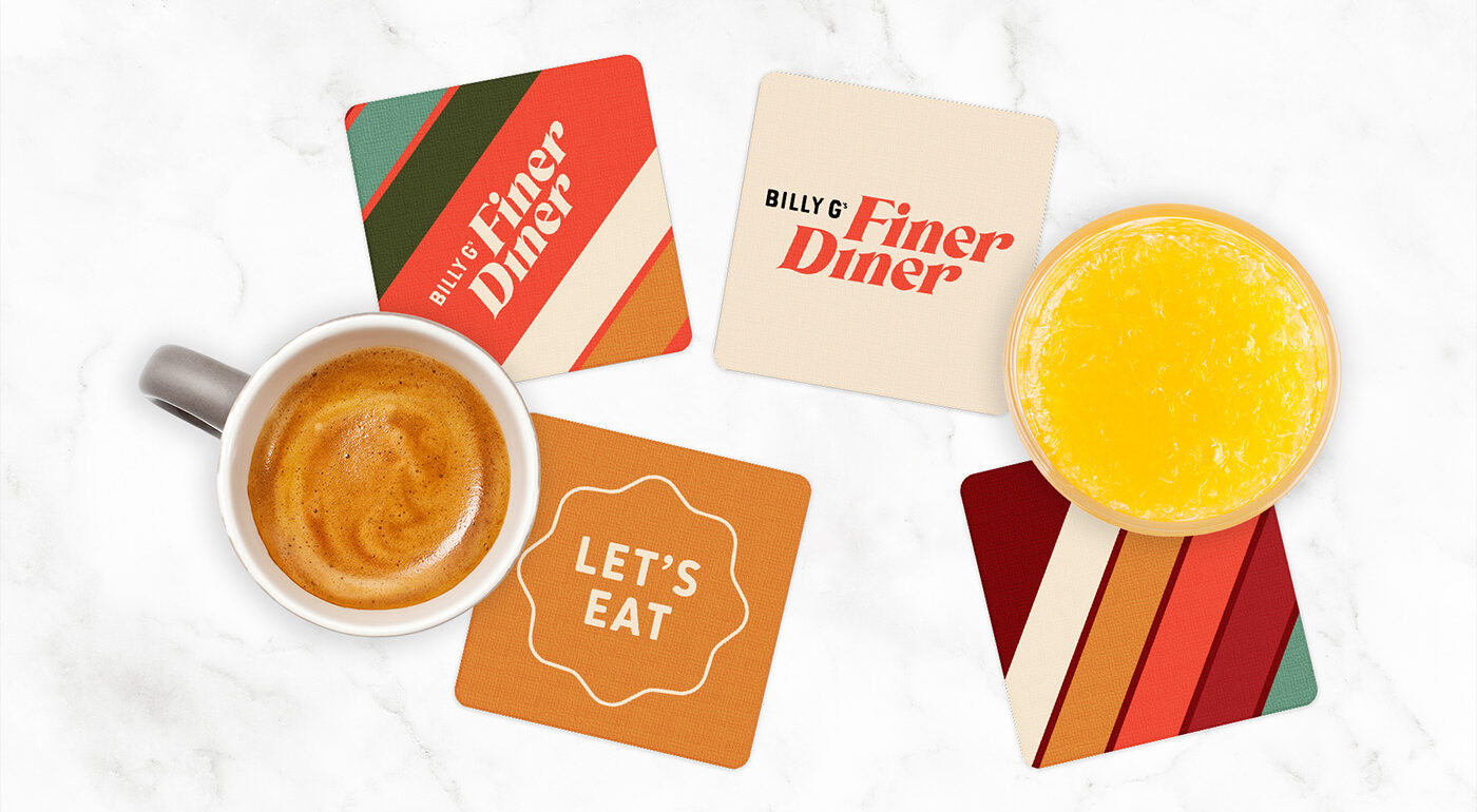
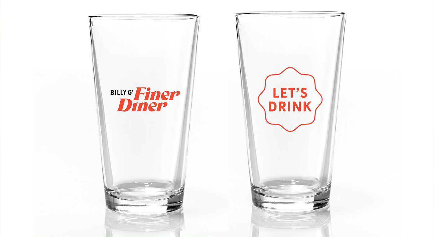
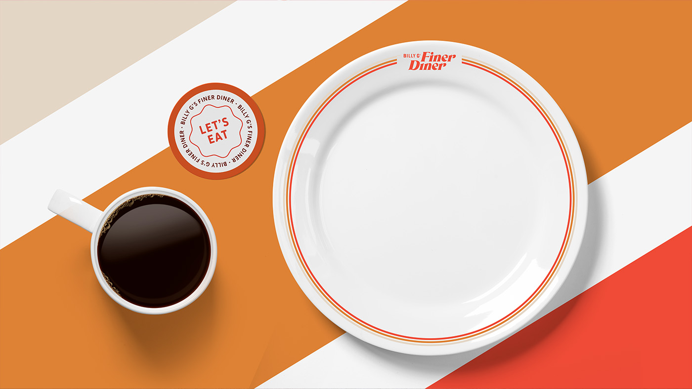
We added subtle retro touches, through typeface and illustration styles, but balanced them with the bold Billy G’s logo and graphic elements—including an updated version of the brand’s signature Let’s Eat “sprocket”—to create a look that feels more dynamic and less kitschy.
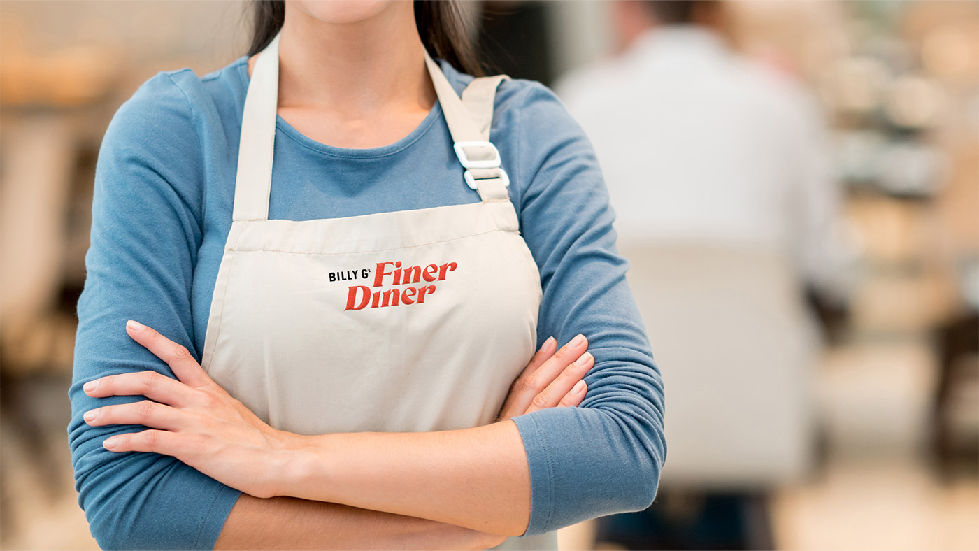
And then we explored how the brand could flex across the dining experience—menus, coffee mugs, mimosa glasses, employee hats, t-shirts and more.
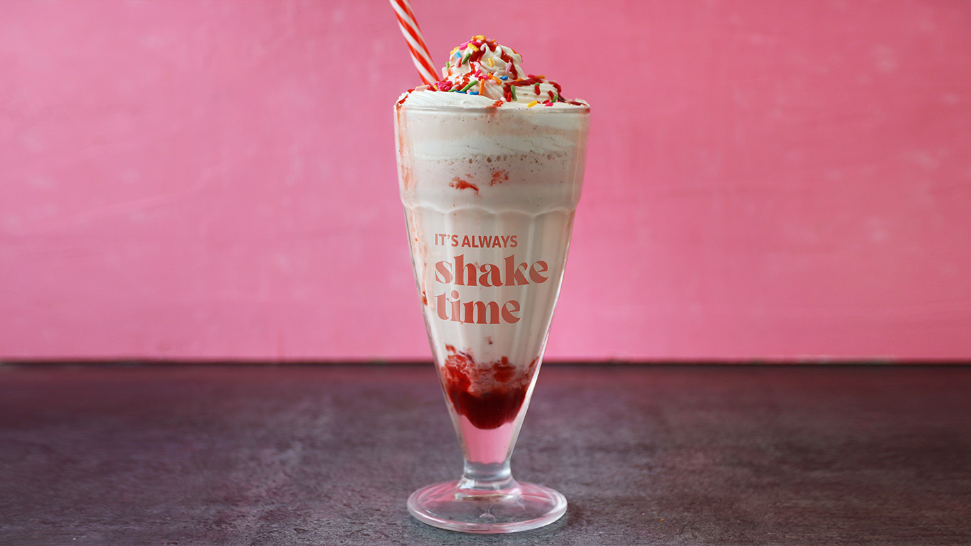
All together, it creates just the right vibe: retro without being corny, modern but relatable, reminiscent of a diner but with an elevated feel.
Let’s Eat
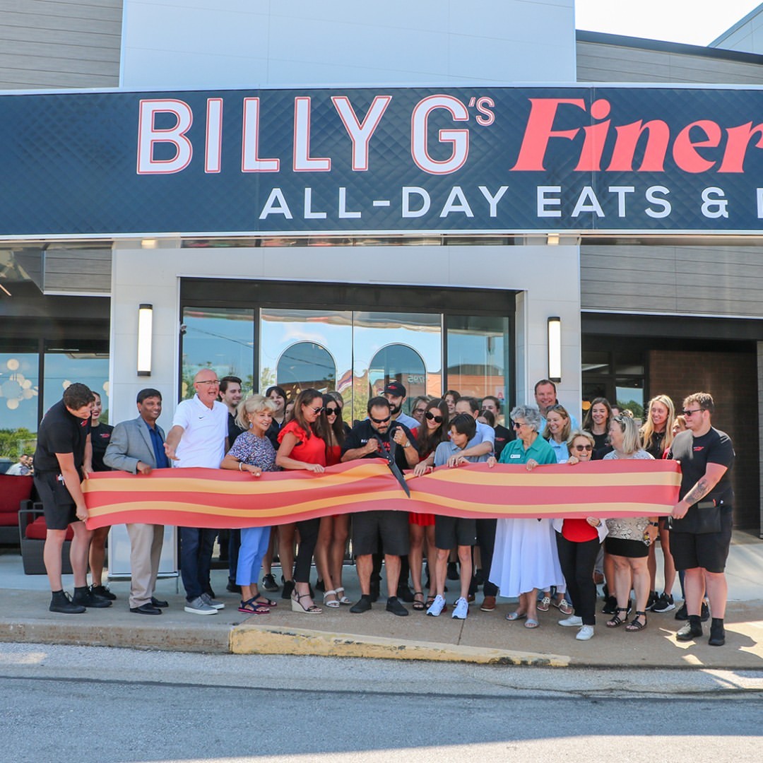
Billy G’s Finer Diner opened in true diner fashion: with a ribbon bacon cutting ceremony. We’ve enjoyed watching all the pieces come together inside and outside of the space—and we can’t wait to grab a coffee (or cocktail) at Chesterfield’s newest dining destination.