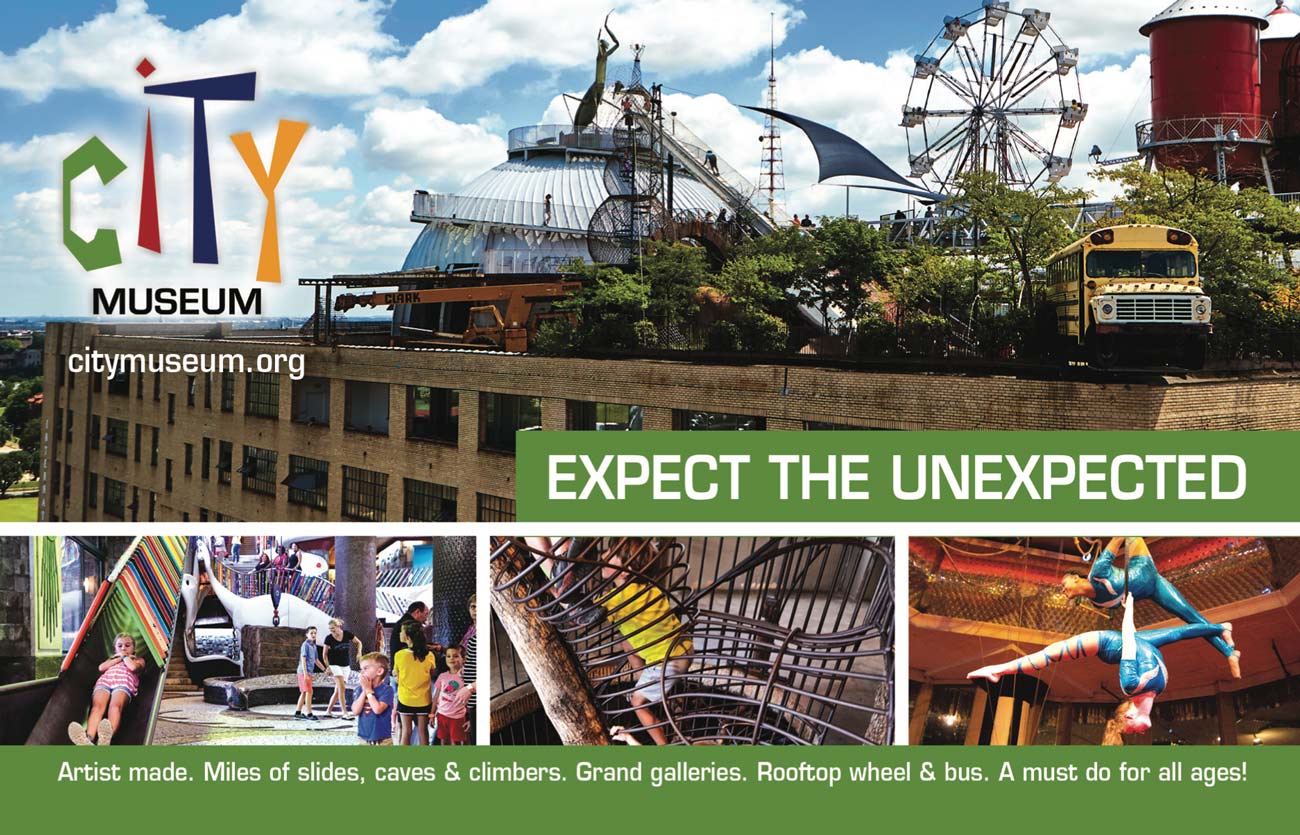
“You see, it started out as an aquarium, but it sort of got out of control.” – Bob Cassilly, Creator of City Museum
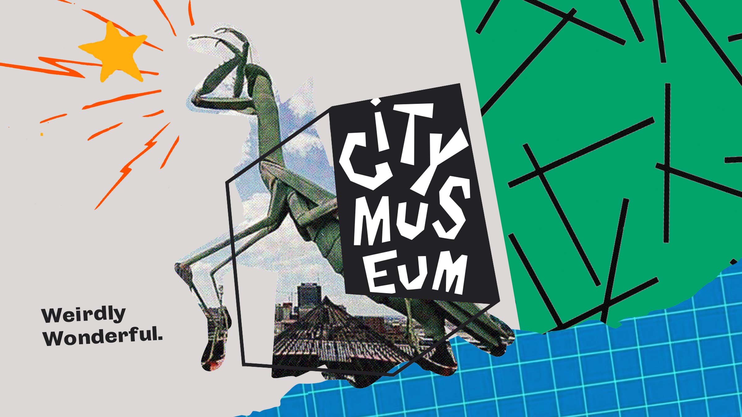
There really is no simple way to describe City Museum—even with great branding.
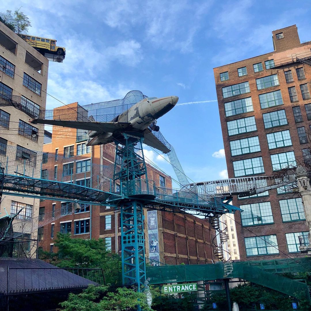
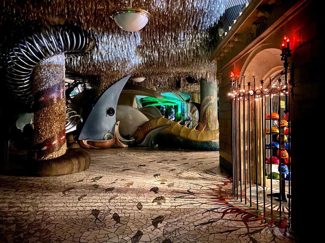
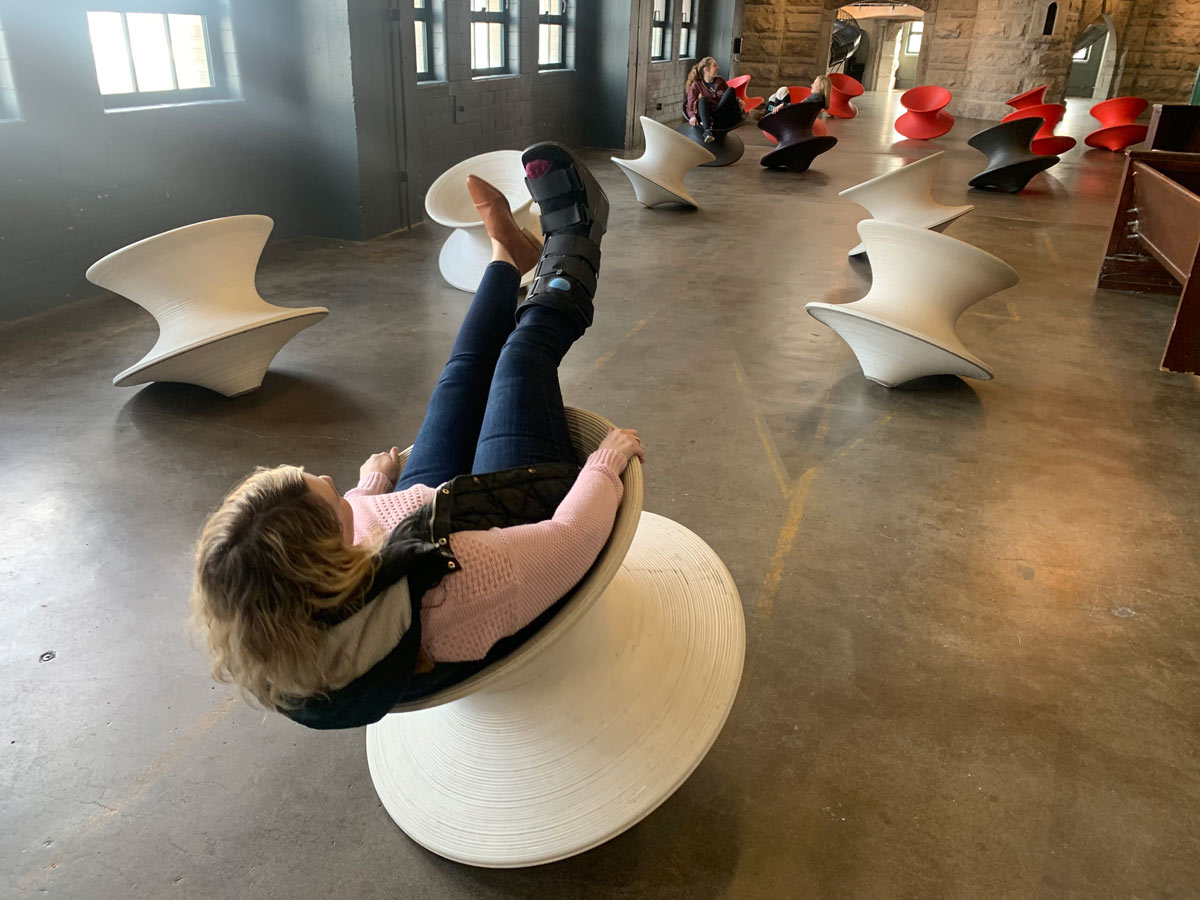
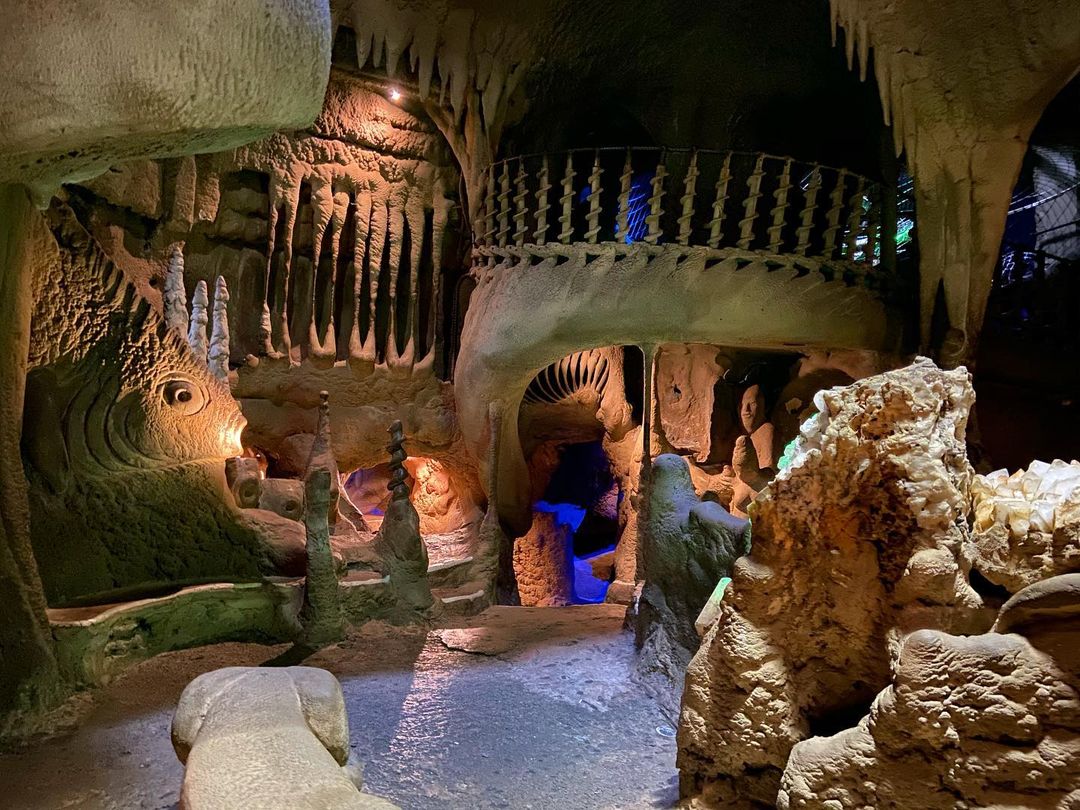
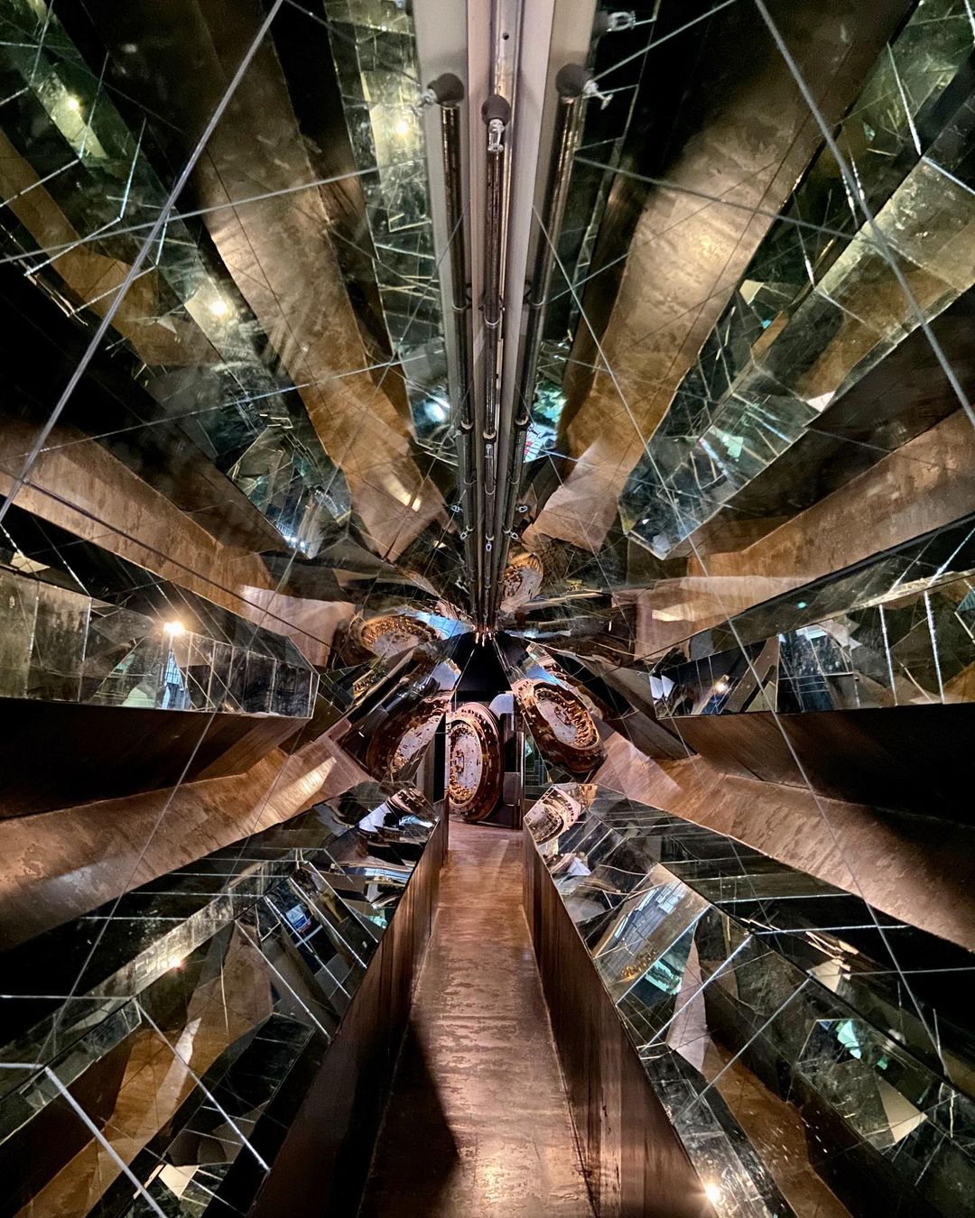
The easiest attempt would be to call it a 10-story, artist-driven playground, full of larger-than-life sculptures you can climb on and tiny dark tunnels leading to (hopefully) somewhere that you can explore (if you’re brave enough—and can fit).
It is a work of art, a living concept and a helicopter parent’s worst nightmare. It is iconic and wonderful. And in the middle of 2019, Atomicdust was asked to help refine and expand its brand.
Bob was the brand
City Museum was created by an artist named Bob Cassilly.
He purchased a mostly abandoned, 10-story building in downtown St. Louis, and in the lower level, started to build sculptures out of found objects for his own amusement and artistic expression.
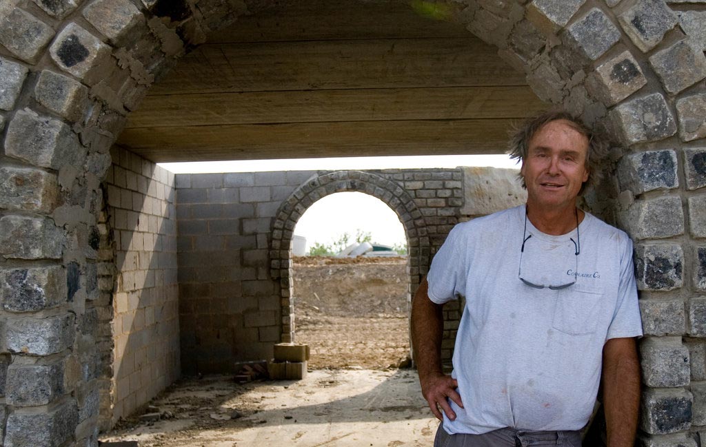
What started as personal expression became City Museum, which opened to the public in 1997. It was Bob’s property, his domain and his playground to explore.
Bob died unexpectedly in 2011.
Bob is the story here. Bob was what started it all. He had created a magical place that had evolved to be even more, thanks to the ingenuity of his engineering team, the Cassilly Crew.
For this project, Bob was the gift and the curse. He was conflicting, opposing forces. Bob made this project really tough, and very clear.
Branding and butterflies
Being asked to brand City Museum was a lot like visiting there. It was both exciting and a little scary. This place is a beloved icon of our city and region and—hell, the world really. If there was ever a time to use the word legendary, I think now would be it.
And maybe it was too built up in my head from the start, but I wondered, Is it counterintuitive to give a place like City Museum a brand identity? Is it against the very spirit of the place?
We were going to find out.
Not killing the vibe
“We got a 10-story building. We’re not using it for anything rational, we’re using it to play with.” – Bob Cassilly
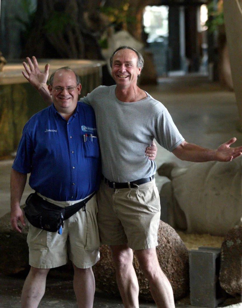
After Bob died, City Museum wasn’t in the best place financially. Eventually, a buyer came along: Premier Parks, owners of some of the most beloved theme parks in the country.
Premier Parks, new owners of City Museum and our new clients, found themselves with a property like no other.
City Museum had a conflicted reputation. On one hand, it’s an iconic, mysterious and bohemian artist’s dreamland. It’s also hard to explain what it is. And its culture sees any attempt to commercialize or explain it as “selling out.”
Bob and the Cassilly Crew never wanted any signs inside (like, not even restrooms signs), did no marketing or advertising, and never wanted it to be defined.
Atomicdust was brought in to help clarify the brand, create new ways to promote it to visitors and most importantly, to not kill the spirit.
The fear was that the new owners would come in and turn City Museum into a commercial theme park. That they would beat the joy and mystery out of it by making it ultra-commercial.
This is where I really want to point out that the team at Premier Parks did not want to beat the spirit out of City Museum. In fact, from our experience, they’ve done everything they can to keep the spirit of the place alive.
Our goals with the branding were:
• Define a brand identity system—without killing the vibe
• Define a core set of language—without killing the vibe
• Make things clearer for visiting families—without killing the vibe
• Point out the individual attractions—without killing the vibe
It was up to us to not mess it up.
Art and commerce
“You know, we call this place a museum—I get it from the original museum term, which is ‘dwelling place of the muses.’” – Bob Cassilly
I like to tell young designers I meet that there is a difference between art and design.
Art is something you make for expression and pleasure. Design solves a problem.
Your personal enjoyment isn’t the main goal of design. It’s achieving the client’s goals.
Art is for fun, design is for money—usually.
Wow. What a cold way to frame things. I can only imagine what Bob Cassilly would say.
Part of the reason Premier Parks hired us was to help that commerce part. City Museum is about art, but to keep it running, it needed to be a profitable business. Not a greedy business, or a soulless business, but a functional, viable business.
Keeping City Museum a viable business meant evolving its reputation. You can swap the word “branding” with the word “reputation” in most sentences, and it will mean the same thing. City Museum’s reputation wasn’t the strongest for making visiting parents feel confident.
I have three sons. While working on the project, I started listening to what other parents had to say about taking kids to City Museum.
“You’ll lose your kids there.”
“So-and-so broke their arm there.”
“Make sure you wear knee pads.”
“They might be too young to go.”
But while the landscape of City Museum looks different than most playgrounds, the Cassilly Crew includes playground engineers who focus just as much on safety as they do aesthetics. And Premier Parks had done even more to improve safety at City Museum, without killing the vibe. Small changes have made big safety improvements, without taking away from the adventure.
But that’s the thing about reputations. They can be tough to change.
We had our work cut out for us. It was time to get started.
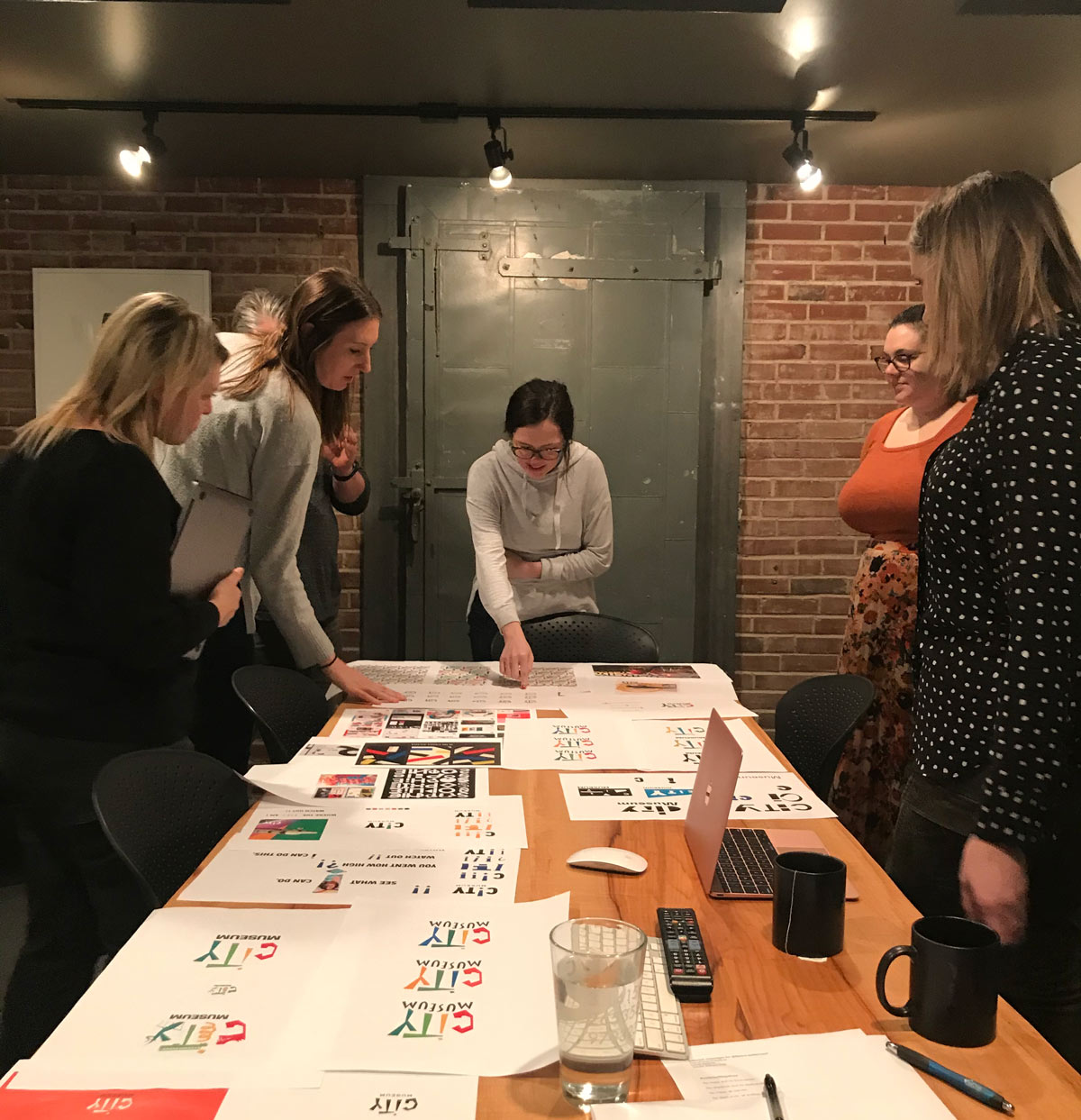
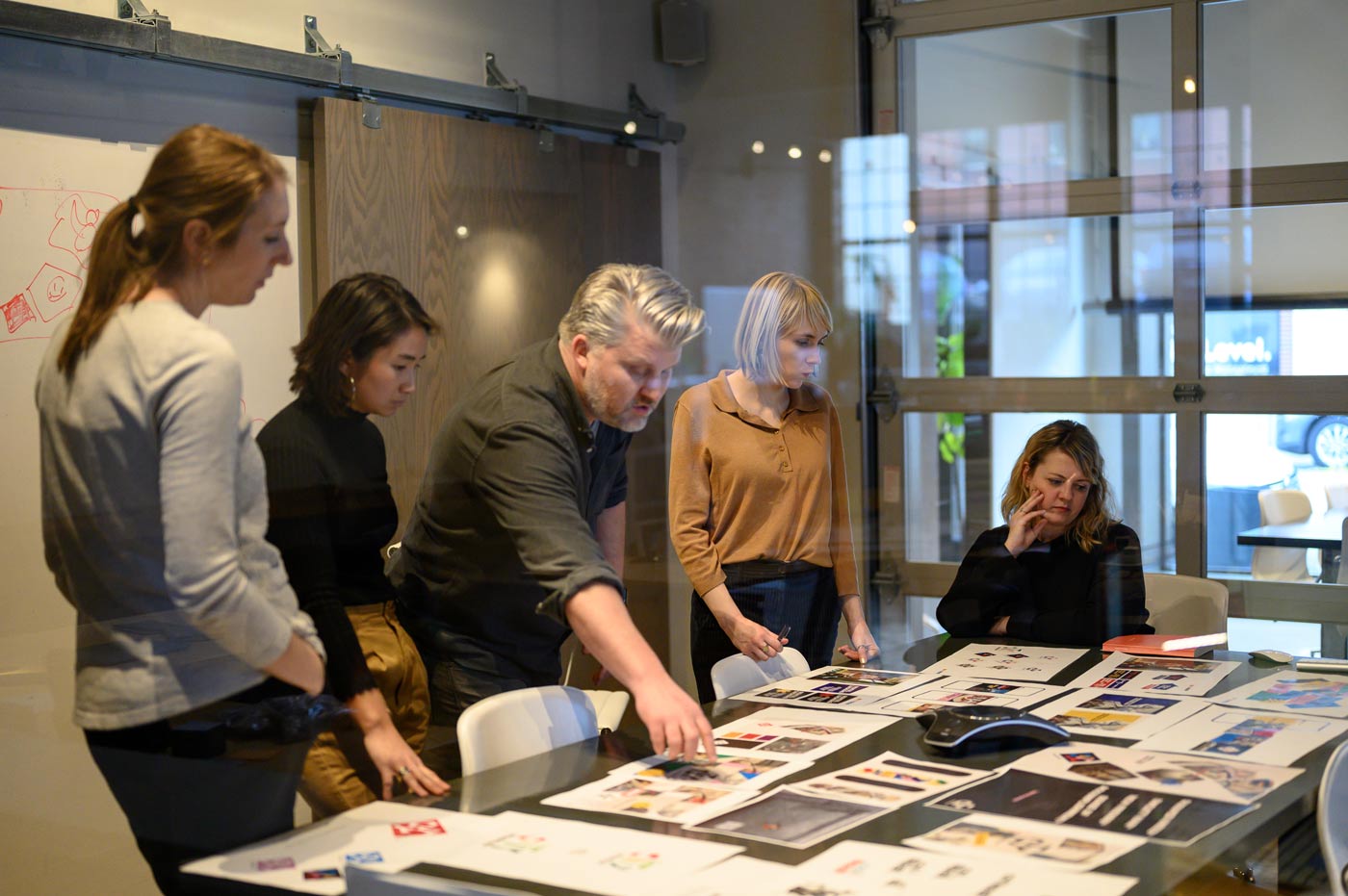
Conversations with the Crew
We began our Branding Program with interviews. We had great conversations with new managers, former leadership, veteran employees and the Cassilly Crew themselves.
We asked about how people describe City Museum, what they think the purpose is, what the future might hold, and any advice they had for us.
Everyone we talked to had great stories to share. Weird, strange stories of St. Louis, the objects in the museum and personal stories of what City Museum means to them.
We spoke with so many people about their perspective of City Museum. Of course, the only person we didn’t get to talk to was Bob.
The dissonant symphony
I would sit in my office, thinking about what to do, how to interpret what we heard, and how to not make the new brand corporate.
I found myself Googling and learning what I could about Bob Cassilly—searching for what advice he might give us.
Eventually I found a YouTube video of a reporter asking Bob questions that were similar to what we would have asked him.
Bob’s answers had a recurring theme: the idea of balancing opposites.
“So we were going to try and make this thing where we put all these opposites and see if they work together—but by contrasting all these different forms, we formed sort of this dissonant symphony.” – Bob Cassilly
The concept of balancing opposites was the theme of the museum, and the key to getting the brand aligned with what City Museum had evolved to become.
Our job was to balance art and commerce.
The logo
The logo is always the big question with branding, isn’t it?
And even if people don’t particularly care for a logo, after enough time, they don’t really think about it anymore. They associate their feelings not with the actual form of the design, but all the experiences that surrounded it. The memories, the good times and bad. The constant presence of it all. The nostalgia.
There is this old Donnie Deutsch book that talks about his early work for Ikea. When his team surveyed customers and asked why they didn’t buy new furniture more often, even when it needed to be replaced, the common answer was, “You get used to it.”
The logo had so much history and meaning to people that they didn’t really want to see it go. (We heard rumors that Bob had drawn it, or at least early versions of it, but we could never confirm whether they were true.)
On the other hand, visitors who were seeing the logo for the first time could clearly see the wear and tear on the thing.
It needed an upgrade.
When Rick Erwin took over City Museum after Bob’s death, he tried to pick up some of Bob’s unfinished projects. He said that he was going to try and do things the way that Bob would do them, even though “Whenever I would try to think like him, he would tell me that that was my downfall. He said, ‘If I think like him, then I’m going to question myself. I should do what I want to do.’”
With that thought, we did what we thought we should do.
![]()
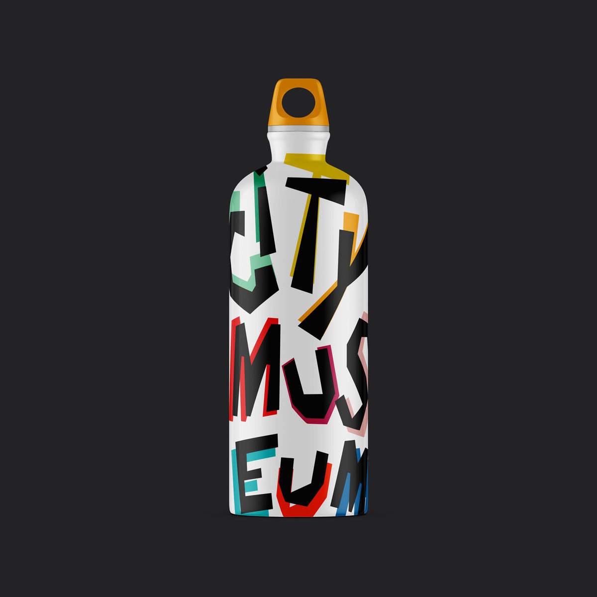
We didn’t want to reinvent the logo. We didn’t want it to be a trendy badge lockup. So, we took some of the hand-drawn letter forms of the existing logo and started to refine them.
The logo we landed on was a form that reshaped the original hand-drawn logo, cleaned it up a bit, and modernized it a little.
![]()
![]()
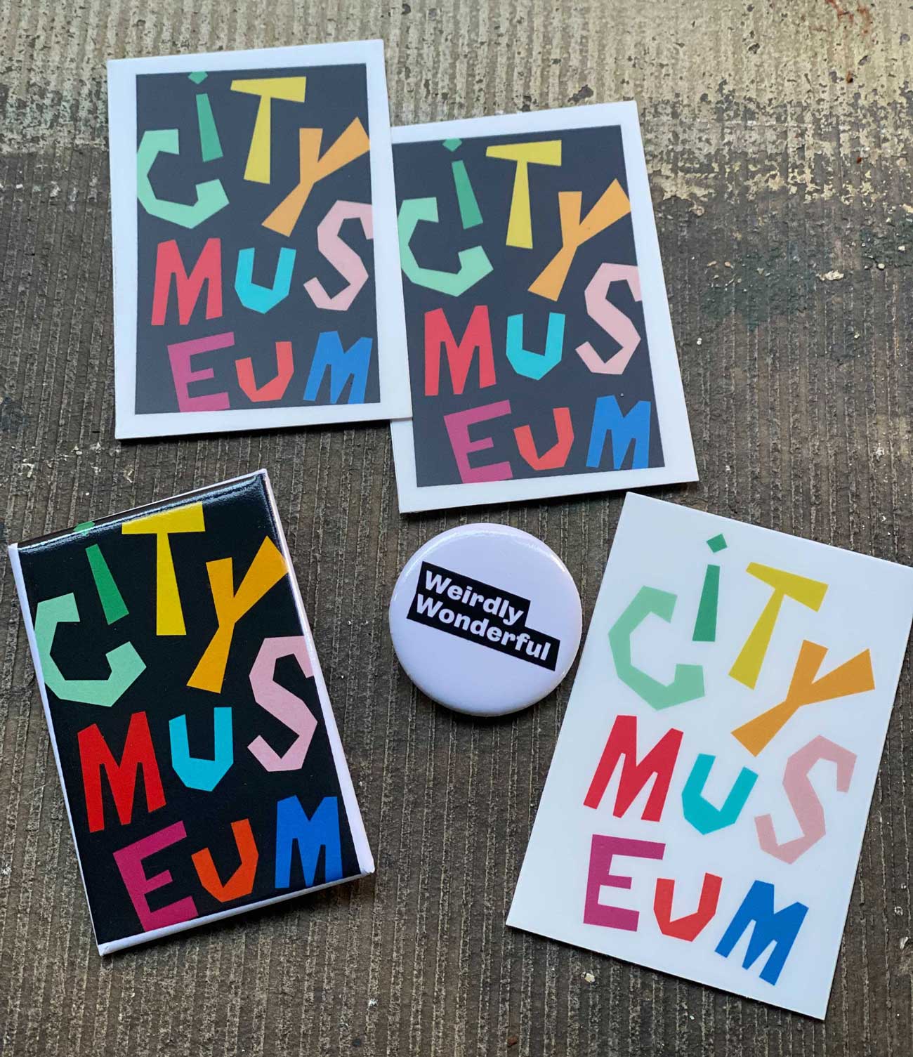
We updated the colors to maintain a bit of the aesthetic of the original logo, but made them more vibrant and friendly along the way.
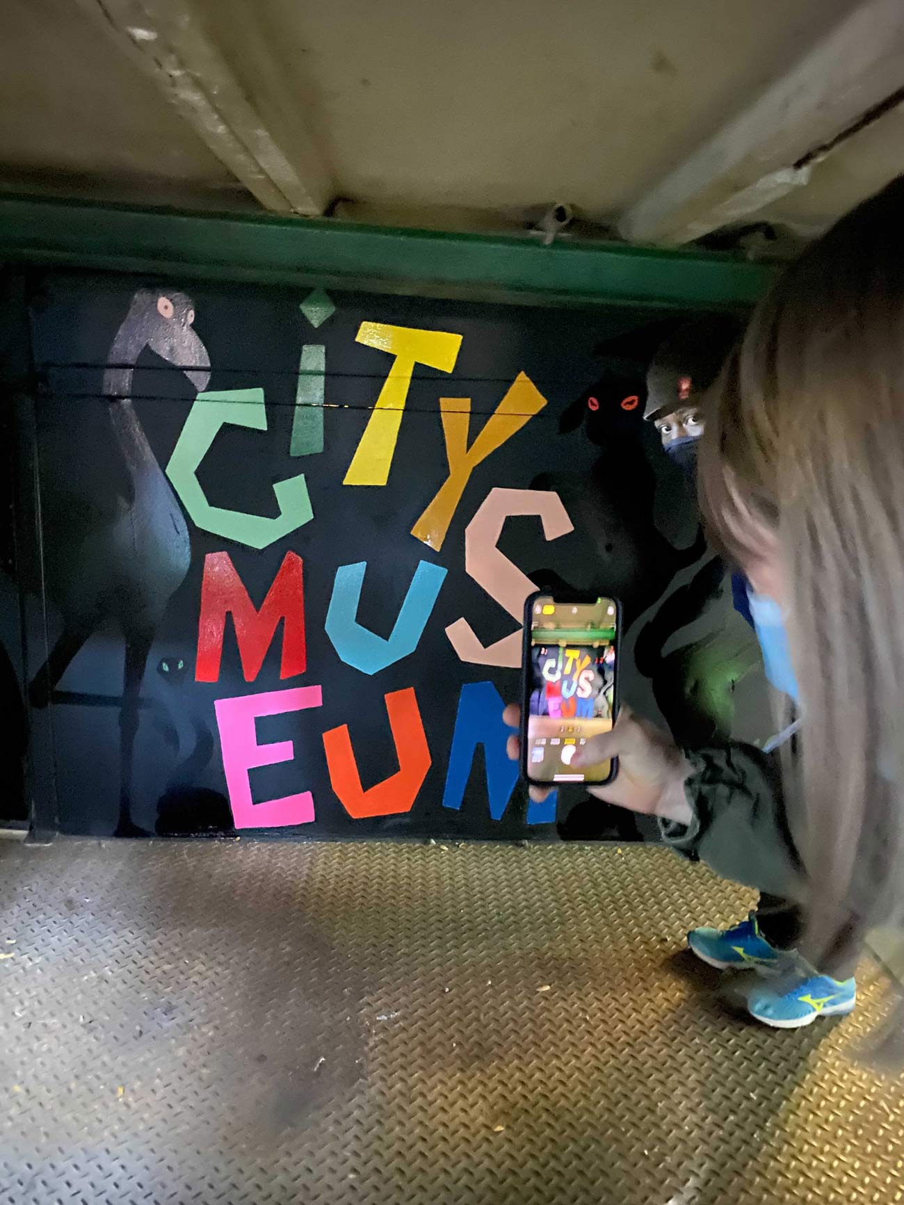
We contained the type in a tall rectangle, symbolizing the 10-story building itself. The letters inside are bright, strange and non-uniform.
It’s a progression of the original logo, but with a lot more energy behind it.
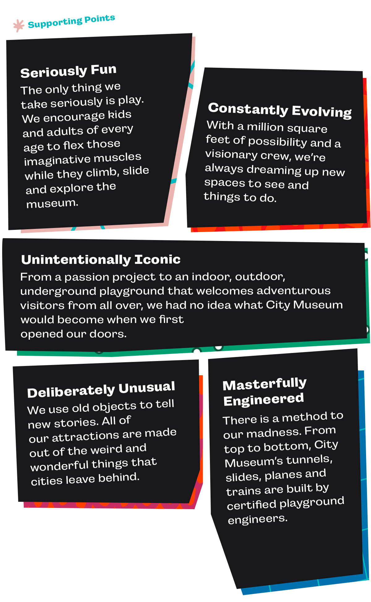
The brand language
When we design brands, language is critical. It articulates how we want people to think about the brand. It’s a synthesis of dozens of conversations, ideas, research and internal augments.
To put a place like City Museum into words was a challenge—but using those words to help shape visitors’ impressions of it without killing the vibe was even harder.
Oh, and it rhymes.
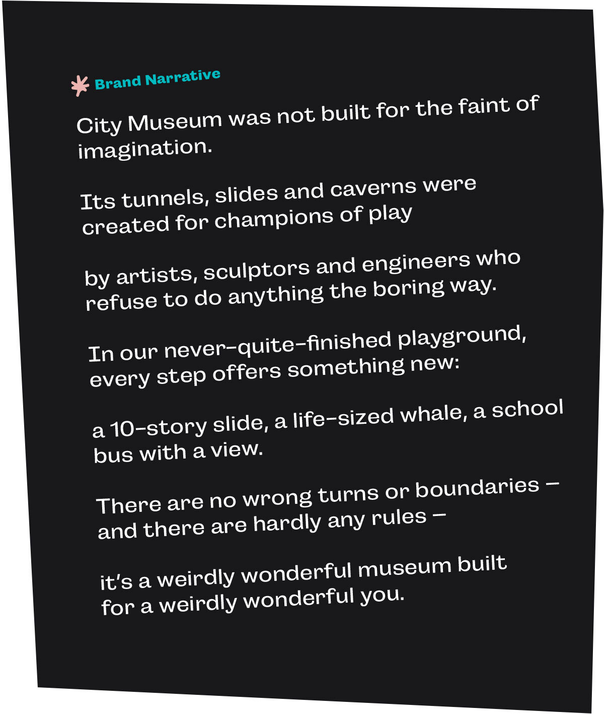
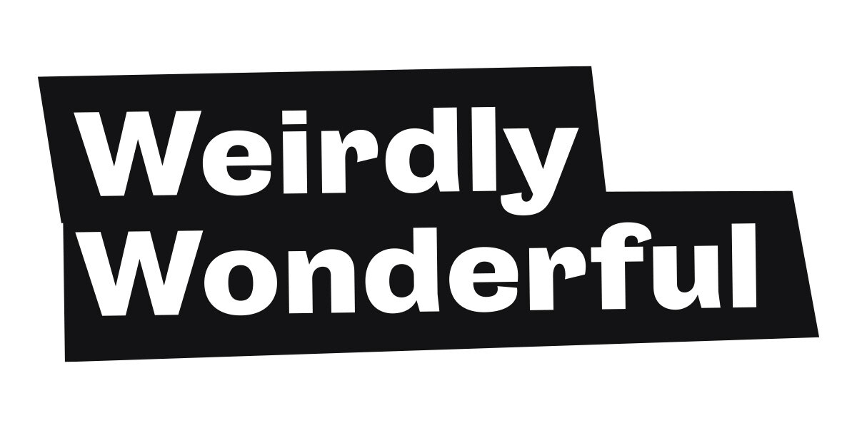
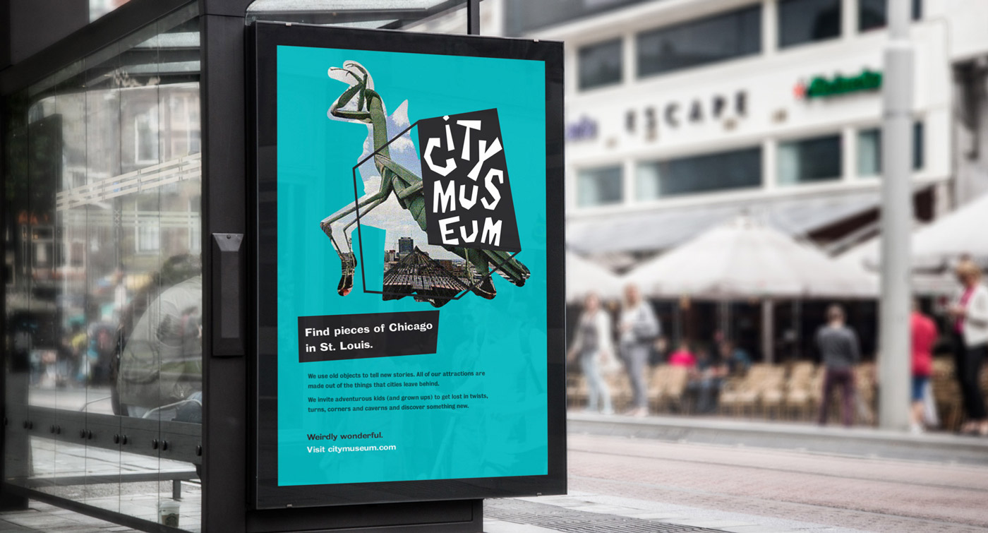
The tagline we created, Weirdly Wonderful, is simple, but still captures that opposing balance. Weird and Wonderful. Two words that you hardly see describing the same experience.
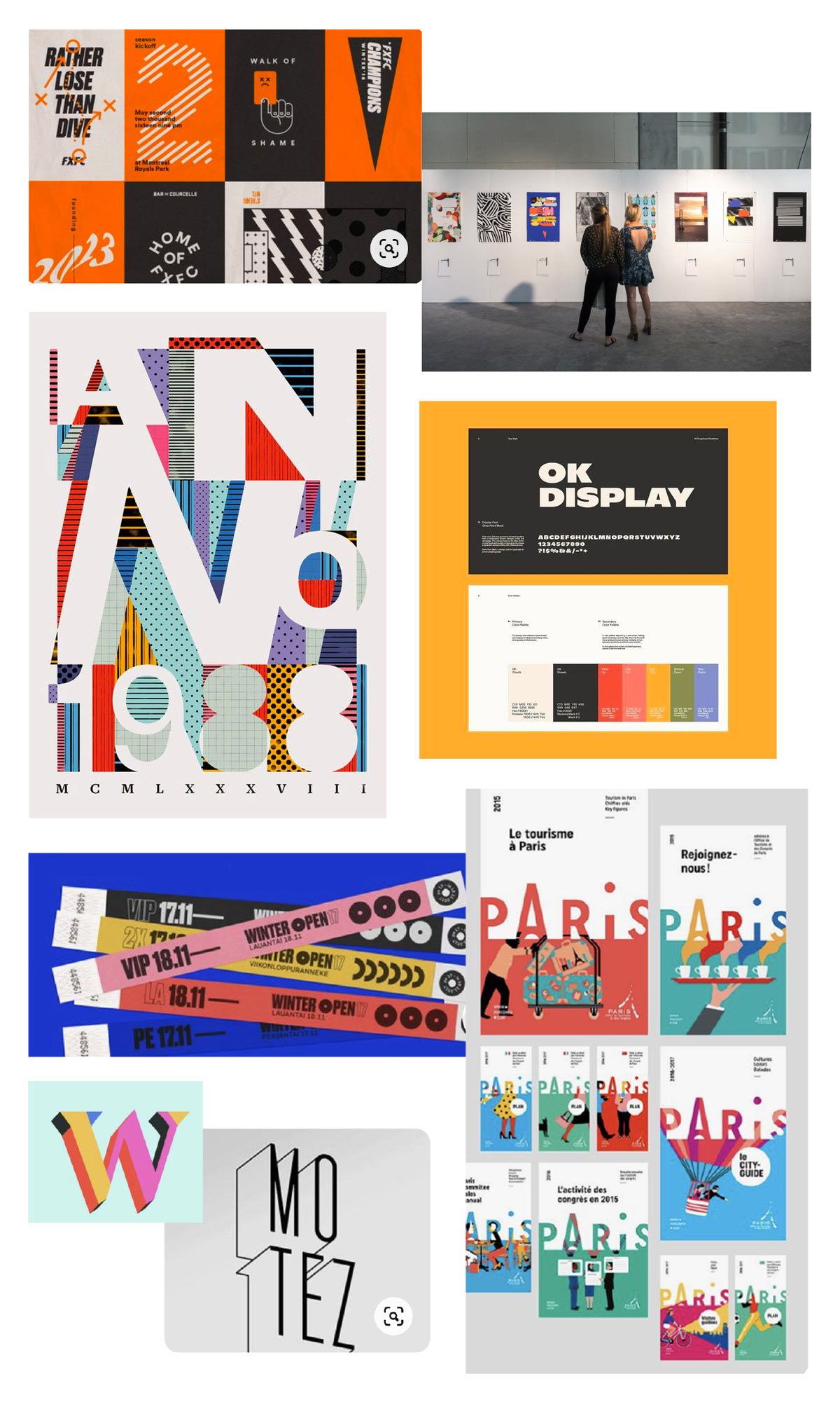
Patterns and color
To give the City Museum brand more elements besides a logo to build off of, we created patterns based on surfaces and textures found around the museum.
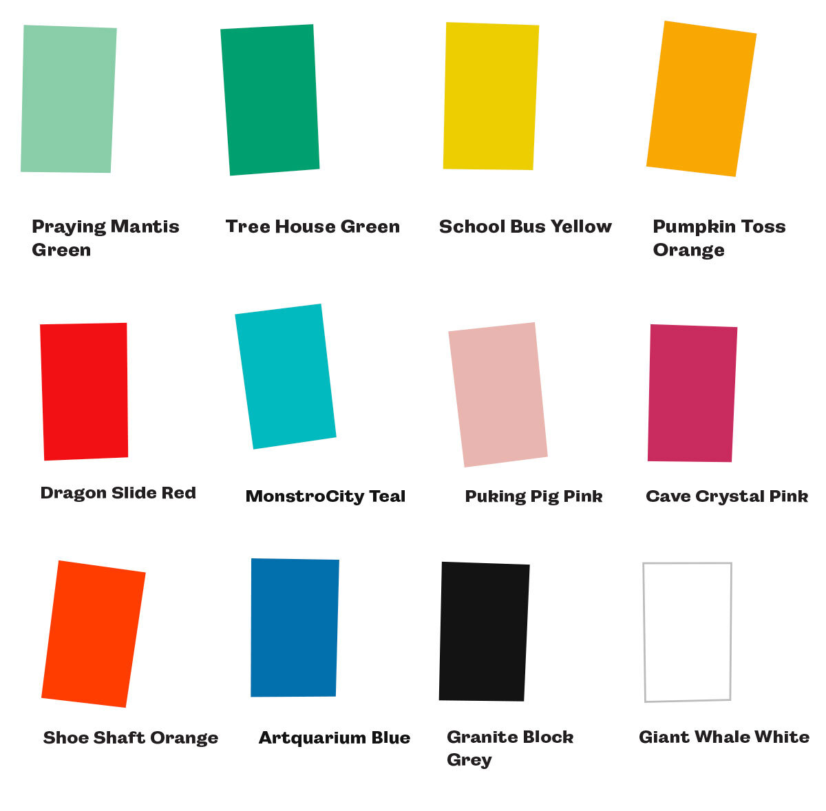
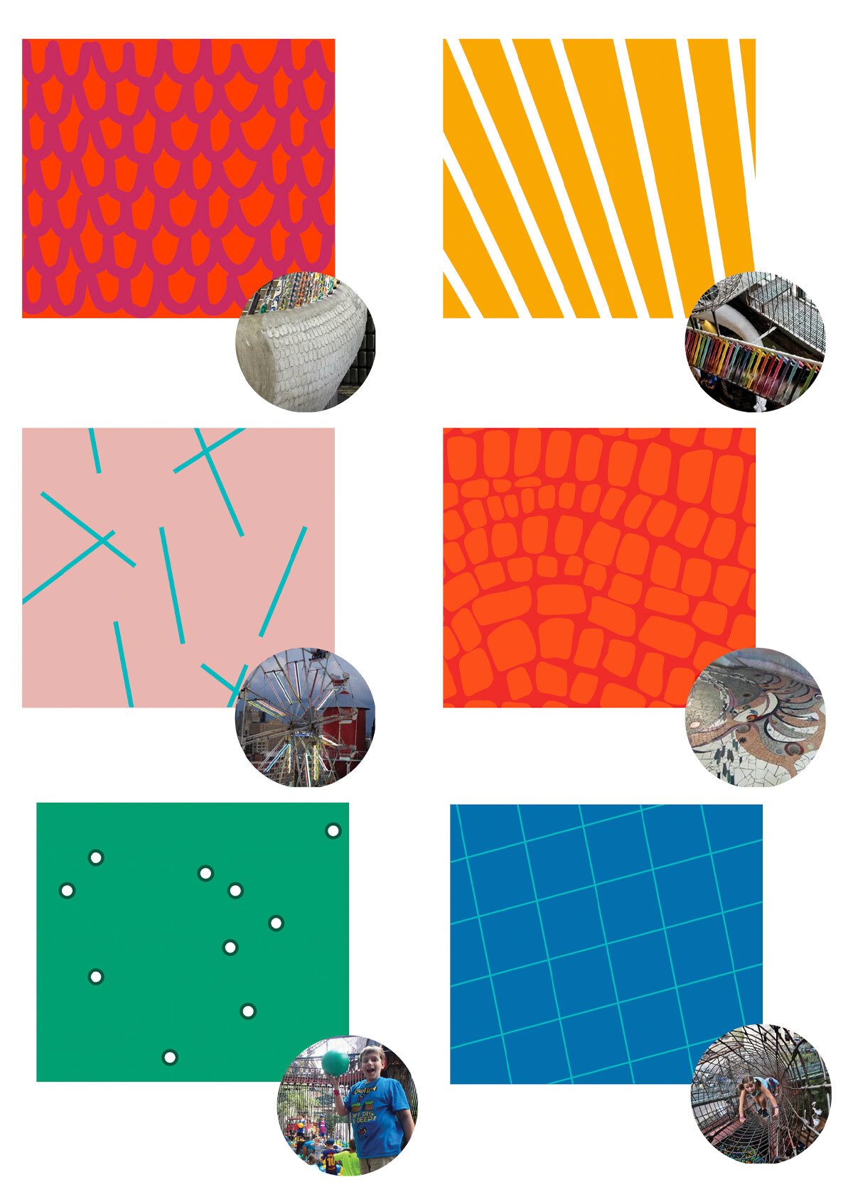
We chose bright, vibrant colors to contrast the natural and industrial tones found throughout the museum.
Photography
City Museum had thousands of images of the exhibits taken over the years. All with different cameras, lighting and varying degrees of quality.
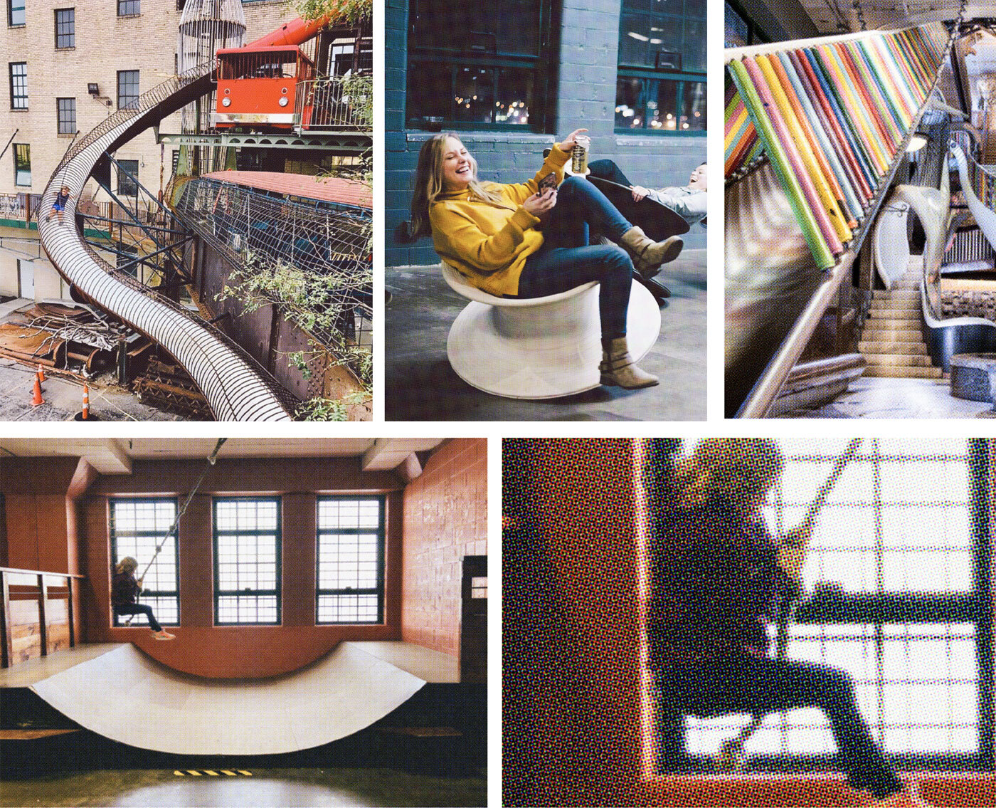
To unify the photos and make them more ‘branded,’ we created a Photoshop filter that would desaturate and unify the photos.
When photographs are used in marketing and advertising pieces, we wanted them to come across as organic, raw and a bit rebellious. So we masked the photos to never be the perfect rectangles that you would expect to see.
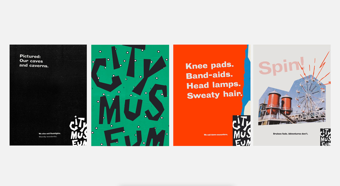
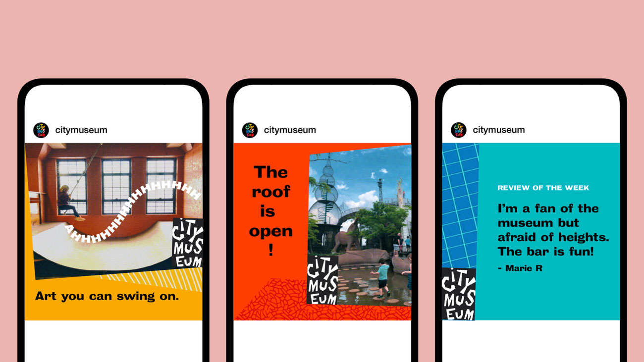
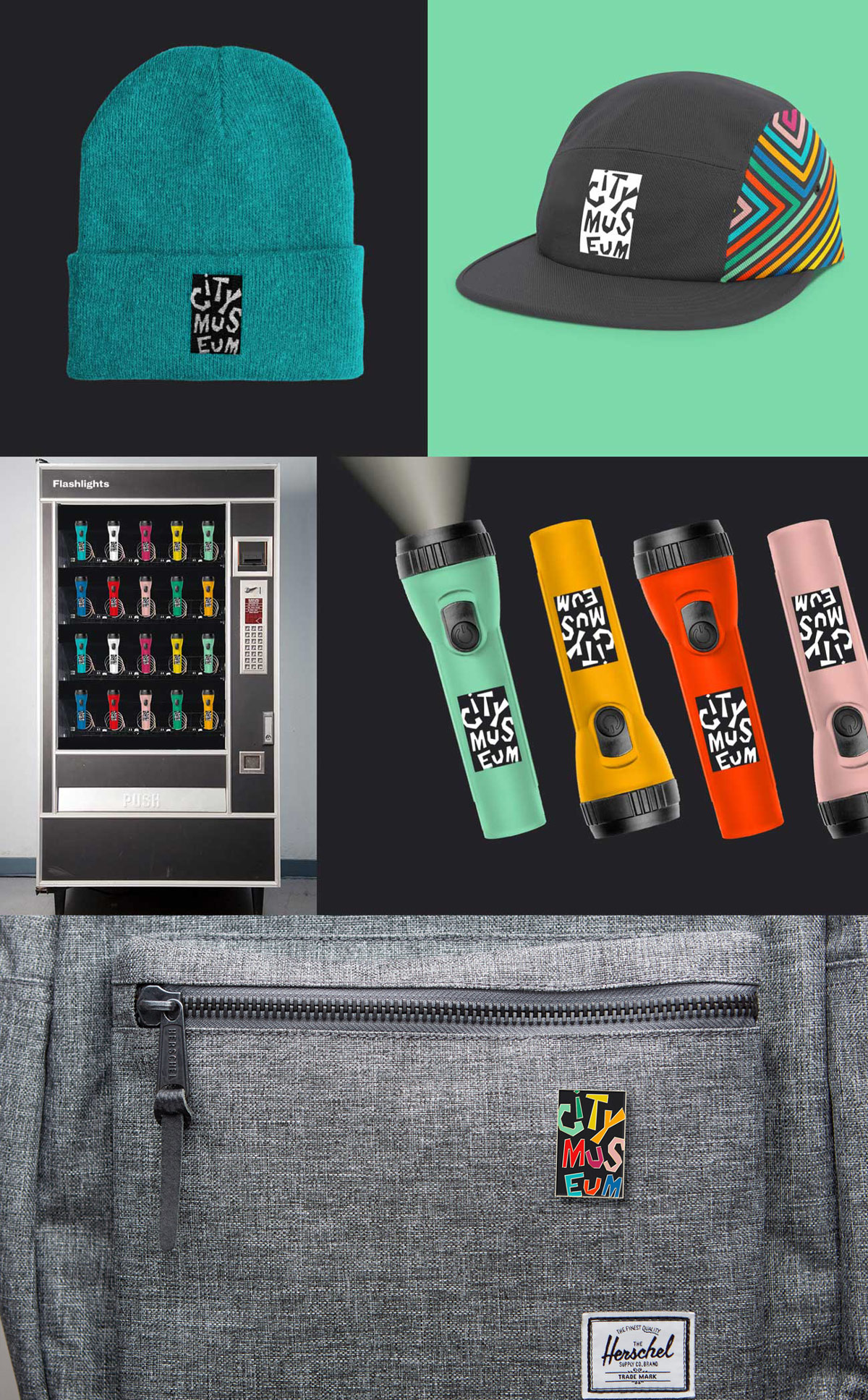
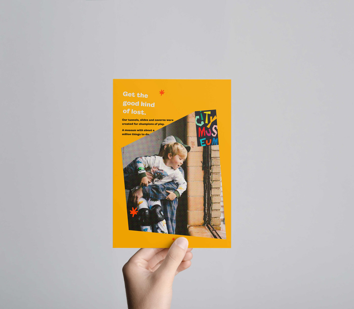
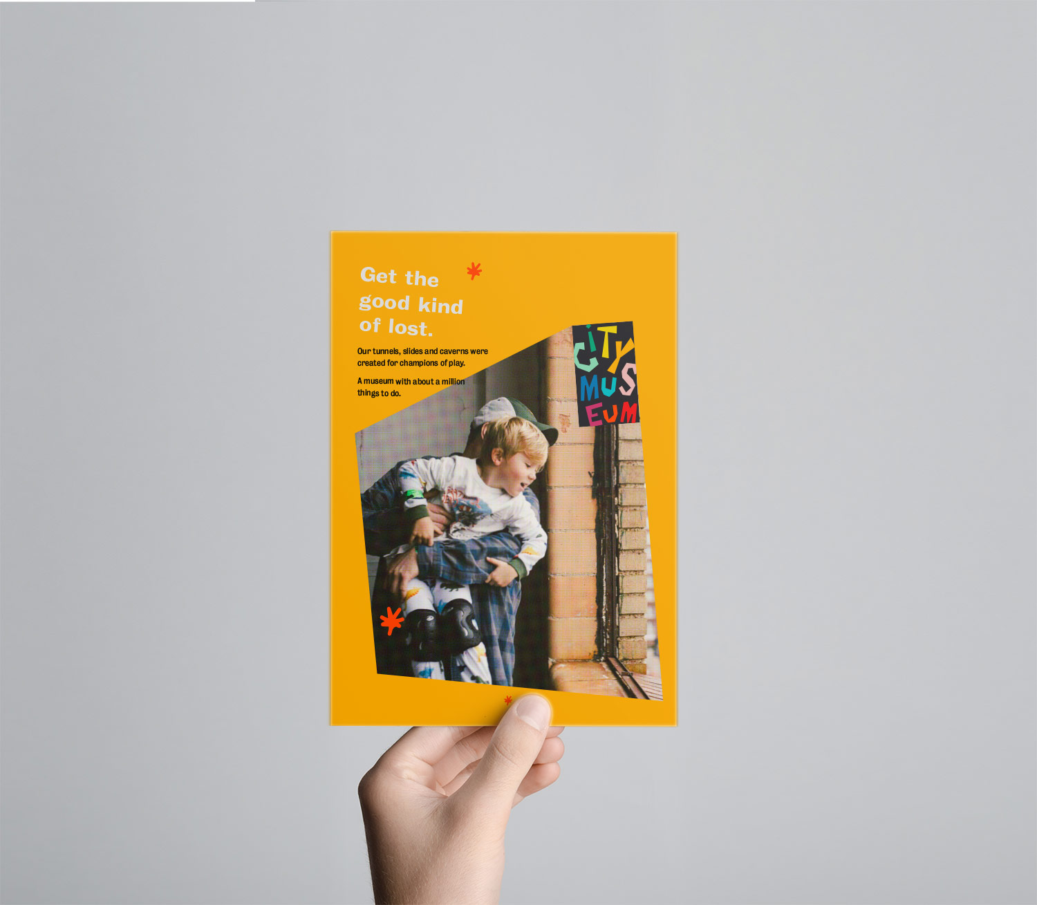
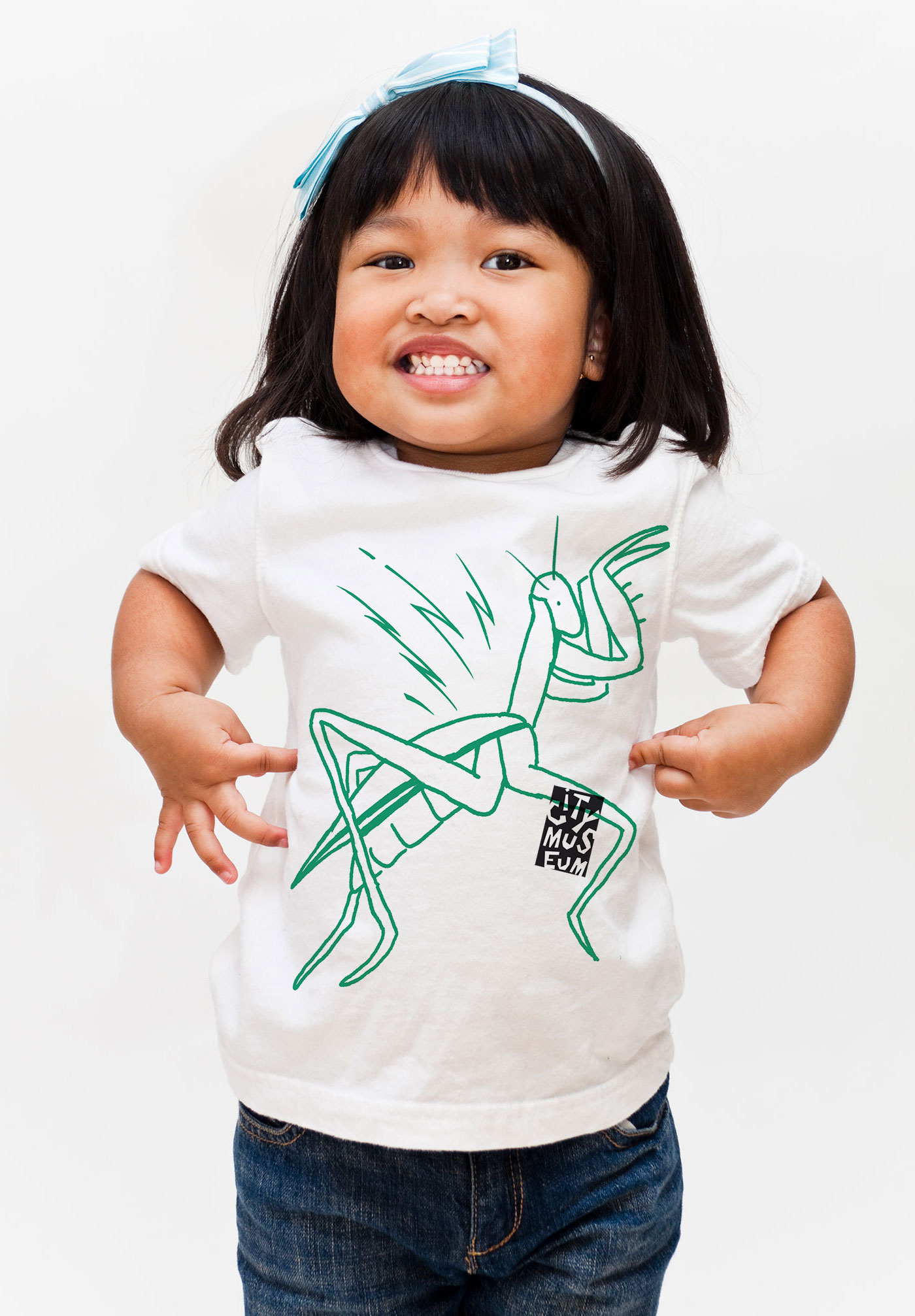
Brand expressions
Branding isn’t about logos, language or any standalone element. Branding is about how someone experiences the organization, what they think of, and what they retain from that experience.
We could show clients new logos and language, but by themselves, they wouldn’t convey any sense of experience.
So, for branding projects, we create design mockups (we call them creative expressions) to show the new brand in action.
![]()
They are a combination of all the new elements coming together, to show how the brand will live in the world.
City Museum has never really advertised. To them, ads were cheesy. We brought the brand together by creating branded expressions that would reflect the rebel culture of City Museum, but also attract and inform visitors.
Nervous wrecks
In early March of 2020, we presented the new branding to the City Museum leadership team.
And like any branding project, we were nervous wrecks. All the time, creative energy, discussions and arguments had led up to a big reveal. It was both exciting and scary.
Our worries didn’t last long–the team at City Museum was thrilled with the brand, saying things like, “For the first time, we’d be proud to have ads.”
And more high praise from the team like, “I really expected to hate this—but I don’t!” Ha.
Then, Covid-19 locked down City Museum, our office and the momentum for a brand rollout.
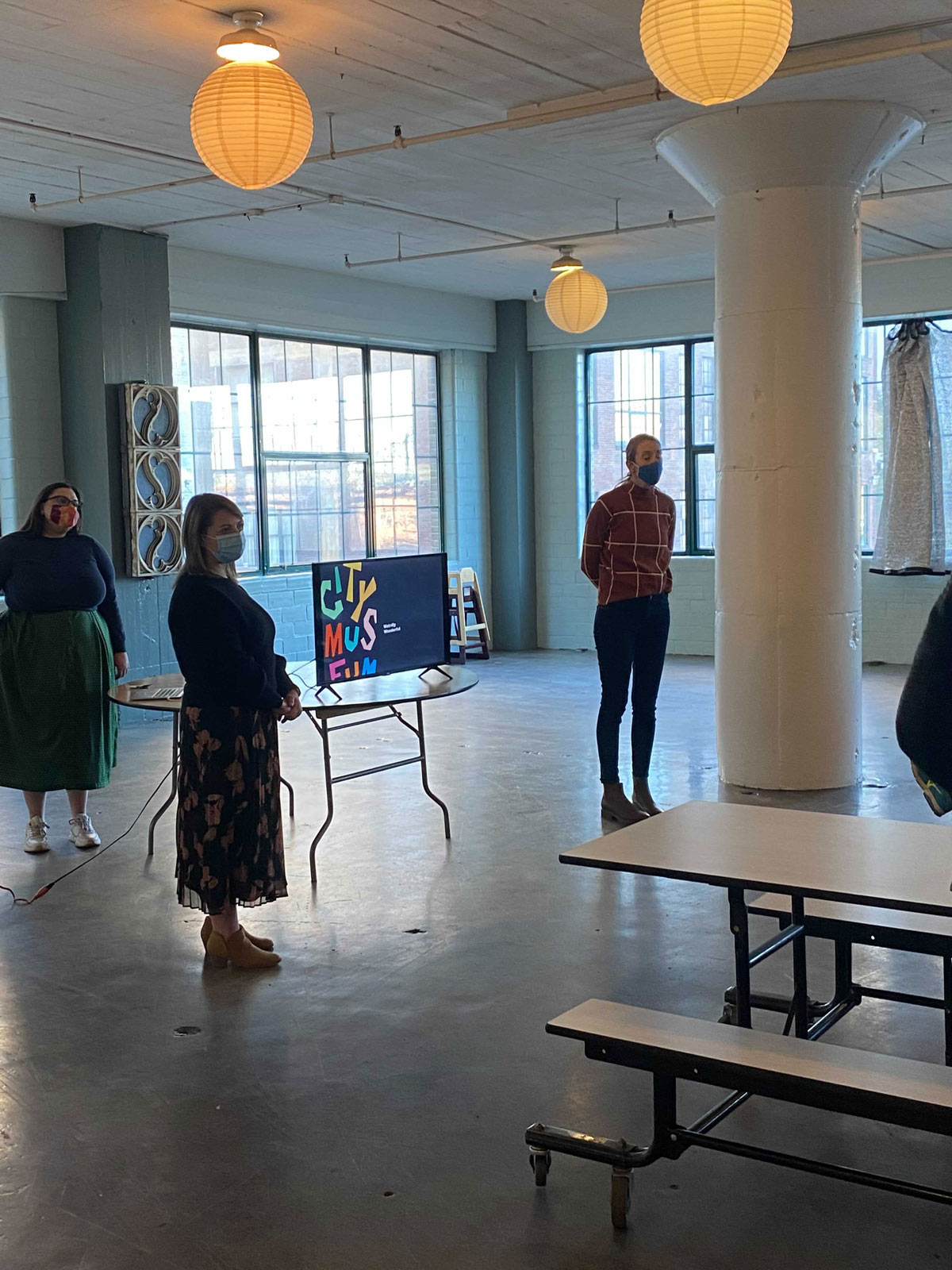
It would be an entire year before we picked the project back up again. City Museum was back open and ready to share the new brand with the world.
In true City Museum fashion, they launched the brand with an Instagram post and bio update.
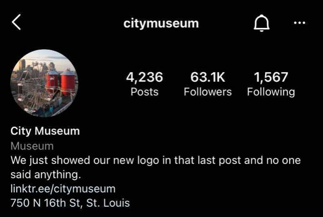
High praise indeed!
Exiting through the gift shop
The weight of nostalgia is heavy. Throw in a legendary artist and it gets even heavier.
Design or not, the reputation of City Museum (at least locally) was one of rebellion, exploration and audaciously unbridled creativity.
Our team was beyond proud to be selected for the project, and to help shape its future while holding onto its soul.
![]()
![]()
But I would be lying if I didn’t tell you that I wonder what Bob would have thought. Ultimately, he may not have agreed with what we did (or any branding, from any agency), but I think he would have loved the fun we had exploring the idea of the museum itself. And it was definitely fun.
I’ll leave you with one more quote about opposites, rebellion and permission from Bob.
Bob once told a photographer who was caught sneaking photos of his unfinished work, “Well, I could give you permission to take photos here, but then I would rob you of the experience of going behind my back to do it.”
Be brave, break the rules a bit and have adventures. Thank you for reading. And thank you to City Museum for the project and the lessons.