We’re officially in awards season—move over, Wicked—because we’re adding a few more wins of our own to the mix.
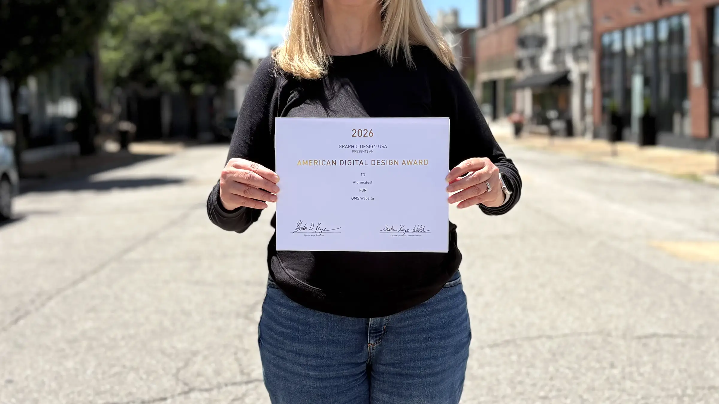
Atomicdust won eight honors in the 62nd Graphic Design USA Design Awards, the organization’s flagship competition. This year, over 6,000 entries were submitted, and only the top 10% were recognized. The winners reflect design at its best: smart ideas, thoughtful execution, and work that actually inspires, not just visually, but in how viewers and users experience a brand.
Getting the news that we’d won was a thrill, but that was just the start.
Soon after, to our surprise, Gordon Kaye, GDUSA’s publisher, reached out to let us know that our eight wins place Atomicdust “among the top ten creative firms and agencies nationwide.”
So imagine our excitement when the winners of GDUSA’s 2026 Digital Design Awards were announced, and we got a similar email—this time letting us know our five wins placed us in the top five creative agencies nationwide.
We joked about hiring a skywriter, but that felt like a bit much. But we’re definitely printing that out and hanging it on our refrigerator. Or adding it to our email signatures.
But we’ll pause the celebratory theatrics long enough to focus on the winning work:
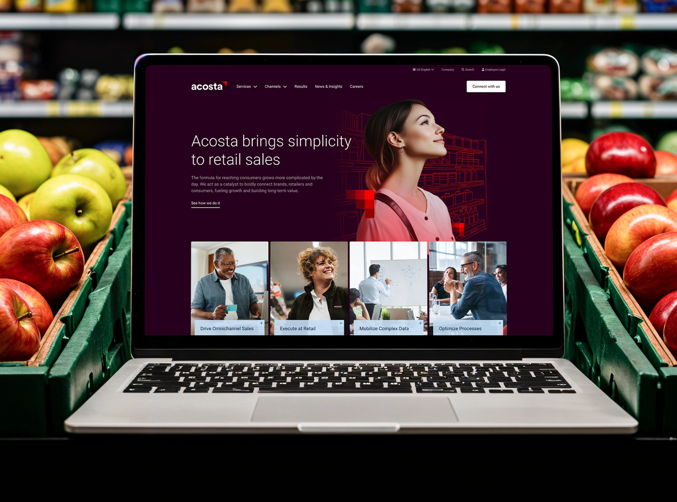
Acosta Website
Acosta came to Atomicdust with a century of legacy and a capabilities story that had outgrown its digital presence. Through brand workshops and deep strategic work, we discovered Acosta‘s core strength is simplifying sales in a complex retail ecosystem. That idea shaped everything. To add sophistication, we reimagined how the brand color palette is used, and turned the pixel logomark into a visual device. We restructured the navigation around client goals rather than Acosta’s org chart, with service pathways like “Drive Omnichannel Sales” that speak directly to what buyers need.
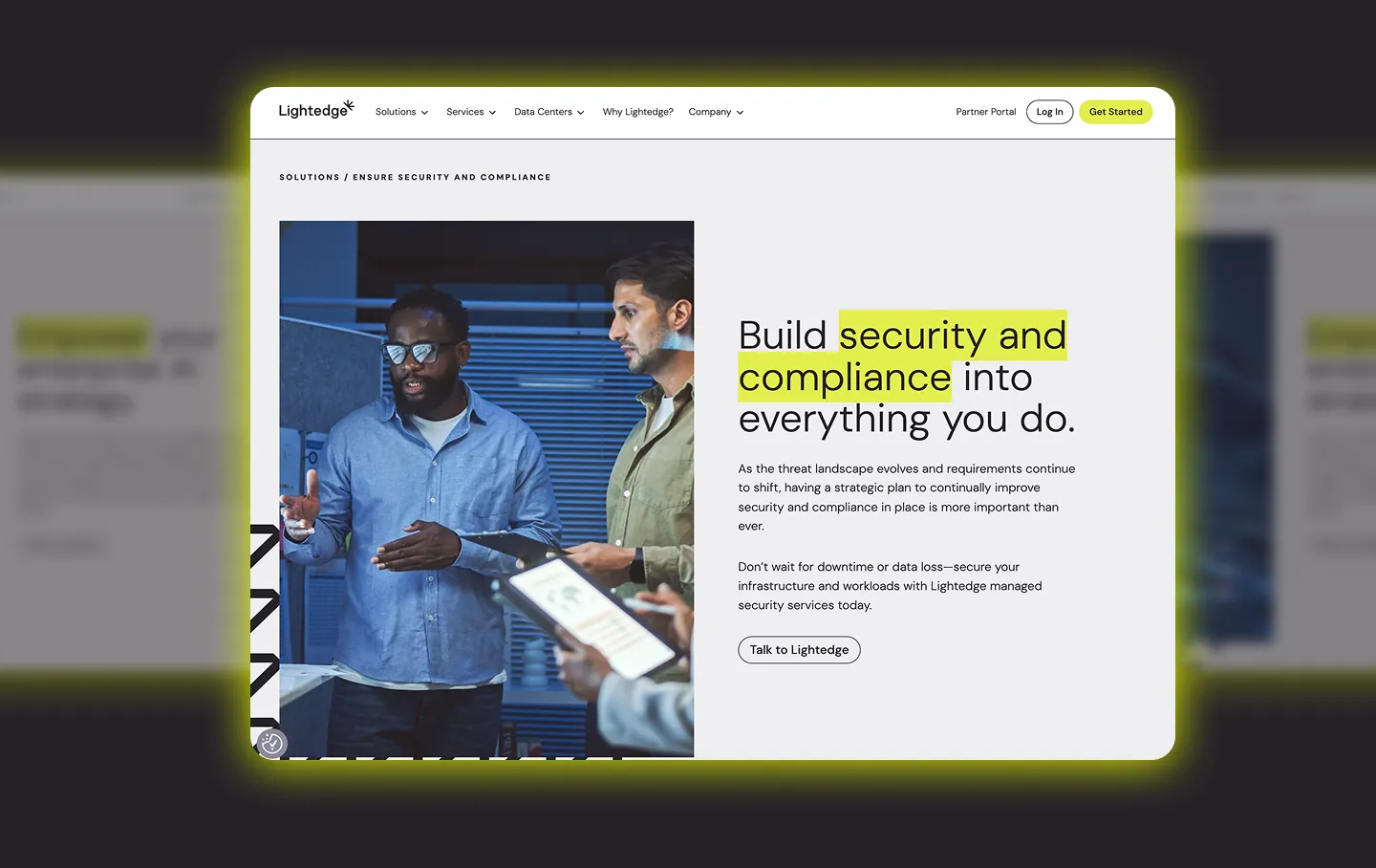
Lightedge Website
Building onto the evolved brand, the new Lightedge website gives users a bold experience. Subtle animations guide the eye, while the brand’s highlighter yellow calls out key language, glows behind imagery and calls to action. The logomark becomes a versatile design device, adding depth in the background and creating visual interest in unexpected places. Trust builds naturally through a rotating band of client logos, reinforced by bold stats and interactive components that respond as users explore. The result is a site that feels confident, clear and elevated.
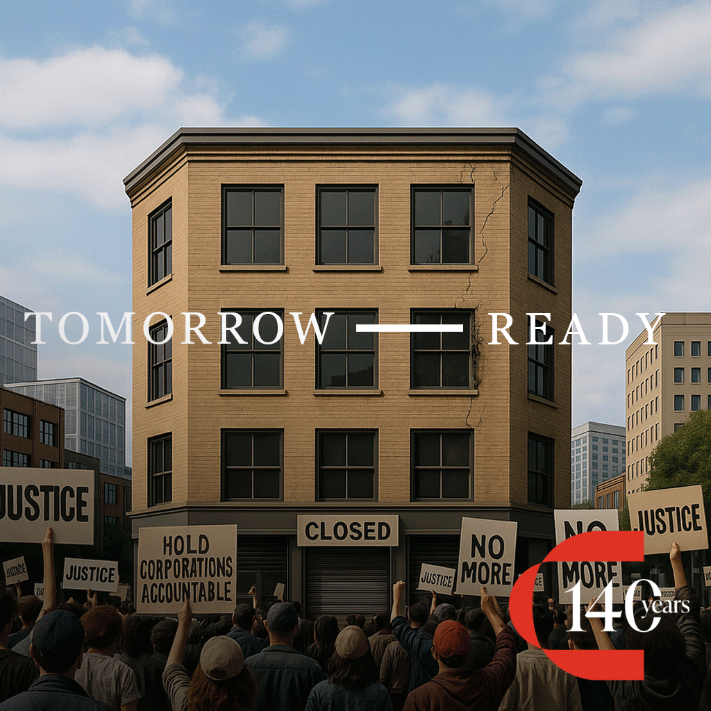
Crane Agency Social Posts
Anniversary posts are usually only about the past. But 140 years in, Crane Agency isn’t slowing down to reminisce. So we built a social campaign that celebrated where they’ve been and where they’re headed. Using AI, we created images of homes, cars and businesses across the decades and combined them into fast-moving GIFs—a quick way to show that risk changes, but the need for protection stays the same. The result was a celebration rooted in history, sure, but still focused on new challenges, new opportunities, and the same commitment to showing up for people when it matters most.
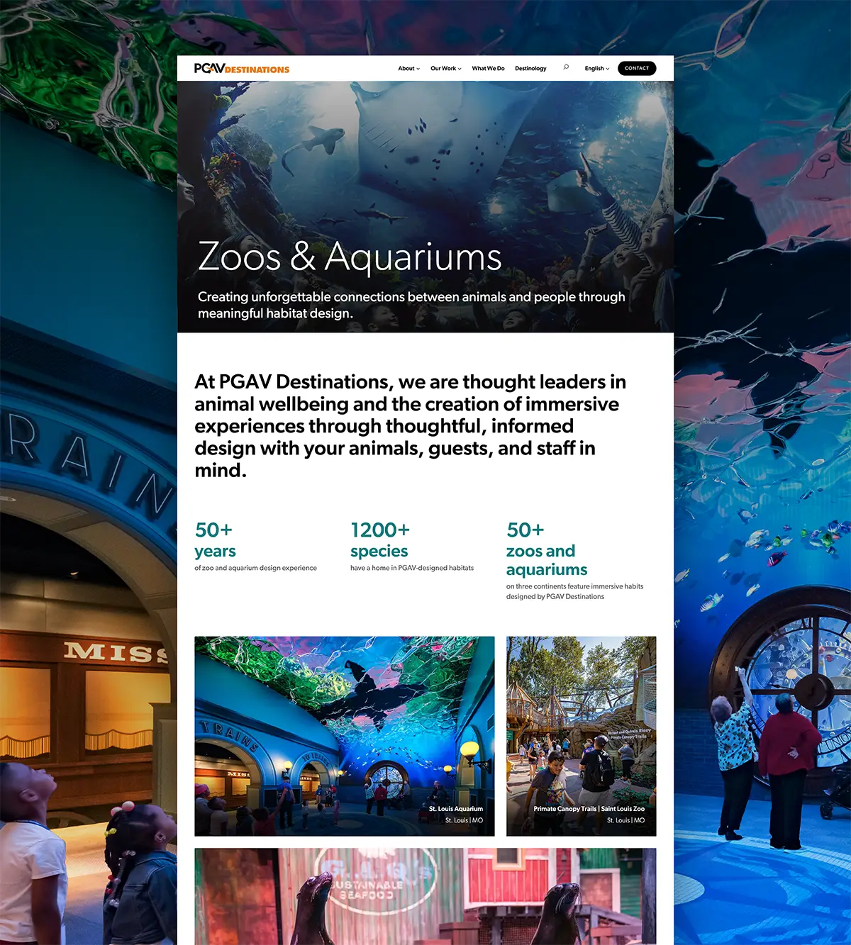
PGAV Destinations Website
PGAV Destinations designs destinations and exhibits that spark wonder. So their website needed to feel like an experience in its own right. Large, attention-grabbing headers set the stage and draw readers in while immersive backgrounds showcase the environments PGAV brings to life. Sketch-to-reality sliders reveal how ideas evolve from pencil lines to full-scale attractions, and a dynamic client reel builds credibility without ever breaking the flow. The site now feels engaging and transportive—proof that imagination can become reality.
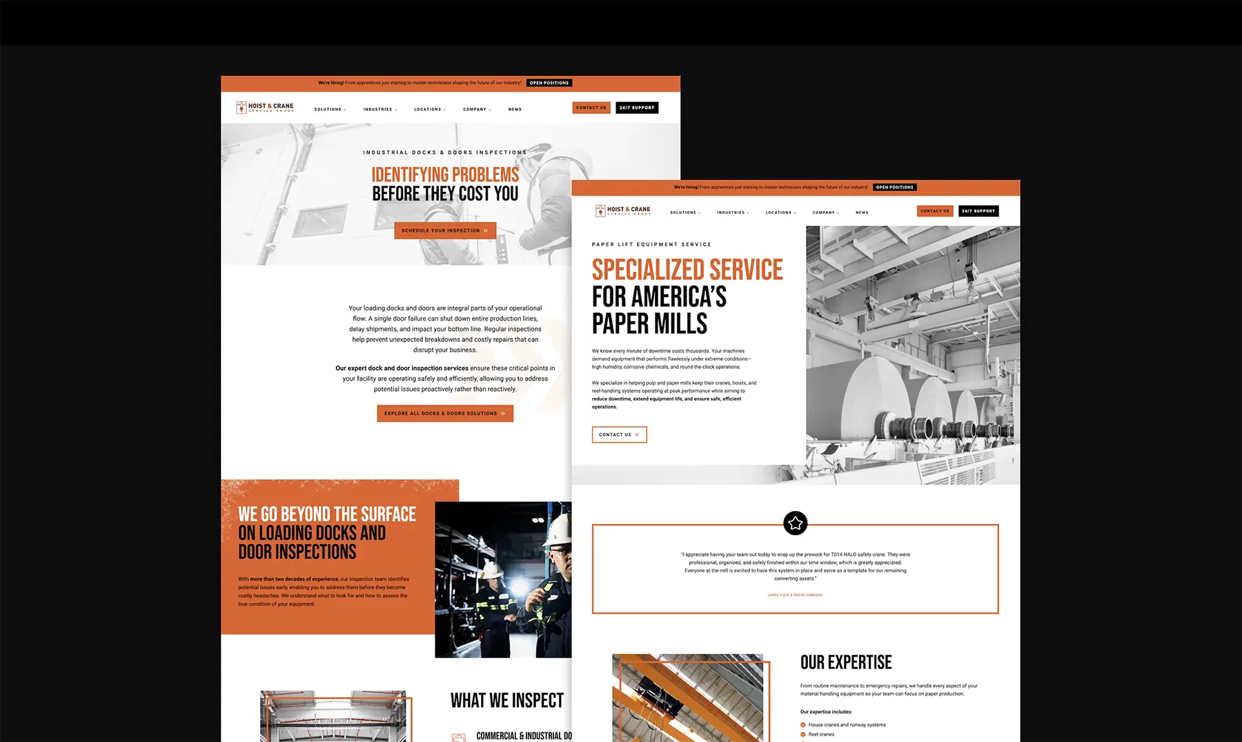
Hoist & Crane Service Group
Redesigning Hoist & Crane’s website started with a reframe, from just listing services to spotlighting benefits—the company reduces risk, preserves uptime and keeps complex industrial environments running. That sharper story drove everything from a refreshed site architecture with clear service hierarchies, to visual elements that reinforce the brand’s grit and strength. The company’s people moved to the center of the experience, with technicians, training programs and veteran hiring treated as proof of quality — not footnotes.
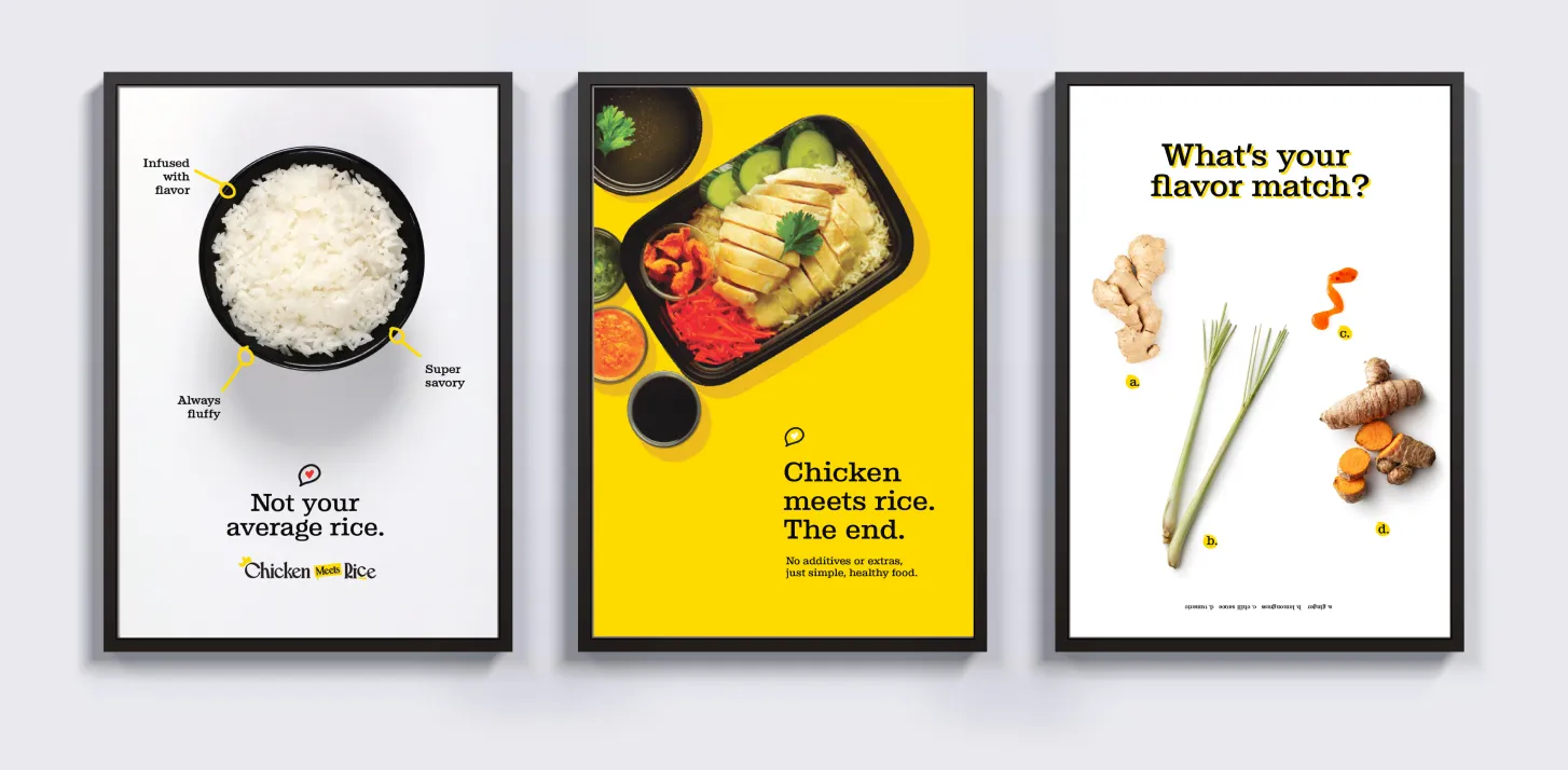
Chicken Meets Rice Brand
The Chicken Meets Rice brand identity centers around a charming chicken mascot clutching a steaming bowl of Hainan chicken. Paired with thick, playful typography and a bright yellow-and-black palette, the brand feels warm and friendly. Custom icons and a rhyming storybook narrative add to the nostalgia, celebrating the care and tradition behind every slow-poached recipe.
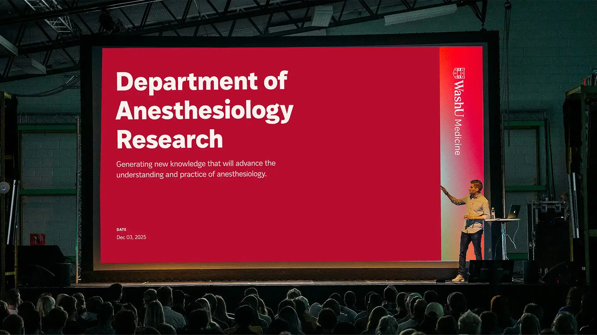
WashU Medicine Brand
For an institution where breakthroughs reshape the future of healthcare, the WashU Medicine brand needed to feel as bold and human as the work behind it. Inspired by the scale and purpose of the institution, we evolved core WashU Medicine elements to feel more dynamic and expressive, with gradients, refined type and ripple-like movement that hint at how progress radiates outward from every discovery and patient interaction. The result is a brand that feels ambitious and innovative, reflecting the spirit of the people who push medicine further every day.
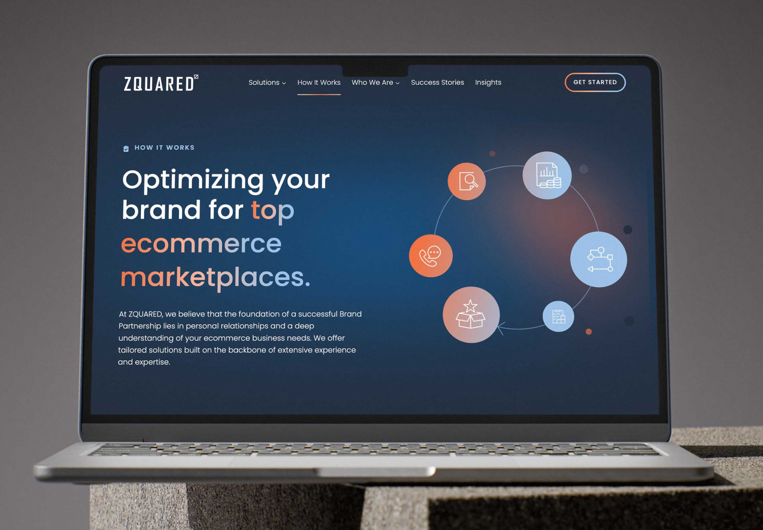
ZQUARED Website
ZQUARED needed a digital presence that reflected their leadership in helping brands grow on major retailers like Amazon and Walmart. We created a sleek experience, with dynamic stats and iconography, and clear problem-solution messaging. We coded headlines so that the brand gradient is applied to key phrases and elements. The site now communicates expertise, supports growth and positions ZQUARED as the partner ambitious brands want in their corner.
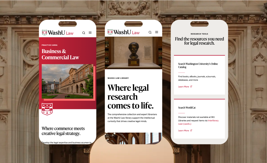
WashU Law Website
One of the country’s most respected and dynamic law schools, WashU Law needed a digital presence that serves a wide range of audiences, from prospective students to established attorneys. The new site is all about balance, between structure and breathing room; the WashU master brand and the Law school’s distinct identity; the school’s exceptional academics and approachable culture. We created new ways to use the WashU shield as a versatile graphic device, while scroll-triggered animations and zooming imagery give the site kinetic energy.
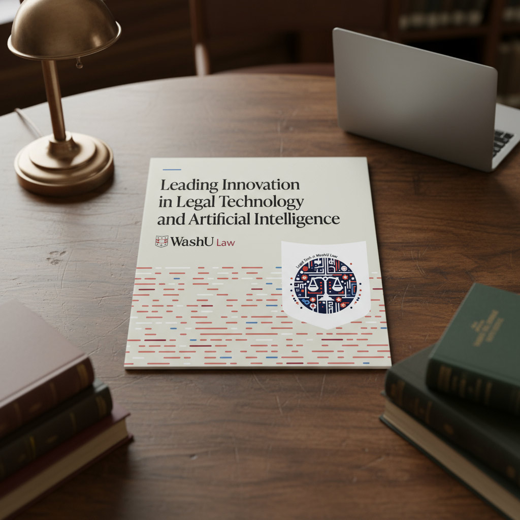
WashU Law Legal Tech Brochure
WashU Law is a leader in artificial intelligence and legal technology. We developed a brochure that inspires stakeholders, from prospective students to established attorneys and global partners, to learn more about WashU Law. A modular box-like layout echoes the structure, logic and pattern recognition at the heart of AI. Photography highlights WashU Law’s tech initiatives in action, with photos of real people and real work.
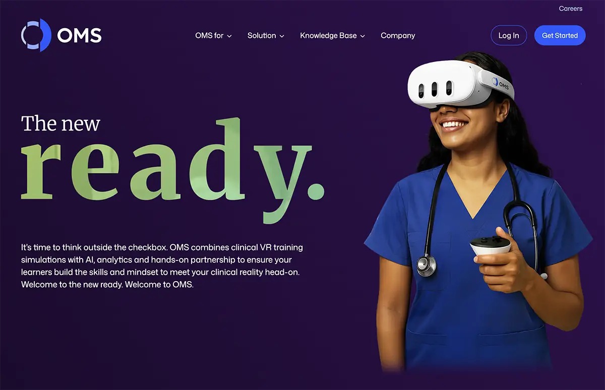
Oxford Medical Simulation
The OMS website opens with a bold declaration—”The new ready”—and immediately makes good on the promise. Clear pathways for different audiences guide visitors to relevant solutions, while outcome-driven stats make the business case visceral and fast. The overall effect is a site that feels as rigorous and high-stakes as the clinical environments it serves: confident, credentialed and built to convert.
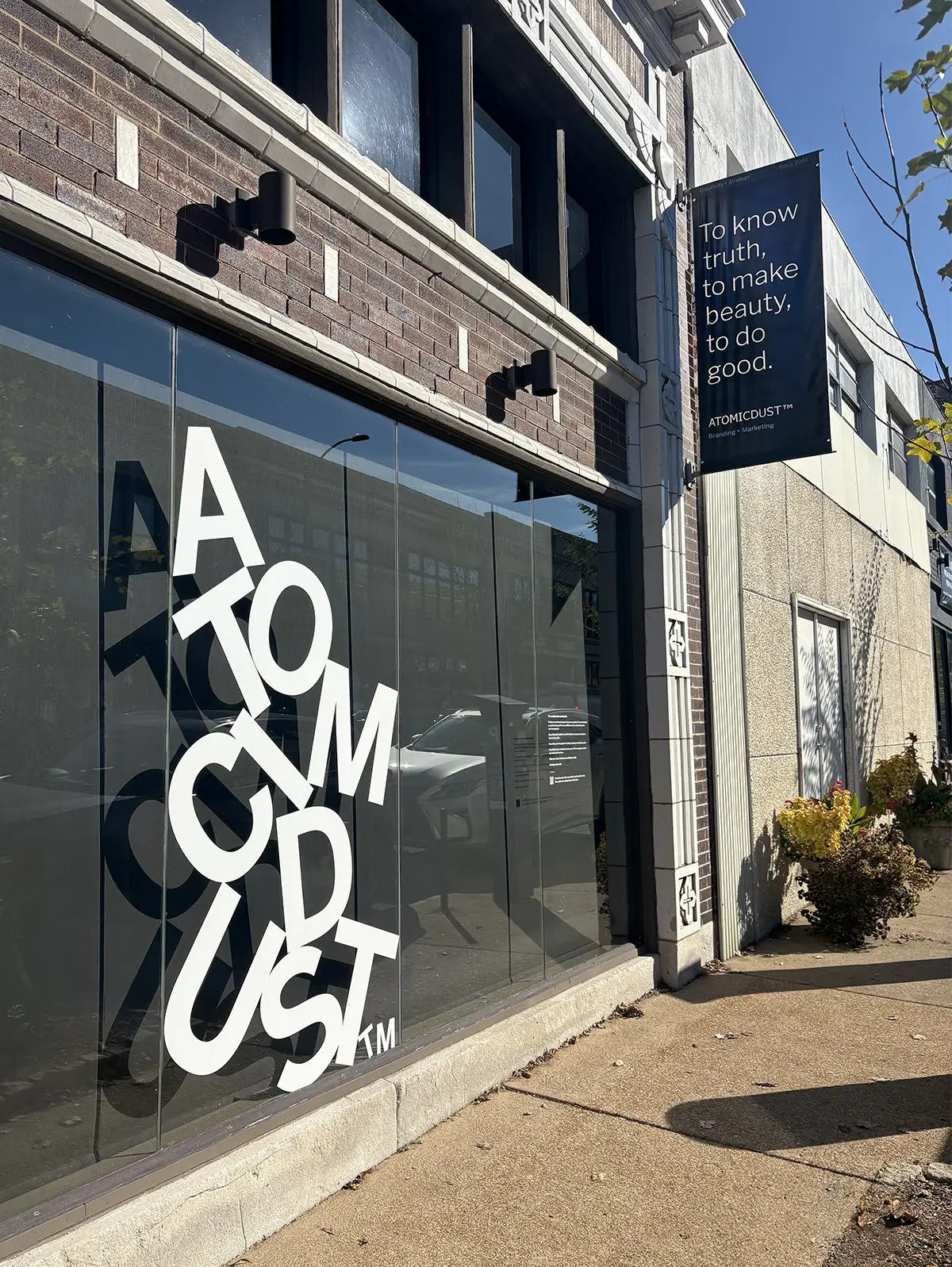
Atomicdust Window Graphics
Sometimes the best canvas is your own front door… or window. We created an eye-catching window graphic playing with giant letters, tilted and staggered as if they tumbled down from above. We paired the design with an aspirational quote that invites people to remember they are capable of more than they think—they just need to push past obstacles and make what seems impossible a reality.
We’ll go before the music plays, but the real applause goes to the amazing clients who trust us to bring these big ideas to life. They bring us their challenges, trust us with their brands and say “yes” to ideas that don’t exist yet. These wins are shared and well-earned with the teams who collaborate alongside us.