“So who is your dream client?”
Over the years, I’ve come to dread this question. I’ve also learned that people love to ask it to creatives.
Nike—I would imagine that 90% of creative people would answer something along the lines of popular consumer brands like Nike. Nike is always the default answer.
(I think earlier in my career, I would have said Playstation, following in the footsteps of famed design group The Designers Republic. We did do some web design work for Voltron once, and that was an incredible experience.)
But I haven’t been able to declare a big dream client in decades. Brands like Nike and other established household brands are already cool—so any work creatives do have to raise that bar even higher or it’s a dud. That can be a lot to take on.
This doesn’t mean I don’t enjoy working with established brands. They just aren’t always what I dream about.
The businesses that can gain the most from good design are the ones that can benefit from people seeing them in a new way.
Making an established brand marginally cooler is great—but taking a brand that everyone expects to be one way and changing their mind is the mark of a good designer. It’s tough to do.
So dream clients for me are about wrestling interesting problems and working with great people.
Dream clients are about reinvention.
Which is why when we received an email from a small, two-person architecture studio, I hesitated.
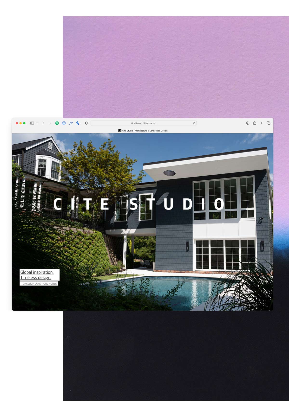
A small website, refreshed.
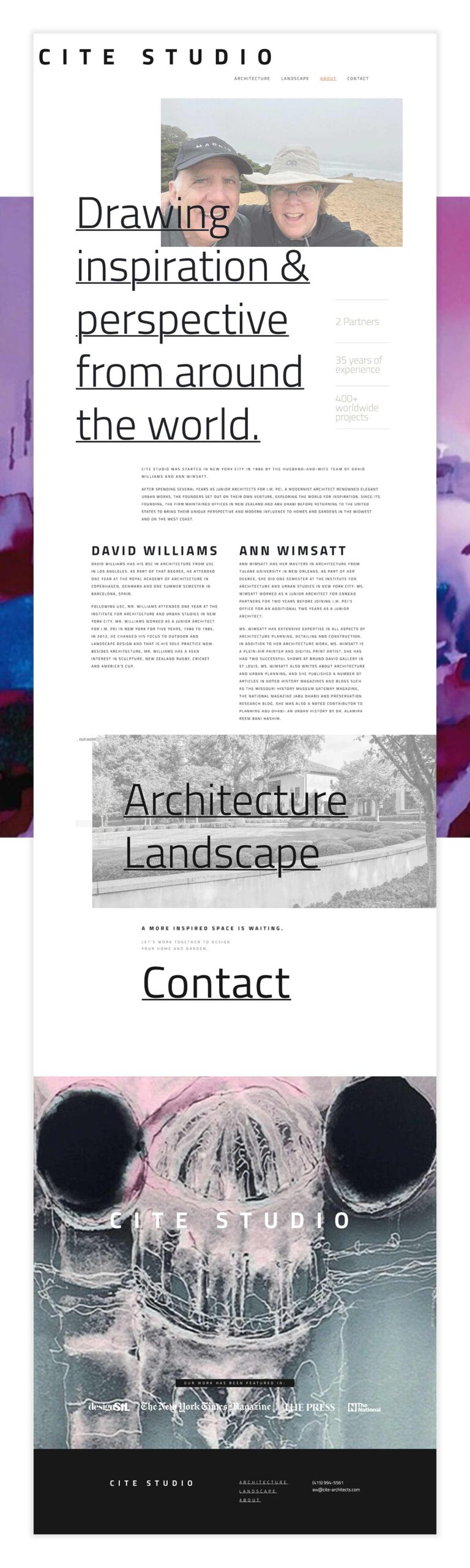
Cite Studio is an architecture and landscape design firm operated by Ann Wimsatt and David Williams, married designers that have lived and worked on projects across the world.
They were picking up their practice and moving to the west coast, and thought it was time to redo their website.
The existing website they had was nice and clean—basically, what you’d expect. Large pictures of work, minimal copy and some contact information.
It was nice, but a familiar pattern with website design.
At first, I was nervous that Cite Studio would want something marginally similar to what they had already, and I felt the work needed to be louder, and a little weirder, to get noticed.
And if we were going to make a website for a couple of renowned architects, we wanted it to be all the things people love about high-end architecture.
Tapping into the beauty and wonder of architecture.
When I was younger and just getting into graphic design, I was obsessed (and still am) with magazines like *Wallpaper and Dwell—and countless other design nerd publications.
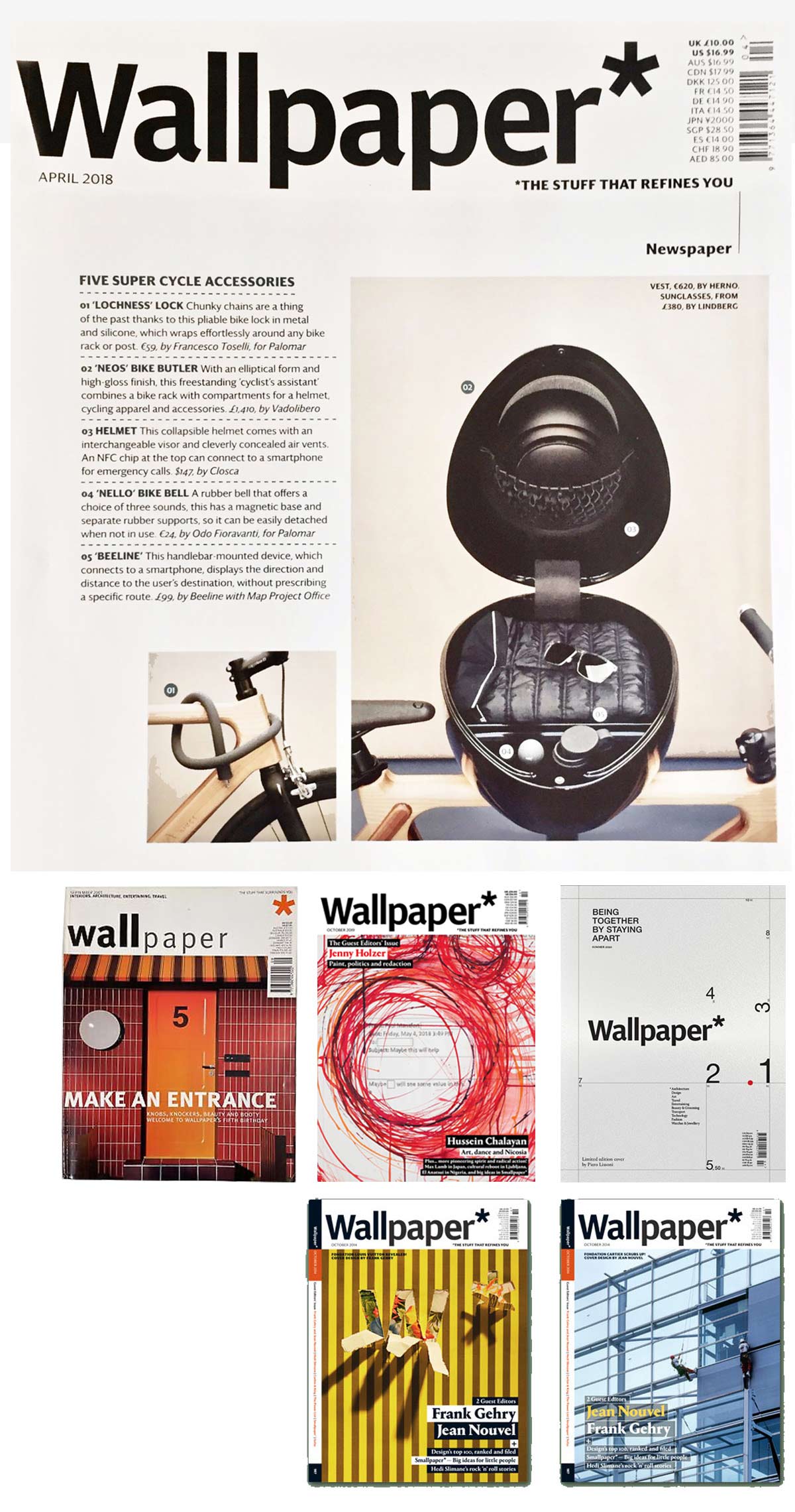
The broken grids, the juxtaposed scale of type, the maximized white space. These printed magazines framed how I thought about architecture and shaped how I approach graphic design.
Now, I know there are a lot of architecture firms that threw away their black turtleneck sweaters years ago. And my mental construct of architecture doesn’t apply to everyone—but for Cite Studio, we had the opportunity to apply all the things we love about the category and use it to help a small practice look sophisticated, smart and disruptive.
It was a classic example of David and Goliath in branding, where Cite Studio is David throwing stones at the big firms in their industry—but imagine David wearing thick dark glasses and talking about form and composition.
We knew where we were headed and were excited to get started.
Luckily, Ann and David were on board for some reinvention.
Approaching the website build.
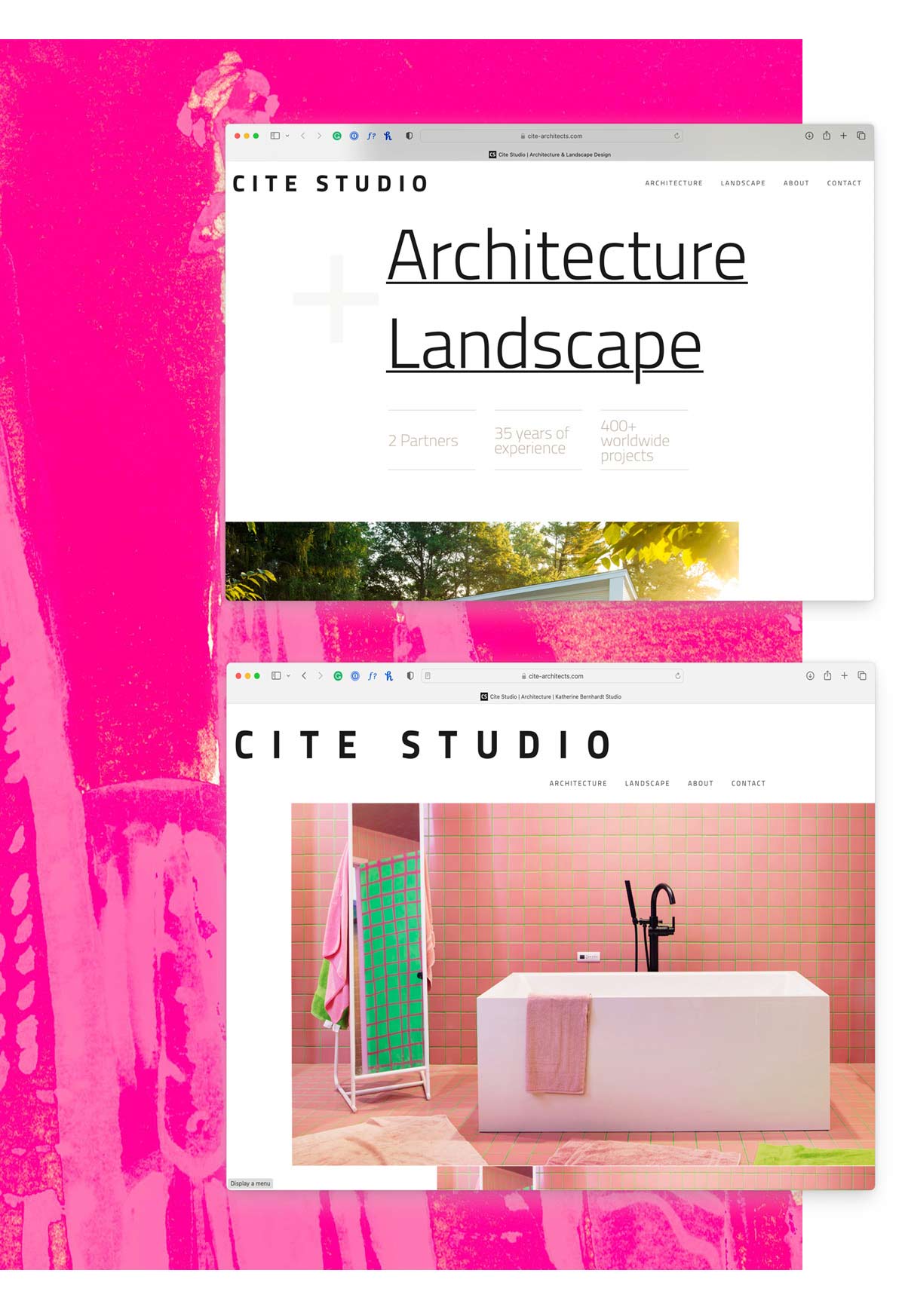
We wanted to make the Cite Studio website design convey the same intrigue and wonder that we feel when we experience great architecture, so we tried to use the same ideas and philosophies. Scale. Balance. Boldness. Open Space. Juxtaposition. Heck, we have a cantilever or two in there.
The website opens with large images of work from their portfolio, and then text quietly fades in.
Oversized headlines are paired with small type. Elements are staggered throughout to break the expectation of uniformity that the visitor might have.
And even with all that, the website is still simple, easy to use and easy to navigate. We didn’t sacrifice order and usability. But we did want to break a few conventions and expectations along the way.
The site is built on WordPress, uses responsive design so it works great on devices of all sizes, and is easy for Ann and David to update and add new projects.
The design of the website was an ode to high concept, modern architecture in all its pretense and highbrow glory. It breaks the rules and seems sophisticated and complex, even though it really is very simple.
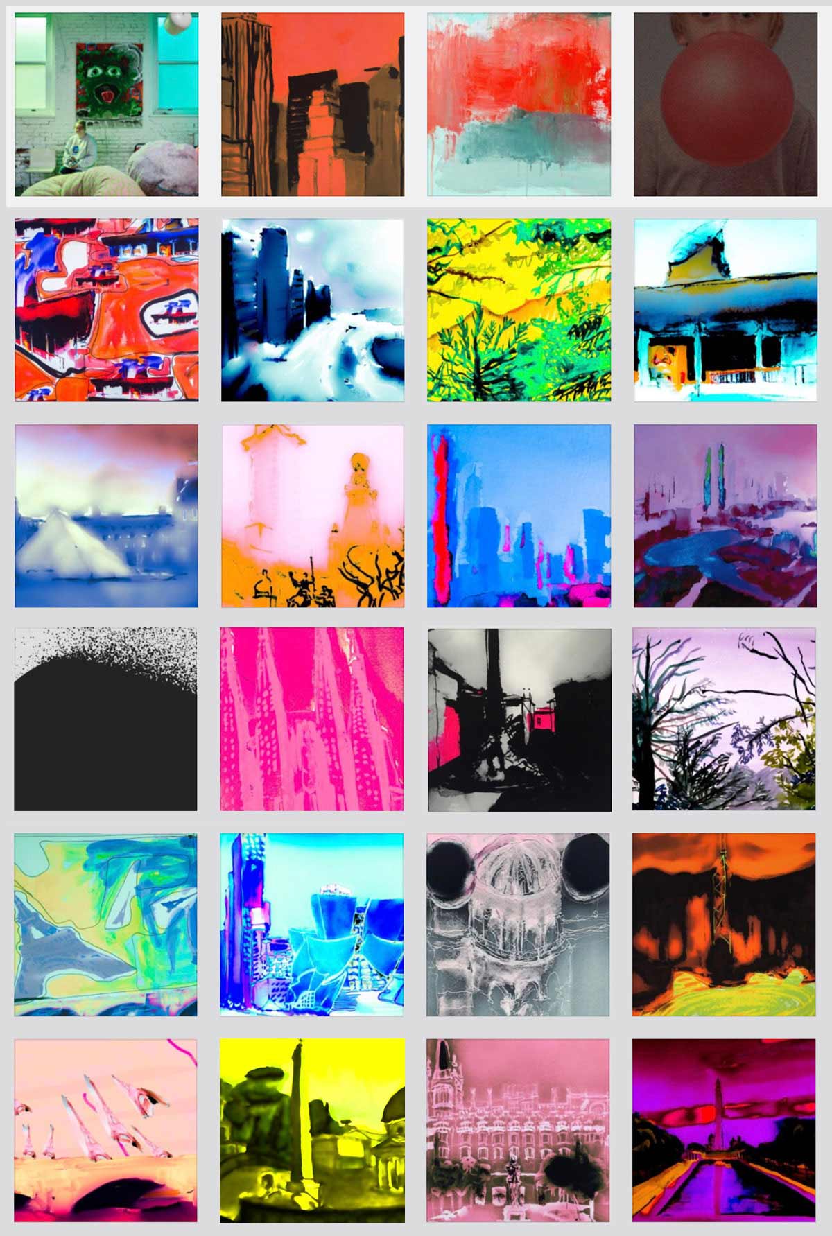
We wanted to offset the seriousness of the website with vibrant, strange footers—like a loud canvas on a blank white wall. And midway through the project, we discovered that our client, Ann, was an accomplished painter with a wonderful collection of works she had made over the years.
So, the footer of the website randomly draws from a bank of Ann’s amazing, colorful paintings, plus a couple of images we thought were appropriately defiant that we threw in for good measure.
Design, of course, is the focus of the site. So we kept copy minimal and straightforward, rounding out the user experience and feel of the site.
The great thing about design is the unexpected.
The Cite Studio website was designed and build in about six weeks—much faster than a typical website design and development program for us.
Mostly that’s because it’s not a huge website. A handful of key pages serve as a frame for our clients’ amazing body of work—but it was an absolute pleasure to be able to pause for a moment and remember that the best designs, both graphic and architecture, surprise and delight its audience. That the works of other people have a lasting impact on the lives, careers and how we see the world.
Or maybe I’m just reading too far into it all.
Either way, I’ll leave you with this. Designer Paul Rand once shared his secret to good design: “The trick is to be practical at the same time you’re being impractical.”
That quote is probably is the best way to describe great design and architecture—and dream projects for creatives.