Sometimes, even when you are truly different, you end up sounding like everyone else.
That’s exactly the challenge MAREK brought to us. Headquartered in Houston, they’re behind some of their region’s most impressive interior construction projects. Hospitals, high rises, sports stadiums, airports and more.
They’ve built a reputation for a level of professionalism most contractors in their space can’t match. Expertise, coordination and craftsmanship are their hallmarks, but their old website didn’t bring this story forward.
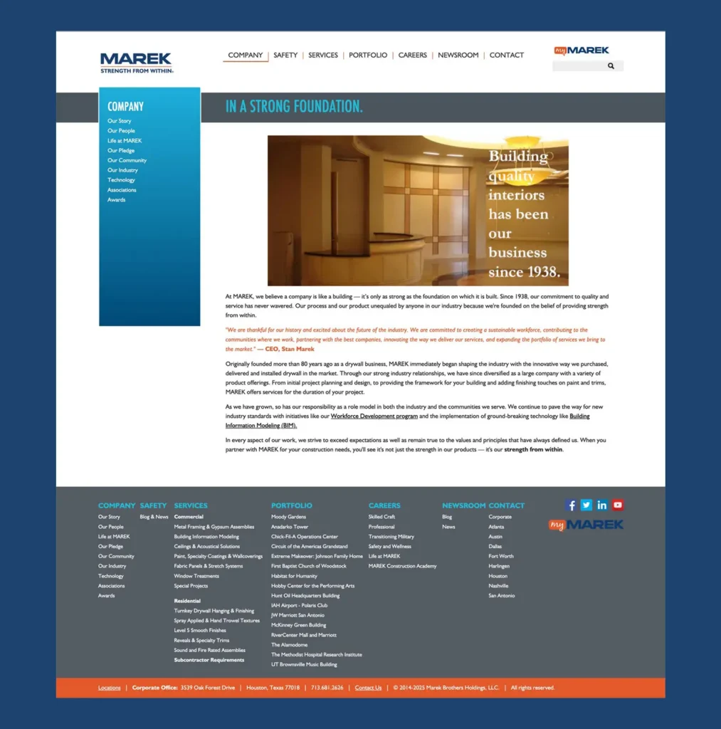
True, if you scroll through enough contractor websites (and trust me, we have), it all starts to look and sound the same. Long descriptions of services. Vague promises. MAREK needed a website that would let their differences shine.
Leading with customers, not capabilities.
Most construction websites are organized around internal operations: divisions, service lines and geographic footprints. But that doesn’t always line up with how decision-makers evaluate potential partners.
General contractors and project owners have specific questions: Can this team handle the scope? Have they tackled projects like ours? Can they meet deadlines, while working alongside other contractors with different scopes? Do they have enough craft professionals on hand to take this on? And how will they react when challenges inevitably arise?
We worked with the MAREK team to refine their message to address these questions right upfront. We’re big fans of Donald Miller’s StoryBrand framework for branding and messaging. And it turns out, they are, too. So that’s where we started.
The foundational idea of every aspect of the site—from the message, to the navigation and user flow, to aesthetic and technical aspects of design and development—was to demonstrate that MAREK gets it.
MAREK knows how to partner with their customers, because they understand exactly what their customers are facing and how to lead them forward. This idea became the guiding principle of the site.
Defining the right path for every audience.
It can be tempting to start designing pages—but a great user experience starts with users easily finding what they need.
The main navigation is deliberately concise: Projects, Expertise, Careers, Safety, News and Company. The message from MAREK? We’re here to serve prospects wherever they are in their evaluation process.
Job seekers get prominent CTAs to apply. Project managers with urgent service requests can find support quickly. And general contractors doing preliminary research can see examples of work and then browse by sector, scope or region.
Most contractor sites address prospects with laundry lists of services, scopes and sectors. We knew that wouldn’t fit the bill here, even if we needed to convey the same kind of information.
The truth is, though, MAREK does handle multiple scopes of work. They do work across diverse sectors. And they offer specialized services. In fact, this range, and their ability to deliver multiple scopes through one point of contact, is one of MAREK’s key differentiators.
The solution was to organize the information around how customers think.
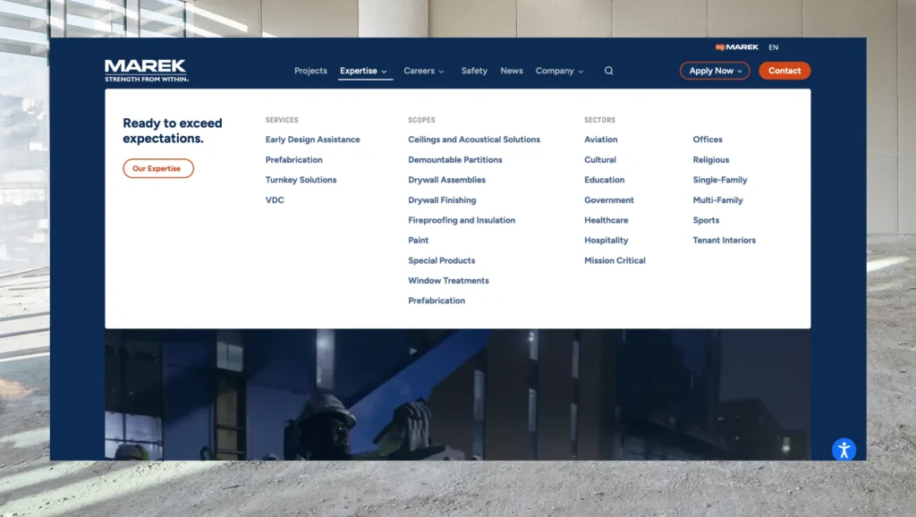
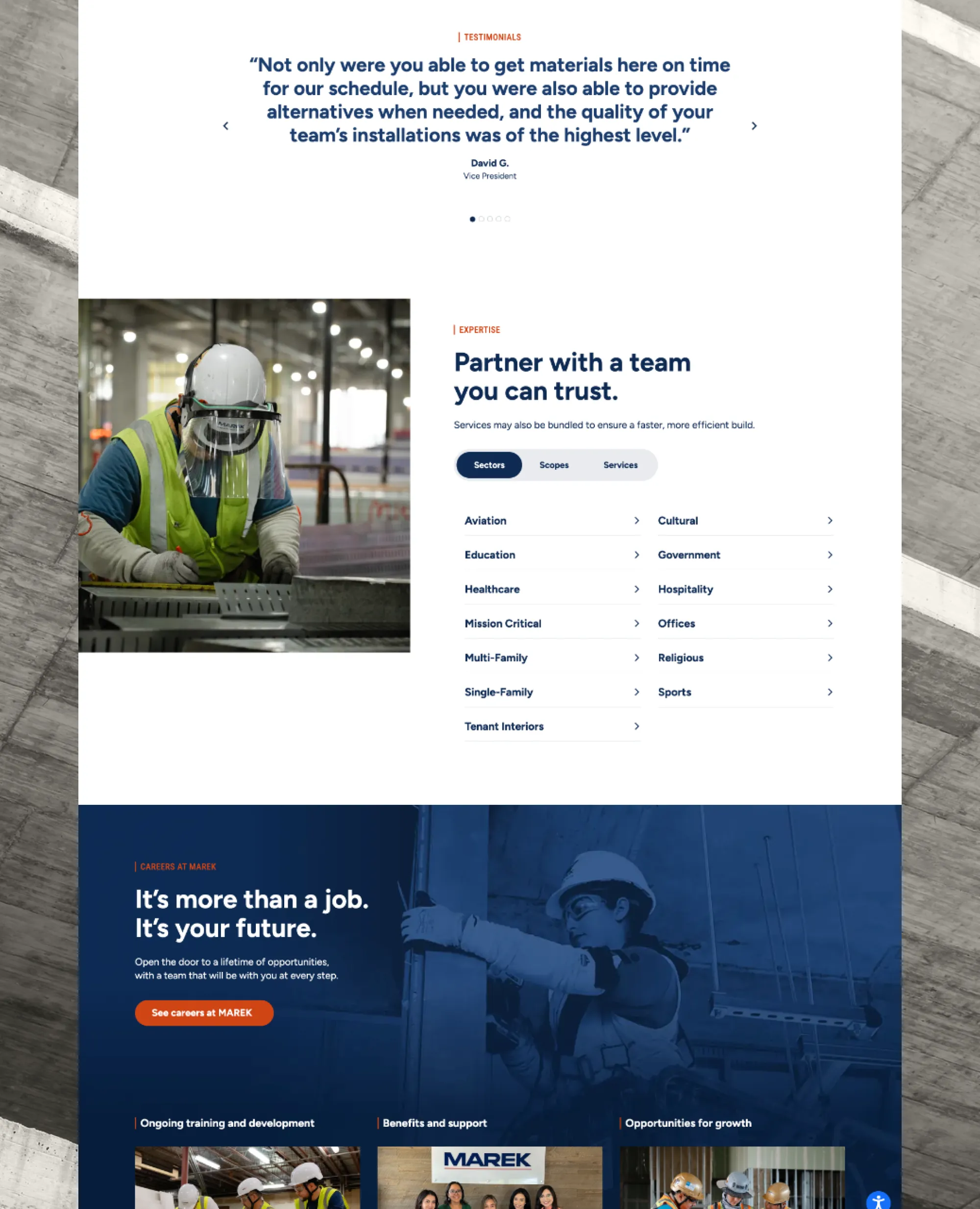
The Expertise section, with its three-tab navigation, became the heart of the site. Even the title of the navigation point — Expertise — hones in on what customers are looking for when they hire a contractor.
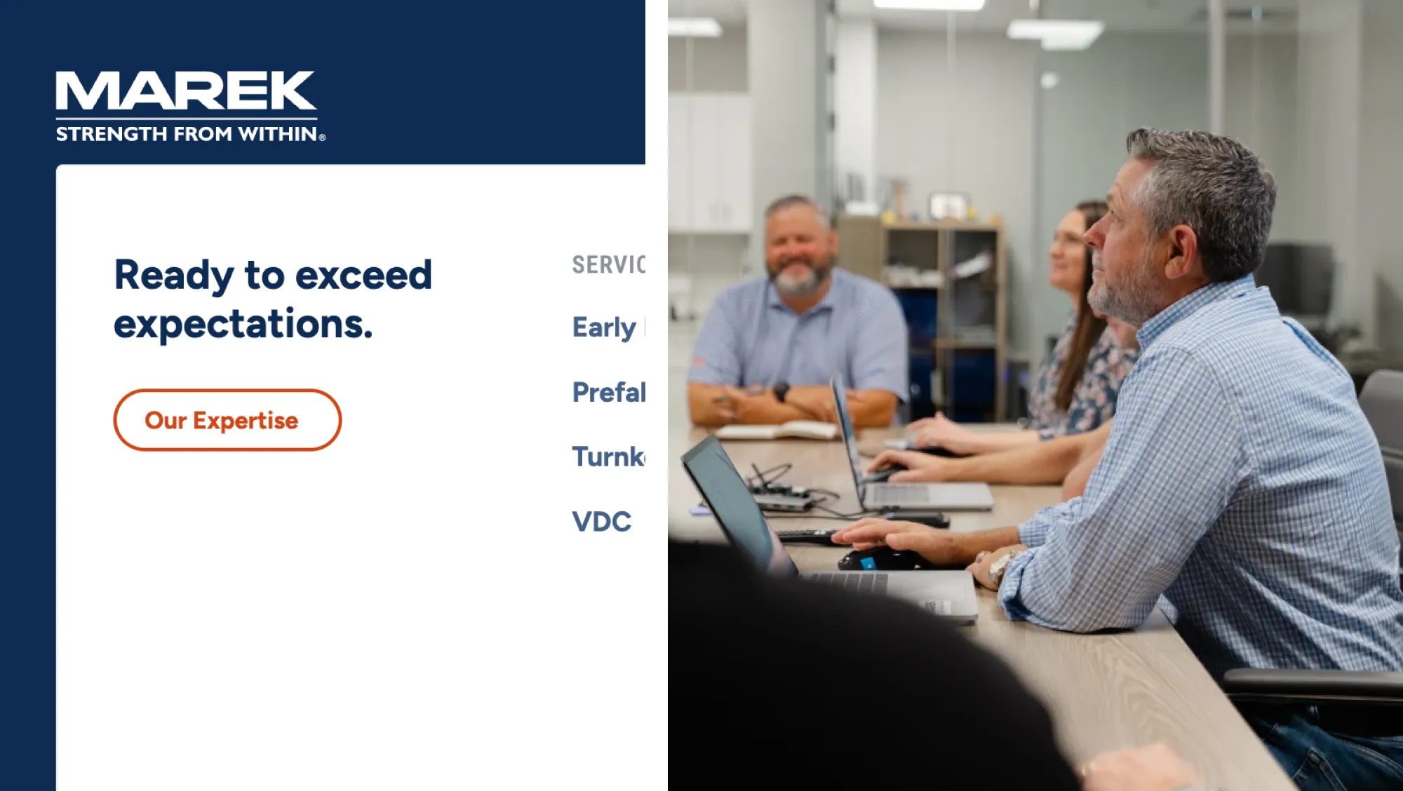
“Scopes” speaks to visitors who know their specific needs. Most do, so this sits front and center. “Services” addresses those who want to explore MAREK’s approach and additional capabilities. Their prefabrication and digital design capabilities often give them an edge in competitive bid situations, so these are featured prominently. And “Sectors” speaks to buyers who need reassurance that MAREK has the specific market-specific expertise they need.
Each category gets its own tab, with clean, clear navigation. It doesn’t force a single path. Instead, it helps visitors understand exactly why MAREK is the interior construction partner they should trust.
Building credibility, page by page.
There’s a common phrase in writing classes, “Show, don’t tell.” And that’s exactly the philosophy we used as we mapped content for each page.
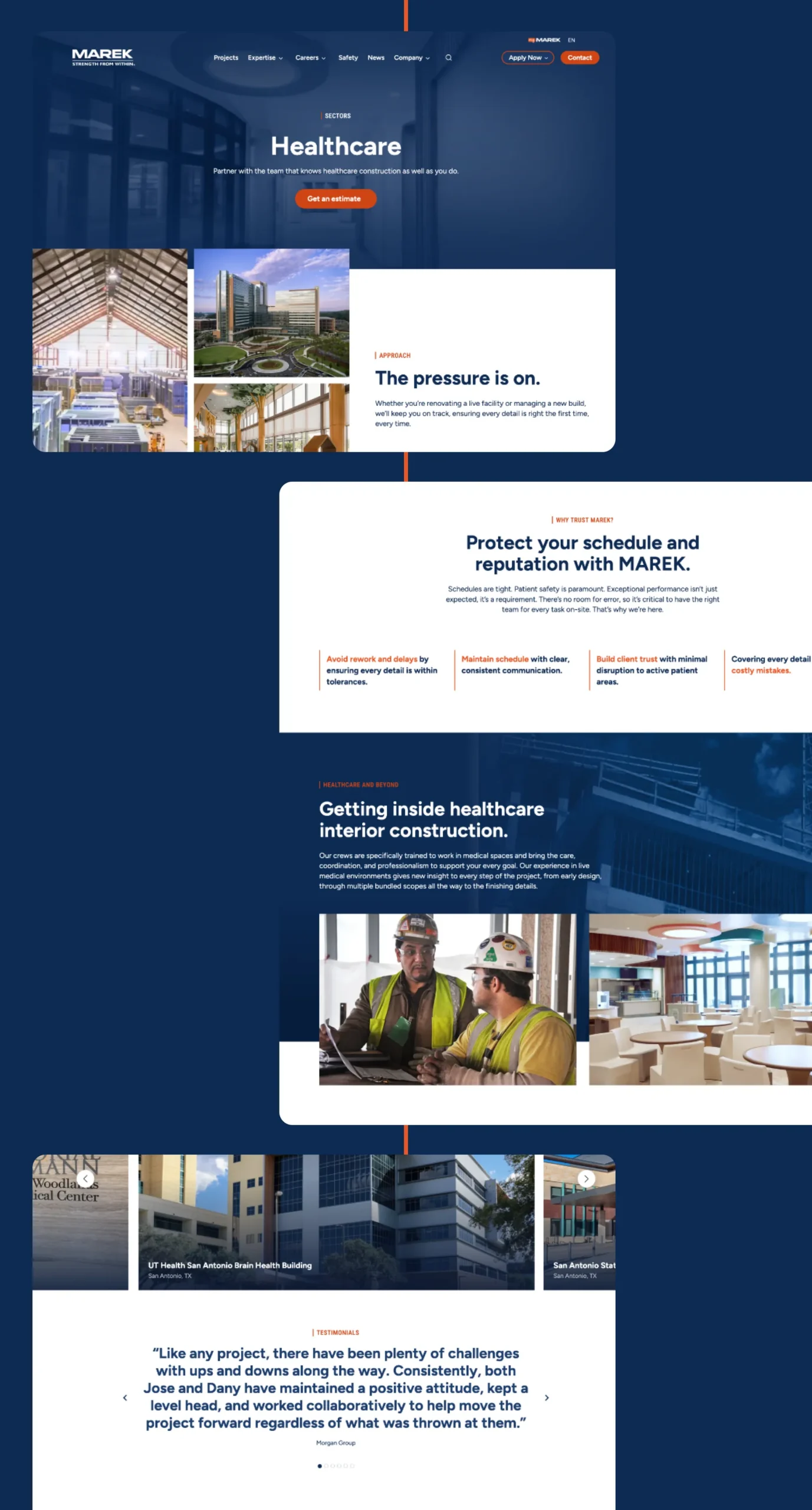
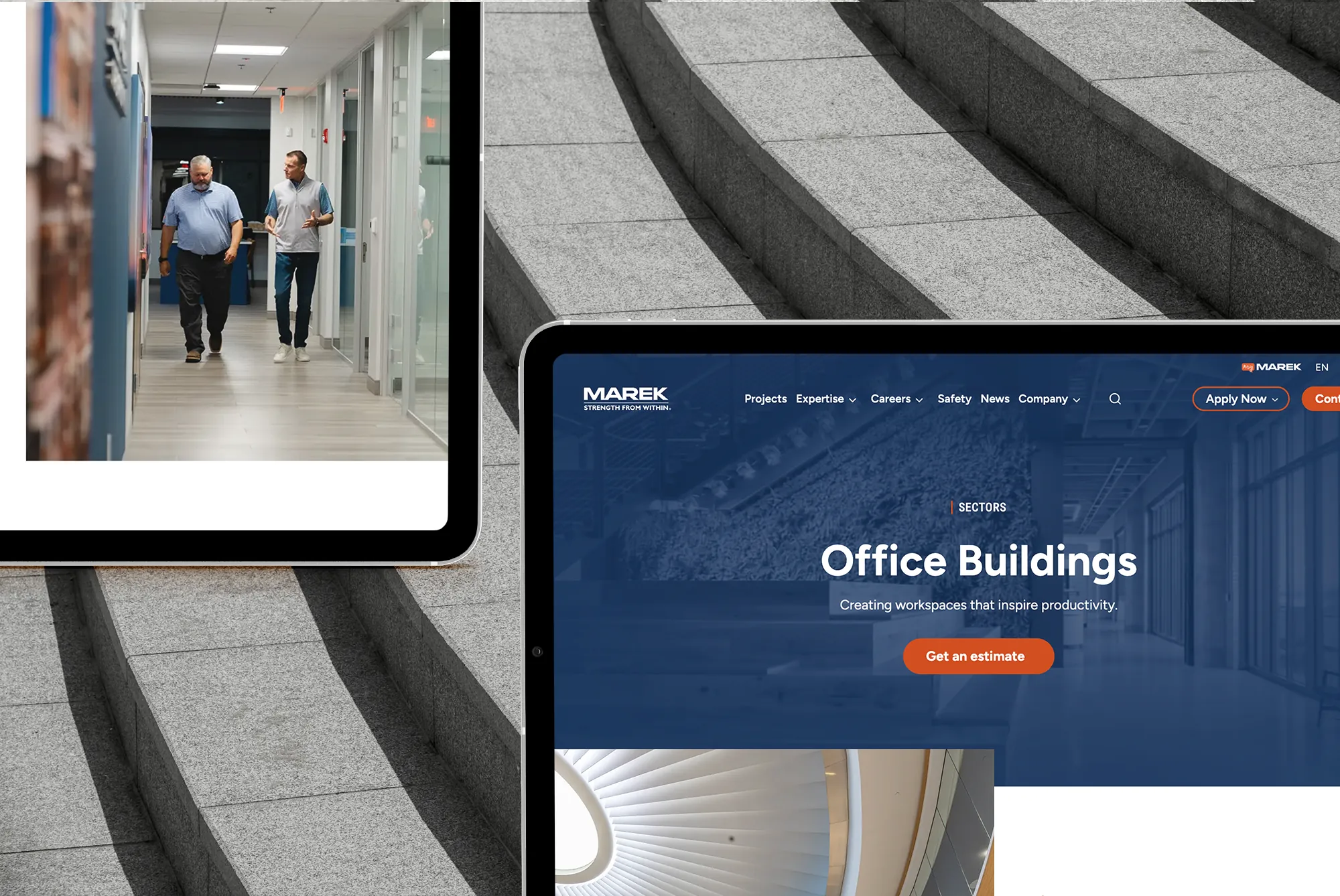
Sector and scope pages open with short, clear explanations of the common problems customers face. These concise, relatable narratives are designed to get prospects nodding, “yes,” right from the start.
“Yes,” that’s exactly the problem I have. “Yes,” it’s comforting to have someone who understands me. And of course, “Yes,” I’ll trust them with this important project.
After establishing trust, each page delivers real details about philosophy, methodology, quality control and project delivery. The goal? To let prospects know exactly what to expect from working with MAREK. And to show how working with MAREK will make their projects a success.
This is classic StoryBrand. Set up the problem, establish credibility and be the guide that allows the customer to be the hero of the story.
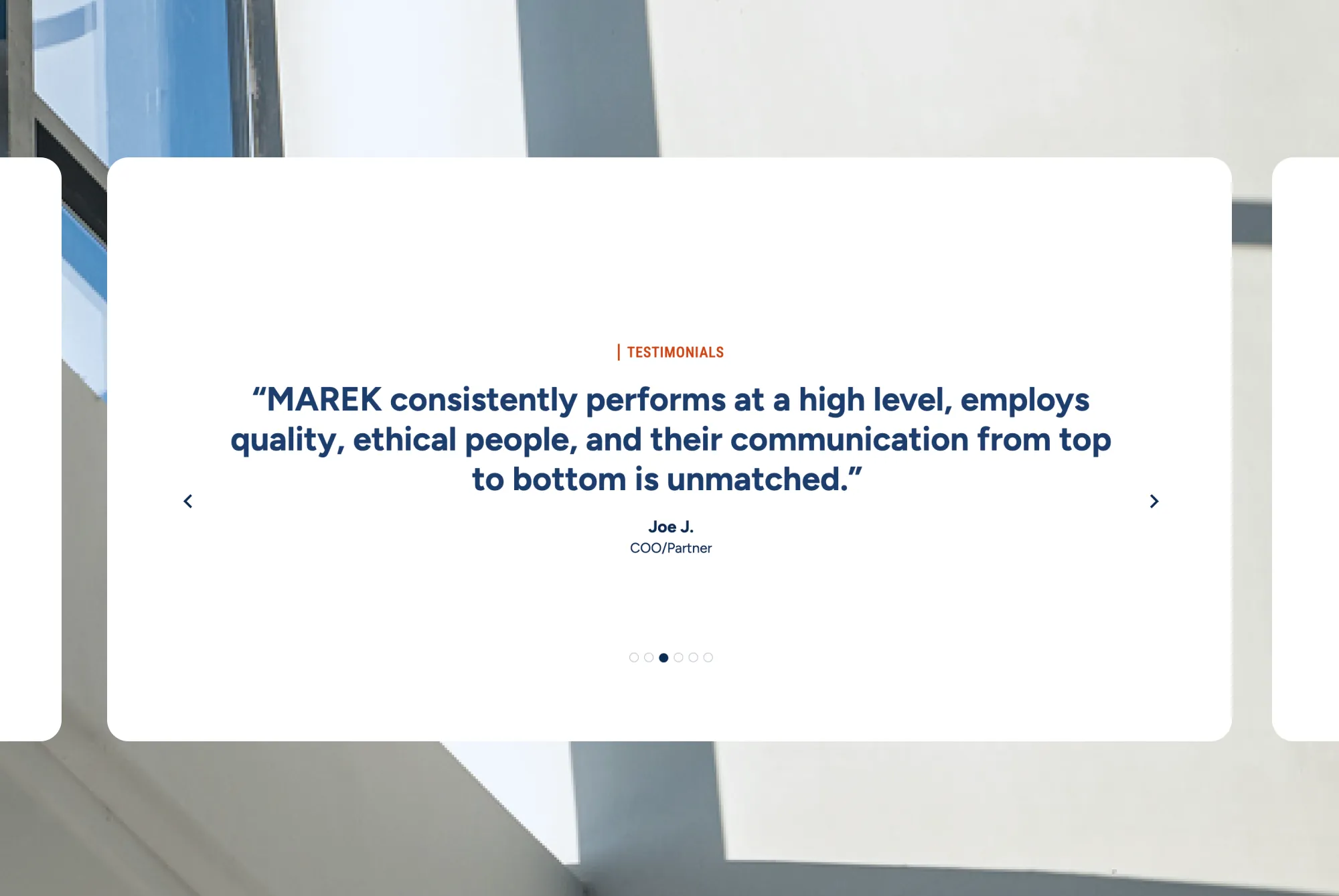
Customer testimonials and relevant examples of work punctuate this hero’s story, further building MAREK’s capability. These elements are critical: Gartner research suggests that social proof like testimonials influences 90% of buyers when they’re comparing products.
Consistency and credibility go hand in hand.
We took this layout system and applied it to all core service pages. This creates familiarity as visitors navigate the site. They learn where to look for specific information once, and it works wherever they go.
It’s an approach that ensures everything feels intentional and considered. Elements align. Whitespace is purposeful. The visual hierarchy guides visitors through each page without needing to compete or shout for attention.
Every element designed to inspire action.
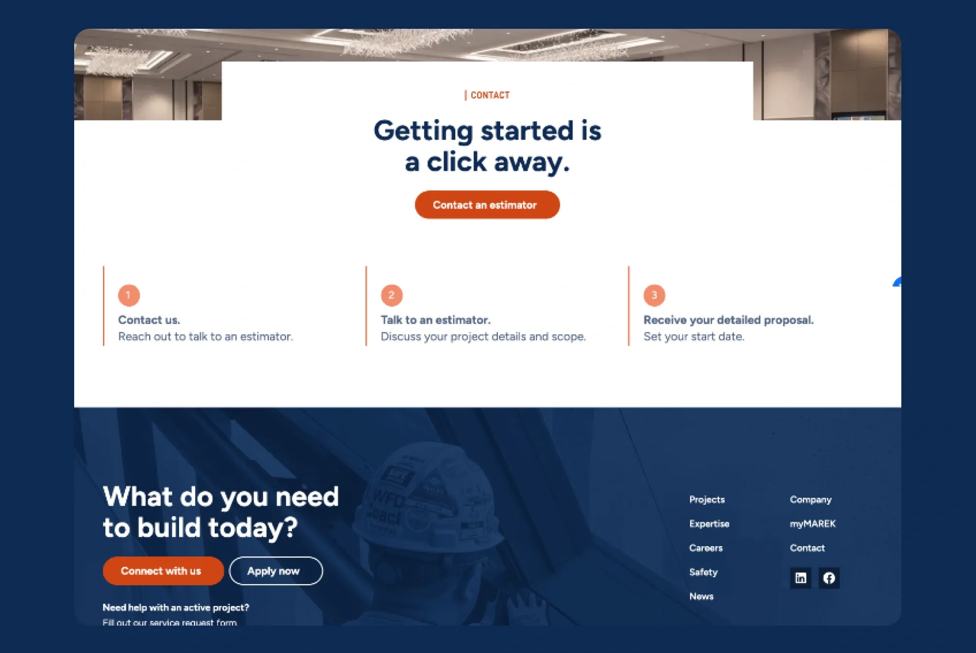
From pages within the expertise hub to individual project pages, no page on the MAREK site is a “dead end.” Calls to action lead to other pages on the site—project examples, related scopes or services, careers pages—keeping people engaged and helping them move closer to a decision.
The final call to action on the page, an invitation to schedule an estimate, is also a bit of reassurance. It lets prospects know how easy it is to work with MAREK. But it also speaks their language. Clear, straight and to the point.
Evolving how projects tell the story.
Project pages can make or break a construction website. Many feature big, beautiful images with a few basic stats, and that’s it. But for companies like MAREK, projects are proof. They’re the best evidence that the company can tackle these challenges.
Photos take center stage, of course, with edge-to-edge images dominating the page. Stats come next, along with a brief narrative to put it all into context. The problem-solution cadence here makes it easy to demonstrate what made the product challenging, and how MAREK’s unique capabilities brought it to life.
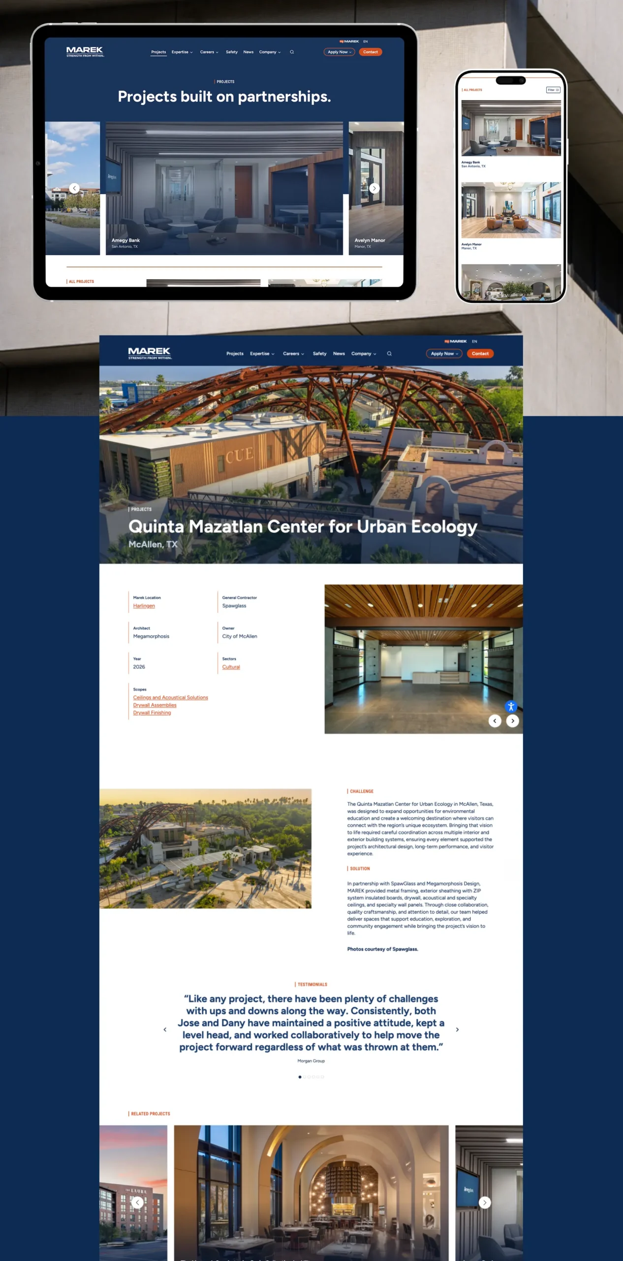
The projects hub can be filtered by sector, scope and location—making it easy, for example, for a healthcare-focused general contractor to find relevant work on the MAREK site. These filters elevate the project page from a gallery to a source of useful information.
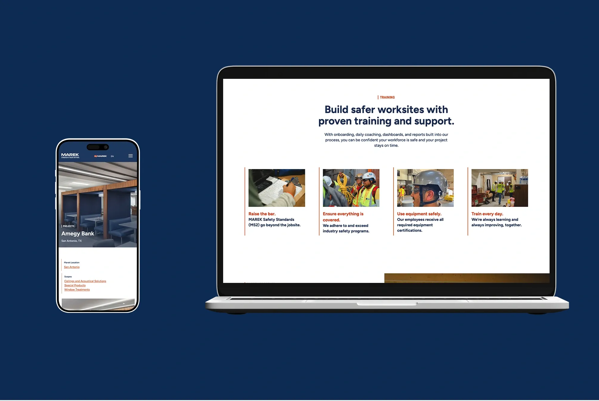
Bringing spaces to life with advanced web technologies.
Dramatic photos are one thing, and this site has a ton of them. But what if we could make them feel dynamic? What if we could make visitors feel almost like they were in the spaces? That’s the power of animation.
We used Google Veo, an AI tool, to create short, cinematic videos of MAREK’s projects for the homepage. Starting with still images of the projects, the small adjustment made a big difference.
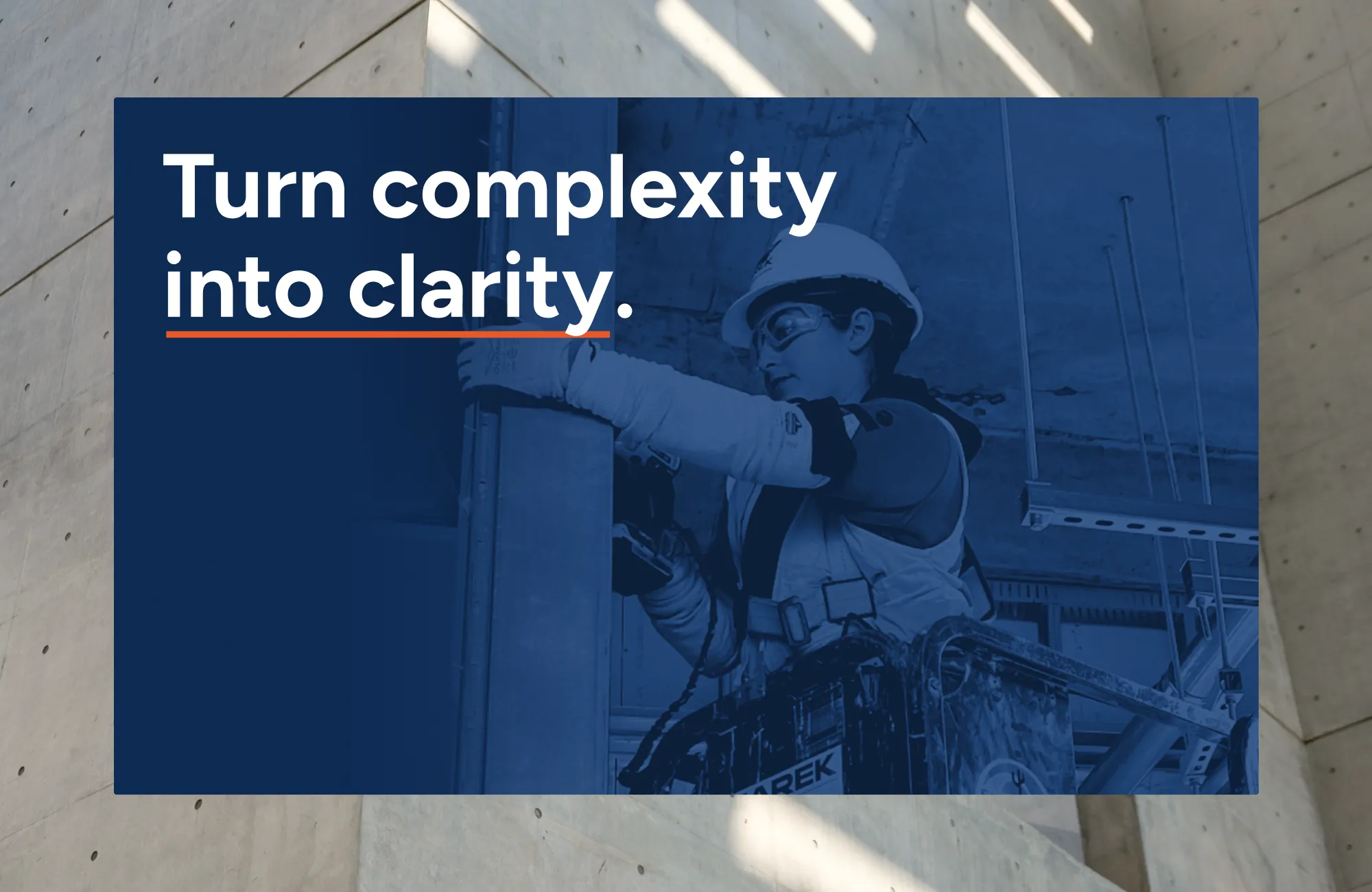
Subtle parallax effects and scroll-triggered animations give the site new depth. As visitors move through pages, images reveal themselves in ways that feel organic and immersive, not gimmicky.
The effect was intentional: to help visitors experience, rather than simply visualize, the quality and scale of MAREK’s work.
These decisions were technical, of course, but also strategic. The animations create an experience that matches the quality of MAREK’s work. To convey the same level of detail and craftsmanship MAREK brings to every build.
Celebrating the people who make it happen.
The more people we talked to from the MAREK team one truth kept ringing true: their people are the heart and soul of their business. Again, “show,” don’t just “tell.” Far too many companies in this space, like MAREK’s old site, talk a big culture game.
We wanted to show it in a big way.
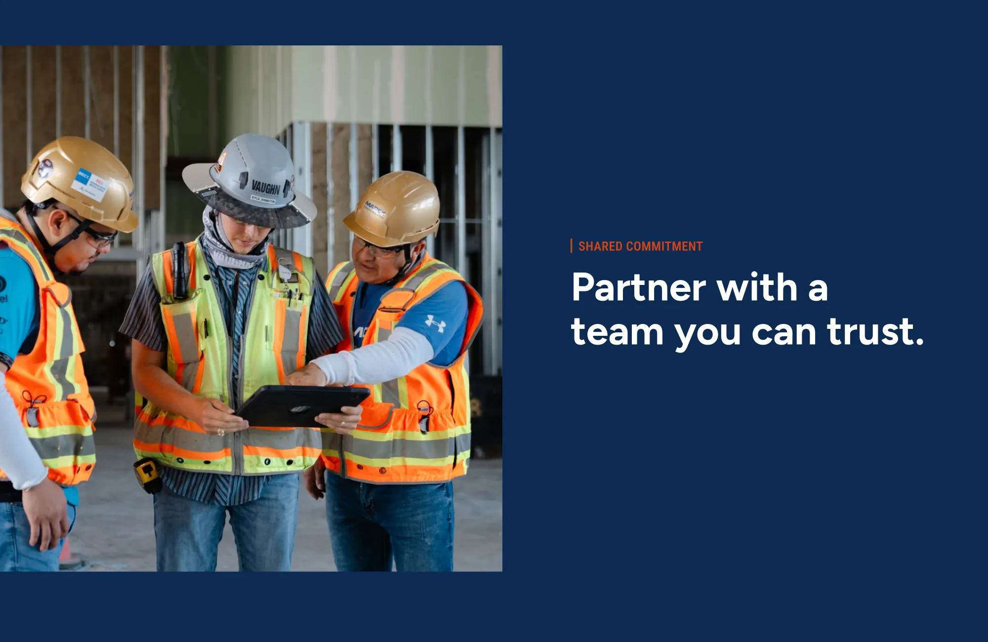
We made a deliberate decision to make people visible throughout the experience. Real MAREK employees appear on real job sites across the new site. Photography captures the actual work, true craftsmanship and real collaboration.
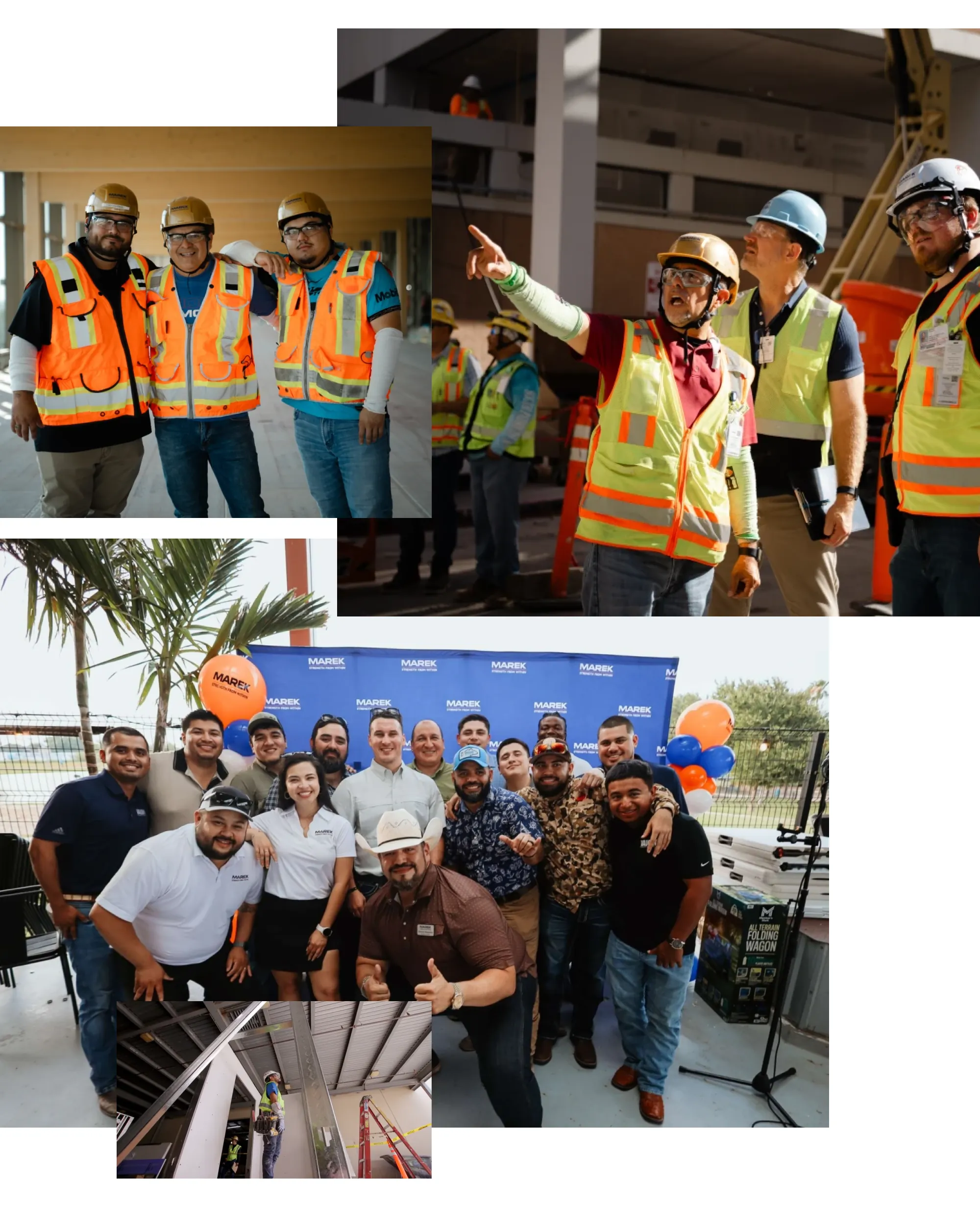
This is a culture of getting things done and of respecting the people around you, and we wanted to make sure it was front and center.
This is important for attracting new business, but also for another key element of the site, recruitment.
Showing what it’s like to work at MAREK.
In an incredibly tight construction labor market, we needed to show what makes MAREK a great place to work. This is about more than opportunities and benefits. Those are expected. We needed to go further.
We worked with their team to develop a “Life at MAREK” experience on the Careers page. Career growth opportunities. Ongoing training programs. Pathways for advancement. Support systems that help people take on new challenges.
The goal? To build MAREK’s credibility in the eye of the job seeker. To prove that they are the employer of choice in interior constructions. Put another way, MAREK will make employees feel like the heroes of their own career stories. Yeah, there’s that StoryBrand again.
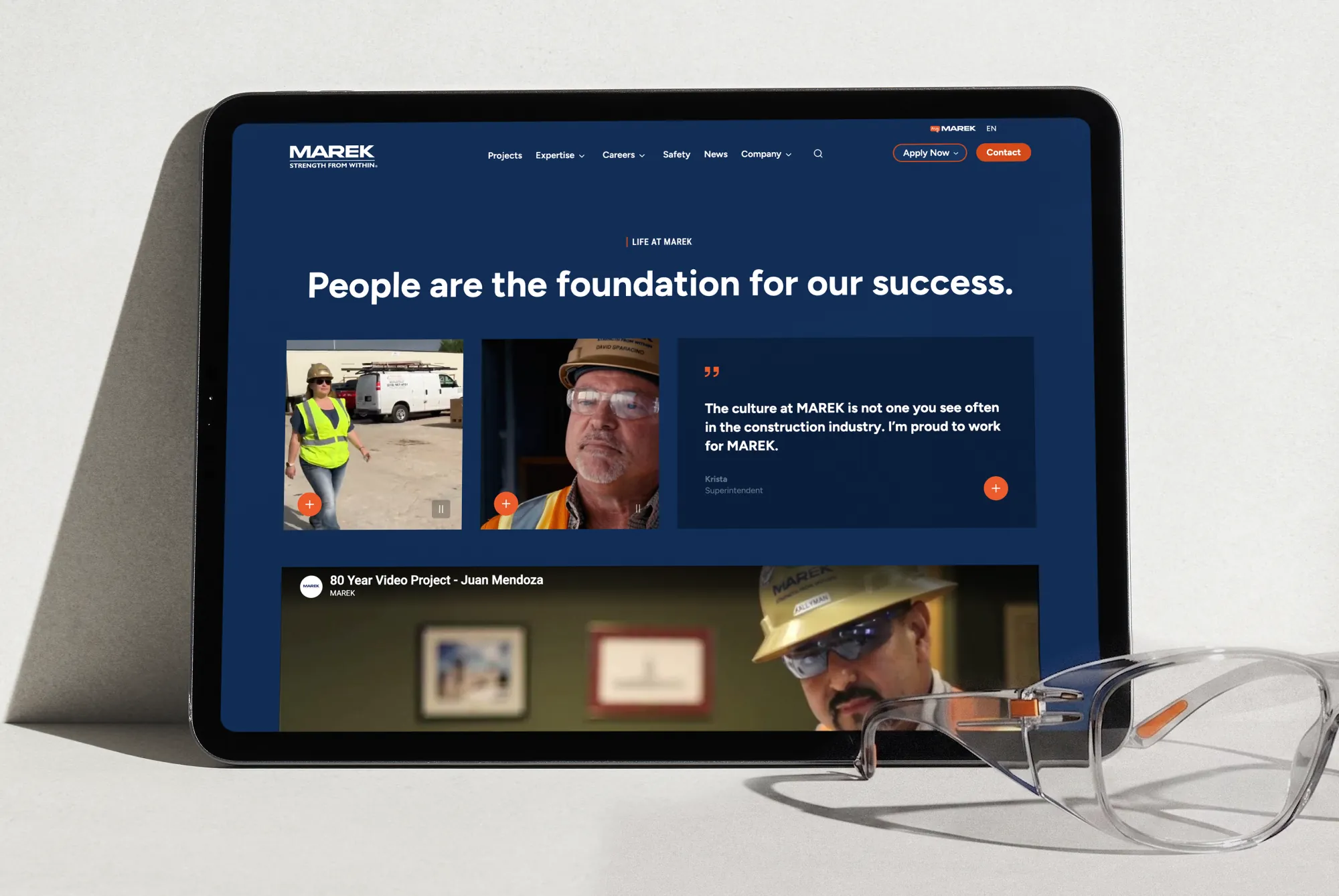
Photography reinforces this throughout. Employees learning new techniques. Teams collaborating on complex challenges. People who’ve been with the company for years and decades, evidence that MAREK invests in their people and those people choose to stay.
Building the site for today and tomorrow.
Construction companies are dynamic. They expand into new markets, add capabilities, form new partnerships and evolve their service offerings. This happened even as we were building the site, as MAREK expanded service lines and formed new brand partnerships.
We built the site using WordPress and Kadence. So it’s easy for MAREK’s team to update capabilities, add new projects and publish news as the company expands. No code required.
The page and content templates are flexible enough to accommodate different types of content while maintaining the visual consistency that makes the brand feel so cohesive. As MAREK expands, the structure accommodates that growth naturally.
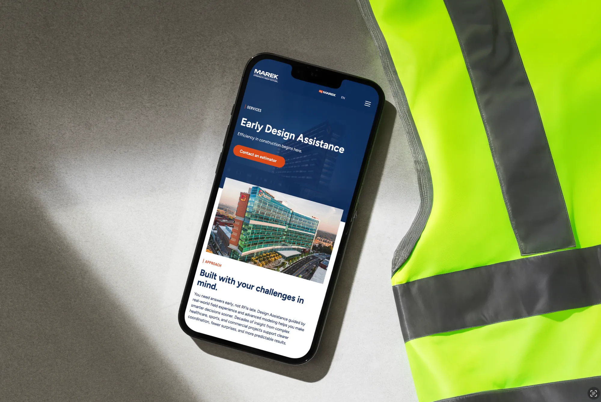
Clarity makes MAREK the hero.
At the end of the project, we realized what we really gave MAREK was clarity.
Clarity about what they do and how they do it. Clarity about how they serve and what challenges they solve. Clarity about what makes them different in a sea of contractors making the same promises.
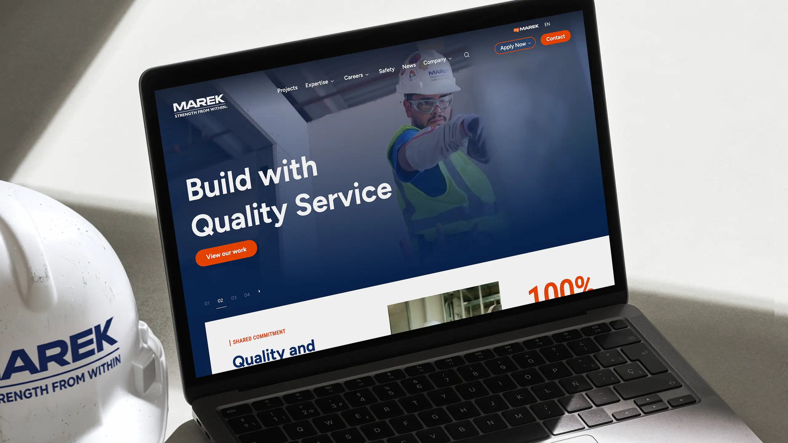
The approach was simple. Build a clean, organized platform that lets their work, their people and their approach shine. Let projects prove capability. Let people demonstrate culture and commitment. And let testimonials provide validation and reassurance at every critical decision point.
Because in a sea of contractors all making the same promises, what sets a company apart on the web is the ability to demonstrate they can actually deliver.
Because that’s what makes MAREK different. And now their website shows it.
We’re proud to have helped make MAREK the hero of this story, and are looking forward to seeing where they go next.