Last summer, we got a phone call from Stephen Savage and the partners of 1000 Spruce about opening a new restaurant, half a block away from their already mega-successful ventures in downtown St. Louis, Wheelhouse and Start Bar.
We’d met them a few years ago when they brought us on to design the brand identity and interior of Start Bar, an arcade bar that has since become a nightlife destination. We had an awesome time working with them–they’re always very collaborative and open to our out-of-the-box ideas. We were excited to hear about their latest concept.
It’s BBQ…
We met with the team and listened to their vision of a more upscale dining and cocktail experience centered around a Midwest favorite: barbecue. The new restaurant would be at the corner of Spruce and 9th, previously occupied by Flying Saucer, featuring a giant outdoor patio and live music. And the icing on the cake: the building has a direct view of Busch Stadium, so it’s the perfect place for fans to hang out before and after the game.
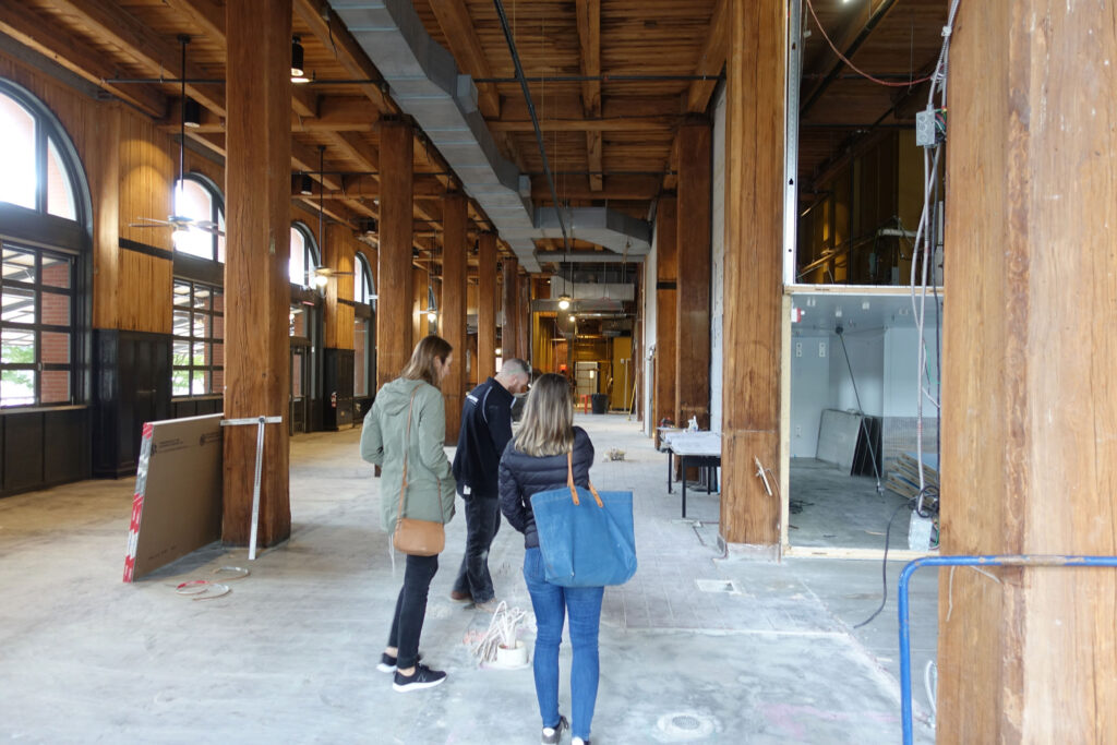
(Above: The space before demolition began.)
…but different.
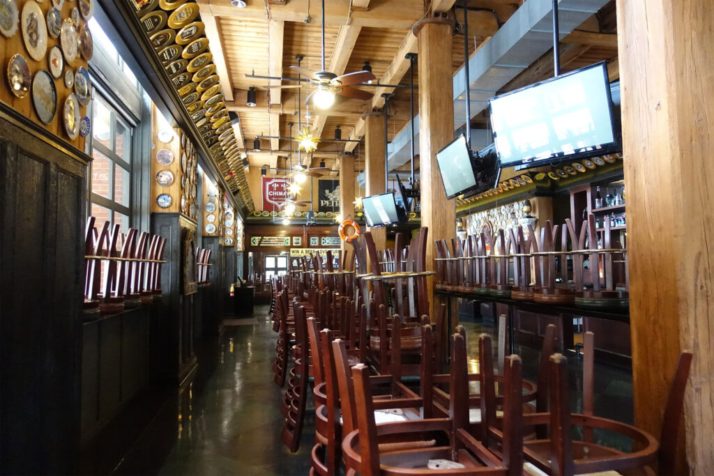
If there’s one thing St. Louis has an abundance of, it’s good barbecue. From giant names like Pappy’s, Bogarts and Sugarfire to favorites like The Shaved Duck, Salt + Smoke and BEAST (plus many, many more), there’s no shortage of great barbecue joints in this town.
So how could we open another barbecue restaurant and be unique? What would make this one different from the rest?
There were three big factors working in our favor. The first is that the guys behind 1000 Spruce are exceptionally good at running restaurants and nightlife venues. They are like machines for great customer experiences, not to mention non-stop social media marketing.
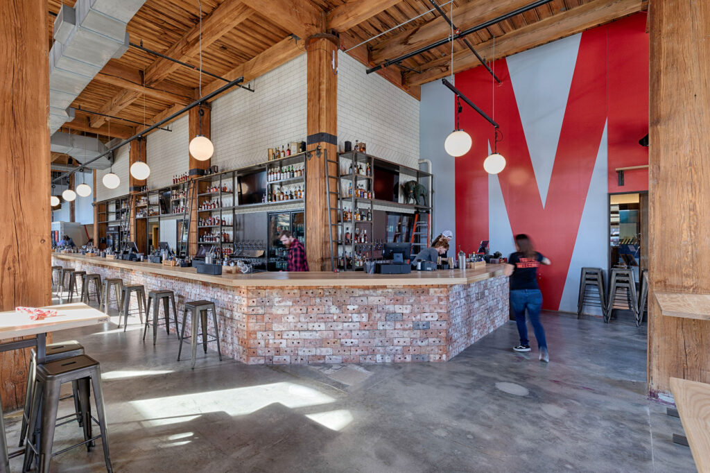
The second factor was their differentiator—a more formal barbecue experience than the city is used to, one where you don’t have to stand in a long line and pick up your food at the counter. The concept pairs great barbecue with a sophisticated bar program in a space that would become the largest barbecue restaurant in St. Louis.
Oh, and did I mention Ben Welch?
Ben is the highly acclaimed chef behind Big Baby Q. How highly acclaimed? Food & Wine Magazine proclaimed his creations as “The Best in Missouri,” beating out everyone else, including our neighbors in Kansas City.
It was a secret, but Ben was closing down Big Baby Q and partnering with the 1000 Spruce team to run the food program at the new restaurant. This would give the brand instant street cred.
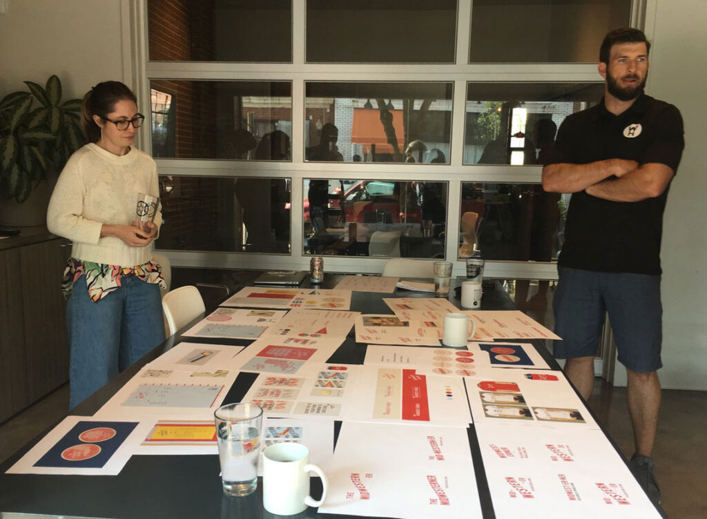
With these unique factors in place it was time for us to make something unique of our own.
Not Your Average BBQ joint
When you think of a barbecue restaurant, you might think of two things: checkered table cloths and iron pigs. Or maybe iron pigs and butcher knives. Either way, people have grown accustomed to the norm.
For the concept’s branding to be outstanding, we needed to stand out from the crowd.
But first we needed a name.
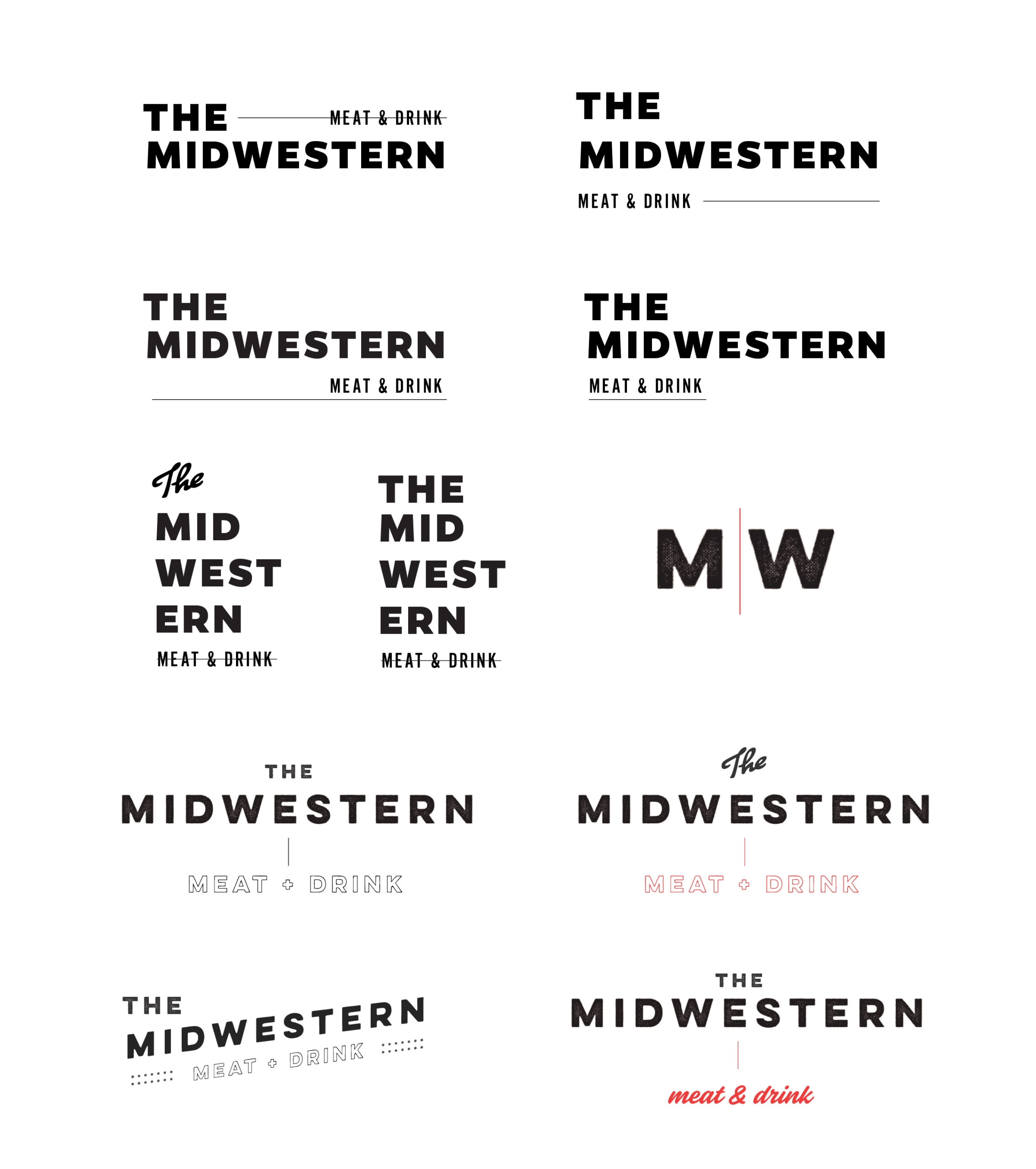
Meet The Midwestern
Naming can be a difficult part of the branding process. It’s literally the starting point for the entire brand identity.
The team at 1000 Spruce had floated the name “Midwestern” when they initially shared the concept with us. For a while we toyed with calling it “The Midwesterner,” but ended up dropping the -er.
Things started falling into place.
Backyards and Leisure Time
Our first thought was of barbecue culture as a social event, in the backyards of America during the 1950s. A sense of nostalgia, of neighborhood kids running through the sprinkler as dad wore tube socks while manning the grill and mom fixed potato salad in the kitchen. The weave of patio chairs etching ridges into your skin while you waited for Mrs. Jensen from down the block to bring out her coconut cream pie.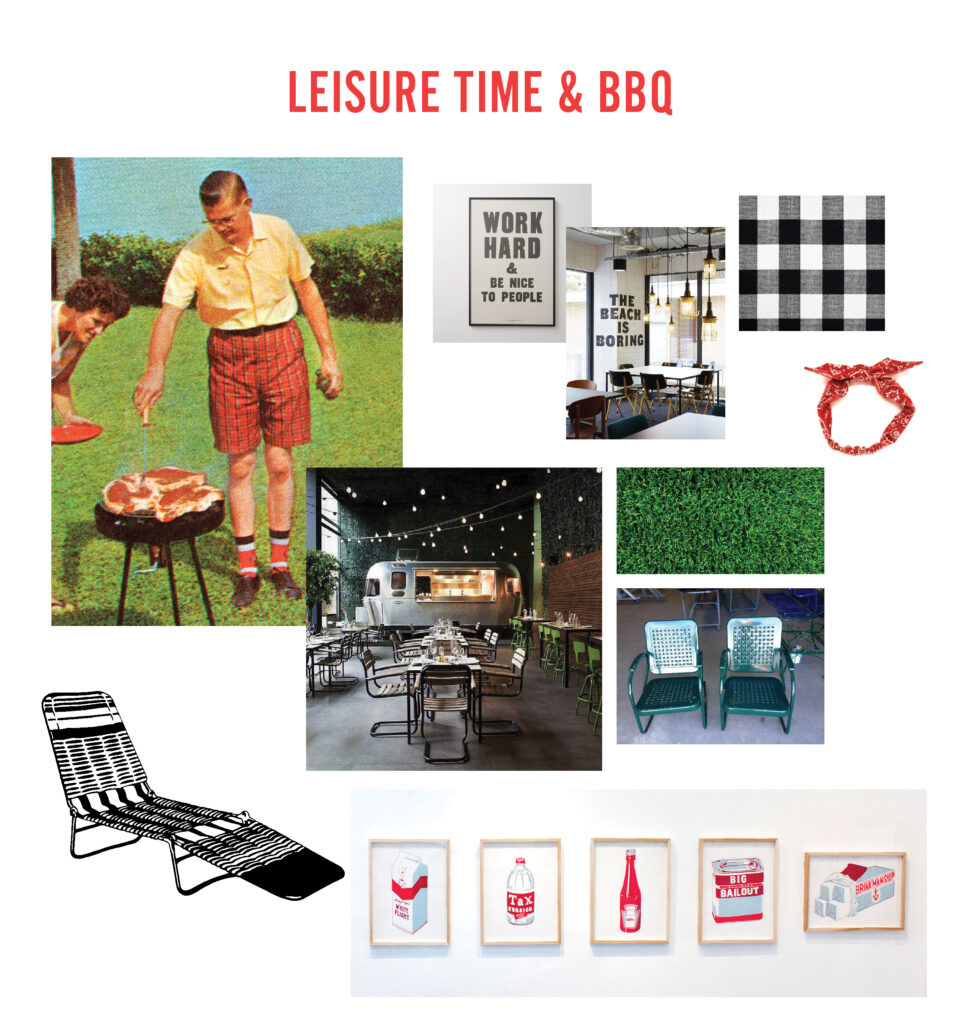
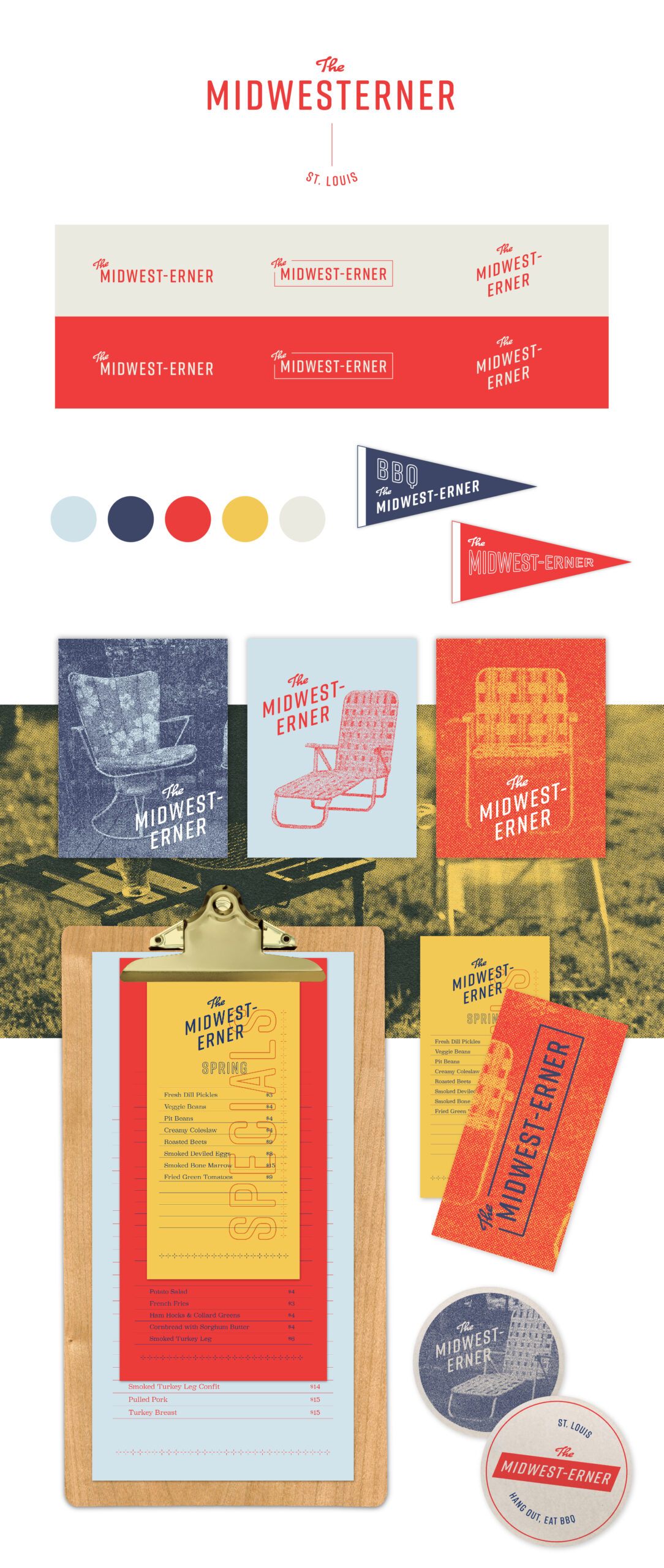
The concept was enjoyable to work on and was a crucial part in the journey toward the final project. But it was too kitschy, and not fresh enough. The Midwestern’s branding needed to be a more modern, straightforward take on the Midwest. Not cliché and corny, but a salute to the hardworking people, fruitful land and honest culture of the flyover states.
Mmmmmm.
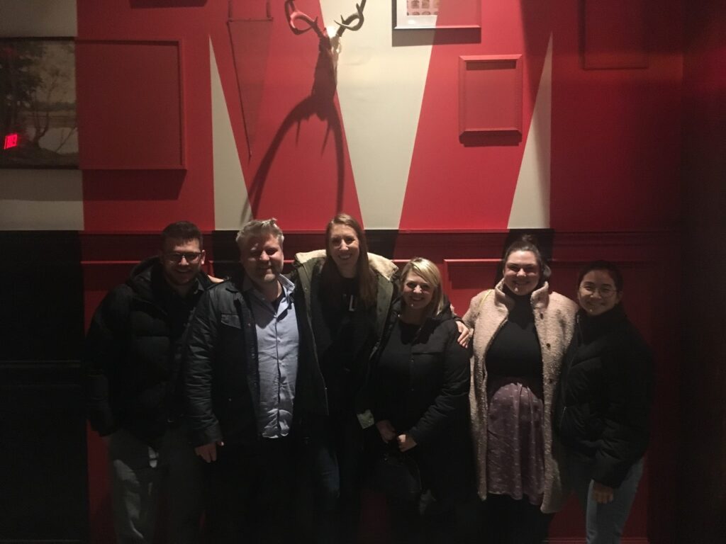
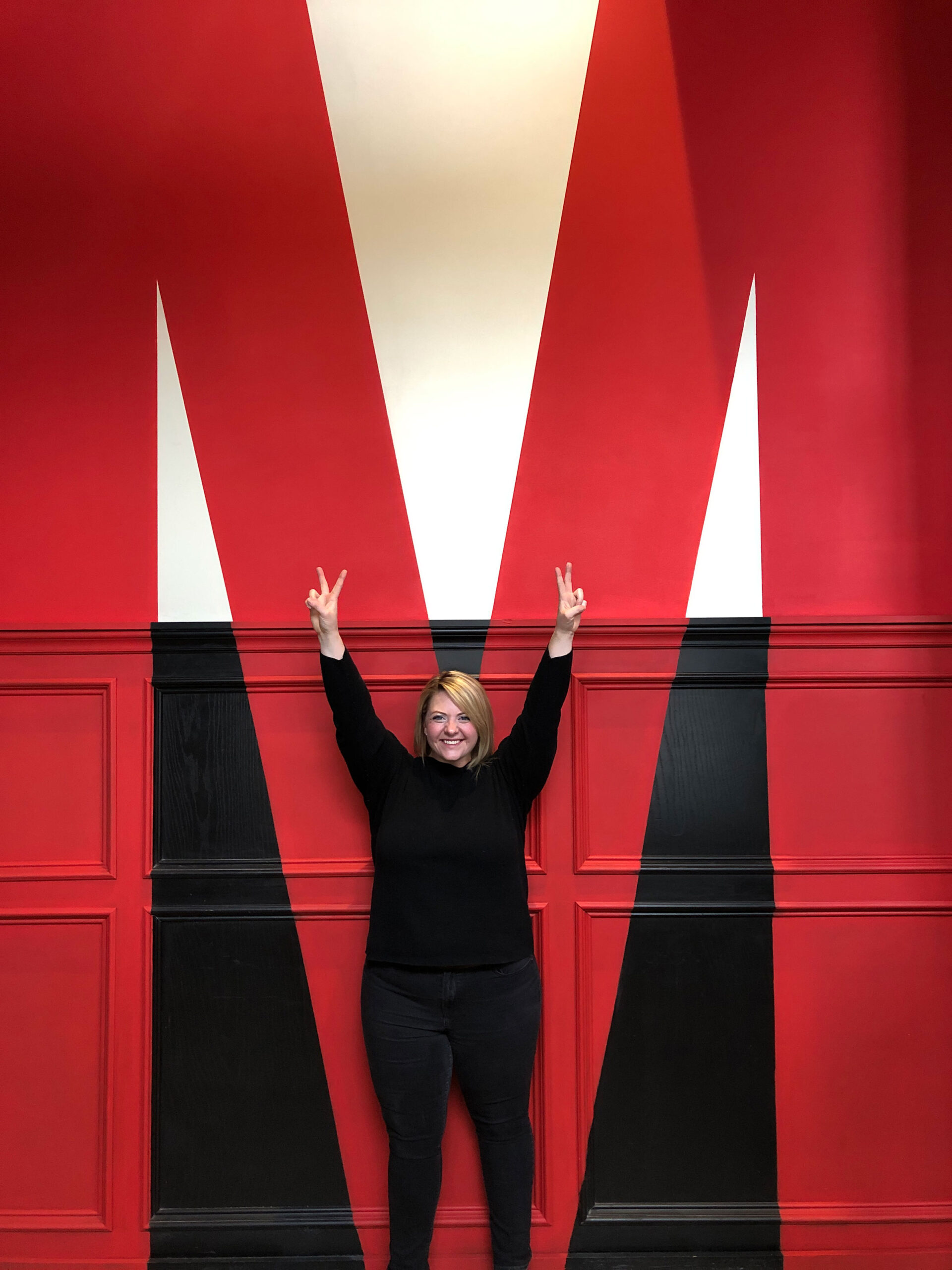
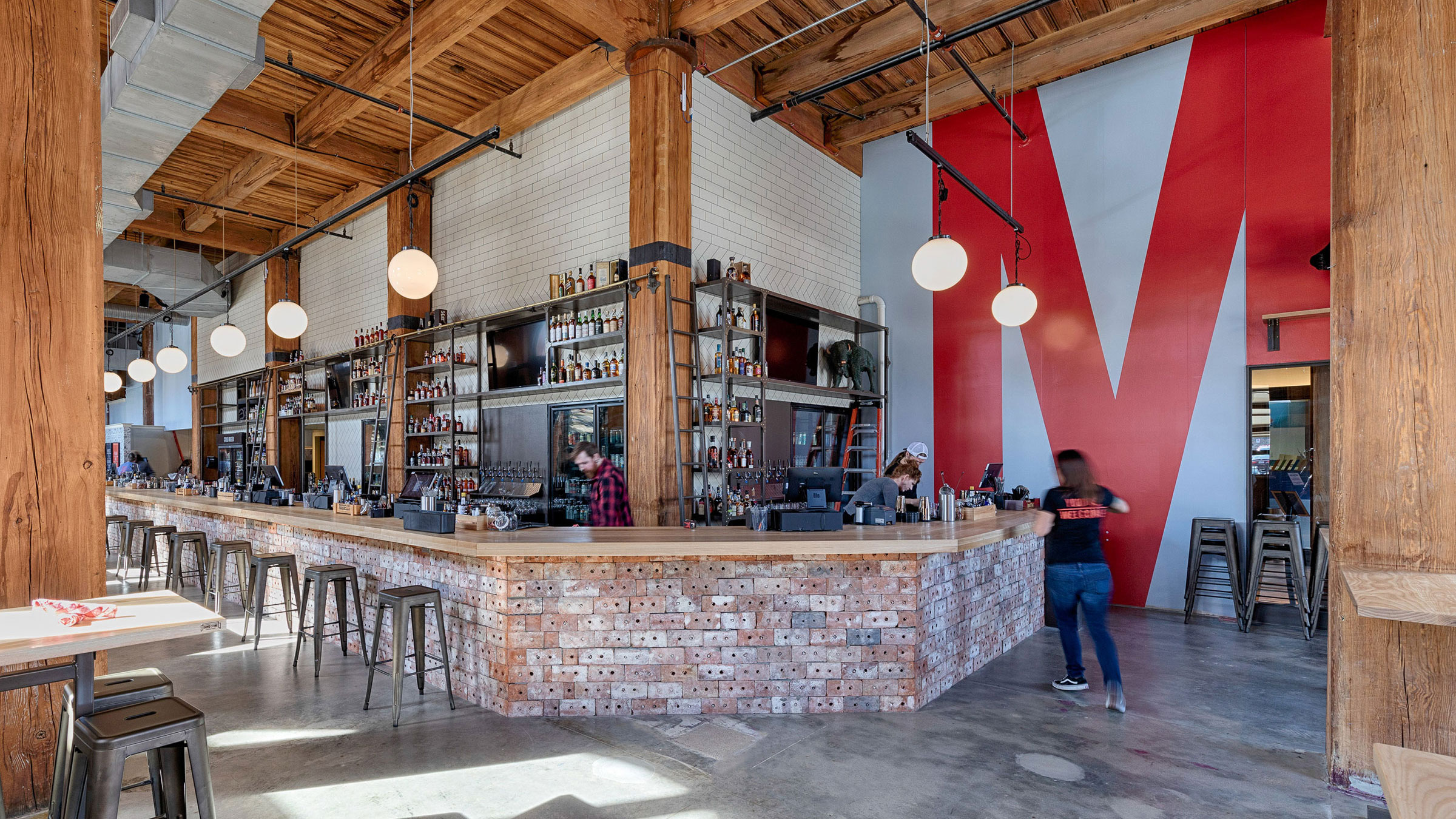
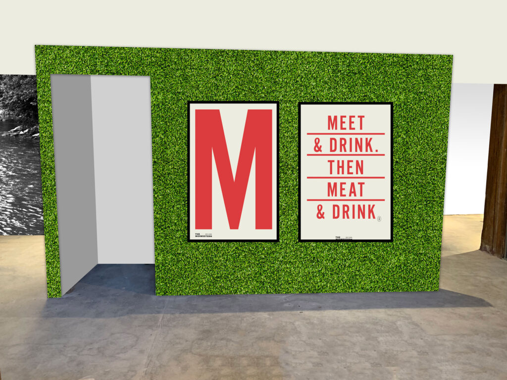
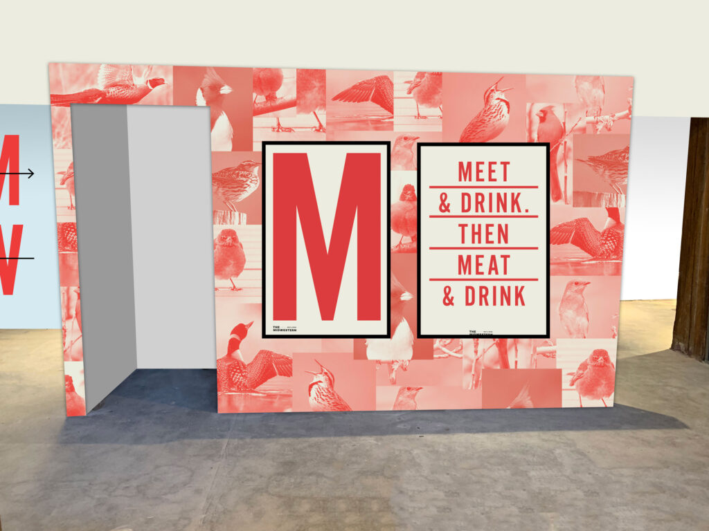
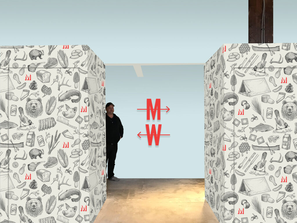
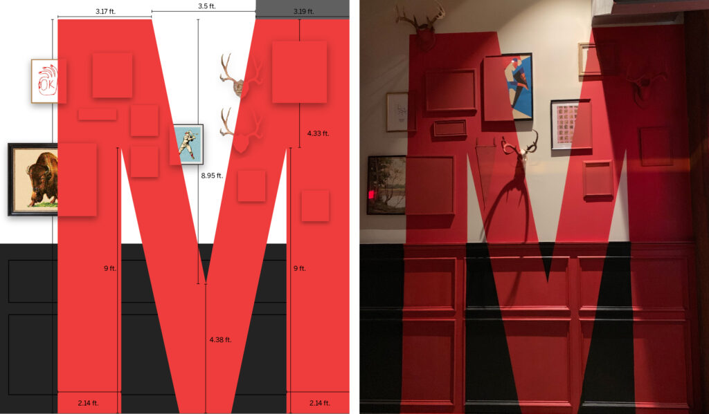
The Midwestern’s name gave us some great material to work with: the M. We started by creating expressions of the logo, and from there, using the M as a seal of the brand. A towering M on the front wall would greet visitors and the red M throughout—sometimes oversized and obvious, other times small and hidden—reinforces the branding.
![]()
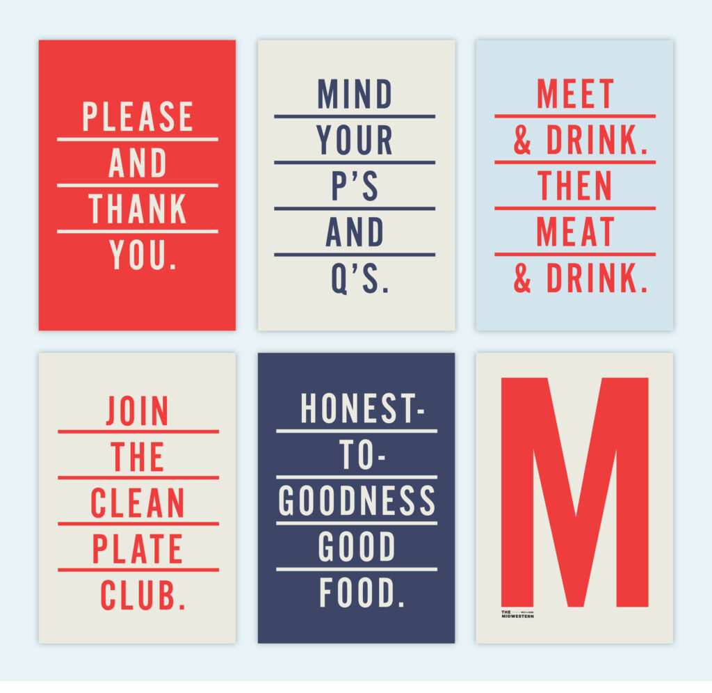
Brand Language that Gets the Job Done
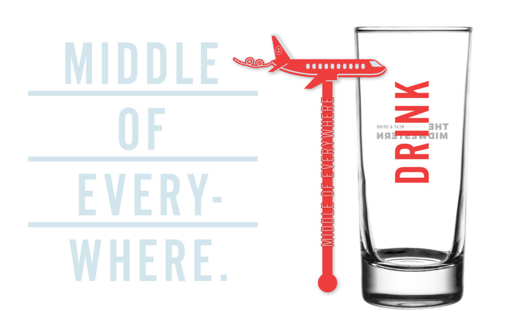
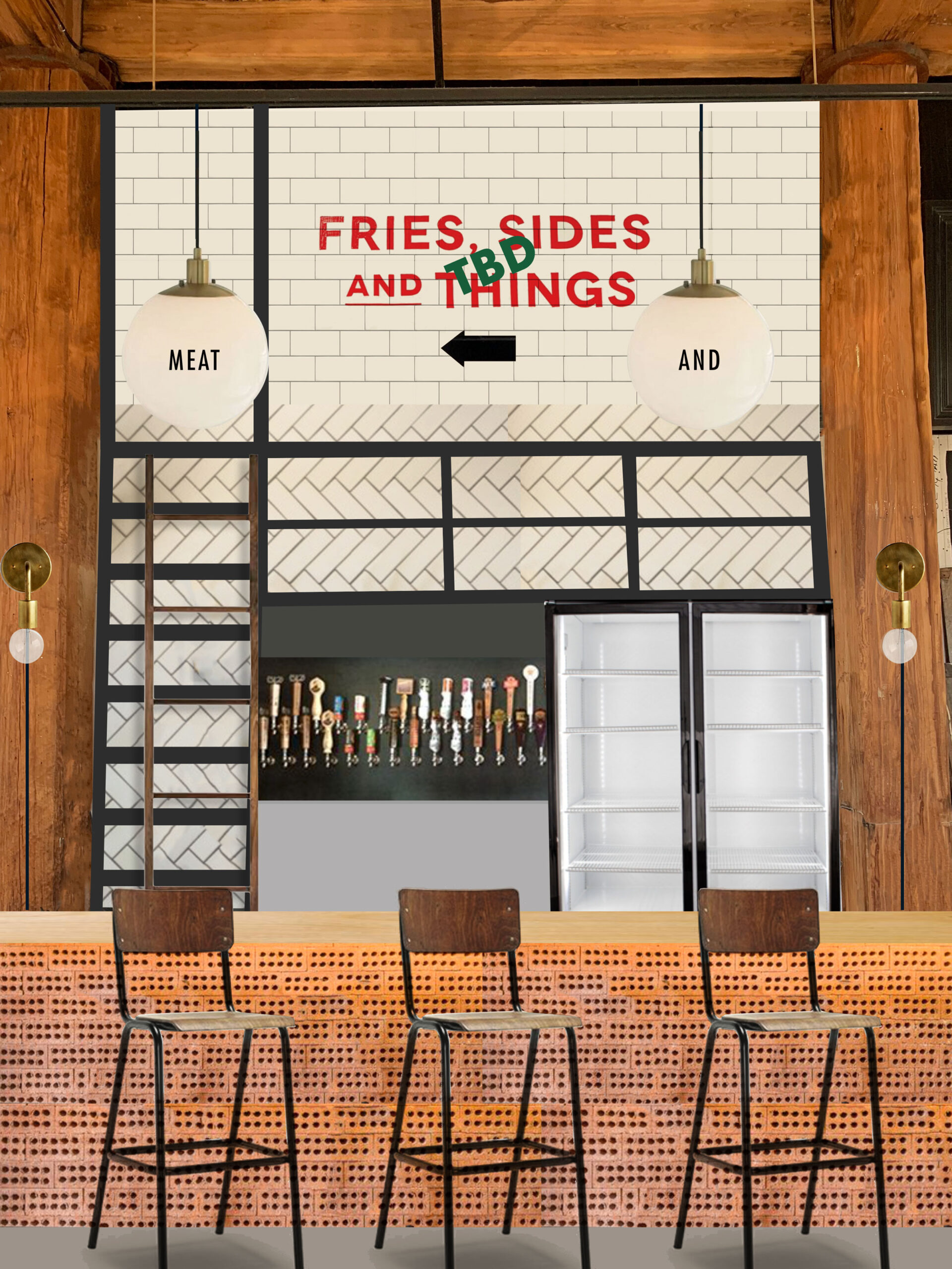
Words play a big part in The Midwestern branding. Inspired by heartland-raised, working class people, the language is confident but uncomplicated. It doesn’t try too hard. The signs and text used throughout the restaurant don’t beat around the bush—while still being polite.
The simplistic lines paired with the text provide the Midwestern team a scalable way to maintain consistent branding, from social media posts to future iterations of menus and signage.
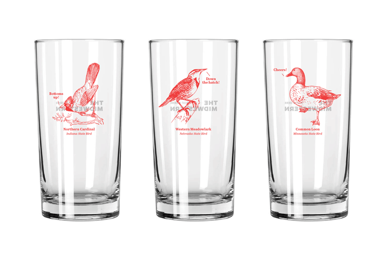
Celebrate the States
As proud as we are of our city, we knew the branding needed to reflect more than just St. Louis. Twelve states make up the Midwest, and each one boasts its own state bird, state slogan, state plant. We experimented with highlighting the facts on the barware and in details sprinkled throughout the space.
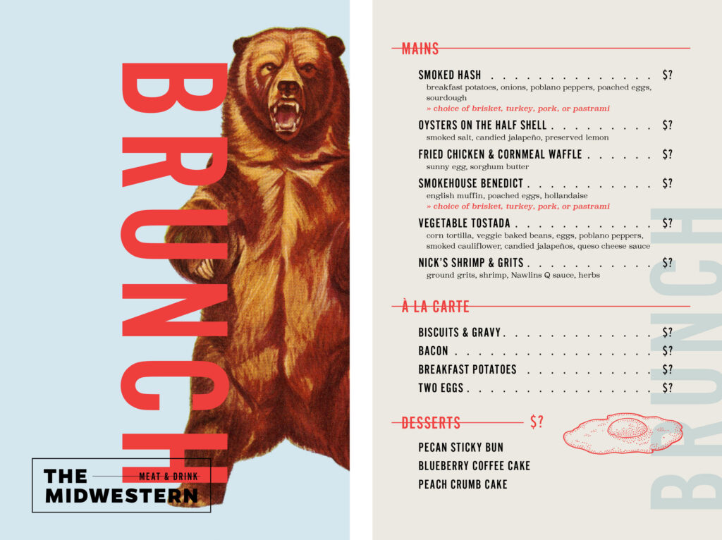
The line bisecting the logo translated well to the brunch, all-day and dessert menus. The menu designs were later featured on Under Consideration’s Art of the Menu.
The walls provided more opportunities to show off The Midwestern’s personality. For a while there was going to be an entire wall covered in Astroturf. Instead, we started mocking up custom wallpapers. This ended up being another great way to tie in state animals, as well as foods, creatures and objects found throughout the central states.
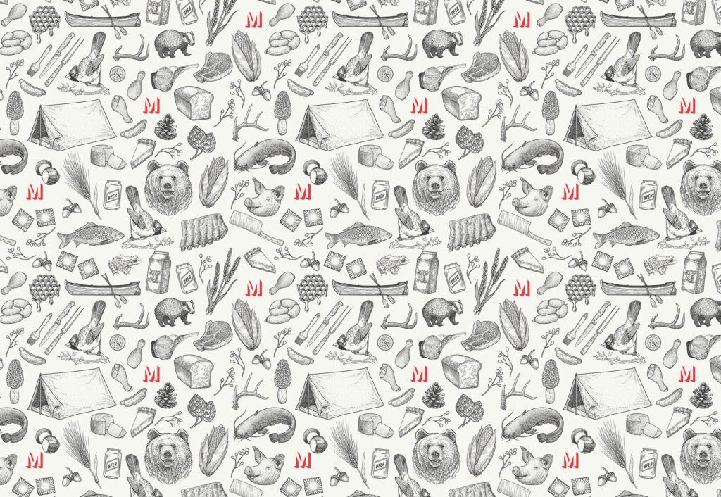
We knew we’d gotten it right when we sent Stephen our proposed design and he responded with an email saying, “The wallpaper is amazing. If I ever get tattoos, it will be all of this.”
It’s What’s on the Inside
As a nod to the Midwest’s strong industrial history, we sourced repurposed brick to line the length of the bar, and other materials like oak and brown leather to give the space a confident, masculine feel. The trough-style sinks in the bathrooms were custom made, and many elements were created by local craftspeople, including the giant red Ms, lettered by a sign-painting company, and tables made by the talented David Stein. (Thanks to Topcoat Signs, Swift Printing and Henley Forge for their amazing work bringing our creations to life.)
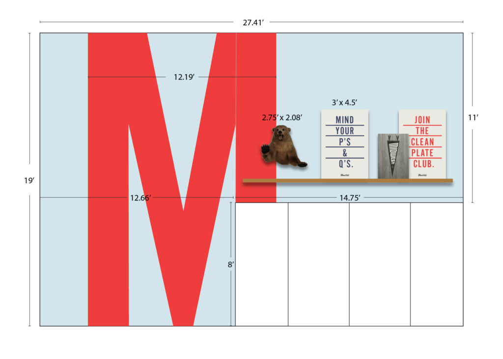
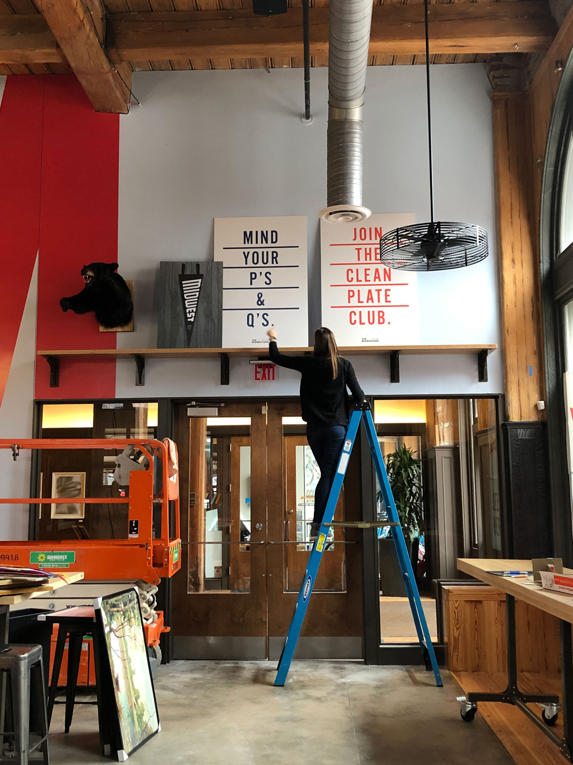
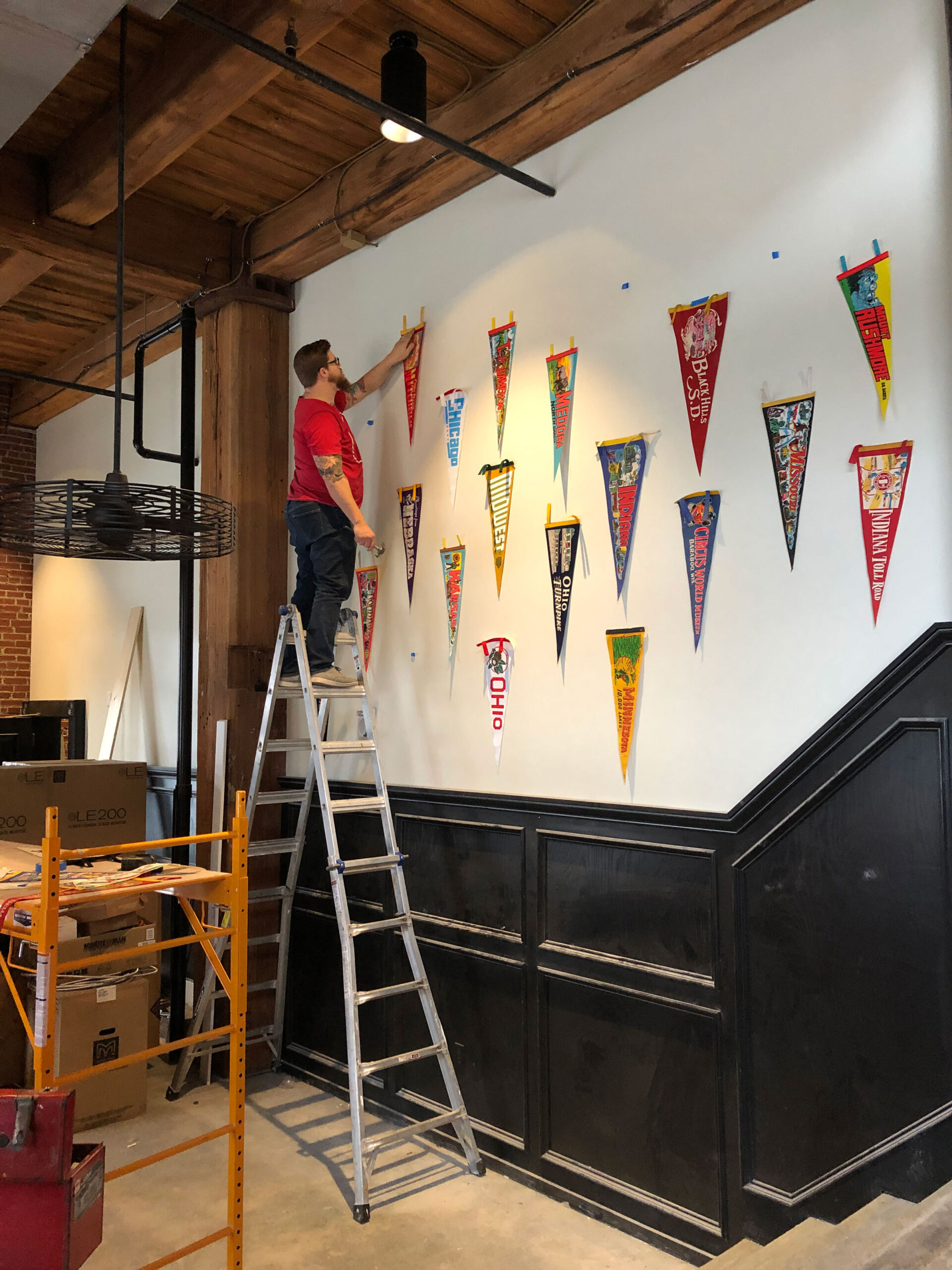
Our team also scoured thrift stores and the web for vintage pennants, art and old frames to give the space warmth and texture.
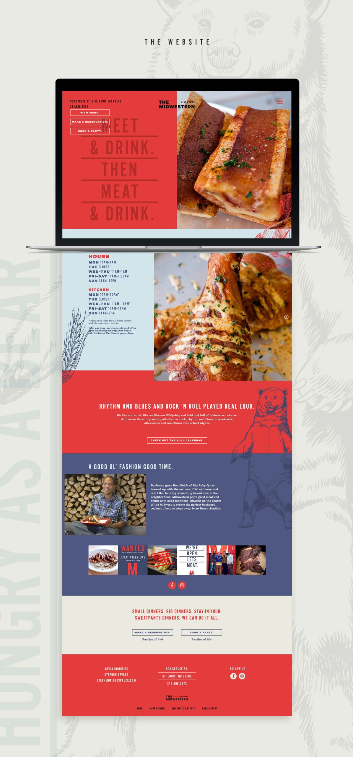
Taking the Midwestern to the Web
With a mouthwatering menu and live music playing several nights a week, the restaurant needed a strong website. We built a music calendar that the folks at The Midwestern can easily update as needed, plus an Instagram feed to showcase recent specials and events. Diners can easily peruse the various menus and see gorgeous photos of the dishes, as well as make reservations and book large parties right through the site.
This Land is Our Land
Everyone on the Atomicdust team learned something during this project, both born-and-bred Midwesterners and new transplants, as we explored the best ways to pay homage to our region. We’re proud of how it turned out and are grateful to Stephen and the whole team at 1000 Spruce for working as true partners on the project.
We were lucky enough to score an invite to the soft opening before The Midwestern opened its doors to the public this past weekend. The food and drinks deserve a whole separate blog post, but you shouldn’t take our word for it—go try it yourself.