Medical education has a bit of a problem.
Everyone agrees clinical training is important. Everyone agrees competency is what matters most. But most educational programs and health systems still rely on limited clinical exposure for the experience learners need.
Oxford Medical Simulation (OMS) came to us because they were solving that problem. Our job? To help them explain it.
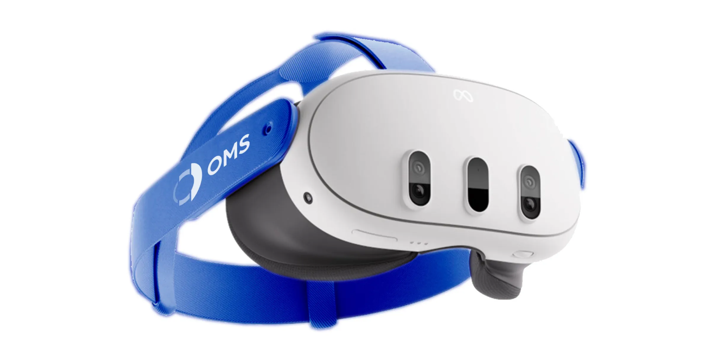
At first glance, OMS looked like every other AI and VR company in the medical space. Headsets. Scenarios. Digital patients. During our Branding Program, however, we uncovered a completely different story.
Going beyond gadgets to build a brand.
Our research made it clear: talking about headsets and simulations creates parity, not differentiation. And when it comes right down to it, OMS isn’t selling VR. They’re redefining what it means to be ready for real-world practice. VR just happens to be the way they’re doing it.
They’re also leading the charge to use AI to make their VR experiences more engaging and immersive. It’s an intentional application of AI built on real clinical experiences.
It’s a stark philosophical difference compared to most companies out there. This isn’t technology for the sake of technology. It’s not flash just to be flashy. It’s clinical technology with a defined, measurable purpose.
That thought, that this is all about clinical readiness and not VR or AI, is even more meaningful to the majority of the OMS audience. VR, after all, is a new, unproven concept for most people in healthcare education. And healthcare is one industry that thrives in evidence and proof.
After conversations with the client and other healthcare leaders, we tried to put ourselves in that moment that learners step into real practice for the first time. We donned the headsets and tried the simulations for ourselves, even though we don’t have any formal medical knowledge ourselves.
We felt the pressure. Made the decisions. Experienced consequences that really matter.
It totally changed the way we thought about technology and its place in medical training.
In short, OMS exists, not as a demonstration of VR or AI like the many entertainment-grade applications that exist today. It’s a healthcare-first platform that helps prepare people for real-world practice clinically, professionally and emotionally.
That’s where the concept really came to life.
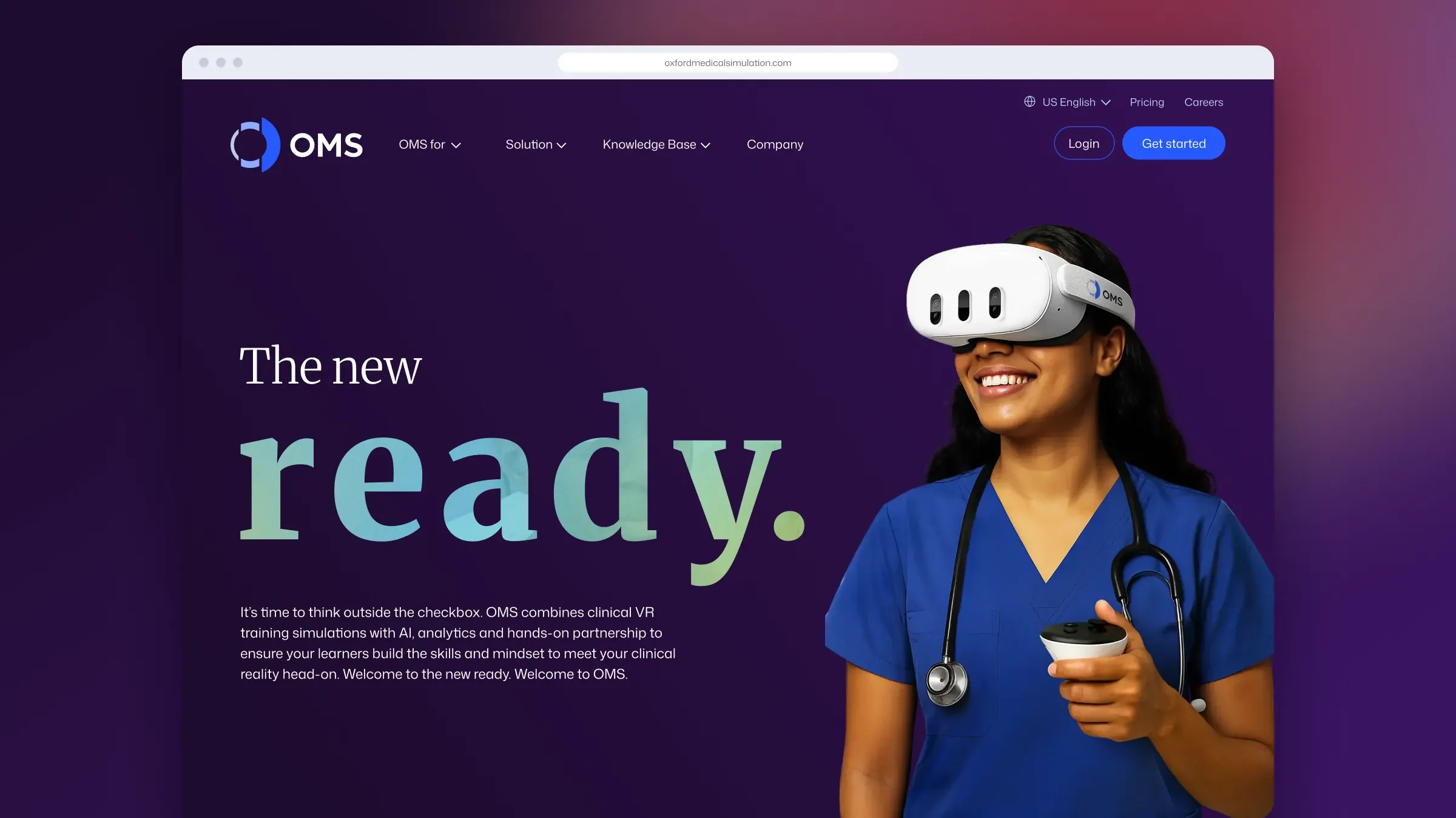
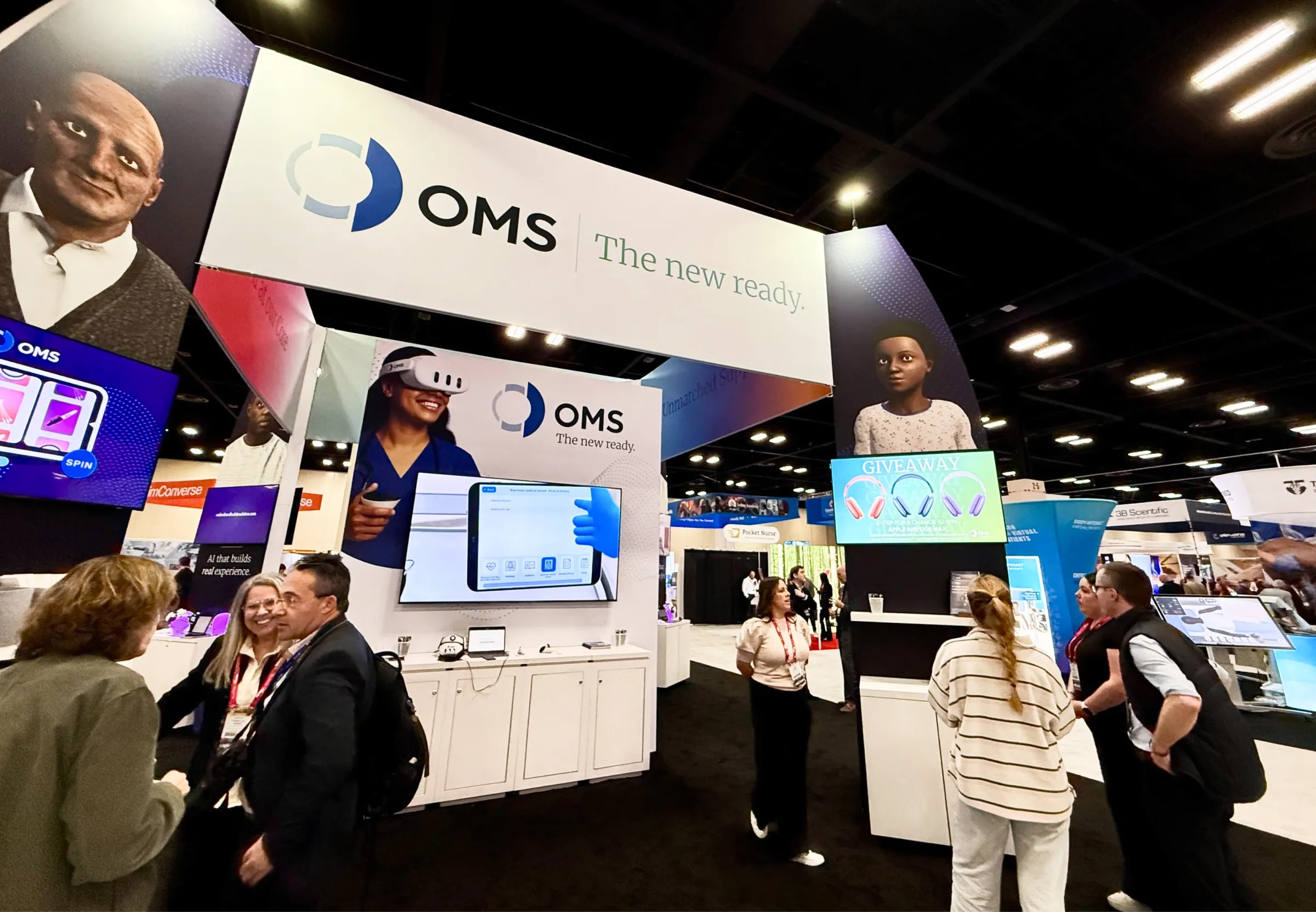
The new OMS tagline, “The new ready,” carries a lot of weight. It’s a bold promise in today’s world. The implication? To be ready for practice isn’t enough; you need the new ready.
While “new” in the marketing business gets dated quickly, here it achieves the exact opposite. OMS will always be innovating. Their team will always be redefining clinical readiness. Today, they’re using AI and VR to do it. Tomorrow, it may be something else. But their mission remains the same.
Blending medicine with technology for a next-era brand.
The OMS brand had to live in two worlds.
It needed to exude clinical authority. Traditionally, this meant being a bit more conservative, grounded in proof, not flash. And yet the brand also needed to feel at home in the tech space, with a bit of edge and maybe a hint of “disruptor” flavor.
After all, OMS is here to transform long-held industry approaches to clinical readiness.
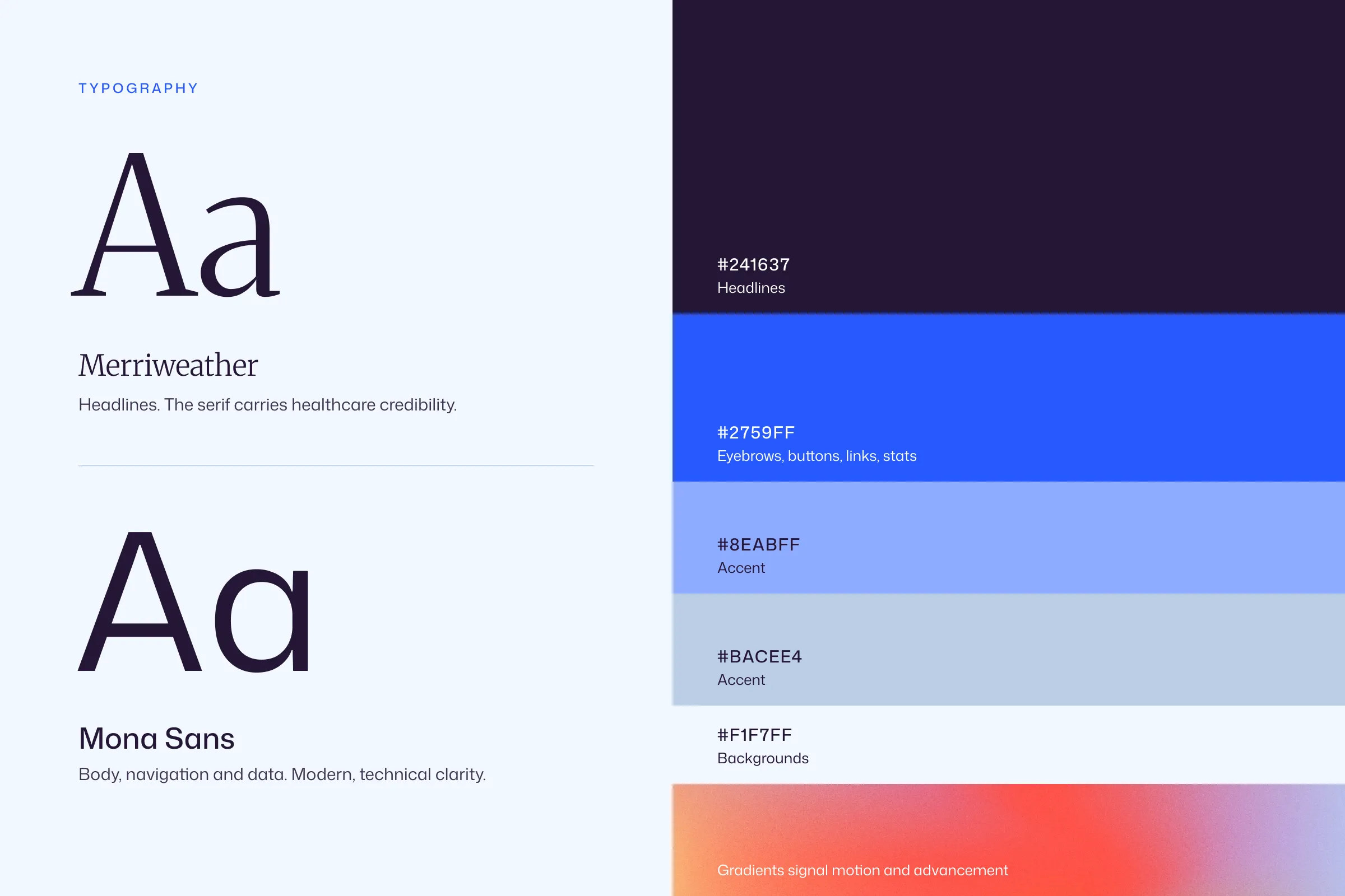
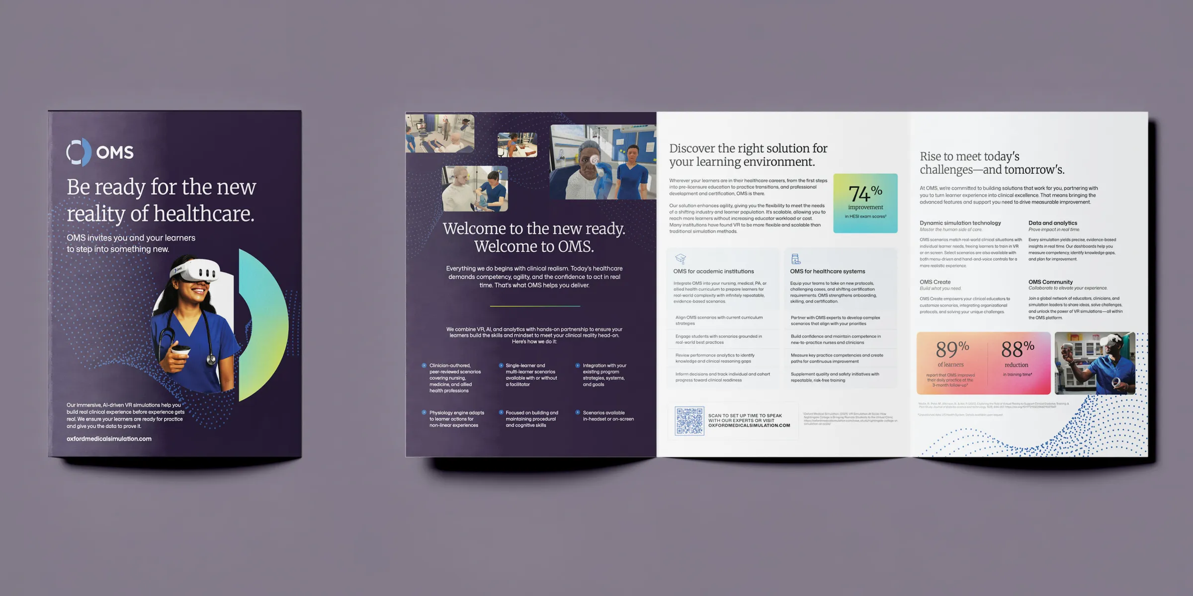
The visual system bridges those worlds through typography and color. A serif brings healthcare credibility. The sans serif lends modern, technical clarity.
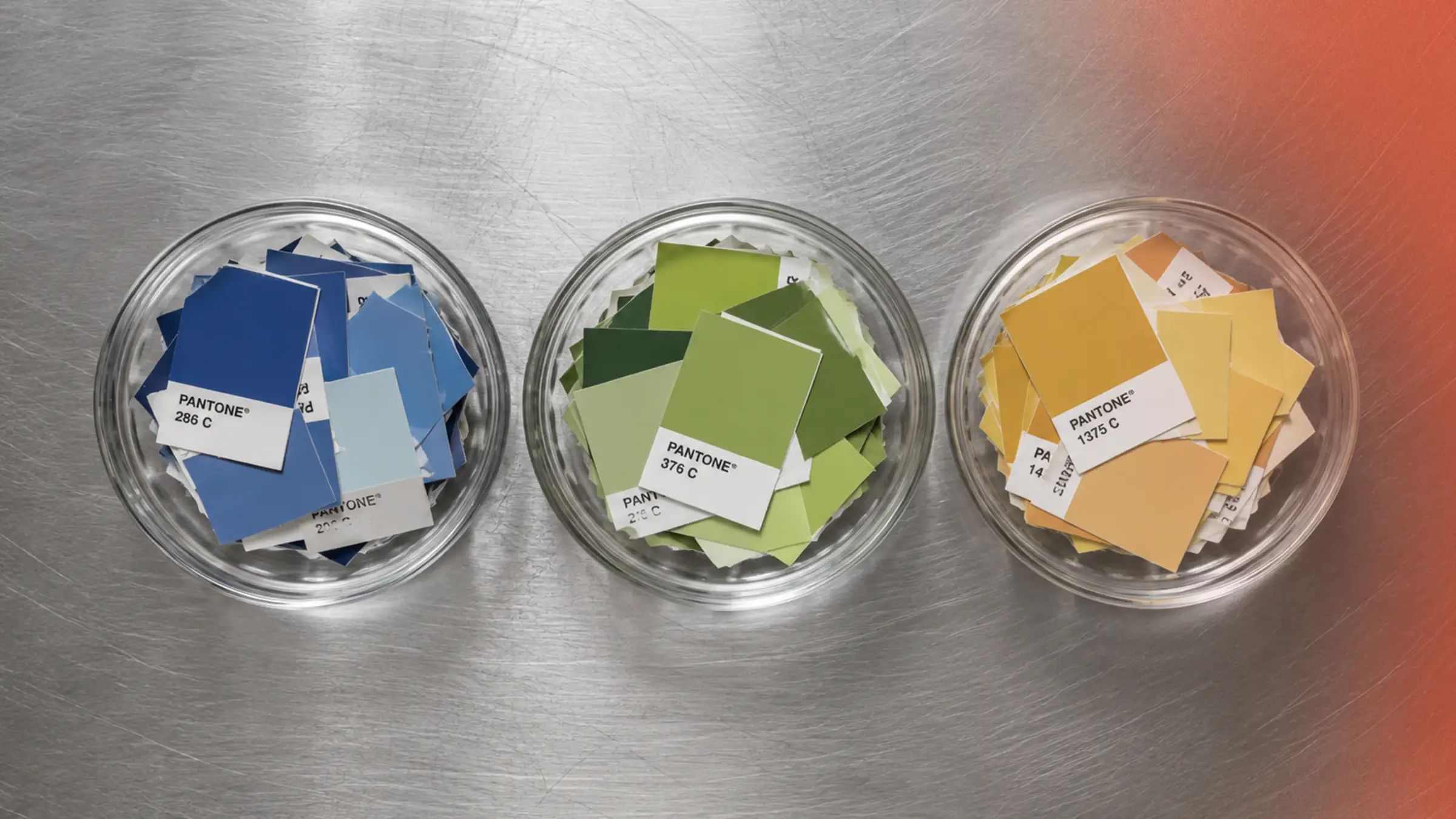
We also brightened their existing blue-forward color scheme, making it feel familiar to existing customers, but fresher, reflecting the idea that OMS is a trustworthy guide that’s evolving right alongside the practice of medicine.
The result feels at home inside a medical school or hospital, while still holding its own alongside technology leaders.
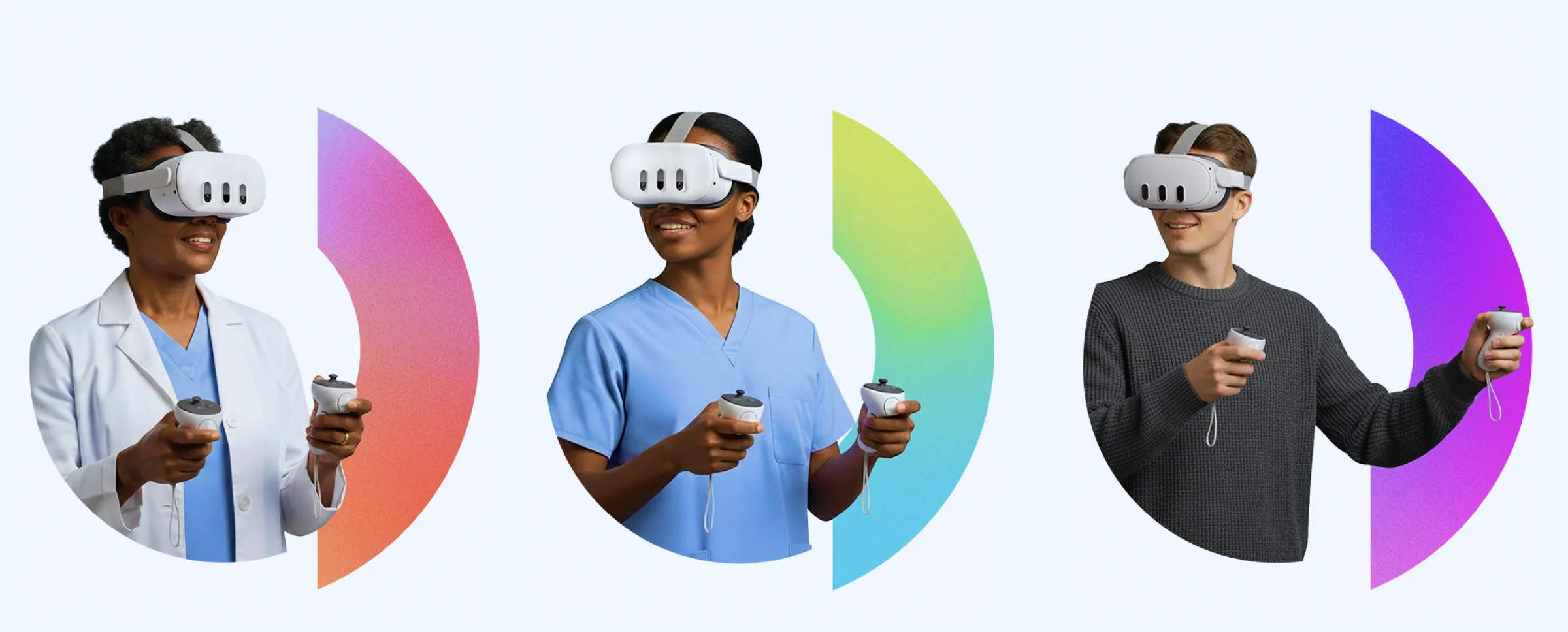
That balance extends into our use of photography, too. People are capable and composed. Technology supports the story instead of hijacking it. Gradients and motion demonstrate advancement, without drawing too much attention to the gadget. The focus here is on people.
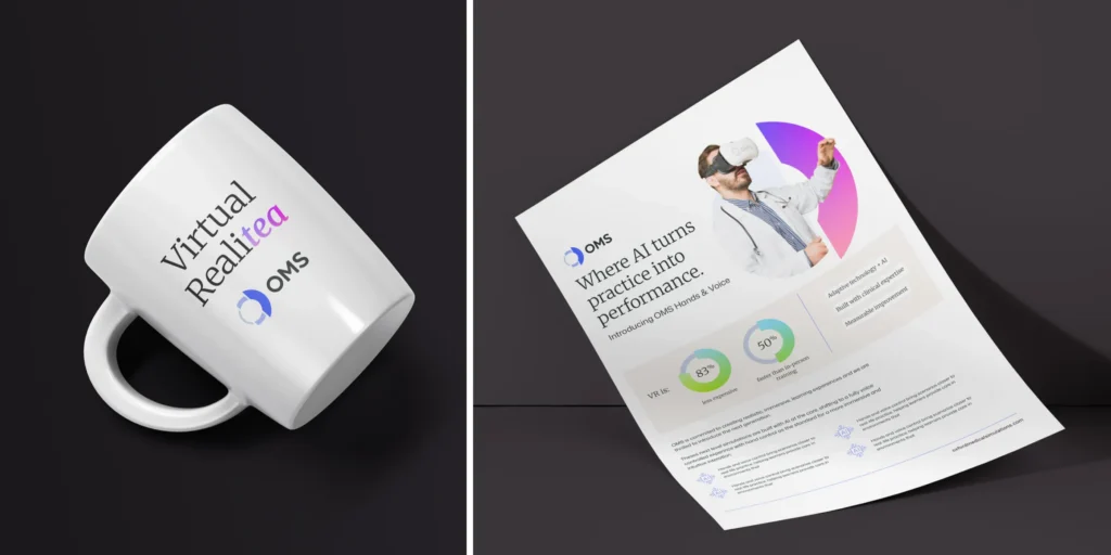
Our goal? When someone encounters OMS for the first time, they see a company that’s education first, technology second.
We held this thought front and center as we moved to the next phase of our project: the website design.
Multiple audiences. One website. Zero compromises.
As with many of the B2B websites we design and build, the website needed to talk to many different audiences, each with a unique set of priorities and even vocabulary.
Nursing education programs are focused on faculty workload and clinical placement shortages. Medical schools are focused on assessment and accreditation. Health systems are focused on staff competency and patient safety outcomes.
Educational programs have “students.” Professional settings have “learners.” Both have clear objectives and metrics.
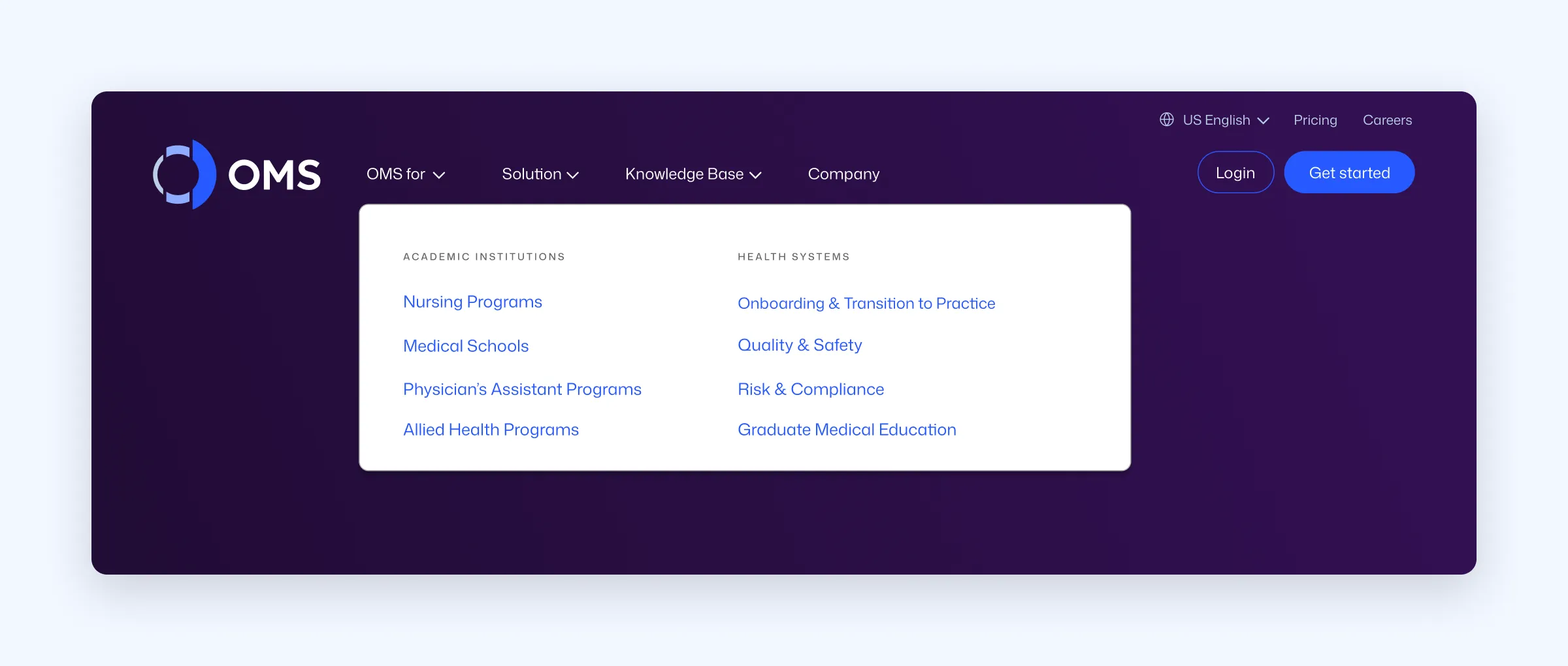
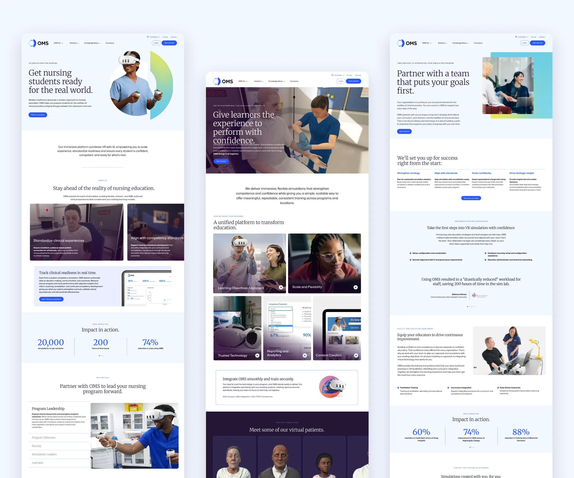
We built parallel sections for each audience. The structure stays consistent, so navigation feels familiar no matter where a prospect enters. The content adapts to who’s reading it, demonstrating, rather than just talking about, expertise.
Yes, technology is always present here, but it’s still in the context of real educational priorities and goals. Case studies, scenarios and outcomes are all carefully mapped to the priorities of each group, focusing on learning outcomes.
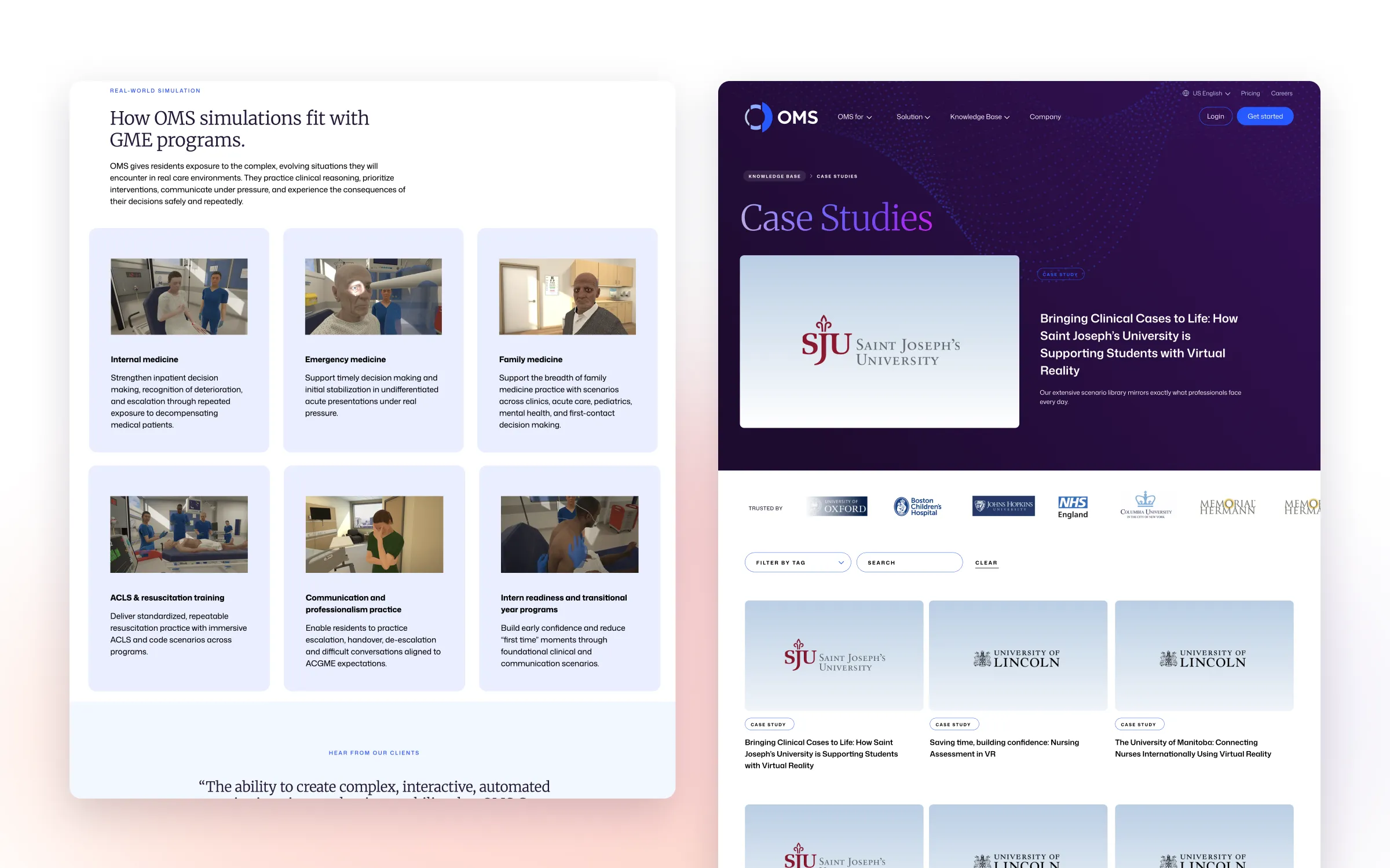
Here’s the thing about VR in healthcare: simulations rarely look dramatic or interesting in static screenshots. Yes, we have to show them. It’s the product. But we wanted to demonstrate what the scenarios enable, rather than just the technology itself:
Decision-making under pressure. A safe space to fail. Repetition without risk. Helping learners build real confidence before the stakes are real.
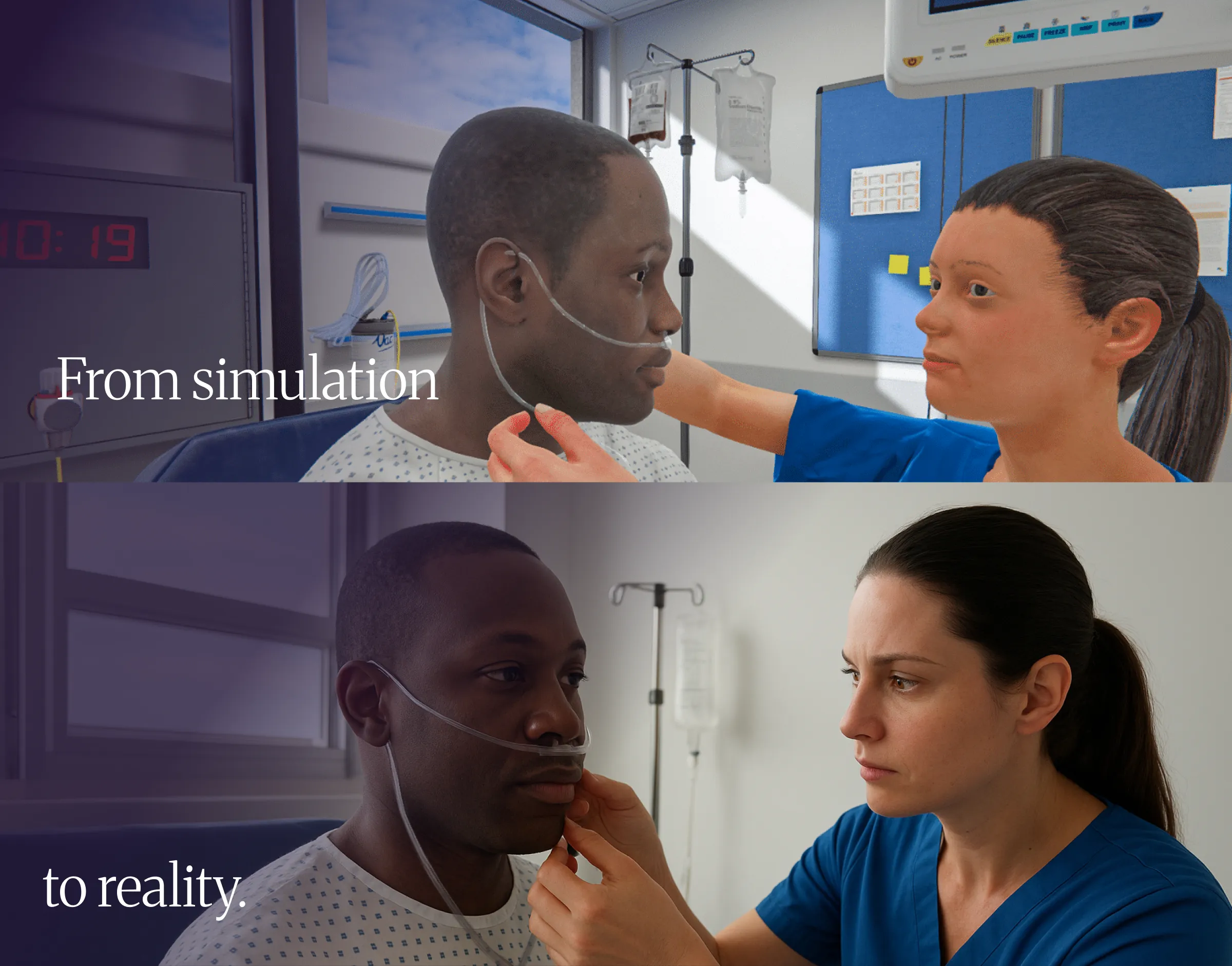
Just as we did in the narrative, on the homepage we framed the product as a bridge between virtual experience and clinical reality. It’s a tenet of the brand, but also of the technology behind it.
The message becomes less about visual realism and more about professional impact. That’s a much more compelling story than any VR or AI company could tell.
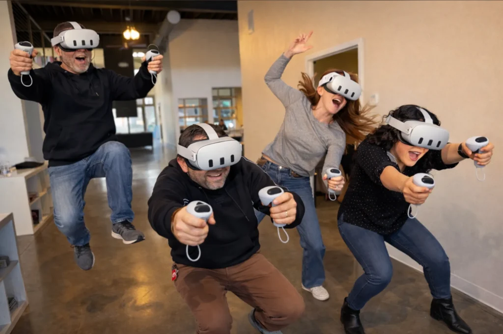
The website is just the beginning.
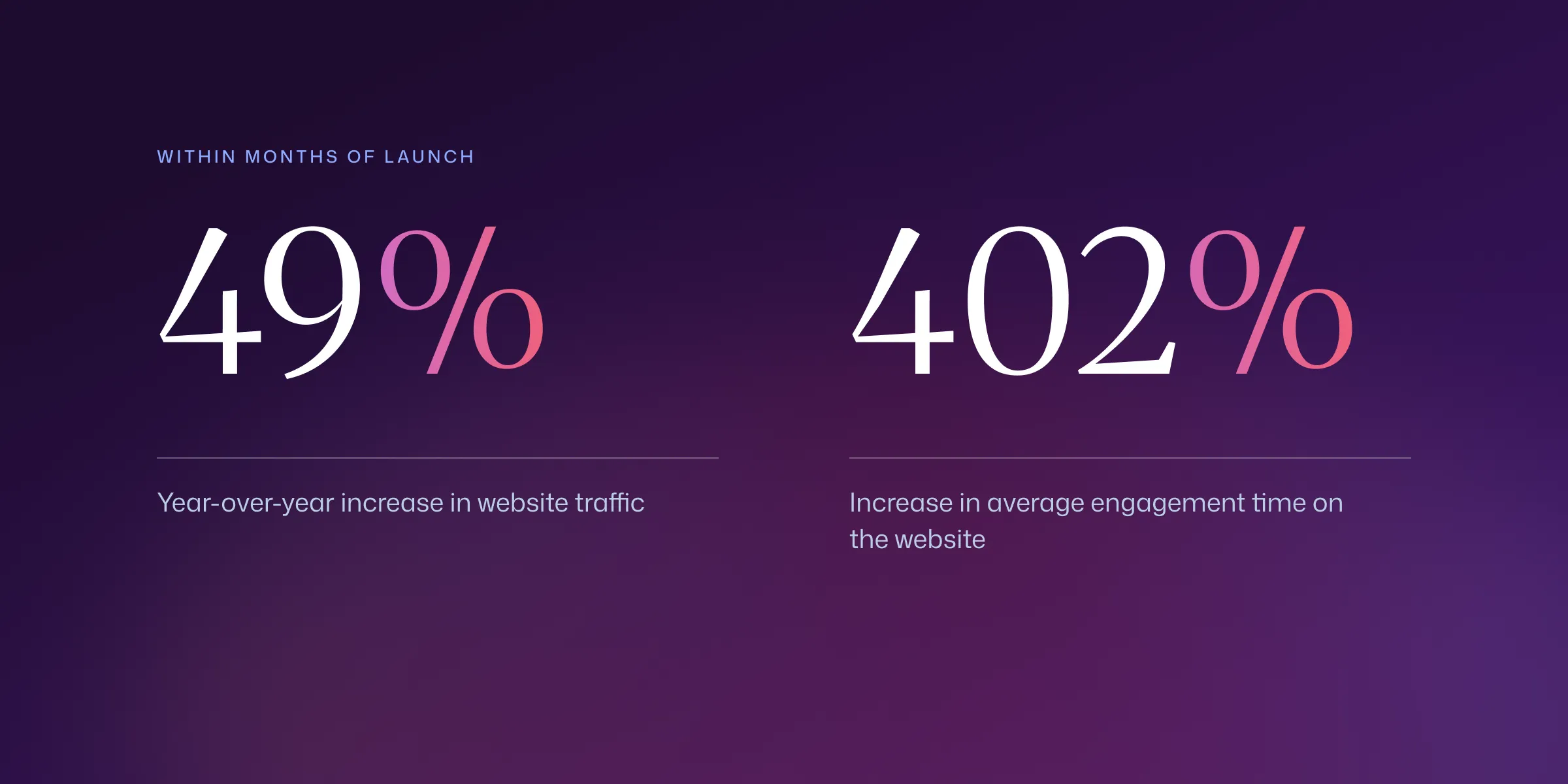
Within a couple months of launching, the impacts of the new brand and site were clear. Year over year, the site saw a 49% increase in traffic. Average engagement time on the website increased 402%.
But the best part of the OMS brand and website is that they are not designed to be static.
As technology evolves and the company’s products and services move forward, the brand will still support them. Again, it’s about readiness, not a fixed technology. As new modalities emerge, the story still holds. “The new ready” still reflects where people want to be.
OMS didn’t come to us for a better way to sell VR. They didn’t want to push AI on an AI-weary world. They needed a way to explain why preparation itself is being redefined. We’re honored to have been a part of this story.