Understanding Responsive Website Design. An Overview for Marketing Managers
.gif)
We’ve been reading a lot about responsive website design on the web (it’s a very popular topic) and thought we would put together an overview for Marketing Managers that might have questions about the topic.
What is responsive web design?
Responsive (some people call it adaptive) website design is a concept where a website is built with multiple size screens in mind, and the design elements and content scale and rearrange themselves according to to best fit the visitor’s screen.
So the same website you see on your computer just scales and reshuffles itself to work on your mobile phone. There aren’t two separate versions.
With responsive web design, you have a website that looks and works great on a laptop, tablet and mobile phone.
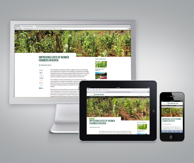
The Monsanto Blog is responsive and works great on monitors, tablets and mobile phones.
Why is responsive web design worth talking about?
A few years ago, when more people started thinking about mobile website design, the thinking was that a brand would have a ‘regular’ version of their website, and a ‘mobile’ of their website. Both versions would feed off the same content management system, or worse, have to be updated separately.
The problem with multiple version of a website is that it doubles the work, fragments marketing efforts, and often delivers a ‘light’ version of a website for the mobile visitors, delivering a static version of limited-scaled down content.
So how can you make your website responsive? Plan ahead.
It’s not easy to take an existing website and make it responsive. The technology itself isn’t the barrier. It’s just a challenge to take a website designed for a specific screen size and retrofit it to be fluid and responsive.
Sometimes, it’s just more practical to rebuild the entire site, and to do so with mobile and responsive web design in mind. You can plan the layout accordingly and use best practices to determine how content will be arranged on different sized screens.
Responsive design is awesome.
In a time where most of us are glued to our mobile phones, mobile is becoming the primary web browsing experience. When your site doesn’t adapt, you set yourself up to disappoint your visitors as they try to deal with tiny drop down menus, hard-to-read type, weird light boxes, constant scrolling and more.
Earlier this year at Atomicdust, we made a shift in thinking. We now aim to ensure the websites we build work on mobile devices, not for an additional service to sell to our clients, but because its the responsible thing to do.
The internet has outgrown the desktop, and responsive web design is a way for you to deliver your brand on whatever size screen their customers or clients may be in front of at the time.
 Mike Spakowski is Principal / Creative Director of Atomicdust and is involved with the day-to-day design strategy, art direction and studio management.