University City is a melting pot of cultures. Bordering the city of St. Louis, U.City, as it’s affectionately called, is home to people of different backgrounds, colors, ages, religions and economic levels. It’s about as diverse as you can get – and that’s what makes it wonderful.
But the diversity that makes U. City such a great place to live isn’t always reflected in the schools.
Over the years, as more and more parents sent their children to private schools, the public schools in U. City became less diverse (and so did the private schools). And with that divide, some misguided perceptions were established.
How does branding fix that? How do you change perceptions? How do you help students, faculty and parents see that each U. City School offers a welcoming, vibrant environment, where all kids can succeed? How do you build pride?
Getting Started
The School District of University City asked Atomicdust to create a campaign for their high school Open House leading into the 2017 school year.
The Open House is a great opportunity to get families to tour the school and meet the faculty. It’s an invitation to the community to see what the school district is all about. And they wanted the branding for it to be something that students, faculty and the community could all rally behind.
To us, the words “branding” and “reputation” are interchangeable.
The School District of University City didn’t just want a branded campaign, they wanted a reputation. A reputation they could be proud of.
We knew that the Open House campaign was the first step in correcting negative perceptions people might have of the public school district, and share how great an environment U. City was building for the neighborhood’s kids – whether they attended that particular school or not.
Like their mascot, it was time for this lion-based organization to roar – and we were excited to help.
Our exploration of the School District of University City’s logoInspired by the Hallways
Even though the Open House is held at the high school, it really puts the whole school district on display. So, we started off just like any prospective family would – with some tours.
We walked the hallways of each school in the district, talked with faculty, and saw the smiling faces of the students.
The historic buildings that house the schools are filled with energy and culture, and it seemed like every hallway was covered in art.
Bright, colorful murals.
Handmade posters and message boards.
Positive messages.
It was fantastic.
Every Kid Needs a Champion
Back at the office, we looked to prolific educator, Rita F. Pierson, to gain a deeper insight into what makes the biggest difference in a classroom environment. In one of her talks, Pierson explains that kids learn best when they have a positive, encouraging influence in their life. That teaching and learning should bring joy.
Joy!
We wanted to build a brand that had the same effect.
(If you have eight minutes and are interested in future of our world, you should check out this video.)
Early inspiration for our U. City workBelieve in U
We knew that in order to represent the school district in a genuine way, it needed to feel organic and welcoming. Our branding solution had to appeal to more than just high school kids. It needed to be relevant to elementary and middle school students, and their parents too.
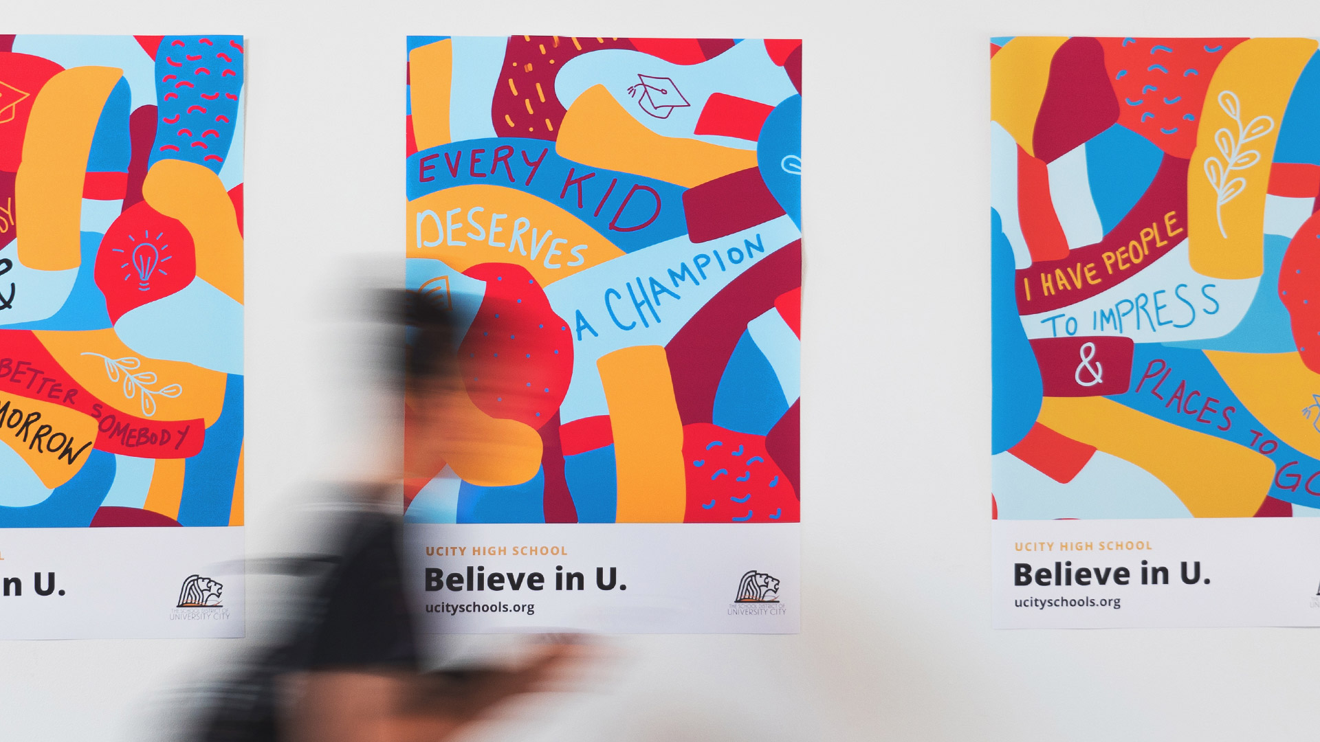
Inspired by the hallway art, we mixed bright colors and playful patterns with handwritten messages inspired by Pierson. The brand came to life.
And then, we gave them a rallying cry.
Believe in U serves as a reminder that the school district believes in and supports their students, faculty and the community itself. Literally, “we believe in you, and we believe in U. City.”
More than that, it’s a call to the students, faculty and community to take pride in U.City.
Bringing It All Together
We loved how clearly the letter “U” represented not only our brand language, but the community (and school) itself. We brought the pieces together using the school’s colors and iconic lion logo.
With the visual identity and brand language in place, we created key pieces for the Open House, including welcome kits, yard signs, and alumni fundraising materials. We also provided working files so the school’s internal marketing team could create their own branded pieces, or expand on the campaign over time.
Building a Brand (and Building Reputation)….
As fans (and myself, a former resident) of U. City, we really loved working with The School District of University City. It was inspiring to see such positive, vibrant energy in education. It certainly helped shape our branding work, and we know it will help shape the future of the school district and community.
Want to keep up with the latest work from Atomicdust?
Subscribe to our newsletter for all the latest news, events and weekly marketing tips from our team.