If you’ve watched TV lately—the old-school kind with ad breaks—chances are you’ve encountered an ad for insurance. It may have featured a small green gecko, a catchy jingle or my college classmate Kevin (who now answers to Jake and exclusively wears red).
Insurance companies are vying for your attention (and the attention of every driver, renter, homeowner, boater and business owner) for good reason. The industry is worth a staggering $1.4 trillion—it’s fiercely competitive and largely controlled by huge corporations. Amidst all this, there are fewer independent agencies that genuinely advocate for their clients.
Enter Crane Agency: the oldest independent insurance agency west of the Mississippi. When they approached us to help evolve the company’s brand, we knew we had to respect their long-standing legacy and emphasize their independence to set them apart from the competition.
A Brief History
Charles L. Crane, the son of a steamboat captain, founded Crane Agency in 1885. The agency got its start writing insurance policies for barge owners traveling the busy Mississippi.
In the century since its founding, the company has grown and expanded its services, reach and network of brokers—all while avoiding acquisition, preserving its independent status and serving business owners in the Midwest and beyond.

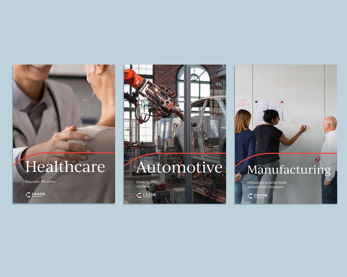
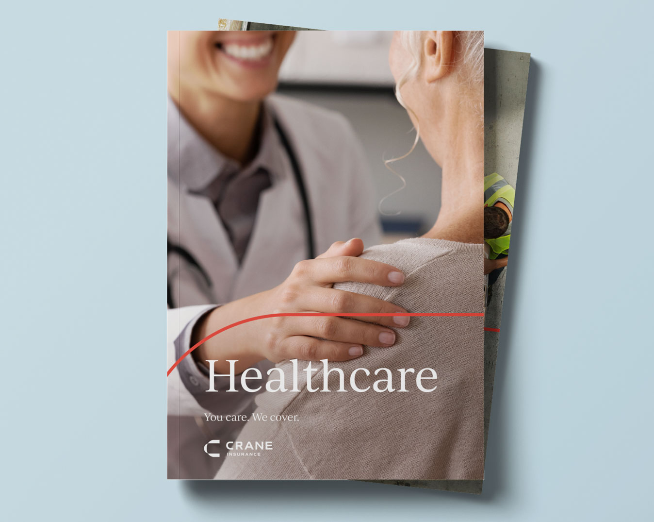
However, maintaining consistency across 95 independent brokers isn’t easy. Different logos, letterheads, sales sheets and email signatures were all being used to represent Crane.
It was time to unite the company under a modern brand identity. One that would establish credibility, stand out in the crowded industry and resonate with clients—and, perhaps just as importantly, the brokers who would need to adopt it.
We just needed to figure out how.
Change for Growth
When a client like Crane Agency asks for help evolving their brand, we focus on a lot more than a shiny new logo or tagline. We develop a foundation for success, designed around the needs of the company as well as its people, audiences and future.
Our first step involved talking to brokers, leaders and department heads to understand how a new brand identity could prepare the agency for the future.

We discovered Crane Agency’s deep commitment to their clients and the value they place on long-standing relationships. Being business owners themselves, Crane’s brokers understand the competitive market, the high stakes and the opportunities that business owners face.
Their goal was to be more than an insurance vendor for their clients: they wanted to be advocates, finding proactive solutions and empowering business owners to be bold, knowing they’re backed by a trusted advisor.
Future-proof your B2B strategy. Subscribe to Atomicdust’s newsletter to gain an unfair advantage in the ever-evolving B2B landscape.
So, we set out to create a brand that honored Crane’s rich history while capturing their commitment to clients and independent spirit.
Lead With Confidence
We started drafting language with a goal of giving Crane a distinctive voice, a clear marketing position and messaging that instilled confidence in their clients.
But I’ll admit—we stared at a blank page for a long time. In an industry inundated with players offering the same services and competing for attention, how could we cut through the noise and present a fresh point of view?
The answer was right in front of us. Crane’s deep-rooted culture of independence, personalized care and an unwavering commitment to clients inspired language that not only captured the essence of Crane but also resonated with the needs of today’s consumers.
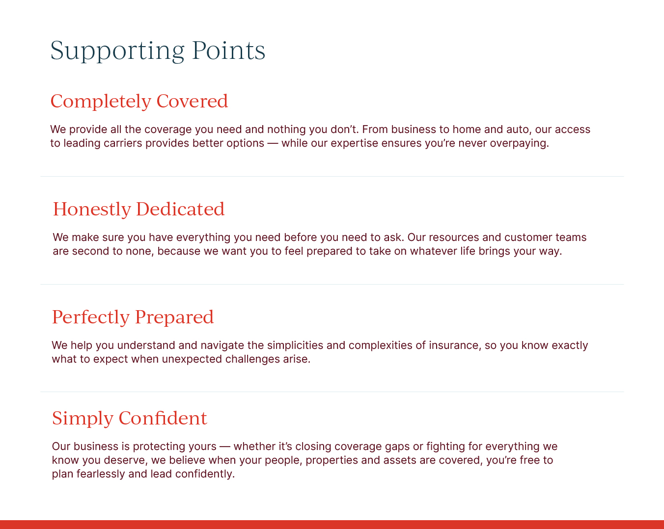
We highlighted Crane’s role as advocate and protector, giving the company an edge over competitors. The result was a powerful narrative that underscores the agency’s unique philosophy and enables them to stand out in a crowded field:
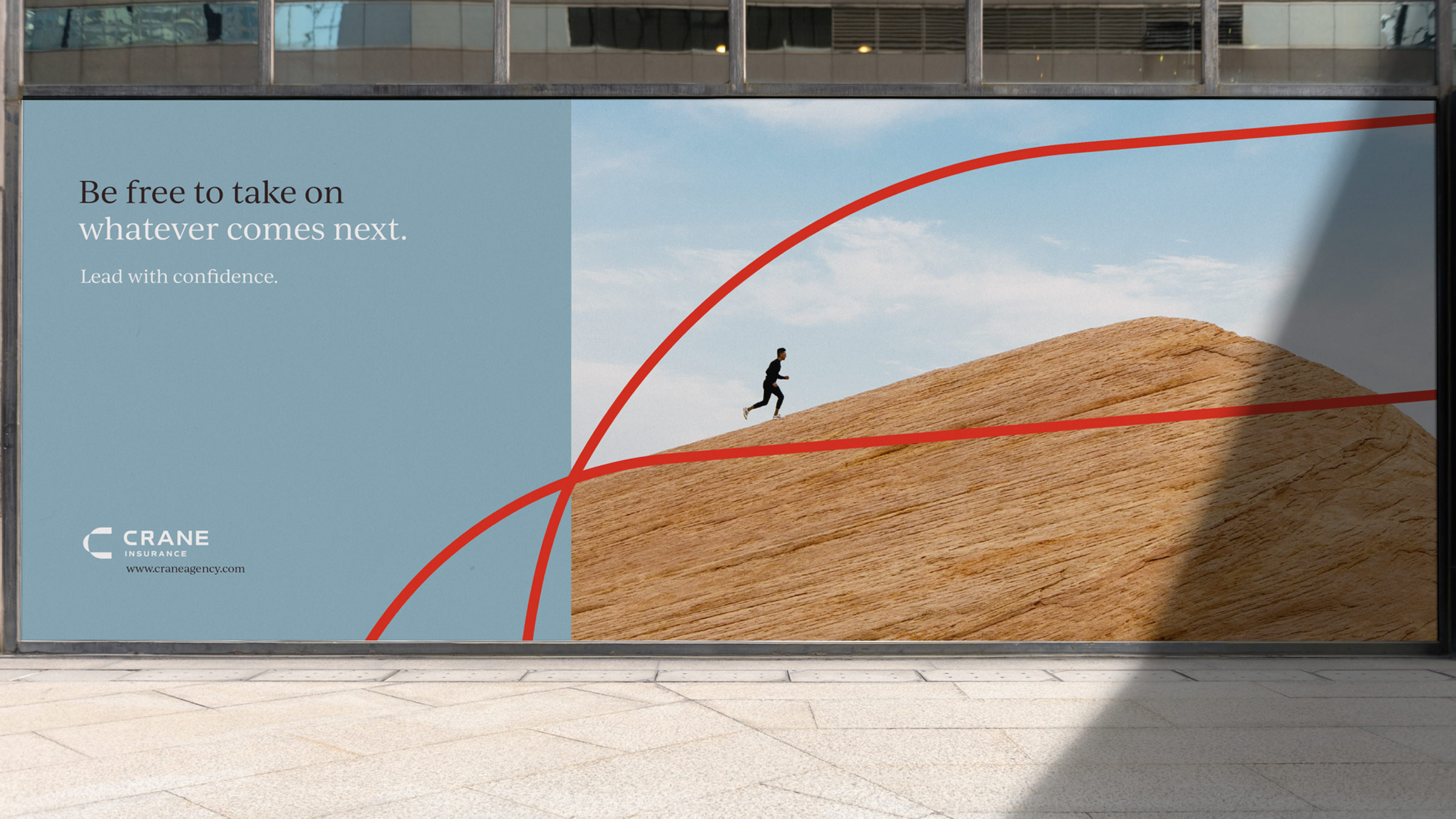
It’s rare for an insurance brokerage to encourage clients to make bold moves.
But we understand business. The competition, the stakes… the possibilities.
The amazing things that happen when leaders are free to take on whatever comes next.
We can help you cover your business and carry your worry.
We are your advocate in an ever-changing world. Always here to provide clarity so you can lead with confidence.
The tagline, “Lead with confidence.” became the powerful cornerstone of Crane’s positioning. It highlights their dedication to guiding clients through business insurance complexities, preparing them for life’s twists and turns.

Another meaningful line, “Be free to take on whatever comes next.” emphasizes the peace of mind Crane offers and the ability to seize future opportunities with a trusted insurance advocate.
We had crafted a strong and unique voice for Crane. But a brand’s visual identity also plays a crucial role in capturing its essence.
And we had to get that just right if the new brand was going to be a success.
Life’s Twists and Turns
Maintaining the balance between the past and the future was one of the major challenges we faced when evolving Crane’s brand mark.
![]()
![]()
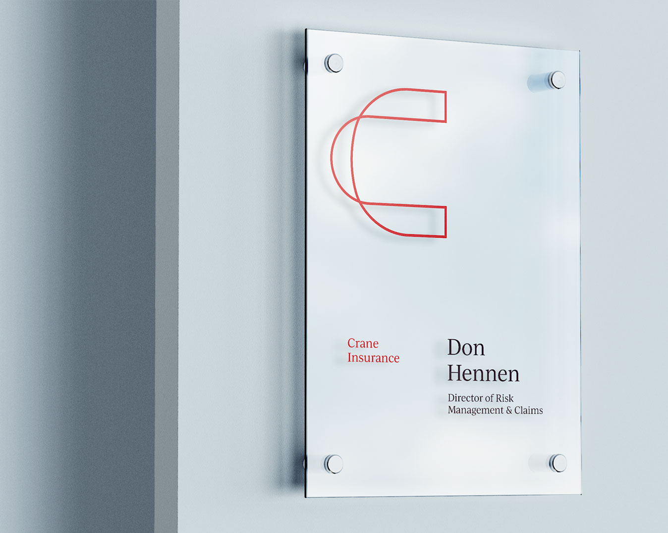
We aimed to create a design that symbolized growth, guidance and upward movement, reflecting Crane’s evolution and progressive approach, but we also wanted to honor Crane’s long-standing “C” mark. The architecture of the new mark is an illustration of life’s twists and turns—an embodiment of Crane’s journey, represented in the curves of the “C.”
Some could even perceive it as the winding Mississippi, a nostalgic nod to the agency’s origins.
Preserving the brand’s history, we retained its signature maroon, but complemented it with a lively and adaptable secondary palette with a brighter red and soft blues.
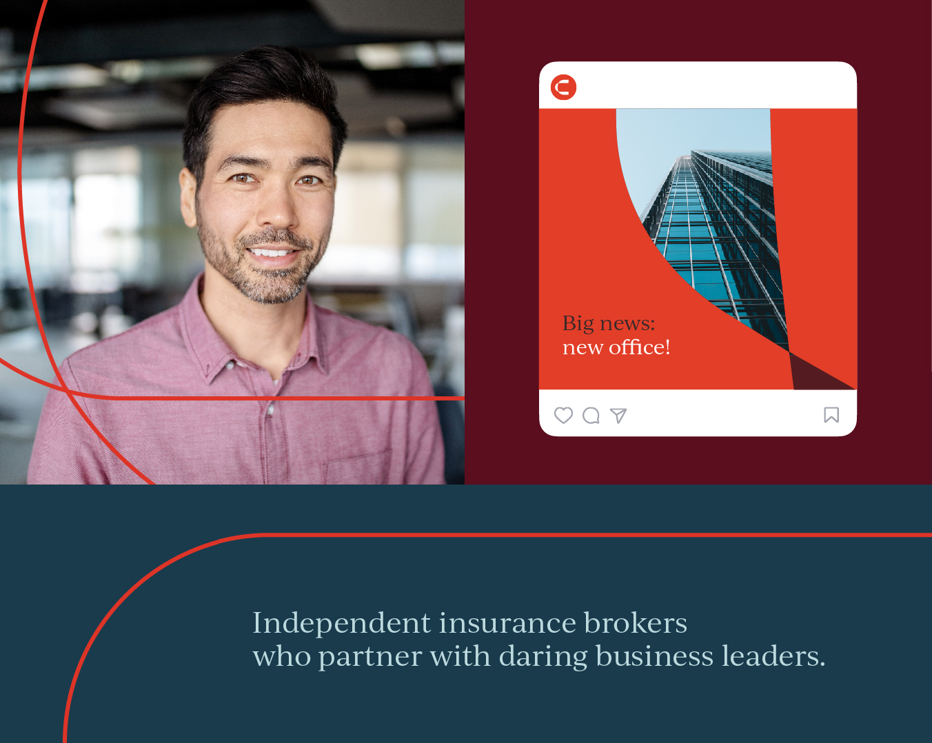
A modern, inviting and vibrant visual representation was key in attracting the next generation of brokers and clients while still resonating with their existing clients.
Free to Take on Whatever’s Next
The next step was to unveil the new brand to the internal company—the brokers and teams who make Crane Agency what it is. We wanted this moment to be impactful, generating excitement, fostering a sense of unity among the team and encouraging everyone to embrace the transition from older logo iterations to a cohesive, refined future.
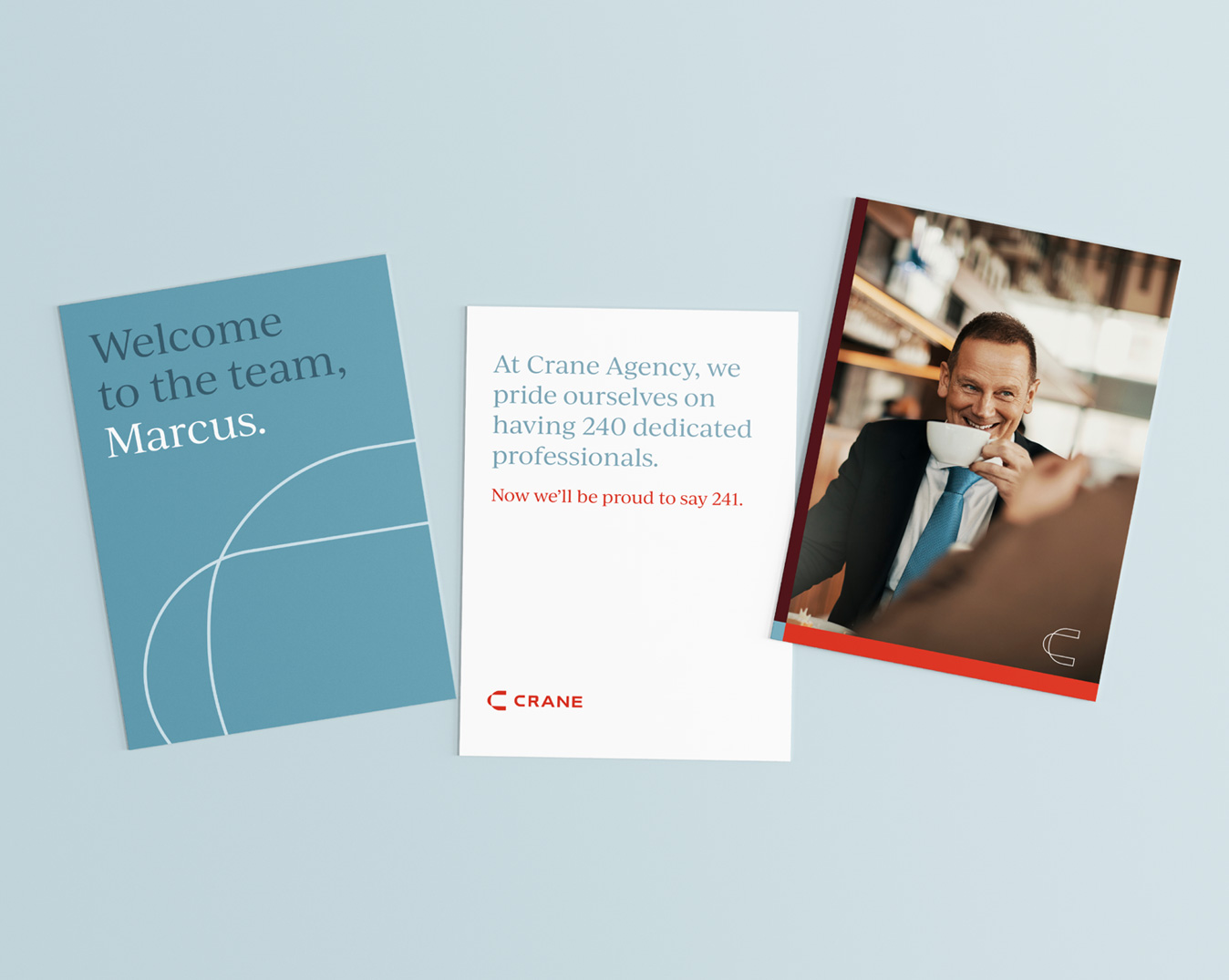
This event served as a rallying point for brokers and internal teams, motivating them to embrace Crane’s legacy with renewed confidence and purpose. New collateral—fresh PowerPoint decks and sales sheets—and of course, swag, helped build the excitement and adoption around the new brand.
Of course, a brand needs to be upheld everywhere, and align with a business’ ongoing marketing strategy, to really have the biggest impact. Shortly after the brand launched, we set to work launching content marketing and digital ads to help the new Crane reach a whole new audience.

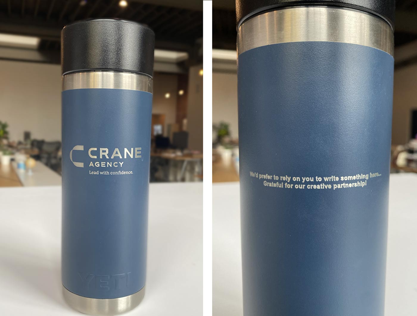
After the launch, the Crane team surprised us with custom travel mugs engraved with their new logo and a thoughtful message. The thermoses are coveted around our office.
We are honored to have played a role in Crane Agency’s brand evolution. And we’re excited to witness their continued success in the ever-changing world of insurance—no geckos or khaki pants needed.