Atomicdust has been designing and building websites for almost two decades, and even though a lot has changed, one thing hasn’t: a good user experience, or UX, is vital.
We specifically look at UX when we plot out our clients’ customer journey maps. Every stage has opportunities for improvement, whether it’s incorporating best practices or addressing things customers have encountered problems with.
Here are some common pain points we’ve encountered, and how to avoid them to improve your UX.
1. Asking for information that’s already been given or should already be known.
You probably know the old saying, “The only certainties in life are death and taxes.” I propose we add a third certainty for the digital age: sharing our personal info. Giving out information—name, location, email address—is unavoidable for anyone who uses the internet. It’s become commonplace, but it’s still annoying.
When a user shares their information, it’s the company’s responsibility to keep it and not ask for it again. (The only exception: security checkpoints used to verify identity.)
For example, I recently got an email from a certain B2B marketing platform offering a downloadable ebook. But when I clicked through, I could only access the ebook after giving them my email address—even though said company already has it. And just used it to tell me about the ebook. It’s a frustrating experience, to say the least.
Your site should answer users’ questions, not ask them annoying questions they’ve already given you answers to.
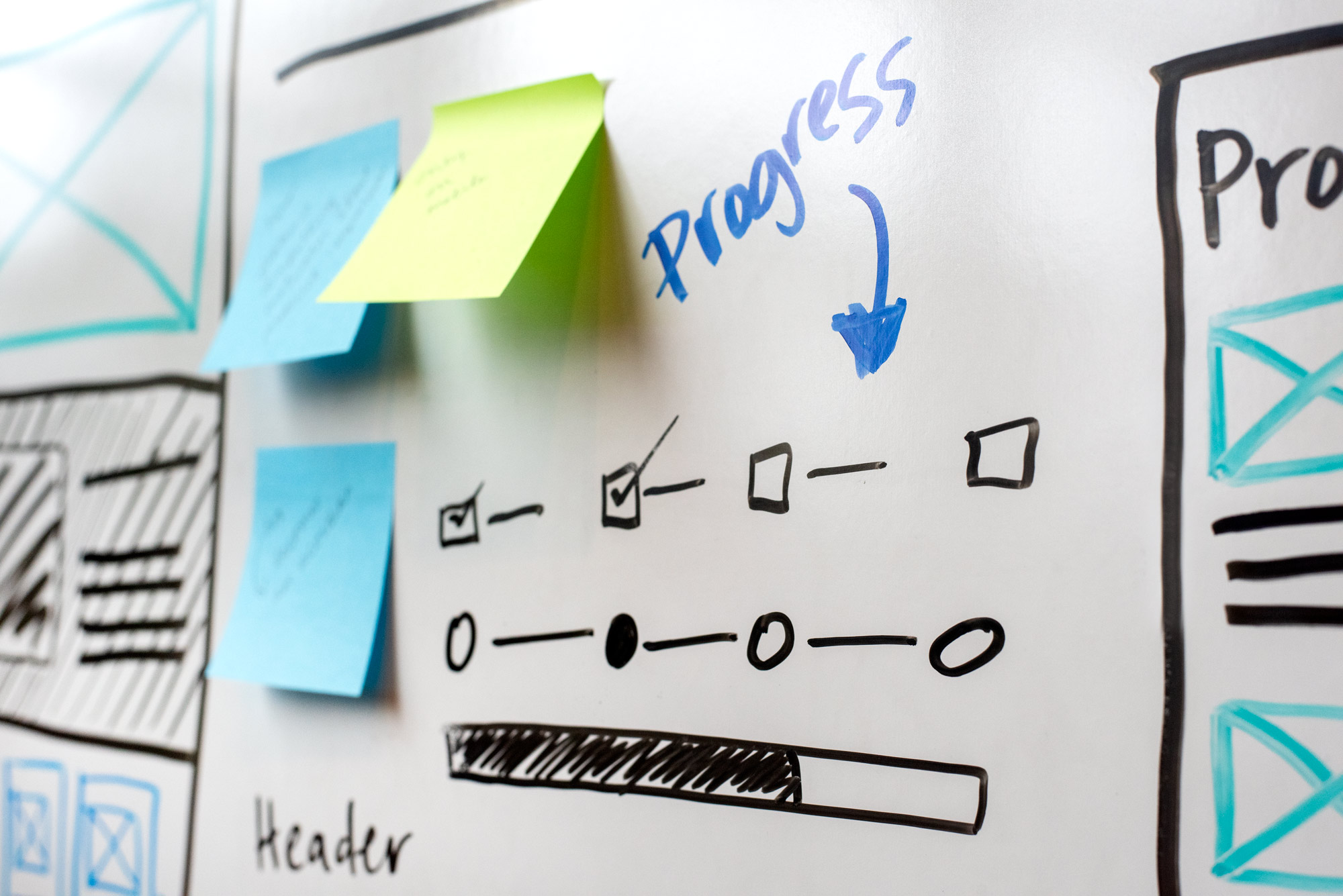
2. Not communicating expectations or where people are in the customer journey.
No one likes feeling unsure or like they don’t have control in a situation, and it’s no different online. Visitors expect to know exactly where they are in any given process and what they need to do next.
Way back in the 90s, Jakob Nielsen created the 10 Usability Heuristics for UI Design. The first one? Visibility of system status, which basically means this: more-informed people make better decisions.
Put another way, “A lack of information often equates to a lack of control.”
At Atomicdust, we call this “no dead ends,” and keep it top of mind when we’re designing websites. The user should always end the experience with either a next step in mind or a clearly defined expectation, whether that’s planning to visit a company in-person, waiting for a phone call from a sales rep or checking their inbox for a confirmation email.
Try doing an audit of your website and see if a new client or prospect would have a solid understanding of what’s going on at each step of the journey.
3. Making obviously self-serving recommendations.
The goal of marketing is always to convince people to do something—sign up for a service, buy a product, support a cause. But there’s a fine line between nudging someone to do something and being so assertive it’s off-putting.
Users want to believe that you’re on their side. Even when promoting a product or upgrade, marketers have to position it as a benefit to the client.
When prospects feel like a company is pushing them too hard down a certain path, they’ll actually revolt at the lack of freedom and do the opposite of what you’re suggesting. (There’s even a word for this: reactance. Here’s a great article with examples and help on how to avoid triggering it.)
Make sure the calls to action and microcopy on your website support a positive experience, and don’t use fear or aggressive language in an attempt to persuade.
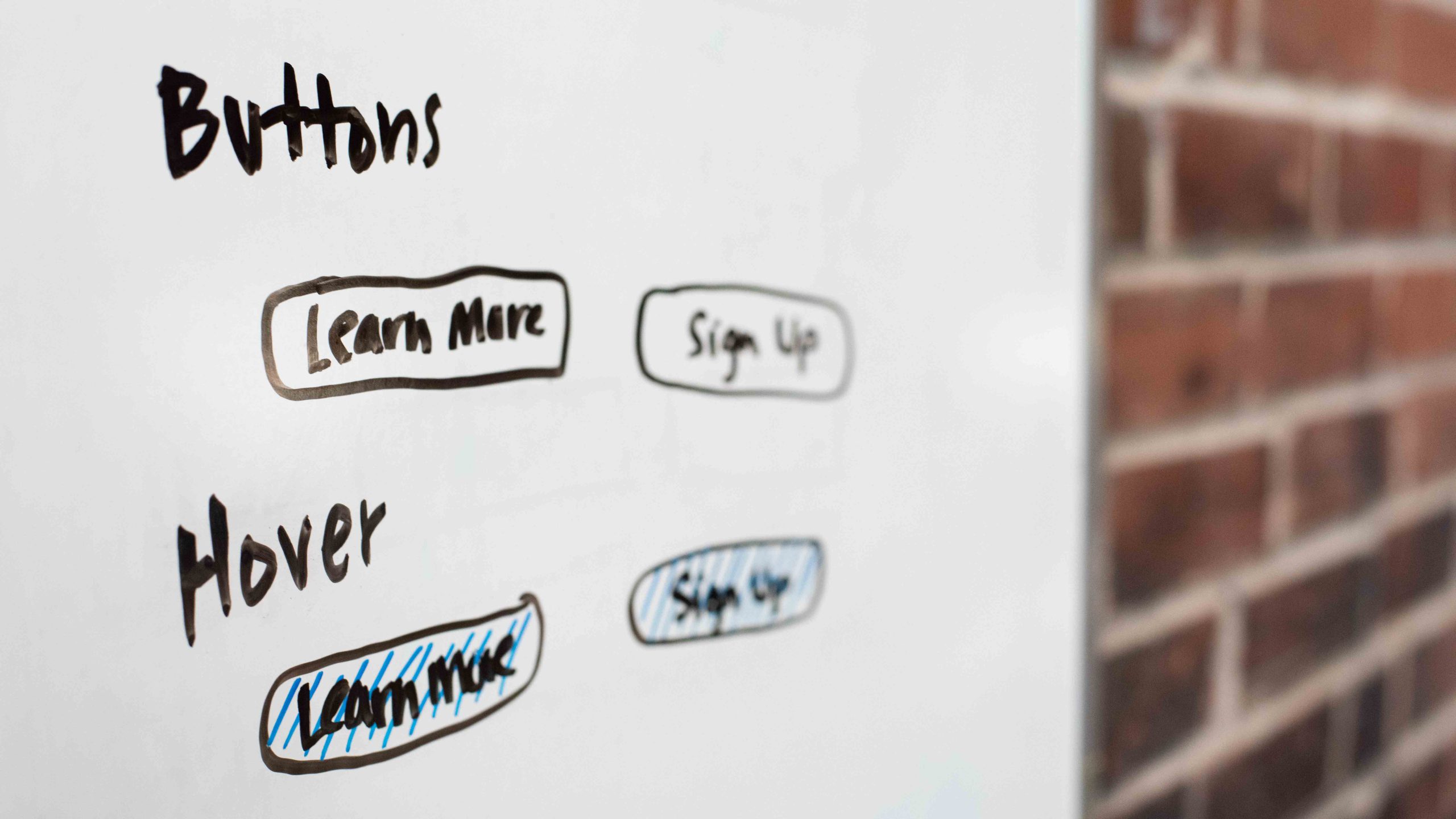
4. Using inconsistent designs or user flows.
Consistency throughout a brand experience is important for brand awareness and affinity, but it should be considered in the UX design too. Just like lack of communication, inconsistency on a website will lead to a user feeling unsure and uncomfortable.
The more consistent the experience is, the easier it will be for visitors to learn how to navigate the site. This can mean anything from button designs and hover animations to headline fonts and image type.
Don’t get me wrong: I’m not saying you should keep your website the same forever or make every page look like a clone of the one before it. But changes and improvements should align with the UX—and brand look and feel—as a whole. A site should be consistent enough to build trust in the user, but unexpected enough to delight and keep visitors interested and coming back.
5. Burdening visitors with unnecessary information.
Every morning as I get ready for work, I ask our smart speaker about the weather. We have a Google Dot in one part of our house and an Amazon Alexa in the other, so the answer varies. The Dot tells me, “The forecast for St. Charles, Missouri is partly cloudy with a high…” while Alexa says, “Today’s forecast is partly cloudy with a high…” Notice the difference? Google includes unnecessary info before giving me the answer—I don’t need to know my current location, I’m here.
People are interested in what they want to know, not necessarily what you want to tell them.
Take a look at your website. For each step in the journey map of the site, ask yourself if the information is what the prospect wants to know at that point. Is the burden of knowing/reading the information valuable to the experience? The less unnecessary info you can load onto your user, the more freedom they’ll feel. And, as we know from reactance, people who feel their freedom is intact are more likely to buy.
Awesome UX, here you come.
Just like other aspects of marketing and business, keeping the client in mind when making decisions and designing your UX will lead to happier clients and better sales. When in doubt, put yourself in your clients’ shoes and ask yourself if every aspect of your site is making things easier, more intuitive and enjoyable.
Need help revamping your customer journey or improving the UX of your site? Let us know!
Let’s stay in touch! Keep up with the latest from Atomicdust.
Subscribe to our email list for all the latest news, events and monthly marketing tips from our team.