In our first meeting with M+H Architects, they said something we’ve found to be very common in business-to-business marketing.
“We’re always behind the scenes. Our brand isn’t recognized anywhere. We’re doing this amazing, cutting-edge work, but no one knows about us.”
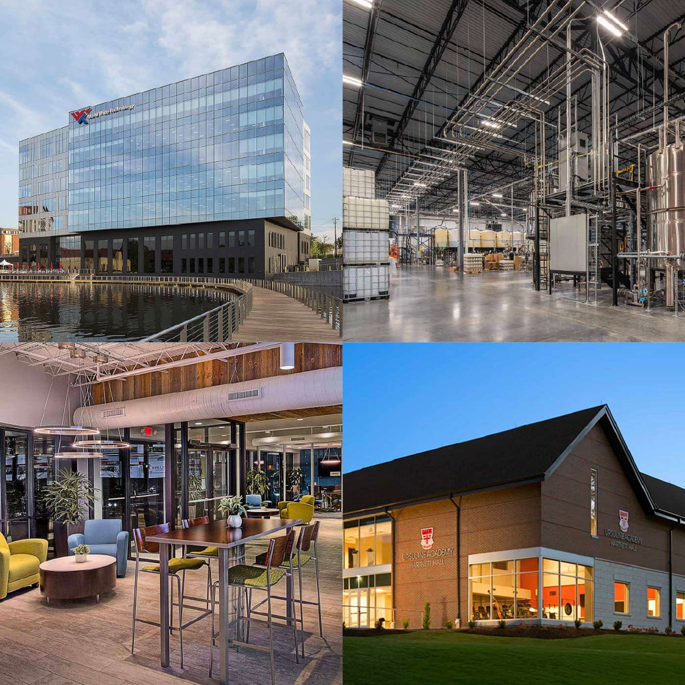
It made sense. M+H was known for designing spaces that were important to businesses (warehouses, office buildings, distribution centers) but weren’t the type of architecture typically making headlines.
Even against this challenge, the firm was growing. Their team had recently completed some high-profile projects (including some schools, churches and office buildings you might be familiar with if you live in St. Louis)—but didn’t have a strong brand to put behind them, or platform from which to share them.
M+H needed an updated brand that would capitalize on the company’s recent successes and elevate its reputation. And they needed a new website design that would drive business, of course—but also attract new talent to the growing firm.
But wait, there’s more! They were also moving to a new office, and turned to us to provide new ideas, graphic elements and pieces of personality they could use to complement their larger, more modern space.
No pressure, right? Building a brand that would be both digital and physical, influencing both external and internal audiences?
It’s a good thing that’s exactly what Atomicdust was born to do.
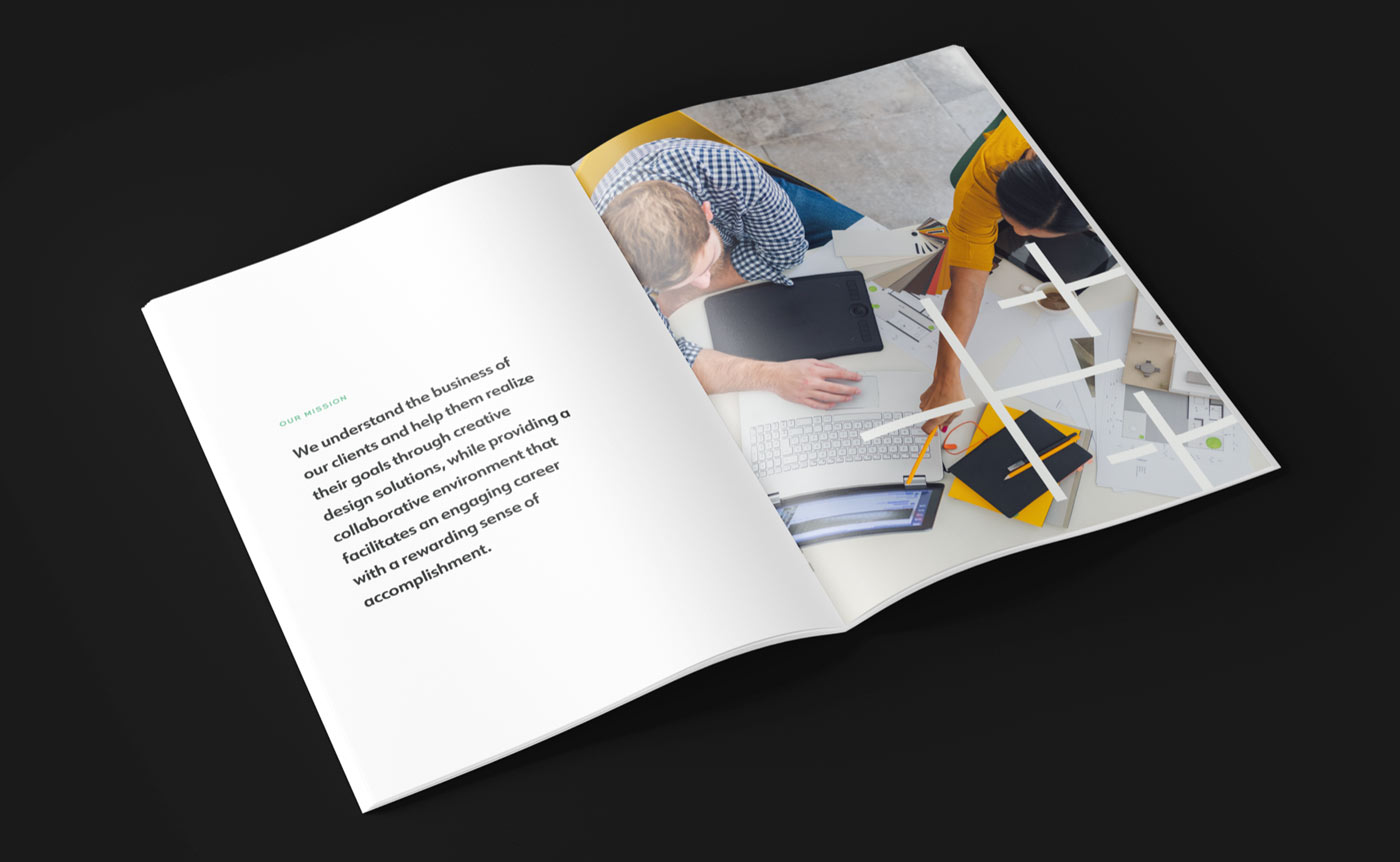
Immersing ourselves in the brand.
If you’re a regular reader of this blog, you’ll know the first step of our branding process is getting to know the “truth.” Yeah, that’s an overused phrase in branding these days, but it is, well, the truth.
For a firm like M+H, this was… almost easy. When they showed us the renderings of their new space, we instantly felt a connection. We appreciated their aesthetic. We were, right from the start, on the same page.
But to take the metaphor a step further—we were confident early on that we could help them begin this new chapter in the firm’s evolution.
As we started having individual conversations, the connection grew stronger. We started hearing more about what really sets them apart. We heard words like responsiveness: they answer the phone when clients call. We heard about professionalism and experience, and their focus on professional development. We heard about innovation, creativity and commitment.
While admirable qualities in and of themselves, they didn’t feel unique until we started to hear about how the M+H team brings them all together.
One example? They’re way ahead of anyone else in the market for creative use of technology. They’ve even moved beyond traditional (and sometimes gimmicky) headset-based “virtual reality.” Instead, M+H creates virtual walkthroughs for clients so they can make real-world decisions – and changes – before ground is even broken.
It’s part of what they call “immersive design”—an innovative way for them to (no surprise here) immerse themselves in their clients’ work, and for their clients to feel a part of the process, too. It’s pretty cool, and it felt like a fresh perspective for an architecture firm.
It all came together in a client-focused brand narrative that supports the company’s aspirations of having a more widely known reputation.

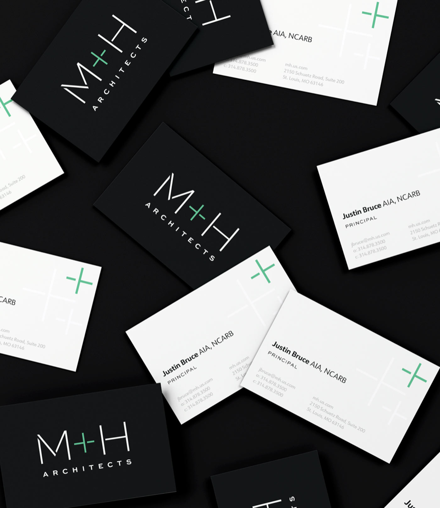
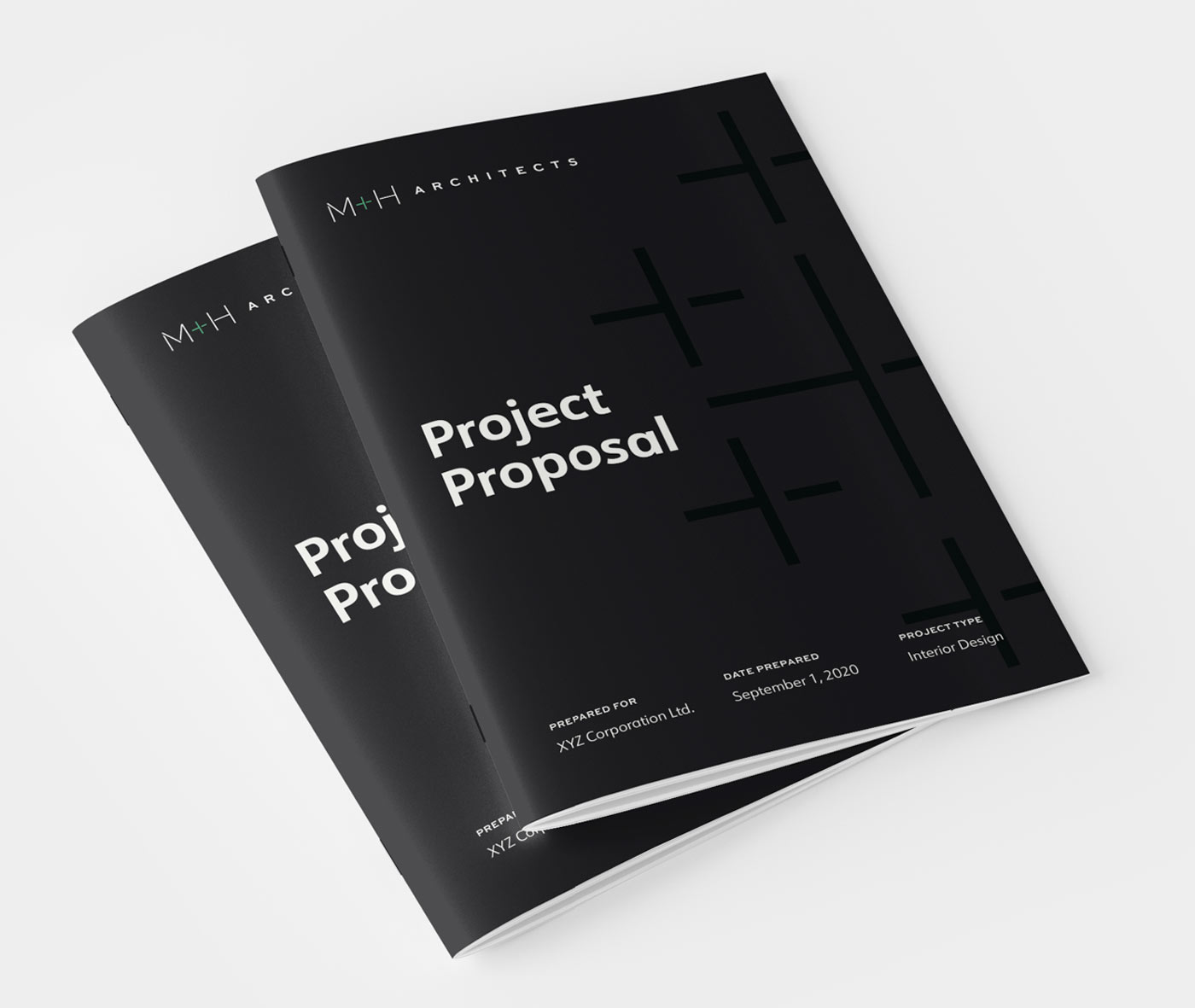
Of course, M+H had an existing logo. But we wanted to give it a modern spin. The new logo needed to reflect the level of innovation and polish they bring to their projects.
![]()
This evolution also gave us the foundation for future designs—and elements M+H could use as they built out their space.

![]()

![]()
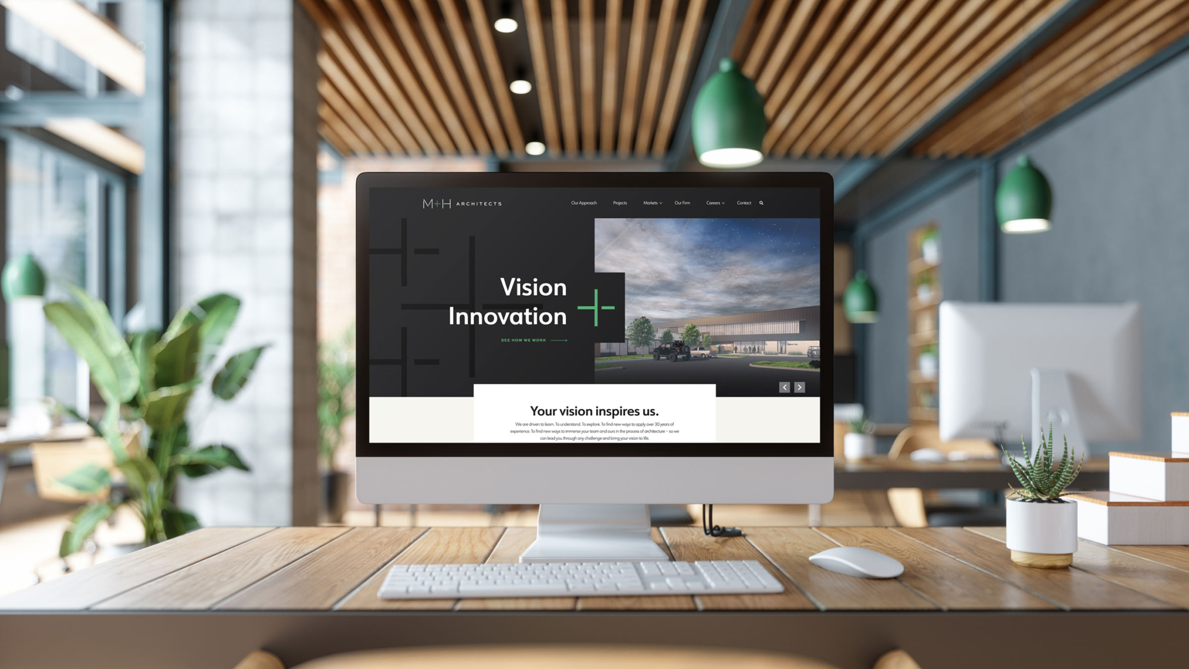
Taking a deep dive into website design.
Full confession: there’s nothing quite as intimidating as creating something for someone whose vision you admire, and whose aesthetic you enjoy. There’s added pressure.
But of course, that’s part of the fun.
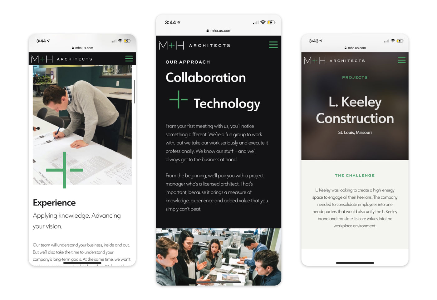
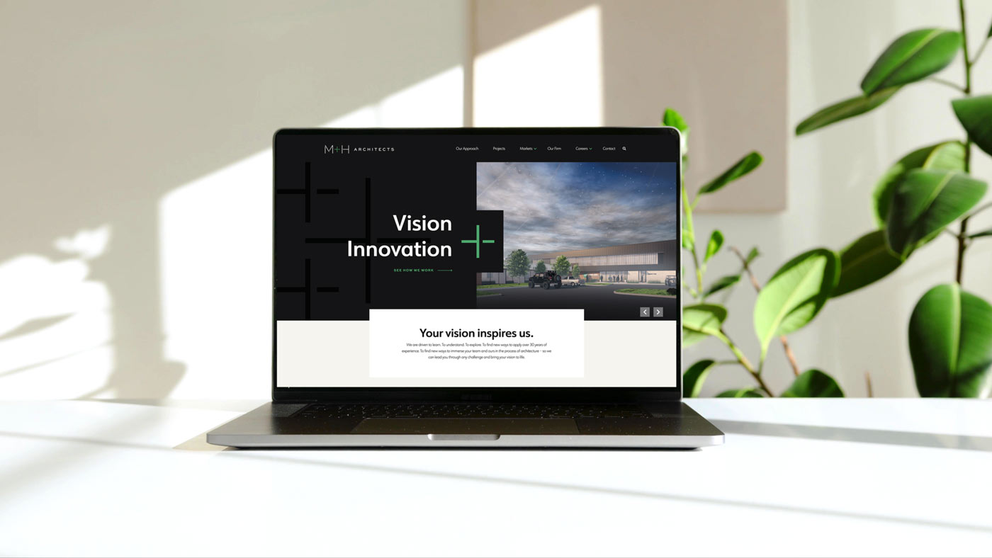
Taking cues from our brand research, we created an immersive web experience that helped M+H highlight its projects. The photos are big and bold—but so are the promises the page makes.
It’s about bringing the kinds of projects and details that often hide in the background to the forefront. And it’s about inspiration—bringing visitors deeper and deeper into the brand experience as they scroll down the page and click into the site.

The dynamic content on the homepage gives M+H further opportunities to put the spotlight on their latest work, on their approach to technology, and on inviting people to join their team.
On the “Our approach” page, we continued to bring their core values to life, making them approachable and relevant to both prospects and potential associates.
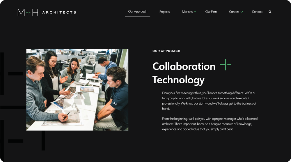
It’s a friendly, almost casual page that reflects the personality and culture of the firm. We didn’t want the story to end there, however, so the page ends with an invitation to explore their key markets, drawing visitors even deeper into the site.
Building a wave of options with Gutenberg blocks.
As you can see, there’s an incredible consistency to the site, even as page content varies from page to page and project to project. That’s thanks to a new-ish WordPress technology, Gutenberg block editor.

It gives M+H the ability to create beautiful project page layouts with whatever information they have available. They can spotlight one photo or several. They can include bulleted lists of technical information or skip that step if it’s not appropriate for a specific project.
Capturing the true nature of an amazing firm.
Remember that extra (self-inflicted) pressure we mentioned that sometimes comes with having a client whose work inspires you? That all went away as we continued to hear positive feedback from the M+H team throughout the project—like this email:
“You really hit the mark for the look, the feel, the goal… everything! I literally got goosebumps when you were all reading the copy and the updated logo is just the refresh we need! … I can’t wait to take the next steps and see this all come to life!”
We’re thrilled to have been able to get to know the people behind M+H Architects, and we can’t wait until the world opens up again so we can see their cool new office space in person.
In the meantime, feel free to immerse yourself in M+H Architects’ brand-new website.