Sometimes, figuring out the best way to protect the environment feels impossible.
There’s a million options: wasting less, recycling more, advocating for change on a larger level, eliminating plastic from our day-to-day lives. And each choice has varying (and hotly debated) degrees of impact.
Honestly, it makes my head spin.
But then there’s PERC.
Shaking up conservation.
For more than four decades, PERC has taken an innovative, effective approach to conservation and environmental stewardship: market-based environmentalism.
Drawing on both economics and environmentalism, the nonprofit, nonpartisan organization uses markets, incentives, property rights and partnerships to produce positive outcomes for land, water and wildlife. PERC sponsors academic research, environmental law and policy reform efforts, and innovative conservation models to unite people and organizations behind the mission.
By exploring how aligning incentives for environmental stewardship produces lasting wins, PERC’s approach helps make conservation more durable and enduring.
There was just one issue: PERC’s website, where it publishes its research and promotes its reform efforts, was hindering the organization from reaching its potential.
A content overhaul.
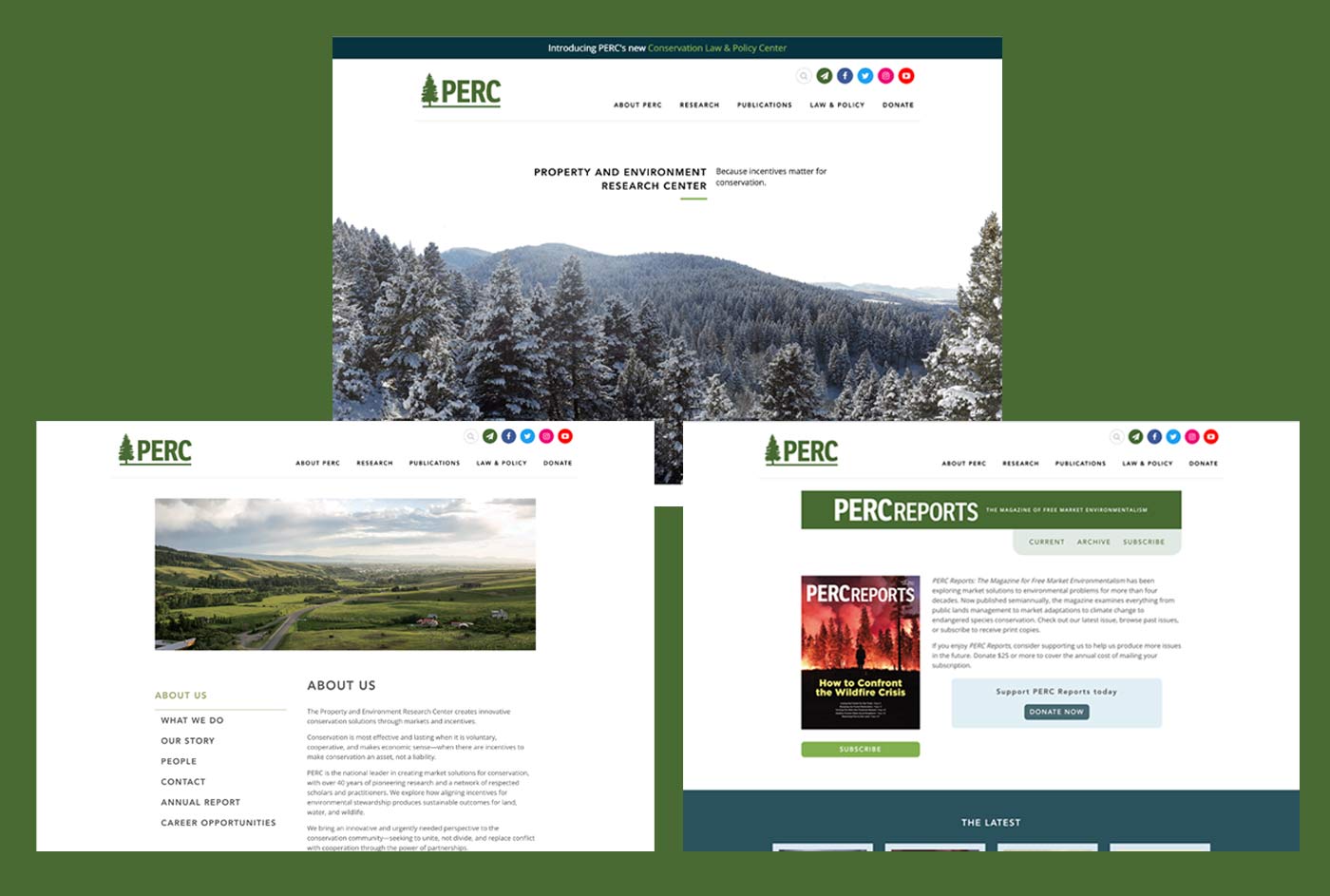
One thing was clear about PERC: they had a lot of content. Thousands of articles, magazine issues, academic reports, videos and more dating back to the 90s.
But the existing website’s structure limited how and where that content could be shared. Their team asked us for a more sophisticated solution that would saturate the site with the valuable content and give them the flexibility to build out new content in the future.

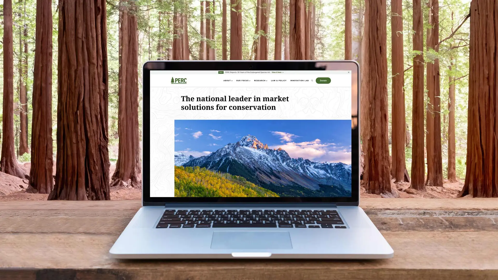
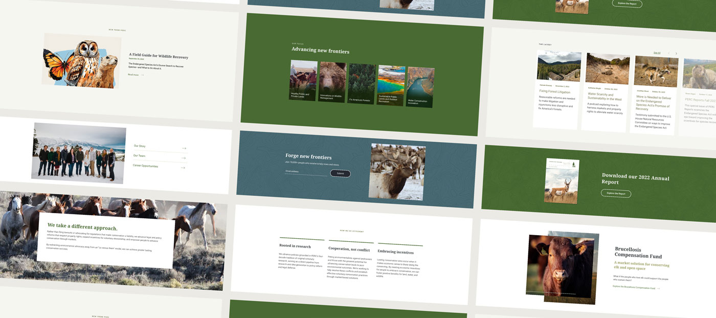
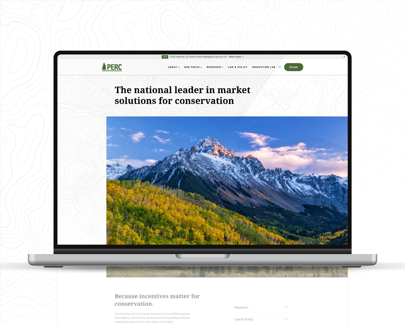
We started with the homepage, layering images and text on a topographic pattern to give the page texture while immediately conveying PERC’s focus. We cleaned up icons and borrowed from the organization’s vast library of nature photos to illustrate its various efforts.
![]()
More than just good looks.
One of my favorite quotes about design is from Steve Jobs.
“Design is not just what it looks like and feels like. Design is how it works.”
Our challenge with the PERC website design was this quote in digital form. We knew there were opportunities to make the site more visually appealing and reinforce PERC’s brand. But the biggest obstacle wouldn’t be form—it was function.
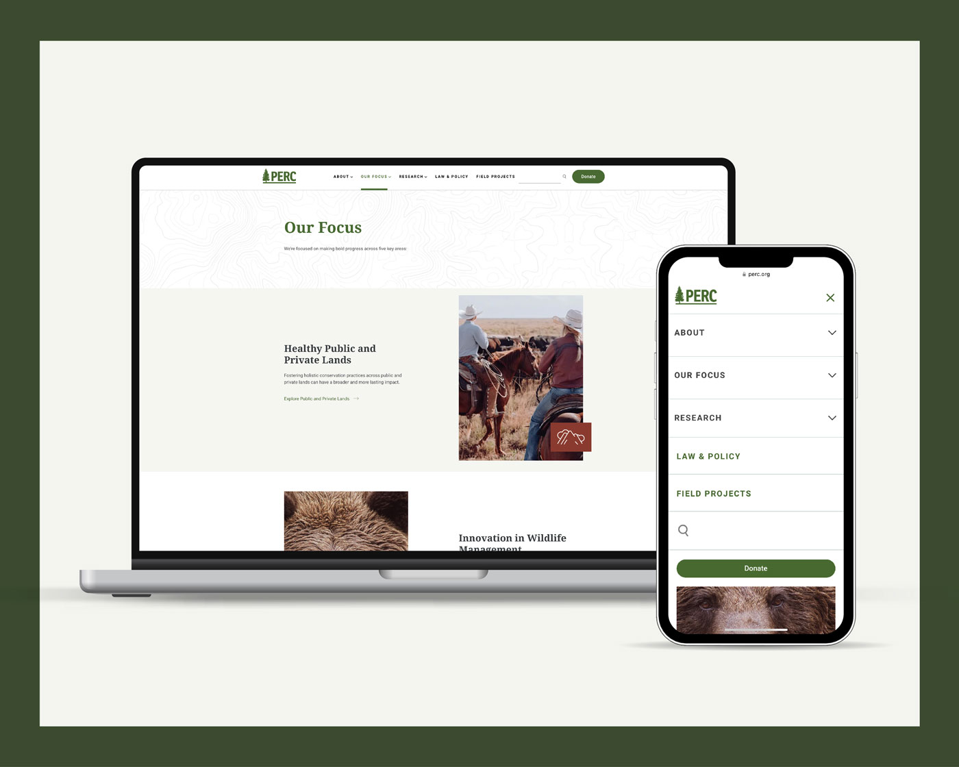
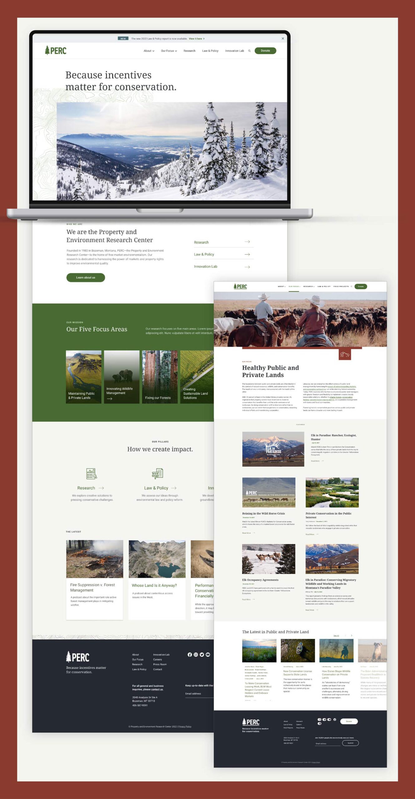
We started by streamlining the site’s organization, adding an “Areas of Focus” dropdown to the main navigation and developed a page dedicated to the organization’s Innovation Lab. In the Research hub, visitors can find content by type or topic.
Callouts to view specific content (like the annual report) and related content keep visitors engaged as they explore the site.
And by modifying an existing plugin, we made all of the content searchable.
Easy reader.
How some of the content was formatted also needed a refresh.
The long articles and reports came with rich imagery—which was getting downplayed by the limiting post structure of the old site.
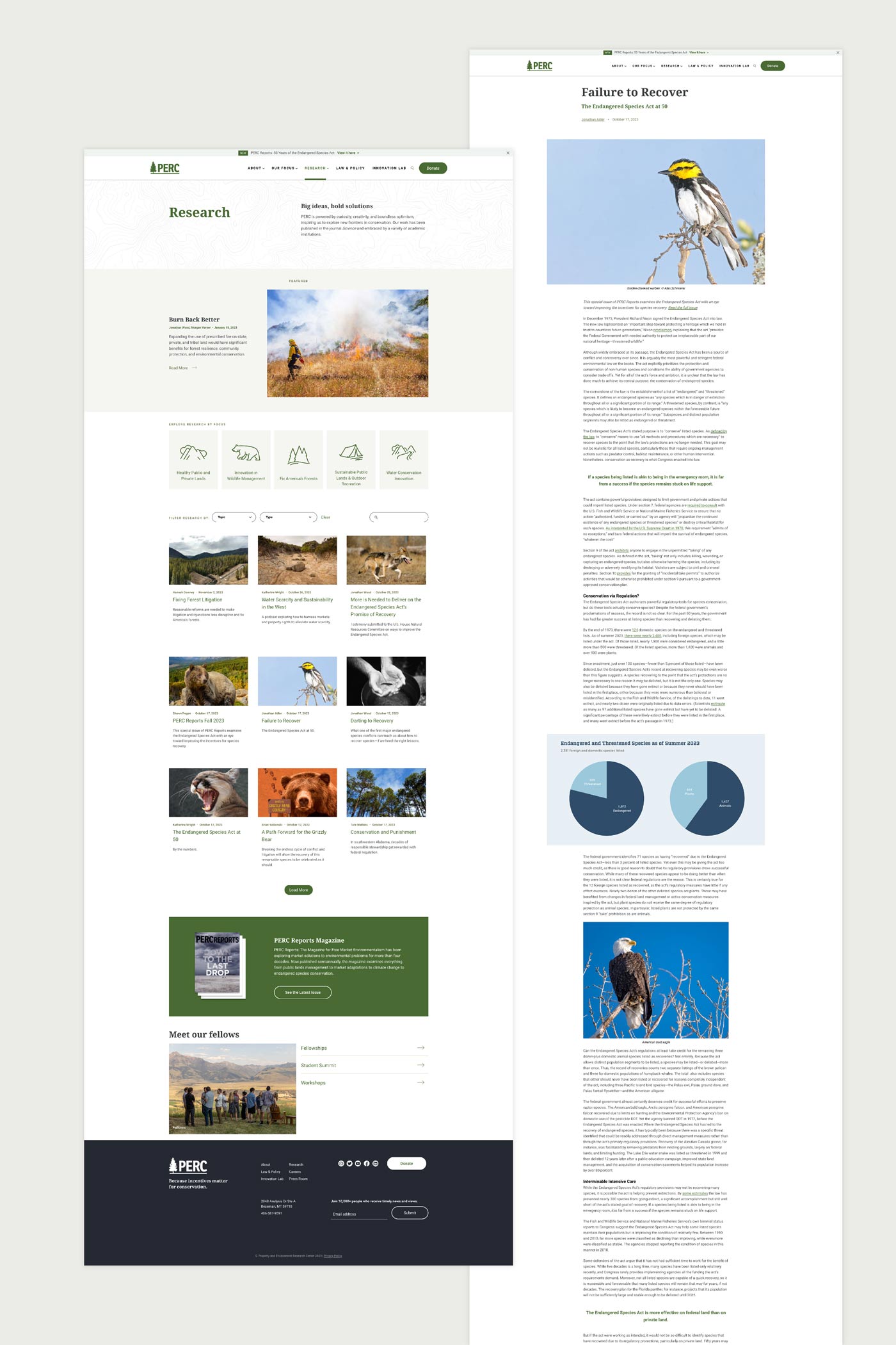
So we developed a non-standard post type that supports a range of media, including full-width images and charts in the copy, blocks with colored backgrounds to call out specific sections and a “sticky” table of contents that allows readers to quickly jump to specific sections.
And to fuel PERC’s fundraising efforts, calls to donate appear after visitors view reports and articles. We beefed up the main Donate page as well, pushing the form higher on the page and making the design more visually appealing.
From internal linking and icons to building out each of the thousands of pieces of content, every element of the site was intentional, designed to engage unique audiences—just like PERC.
Empowering positive change.
Near the top of the rankings for Atomicdust’s biggest site builds, the new PERC.org is much more manageable, both for visitors to navigate and the PERC team to update. The site uses Kadence Blocks, reusable WordPress blocks their team can use to quickly develop new pages and layouts.
PERC’s approach to environmental protection doesn’t put the onus entirely on individuals, or private companies or governments—or even nonprofits. Instead, it develops solutions that multiple parties can all get behind.
Or like it says on the site, PERC makes “conservation an asset, not a liability.”
It’s a unique method for an incredibly worthwhile endeavor—and deserves a strong website and content strategy to support the mission.
Our team was proud to get to support PERC, and we’re looking forward to seeing what positive changes they champion next.