Did I ever tell you I have a slight fear of elevators?
Our first office was in an old building on Washington Ave. in downtown St. Louis. It had a manual switch you used to operate it. No button or stopping directly at floors. Just an old, canary-cage elevator that you could see through during your climb.
Sometimes, if you were out of practice, you would end up a foot higher or lower than the floor when you opened the door. So you’d push the switch again, and the whole thing would bounce up or down.
Anyway—I got to know the staircase in that building really well.
And if you were to tell me that I would miss that old canary cage elevator compared to what we went up in for our latest branding project, I wouldn’t have believed you.
A really, really big building
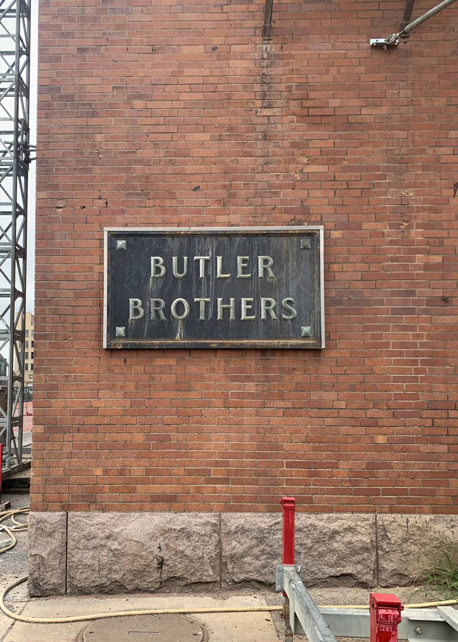
Last summer, we got a call from the new owners of the Butler Brothers Building in Downtown West, St. Louis. Have you heard of it? If you’ve lived in the area, you’ve probably driven by it.
The Butler Brothers Building is absolutely huge. In fact, it takes up an entire city block. A century ago, the place was a warehouse that stored trinkets and goods headed for Ben Franklin five-and-dime stores.
I’ve worked near the building for the last 25 years. Not many know it by name, but if I say “It’s the huge building next to the White Knight Diner,” I get a few head nods. I’ve only stepped foot inside of it a few times. There used to be a small photography studio there, but for the most part, it was a pretty forgotten about and neglected space.
The new owners, the people who had contacted us, are developers based in Memphis. They had recently purchased the building and wanted to update and convert it from old warehousing and studio space to modern, amenity-rich apartments—and they wanted Atomicdust to help name and develop a brand identity for the property.
Around the block
I’m not sure where you live in the world, but you might have heard St. Louis is getting its first Major League Soccer team. That is pretty big news for a couple reasons. One, we are the greatest sports city in the country. And two, the area that they built the new, beautiful soccer stadium in, just a few blocks from the Butler Brothers Building, really needed some love.
The area had been losing businesses and didn’t get a lot of visitors. Over the decades, the only companies that I know of that flourished there were scrappy creative firms (no, not just us).
With the rise of soccer, and the new NGA building nearby, the Downtown West area is seeing a lot of improvements and dollars invested into it from private businesses. Those dollars are bringing positive growth and revitalization, an amazing and very welcome change.
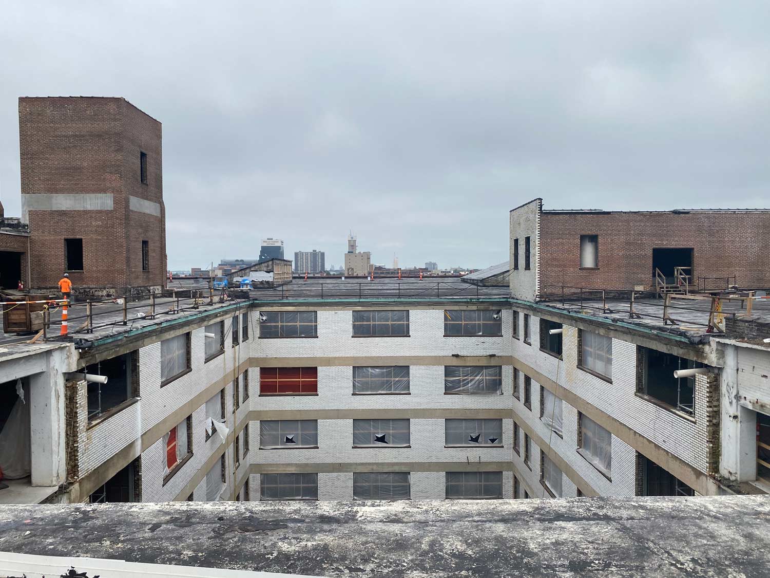
The Butler Brothers Building would be changing, too. Our team took a tour of the building pre-construction (where I faced my fear of scarily outdated industrial elevators).
It’s a massive building, with tons of space for cool amenities and community areas. The two-acre rooftop alone is a major draw. Once completed, the building will have a pool deck, bar, pickleball courts, fitness center, electric car charging stations, a dog run, central courtyard, co-working spaces and even a golf simulator. Not to mention the apartments themselves.
They’ll also be installing new elevators.
Plus, it’s just blocks away from places like Union Station, City Museum, Saint Louis University and the brand new CITYPARK soccer stadium.
With a great location and appealing amenities, naming and branding should be easy.
But that’s the thing.
Strong opinions about names
Atomicdust has done a lot of residential development branding over the years. Enough to know that there’s more to consider than most people might think.
The Downtown West area is changing. The renovated Butler Brothers Building will help bring in a new era for the neighborhood. And the people we spoke to as we conducted stakeholder interviews had strong feelings about it all.
Some people felt changing the name of the building to anything other than the Butler Brothers Building would result in failure. Others believed it was time for something new. Some didn’t really think it even mattered.
As a team, we were split. (Although as a branding agency, none of us thought the name wouldn’t matter.) Some of us wanted to uphold the meaning-filled Butler Brothers name. Others felt like the renovation was a chance to evolve the building’s (and area’s) reputation.
Not yet crossing Butler Brothers Building off the list of possibilities, we started brainstorming alternatives.
Our list of ideas was extensive. We considered the building’s history, size and location. We thought about the region’s tie to soccer and the game itself. We came up with abstract words that just sounded cool.
And eventually, we decided against keeping the Butler Brothers name.
Why?
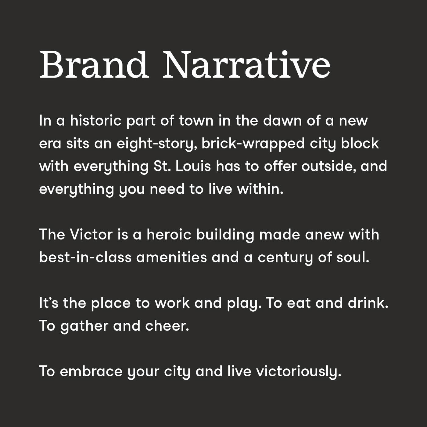
When you’re trying to bring life into an old building, you have to reinvent the use. The Butler Brothers name means something to the local preservation community. But it doesn’t mean anything to the people who will live there.
The building’s revitalization was helping jumpstart the city’s future. We wanted the name and brand to help push St. Louis forward, too.
Big ideas for a big building
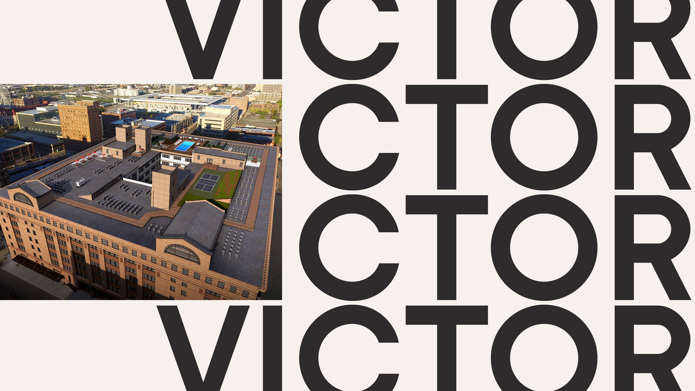
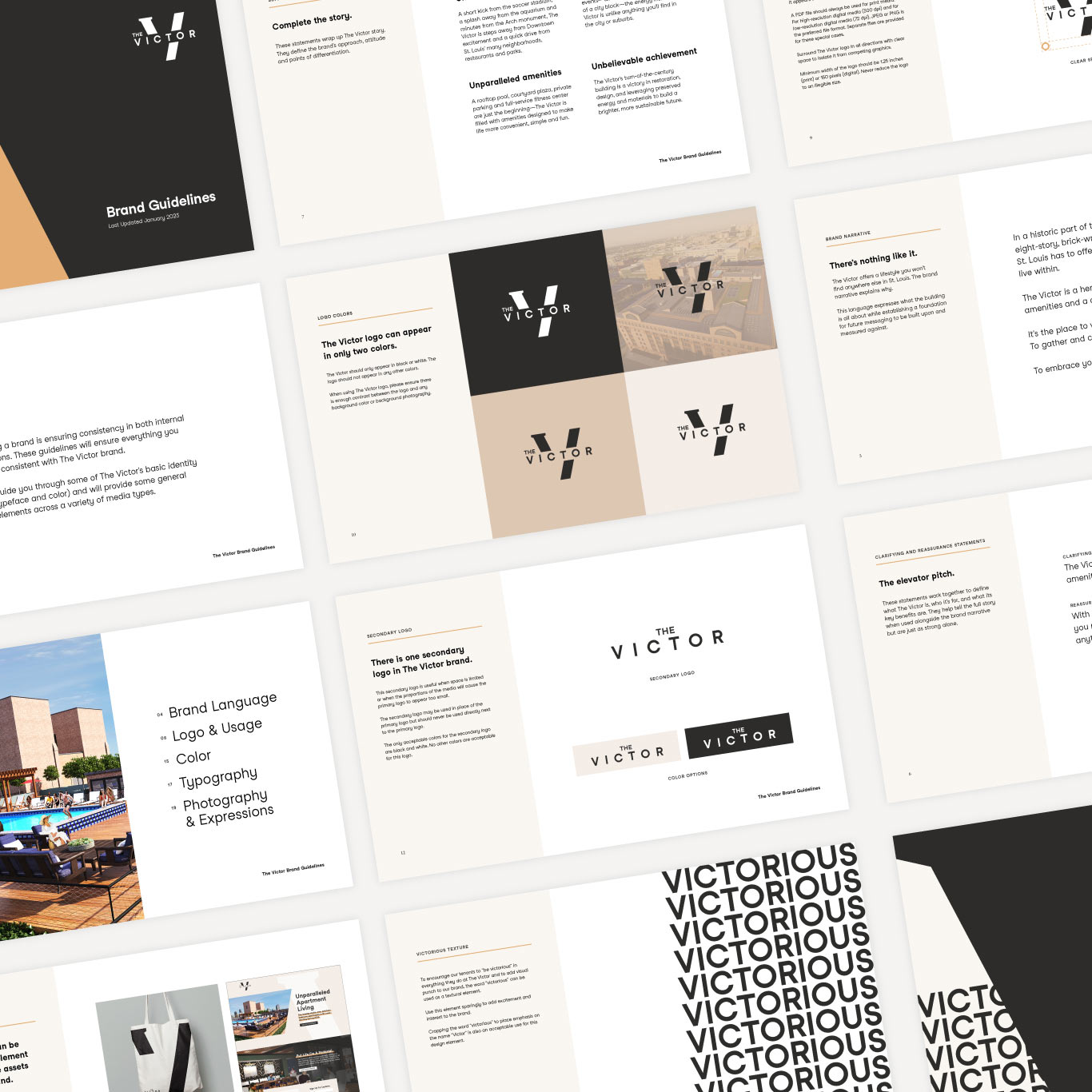
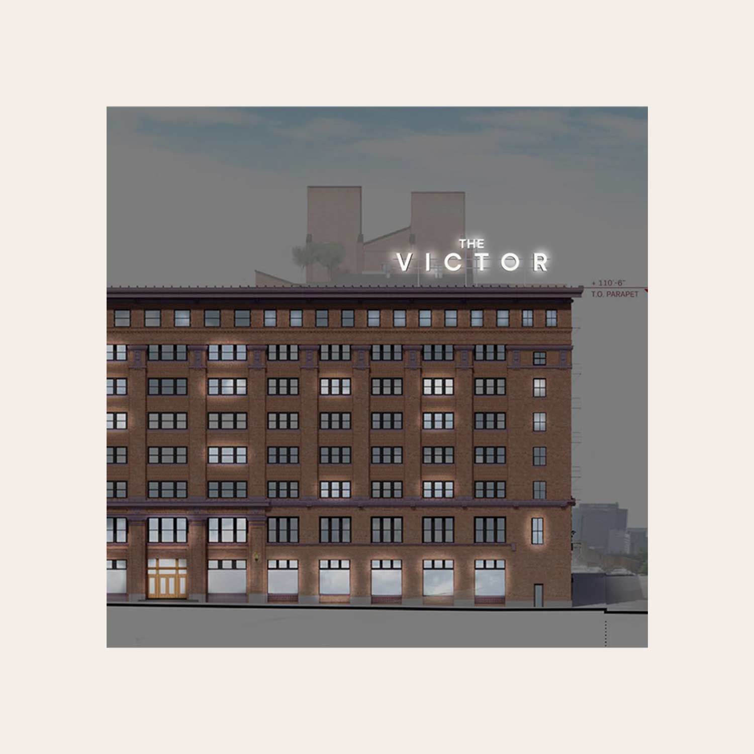
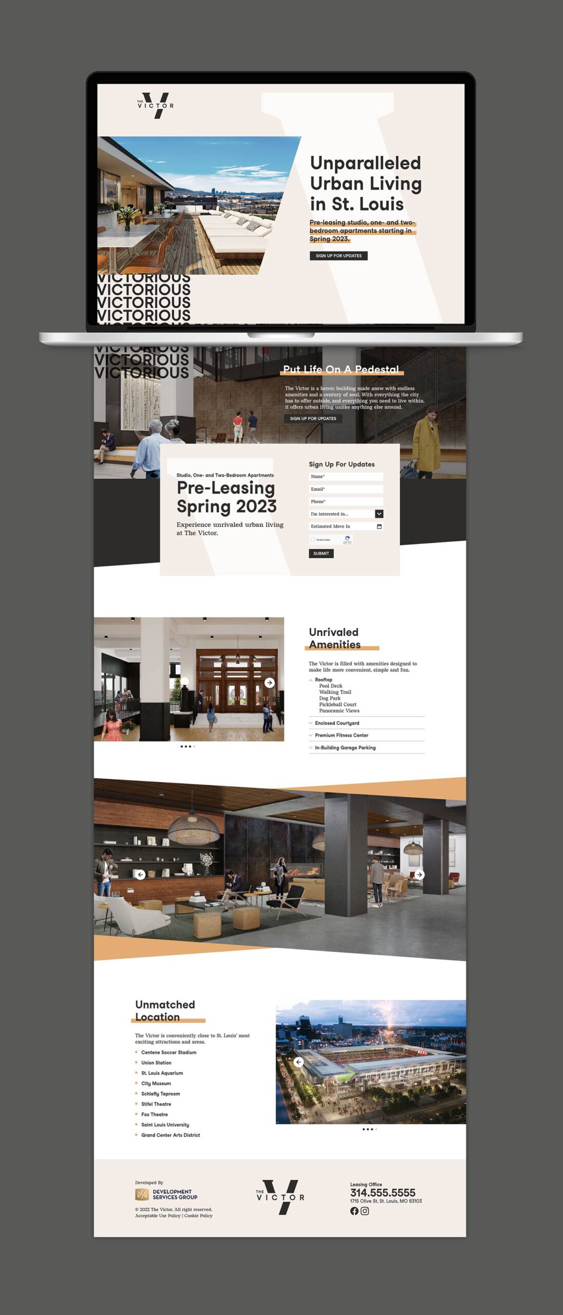
From our narrowed down list of names, the client chose a winner: The Victor.
What’s great about The Victor is that it can mean a few different things, depending on how you look at it and who you are.
It nods to the city’s sports teams, of course. And it works well with the mockups we’d seen of the interior design of the building—masculine, timeless and sophisticated. But it also represents achievement and triumph, something this building will symbolize to not only the nearby community, but the entire city.
Visually, the form of the word “Victor” gave our design team a great structure to start with. Playing on the juxtaposition of the building’s past and future, we developed a logo that embraces both, pairing a serif and sans serif typeface in one letter.
![]()
![]()
How do you talk about such a behemoth of a building?
You need words and messaging that can hold up. So we developed a brand narrative and supporting points.
The brand visuals get an unexpected twist in the form of a pattern, made by gridded repeats of the word “VICTORIOUS” in simple, all-cap type. Photos masked by the upward slant of the “V” add an extra element of modernism.
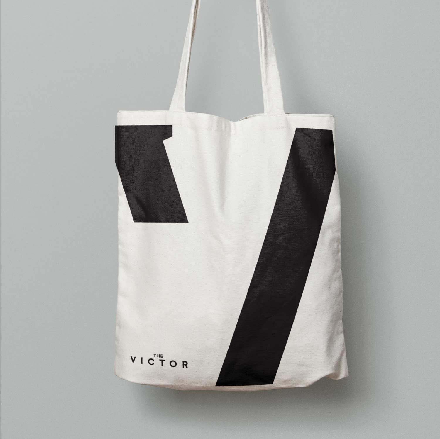
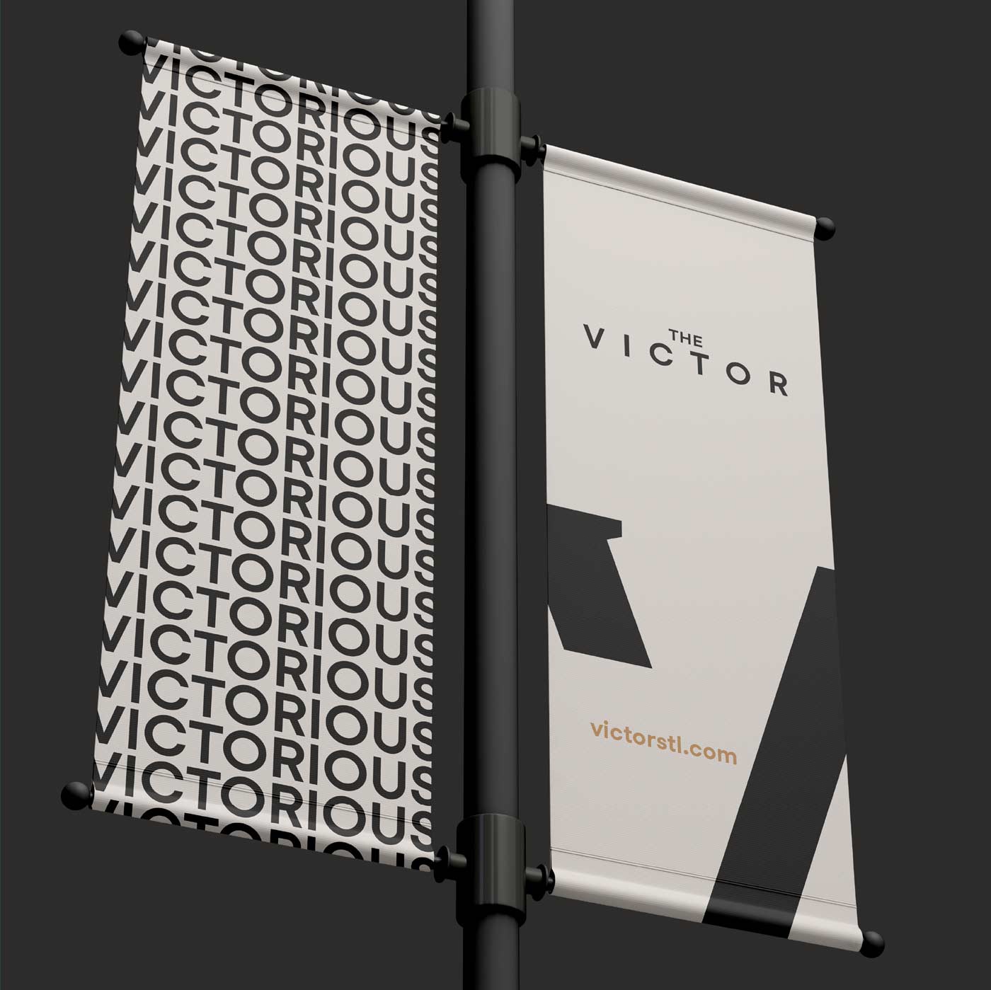
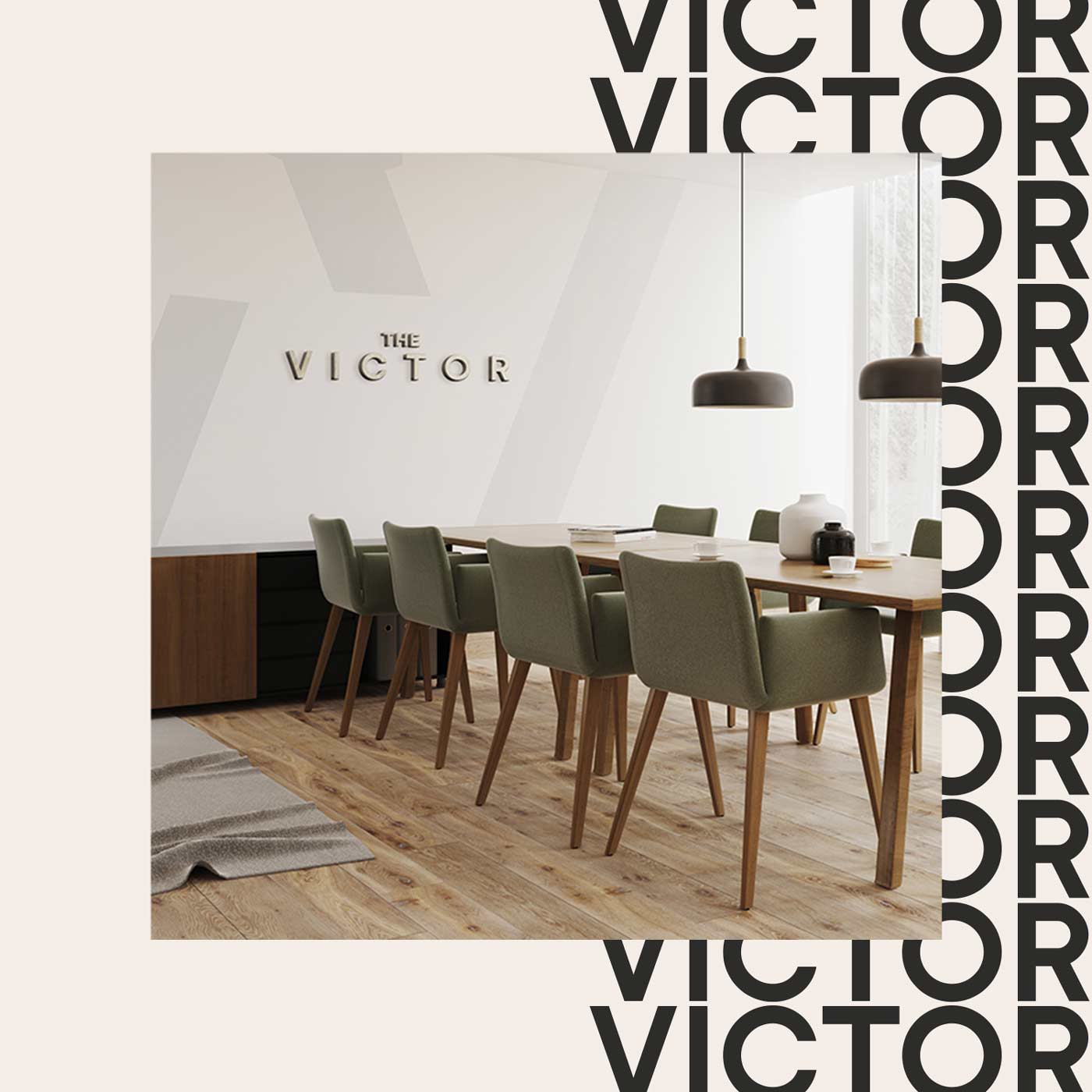
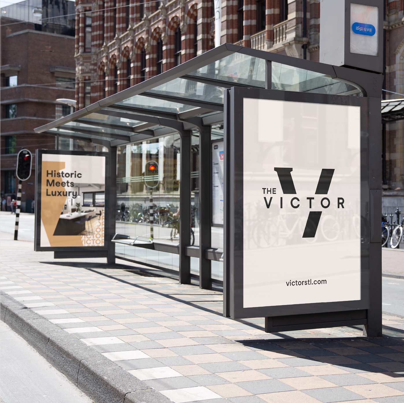
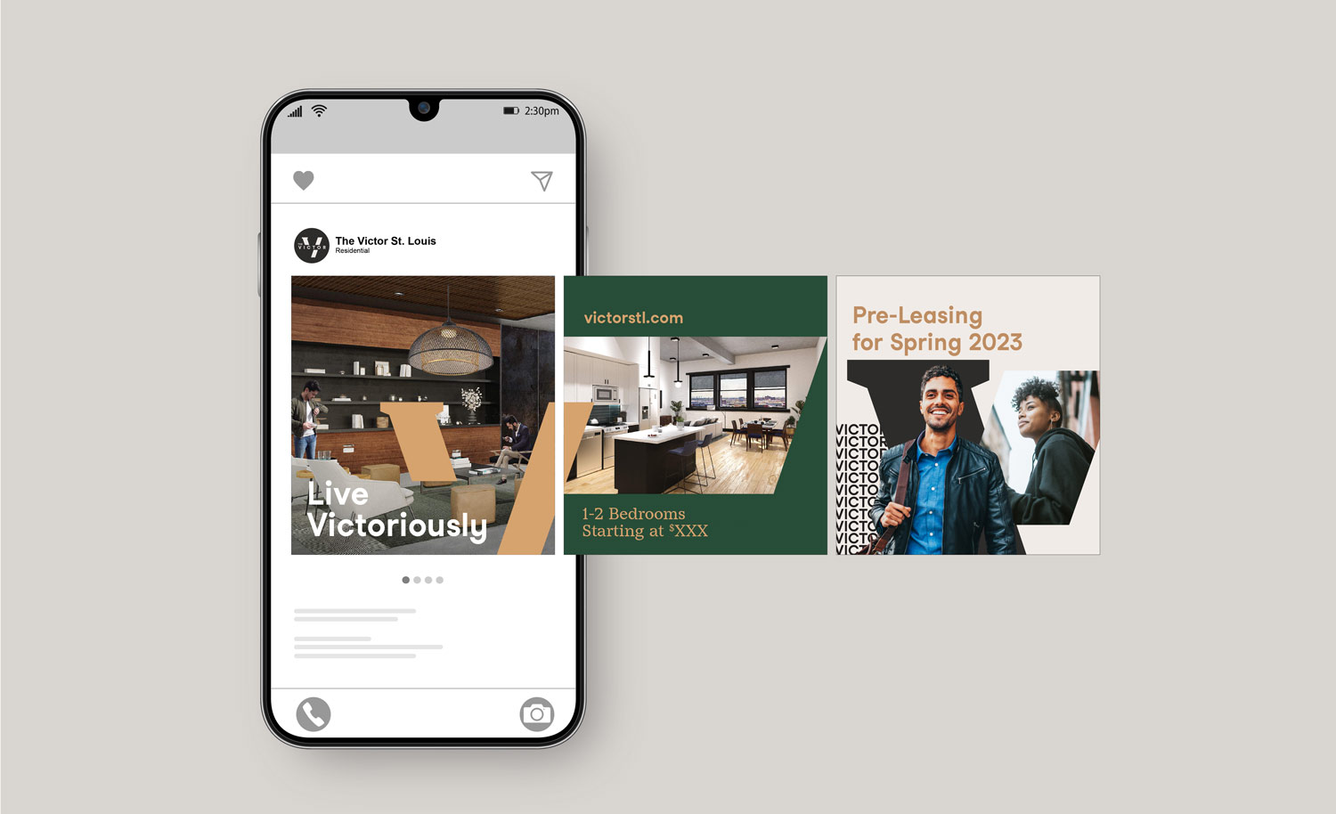
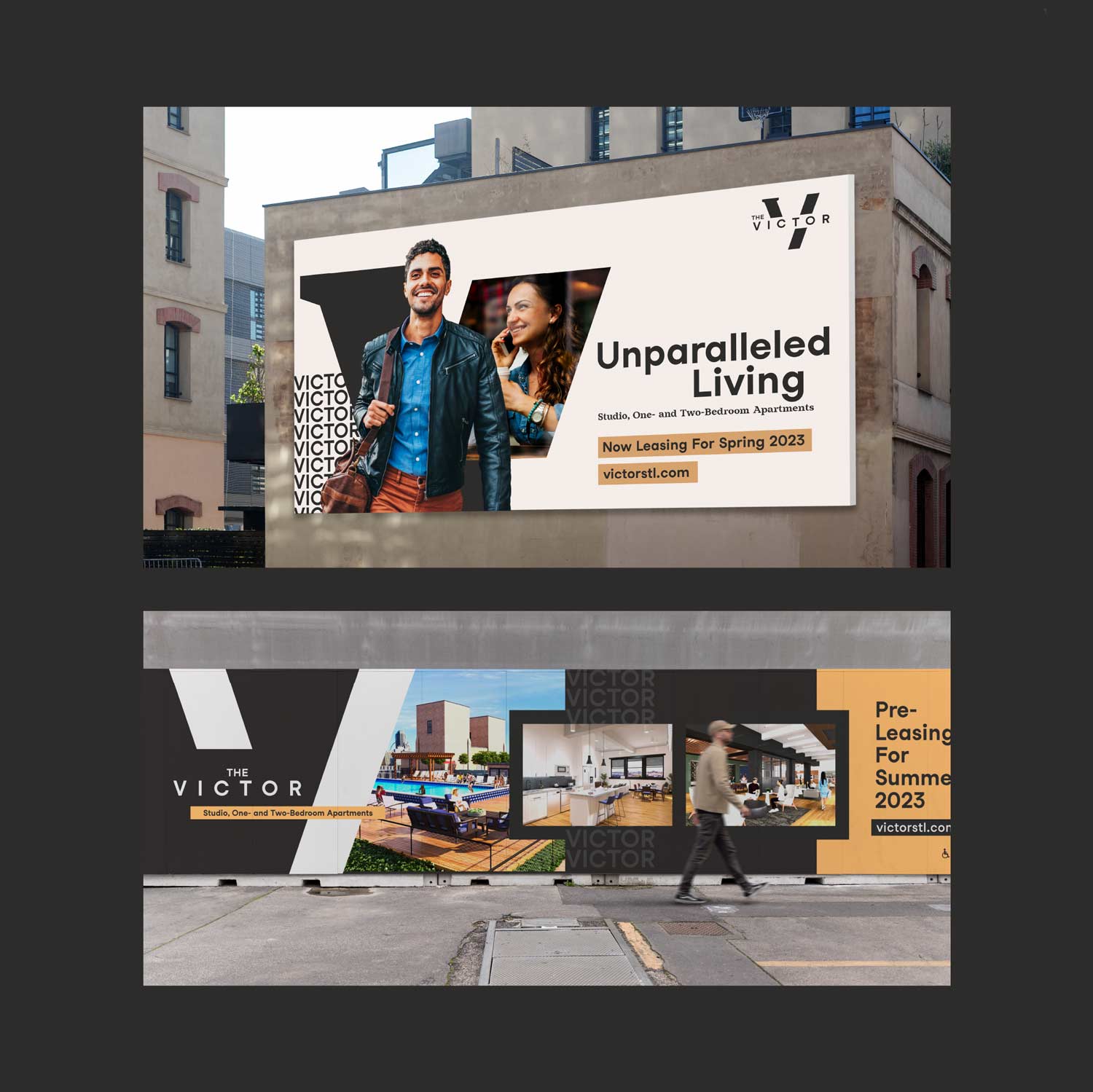
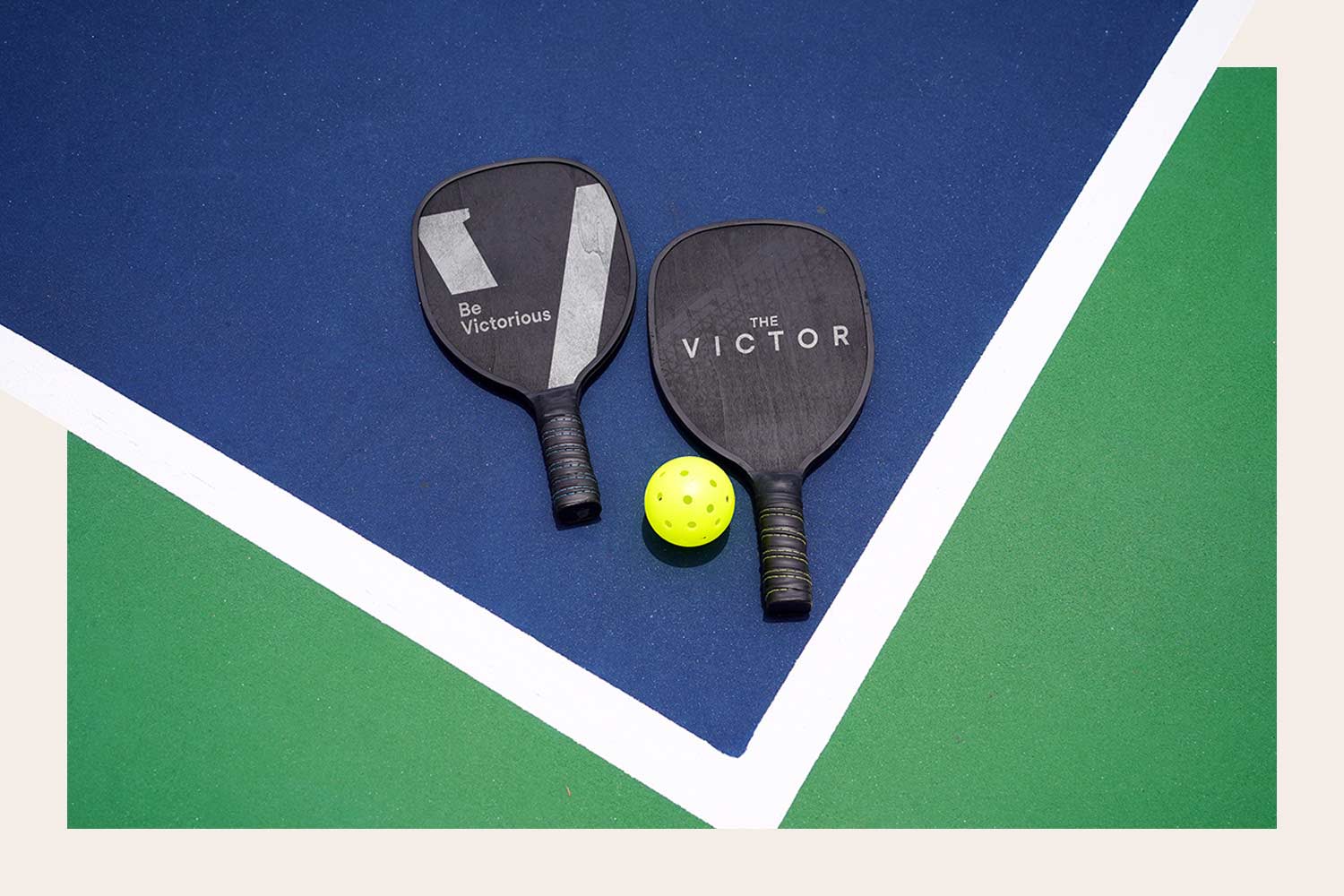
And to show how it would work in action, we developed creative expressions, or mockups of brand touchpoints: signage, advertisements, swag, business cards, social media posts, pickleball paddles.
Looking to the future
The Victor won’t be move-in ready until later this year. But to drum up excitement and begin pre-leasing, we built a simple website that expresses the spirit of the building, lays out the different amenities and features and allows potential tenants to start the sign-up process.
For two decades, our team has been lucky to have a small hand in shaping St. Louis, and it’s always a big honor. We’re looking forward to touring The Victor again once construction is complete.